10,000 search results
(0.216 seconds)
- Abigan by IM Studio,
$18.00 Abigan is an elegant new serif font that will add a touch of luxury and sharp diamond points add a slick yet legible Persian style. This versatile font is Perfect for editorial projects, magazine headers, Logo designs, Apparel Branding, product packaging, and displays both masculine and feminine qualities. Abigan comes with full uppercase, lowercase, numbers and punctuation marks + Multi-language support and PUA encoding. To enable the OpenType Stylistic alternative, you need a program that supports OpenType features such as Adobe Illustrator CS, Adobe Indesign & CorelDraw X6-X7, Microsoft Word 2010 or later.
 - Glastia Monoline by HansCo,
$12.00 Glastia Monoline Font is an elegant handwritten signature. I made Glastia Monoline font inspired by the concept of classic calligraphy and made it into a modern yet clean style. I also added some ligatures and alternatives swashes that are very interesting when applied. This font is perfect for creating signature logos or just watermarks for your photography studio or print templates like posters, branding, quotes, or anything else. Alternative and swash characters are also available. Very recommended to use in Adobe Illustrator, Adobe Photoshop, Adobe InDesign, CorelDraw. Enjoy!
 - Milk Water by Yumna Type,
$12.00 Be a the ultimate you with gorgeous style font. The awesome Milk Water. It is a beautiful font duo that reflects youth, power, yet cuteness. The weight of the display font brings strength to any title or header you apply to it. On the other hand, the curve of the script font also convey a sense of cuteness. Features: Stylistic Sets Ligatures Multilingual Supports Numerals and Punctuations Thank you for purchasing premium fonts from our studio. If you have any further questions, don't hesitate to contact us. Happy Designing.
 - Gerbera by Brownfox,
$44.99 Gerbera is a new sans-serif with a distinct personality that fuses geometric and organic elements. It is at once hip and quaint, clear yet idiosyncratic, restrained but sensual. Its deliberately varied classical capital proportions and geometric structure are balanced by slightly reversed stress and pinched terminals on curved strokes. This versatile font comes in five weights with their italics and offers a variety of Open Type features, including small caps, alternate characters and punctuation, five sets of figures, and CE, Baltic, and Cyrillic support. Designed by Gayaneh Bagdasaryan & Vyacheslav Kirilenko, 2014-2022.
 - Sarlotte by Attract Studio,
$18.00 Sarlotte is a luxurious serif with an elegant style. It seduces your eyes with its curves yet still manages to maintain its classy serenity, it's perfect for branding, logos, invitations, long texts, and many more of your other needs. Sarlotte Features: Multilanguange PUA Encoded Alternates Ligatures. To be able to access alternative fonts, make sure the software you use can support opentype features such as Microsoft Word, Paint, Adobe, Corel draw, Cricut and other applications. If you need help, please contact me :) Check out Holen Vintage which is a great pair for Sarlotte.
 - Simarigo by Asenbayu,
$15.00 Simarigo is a serif-stencil display font with a unique shape. Simarigo has an interesting combination of typography, crafted from serif shapes that make it elegant and luxurious, yet one of those stencils that are abstract and strong. You can use this font in modern, vintage and retro design. This font is perfect for a variety of projects, such as branding, poster displays, logo designs, magazine, headline, sticker and more. Simarigo font feature open type, kerning, ligatures, and alternative styles. Simarigo font include uppercase, lowercase, numbers, punctuation and multilingual support.
 - Simply Nouveau JNL by Jeff Levine,
$29.00 As Word War I raged on during 1917, a large number of songs were written as morale builders for both the soldiers leaving for overseas service as well as their friends, family and loved ones. One such song, "Send Me Away with A Smile" has its title hand lettered in a simple, yet somewhat stylized sans serif design that was so much a part of the Art Nouveau style of that era. Simply Nouveau JNL captures and preserves that design within a digital typeface; available in both regular and oblique versions.
 - Ludwigon by IbraCreative,
$17.00 Ludwigon is a contemporary serif typeface that seamlessly melds timeless elegance with a modern sensibility. With its gracefully elongated serifs and refined letterforms, Ludwigon exudes sophistication and readability, making it a versatile choice for a wide range of applications. Its clean lines and balanced proportions lend an air of classic refinement, while subtle design nuances, such as tapered stroke endings and graceful curves, infuse it with a touch of contemporary flair. Ludwigon strikes a harmonious balance between tradition and innovation, making it a compelling choice for projects seeking a timeless yet fresh typographic aesthetic.
 - Hello Amsterdam by Ake,
$18.00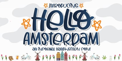 Hello Amsterdam Font is an informal, cute modern, fashionable, friendly, and trendy handwritten font. With its playful yet versatile style, Hello Amsterdam adds a delightful touch to any design project. Whether you're creating greeting cards, invitations, logos, social media posts, or anything in between, this font brings a casual and adept vibe to your work. Its handwritten charm and contemporary appeal make it a perfect choice for those seeking a touch of personality in their designs. Embrace the trendy vibes of Hello Amsterdam Font and let your creativity shine!
 - Carolyna Pro Black by Emily Lime,
$89.00 Carolyna Pro Black is the bolder sibling of Carolyna Pro. It is an elegant, yet whimsically handwritten calligraphy font that was created with readability in mind. It uses open-type features to assist with letter flow and to give each creation that modern, hand-lettered touch. With over 1000 characters, there are many stylistic alternatives from which choose, tons of foreign characters so you can write in other languages, and fun swashes to give headings a little something extra. Note: This font works best with open-type friendly applications.
 - Melodica by Scholtz Fonts,
$19.95 Melodica was so named because the characters dance easily across the page as music wafts across a room. The font was designed to meet the need of designers that need clarity, sensuousness, a suggestion of the oddball, and a modicum of humor. With its boldly curvy caps, and large x-height lower case characters, Melodica suggests a boldness of purpose while enjoying a well modulated delicacy of line. Use Melodica for any purpose that wants a happy, vibrant, slightly quirky yet "not too far from the norm" solution. Language support includes all European character sets.
 - Classike by Emtype Foundry,
$69.00 Classike is a high contrast squarish display typeface. Inspired by the Art Déco period from a modern perspective. Refined and elegant yet with a mechanical vibe, it is ideal for pairing with any functional font, it works especially well with Geogrotesque, from which it inherited its proportions and soul. Classike adds an exclusive touch and helps enrich your graphic voice. A Variable Font version is included with the family or as a separate style. Read some thoughts about the design process at the Emtype's blog. For more details see the PDF.
 - Brown Fox by Wilton Foundry,
$29.00BrownFox was created because I saw a need for a condensed, loose handwriting - I used my trusty nylon marker to create this font - it is rough, yet thin and elegant. BrownFox has a few surprises like some serious ascenders and descenders with an exaggerated x-height. Caps are intentionally simple to maintain an even rhythm. BrownFox works very well in caps, upper-lowercase, lowercase only, small and large. This font will be useful in many applications from invitations through CD album covers. The name was inspired by the other ipsum lorem.:-) - TA KokoroF by Skill Information"S",
$99.00 TA-kokoro is very popular in Japanized font. TA-kokoro is designed by Yasushi Saikusa who is famous as typographer and based with Maru-gothic. TA-kokoro expresses yet cuteness. TAこころは、日本語のデザイナーズフォントの中で大変人気の有るフォントです。 タイポグラファで有名な七種泰史がデザインしたフォントで、丸ゴシックのデザインをベースにして更に可愛らしさを表現したフォントです。
 - Jutlandia Pro by David Engelby Foundry,
$12.00 Jutlandia Pro is a redesign of Jutlandia Slab. About the Jutlandia font family: made for straightforward and functional typographic design. Its design is rooted in clarity and legibility which is the slab serif tradition. The unpretentious, yet sturdy and functional visual expression of the regular form, and the subtle bold and italic forms is an homage to Jutland – the Cimbrian Peninsula of Denmark and my birthplace. It's suitable for package design, logotype, poster design, editorial design and anything you can dream of! Great for tons of text copy as well. Enjoy!
 - Galaktik by ExFour,
$19.00 Galaktik is a fresh embodiment of the monospace font. Born out of creative ideation, it attempts to pay homage to a long history of display fonts while exhibiting contemporary, playful accents. This balance of geometric shapes and creative expression allows Galaktik to feel both familiar and yet unique. Features Numerals Punctuations Special Characters Galaktik's freshness fits modern typographic schemes, futuristic logos, and even command-line consoles. The limits are boundless. Thank you for your purchase! Feel free to reach out for any issues or if need any assistance.
 - Smashing by PintassilgoPrints,
$26.00 Smashing is a stout typeface, with a twist. It’s a massive all-caps font with bouncing glyphs, positively bold yet quite good-humored. Its upper and lower case slots stores different lettershapes, providing handy options to choose from. When working with OpenType savvy applications you can turn on the contextual alternates feature to instantly get alternating glyphs, which add spontaneity to your artwork and prevent neighbor double letters from using the same glyph. Also try the discretionary ligatures feature to get some cool interlocking pairs. A smashing font for truly smashing designs!
 - Rum Raisin Pro by Stiggy & Sands,
$29.00 Our Rum Raisin Pro was inspired by the lettering from a vintage Kellogg's Raisin Bran cereal box, yet is has expanded from what was originally a unicase design to include a lowercase character set. For those seeking to use the original unicase A, you can find it in the Delta character slot. Fun and festive, this font plays the comic clown to perfection. The SmallCaps and extensive figure sets offer a change up to a slightly more serious tone or alternate personality for a wider range of use.
 - Classi MF by Masterfont,
$59.00 High contrast serif font, so elegant, keeping the ethnic look and feel.
 - KG Satisfied Script by Kimberly Geswein,
$5.00 An organic handwritten script font with alternates to create a custom look.
 - Wire Type Mono by Thomas Käding,
$9.00 A monospaced typeface meant to look and feel like an old typewriter.
 - Chef's Slice Novice, a font designed by Graham Meade under the banner of GemFonts, is a playful yet sophisticated typeface that embodies the whimsical essence of culinary art. Its design intricately ...
- Pewter by KC Fonts,
$14.00 KC Fonts would like to present its latest creation: Pewter. Pewter is a three weight font (including italics) with four grungy family members (also with italics) for a total of 14 OpenType/TrueType fonts. The Pewter family allows you to freely mix and match between the weights and the grunge variants as it’s not just the same erosion over and over. The Original Trio: Regular, Bold & Black - they're perfect for your more front page useage and anywhere you need a more traditional look. The Grunge Family: each is different from one another - there is Corroded for the caked on dirty look, Scuffed for a mild abrasion with a worn and washed feel, Stamped for printing press & your rubber stamp effect and Trashed for a destroyed (but not over the top) look to your work. It looks great in all cases: UPPERCASE, lowercase, Title Case & MiXeDcAsE, whether it’s printed LARGE or small it will look great!
 - Garalda by TypeTogether,
$49.00 Type designer Xavier Dupré’s Garalda is a charming 21st century family that renews a legacy of finesse. As paragraphs on a page, Garalda’s overall impression is of a workaday personality, committed to the main purpose of the job: easy long-form reading. But setting it in display sizes proves something different: This reinvented Garamond is anything but basic. The Garalda story begins with the serendipitous finding of a book typeset in a rare Garalde, called Tory-Garamond, with which Dupré was not immediately familiar. This Garamond was used in bibliophile books in the decades surrounding 1920, but after that it became déclassé for an unknown reason. Dupré found the italic styles especially charming and discovered the family was probably the mythical Ollière Garamond cut from 1914. He obtained low resolution scans of the typeface and used them, rather than high resolution scans, as the basis for his new type family. This allowed Dupré the mental freedom to experiment and remix as he saw fit, culminating in a contemporary family with heritage. As seen in the simplistic rectangular serifs, Garalda is a humanist slab serif, but with a mix of angles and curves to give the classic shapes a fresh, unorthodox feeling. While almost invisible in paragraph text, these produce a graphic effect in display work. The set of ligatures in the roman and italics lend themselves to unique display use, such as creating lovely logotypes. In the italics, some swashes inspired by different historic Garamonds are included, sometimes breaking their curves to be more captivating. Just look at how the italic ‘*-s’ ligatures create ‘s’ with a cursive formation rather than merely a flowing slant. And how the roman ‘g’ link swings as wide as a trainer’s whip. These are all balanced by squared serifs in the roman to keep an overall mechanised regularity. The Garalda family comes in eight styles, includes some of the original arrows and ornaments, and speaks multiple languages for all typesetting needs, from pamphlets to fine book printing. The complete Garalda family, along with our entire catalogue, has been optimised for today’s varied screen uses.
 - Le Mano by Afkari Studio,
$13.00 "Le Mano" is a captivating serif display font that seamlessly blends classic elegance with modern sophistication. Crafted with precision, its graceful strokes and refined serifs exude a sense of timeless charm, making it a versatile choice for various design projects. This font commands attention with its distinctive and carefully balanced letterforms, each meticulously designed to offer a harmonious flow and readability. The deliberate spacing and clean lines ensure clarity, even at larger sizes, while maintaining a graceful presence in smaller text. Features: - Uppercase, Lowercase, Number, and Punctuation - Standard and Special Ligatures and alternates - Works on PC & Mac - Simple installations - Accessible in Adobe Illustrator, Adobe Photoshop, Adobe InDesign, and even works on Microsoft Word - Fully accessible without additional design software - Multilingual Support, ä, ö, ü, Ä, Ö, Ü, ß, ¿, and ¡. Utilizing this font for titles, headings, or focal points within a design can create a unique juxtaposition that captures attention and adds a touch of sophistication to the fun and spooky theme. If you're looking to insert "Le Mano" into your designs for these themes, consider experimenting with its application in headlines, titles, accent text, horror theme, and horror font, leveraging its elegant yet slightly haunting aesthetic to amplify the overall feel of the design.
 - Hello Eiffel by Yumna Type,
$15.00 Being loyal to your same old font will make your designs plain and dull. You need a prominent font to live up your messages without losing the essence of the content itself. Time to welcome Hello Eiffel, a font to help you deliver your desired messages without omitting the whole design. Hello Eiffel is a display font in simple, yet interesting letter shapes with which you can strengthen your desired messages to deliver without distracting attention on the text content itself. Despite its simplicity, Hello Eiffel remains interesting in modern styles to enhance the design’s aesthetic value. Its letters are legible enough to be flexibly applicable for various text sizes, and it gives you a clipart as a bonus. You can enjoy the available features here as well. Features: Multilingual Supports PUA Encoded Numerals and Punctuations Hello Eiffel fits best for various design projects, such as brandings, posters, banners, headings, magazine covers, quotes, printed products, merchandise, social media, etc. Find out more ways to use this font by taking a look at the font preview. Thanks for purchasing our fonts. Hopefully, you have a great time using our font. Feel free to contact us anytime for further information or when you have trouble with the font. Thanks a lot and happy designing.
 - Two Sugars by Set Sail Studios,
$16.00 Introducing the Two Sugars Script Font! Two Sugars is a playful yet striking clean monoline script font, available in 2 weights and includes bonus extra stars & underlines. It's chunky, hand-drawn letterforms are guaranteed to stand out whether that be on light hearted merchandise designs or more impactful quote designs. The Two Sugars family consists of; Two Sugars Regular • A clean, connecting script font containing upper & lowercase characters, numerals, and a large range of punctuation. Two Sugars Extras • A set of 26 hand-drawn stars & underlines designed to compliment your Two Sugars script fonts. Simply install this as it's own separate font, and type any A-Z character to generate one of the extras. Two Sugars Bold & Two Sugars Extras Bold • If you're looking for a chunkier version of the Two Sugars & Two Sugars Extras fonts, simply switch to the bold versions! Alternates • Are available for lowercase descenders g, j, z, & y. These have elongated tails to add some extra flair to your text, and are accessible by switching on 'Stylistic Alternates' or via a Glyphs panel. Language Support • Two Sugars supports the following languages; English, French, Italian, Spanish, Portuguese, German, Swedish, Norwegian, Danish, Dutch, Finnish, Indonesian, Malay, Hungarian, Polish, Croatian, Turkish, Romanian, Czech, Latvian, Lithuanian, Slovak, Slovenian
 - Stars & Love by Roland Hüse Design,
$22.00 Stars & Love is a bold, cursive brush calligraphy font, influenced by retro script style with a friendly rounded look and flourished elegance. It features stylistic alternates, contextual alternates, standard ligatures and terminal forms (beginning and ending characters are a bit different) that ensures multiple options for you to choose from for your design work. This font comes in two instances, a Bottom Heavy and a Regular version. Being friendly yet elegant in its visual presence, Stars & Love is perfect for Love theme designs, premium packaging, stationery design, invitations, posters, logos, custom products and more. The Character set covers most Latin languages. Font Guide PDF Font presentation video For feedback, customisation or extra character request please email me at fonts@rolandhuse.com Font Features: • Latin character set: Uppercase & Lowercase A - Z • Stylistic Alternates (up to 3 Sets) • Contextual Alternates (Initial and Final Forms) • Standard Ligatures • Underline Swashes (Stylistic alternates for underscore) • Numerals & Punctuation • Accented Characters • Symbols (Currencies and basic symbols such as @ # % etc.) Please refer to the Font Guide pdf for more details. To access all features of Stars & Love such as stylistic alternates etc., it's highly recommended to use professional design software such as Adobe Illustrator, Adobe Photoshop, Adobe InDesign or Procreate (via 'add text' feature).
 - DT Enigmystic by Dragon Tongue Foundry,
$9.00 When reading text, the most informative parts of the written word for a human brain to identify, are the top and bottom edges of each word, and to a lesser degree, the leading and trailing edges. The overall shape has more useful info than the inner workings of each word. DT Enigmystic, is a display font family that gives you just that. The outer edge. At first glance, these letters don't look like standard letters, and yet, they are perfectly readable. And it is a 'somewhat' smart text, in that it will automatically complete the trailing edge of every word, whenever it sees a comma, period or space. Similarly, it will automatically complete the leading edge of every word following a space. When used as display test or as a heading, the first letter will need to be preceeded by a space, to achieve a full enclosed word outline. As with most of my fonts, do use Contextual Ligatures. This allows the letters to come alive. When generated here on this webpage, contextual ligatures are not turned on, and so the words do not appear completely closed at their beginnings and ends. But as can be seen in the poster images, these outlined words do automatically complete themselves when contextual ligatures are active.
 - Axalp Grotesk by ROHH,
$39.00 Axalp Grotesk™ is a post-Swiss-Style modernist sans serif type family characterized by the play between elegant rounded shapes and sharp angular details. It is minimal, legible, well balanced and charismatic. Its heavy weights deliver powerful yet friendly impact. Thin ones emanate elegance, fine lines and precision. The family has very versatile proportions and generous x-height allowing a successful use for user interfaces, all sorts of display and branding scenarios, as well as a paragraph text typeface. Contemporary minimalistic approach makes Axalp Grotesk an outstanding design tool for creating modern visual identities and user interfaces. A truly universal sans serif family where beautiful forms and proportion work together with careful spacing, kerning and hand-hinting. Axalp Grotesk is an attractive contemporary alternative to the classics of Swiss Design School such as Akzidenz-Grotesk, Univers and Helvetica. It is bright, crisp, modern and friendly in character, and features an alternative stylistic set for more minimalistic and neutral look, simplifying such characters as “Q”, “J”, “a” and “y”. The family has extended latin language support, as well as broad number of OpenType features, such as stylistic alternates, case sensitive forms, ligatures, contextual alternates, lining, oldstyle, tabular and circled figures, slashed zero, fractions, superscript and subscript, ordinals, currencies and symbols.
 - Vox by Canada Type,
$39.95 The original brief for Vox was a extensive monoline typeface that can be both precise and friendly, yet contain enough choice of seamlessly interchangeable variants for the user to be able to completely transform the personality of the typeface depending on the application. Basically, a sans serif with applications that range from clean and transparent information relay to sleek and angular branding. When the first version of Vox was released in 2007, it became an instant hit with interface designers, product packagers, sports channels, transport engineers and electronics manufacturers. This new version (2013) is the expanded treatment, which is even more dedicated to the original idea of abundant application flexibility. The family was expanded to five weights and two widths, with corresponding italics, for a total of 20 fonts. Each font contains 1240 glyphs. Localization includes Cyrillic and Greek, as well as extended Latin language support. Built-in OpenType features include small caps, caps to small caps, four completely interchangeable sytlistic alternates sets, automatic fractions, six types of figures, ordinals, and meticulous class-based kerning. This kind of typeface malleability is not an easy thing to come by these days. For additional versatility, take a look at Vox Round, the softer, but just as extensive, counterpart to this family.
 - Selfie Neue Rounded by Lián Types,
$29.00 INTRODUCTION When I started the first Selfie back in 2014 I was aware that I was designing something innovative at some point, because at that time there were not too many, (if any) fonts which rescued so many calligraphy features being at the same time a monolinear sans. I took inspiration from the galerías’ neon signs of my home city, Buenos Aires, and incorporated the logic and ductus of the spencerian style. The result was a very versatile font with many ligatures, swashes and a friendly look. But… I wasn’t cognizant of how successful the font would become! Selfie is maybe the font of my library that I see the most when I finally go out, (type-designers tend to be their entire lives glued to a screen), when I travel, and also the font that I mostly get emails about, asking for little tweaks, new capitals, new swashes. Selfie was used by several renowned clients, became part of many ‘top fonts of the year’ lists and was published in many magazines and books about type-design. These recognitions were, at the same time, cuddles for me and my Selfie and functioned as a driving force in 2020 to start this project which I called Selfie Neue. THE FONT "Selfie for everything" Selfie Neue, because it’s totally new: All its glyphs were re-drawn, all the proportions changed for better, and the old and somehow naive forms of the first Selfie were redesigned. Selfie Neue is now a family of many members (you can choose between a Rounded or a Sharp look), from Thin to Black, and from Short to Tall (because I noticed the feel of the font changed notoriously when altering its proportions). It also includes swashy Caps, which will serve as a perfect match for the lowercase and some incredibly cute icons/dingbats (designed by the talented Melissa Cronenbold) which, as you see in the posters, make the font even more attractive and easy to use. You'll find tons of alternates per glyph. It's impossible to get tired with Selfie! Like it happened with the old Selfie, Selfie Neue Rounded was thought for a really wide range of uses. Magazines, Book-covers, digital media, restaurants, logos, clothing, etc. Hey! The font is also a VF (Variable Font)! So you can have fun with its two axes: x-height and weight, in applications that support them. Let me take a New Selfie! TECHNICAL If you plan to print Selfie Neue VF (Rounded or Sharp), please remember to convert it to outlines first. The majority of the posters above have the "contextual" alternates activated, and this makes the capitals a little smaller. I'd recommend deactivating it if you plan to use Selfie for just one word. Use the font always with the "fi" feature activated so everything ligatures properly. The slant of the font is 24,7 degrees, so if you plan to have its stems vertical, you may use Selfie with that rotation in mind. THANKS FOR READING
 - Reina by Lián Types,
$37.00ATTENTION! See the newest version of Reina here. Reina Neue is now a family of 45 styles and it's also a Variable Font! Have a look. For the traditional version of Reina, you may stay here ;) --- Reina is Sproviero’s didone of the year. We recommend seeing its user’s guide . Inspired in the sweet letters of calligraphy and typography masters of our past; such as Didot, Bodoni and the incredible Herb Lubalin, its aim was to incorporate the decorative accolades from blackletter and copperplate styles of calligraphy into a Modern Roman typeface. Reina reflects sovereignty due to the enveloping atmosphere and the sensation of greatness that can be felt when using it. It has an unique way of standing over paper and screen, being its swashes responsible of an extreme elegance. Similar to what Lian did in his last font Breathe , Reina was designed to be playful yet formal: While none of its alternates are activated it can be useful for short to medium length texts; and when the user chooses to make use of its open-type decorative glyphs, it can be useful for headlines with dazzling results. TECHNICAL Reina is a family with many members. In order to achieve better results when printing, Lian took his time to design the necessary styles: Reina 72 Pro, prepared for display sizes; Reina 36 Pro, for medium sizes; and Reina 12 Pro, the best for text or decorative words in small size. Each of these members have variants inside, which are open-type programmed: The user decides which glyph to alternate, equalizing the amount of decoration wanted. Reina Engraved Pro has the same features than the variants mentioned above. The family also contains variants which were made exclusively for decoration. These are: Reina Words, a set of the most common words used in english, german, italian, french and spanish; Reina Capitals, which consists in a big set of ornamented capitals; and Reina Fleurons, those little friends which always help to embellish our work. - LemonCookieBold, created by Shara's Fonts, is a font that immediately evokes a sense of whimsy and sweetness, much like the delightful treat it is named after. This bold variant of the LemonCookie fo...
- Dom LT by Linotype,
$29.99Dom Casual and Dom Diagonal are a set of informal script typefaces that look like brush writing. They were designed by Peter Dombrezian for American Type Founders in 1952 and were an immediate success. Use these typefaces to create a friendly, informal look in signs, advertising, and invitations. - Sellebou by Creativemedialab,
$20.00 Sellebou is a modern display font. It consists of three weights, display, regular and text. Straight lines combined with a slight curve make Sellebou look modern and unique. Try uppercase for a simple look. Sellebou is perfect for website headers, logos, Instagram stories, magazines, or fashion-related branding.
 - Nimid by Midtype,
$25.00 Introducing Nimid Regular typeface, it looks natural like a handmade which has a fast dry brush style. That is ideally suited for advertising and packaging, logo, branding and creative industries. The Nimid Regular typeface is designed to make your next great project look more natural and stand out.
 - Fortune by Aestherica Studio,
$9.00 Fortune is a cute and simple handwritten font. This font will look great on any design idea. It will add a cute and romantic touch to any of your projects, This font is also specially made for those who need a beautiful and refreshing look for their designs!
 - Tough Stuff JNL by Jeff Levine,
$29.00Tough Stuff JNL is a solid version of Jeff Levine's Tough Guy JNL [an outline font with a cast shadow]. In this version, the bold lettering shows off its "hand-made" look, and is perfect for posters, fliers or ads that need to grab attention without looking too formal. - Aster Sphin by Krakenbox Studio,
$15.00 Aster Sphin is a fashionable sophisticated signature-style script with its own unique curves and an elegant inky flow. Its elegant, classy, and modern look. It looks stunning on wedding invitations, thank you cards, quotes, greeting cards, logos, business cards and every other design which needs a customized touch.