10,000 search results
(0.199 seconds)
- Nagamaki by LePunktNoir,
$14.00 Multilingual, semi-connected display brush script, Nagamaki is perfect for logos, food packaging, menus, labels, apparel, advertising, cards, branding and more. Nagamaki comes with a set of lowercase swash alternates, ligatures and ending terminals. Inspired by my writing created with Pentel Touch Brush Pen and polished into clean forms, it’s stroke endings on letters like l or t reminded me of Japanese Katana swords. After researching the swords I named the font Nagamaki, which is a type of Katana sword with an extra long handle. It works well in smaller sizes and for more text but it shines in medium to large point sizes. You can access all the OpenType features through Adobe, Affinity and other similar software. With a couple of defining features like double story lowercase g and alternate lowercase r it makes a perfect choice for giving a little character to your designs while keeping everything nice and neat.
 - Dunyah by IbraCreative,
$17.00 Dunyah – An Organic Marker Script Typeface Dunyah, an organic marker script typeface, embodies a distinctive blend of fluidity and authenticity, making it a captivating choice for a range of creative endeavors. With each stroke, Dunyah exudes a handcrafted essence, emulating the natural and dynamic flow of freehand markers. Its letters dance gracefully across the canvas, maintaining a harmonious balance between sophistication and approachability. The typeface’s organic design captures the nuanced irregularities of authentic handwriting, providing a unique and personalized touch to any project. Whether used for branding, invitations, or artistic displays, Dunyah effortlessly infuses a sense of warmth and character, creating a visually engaging experience for those who encounter its expressive, nature-inspired charm. Dunyah is perfect for branding projects, logo, wedding designs, social media posts, advertisements, product packaging, product designs, label, photography, watermark, invitation, stationery, game, fashion and any projects. Fonts include multilingual support for; Afrikaans, Albanian, Czech, Danish, Dutch, English, Estonian, Finnish, French, German, Hungarian, Italian, Latvian, Lithuanian, Norwegian, Polish, Portuguese, Slovak, Slovenian, Spanish, Swedish.
 - Garduja by IbraCreative,
$17.00 Garduja, a stylish slim serif font, effortlessly blends sophistication with modern aesthetics, creating a typographic masterpiece that captivates the eye. Its slender and refined letterforms exude a timeless elegance, while subtle serifs add a touch of classic charm. Garduja strikes the perfect balance between readability and artistic flair, making it an ideal choice for projects that demand a polished and contemporary design. The font’s graceful curves and precise detailing contribute to its overall sleek appearance, ensuring a distinctive and memorable presence in both print and digital applications. With Garduja, every character embodies a harmonious fusion of tradition and innovation, offering a visually striking and versatile option for designers seeking a tastefully sleek serif typeface. Garduja is perfect for branding projects, logo, wedding designs, social media posts, advertisements, product packaging, product designs, label, photography, watermark, invitation, stationery, game, fashion and any projects. Fonts include multilingual support for; Afrikaans, Albanian, Czech, Danish, Dutch, English, Estonian, Finnish, French, German, Hungarian, Italian, Latvian, Lithuanian, Norwegian, Polish, Portuguese, Slovak, Slovenian, Spanish, Swedish.
 - Bernadion by IbraCreative,
$17.00 Bernadion – A Modern Serif Typeface Bernadion, a modern serif typeface, seamlessly merges sophistication with contemporary design elements, creating a harmonious balance of timeless elegance and sleek aesthetics. With its refined letterforms and subtle geometric influences, Bernadion captures attention with a crisp and professional demeanor. The font’s balanced proportions and meticulous detailing ensure clarity and readability across various platforms, making it versatile for both print and digital applications. Whether employed in editorial design, branding, or web interfaces, Bernadion stands as a testament to the marriage of classic serif traditions and the demands of modern design, elevating any project with its distinctive and polished appeal. Bernadion is perfect for branding projects, logo, wedding designs, social media posts, advertisements, product packaging, product designs, label, photography, watermark, invitation, stationery, game, fashion and any projects. Fonts include multilingual support for; Afrikaans, Albanian, Czech, Danish, Dutch, English, Estonian, Finnish, French, German, Hungarian, Italian, Latvian, Lithuanian, Norwegian, Polish, Portuguese, Slovak, Slovenian, Spanish, Swedish.
 - Xmas Clause by Hatftype,
$15.00 Xmas Clause – Playful Christmas Font is a font with distinctive handwritten characters perfect for branding projects, logos, wedding designs, media posts, advertisements, product packaging, product designs, labels, photography, watermarks, invitations, stationery, and any project who need handwritten dishes. Features : • Character Set A-Z • Numerals & Punctuations (OpenType Standard) • Accents (Multilingual characters) • Ligature Multilingual Support : Afrikaans, Albanian, Asu, Basque, Bemba, Bena, Catalan, Chiga, Cornish, Danish, English, Estonian, Faroese, Filipino, Finnish, French, Friulian, Galician, German, Gusii, Icelandic, Indonesian, Irish, Italian, Kabuverdianu, Kalenjin, Kinyarwanda, Low German, Luo, Luxembourgish, Luyia, Machame, Makhuwa-Meetto, Makonde, Malagasy, Malay, Manx, Morisyen, North Ndebele, Norwegian Bokmål, Norwegian Nynorsk, Nyankole, Oromo, Portuguese, Romansh, Rombo, Rundi, Rwa, Samburu, Sango, Sangu, Scottish Gaelic, Sena, Shambala, Shona, Soga, Somali, Spanish, Swahili, Swedish, Swiss German, Taita, Teso, Vunjo, Zulu. There it is. I really hope you enjoy it. Comments & likes are always welcome and accepted. More importantly, don’t hesitate to send a message if you have a problem or question.Now just read this, go there and make it happen.
 - Kilasera by IbraCreative,
$17.00 Kilasera – A Modern Narrow Sans Serif Font Kilasera is a contemporary narrow sans-serif font that effortlessly blends sophistication with modernity. Exhibiting clean lines and minimalistic design elements, Kilasera exudes a sense of sleekness and versatility. With its slender proportions, the font is well-suited for a wide range of applications, from editorial layouts to digital interfaces. The letterforms are meticulously crafted, featuring balanced spacing and a subtle geometric precision that ensures readability without compromising on its distinctive aesthetic. Kilasera’s sleek and timeless appeal makes it an ideal choice for projects seeking a refined, contemporary typographic style that seamlessly integrates into the visual language of the present day. Kilasera is perfect for branding projects, logo, wedding designs, social media posts, advertisements, product packaging, product designs, label, photography, watermark, invitation, stationery, game, fashion and any projects. Fonts include multilingual support for; Afrikaans, Albanian, Czech, Danish, Dutch, English, Estonian, Finnish, French, German, Hungarian, Italian, Latvian, Lithuanian, Norwegian, Polish, Portuguese, Slovak, Slovenian, Spanish, Swedish.
 - Gogh by Type Forward,
$32.00 Gogh is a geometric sans serif with a modern look and traditional spirit. It blends evenly without overly distracting the reader, yet still keeps a rich and distinctive character. The generous x-height, easily distinguishable glyph forms, and open terminals help the eye perceive a block of text smoothly, making it clearly legible. Gogh thrives when used both on-screen and on print media. Gogh type family consists of 10 weights from Hairline to Black and their matching Italics. Gogh is also available as a fully functional variable font, which gives unlimited opportunity to explore typography without the restrictions of predefined weights. Gogh Variable is also the best option if used on the web as it has a much-reduced size compared to the original font family. Regardless of which Gogh family you choose, the typeface covers a broad spectrum of languages, as it includes Extended Latin and Cyrillic. And it also comes with an alternative stylistic set that will completely change the overall look of a paragraph, giving it a more contemporary and display appearance. In addition to that, Gogh type family is enriched with an extensive list of OpenType features for advanced typographic layout, including standard and discretionary ligatures, tabular and small figures, fractions, language localizations, case sensitive punctuation, and more.
 - Love Angellina by Good Java Studio,
$20.00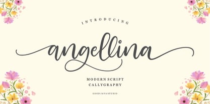 Love Angellina a luxury font with a natural and modern handwritten font. It's perfect for logos, invitations, stationery, wedding designs, social media posts, advertisements, product packaging, product designs, labels, photography, watermarks, special events or anything.
 - MAREGY by Salamahtype,
$19.00 MAREGY is a modern sans-serif font with an elegant style. This font is perfect for branding projects, logos, social media posts, advertisements, product packaging, wedding invitations, product design, labels, photography, watermarks, stationery, and more.
 - Candy Lovely by Good Java Studio,
$25.00 Candy Lovely - Cute Handwritten Font make from handlettering ideas in typeface. This font includes full of Alphabetical glyphs, Numerals, and punctuation. This is so perfect for invitations, monograms, wedding, fashion, branding, label, handlettering or logotype.
 - Bronzen Abundance by Kaer,
$14.00 Vintage font with premium decoration. Classic line serif font. Bronzen Abundance is perfect to use in any alcohol labels, glamour posters, luxury identity, and more. Comes in four font styles: pattern, filled, line and colored.
 - Aerotis by Ef Studio,
$15.00 Introducing Aerotis, a classy modern calligraphy font. Aerotis is perfect for invitations, branding, websites, red wine labels, and editorial designs. Includes all upper and lowercase letters, multilingual support, punctuation, binding and initial and final swash.
 - Amassian by Akifatype,
$12.00 Amassian is a modern smooth brush and natural handwritten font, organic, dynamic and energetic sytle.Can used for various purposes. such as the title, signature, logo, correspondence, wedding invitations, letterhead, signage, labels, newsletters, posters, badges, etc.
 - Infection by Ronin Design,
$15.00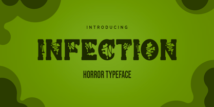 Infection is a horror and halloween font. Designed with a zombie virus touch will give a creepy impression, This font is ideal for labels, posters, or pretty much anything else that requires a creepy touch.
 - October Quirky by Good Java Studio,
$20.00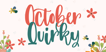 October Quirky - Cute Quirky font make from handlettering ideas in typeface. This font includes full of Alphabetical glyphs, Numerals, and punctuation. This is so perfect for invitations, monograms, wedding, fashion, branding, label, handlettering or logotype.
 - Snow Bright by Sronstudio,
$15.00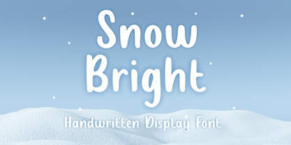 Snow Bright is a fun Handwritten Font, this font Is perfect for product packaging, product designs, label, photography, watermark, special events, or anything. Snow Bright comes with uppercase and lowercase letters, multilingual symbols, numerals, punctuation.
 - Koe Benson by Sronstudio,
$15.00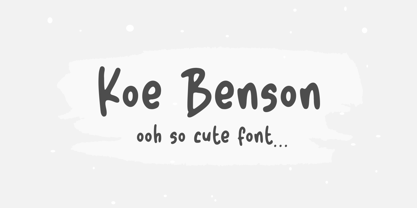 Koe Benson is a fun Handwritten Font, this font Is perfect for lproduct packaging, product designs, label, photography, watermark, special events or anything.? Koe Benson comes with uppercase and lowercase letters, multilingual symbols, numerals, punctuation.
 - Monthier by Aestherica Studio,
$9.00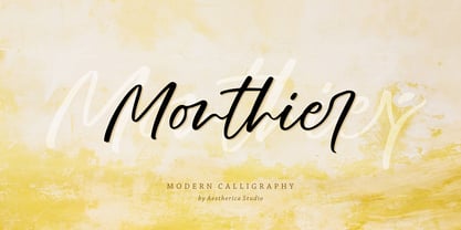 Monthier is a modern and original handwritten font perfect for branding projects, logos, wedding designs, social media posts, advertisements, product packaging, product designs, label, photography, watermark, invitation, stationery, and any projects that need handwriting taste.
 - Milk Child by HafisHidayat,
$20.00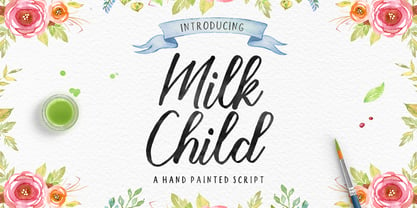 Milk Child is an organic, energetic, dynamic and modern handwriting script that can be used for various purposes, such as with titles, correspondence, wedding invitations, letterheads, signage, labels, signature newsletters, logos, posters, badges, and more.
 - Lustig by Juraj Chrastina,
$39.00 In german lustig means funny. Furthermore Mr. Lustig is a character in one of Karel Čapek's miraculous fairy tales. In addition it's also a lively hand-lettered font equipped with playful interlocking ligatures. Have fun!
 - Newtoon by Good Java Studio,
$18.00 Newtoon is a modern signature font. Perfect for logos, invitations, stationery, wedding designs, social media posts, advertisements, product packaging, product designs, labels, photography, watermarks, special events and more. This family includes: Newtoon Regular & Newtoon Italic.
 - Speedster by Vozzy,
$10.00 Introducing a vintage label font named Speedster. This strong typeface is perfect for lettering on vintage style posters, t-shirts, greeting cards, logo etc. All available characters and styles you can see at the preview.
 - Sandy House by Sronstudio,
$15.00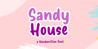 Sandy House is a fun Handwritten Font, this font Is perfect for lproduct packaging, product designs, label, photography, watermark, special events or anything. Sandy House comes with uppercase and lowercase letters, multilingual symbols, numerals, punctuation
 - Amestina by Aqeela Studio,
$20.00 Amestina’s most recent letter styles are ideal for projects that call for a handwritten aesthetic, including wall displays, wedding invitations, social media post logos, commercials, product packaging, product designs, labels, photographs, watermarks, invitations, and stationery.
 - October Story by Sronstudio,
$15.00 October Story is a fun Handwritten Font, this font Is perfect for product packaging, product designs, label, photography, watermark, special events, or anything. October Story comes with uppercase and lowercase letters, multilingual symbols, numerals, punctuation.
 - Pumpkin Story by Sronstudio,
$15.00 Pumpkin Story is a fun Handwritten Font, this font Is perfect for lproduct packaging, product designs, label, photography, watermark, special events or anything. Pumpkin Story comes with uppercase and lowercase letters, multilingual symbols, numerals, punctuation.
 - Aure Teddy by Aure Font Design,
$23.00 Aure Teddy emanates the trusting tenderness of a favorite teddy bear. The hand-penned look of these forms engages the reader with a subtext of comfort. Teddy is delightfully legible as a text font and works well where a more organic look is wanted. It brings an unassuming charm to text and titles and a welcome empathy to astrological expressions and chartwheels. Its engaging charcter serves well in labeling diagrams and personalizing nametags. Teddy is an original design developed by Aurora Isaac. After more than a decade in development, 2018 marks the first release of the CJ and KB glyphsets in regular, italic, bold, and bold-italic. The CJ glyphset is a full text font supporting a variety of European languages. A matching set of small-caps complements the extended lowercase and uppercase glyphsets. Supporting glyphs include standard ligatures, four variations of the ampersand, and check-mark and happy-face with their companions x-mark and grumpy-face. Numbers are available in lining, oldstyle, and small versions, with numerators and denominators for forming fractions. Companion glyphs include Roman numerals, specialized glyphs for indicating ordinals, and a variety of mathematical symbols and operators. The CJ glyphset also includes an extended set of glyphs for typesetting Western Astrology. These glyphs are also available separately in the KB glyphset: a symbol font re-coded to allow easy keyboard access for the most commonly used glyphs. Aure Teddy fills a unique niche, being a modestly decorative font as well as a competant text font. Like Aure Jane, Aure Teddy serves well paired with the decorative touches of Aure Brash and Aure Sable. Give Aure Teddy a trial run! You may discover a permanent place for this font family in your typographic palette. AureFontDesign.com
 - Antique by Storm Type Foundry,
$26.00The concept of the Baroque Roman type face is something which is remote from us. Ungrateful theorists gave Baroque type faces the ill-sounding attribute "Transitional", as if the Baroque Roman type face wilfully diverted from the tradition and at the same time did not manage to mature. This "transition" was originally meant as an intermediate stage between the Aldine/Garamond Roman face of the Renaissance, and its modern counterpart, as represented by Bodoni or Didot. Otherwise there was also a "transition" from a slanted axis of the shadow to a perpendicular one. What a petty detail led to the pejorative designation of Baroque type faces! If a bookseller were to tell his customers that they are about to choose a book which is set in some sort of transitional type face, he would probably go bust. After all, a reader, for his money, would not put up with some typographical experimentation. He wants to read a book without losing his eyesight while doing so. Nevertheless, it was Baroque typography which gave the world the most legible type faces. In those days the craft of punch-cutting was gradually separating itself from that of book-printing, but also from publishing and bookselling. Previously all these activities could be performed by a single person. The punch-cutter, who at that time was already fully occupied with the production of letters, achieved better results than he would have achieved if his creative talents were to be diffused in a printing office or a bookseller's shop. Thus it was possible that for example the printer John Baskerville did not cut a single letter in his entire lifetime, for he used the services of the accomplished punch-cutter John Handy. It became the custom that one type founder supplied type to multiple printing offices, so that the same type faces appeared in various parts of the world. The type face was losing its national character. In the Renaissance period it is still quite easy to distinguish for example a French Roman type face from a Venetian one; in the Baroque period this could be achieved only with great difficulties. Imagination and variety of shapes, which so far have been reserved only to the fine arts, now come into play. Thanks to technological progress, book printers are now able to reproduce hairstrokes and imitate calligraphic type faces. Scripts and elaborate ornaments are no longer the privilege of copper-engravers. Also the appearance of the basic, body design is slowly undergoing a change. The Renaissance canonical stiffness is now replaced with colour and contrast. The page of the book is suddenly darker, its lay-out more varied and its lines more compact. For Baroque type designers made a simple, yet ingenious discovery - they enlarged the x-height and reduced the ascenders to the cap-height. The type face thus became seemingly larger, and hence more legible, but at the same time more economical in composition; the type area was increasing to the detriment of the margins. Paper was expensive, and the aim of all the publishers was, therefore, to sell as many ideas in as small a book block as possible. A narrowed, bold majuscule, designed for use on the title page, appeared for the first time in the Late Baroque period. Also the title page was laid out with the highest possible economy. It comprised as a rule the brief contents of the book and the address of the bookseller, i.e. roughly that which is now placed on the flaps and in the imprint lines. Bold upper-case letters in the first line dramatically give way to the more subtle italics, the third line is highlighted with vermilion; a few words set in lower-case letters are scattered in-between, and then vermilion appears again. Somewhere in the middle there is an ornament, a monogram or an engraving as a kind of climax of the drama, while at the foot of the title-page all this din is quietened by a line with the name of the printer and the year expressed in Roman numerals, set in 8-point body size. Every Baroque title-page could well pass muster as a striking poster. The pride of every book printer was the publication of a type specimen book - a typographical manual. Among these manuals the one published by Fournier stands out - also as regards the selection of the texts for the specimen type matter. It reveals the scope of knowledge and education of the master typographers of that period. The same Fournier established a system of typographical measurement which, revised by Didot, is still used today. Baskerville introduced the smoothing of paper by a hot steel roller, in order that he could print astonishingly sharp letters, etc. ... In other words - Baroque typography deserves anything else but the attribute "transitional". In the first half of the 18th century, besides persons whose names are prominent and well-known up to the present, as was Caslon, there were many type founders who did not manage to publish their manuals or forgot to become famous in some other way. They often imitated the type faces of their more experienced contemporaries, but many of them arrived at a quite strange, even weird originality, which ran completely outside the mainstream of typographical art. The prints from which we have drawn inspiration for these six digital designs come from Paris, Vienna and Prague, from the period around 1750. The transcription of letters in their intact form is our firm principle. Does it mean, therefore, that the task of the digital restorer is to copy meticulously the outline of the letter with all inadequacies of the particular imprint? No. The type face should not to evoke the rustic atmosphere of letterpress after printing, but to analyze the appearance of the punches before they are imprinted. It is also necessary to take account of the size of the type face and to avoid excessive enlargement or reduction. Let us keep in mind that every size requires its own design. The longer we work on the computer where a change in size is child's play, the more we are convinced that the appearance of a letter is tied to its proportions, and therefore, to a fixed size. We are also aware of the fact that the computer is a straightjacket of the type face and that the dictate of mathematical vectors effectively kills any hint of naturalness. That is why we strive to preserve in these six alphabets the numerous anomalies to which later no type designer ever returned due to their obvious eccentricity. Please accept this PostScript study as an attempt (possibly futile, possibly inspirational) to brush up the warm magic of Baroque prints. Hopefully it will give pleasure in today's modern type designer's nihilism. - Miedinger by Canada Type,
$24.95 Helvetica’s 50-year anniversary celebrations in 2007 were overwhelming and contagious. We saw the movie. Twice. We bought the shirts and the buttons. We dug out the homage books and re-read the hate articles. We mourned the fading non-color of an old black shirt proudly exclaiming that “HELVETICA IS NOT AN ADOBE FONT”. We took part in long conversations discussing the merits of the Swiss classic, that most sacred of typographic dreamboats, outlasting its builder and tenants to go on alone and saturate the world with the fundamental truth of its perfect logarithm. We swooned again over its subtleties (“Ah, that mermaid of an R!”). We rehashed decades-old debates about “Hakzidenz,” “improvement in mind” and “less is more.” We dutifully cursed every single one of Helvetica’s knockoffs. We breathed deeply and closed our eyes on perfect Shakti Gawain-style visualizations of David Carson hack'n'slashing Arial — using a Swiss Army knife, no less — with all the infernal post-brutality of his creative disturbance and disturbed creativity. We then sailed without hesitation into the absurdities of analyzing Helvetica’s role in globalization and upcoming world blandness (China beware! Helvetica will invade you as silently and transparently as a sheet of rice paper!). And at the end of a perfect celebratory day, we positively affirmed à la Shakti, and solemnly whispered the energy of our affirmation unto the universal mind: “We appreciate Helvetica for getting us this far. We are now ready for release and await the arrival of the next head snatcher.” The great hype of Swisspalooza '07 prompted a look at Max Miedinger, the designer of Neue Haas Grotesk (later renamed to Helvetica). Surprisingly, what little biographical information available about Miedinger indicates that he was a typography consultant and type sales rep for the Haas foundry until 1956, after which time he was a freelance graphic designer — rather than the full-time type designer most Helvetica enthusiasts presume him to have been. It was under that freelance capacity that he was commissioned to design the regular and bold weights of Neue Haas Grotesk typeface. His role in designing Helvetica was never really trumpeted until long after the typeface attained global popularity. And, again surprisingly, Miedinger designed two more typefaces that seem to have been lost to the dust of film type history. One is called Pro Arte (1954), a very condensed Playbill-like slab serif that is similar to many of its genre. The other, made in 1964, is much more interesting. Its original name was Horizontal. Here it is, lest it becomes a Haas-been, presented to you in digital form by Canada Type under the name of its original designer, Miedinger, the Helvetica King. The original film face was a simple set of bold, panoramically wide caps and figures that give off a first impression of being an ultra wide Gothic incarnation of Microgramma. Upon a second look, they are clearly more than that. This face is a quirky, very non-Akzidental take on the vernacular, mostly an exercise in geometric modularity, but also includes some unconventional solutions to typical problems (like thinning the midline strokes across the board to minimize clogging in three-storey forms). This digital version introduces four new weights, ranging from Thin to Medium, alongside the bold original. The Miedinger package comes in all popular font formats, and supports Western, Central and Eastern European languages, as well as Esperanto, Maltese, Turkish and Celtic/Welsh. A few counter-less alternates are included in the fonts.
 - Direkteur by Bogstav,
$16.00 A legible and very functional comic book font, with a slightly crunchy edge.
 - Hebrew Pirkei Avot Std by Samtype,
$49.00 This is beautiful script font based in typeface of the Pirkei Avot book.
 - Eingraviert by Intellecta Design,
$29.90 Eingraviert is based on old books capitals, with a wood type engraving style
 - Fraggle by BA Graphics,
$45.00Designed with a happy loose feeling. Great for childrens books and fun occasions. - Liam by Intellecta Design,
$19.95Liam, an oldstyle easy to use typeface, excelent to emulate old printed books... - Sidkit MF by Masterfont,
$59.00 Grunge, rough, very coarse typeface. Great for posters, book jacket, music ads etc.
 - Raila Skies by Dismantle Destroy,
$19.00This would be a great font for scrap-booking, notes and anything fun. - Golden Clouds by Anastasia Kuznetsova,
$22.00 Say hello to Golden Clouds :) A charming and cute font duo with handwritten letters and doodles!! Bring some irresistible fun to your design with Golden Clouds Font Duo! This playful font duo consists of a fast-flowing signature font and a charming font with small capital letters as the perfect companion. But that's not all - the set also includes a bonus Doodle font containing hand-drawn drawings designed to give your "Golden Clouds" fonts the appeal of handmade. Golden Clouds Script • A clean, smooth handwritten signature font containing uppercase and lowercase characters, numbers and a wide range of punctuation marks. Golden Clouds SmallCaps • Clean, charming handwritten font with capital letters. Golden Clouds Doodles • A set of hand-drawn drawings designed in combination with Script and Small Caps fonts. Just set it as your own font and enter any character to create each drawing. "Golden Clouds" is ideal for everyday use in greeting cards, illustrations, quotes, original branding, book covers, children's books, packaging and much more :) Font Features: A-Z; a-z character set; 1 language (English); numbers and punctuation marks, symbols. Fonts can be opened and used in any software that can read standard fonts, even in MS Word. No special software is required to get started. It is recommended to use it in Adobe Illustrator or Adobe Photoshop. Made with love and magic ♡ Thank you for reading it, and do not hesitate to send me a message if you have any questions! ~ Anastasia
 - Manstein by Gold Type,
$16.00 Manstein Script is one of the Elegant script fonts that comes with a very beautiful character change, a kind of classic copper decorative script with a modern touch, designed with high detail to present an elegant style. Manstein Script is interesting because the typeface is pleasing to the eye, clean, feminine, sensual, glamorous, simple and very easy to read, because of the many luxurious letter connections. I also offer a number of decent stylistic alternatives for some of the letters. The classic style is very suitable to be applied in various formal forms such as invitations, labels, restaurant menus, logos, fashion, make up, stationery, novels, magazines, books, greeting / wedding cards, packaging, labels or all kinds of advertising purposes. . . Manstein supported With OpenType features with alternative styles and elegant ligatures. The OpenType features don't work automatically, but you can access them manually and for best results your creativity will be required in combining variations of these Glyphs. I highly recommend using a program that supports OpenType features and the Glyphs panel such as Adobe Illustrator, Adobe Photoshop CC, Adobe InDesign, or CorelDraw, so that you can view and access all variations of Glyphs. How to access all alternative characters using Adobe Illustrator: https://www.youtube.com/watch?v=XzwjMkbB-wQ How to access all alternative characters, using the Windows Character Map with Photoshop: https://www.youtube.com/watch?v=Go9vacoYmBw If you need help or have any questions, let me know. I'm happy to help. Thanks & Happy Designing
 - Tempting by RGB Studio,
$19.00 Tempting Script is one of the Elegant script fonts that comes with a very beautiful character change, a kind of classic copper decorative script with a modern touch, designed with high detail to present an elegant style. Files Include : Basic Latin A-Z and a-z Numbers Symbols PUA Encode Multilanguage Support Tempting Script is interesting because the typeface is pleasing to the eye, clean, feminine, sensual, glamorous, simple and very easy to read, because of the many luxurious letter connections. I also offer a number of decent stylistic alternatives for some of the letters. This font perfectly made to be applied especially in logo, and the other various formal forms such as invitations, labels, logos, magazines, books, greeting / wedding cards, packaging, fashion, make up, stationery, novels, labels or any type of advertising purpose. Tempting has 349+ , including multiple language support. With OpenType features with alternative styles and elegant. The OpenType features don't work automatically, but you can access them manually and for best results your creativity will be required in combining variations of these Glyphs. I highly recommend using a program that supports OpenType features and the Glyphs panel such as Adobe Illustrator, Adobe Photoshop CC, Adobe InDesign, or CorelDraw, so that you can view and access all variations of Glyphs. Thanks and have a wonderful day, If you have any questions, please get in touch with us Don't forget to check out our other products.
 - Lemon Press by Attype Studio,
$7.00 Lemon Press is display font of fresh lemon, come up with two font regular and display. It is suitable for any summer event! Lemon Press is perfect for branding, logo, invitation, stationery, social media post, product packaging, merchandise, blog design, game titles, cute style designs, Book/Cover Titles and more. Multilingual Support included for Afrikaans, Albanian, Catalan, Danish, Dutch, English, Estonian, Finnish, French, German, Icelandic, Italian, Norwegian, Portuguese, Spanish, Swedish, Zulu. Hope you enjoy with our font! Attype Studio