10,000 search results
(0.141 seconds)
- Abelina by Sudtipos,
$69.00 «Abelina» is a typeface that can be used in display sizes for titles where part of the central premise is to emulate certain features of gestural handwriting. Concepts like spontaneity, speed and fluidity, associated with the use of certain calligraphic tools – in this case the pointed brush – led to a typographic result based on the pattern-like structure coming from the chancery and italic calligraphic models. «Abelina» - initially designed by Yanina Arabena (Calligrapher, Graphic Designer and Typographer) - is reborn to make way for “Abelina Pro” through the solid work of Guillermo Vizzari working together with Ale Paul from Sudtipos. Throughout its use, “Abelina Pro” maintains the structure of a firm style, integrating a dynamic rhythm in the composition of short texts and offering personality to each of the words it builds. It has over a thousand glyphs, including several alternates, ligatures combination, initials and miscellaneous to reinforce the idea of the author of merging a calligraphic project in the typographic world; allowing new ways to capture this great universe of italic faces. «Abelina» project was initially born as a typographic project developed by Yanina Arabena – tutored by Ale Paul and Ana Sanfelippo – under completion of the Specialization in Typography Design at University of Buenos Aires, Argentina, during the years 2011 and 2012.
 - Figgins Antique by HiH,
$12.00 “Hey, look at me!” cried the new advertising typefaces. With the nineteenth century and the industrial revolution came an esthetic revolution in type design. Brash, loud, fat display faces elbowed their way into the crowd of book faces, demanding attention. Those who admired traditional book types harumphed and complained. Robert Thorne had fired the opening round with his Fatface. With the cutting of Figgins Antique, the battle was well and truly joined. Job printing came into its own and it seemed like everything changed. The world of printing had been turned upside down and the gentile book-type aficionados recoiled in horror much as the rural landed gentry recoiled at the upstart middle class shopkeepers and manufacturers. William Savage, approvingly quoted by Daniel Berkeley Updike over a hundred years later, described the new display faces as “a barbarous extreme.” These were exciting times. According to Geoffrey Dowding in his An Introduction To The History Of Printing Types, “The types which we know by the name of Egyptian were first shown by Vincent Figgins in his specimen book of 1815, under the name Antique.” Of course, dating the design is not quite as simple as that. Nicolete Gray points out that Figgins used the same “1815” title page on his specimen books from 1815 to 1821, adding pages as needed without regard to archival issues. As a result, there are different versions of the 1815 specimen book. In those copies that include the new Antique, that specific specimen is printed on paper with an 1817 watermark. The design is dated by the 1817 watermark rather than the 1815 title page. Figgins Antique ML is an all-cap font. This typeface is for bold statements. Don't waste it on wimpy whispers of hesitant whimsies. And please don't use it for extended text -- it will only give someone a headache. Think boldly. Use it boldly. Set it tight. Go ahead and run the serifs together. Solid and stolid, this face is very, very English. FIGGINS ANTIQIE ML represents a major extension of the original release, with the following changes: 1. Added glyphs for the 1250 Central Europe, the 1252 Turkish and the 1257 Baltic Code Pages. Added glyphs to complete standard 1252 Western Europe Code Page. Special glyphs relocated and assigned Unicode codepoints, some in Private Use area. Total of 331 glyphs. 2. Added OpenType GSUB layout features: liga and pnum. 3. Added 86 kerning pairs. 4. Revised vertical metrics for improved cross-platform line spacing. 5. Redesigned mathamatical operators. 6. Included of both tabular (standard) & proportional numbers (optional). 7. Refined various glyph outlines.
 - Malow by Putracetol,
$28.00 Malow - Display Font Malow is a stunning display font that will bring elegance and sophistication to any project. This font was designed with a contemporary style that still maintains a classic look, making it perfect for a wide range of applications. The idea behind the creation of Malow was to develop a font that combines a modern aesthetic with a touch of timeless elegance. The result is a typeface that looks fantastic on branding projects, logos, packaging designs, posters, and more. Malow is a versatile font that can be used in a variety of design contexts, whether it's for print or digital projects. Its clean lines and bold appearance make it an excellent choice for headlines and titles, while its legibility also makes it ideal for body text. This font comes with a range of features that make it even more appealing. It includes uppercase and lowercase letters, opentype alternates and ligatures, and full multilingual support, ensuring that it can be used for projects in any language. In the font package, you will find three different file formats, including OTF, TTF, and WOFF. This makes it easy to use the font across a range of design software, including Adobe Illustrator, Photoshop, InDesign, and more. If you're looking to add a touch of sophistication to your design project, then Malow is an excellent choice. Its clean lines and elegant style make it a versatile font that will elevate any design. In summary, Malow is an elegant display font that combines modern and timeless styles, making it a great choice for a wide range of design projects. Its features include multilingual support, opentype alternates and ligatures, and three file formats in the package. This font is perfect for anyone looking to add a touch of sophistication to their project.
 - LTC Winchell by Lanston Type Co.,
$24.95 Winchell is the only identified typeface designed in Buffalo, NY prior to the formation of P22 type foundry. It was created by Edward Winchell of the Matthews-Northrup Printing Works and released by the Inland Type Foundry in 1903. The Winchell typeface was also made in Wood by the Hamilton Manufacturing company in the mid 20th Century. The Winchell typeface is a Clarendon styled slab serif that clearly has the look of a pre-modernist design. E.E. Winchell’s Arts & Crafts tendencies show through in this design
 - Mocha Mattari by Dharma Type,
$19.99 Mocha Mattari is a distressed font designed based on Bebas Neue released as a free font in 2010. The Original Bebas Neue has an inordinate level of popularity and it has often been used as a web font in recent years. This Mocha Mattari was made by damaging the original and tweaked by hand work. Basically, Mocha Mattari does not have lowercases but alternative Uppercases. Exceptionally “g, m, oz, fl, lb” for “gram, milli, ounce, fluid, pound” can be available by opentype dlig or salt features.
 - Arca by PintassilgoPrints,
$20.00 A charming font inspired by the Brazilian beloved album for children by Vinicius de Moraes, author of the bossa nova classic 'Garota de Ipanema' (Girl from Ipanema) with his partner Tom Jobim. The font has a cheerful cutout look, as does the original album cover designed by Elifas Andreato in 1980. Arca font is loaded with alternates for a nice natural look and has yet quite cool interlocks. Its complementary font brings handsome graphic elements to add some bossa here and there. Now let's dance!
 - Rotation by Linotype,
$29.99After the Second World War, the Ionic style replaced Modern Face as the favored typeface for newsprint. A couple decades later, it was in turn replaced by the next generation of newspaper fonts, a mix of Old Face, Transitional and Modern Face forms. Rotation was designed by Arthur Ritzel and presented by Stempel/Linotype in 1971 and named for the rotation newsprint machine for which is was particularly suited. The font displays the influence of Old Face design and gives newsprint a feeling of lightness and elegance. - HT Fera Text by Hype Type,
$34.00 Transitional serif font inspired by the italian’s lettering tradition, in particular by the street sign letters you can find around Florence. All elements are designed to be elegant and easy-to-read, even in a long blocks of text. -- The HT Fera Text is freely inspired by the typographical tradition of Florence's municipality and its streets. Letters shape, contrasts, junctions, stems, teardrops, they are all the result of careful research carried out on the Dante's streets, redesigned in a contemporary mood. -- hype-type.com / kidstudio.it
 - Anisette Std Petite by Typofonderie,
$59.00 Geometric font inspired by shop signs in 4 styles Anisette has sprouted as a way to test some ideas of designs. It has started with a simple line construction (not outlines as usual) that can be easily expanded and condensed in its width in Illustrator. Subsequently, this principle of multiple widths and extreme weights permitted to Jean François Porchez to have a better understanding with the limitations associated with the use of MultipleMaster to create intermediate font weights. Anisette built around the idea of two widths capitals can be described as a geometric sanserif typeface influenced by the 30s and the Art Deco movement. Its design relies on multiple sources, from Banjo through Cassandre posters, but especially lettering of Paul Iribe. In France, at that time, the Art Deco spirit is mainly capitals. Gérard Blanchard has pointed to Jean Francois that Art Nouveau typefaces designed by Bellery-Desfontaines was featured before the Banjo with this principle of two widths capitals. The complementarity between the two typefaces are these wide capitals mixed with narrow capitals for the Anisette while the Anisette Petite – in its latest version proposes capitals on a square proportions, intermediate between the two others sets. Of course, the Anisette Petite fonts also includes lowercases too. Anisette Petite, a geometric font inspired by shop signs in 4 styles So, when Jean François Porchez has decided to create lowercases the story became more complicated. His stylistic references couldn’t be restricted anymore to the French Art-déco period but to the shop signs present in our cities throughout the twentieth century. These signs, lettering pieces aren’t the typical foundry typefaces. Simply because the influences of these painted letters are different, not directly connected to foundry roots which generally follow typography history. The outcome is a palette of slightly strange shapes, without strictly not following geometrical, mechanical and historical principles such as those that typically appear in typefaces marketed by foundries. As an example, the Anisette Petite r starts with a small and visible sort of apex that no other similar glyphs such as n or m feature, but present at the end of the l and y. The famous g loop is actually inspired by Chancery scripts, which has nothing to do with the lettering. The goal is of course to mix forms without direct reports, in order to properly celebrate this lettering spirit. This is why the e almost finishes horizontally as the Rotis – and the top a which must logically follow this principle and is drawn more round-curly. This weird choice seemed so odd to its designer that he shared his doubts and asked for advise to Jeremy Tankard who immediately was reassuring: “Oddly, your new top a is fine, it brings roundness to the typeface, when the previous pushes towards Anisette Petite to unwanted austerity.” The Anisette Petite, since its early days, is a mixture of non-consistent but charming shapes. Anisette, an Art Déco typeface Anisette Petite Club des directeurs artistiques, 46e palmarès Bukva:raz 2001
 - Aire by Lián Types,
$37.00 Aire is what Sproviero would call a < big display family >. We recommend seeing its user’s guide. After his success with Reina, Sproviero comes out with this big family of 7 members: Each of them loaded with lots of sophisticated ligatures, alternates and the entire cyrillic alphabet. The overall impression that the font gives is lightness and delicateness; that’s the reason the designer chose to call it Aire, or Air, in English. "Aire was somehow having a rest from my fat face Reina [...] It started as a really thin style of Reina, but it rapidly migrated from it and grew up alone. And how it grew..." The inspiration came from his own past creations: “The heavy strokes of Reina were shouting for a more delicate thing. Something more feminine. More fragile. Something which had a lot of elegance and fresh air inside”. Aire responds to this: Sproviero found that many of the typefaces of nowadays which are used for headlines (best known as display fonts) have almost always just one, maybe two weight styles. This was his opportunity to try something new. Aire makes it easier for the user to generate different levels/layers of communication thanks to its variety of styles. With this font you can solve entire decorative pieces of design with just one font, and that was the aim of it. Aire was designed to be playful yet formal: While none of its alternates are activated it can be useful for short to medium length texts; and when the user chooses to make use of its open-type decorative glyphs, it can be useful for headlines with dazzling results. On March of 2012, Aire was chosen to be part of the most important exhibition of typography in Latinoamerica: Tipos Latinos 2012. TECHNICAL Aire is a family with many members. In total, the user can choose between almost 6,000 (!) glyphs (1,000 per style). Each member has variants inside, which are open-type programmed: The user decides which glyph to alternate, equalizing the amount of decoration wanted. Every decorative glyph has its weight adjusted to the style it belongs to. Exclusively for decoration, Aire Fleurons Pro is an open-type programmed set of ornaments. And last but not least, remember Aire is delicate. What’s my point? It is not recommended to activate all the alternates at the same time. It is typo-scientifically proved: A maximum of 3 or 4 alternates per word would be more than enough.
 - Verve by Altered Ego,
$65.00Called by some the "Archetype of the millennium", Verve is a seven-weight typeface family. It features a complete Adobe character set with kerning and fit to match. The alternate characters offer some variations on s,f,h,j,k,S,T,Y and others, plus this font has the Euro symbol. Verve is the fourth in an on-going series of condensed typefaces that I’ve been designing since 1989. My concept was to create an elegant condensed typeface that would be a "typeface for the millennium," in style and functionality. At the very core of all my designs is a typographic problem I wanted to solve, or a market niche that I think needs filled. Verve addresses both of those concerns, without copying or borrowing from its predecessors. There’s the challenge of creating a rich and interesting typeface with an austerity of line and elegance of form. I’m a minimalist by nature – but I wanted Verve to have a sensuous feel in certain respects – yet have that sensuality balanced by the uniformity of the uniform character widths. Gottfried Pott always stresses "theme and variation," and "point and counterpoint," and that’s what I’m doing in Verve. What one finds in musical composition is evident in Verve. Perfect for book covers, CD packaging, club flyers, retail packaging (especially bottles!), identity design and multimedia. The adventurous can try it in text, but it will give you a headache. The beauty of Verve is in thesize and weight variations which create a rich typographic texture in this font. - Arabetics Harfi by Arabetics,
$59.00 Arabetics Harfi is a Latin Serif typeface with a comprehensive support for the Arabetic scripts, including Quranic texts. Careful spacing and kerning was used to enhance resulting text legibility both scripts. Arabetics Harfi fully supports MS 1252 Western and 1256 Arabic code pages, in addition to all transliteration characters required by the ALA-LC Romanization tables. Users can either select an accented character directly or form it by keying the desired combining diacritic mark following an unaccented character. For Arabic, it fully supports Unicode 6.1, and the latest Arabic Supplement and Extended-A Unicode blocks. The Arabic design of this font family follows the Mutamathil Taqlidi type style with connected glyphs, but it emphasizes a horizontal look and feel rather than verticalone, utilizing slightly varying x-heights. The Mutamathil Taqlidi type style uses one glyph per every basic Arabic Unicode character or letter, as defined by the Unicode Standards, and one additional final form glyph, for each freely-connecting letter of the Arabic cursive text. Arabetics Harfi includes the required Lam-Alif ligatures in addition to all vowel diacritic ligatures. Soft-vowel diacritic marks (harakat) are selectively positioned with most of them appearing on similar high and low levels—top left corner—, to clearly distinguish them from the letters. Tatweel is a zero-width glyph. Arabetics Harfi includes both Arabic and Arabic-Indic numerals, in addition to generous number of punctuation and mathematical symbols. It includes two weights, regular and bold, each of which has normal, right slanted Italic, and left-slanted styles.
 - Oldsman No. 1 by Serebryakov,
$49.00 Oldsman No. 1 is an uppercase font family. It was specially designed for logotypes and experimental editorial design projects. Geometric, rhythmic, modern... Try it!
 - pencilPete by JOEBOB graphics,
$19.00 Just a straight and simple font with a character of its own: written with a HB pencil which is very recognizable in its appearance.
 - Odditype JNL by Jeff Levine,
$29.00Odditype is a font that surely lives up to its name... Odd, quirky, techno...yet not. Its use is as broad as your imagination. - Comicbasic by giftype,
$16.00 Comic basic font is ideal tó use in a comic book or for children , it is very appropiate becouse it is easy to read.
 - Ongunkan Liljegren Runic by Runic World Tamgacı,
$50.00 It is the 3rd inscription font I shared with Liljegren Runic, one of the inscriptions in America. I couldn't find much information about it.
 - Environ by MADType,
$- Environ is a rounded and modular font. Because it utilizes many straight lines, it works well for small blocks of text at small sizes.
 - PaperCutAlmondDark by PineStreet,
$25.00 This is the 'dark' version of our font PaperCut Almond. It has all of its openings closed to enhance the effect of handcut lettering.
 - Roskilde by Hanoded,
$15.00 Roskilde is a city in Denmark, famous for its Rock Festival and its Viking Ship museum. Roskilde font is a very legible headline font.
 - FG Petra by YOFF,
$12.95FG Petra looks like usual handwriting yet very pretty! It has a large 'K' in lowercase; I think that is what makes it special. - Junkfool by PizzaDude.dk,
$17.00What happens if you take a bamboo stick and break it into two, then use it with ink on cardboard? Junkfool! - That's what happens! - Chit Chat by Jonahfonts,
$29.95 A brush font that keeps its legibility without sacrificing its free-spirit. Usage recommendations: Captions, packaging, cards, posters, ads, book jackets, manuals, and menus.
 - Tofes by Putracetol,
$28.00 Tofes - Modern Serif Font Tofes - Modern Serif Font is a versatile typeface that exudes elegance and sophistication. This font is perfect for any project that requires a touch of luxury and class, such as branding, packaging, logos, and more. The font's name is inspired by the Hebrew word for "apple," which symbolizes beauty and perfection. With its clean lines and modern look, Tofes is a must-have for any designer looking to create stunning and professional designs. If you're looking to create a romantic and elegant branding, Tofes is the perfect font for you. Its clean lines and modern look give it a timeless quality that works well for a variety of design projects. This font is particularly well-suited for use in packaging and logos, where it can help convey the quality and sophistication of your brand. Tofes comes with a range of features that make it a versatile and useful typeface. The font includes both uppercase and lowercase letters, as well as Opentype features such as alternates and ligatures. It also includes support for a wide range of languages, making it a great choice for designers working on international projects. Additionally, Tofes comes with number, punctuation, and symbol glyphs, allowing you to create a wide range of design elements with ease. In the font package, you will find Tofes in three different file formats: OTF, TTF, and WOFF. These formats ensure that the font is compatible with a wide range of software applications, including Adobe Creative Suite, Microsoft Office, and more. This means that you can use Tofes in virtually any design project, whether you're creating graphics for a website, designing a logo, or working on a print project. In summary, Tofes - Modern Serif Font is a versatile and elegant typeface that is perfect for a wide range of design projects. With its clean lines, modern look, and support for multiple languages, Tofes is an excellent choice for designers looking to create sophisticated and professional designs. Its features, including Opentype alternates and ligatures, make it a valuable addition to any designer's toolkit.
 - Fried Chicken by FontMesa,
$25.00 The name of this font brings back memories of an old fried chicken restaurant in Willow Springs Illinois circa 1960’s and 1970’s, my family would all get in the car and take a long drive down to an old country road Illionis Rt 171 through a forest preserve where we’d come upon the old Willowbrook motel with a bar and restaurant next door. The restaurant was called Kegal’s, when you entered the building you had to walk through the smoky bar first to get to the restaurant, I can still see the hard wood floors with all the finish worn off from decades of foot traffic. Up until the mid 1960’s Kegal’s used to raise their own chickens behind the restaurant, back then fried chicken in the Midwest was either coated in flour or bread crumbs, Kegal’s was covered in a beautiful layer of golden bread crumbs. Before your meal arrived they’d bring a basket of dinner rolls along with crackers, bread sticks and country butter, on the side they’d serve coleslaw with a vinegar sauce, which is very common in the Midwest, the first time you try it your face puckers up like you just sucked on a lemon but you get used it over time. After waiting for what seemed like forever to a child the waitress comes out of the kitchen with a huge tray of that golden deliciousness and your mouth begins to water, in her other hand was another tray filled to overflowing with crinkle cut french fries all made by hand, I’d eat a hole handful of those french fries first then take a bite of that tender juicy farm raised chicken. Today a fine Italian restaurant occupies the old Kegal’s building and the motel is long gone, only my fond memories remain. Fast forward to 2020 and FontMesa has just made some Fried Chicken as an eight weight type font family with alternates. With the Fried Chicken slab serif font family we’ve broken some rules by removing a few of the slabs on certain letters for a unique homemade look. Fried Chicken is perfect for your next product label, t-shirt design, logo, headline or cookbook cover. Treat yourself to some good ol’ Fried Chicken today.
 - Createland by Awan Senja,
$14.00 Createland is a bold display font, carefully handcrafted to become a true favorite. Its casual charm makes it appear wonderfully down-to-earth, readable and, ultimately, incredibly versatile. Createland will look outstanding in any context, whether it�s being used on busy backgrounds or as a standalone headline!
 - Lil Milton AEF by Altered Ego,
$45.00Lil Milton is full of energy and excitement, like the blues legend that inspired its name. Irregular counters (and irregular outlines!) creates a dissonant harmony of form and function. Stretch it, but don't condense it for a righteous look. Lil Milton is the perfect companion to Adobe Myriad Tilt. - Winterfell by Alan Meeks,
$45.00 It is difficult to define the classification of Winterfell. The caps are definitely Roman however the lowercase is italic and slightly calligraphic. Because of its old style look I decided to describe it as modern medieval. This design reminded me of Game of Thrones hence the name Winterfell.
 - Benso Yolmi by madeDeduk,
$16.00 Benso Yolmi is a clean and modern minimalist serif font designed for clarity and simplicity. With its sleek lines and balanced letterforms, it conveys a timeless elegance that suits a wide range of applications. Feature Uppercase & Lowercase Number & Symbol International Glyphs Multilingual support Alternative Ligature Hope you enjoy it.
 - Aster Sphin by Krakenbox Studio,
$15.00 Aster Sphin is a fashionable sophisticated signature-style script with its own unique curves and an elegant inky flow. Its elegant, classy, and modern look. It looks stunning on wedding invitations, thank you cards, quotes, greeting cards, logos, business cards and every other design which needs a customized touch.
 - Roderick by Arendxstudio,
$18.00 Roderick Is a retro style monoline font that you can use for logos, branding names, posters, podcasts and so on. This is perfect for you all. It features Uppercase and Lowercase, Numbers and Punctuation, Multi-lingual support, Ligatures, Alternates. There it is! I really hope you enjoy it
 - Habone by Balevgraph Studio,
$12.00 Habone is a modern, sans serif font. It can easily be matched to an incredibly large set of projects, so add it to your creative ideas and notice how it makes them stand out! Features: Multilingual Ligatures Alternates PUA encoded Files Included: Habone Regular TTF Habone Italic TTF
 - Overexposed by Cool Fonts,
$24.00 This is a "Grunge" style font that looks as if it was overexposed on film. It is funky yet still very readable. It is best used in sizes over 12 points but really looks cool when used over 16 points. This is a favorite for use in video graphics.
 - Bear Story by Mvmet,
$12.00 Bear Story is a cute animal themed display font. Create something with it from regular typing notes, to t-shirts, kids’ book designs, greeting cards, stickers, posters, or anything that needs a casual touch. Fall in love with its incredible style and use it to create lovely designs!
 - Rabid by AdultHumanMale,
$15.00 Rabid is an inky, messy, super distressed display font. It's part charcoal, part chalk strokes, add a splash a of red and it starts to look like blood. Why SO Serious? It has about 200 glyphs including all those extra pesky foreign features. O Hope you like it.
 - Candymore by Epiclinez,
$18.00 Candymore is a fun and playful handwritten font. Its simple and friendly style is suitable for your DIY or crafting projects. This font has 197 glyphs and its supporting 66 languages, from English to Zulu. Have fun with this super cute font and explore its awesomeness. Thank You!
 - Firm by Larin Type Co,
$14.00 Firm is a black sans serif display font. Perfectly attracts attention due to its shapes. With it, you can highlight important information in your text, and it is also perfect for creating a logo.This font contains alternates lowercase, ampersand and ligatures, math symbols, arrows, fractions, and multilingual support.
 - TWA Assembly Sans by Work Type,
$30.00 TWA Assembly Sans is not your standard workhorse sans. Although it sports the same geometric shapes, grotesk characteristics, and comes in many weights, its unique qualities and slight diagonal curves give Assembly Sans a friendlier appearance. As the weight increase, the contrast becomes more extreme, adding to its approachability.
 - Virgiluna by Stringlabs Creative Studio,
$25.00 Virgiluna is a sweet, soft hand-lettered script font. The playful rounded characters make it the perfect font for creating amazing designs. Fall in love with its authentic feel and use it to create gorgeous wedding invitations, beautiful stationary art, eye-catching social media posts, and cute greeting cards.
 - Sale Inline by Mvmet,
$10.00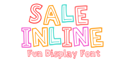 Sale Inline is a fun and playful inline font. You can use it for anything ranging from t-shirts, kids’ book designs, greeting cards, stickers, and posters, or anything that needs a casual touch. Fall in love with its incredibly versatile style and use it to create lovely designs!