10,000 search results
(0.033 seconds)
- Better Regards by SSI.Scraps,
$18.00 Better Regards is a very beautiful, simple and elegant signature font. It contains charming alternates. Enjoy its natural look!
 - File Folder JNL by Jeff Levine,
$29.00 File Folder JNL and File Folder Italic JNL are a pair of sans serif fonts with a square look.
 - Avnei Gad Hakuk MF by Masterfont,
$59.00 Carved in stone or wood? this old looking typeface will be great for signage, posters and short texts too.
 - Chewy Blossom by Jelloween,
$20.00If you're looking for a funny, informal font to spice up your projects, Chewy Blossom is your bestest friend! - Smeethe by Aah Yes,
$4.95Smeethe manages to look almost out of focus while being slightly degraded and distorted, but has a smoothed outline. - Brother Samphen by Liartgraphic,
$14.00 Brother Samphen is a hand-written script in with a sharp, young, spirited look. It includes multiple alternate characters.
 - Jacky Chan by Asd Studio,
$15.00 Introducing, Jacky Chan - Brush Font Jacky Chan font preserves all the high definition detail of the original handwritten letters. This font it truly looks realistic. Take your design to the up level with a hyper-realistic font that truly looks hand painted. Jacky Chan uses feature Bitmap Trace in Inkscape that makes way for more authentic looking fonts and is sure to grab the attention of customers and designers alike. Jacky Chan installs like any other font, and can be used in any color, on any background. What's Included? :: Uppercase & Lowercase (Regular and Italic Version) :: Numbers & Punctuation : Swashes Ligature :: Multilingual Support Enjoy our font, thank you.
 - Nextrue by Asenbayu,
$12.00 Nextrue font is a sans serif font with a sleek and sporty look. This font is shaped as a professional multipurpose font with a strong look in upright and a dynamic look in slant letter. You can use it in modern youth design, adventure, hobbies and sports. This font is perfect for a variety of projects, such as branding, poster displays, logo design, magazine covers, product labels, clothing and more. This font is perfect for taking your designs to the next level! Nextrue fonts feature opentype, kerning, ligatures, and alternative styles packed in 12 fonts (Condense, Extend, Slant). Nextrue fonts include uppercase, lowercase, numbers, punctuation and multilingual support.
 - Ledge by RagamKata,
$16.00 Ledge is a type of elegant display font that features large, bold lettering with unique decorative details on each character. The font gives off an elegant and classic feel, while still appearing modern and in line with current design trends. Ledge is well-suited for a variety of projects that require a high-end, eye-catching look, such as wedding invitations, luxury product packaging design, or promotional materials for brands looking to convey an exclusive and luxurious image. This serif font is also suitable for logo design or website design that aims to showcase a creative and elegant look, while still maintaining a professional and classic appearance."
 - Dudu by Borutta Group,
$10.00Dudu is a font which I made mainly for my own purposes. A lot of times in many projects I was looking for elegant vertical and modular typeface. There is a lot of fonts that overall look good but if You take a closer look, You can clearly see they have mistakes. That's why I made Dudu. Dudu is a font designed with a highest attention to the detail. Each Dudu glyph has the same modular construction. Dudu Font contains over 400 glyphs ready to use in various languages. I'm also working on a cyrillic version of a Dudu Font which soon is going to be published. - Clay Handwriting Pro by SoftMaker,
$7.99 Digitized handwriting fonts are a perfect way to give documents the “very special touch”. Invitations look simply better when handwritten than when printed in bland Arial or Times New Roman. Short handwritten notes look authentic and appealing. There are numerous occasions where handwritten text makes a better impression. Clay Handwriting Pro is a beautiful typeface that mimics true handwriting closely. Use Clay Handwriting Pro to create stunningly beautiful designs easily. This typeface comes with alternative characters for sophisticated typography – all easily accessible as OpenType features. A “random” feature even allows for automated random switching between variations of the same character, resulting in type that looks authentically handwritten.
 - Verve by Altered Ego,
$65.00Called by some the "Archetype of the millennium", Verve is a seven-weight typeface family. It features a complete Adobe character set with kerning and fit to match. The alternate characters offer some variations on s,f,h,j,k,S,T,Y and others, plus this font has the Euro symbol. Verve is the fourth in an on-going series of condensed typefaces that I’ve been designing since 1989. My concept was to create an elegant condensed typeface that would be a "typeface for the millennium," in style and functionality. At the very core of all my designs is a typographic problem I wanted to solve, or a market niche that I think needs filled. Verve addresses both of those concerns, without copying or borrowing from its predecessors. There’s the challenge of creating a rich and interesting typeface with an austerity of line and elegance of form. I’m a minimalist by nature – but I wanted Verve to have a sensuous feel in certain respects – yet have that sensuality balanced by the uniformity of the uniform character widths. Gottfried Pott always stresses "theme and variation," and "point and counterpoint," and that’s what I’m doing in Verve. What one finds in musical composition is evident in Verve. Perfect for book covers, CD packaging, club flyers, retail packaging (especially bottles!), identity design and multimedia. The adventurous can try it in text, but it will give you a headache. The beauty of Verve is in thesize and weight variations which create a rich typographic texture in this font. - Raffia by ARTypes,
$35.00Raffia is derived from the Raffia initials designed by Henk Krijger and issued by the Typefoundry Amsterdam in 1952. Nine ornamental dashes based on designs by Crous-Vidal and issued by Amsterdam are included. - Nanami Handmade by Thinkdust,
$10.00 Can we get a drum roll please? It’s not every day that a new link in a best selling chain is forged. First, there was Nanami, a font which took the world of type by force, storming to the top of MyFonts Hot New Fonts list; then there was Nanami Rounded, the most successful follow-up since Terminator 2. Well, say Hasta La Vista to boring design because now, there’s Nanami Handmade. With all the geometric, Japanese inspiration and style of the first two iterations, Nanami Handmade carries a quirky, mischievous charm. The font has a charisma matched by roguish anti-heroes; bad guys you love to love and good guys the other good guys hate, but everyone knows they’re what the audience turns up to see. Nanami Handmade comes in two styles, a solid and a hand-drawn, each of which has eight weights. Mix and match between these options to create a balanced piece which makes good use of the tactile, warm, earthy nature of the font. With these sans-serif styles working well in small and large sizes, both on and off screen, Nanami Handmade’s applications are virtually endless. Get your own piece of typography’s elite now, with Nanami Handmade, by Thinkdust.
 - Tropical Jungle by Colllab Studio,
$19.00 "Hi there, thank you for passing by. Colllab Studio is here. We crafted best collection of typefaces in a variety of styles to keep you covered for any project that comes your way! Tropical Jungle is a fun wild font, inspired by the wild life of the jungle. Inspired by the tropical rainforests of South America, Africa, and Asia, this font will inspire you to get out there and explore! Tropical Jungle is a bold, quirky typeface that captures the joyous spirit of life on earth or at least, of the parts we’re most familiar with: monkeys swinging through trees, tigers stalking their prey through the jungle, butterflies flitting from flower to flower. You can tell just from looking at it that this is going to be a fun-loving font that will bring a smile to your face and a bounce to your step. With over 500 glyphs, this stack of jungle animals will be a joy to use! We made sure our font was easy to read in any application so you don’t have to worry about your documents cluttering up. We know you can’t wait to get started using it in your next project. So go ahead! Grab Tropical Jungle now! A Million Thanks Colllab Studio www.colllabstudio.com
 - Churchward Typestyle by BluHead Studio,
$25.00 Churchward Typestyle is a clean sans serif font, originally designed as a photo font by Joseph Churchward back in 2002. Under exclusive license, BluHead Studio has digitized this typeface by using his original drawings. We added any missing glyphs, being careful to maintain the aesthetic that makes this a classic Churchward design. Joseph intended this to be a six weight family, so we digitized the Light and Ultra Bold weights and interpolated the middle four. We enhanced the functionality of the family by creating a complimentary set of small caps, as well as creating a 10 degree oblique of each weight, being careful to correct the slanted curve forms of the letters. Churchward Typestyle is now an extensive 12 weight family, ranging in weights from Light to Ultra Bold, making it extremely useful in a broad range of design applications, from text and print, to display, posters and billboards. It’s sanserif design is clean and open, with a few of those characteristic Churchward goodies. Joseph loved his ink traps, so look for many of those! They especially become more apparent in the heavier weights. All of the Churchward Typestyle fonts support the major Western European languages, and have OpenType features for ligatures, smallcaps, tabular figures, superiors, inferiors, fractions, and ordinals.
 - Lavoza by Alit Design,
$22.00 Presenting the LAVOZA typeface from alitdesign. LAVOZA font is designed by combining a slant blackletter font with a classic serif font style. The Lavoza font is inspired by a classic roman design that we apply modern elements according to current trends. This bold classic concept will create a design that is frightening but still looks modern and elegant. The Lavoza font is perfect for the design of young people who dare to be different and unique from the current trending design concept. Lavoza font is highly recommended to be a collection of fonts for current or future design creation. LAVOZA is perfect for magazine cover designs, brochures, flyers. Instagram ads, Canva Design and so on with unique and modern and brave concepts. besides that this font is very easy to use both in design and non-design programs because everything changes and glyphs are supported by Unicode (PUA). The "LAVOZA"contains 587 glyphs with many unique and interesting alternative options. Language Support : Latin, Basic, Western European, Central European, South European,Vietnamese. In order to use the beautiful swashes, you need a program that supports OpenType features such as Adobe Illustrator CS, Adobe Photoshop CC, Adobe Indesign and Corel Draw. but if your software doesn't have Glyphs panel, you can install additional swashes font files.
 - VLNL Tp Kurier by VetteLetters,
$35.00 VetteLetters is proud to bring you the TpKurier-family. It is cooked up by our German chef Martin Lorenz currently living in lovely Barcelona! Chef Lorenz about the TpKurier recipe: “TpKurier is the second redesign we did of Courier. The first redesign in 2000, although based on a five-unit grid, was drawn completely by hand. Six years later we designed another grid version of Courier, and the TpKurier family was born. This version is completely constructed up till its last detail. We didn't want to correct ‘mistakes’ deriving from the use of the grid, but instead make them visible (see “S”). TpKurier is based on a very simple grid, composed a proportion of four units high by two units wide. A series of other links between them make it possible to form a font from this grid. We felt it was important to consistently work within these limitations so that any unexpected asperities would help provide the font with its character. Even though it is a rough constructed typeface it was important to us to design real italic lower case letters and not just a sloped roman (see “a”, “g” or “s”). The first family published contained a serif and sans-serif version of the TpKurier, with italic and bold.”
 - Billock by Alit Design,
$19.00 Presenting the Billock Script font by alitdesign. The Billock script font is inspired by the strokes of a highlighter marker that has a bold square character combined with a dynamic signature script style. Combined with the concept of bright and neon colors, the design of the Billock font becomes more sporty and modern. This Billock script font is very suitable to be the latest collection of your font library, because it has many and very unique swashes and alternatives that make the designs you will make look different and cool. The Billock Script font is perfect for magazine cover designs, brochures, flyers. Instagram ads, Canva Design and so on with unique and modern concepts. besides that this font is very easy to use both in design and non-design programs because everything changes and glyphs are supported by Unicode (PUA). The Billock Script contains 887 glyphs with many unique and interesting alternative options. Language Support : Latin, Basic, Western European, Central European, South European,Vietnamese. In order to use the beautiful swashes, you need a program that supports OpenType features such as Adobe Illustrator CS, Adobe Photoshop CC, Adobe Indesign and Corel Draw. but if your software doesn't have Glyphs panel, you can install additional swashes font files.
 - Delightful by Jessie Makes Stuff,
$12.00 Delightful is a whimsical and cheerful handwritten font family of varying weights and widths. This typeface is like if Comic Sans had a cousin who studied abroad one summer and now wears scarves to look more grown up, even though inside she's still the same, sweet marshmallow she always was. The letters were inspired by my handwriting on a good day - slowed down, legible, and intentionally drawn. I even threw in some of my favorite doodles as alt characters because the set wouldn't be complete without them. And the name was inspired purely by how it feels when I see it - and by my word of the year, delight. Delightful is ideal for anyone who wants to include a bit more warmth and a personal touch with their messaging. It's friendly and non-threatening, and will enhance personal projects or professional ones alike - whether you're a designer, an Instagram influencer, or you need to create some flyers for the local Mom 'n Pop Shop. There are two versions of this font. The original style is slightly more rounded and gets chubbier as you increase its boldness, and the stretched style is like a condensed version, except it's been stretched taller rather than squished narrower. I hope you delight in it as much as I do!
 - Go To Town JNL by Jeff Levine,
$29.00 Vintage sheet music for a song from the 1941 animated feature "Mr. Bug Goes to Town" featured a casual, hand-lettered inline type style on its cover page. Recreated as the digital font Go to Town JNL, this design is presented in all the imperfect glory of pen and ink lettering. Go to Town JNL is available in the regular inline version as well as a solid version. A bit about the cartoon: The project was created by the legendary Fleischer Studios in Miami, Florida (they had relocated from New York City), after they could not obtain the rights to adapt Maurice Maeterlinck's "The Life of the Bee". Beset by the expenses of relocating to Florida, growing production costs on the full-length feature cartoon and other problems; mid-way through the making of "Mr. Bug Goes to Town" the Fleischer brothers were forced to sell their studio to their distributor (Paramount Pictures) in order to continue in operation. It was released on Dec. 5, 1941 - just two days before the Japanese attack on Pearl Harbor. The release [and subsequent re-release by Paramount as "Hoppity Goes to Town"] was a disappointing failure, earning [as late as 1946] only $241,000 of the initial cost of $713,511 it took to make the film.
 - Areplos by Storm Type Foundry,
$53.00To design a text typeface "at the top with, at the bottom without" serifs was an idea which crossed my mind at the end of the sixties. I started from the fact that what one reads in the Latin alphabet is mainly the upper half of the letters, where good distinguishableness of the individual signs, and therefore, also good legibility, is aided by serifs. The first tests of the design, by which I checked up whether the basic principle could be used also for the then current technology of setting - for double-sign matrices -, were carried out in 1970. During the first half of the seventies I created first the basic design, then also the slanted Roman and the medium types. These drawings were not very successful. My greatest concern during this initial phase was the upper case A. I had to design it in such a way that the basic principle should be adhered to and the new alphabet, at the same time, should not look too complicated. The necessary prerequisite for a design of a new alphabet for double-sign matrices, i.e. to draw each letter of all the three fonts to the same width, did not agree with this typeface. What came to the greatest harm were the two styles used for emphasis: the italics even more than the medium type. That is why I fundamentally remodelled the basic design in 1980. In the course of this work I tried to forget about the previous technological limitations and to respect only the requirements then placed on typefaces intended for photosetting. As a matter of fact, this was not very difficult; this typeface was from the very beginning conceived in such a way as to have a large x-height of lower-case letters and upper serifs that could be joined without any problems in condensed setting. I gave much more thought to the proportional relations of the individual letters, the continuity of their outer and inner silhouettes, than to the requirements of their production. The greatest number of problems arose in the colour balancing of the individual signs, as it was necessary to achieve that the upper half of each letter should have a visual counterbalance in its lower, simpler half. Specifically, this meant to find the correct shape and degree of thickening of the lower parts of the letters. These had to counterbalance the upper parts of the letters emphasized by serifs, yet they should not look too romantic or decorative, for otherwise the typeface might lose its sober character. Also the shape, length and thickness of the upper serifs had to be resolved differently than in the previous design. In the seventies and at the beginning of the eighties a typeface conceived in this way, let alone one intended for setting of common texts in magazines and books, was to all intents and purposes an experiment with an uncertain end. At this time, before typographic postmodernism, it was not the custom to abandon in such typefaces the clear-cut formal categories, let alone to attempt to combine the serif and sans serif principles in a single design. I had already designed the basic, starting, alphabets of lower case and upper case letters with the intention to derive further styles from them, differing in colour and proportions. These fonts were not to serve merely for emphasis in the context of the basic design, but were to function, especially the bold versions, also as independent display alphabets. At this stage of my work it was, for a change, the upper case L that presented the greatest problem. Its lower left part had to counterbalance the symmetrical two-sided serif in the upper half of the letter. The ITC Company submitted this design to text tests, which, in their view, were successful. The director of this company Aaron Burns then invited me to add further styles, in order to create an entire, extensive typeface family. At that time, without the possibility to use a computer and given my other considerable workload, this was a task I could not manage. I tried to come back to this, by then already very large project, several times, but every time some other, at the moment very urgent, work diverted me from it. At the beginning of the nineties several alphabets appeared which were based on the same principle. It seemed to me that to continue working on my semi-finished designs was pointless. They were, therefore, abandoned until the spring of 2005, when František Štorm digitalized the basic design. František gave the typeface the working title Areplos and this name stuck. Then he made me add small capitals and the entire bold type, inducing me at the same time to consider what to do with the italics in order that they might be at least a little italic in character, and not merely slanted Roman alphabets, as was my original intention. In the course of the subsequent summer holidays, when the weather was bad, we met in his little cottage in South Bohemia, between two ponds, and resuscitated this more than twenty-five-years-old typeface. It was like this: We were drinking good tea, František worked on the computer, added accents and some remaining signs, inclined and interpolated, while I was looking over his shoulder. There is hardly any typeface that originated in a more harmonious setting. Solpera, summer 2005 I first encountered this typeface at the exhibition of Contemporary Czech Type Design in 1982. It was there, in the Portheim Summer Palace in Prague, that I, at the age of sixteen, decided to become a typographer. Having no knowledge about the technologies, the rules of construction of an alphabet or about cultural connections, I perceived Jan Solpera's typeface as the acme of excellence. Now, many years after, replete with experience of revitalization of typefaces of both living and deceased Czech type designers, I am able to compare their differing approaches. Jan Solpera put up a fight against the digital technology and exerted creative pressure to counteract my rather loose approach. Jan prepared dozens of fresh pencil drawings on thin sketching paper in which he elaborated in detail all the style-creating elements of the alphabet. I can say with full responsibility that I have never worked on anything as meticulous as the design of the Areplos typeface. I did not invent this name; it is the name of Jan Solpera's miniature publishing house, in which he issued for example an enchanting series of memoirs of a certain shopkeeper of Jindrichuv Hradec. The idea that the publishing house and the typeface might have the same name crossed my mind instinctively as a symbol of the original designation of Areplos - to serve for text setting. What you can see here originated in Trebon and in a cottage outside the village of Domanín - I even wanted to rename my firm to The Trebon Type Foundry. When mists enfold the pond and gloom pervades one's soul, the so-called typographic weather sets in - the time to sit, peer at the monitor and click the mouse, as also our students who were present would attest. Areplos is reminiscent of the essential inspirational period of a whole generation of Czech type designers - of the seventies and eighties, which were, however, at the same time the incubation period of my generation. I believe that this typeface will be received favourably, for it represents the better aspect of the eighties. Today, at the time when the infection by ITC typefaces has not been quite cured yet, it does absolutely no harm to remind ourselves of the high quality and timeless typefaces designed then in this country.In technical terms, this family consists of two times four OpenType designs, with five types of figures, ligatures and small capitals as well as an extensive assortment of both eastern and western diacritics. I can see as a basic text typeface of smaller periodicals and informative job-prints, a typeface usable for posters and programmes of various events, but also for corporate identity. Štorm, summer 2005 - Smallstep Pro by Evolutionfonts,
$- Smallstep - One geometric sans serif with a free spirit. If we presume that geometric typefaces play with the idea of what typography would look like in the future when all unnecessary elements would disappear, than most of their designers seem to envision the future in a rather metropolisque kind of way. We love geometric faces, but the cold and heartless feelings that most of them leave is just not our cup of tea. That is why we are happy to bring some optimism in that genre with our new typeface. We called it Smallstep. Smallstep is a typeface that follows the traditions of classic geometric sans serifs like “Futura”, but is at the same time friendly and whimsical. We took the liberty to deviate from the standard sans serif glyphs while drawing some characters (such as ”a” and ”r” ), others (“w” “k”) are completely redesigned. Probably the biggest trademark of this typeface is the way vertical lines in most lower case characters are “cut” so they end in a 60 degree angle. Smallstep is over all a expressive face, which means it brings some emotions to your design and feelings in itself, and should be used accordingly. Other than that, it is suitable for both headline and body text, print and web. So what kind of name is “Smallstep”? We view the type design process as a form of evolution: There can be no typeface that differs drastically from the current standards, since its characters would be unrecognizable and thus unreadable. But at the same time there are hundreds of faces that differ a little, and still manage to make a difference by moving with small steps towards better and more refined looks. Smallstep consist of 4 weights, that cover all the features, that are expected of a modern Opentype face: kerning pairs, ligatures, true italics and alternative characters, plus a set of symbols, that will help you start off your designs more easily.
 - Boxajoy by PizzaDude.dk,
$20.00Boxajoy drawn with an inky pen and scanned at high resolution - that's why it looks good, even at large sizes! - Anthemic by Epiclinez,
$18.00 Anthemic is an timeless bolded script font that is incredibly versatile and will look great on any design or craft.
 - LHF Sofia Script by Letterhead Fonts,
$43.00 Hand-lettered script with alternate characters. Looks especially nice when used in conjunction with bolder letter styles for good contrast.
 - Ben Gurion MF by Masterfont,
$59.00 The first prime minister of the state of Israel was uique in his looks, his voice and his hand writing.
 - Knofedt by PizzaDude.dk,
$15.00 Comicbook letters with a laid back slightly wobbly look! 4 different lowercase letters, which automatically cycle as you type! Wow!
 - Schabernack One by XTOPH,
$20.00 Schabernack One is a handwritten brushfont. If you are looking for a funky, doodle style fontface you have found it!
 - Rooky Hand by Siren Fonts,
$10.00 Rooky Hand was made with the simple goal of creating a casual handwriting font which looked good in all sizes.
 - Monthly Newsletter JNL by Jeff Levine,
$29.00 Monthly Newsletter JNL offers 52 useful column banners in retro style for newsletters seeking a nostalgic look from the past.
 - Updock by TypeSETit,
$24.95 What's Updock, you say? This script style has a slightly playful look. Because it has virtually no slant to it.
 - LDJ Boxed Flirt by Illustration Ink,
$3.00Enjoy this great font and watch your digital scrapbook pages take on a unique look, something that's all your own. - Handana by Ingrimayne Type,
$9.95 Handana is an informal face with a simple but distinctive calligraphic look in four weights: light, plain, medium, and bold.
 - Atoney by Forberas Club,
$16.00 Atoney is simple handwritten. Create with careful every single piece. Recommended to apply this font for something that looks memorable.
 - Hegorustow by Rometheme,
$12.00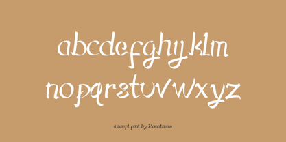 Hegorustow is a luxurious and classy handwritten font. This font looks vintage, elegant, readable, stylish, catchy and easy to use.
 - Alejandra by Arendxstudio,
$17.00 Alejandra Monoline is a bold font that is perfect for your design project. Alejandra comes with OpenType features such stylistic alternates, stylistic sets & ligatures which makes it great for logotypes, posters, badges, book covers, t-shirt design, packaging and many more. Features: • Character Set A-Z • Numerals & Punctuations (OpenType Standard) • Accents (Multilingual characters) • Ligature There it is! I really hope you enjoy.
 - Great Sage NF by Nick's Fonts,
$10.00This pseudo-Egyptian fantasy originally was named Karnac, and was unearthed in the pages of the 1888 American Type Founders Specimen Book. This version derives it name from a continuing character from Johnny Carson's stint on the Tonight show. Both versions of this font include the Unicode Latin 1252 and 1250 Central European character sets, with localization for Moldovan and Romanian. - Love Distance by Letterhend,
$17.00 The Love Distance is a beautiful handwritten script with organic style. This type of font perfectly made to be applied especially in logo, and the other various formal forms such as invitations, labels, logos, magazines, books, greeting / wedding cards, packaging, fashion, make up, stationery, novels, labels or any type of advertising purpose. Features : Uppercase & lowercase Numbers and punctuation Alternates & Ligatures Multilingual PUA encoded
 - Aiger by HansCo,
$15.00 Aiger is a slab type font with rounded characters on each side. Use this display slab font to add that special retro vintage touch to any design idea you can think of! Very suitable for logotype, Stickers, Packaging design, Cricut Project, headlines, brand identity, t shirt or apparel industry, posters, magazines, books, YouTube, Instagram, websites, or any of your creative design projects. Enjoy!