10,000 search results
(0.314 seconds)
- Nocturne by Scholtz Fonts,
$19.95 The font is based on an alphabet from a mid1920s art deco book. The original seemed to have tapering strokes but it was too small to be sure; I made all strokes parallel & orthogonal and slightly modified the original in a number of other ways to bring it into the 21st Century. The designers of the original were Paul Carlyle and Guy Oring. Nocturne has all the elegance of the Deco fonts of the 1930s. It recalls the romantic, sophisticated Zeitgeist of the early 20th century, that nostalgic time "between the wars". Nocturne comes in two styles: Nocturne Regular, which uses the Art Deco convention of small x height, and long ascenders. This style is perfect for headers, posters, labels etc. Nocturne Book, which, with its higher x height and slightly wider characters, is extremely legible and suitable for small size text.
 - Hokaplay by Afkari Studio,
$13.00 Hokaplay - Playful Display Font Hokaplay is a playful display font that creates with a very good concept and adjusted well to keep the legibility. Hokaplay Playful Display Font Comes with upper and lowercase Standard Characters, Punctuation, Numerals And other Glyphs variation of the OpenType features/ Ligatures. Hokaplay Playful Display Font is suitable for logos, posters, school flyers, university banners, modern advertising design, product labels, cartoons, kid books, custom mugs, pillows, t-shirts, youtube thumbnail/cover, poster quote, editorial design, book/cover Title, website/blog, social media post, packaging designs,, and other designs. Features; - 2 Styles; Regular and Rounded - Standart and special ligatures - Uppercase, Lowercase, Number, and Punctuation - Works on PC & Mac - Simple installations - Accessible in Adobe Illustrator, Adobe Photoshop, Adobe InDesign, even work on Microsoft Word - Fully accessible without additional design software. - Mültîlíñgúãl Sùppört for; ä ö ü Ä Ö Ü ß ¿ ¡
 - Rotola TH Pro by Elsner+Flake,
$40.00 Karl-Heinz Lange presented his first drafts of Rotola during a Typoart® type design competition in 1985 under the name "Boutique". A year later, Norbert du Vinage, former manager of the type design department, integrated "Boutique" in his production plan. Due the Fall of the Wall, it took about 18 years until Lange finished this font family in cooperation with Elsner+Flake. Karl-Heinz Lange was born on July 29, 1929 in Wiesenkirch in West Prussia. He was enrolled in the Humanistic Gymnasium at Elbing from 1939 to 1945 and changed to the Wernigerode High School after his family had to flee to central Germany. From 1949 to 1951, Karl-Heinz Lange studied at the Werkkunstschule Halle, where one of his teachers was Professor Post. After 1951, he continued his studies at the Hochschule for Grafik und Buchkunst in Leipzig with an emphasis on book design. He received his diploma in 1955 with distinction based on his design of a hot metal typeface. From 1956 to 1961, Karl-Heinz Lange worked as a lecturer for Type and Commercial Graphics at the Hochschule für Angewandte Kunst in Magdeburg. From 1961 to 1963, he taught at the Hochschule für Grafik und Buchkunst in Leipzig, and finally as a freelance commercial designer in Magdeburg. He worked on a variety of assignments, one of which was the design of trick films. From 1969 to 1976 he took the position of Artistic Director of the Henschelverlag, Berlin; from 1976 to 1994 he was Professor of Type and Typography at the Fachschule für Werbung und Gestaltung in Berlin; and, until 2004, he taught at various institutes for advanced professional education. From 2005 to 2007 he taught at the Fachhochschule Magdeburg/Stendal. Karl-Heinz Lange was awarded the second prize at the "International Type Design Contest 1971" for a headline typeface, and, in 1984, at the XI. Biannual of Graphic Design in Brno, he won a Silver Medal for the design of his typeface family Publica. He created the telephone book typeface Minima and re-designed the Typoart Super Grotesk® (Arno Drescher, 1930) as well as the Newspaper typeface Magna® by Herbert Thannhaeuser for the use on digital typesetting systems. To the day of his death on June 29, 2010, Karl-Heinz Lange lived and worked as a type designer. Among others, he closely followed the designs of the typefaces which were developed under his guidance for Typoart®: "Publica®", "Typoart Super Grotesk®" and "Minima®" which he launched as "Publicala", "Minimala" and "Superla" in 2009. In cooperation with Elsner+Flake, he developed the Typeface family "Rotola" between 2006 and 2009 as well as the script families of the "Viabella®" series. To the end, he followed the development of his first typeface, the "Diplom Antiqua", which he also wanted to bring to market together with Elsner+Flake.
 - AwanZaman by TypeTogether,
$93.00 AwanZaman has a three-phase story, beginning with Dr Mamoun Sakkal’s two Arabic styles and culminating with Juliet Shen’s Latin extension. AwanZaman started as simply Awan, a commission for a modern, clean, monoline typeface for writing headlines and story titles in a forward-thinking Kuwaiti newspaper. Awan was based on the geometric forms of Kufic script, while in phase two, a second typeface (Zaman) was designed to add enough calligraphic Naskh details to make it easy to read in demanding newspaper settings. Together these two phases give the typeface a warm, familiar, and progressive look, as well as an explanatory two-part name — AwanZaman. Since most editorials use typical Naskh headline fonts with an exaggerated baseline, Awan’s rational forms immediately distinguish it as a modern and progressive voice in the crowded field of Arabic editorial typefaces. As the companion Arabic typeface, Zaman has the same basic proportions and forms as Awan, but with many cursive, energetic, and playful details. And since modern monoline fonts are increasingly being used to set extended texts, more features were borrowed from Naskh calligraphy to expand the typeface’s use from headlines into text setting. When using the AwanZaman Arabic family, Awan (geometric Kufic forms) is the starting point. To add the sweeping, energetic personality of Zaman (calligraphic Naskh forms), simply activate an alternate character through the option of 20 stylistic sets available in any OpenType-savvy software. The two typefaces function as one file — the AwanZaman Arabic family — allowing users to combine features from both designs to transform the appearance of text from geometric and formal to playful and informal. The third phase of AwanZaman’s development introduced a companion Latin typeface designed by Juliet Shen to fulfil the persistent need in the Arabic fonts market for modern and geometric bilingual type families. Due to the Arabic’s monolinear strokes, AwanZaman Latin was destined to be a sans serif with a tall x-height, larger counters, and corresponding stem thickness to harmonise with the Arabic’s overall text colour and page presence. But it needed much more. One of AwanZaman’s chief assets is making the two languages look on a par when typeset side by side. Arabic and English readers will have a different sense of what that entails, but this type family defers to the Arabic — graceful and artistic with a good mix of straight stems and curved forms. Latin in general doesn’t aesthetically flow the way Arabic does, yet the tone of the Latin needed to mirror both the Arabic’s more squarish curves and formal personality of Awan and the undulating and more playful shapes of Zaman without looking outlandish. That need was met by creating some novel Latin characters, which are accessed through four stylistic sets the same way as AwanZaman Arabic. The alternates are not just clever in the way they look and how they echo the Arabic aesthetic, but also in harmonising the disparate languages and serving designers well when needing a balanced, bilingual text face with a warm and lively voice. AwanZaman is a clever, seven-weight powerhouse that makes extensive use of OpenType’s stylistic sets (20 in the Arabic and four in the Latin) so writers and designers can make the most of everything from a single glyph in display sizes down to dense text in paragraphs. As AwanZaman Arabic has no italic, neither does the Latin; contextual distinction normally handled by italics is achieved by exploiting the family’s seven weights. AwanZaman’s intricate OpenType programming supports Persian and Urdu, with features such as the returning tail of Barri Yeh treated properly. From its inception in geometry to its melding of two worlds with novel forms, AwanZaman is a personal labor by designers Dr Mamoun Sakkal and Juliet Shen, and embodies the TypeTogether ideals of serving the global community with innovative and stylish typeface solutions. The complete AwanZaman Arabic and Latin families, along with our entire catalogue, have been optimised for today’s varied screen uses.
 - Diane Script by GroupType,
$27.00 In 1995, FontHaus came upon a rare opportunity to create a revival of Aries, a little known and previously unavailable typeface by the legendary Eric Gill. Discovering a lost typeface by one of the major designers of the 20th Century, was the discovery of a buried treasure, and being the first type company to release it was an honor. Thirteen years later, FontHaus came across another little known typeface treasure: Diane. Designed by the legendary French designer Roger Excoffon in 1956, this remarkable script has never been faithfully recreated until now. In close collaboration with Mark Simonson, FontHaus and Mr. Simonson painstakingly researched rare type books, publications, European metal type services, and period showings from the United States, England, Germany and from the University of Groningen in the Netherlands. Finding full specimens of the font turned out to be quite a challenge. In most cases, only the caps and lowercase were shown. Furthermore, the more we researched Diane, many curious facts came to light. The caps in earlier specimens of Diane are completely different from specimens published later, suggesting that the face was redesigned at some point, perhaps in the mid-1960s. So we are left with two different sets of caps. The original had very elaborate, swirly strokes, very characteristic of Excoffon¹s gestural designs for posters and logos. Later on, these appear to have been replaced by a set of simpler, more traditional script caps. The original caps are criticized in one source Mark found (Practical Handbook on Display Typefaces, 1959) as being "exquisite" but "not highly legible". Perhaps this is what led to the simpler caps being introduced. Nevertheless, FontHaus's release includes not only both sets of caps, but a range of alternates and a number of new characters not originally available such as the Euro, and a magnificent alternate Ampersand to name a few.
 - Gaslon by Canada Type,
$24.95 Gaslon is a slight reinterpretation and major expansion of a 1973 film type called Corvina Black, originally designed for VGC by A. Bihari. While the original typeface was popular in its own right, there were some things in it that were too quirky to work in the display applications it was intended for. Some of the letter combinations just didn't work to their visual optimum. For example the a and o were too similar, ditto the C and G, the E, F and J were too overwhelming to be set properly within certain display uses. Gaslon eliminates these problems by the inclusion of plenty of alternates for the vast majority of the original letters. In fact, the original a is itself now an alternate to a gorgeous new one. The Gaslon Alt font includes tremendous possibilities for both unicase use, and proper use in conjunction with the main font. This is our true homage to a typeface that had great potential more than three decades ago, but was overlooked by digitizers because of a few quirks it had in film type contexts. Full of curves and invitation, Gaslon ranks very high among the friendliest poster faces ever made. It is ideal for friendly store signs, children book covers, and plenty of other applications. In fact, if you're planning on contributing to a few protests around your neighborhood or city, you would probably be better off using Gaslon to help your sign/placard carry words and slogans that are big but friendly. Nothing beats "DOWN WITH GAS PRICES" set in a nice imaginative mix of the many Gaslon letters. The OpenType version of Gaslon is a single font that contains all the alternates and niceties programmed within features accessible by OT-friendly programs.
 - Reline Rosery by Nathatype,
$29.00 Reline Rosery is an elegant serif font that radiates sophistication and grace. With its delicate letterforms and light weight, this typeface exudes a refined and gentle charm. The defining feature of this serif lies in its slender and graceful serifs, which add a touch of elegance to each letter. The light weight of the font enhances its delicate nature, giving it a subtle and airy appearance. This font is perfect for projects that require a refined and sophisticated typography choice. Reline Rosery captures the essence of timeless beauty. The serifs are meticulously crafted to create a sense of harmony and balance, while the light weight adds a contemporary twist. This font strikes the perfect balance between tradition and modernity. The letterforms are carefully designed to maintain legibility and clarity, even in the light weight. Each letter retains its distinctive characteristics, allowing your message to be easily understood. You can also enjoy the various features available in this font. Features: Alternates Ligatures Multilingual Supports PUA Encoded Numerals and Punctuations Reline Rosery fits in branding materials, book covers, wedding invitations, or any project that demands a touch of elegance, this font will bring a sense of refinement and beauty. It is particularly well-suited for applications related to luxury, fashion, beauty, and lifestyle. Find out more ways to use this font by taking a look at the font preview. Thanks for purchasing our fonts. Hopefully, you have a great time using our font. Feel free to contact us anytime for further information or when you have trouble with the font. Thanks a lot and happy designing.
 - Lettro Script by Ferry Ardana Putra,
$15.00 Make your own retro design with Lettro Font! Lettro is an exquisite bold script typeface inspired by the retro design from 70-80-ish. Lettro is created with a ton of stylistic alternates, swashes, and ligatures, and also comes with 5 total Layered fonts: Regular, Extrude, Extrude Outline, Double Extruded, and Double Extruded Outline. Perfect fitted layer to give you more contrast, more bold look of the title. Every glyph for alternates is curated for the best and possible without eliminating the characteristic of these fonts! Combine that many styles and create an awesome retro design! This retro typeface is perfect for logotypes, t-shirts, vintage badges, retro quotes, branding, packaging, posters, signboards, social media needs, etc. ——— Lettro features: A full set of uppercase & lowercase characters Layered Style Numbers & punctuation Multilingual language support PUA Encoded Characters OpenType Features +563 Total Glyphs +212 Stylistic Alternates +49 Ligatures +47 Swashes and more (Shiny and Spray Effect Included!) ——— ⚠️To enable the OpenType Stylistic alternates, you need a program that supports OpenType features such as Adobe Illustrator CS, Adobe InDesign & CorelDraw X6-X7, Microsoft Word 2010, or later versions. There are additional ways to access alternates/swashes, using Character Map (Windows), Nexus Font (Windows), Font Book (Mac), or a software program such as Pop Char (for Windows and Mac). ⚠️For more information about accessing alternative, you can see this link: http://adobe.ly/1m1fn4Y ——— 🔑Important tutorial from the author: Tutorial for Mollusca font trio: https://lnkd.in/d984CQD6 How to use Midway | Retro Script Font on illustrator: https://lnkd.in/eusbZd7s How to use Midway | Retro Script Font on Photoshop: https://lnkd.in/evsYrwgs Happy Designing...😊
 - Hagrid by Zetafonts,
$39.00 Crypto-typography - the passion for unknown, weird and unusual character shapes - is a disease commonly affecting type designers. Cosimo Lorenzo Pancini has celebrated it in this typeface family, aptly named Hagrid after the half-blood giant with a passion for cryptozoology described by R. K. Rowling in her Harry Potter books. Extreme optical corrections, calligraphic counter-spaces, inverted contrast, over-the-top overshoots: all the inventions that abound in vernacular and experimental typography have been lovingly collected in this mongrel sans serif family, carefully balancing quirky solutions and solid grotesque design. Hagrid is a typeface designed for editorial & display use, bringing dynamism to the printed and digital page thanks to its extreme contrast and unique details. It has been developed in a range of six display weights ranging from the monolinear and more traditional thin to the expressive heavy weight. For better readability in small sizes and on the web, a companion text family has been developed, with a slightly different selection of weights, wider metrics, and fine adjustments to keep the dynamic expressivity of the design without sacrificing legibility. This is evident in the design of italics: while the display italics sport a cursive feel with calligraphic terminals to lowercase letters, the text design is more restrained, with a more classical geometric grotesque slanted look. Given the crypto-typographer love for foreign specimens of letters, special care has been put into making Hagrid ready for multilingual projects, giving it an extended character sets covering over two hundred languages that use Latin, Cyrillic and Arabic alphabets and adding a selected range of OpenType features to handle alternate forms and stylistic sets.
 - LD Teensel by Illustration Ink,
$3.00LD Teensel is the perfect font for a fun, handwritten look for teens, tweens, or any age. Enjoy! - Gargoyle by Calligraphics,
$30.00Gargoyle is designed for use in headings, informal announcements or any project where a friendly look is desired, - Westo by AuburnForest,
$19.99 Westro is great for portraying western look and feel in a poster, banner or any kinds of headlines.
 - Bodoni Roma by BA Graphics,
$45.00An elegant take on Bodoni, with its subtle flared serifs that give it a very beautiful distinguished look. - Chip Dip by PizzaDude.dk,
$10.00 A simple and uneven handmade brush seriffed font. Great for that extra dip your handmade looking designs need! ;)
 - Neonderthaw by TypeSETit,
$24.95 Put a nice glow to it and it will shine. A font perfect for that neon sign look.
 - Pepper Sans by VIDI Visual Design Studio,
$17.99 The core design of Pepper family, designed by VIDI Visual Design Studio, is the fingertip handwriting style inspired by children’s writings on windows. This distinctive low-contrast typeface combines characteristics from neo-grotesque and organic models. Warmer than most Helvetica inspired typefaces, Pepper has organic shapes, playful strokes, rounded endings, and a generous x-height which makes Pepper easy to read. This family could be used well for food packagings, content aimed for children, book covers, branding, high-impact titles and small body texts, advertising, editorial design and more. What makes Pepper Sans Vol.1 competent and more spicy then some other fonts is that it contains a set of more than 900 characters for each of 5 weights that support many Latin-based languages, Greek and Cyrillic. As the weight decreases, the typeface gains impact with becoming elegant, giving titles in (Hair, Thin or Light) a breath of fresh air. We derived a typeface family consisting of Hair, Thin, Light, Regular, Semi Bold in this Vol.1 edition. Typeface features: • 5 weights: Hair, Thin, Light, Regular, Semi Bold • Latin, Greek & Cyrillic multilingual support • More than 900 characters for each of 5 weights Font Specs: • Created: August 2020 • Files type: .ttf
 - Wolby by LetterMaker,
$16.00 Wolby is a rough and organic hand drawn typefamily which draws inspiration from a variety of sources such as sign painting, hand lettering, comic books, cartoons, health food, sticks and stones to name a few. The letter shapes were all originally created by writing with a pointed brush. The use of one writing tool results in an aesthetical harmony between the very different styles making them all fit together. The family consists of eight styles; upright and slanted caps in regular and bold, a layered block style in fill, outline and shadow styles and a lively script. Wolby is capapble of creating very different moods depending on which style you choose to highlight. Because of it’s aesthetics, range of styles and extensive language support, Wolby is especially suitable for use in advertising, packaging design and gritty branding & fashion design. When using the layered block styles you’ll get the best result by placing the shadow layer on the bottom, the fill in the middle and the outline layer on top. These can also be combined freely so you can use just shadow + fill, shadow + outline or fill + outline. The script style is armed with a set of ligatures and swash capitals which allow you to supercharge your designs.
 - Klothilde by Fontroll,
$20.00 Klothilde is a handwriting font which came to life in one of my doodling sessions (I must admit I still doodle with pen and paper). The idea was to create a font which resembles writing with a quill on paper with exaggerated ball terminals. Sometimes there is too much ink which makes the letters fat and the strokes uneven. The paper soaks the ink resulting in blurred line crossings. The form gets blurry. On the other hand, when the quill runs out of ink the stroke gets thinner looking like the light version of Klothilde. In order to emulate the different looks, I created six fonts with a common skeleton but different appearance which can be altered seamlessly by using the Variable Fonts technology (e.g. in latest Adobe apps or CorelDRAW Graphics Suite) along the Weight and Blurred sliders. But even without, Klothilde can be used even in longer copy. Use it from 18 pt upwards, flush left with tight leading and intersecting ascenders and descenders. Due to extensive manual kerning, it gives your text an even colour. To my knowledge, Klothilde is one of the first script Variable fonts in different weights. No, Klothilde’s letters are not connecting. But I added a whole bunch of connecting ligatures which are simply activated by the ligature feature of your app. Even Microsoft Word can do that. Thus Klothilde comes to life, as it should be expected from a handwriting font. In order to add to variety there are additional glyphs for some critical initial and standalone letters. Repeating letter combinations like nn, mm or rr are avoided by replacing the second letter by an alternative form. All features are activated by the standard ligature feature. Ligatures are available for most European languages, some even in Cyrillic (some special Serbo-Croat letters included and accessible through localization or Style Set 08 features). Romanian comma-accent characters and ligatures are accessible through the OpenType locl feature. For the topping on the cake, I added an alternate ampersand (stylistic set 1) and asterisk (ss04), an alternate Cyrillic b (ss02) and t (ss03), a few fleurons, arrows and a skull (OpenType feature ornm), fractions (frac feature), circled numbers (ss06) and an interrobang (ss07) which result in exactly 900 glyphs in each of the six fonts. There should be enough to play with. Should you be missing a special character, do give me a hint.
 - Ringlet - Unknown license

- Vtg Stencil Italy No. 2 by astype,
$29.00 The Vtg Stencil fonts from astype are based on real world stencils from several countries. The Italian stencils that I chose as a model for this font are roughly based on classic French stencil letters. Please compare the figures (numbers) with their French counterparts. However, the Italian stencils are made with a different production technique. The design of the letters is clearly not punch-cut into the plates, maybe they are drilled, milled or etched. Details such as the serifs look bold and clumsy, and when using the stencils as they are meant, with viscous sign paint, smaller details easily fade away. So I took my freedom to design a font close to the original design but adding several typographic tweaks to let it shine, hoping to get closer to the intended design idea of these Italian stencils. Enjoy the vintage!
 - Albion Signature by TofinoType,
$90.00 Albion Signature is a value packed font of exceptional character, with lots of old world charm to make your next project personal and special. Containing over 2,200 glyphs, it’s large enough to handle any demanding project, big or small. It also contains over 400 flourishes in three sections (dingbats, geometric shapes, and misc. geometric shapes) in numerous styles, that can be used in endless combinations. It’s like several fonts in one. Everything you need to do a stellar project is included. A script font that lines up perfectly with a few extra endings and hidden treasures spread throughout. It also contains a complete easy to use PDF index, so you will be able to find exactly the glyph you are looking for fast. This font can only enhance the fonts that you already own, making them more versatile and useful. On its own, it is a very elegant calligraphy script, that will make every project you create look great. The capital letters overlap and intertwine just like in days gone by, for a unique style. Also included are tools that can give you very precise spacing, right inside a word processor. Usage: Photoshop styles, InDesign, personal promotion logos, monograms & signatures.... That’s where it shines, yet it’s still great for art, cards, fancy documents, really fancy labels & even notes to Mom. Imagine, most people used to write letters like these at one time. Now you too can have documents that look like the work of a studied penman.
 - Dear Sarah Pro by Betatype,
$119.00 Carefully considered letters written long-hand, sealed in an envelope and sent across continents were once the only connection for distant friends and lovers. Dear Sarah is a type that evokes the emotion of those handwritten messages. Using alternates, ligatures and a complex system for randomization and natural connected characters, Dear Sarah seeks to push the boundaries of digital type. The guiding question that drove the design of Dear Sarah was whether it was possible to create a natural looking script that worked well in running text. Hand-written types often work for two or three words, but as soon you you look at them in a paragraph, their unnatural textures make them feel contrived. As one of the first serious types to explore OpenType for a connected script, Dear Sarah uses a unique system to create natural connections. Often script types rely on one connecting point to make sure that all their characters fit together properly. Characters that naturally connect much higher, such as the ‘o’ or ‘v’ are distorted to connect at the same point as an ‘a’ or a ‘c’. Dear Sarah uses multiple sets of lower-case characters to connect at multiple points, creating a much more natural looking script. OpenType is also used to create variety, by using randomization techniques to insert disconnected characters as well as alternates, ligatures, swashes and ink blots to create a natural rhythm across multiple lines.
 - Mightiest Autograph by Din Studio,
$29.00 Digital designs seldom show personal touches to make them stand out and to give unique displays. Generic fonts are no longer enough to do so. You need something special to make great impacts on your work. Therefore, a handwritten font can be the perfect solution to such a necessity. This is the Mightiest Autograph. Mightiest Autograph is a handwritten font in a signature looking style to add elegant, personal nuances on your designs. The curves and wipes in the swinging ends of the letters are the main characters. Like the other cursive fonts, each letter is connected to one another to make the font legible. The letters’ proportions are made different for a more artistic looking style applicable for such romantic texts. You can apply this font for any text sizes due to its great legibility. Additionally, you can enjoy the available features here. Features: Alternates Ligatures Multilingual Supports PUA Encoded Numerals and Punctuations Mightiest Autograph fits best for various design projects, such as brandings, posters, banners, invitations, greeting cards, magazine covers, quotes, printed products, merchandise, logos, social media, etc. Find out more ways to use this font by taking a look at the font preview. Thanks for purchasing our fonts. Hopefully, you have a great time using our font. Feel free to contact us anytime for further information or when you have trouble with the font. Thanks a lot and happy designing.
 - LiebeRuth by LiebeFonts,
$29.90 LiebeRuth is your 100 percent hand-made organic type. She absolutely loves to be typeset in large *and* small sizes, because Legibility is her middle name. (Yes, we know it’s not a typical girl’s name.) She is friendly and polite, but she also has a few quirks. Her friends are impressed with how natural she manages to look every day. Her four weights ensure that Ruth has the right boldness for any context: birthday invitation, personal correspondence, photo album, or billboard ad. During the creation of this font, her designer ate plenty of healthy, organic foods. We think this is the reason why Ruth looks so fresh and lively. And of course Ruth has been designed with lots of Liebe (which is German for “love”—and she speaks many other languages, too). One more thing Ruth is marvelous at: showing off her curly-swirly swashed alternative letterforms that can be activated via OpenType. (Please make sure your software supports OpenType if you wish to use the advanced features.) Each style contains more than 560 gluten-free glyphs—now that is great value! If you like this font, you may want to look at LiebeRuth’s bolder sister LiebeDoni and our best-sellers LiebeErika and LiebeKlara. Or add in some LiebeOrnaments to prepare a curly-licious feast. By the way: LiebeRuth also gets along great with our wide range of illustrative fonts, including LiebeCook, LiebeFish, and LiebeTweet.
 - Ringtail by Din Studio,
$25.00 Every font designer has their own favorite font type, which you do not need to find as it takes too much time to figure it out for you until you can match it with a perfect font. Ringtail has the best answer to your needs. Ringtail is a font containing two font types to use together or separately: sans serif and script fonts. Sans serif font has firm, modern, simple looking lines without curvy edges. Meanwhile, the script font has curvy lines in water paint or ink textures. The textures are extra lines added to each letter and to the background letter patterns. A textured script font looks more artistic and more detailed than the other ordinary script fonts to show elegant, romantic impressions in your designs. Additionally, script font can be applied for adding extra visual contrasts to designs with sans serif font. Features: Stylistic Sets Ligatures Multilingual Supports PUA Encoded Numerals and Punctuations Ringtail fits best for various design projects, such as brandings, posters, banners, logos, magazine covers, quotes, headings, printed products, invitations, name cards, merchandise, social media, etc. Find out more ways to use this font by taking a look at the font preview. Thanks for purchasing our fonts. Hopefully, you have a great time using our font. Feel free to contact us anytime for further information or when you have trouble with the font. Thanks a lot and happy designing.
 - Castile by Eyad Al-Samman,
$3.00 Castile is a central region of Spain that formed the core of the Kingdom of Castile, under which Spain was united in the 15th and 16th centuries. "Castile" is a Kufic modern Arabic typeface. It is suitable for books' covers, advertisement light boards, and titles in magazines and newspapers. It is very distinctive when used in black and white printout. It decorates colored pages and makes artworks more attractive. This font comes in three different weights. I adore Spain and the historical achievements of the Islamic civilization existed there in the past. By designing "Castile" Typeface, I wanted to refer to the Islamic civilization that Muslims had in Spain and especially in Andalusia. Today the name of Castile survives in two autonomous regions of Spain: Castile-La Mancha (capital city is Toledo) and Castile-Leon (capital city is Valladolid). The main characteristic of "Castile" Typeface is in its modern open-end style for some of its Arabic characters such as "Sad", "Dad", "Seen", "Sheen", "Qaf", "Faa", "Yaa" and others. The shape of the characters' "dot", "dots", and "point" is innovative; a triangle with a semi-circle shape. "Castile" Typeface is suitable for books' covers, advertisement light boards, and titles in magazines and newspapers. Its charactersí modern Kufic styles give the typeface more distinction when it is used also in posters, greeting cards, covers, exhibitionsí signboards and external or internal walls of malls or metroís exits and entrances. It can also be used in titles for Arabic news and advertisements appeared in different Arabic and foreign satellite channels.
 - Rangarang by Si47ash Fonts,
$24.00 "At last, something beautiful you can truly own!" This is the first Persian Arabic & Latin COLOR font ever designed! Chromatic or Color fonts are fairly new. And Persian Arabic color fonts are extremely rare. Here, you get a font that supports both Arabic and Latin! Rangarang [means colorful] font comes in with a wonderful color set and variety in forms. Every single glyph has a unique palette of colors. If you look closely at the glyphs, you'll see complex paths and connections in every single one of them. Each glyph could be seen as a typographic artwork! Rangarang font is great for entertainment design, posters, business cards, website titles, magazine illustrations, logotypes, book covers, banners, billboards,... There are countless options! Notes: - SVG fonts contain vector letters with gradients and transparency. - These fonts will show up in apps that are compatible with color fonts, like Adobe Photoshop CC 2017.0.1 and above, Illustrator CC 2018. Learn more about color fonts and their support in third-party apps on: www.colorfonts.wtf - Don't worry about what you see here in the preview section in your browser. You may see the glyphs in black here, but this font is working EXACTLY how you can see it in the font pictures I put here. So if you use it in apps that support colored fonts, you can be sure that after installing the font on the system you will be able to use it like every other font. Shahab Siavash, the designer has done more than 30 fonts and got featured on Behance, Microsoft, McGill University research website, Hackernoon, Fontself, FontsInUse,... Astaneh and Hezareh text and headline fonts, Yaddasht and Yadgar handwriting fonts,... already got professional typographers, lay-out and book designers' attention as well as some of the most recognizable publications in Persian Arabic communities.
 - Apple Pie by FontMesa,
$25.00 You might call this a Bodoni Ornate font that Bodoni never made, close examination of this old 1800s font and it's plain to see that the top half of the letters is very Bodoni in appearance. Apple Pie is a revival of and old font from the William Hagar Type Foundry, which I've been able to date back to 1850. The William Hagar type specimen book from the 1850s only shows this font as a caps only typeface plus numbers, later in 1869 MacKellar Smiths and Jordan offered this font with a lowercase. Over a two year period I was able to collect enough letters to begin production of this old decorative font, the type specimen books only showed a small line of text for this font so I would search through old documents on eBay and also shows relating to Ephemera. I could have easily developed a new font based on a very small sample of letters but I wanted to wait and find as many letters as possible, I was unable to find the Q, X, Z and ten lowercase letters so those missing letters are of my own design. New to this font is the addition of an all Caps Greek character set, accented letters for Eastern Central and Western European countries is also within this font. Fill fonts are available for the Apple Pie font, you will need an application that works in layers such as Adobe Photoshop, Adobe Illustrator or Corel Graphics in order to use the Fill fonts. Some Fill fonts may be used as stand alone fonts but the versions for Apple Pie look best when layered behind the parent or main Apple Pie fonts. Be sure to check out the left and right hands located on the Less Than and Greater Than keys.
 - LFT Arnoldo by TypeTogether,
$39.00 LFT Arnoldo began as an all-caps book cover typeface created during the rebranding of Oscar Mondadori, the most important Italian publisher, with over 4,500 titles from ancient classics to contemporary works, and spanning academic essays to children’s and self-help books. For such a diverse catalogue, it was necessary to find a coherent and flexible paradigm which took into account genre and readership differences and ensured harmony among its works. The main idea was to create a typeface suitable for the branding element and which could be used for each title of the immense catalogue. So what makes LFT Arnoldo a companion to the centuries? Starting with the design of the capital letters, it is first a rational typeface with contemporary proportions. But rationality without style wasn’t enough, so its glyphic nature carries an engraved feeling to resemble letters when chisel is put to stone. Once these two traits were settled, the entire character set was developed as a flared humanist sans in order to complete the family and extend its usage, from titles and display settings to texts. LFT Arnoldo sets titles with dignified authority to appear digitally carved and more arresting than the usual sans or flared sans designs of the past. It is calm and dependable in paragraph use and a captivating vehicle of aesthetic expression in title and display use. At once rugged and syncopated, the slight hourglass stems and incised details make each letter come alive and engrave each paragraph upon our emotions. LFT Arnoldo intends to be a resilient type family for centuries to come. Its seven roman weights have italic counterparts and the entire family is loaded with OpenType features: alternates, ligatures, small caps, oldstyle and lining numerals, and science and math capabilities. In the battle of charisma, where the right voice must project intelligence, influence, and refinement, LFT Arnoldo is the victor.
 - Lotus Heart by Putracetol,
$28.00 Lotus Heart - Classy Ligature Font Lotus Heart is a stunning and luxurious display font that exudes sophistication and elegance. This font is the perfect choice for those looking to add a touch of class to their design projects. The idea behind the creation of Lotus Heart was to capture the essence of luxury and elegance in a typeface. Its classic and timeless style is perfect for high-end product branding, fashion, beauty, logos, book covers, posters, and flyers. Lotus Heart is a versatile typeface that can be used in a variety of design projects. It's a perfect match for any project that requires a touch of luxury and elegance, such as high-end product branding or fashion. This font is perfect for creating logos, book covers, posters, and flyers that will stand out and make a statement. The font comes with various features, including uppercase and lowercase letters, alternates, and ligatures, which can be accessed using OpenType technology. Additionally, this font includes number, punctuation, and symbols, making it suitable for a wide range of design projects. It also supports multiple languages, making it accessible to users from different regions. In the package, you will receive three different formats of the font, including OTF, TTF, and WOFF. This means that you can use Lotus Heart across a range of digital design platforms, including Adobe Photoshop, Illustrator, and InDesign. Lotus Heart is a classy and elegant ligature font that is perfect for adding a touch of sophistication to any design project. Its versatility, along with its classic and timeless style, makes it an excellent choice for product branding, fashion, beauty, and many more design projects. With Lotus Heart, you can create stunning designs that will leave a lasting impression on your audience. Choose Lotus Heart today and elevate your design projects to the next level with its luxurious and sophisticated style.
 - Eyadish by Eyad Al-Samman,
$7.00 Eyadish is an entertaining, comic, and childish font. The name of this font is originally derived from two main syllables. The first one is "Eyad-" which refers to my first name and the second syllables is "-ish" which means characteristics of or relating to. Hence, "Eyadish" refers to the characteristics that "Eyad", the typographer, himself has and had during his childhood. I do like this font for its childish and comic shapes. I have decided to design this font trying to leave a humble and personal imprint regarding the magic and innocent world of all children. Frankly, it is my most favorable designed font. This font comes in two different weights with facilities for writing and publishing in different alphabets included in various Latin and Cyrillic texts and scripts. "Eyadish" is primarily designed to be fit with all prints of kids, children, and juveniles' products. It is major usage is in advertisements and publications. It is suitable for T-shirts, books' covers of children such as fairy tales and comic stories, advertisement light boards in malls, and titles in parental, childish, comic, and other related magazines. "Eyadish" also can be printed in many children's products such as garments, towels, shoes, socks, toys, pacifiers, diapers, exhibitions, festivals, books titles and contents, medicines' packages, kindergartens' signs, buses, comic and TV series, kids and children organizations and charities names, images, software, foods including milk cans, candies, chocolates, and other related products. The font is extremely and distinguishably attractive when it is used with various, and vivid colorful letters and words in posters, cards, and placards. "Eyadish" is specifically designed for commercial, educational, cultural, and social purposes related to infants, babies, kids, and children. The main characteristic of "Eyadish" Typeface is in its childish look that remains when anyone reads or types or even deals visually with its characters.
 - Legendary Legerdemain by Comicraft,
$29.00 Are you watching closely? We know what you're looking for -- the secret. Comicraft’s magic formula, our Legendary Legerdemain. But you won't find it because of course, you're not really looking. You don't really want to work it out. You want to believe in the magic. Every great Comicraft font consists of three parts. The first part is called “The Pledge”. Comicraft shows you an ordinary looking font: A through Z, nothing more than the letters of the alphabet, unaltered, normal. But of course... they aren't. The second part is called “The Turn”. Comicraft takes the ordinary letters of the alphabet and makes them look extraordinary. Now you are peering closely -- you convince yourself you're looking for the secret... even though you really don't want to know. You want to be fooled. And you are! But don't applaud yet. Because making something extraordinary isn't enough... That’s why every Comicraft font has a third part, the hardest part, what we call “The Prestige”. That''s when we have to SELL the font. And that’s the real trick. See the families related to Legendary Legerdemain: Legendary Legerdemain Leggy.
 - Kittle Rough by Talbot Type,
$19.50 Kittle Rough is a robust display font with a time-worn texture. It has a strong, pared down look based on bold geometric forms. Loaded with personality, Kittle Rough features a full upper and lower case character set and an extended set of accented characters for Central European languages. It is also available as Kittle Round, with a smooth, clean look.
 - Habanera by Artegra,
$29.00 Habanera's design is based on the idea of taking perfectionist geometric shapes and making them funky! With gentle tweaks here and there, the glyphs are deliberately designed to look more humane and fun. Same fonts are also presented with round corners, giving it an even more gentle look. Latin poster design and graphic art was an inspiration to design Habanera.
 - Hurson by Garisman Studio,
$20.00 HURSON is born from original and hand-drawn style font. This font gives a feel of vintage, classic, old, handmade looked like. Already PUA Encoded and I think this font is perfect for people looking for vintage aesthetic or hand-drawn logo. Suitable for any graphic designs such as branding materials, t-shirts, prints, business cards, logos, posters, photography, quotes, and more.
 - One Stroke Script by ITC,
$40.99One Stroke Script is the work of British designer Paul Clarke, a highly legible, casual typeface that looks as though it were drawn with a brush. Upper- and lowercase letters should be spaced closely together for the best effect. One Stroke Script is good for a variety of applications: anywhere a cheerful, spontaneous look is desired. Featured in: Best Fonts for Logos - Grizzly Attack by Rometheme,
$25.00 Grizzly Attack is a brush and handdrawn font, this font looks urban, cool, readable, stylish, catchy and easy to use. Grizzly Font is the best choice for your professional design projects, including : logo, poster design, t-shirt, headline, flyer, cd cover album, quotes, business card, branding, magazines, social media, advertisements, product designs, or something that need urban or cool looks.
 - Jathafa by JprintStudio,
$15.00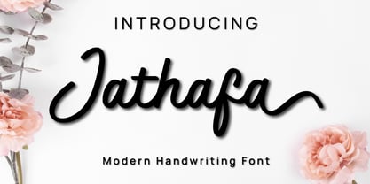 Jathafa is a cute and casual handwritten font with a very friendly feel. Whether you’re looking for fonts to make beautiful wedding invitations, beautiful artwork, interesting social media posts, and funny greeting cards. Jathafa also has several alternative letters that can make your project look modern, luxurious and classy. This font will turn any creative idea into a true work of art!
 - NL Seasalt by Nicky Laatz,
$25.00 A breath of fresh air! Seasalt typeface was designed to emulate natural-looking handwritten notes. Opentype ligatures are included to make the typeface appear more realistic and last but not least, it includes a doodles font - arrows, scribbles and scrawls to help your designs pop! The typeface comes in three different variants to suit the look you are after : Upright, Regular and Slanted.
 - Art Club by Open Window,
$- Like Marker Felt or Comic Sans, Art Club has that informal/playful feel. Only this time its made to look and feel like it was written using a paint brush at your local after-school art club. Next time you want to add that cheerful spice to your Art Club Syllabus, or ANY syllabus, look no further than Art Club (the font).
