10,000 search results
(0.041 seconds)
- LD Old Country by Illustration Ink,
$3.00This old fashion font looks like it belongs on a saloon sign. If you've got old west style photos, finish up your scrapbook page with title and journaling done in this cool font. It's perfect for lettering on western themed invitations, newsletters, sign, flyers, even menus. - ITC Mixage by ITC,
$29.99Mixage font is the work of Italian designer Aldo Novarese, who cleverly combined the character shapes and proportions like those of Syntax and Antique Olive with the grace and warmth of a calligraphic typeface. Mixage font is a good alternative to more traditional sans serif designs. - Park Avenue Script by Linotype,
$29.99Park Avenue is a lighthearted contemporary script designed by Robert E. Smith in 1933 for American Type Founders. This unique design has small x-height lowercase letters with very long ribbon-like ascenders. Park Avenue is a good design for occasional pieces such as invitations and menus. - Radio Interference by Jeff Levine,
$29.00 The font Antique Slabserif JNL was run through a filter to create a design that looks like worn type at smaller settings or jaggedly distressed lettering in larger type heights. The end result is Radio Interference JNL, which is available in both regular and oblique versions.
 - Dale Kids by AdultHumanMale,
$12.00 DaleKids is a fun kiddie style font, a little bit picture book and a little bit comic book too. The font is available in two styles regular and italic. Designed to be playful it looks great on birthday cards and long tome like monologues of cute speak.
 - Belgium by Craft Supply Co,
$15.00 Belgium Font Family is a modern serif font family whose design refers us to the style of modern sans serif. The distinctive features of Belgium Font Family are the relatively low contrast of strokes, the slightly squarish shapes of round characters and the emphasized business like simplicity.
 - Domingo by Sudtipos,
$25.00 The smooth curves and big wondrous eyes of the Tango dancer in all her charm. Domingo expresses the sensual mysteries of South America like no other typeface ever could. Fragile yet firm, loving yet proud, Domingo conveys an eternal sense of care and beauty, depth and poetry.
 - Admercia by Khoir,
$15.00 Admercia is a classic minimalist serif font with lots of variant on each letter, this font is perfect for your design needs like creating eye-catching logos and titles to stand out in any design project. Admercia Uppercase Lowercase 75+ Language 87 Alternates Thank you for seeing
 - Roberta by profonts,
$41.99 Roberta goes back to the old poster fonts of the 1930s. It is an excellent alternative and combination to fonts like Arnold Böcklin or Hobo. Ralph M. Unger redrew and digitized this font in 2003. His work is based on artwork taken from old font catalogs.
 - Minangrasa by Mevstory Studio,
$25.00 Minangrasa is a blackletter inspired by traditional houses in West Sumatra, Indonesia which are shaped like cow horns. It's bold and fun with a retro twist. Using all caps results in very stylish text, while combining capital letters produces text that is very easy to read.
 - Cognac by Solotype,
$19.95Many years ago, we bought a bunch of proofs that had apparently come from the defunct Van Loey-Nouri foundry in Belgium. Cognac was an incomplete alphabet among them, which we completed. Just a guess, but 1910 seems like a probable date for this art nouveau design. - fancyPens by JOEBOB graphics,
$9.00 In case you find yourself looking for an erratic, inconsequent and loose free-style calligraphy font, I guess you need to look no further and try fancyPens. I used several pens in several ways on several days to create it and it shows. Hope you like it.
 - Scrawlerz by Hanoded,
$15.00 My teacher used to say my writing looked like ‘hanenpoten’ (“rooster legs”). It is a Dutch expression for a scrawly script. When this script emerged, it had ‘scrawl’ written all over it! Scrawlerz is a messy script font with a lot of joie de vivre. Enjoy!
 - MommieBrush by Hubert Jocham Type,
$29.90 MommieBrush is a brush script headline typeface. It is based on the Spencerian Mommie that won the 2008 TDC award. But as a brush script it works in a different area. Like my other brush script typefaces it is made for food packaging and product branding.
 - Kidzhood Arabic by NamelaType,
$34.00 Kidzhood Arabic is sibling of Kidzhood with the addition of Arabic glyphs, for Arabic, Urdu, and Farsi. The font represent the characters as funny and flexible, just like childish characters can be. Kidzhood equipped with cute letter form and some attractive ligatures, giving it a playful feeling.
 - Craptoy by PizzaDude.dk,
$20.00Craptoy is a grunge Open Type font - full of different auto ligatures! That means you can write words like beer, letter, bubble, success (just to name a few) without having the double letter repeating itself! (You will need to use OpenType supporting applications to use the autoligatures). - Hugehito Brush by ijemrockart,
$13.00 Introducing a lovingly handmade new typeface, Hugehito Brush, a fun and imperfect modern brushed script font with a tough of uniqueness driven. Design like a professional with this typeface that fits perfectly for your wedding invitations, street ads, Instagram posts, t-shirt design, branding, and much more.
 - Crazy Rooster by Sipanji21,
$16.00 Crazy Rooster is a Strong and rounded display font with a graffiti-like appearance. Use this font for any crafting project, apparel design, logotype, advertising, wall decoration, and pretty much anything that requires a personalized look. Take your designs to the next level with this stunning font!
 - Digdope by Holis.Mjd,
$10.00 Digdope is a fun and natural font like a handwritten sans font, so you will get a more realistic feel. Digdope is a layered font available in three styles, REGULAR/NORMAL, OUTLINE &, SHADOW. Perfect for branding, logos, posters, quotes, headlines, movie titles, book titles, and other designs.
 - Sahan by GRIN3 (Nowak),
$20.00 Sahan is a typeface which looks almost like Arabic, but it is not a real Arabic font. This simulation font includes upper and lower case Latin alphabets and numerals. Language support includes Western, Central and Eastern European character sets, as well as Baltic and Turkish languages.
 - Foolish Hand by Sipanji21,
$10.00 Foolish Hand is a handwritten font written in original handwriting, this font is good for various graphic designs, such as making children's drawings, coloring book covers, packaging, advertising, movie covers, posters and for any crafting. I hope this font is useful for you, have a nice day.
 - Techno Retro JNL by Jeff Levine,
$29.00 Techno Retro JNL looks like a design straight out of the 1980s, but it actually appeared as hand lettering on a sheet music cover for the circa-1940s edition of the song "To You Sweetheart, Aloha", proving the old saying that "everything old is new again".
 - Carpellon by Creativemedialab,
$16.00 Carpellon is inspired by tattoo scripts, and features nice curves to represent the combination of art and beauty. It is unique and easy to read, and includes both regular and ornament styles. It is best for use with gothic art themes, tattoo lettering, posters, logos and more.
 - Vorvalla by Agny Hasya Studio,
$9.00 Vorvalla is a Gothic Decorative Display Serif Font Featured with Uppercase and Lowercase, Numerals, Punctuation, and OpenType Features. Perfect for your design projects like logos, branding, advertising, product designs, stationery, magazine designs, book/cover title designs, photography, art quotes, Special events, labels, product packaging, and more.
 - Exmachino by Borderline Artistic,
$9.99 Exmachino is a rounded geometric monoline display font. Taking inspiration from futurism and minimalism, the letterforms convey an uncompromising machine-like quality. Many futuristic geometric fonts only have uppercase characters but Exmachino attempts to bring the unorthodox geometric styling to a full set of characters and weights.
 - Sweet Curly by Inumocca,
$19.00 Sweet Curly inspired from Girls handlettering, more unique character decorative, fancy, powerfull and beautiful. Really Beautiful font to covering your Project, like For logos, Poster art, Magazine, Branding, Sticker and more your project design. - Unique glyphs - Multilingual Characters - UPPERCASE - Lowercase - Numeric - Symbol - Punctuation Character - PUA encoded inumoccatype
 - Sweet Titling No. 22 by Sweet,
$39.00 Sweet Titling No. 22 is part of the Sweet Collection of engraved lettering styles from the 20th Century, published by MVB Fonts. This obscure, art deco design would have been used for engraved letterhead, business cards, etc., and likely first appeared in the 1920s or ’30s.
 - Standard Cap by Graffiti Fonts,
$19.99Standard Cap is rough font made to look like it was written with a "standard cap" (the cap that comes on a krylon, rusto or other spraycan). The font includes full uppercase and lowercase alphabets as well as a full array of numbers, symbols, punctuation etc. - Stiff by Edyta Demurat,
$20.00 We present to you STIFF - a simple, characteristic typeface in a nice, retro style which is angular, geometric and extra narrow. Stiff makes the text look distinctive and unique so it's perfect for titles, subtitles, logotypes or short parts of text which need to be exposed.
 - Sundowners by PintassilgoPrints,
$29.00 Sundowners is a smiley face. It is a simple and versatile font, with a pocketful of cool interlocking glyphs for those days of groovier moods. It also brings a handful of amusing initial and terminal forms and a couple of ornaments. That simple. And that nice.
 - De La Croix by Wilton Foundry,
$19.00 De La Croix font was inspired by the works of Eugène Delacroix, leader of the Romantic School. De La Croix is a strong yet romantic font that plays well in a wide variety of placements like posters, signage, advertising, fashion, display, wayfinding, publications, packaging, logotypes, and more.
 - Book& by Holland Fonts,
$30.00A design reminiscent to school script and handwriting, yet slightly off beat, with a gracious and elegant motion. Originally designed for invitations for a book store, the typeface likes to think it refers refers to book typography of the 40s and 50s of the last century. - Ghetto by Bosstypestudio,
$12.00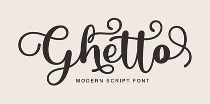 Ghetto is a modern script with handwriting, decorative characters, and dancing baselines! It's very suitable in use like blog headers, t-shirts, and for weddings, social media, product design, stationery, advertising, clothing, book covers, business cards, greeting cards, branding, merchandise, invitations and handmade quotes and more.
 - GL Tetuan by Fontbilisi,
$30.00 If you are searching for a stylish font to fit in a not very wide space, GL Tetuan is your font. Slab, modern but with a touch of oldstyle, compatible with many languages, including special characters and very nice ligatures. It includes Cyrilic, Georgian and Greek alphabets.
 - Cryptolucre by Otto Maurer,
$15.00 Cryptolucre is a font specifically for all crypto currencies like Bitcoins, Litecoins, Ethereum, Ark, Siacoin, Golem and what else is there. The icon version includes some existing currency logos and newly invented currency logos. The sans serif font comes in 11 font styles with 1 graphic font.
 - Rothe by Konstantine Studio,
$10.00 ROTHE, A luxury vintage lettering style fonts. Inspired by the branding from the vintage classic era with the full decorative feels and complex design but still get the luxury feels right away. Armed with some swash letters to expand the style like the old lettering way.
 - Aghellay by Liartgraphic,
$16.00 Meet our newest product, we call this product Aghellay font. Aghellay font are cute typeface font Whit a uniqe touch and assertive. Aghellay font is very nice to use on: fashion magazine, logos, ,and photography, landing page, fliyer. What’s includes - multilingual support - alternate - ligature Ali Sifak Muftari
 - Fontazia Mazzo by Deniart Systems,
$15.00 Fontazia Mazzo features a unique assortment of floral bouquets in abstract vases. A modern addition to any interior design layout or for any project where flowers say just the right thing! Like other type, these dingbats can easily be integrated into any text document or graphic program.
 - Letterhear by FallenGraphic,
$20.00 Letterhear a modern script with a feminimst calligraphy style, decorative characters . in this font script there are many alternative choices of characters Support Ligature, and Stylistic set. So beautiful on invitation like greeting cards, branding materials, business cards, quotes, posters,wedding invitations and more!! Thank you!
 - Round by OtterType,
$20.00 Round is an elegant and clean modern display font. You can use it for a variety of design projects like posters, business cards, wedding invitations, games, covers, social media posts, quote photos, branding, editorials, and much more. Round is a multilingual font, also supporting Cyrillic alphabet.