10,000 search results
(0.085 seconds)
- Death Demon by Yoga Letter,
$15.00 "Death Demon" is a horror font that is very scary and full of mystery. This font is perfect for Halloween moments, movie titles, book titles, Halloween party invitations, and more. Equipped with uppercase, lowercase, numerals, punctuation, and multilingual support.
 - Halloween Devil by Yoga Letter,
$15.00 "Halloween Devil" is a unique and spooky display font. This font is perfect for Halloween moments, Halloween invitations, metal concerts, horror movie titles, and more. Equipped with uppercase, lowercase, ligatures, uppercase alternates, lowercase alternates, multilingual support, numerals, and punctuation.
 - Bagias by Letterena Studios,
$9.00 Bagias is a modern and classic sans serif font that features its own unique look. This typeface is perfect for elegant & luxurious logos, book or movie title designs, fashion brands, magazine covers, clothes, lettering, quotes, and so much more.
 - Black Combat by Yoga Letter,
$15.00 "Black Combat" is a unique, elegant, and fantastic handwritten brush font. This font is equipped with upper- and lower-case letters, numerals, punctuation, and multilingual support. Perfect for Easter, Spring, Halloween, Summer, logos, banners, posters, branding, stickers, and more.
 - Rajomon by Etewut,
$20.00 Introducing Rajomon the hand drawn script made with dry brush. All European languages are in. More of all there are initial, final and alternative letters for making your lettering on a high level as a peak of the rock!
 - Rolanda by Letterena Studios,
$9.00 Rolanda feels equally charming and elegant. It looks stunning on wedding invitations, thank you cards, quotes, greeting cards, logos, business cards and more. This font is PUA encoded which means you can access all glyphs and swashes with ease!
 - Reina Neue by Lián Types,
$29.00 Hey! See Reina Neue in action here! INTRODUCTION When I designed the first Reina¹ circa 2010, I was at the dawn of my career as a type designer. The S{o}TA, short for the Society of Typographic Aficionados, described it as complex display typeface incorporating hairline flourishes to a nicely heavy romantic letterform². And it was like that; that’s what I was pursuing at that time since I was very passionate about ornaments and accolades of Calligraphy. Why? I felt that Typography, in general, needed more of them. These subtle flourishes could breathe life into letters. Maybe, I thought it was the only way I could propose something new into the field of type. However, after some years, I came across a very interesting quote: –Beautiful things don’t ask for attention– Wow! What did this mean? How could something be attractive if it’s not actually showing it. Could this be applied to my work? Sure. I think every type-designer goes through this process (aka crisis) regarding his or her career. At the beginning we love everything. We are kind of blind, we only see the big picture of a project. And that’s not because we are lazy. We actually can’t see the small mistakes nor the subtleties that make something simpler beautiful. We are not able. But, the small subtleties… They are actually everything: With experience, one puts more attention into the details and learns that every single decision in type has to be first meticulously planned. Here I am now, introducing a new Reina, because I felt there was a lot of it that could be improved, also the novelty of Variable Fonts caught my attention and I had to take that to my type library. THE FONT A thing of beauty is a joy forever Now, a decade later, I’m presenting Reina Neue. This font is not just an update of its predecessor: –A thing of beauty is a joy forever– is the first line of the poem ‘Endymion’ by John Keats, and despite the meaning of “beauty” may vary from person to person, and even from time to time (as read in the last paragraph), with Reina I always wanted to bring joy to the eye. In 2010, and now, in 2020. I believe the font is today much better in every aspect. It was entirely re-designed: Its shapes and morphology in general are much more clean and pure. The range of uses for it is now wider: While the old Reina consisted in just one weight, Reina Neue was converted into a big family of many weights, even with italics, smallcaps and layered styles. The idea behind the font, this kind of enveloping atmosphere made out of flourishes, is still here in the new Reina. This time easier to get amazing results due to the big amount of available alternates per glyph and also more loyal from a systemic point of view. However, and as read in the introduction -Beautiful things don’t ask for attention-, if none of the flourishes are activated the font will look very attractive anyway. Reina Neue is ready to be used in book covers, magazines, wedding cards, dazzling posters, storefronts, clothing, perfumes, wine labels and logos of all kind. Like it happened with the previous Reina, I hope this new font satisfies every design project around the world if used, and can be a joy forever. SOME INSTRUCTIONS Before choosing the right style for your project, hear my advice: -Reina Neue Display was meant to be used at big sizes. If you plan to print the font smaller than 72pt, I suggest using Reina Neue, not Display. Otherwise, if the font will be BIG or used on a digital platform, Reina Neue Display should be your choice. For even smaller sizes, use Reina Neue Small. This style was tested and printed in 12pt with nice results. (Note for variable fonts: Print them in outlines) -Reina Italic is not a slanted version of the roman, and this means some flourishes are different between each other. The Italic version has other kind of swirls. More conservative, in general. -All the styles of Reina Capitals have Small Capitals inside. -Reina Capitals Shine should be used/paired ONLY with Reina Capitals Black. The engraved feeling can be achieved if Reina Capitals Black and Reina Capitals Shine are used as layers, with the same word. Variable fonts instructions: -For more playful versions, choose Reina Neue VF, Reina Neue Italic VF or Reina Neue Capitals VF: With them you can adjust between 3 axes: Weight (will change the weight of the font) – Optic Size (will thicken/lighten the thin strokes and open/close the tracking) – Accolades (will modify the weight of the active flourishes). SOME VIDEOS OF REINA NEUE VF https://youtu.be/8cImmT5bpQM https://youtu.be/1icWfPmKAkg https://youtu.be/YC9GkJDL1a8 NOTES 1. The original Reina, from a decade ago: https://www.myfonts.com/fonts/argentina-lian-types/reina/ 2. In 2011, Reina received an honourable mention by S{o}TA. “Great skill is shown in the detailing, and an excellent feel for the correct flow of curves and displacement of stroke weight.” https://www.typesociety.org/catalyst/2011/ Reina was featured in the “Most Popular Fonts of the year” in MyFonts in 2011 https://www.myfonts.com/newsletters/sp/201201.html In 2012, the font was also selected in Tipos Latinos, the most prestigious competition of type in Latinoamerica. https://www.tiposlatinos.com/bienales/quinta-bienal-tl2012/resultados Also, chose as a “Favorite font of the year” in Typographica. https://typographica.org/typeface-reviews/reina/
 - ITC Tactile by ITC,
$29.99ITC Tactile is a puzzle of subtle typographic contradictions. Capitals have traditional epigraphic proportions, but the lowercase has a uniform optical width. Light weights are stately and elegant, but bold designs are almost jolly. This paradoxical alphabet even combines two distinctively different serif designs. Designer Joe Stitzlein says, “I wanted to create a modern and dynamic serif face that draws its forms from antiquity. I also wanted to have as much fun as possible with the drawing and architecture of each letter. Hopefully I've created a very legible typeface that grabs the reader's eye in a nice, 'tactile' way.” The apparent inconsistencies of the design are the result of careful consideration. Of the seemingly odd serif design, Stitzlein explains, “The transitional serif is an entry point for the eye into the letterform, and the long slab is an exit, leading to the next letter.” The result is a typeface that's easy to read at text sizes but offers surprising details when enlarged to display sizes, setting ITC Tactile apart from more traditional designs. While this is his first commercial typeface design, Stitzlein has ample experience creating custom typefaces for corporate branding, including companies such as Silicon Graphics and Sempra Energy. His graphic design business has served a wide range of clients, including Apple Computer and the 2002 Salt Lake City Olympics. The ITC Tactile family is available in three weights, with complementary italic designs and a suite of small caps for each of the roman designs. Stitzlein drew the small caps to match the height of the lowercase x-height, which enables “bi-form” or “unicase” setting in display copy. - Master Rumble by Alit Design,
$24.00 Introducing "Master Rumble" - an exquisite font that embodies the timeless elegance of the Victorian era. With its ornate details and refined aesthetics, this font exudes a sense of grandeur and sophistication. "Master Rumble" offers two distinct versions: the regular and expanded. The regular version maintains the classic proportions and delicate details, perfect for creating elegant headlines and body text. The expanded version, on the other hand, provides a more dramatic and impactful look, making it ideal for titles and display purposes. These two variants offer versatility and flexibility to suit different design needs. With an impressive collection of 646 glyphs, "Master Rumble" empowers you to craft captivating typographic compositions. The font boasts an extensive range of alternative characters, allowing you to experiment with different letterforms and create unique combinations. This abundance of options gives you the freedom to customize and tailor the font to perfectly match your creative vision. Enhancing the font's allure, "Master Rumble" comes with an additional 146 ornamental elements. These ornaments beautifully complement the Victorian style, enabling you to adorn your designs with decorative flourishes, frames, and borders. These intricate details add a touch of opulence and bring a sense of refinement to your typographic creations. In conclusion, "Master Rumble" is a font that epitomizes the Victorian elegance, offering a perfect balance between classic charm and contemporary design. With its regular and expanded versions, extensive glyph set, alternative characters, ornamental elements, and multilingual support, this font empowers designers to create captivating and sophisticated typographic designs that leave a lasting impression. Elevate your creative projects and embrace the timeless beauty of "Master Rumble".
 - Cheer Forever by Ditatype,
$29.00 Cheer Forever is a delightful display font that merges the timeless simplicity of a sans serif with playful brush-style accents. With its uppercase letterforms and unique design, this typeface adds a touch of cheerfulness and character to your projects. The defining feature of Cheer Forever lies in its combination of a clean and geometric sans serif base with brush-inspired accents. The uppercase letters maintain a sleek and straightforward appearance, while the brush-style elements bring an element of spontaneity and liveliness. This fusion of styles creates a harmonious balance, resulting in a font that is both contemporary and playful. Inspired by the joyful nature of brush calligraphy, Cheer Forever captures the essence of creativity and self-expression. The brush-inspired accents add a touch of whimsy and personality to each letter, as if they were hand-drawn with a brushstroke. This unique style injects a sense of fun and positivity into your designs. Enjoy the various features available in this font. Features: Ligatures Multilingual Supports PUA Encoded Numerals and Punctuations Cheer Forever fits in logos, titles, headlines, and any design that aims to make a bold statement with a touch of playfulness. It is also particularly well-suited for designs related to children's products, event promotions, and any theme that calls for a touch of creativity. Find out more ways to use this font by taking a look at the font preview. Thanks for purchasing our fonts. Hopefully, you have a great time using our font. Feel free to contact us anytime for further information or when you have trouble with the font. Thanks a lot and happy designing.
 - Bubble Brown by Alit Design,
$20.00 Introducing Bubble Brown, an exciting and playful bubble display font that will add a touch of whimsy to your designs. This font features a unique alternate ligature style that combines bubbles and letters, creating a fun and engaging visual experience. With its lively appearance, Bubble Brown is perfect for various design projects, especially those aimed at children, toys, games, or anything that requires a cheerful and vibrant aesthetic. This font is carefully crafted with 710 characters, ensuring versatility and multilingual support. Whether you're designing in English, French, Spanish, German, or any other language, Bubble Brown has got you covered. The font includes special characters, punctuation marks, numerals, and a wide range of glyphs, allowing you to express your creativity without limitations. One of the standout features of Bubble Brown is its support for PUA Unicode. This means that you can access the font's extensive character set through private use area codes, giving you even more freedom to customize and personalize your designs. Let your imagination run wild as you combine different characters and ligatures to create captivating typographic compositions. Bubble Brown will bring joy and excitement to any project it graces. Whether you're designing posters, logos, packaging, websites, or any other creative endeavor, this bubble display font is bound to make a lasting impression. Its alternate ligature style adds a touch of uniqueness and flair, setting your designs apart from the crowd. So why wait? Get your hands on Bubble Brown today and unlock a world of creativity, fun, and boundless possibilities. Let this font take your designs to new heights and bring smiles to the faces of your audience.
 - Charter BT by Bitstream,
$50.99 Originally released in 1987, Charter incorporates three important features: compact set width to give economical copyfit; generous x-height to give readability at small point sizes; and sturdy open letterforms to give reliable reproduction at both typesetter and laser printer resolutions. The design brings a clarity and freshness to everyday documents, such as newsletters, textbooks, directories and technical manuals, where the reader’s concentration must not be interrupted by unfamiliar letterforms but where typographic dullness can itself impair comprehension. The Italic has cursive letterforms - so is instantly distinguishable, while being readable enough in its own right for continuous text. The Charter BT Pro Pack features 6 fonts: roman, italic, bold, bold italic, black, and black italic. The fonts include characters originally developed for expert sets, such as ligatures, ornaments, old style figures, small caps, and superiors. The Pro Pack fonts support Western, Central European, and Eastern European languages. OpenType fonts are a cross-platform font format. The same OpenType font can be installed on Mac OS X, Windows, Linux, and Unix systems. Mac OS X and Windows 2000, XP, and Vista have built-in support for OpenType. OpenType fonts also work on Linux, Unix, and earlier versions of Windows, where they are recognized as TrueType fonts. OpenType includes many more features than the standard TrueType and PostScript formats, including the ability to install the same font on different platforms, crucial for document portability. OpenType fonts boost productivity because graphic designers and business professionals do not have to wrestle with many different fonts. With OpenType, customers have larger character sets to work with and fewer font files to deal with.
 - Belgato by Molly Suber Thorpe,
$9.00 Belgato is a vintage-inspired typeface with delicate details. It comes in six weights – plus italics! – for a total of 12 fonts, making it a highly versatile display face. The variable font version allows for ultimateweight and slant customization in print and web. Belgato has Latin, Greek, and Cyrillic alphabets, and supports dozens of languages, making it ideal for multilingual branding, publications, ads, social media, and more! I had so much fun designing this typeface, playing with classic serif letterforms to create an elegant, mid-century modern vibe. Belgato Light is fresh, airy, and delicate – perfect for feminine branding. By contrast, Belgato Black boasts fat curves with thin details, perfectly-suited to bold layouts and retro branding projects. Each Belgato font has 665 glyphs, encompassing: - the Latin alphabet (including hundreds of accented characters) - the Modern Greek alphabet - the Cyrillic alphabet (for Russian, Ukrainian, Bulgarian, and Serbo-Croatian) - discretionary ligatures - stylistic and alternate glyphs - numerals (lining and old style), small figures, and fractions - extensive punctuation, symbols, and diacritical markings Software: No special software is required to use Belgato fonts. You can even use these fonts with Canva! To access Belgato’s variable font features, ligatures, and stylistic alternates, it is best to use software that supports these functions (Adobe programs, Corel Draw, Sketch, etc). Languages: Belgato supports dozens of languages which use the Latin, Greek, and Cyrillic alphabets. Among the most common languages it supports are: English, Bulgarian, Catalan, Croatian, Czech, Danish, Dutch, Filipino, Finnish, Flemish, French, German, Modern Greek, Hungarian, Icelandic, Indonesian, Italian, Luxembourgish, Maltese, Norwegian, Polish, Portuguese, Russian, Serbo-Croatian, Spanish, Swedish, Swiss German, Turkish, and Ukrainian.
 - Candyhouse by Set Sail Studios,
$12.00 Welcome to Candyhouse! It's bold, playful, loopy & the party never stops! This hand drawn font set is perfect for injecting some bubbly energy into your project. The great thing about Candyhouse is that it's not just a script font; it's crammed full of extra goodies such as a complete set of alternate lowercase characters, an additional all-caps font, and a bonus set of 30 hand-drawn elements including doodles, swashes & arrows. All of these combined provides you with a huge range of layout options and fun ideas to experiment with. Candyhouse consists of 4 fonts; 1. Candyhouse • A hand drawn script font containing upper & lowercase characters, numerals and a large range of punctuation. 2. Candyhouse Alt • This is a second version of Candyhouse, with a completely new set of lowercase characters. If you wanted to avoid letters looking the same each time to recreate a custom-made style, or try a different word shape, simply switch to this font for an additional layout option. 3. Candyhouse Caps • An all-caps font containing uppercase-only characters, perfect for supporting text to compliment the Candyhouse script font. Also includes numerals and a large range of punctuation. 4. Candyhouse Doodles • Need a bit more visual appeal to your text? This bonus font includes 30 hand-drawn doodles, swashes and arrows which are the perfect companion to Candyhouse when you need that extra personalised touch. Simply install the font and type any a-z (swashes) or A-Z (doodles) letter to generate a doodle. Fonts include multilingual support for the following languages; English, French, Italian, Spanish, Portuguese, German, Swedish, Norweigen, Danish, Dutch, Finnish, Polish, Indonesian, Filipino, Malay
 - Ah, Gretoon Highlight! Imagine if a carnival and a quill pen had a love child that then decided to pursue a career in typography. This font, birthed from the imaginative loom of Måns Grebäck, is wher...
- Spritz And Delicious by Mans Greback,
$79.00 Spritz And Delicious is a modern typeface with a traditional heritage. Captivating and blending the ruggedness of a saloon's wooden sign and the elegance of a Victorian tea room's menu, Spritz And Delicious is a typeface where the subtle hint of serifs adds a unique flavor, a nod to its vintage inspirations. At its core it remains a robust sans-serif, maintaining a fresh, modern twist. Provided in Regular, Bold, Italic and Bold italic, this font family is as diverse as it is refined. The font is built with advanced OpenType functionality and has a guaranteed top-notch quality, containing stylistic and contextual alternates, ligatures, and more features; all to give you full control and customizability. It has extensive lingual support, covering all Latin-based languages, and includes all the characters and symbols you'll ever need. Behind this creation is type designer Mans Greback.
 - Corners 2 isn't one of the mainstream fonts that you'd find popping up in your everyday text editor or design program. It's more like a hidden gem tucked away in the vast world of typography, waiting...
- Ah, Bou College, the font that decided it was time to put its varsity jacket on and strut through the halls of typographical academia with a sporty swagger. Picture this: the letters, muscular and fi...
- Alison, if it were a person, would be the charming friend who can walk into any room and instantly make everyone feel more cheerful and at ease. Picture a font that balances the line between casual a...
- Miedinger by Canada Type,
$24.95 Helvetica’s 50-year anniversary celebrations in 2007 were overwhelming and contagious. We saw the movie. Twice. We bought the shirts and the buttons. We dug out the homage books and re-read the hate articles. We mourned the fading non-color of an old black shirt proudly exclaiming that “HELVETICA IS NOT AN ADOBE FONT”. We took part in long conversations discussing the merits of the Swiss classic, that most sacred of typographic dreamboats, outlasting its builder and tenants to go on alone and saturate the world with the fundamental truth of its perfect logarithm. We swooned again over its subtleties (“Ah, that mermaid of an R!”). We rehashed decades-old debates about “Hakzidenz,” “improvement in mind” and “less is more.” We dutifully cursed every single one of Helvetica’s knockoffs. We breathed deeply and closed our eyes on perfect Shakti Gawain-style visualizations of David Carson hack'n'slashing Arial — using a Swiss Army knife, no less — with all the infernal post-brutality of his creative disturbance and disturbed creativity. We then sailed without hesitation into the absurdities of analyzing Helvetica’s role in globalization and upcoming world blandness (China beware! Helvetica will invade you as silently and transparently as a sheet of rice paper!). And at the end of a perfect celebratory day, we positively affirmed à la Shakti, and solemnly whispered the energy of our affirmation unto the universal mind: “We appreciate Helvetica for getting us this far. We are now ready for release and await the arrival of the next head snatcher.” The great hype of Swisspalooza '07 prompted a look at Max Miedinger, the designer of Neue Haas Grotesk (later renamed to Helvetica). Surprisingly, what little biographical information available about Miedinger indicates that he was a typography consultant and type sales rep for the Haas foundry until 1956, after which time he was a freelance graphic designer — rather than the full-time type designer most Helvetica enthusiasts presume him to have been. It was under that freelance capacity that he was commissioned to design the regular and bold weights of Neue Haas Grotesk typeface. His role in designing Helvetica was never really trumpeted until long after the typeface attained global popularity. And, again surprisingly, Miedinger designed two more typefaces that seem to have been lost to the dust of film type history. One is called Pro Arte (1954), a very condensed Playbill-like slab serif that is similar to many of its genre. The other, made in 1964, is much more interesting. Its original name was Horizontal. Here it is, lest it becomes a Haas-been, presented to you in digital form by Canada Type under the name of its original designer, Miedinger, the Helvetica King. The original film face was a simple set of bold, panoramically wide caps and figures that give off a first impression of being an ultra wide Gothic incarnation of Microgramma. Upon a second look, they are clearly more than that. This face is a quirky, very non-Akzidental take on the vernacular, mostly an exercise in geometric modularity, but also includes some unconventional solutions to typical problems (like thinning the midline strokes across the board to minimize clogging in three-storey forms). This digital version introduces four new weights, ranging from Thin to Medium, alongside the bold original. The Miedinger package comes in all popular font formats, and supports Western, Central and Eastern European languages, as well as Esperanto, Maltese, Turkish and Celtic/Welsh. A few counter-less alternates are included in the fonts.
 - Horror - Unknown license

- Damaged - Unknown license

- T-Air - Unknown license

- Spinach Outline - Unknown license

- Bodybag - Unknown license

- Adoha by Letterena Studios,
$17.00 Proudly present Adoha Typeface. A modern and classic serif typeface featuring its own unique style & modern look. This typeface is perfect for an elegant & luxury logo, book or movie title design, fashion brand, magazine, clothing, lettering, quote, and so much more.
 - Overline Stencil by WAP Type,
$15.00 Overline Stencil font is perfect for your up coming projects. Such as logo branding, editorial design, fashion, stationery design, sport design, blog design, modern advertising design, card invitation, art quote, home decor, book/cover title, special events and any more.
 - Tropicollo by OzType.,
$16.00 Tropicollo is a handwritten mono weight cursive font. Its super clean and tidy design will turn any idea into a true standout end result! Works great applied to logos, prints, quotes, magazine headers, clothing, advertisements, product designs, labels, and much more!
 - Esquina by Green Type,
$37.00 Esquina is a family of octagonal slab serif fonts. Designed for use in outdoor advertising, branding, packaging. Esquina is also ideal for sports related materials such as team logos, flyers, posters and more. Esquina contains Latin, Cyrillic and Greek glyphs.
 - TXT Tough Love by Illustration Ink,
$3.00Add character to your paper crafts and publications. Download this cool Tough Love font to create lettering with a scratched or brush-stroke look. Design titles, captions, journaling and more, or simply give your publication an off-beat, handwritten appeal. - Strash by Sesa Grafika,
$15.00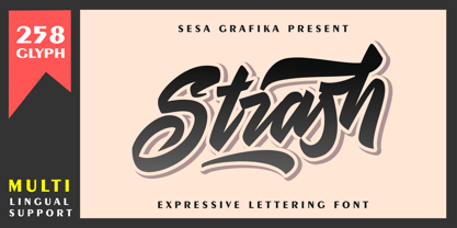 Strash is is designed with a natural expressive handwriting style. This font is perfect for Logo Branding, tshirt design, posters and so much more! Remember that the font is PUA encoded, meaning you can access all delightful glyphs and swashes effortlessly.
 - Spooky Witch by Arkrist Letter,
$13.00 Spooky Witch is the latest Halloween font from Arkrist Letter studio. A serif font designed with elegant characters, but looks scary. Spooky Witch font is suitable for design, logo, greeting card, invitation, etc. make your day more spooky with Spooky Witch!
 - Cute Dog by Yoga Letter,
$15.00 "Cute Dog" is a display font with decorative bones, dog heads, and dog paws. This font is equipped with lowercase, uppercase, numerals, punctuation, and multilingual support. Suitable for posters, business branding, logos, banners, stickers, magazine titles, film titles, and more.
 - Goodbees by ZetDesign,
$15.00 Goodbees is built from a bold base, unique combinations, smooth curves, and sharp edges. Goodbees is best uses for headings, Logo types, quotes, apparel design, invitations, flyers, posters, greeting cards, product packaging, book covers, printed quotes, album covers, movies and more.
 - Thanks Lovely by Yoga Letter,
$15.00 "Thanks Lovely" is a modern handwritten font, featuring a decorated heart on each character. It's perfect for Valentine's Day, Christmas, Thanksgiving, weddings, invitations and more. This font is PUA coded which means you can find all glyphs and glyphs easily!
 - Bresley by Blankids,
$27.00 Introducing a new clean signatures script called Bresley. Bresley came with open type features such contextual alternates, stylistic alternates, ligature, good for signature logo, wedding invitation, romantic quote, logotype, poster, social media kit, book cover, tshirt design, packaging and any more.
 - Avebury by Parkinson,
$25.00 An ultra black blackletter, Avebury Black and Avebury Inline were inspired by an early blackletter from the Caslon Foundry. Early blackletters from the Bruce Type Foundry are also reflected in this slightly modernized and more readable typeface. Caution. For display only.
 - Quintton by TypoBureau Studio,
$15.00 Quintton script is a casual clean brush stroke font, perfect for logo design, branding, invitations, t-shirts print, mock up, magazines, signage and so much more. With its handmade feel, Quintton is perfect for your upcoming projects so don't miss out.
 - Ring Stag by Ochakov,
$14.00 It's important to realize that each of us is unique. I wish Ring Stag will emphasize it. Single but ready for anything. The new Ring Stag is bolder, more dynamic and masculine. New addition to the big family called Ring!
 - Unholy by Natural Ink,
$12.00 Unholy Script is a modern calligraphy design, including Regular. This font is casual and beautiful with swash. Can be used for various purposes. such as logos, product packaging, wedding invitations, branding, headlines, signage, labels, signatures, book covers, posters, quotes, and more.


