10,000 search results
(0.041 seconds)
- Maille by The Paper Town,
$23.00 Maille is a bold display font powered by OpenType, featuring contextual alternates, beautiful ligatures and stylistic sets with just a hint of retro feel. Maille comes with a set of 720+ glyphs and can cover a wide range of projects from branding to advertising, stationery, headers, quotes and so much more. OpenType features include stylistic alternates with lovely swashes, initial and terminal forms and contextual alternates to enhance your text and create beautiful designs. It also includes 139+ standard and discretionary ligatures with multilingual support. The OpenType features can be easily accessed by using an OpenType capable software such as Adobe Illustrator, Photoshop or InDesign. Maille supports multilingual characters for western, central and south-east European languages.
 - Mr Dodo by Hipopotam Studio,
$24.00 Mr Dodo is a hand drawn typeface family with eight styles. Four weights with a rounded version for each one. It has uppercase and lowercase characters with up to three alternate glyphs. Each style was drawn separately. We did not interpolate any glyphs to keep an irregular, organic feeling. This way you can combine different styles without worrying that same characters will look like a awkward copy when standing close to each other. It has build in OpenType Contextual Alternates feature that will automatically set alternate glyphs depending on frequency of appearance of the same character (even in web font but only in HTML5 browsers). The script doesn’t just throw random glyphs.
 - Mitta Githa by Jinan Studio,
$20.00 "Mitta Githa" is more than just a font, it's a vehicle for expressing love and style in your designs. With its carefully crafted letters, alternates, and romantic style, it empowers you to infuse your projects with a touch of elegance and heartfelt emotion. Whether you're planning a Wedding, crafting a Valentine's Day surprise, or adding a loving touch to your design project, "Mitta Githa" will be your faithful companion in delivering messages of love and style. Features A set of uppercase and lowercase glyphs Number, symbol, and punctuation Multilingual Support Alternates and ligatures Heart Connecting So easy to use Heart Connecting Access by keyboard Key plus ' + ' to feature Heart Connecting 1 Key equal ' = ' to feature Heart Connecting 2
 - Klapt Cyrillic by SevenType,
$29.99 Klapt Cyrillic is a geometric sans serif family that is soft on the outside and sharp on the inside. This font family of four weights includes an extended character set supporting most Latin languages and extended Cyrillic — even Vietnamese, Serbian, Bulgarian and many more. Klapt Cyrillic can be bold or very elegant and is well suited for designs ranging from branding and corporate identity to editorial design or web design. It has a timeless style and is great for display purposes, especially for headlines, posters, magazines, book covers, logos... you name it! Feel free to share your designs using Klapt Cyrillic or just get in touch via email to hi@seventype.com. Klapt Cyrillic is the extension of Klapt.
 - Novecento Carved by Synthview,
$22.00 Novecento Carved is a layered font family. It is designed to be paired with the 2013 version of Novecento Sans , used as base layer. Each glyph of each style of Novecento Carved (around 18.000) was manually reviewed and adjusted to overcome the limitations of an automatic interpolation algorithm. The minimalism of its construction makes it super easy to achieve a bas-relief or engraving effect just switching luminosity values among the two layers (carved and sans). Novecento Carved was selected and displaying on Typodarium 2018, the 18th of June. Webfont usage: to make Novecento Sans and Carved to align properly, please apply these settings when generating your webfonts: Hinting = native; Line Height Adjustments = native.
 - Wubberly by Set Sail Studios,
$16.99 Add some Y2K-inspired bubble typography to your designs with Wubberly! A fun, flowing, and irresistibly gloopy font set containing 2 sets of uppercase characters, as well as 50 swashes and shapes to compliment your bubble text. Whether your project needs a nostalgic pop or just something fun and eye-catching, it's an undeniably playful choice for display text, logo designs, product packaging, social media and more. Try applying your own 3D textures to it for extra wow factor—chrome, liquid, bubble, slime, the choice is yours! Wubberly contains language support for English, French, Italian, Spanish, Portuguese, German, Swedish, Norwegian, Danish, Dutch, Finnish, Indonesian, Malay, Hungarian, Polish, Croatian, Turkish, Romanian, Czech, Latvian, Lithuanian, Slovak, Slovenian.
 - Bakeshop by Melvastype,
$29.00 Bakeshop is a casual script font family. It is drawn with rounded marker so the contrast is quite low. It has bumps at the end of strokes where the pen has stopped and the ink has spread. Bakeshop includes three weights and has both connecting and non-connecting versions. Connecting Bakeshop versions has OpenType features like Final Forms, looping connections with lowercase e, high connecting stroke with ascenders and plenty of discretionary ligatures. You can enable Final Forms either enabling Final Form feature or Contextual Alternates. If you want to use the high connection strokes with ascenders enable Stylistic Alternates or Stylistic Set 2. And if you like to use the ligatures just enable Discretionary Ligatures feature.
 - Instant Harmony by Hanoded,
$15.00 Wouldn’t it be nice to have a pack of Instant Harmony in your cupboard? Just add water and *poof* - all strive and struggle have gone, having been replaced by peace and quiet. The grass seems greener, the sky bluer and the air smells like a fresh mowed lawn. Ahhhh! Zap! Back to reality. There is no instant harmony, don’t go looking for it in your local supermarket! If you want a taste of something resembling instant harmony, then add this super-duper font family to your collection and use it for your designs. You may find that your creativity levels are up, your morning coffee tastes better and your designs look exactly like you had in mind. Pinky promise!
 - Goose Creek JNL by Jeff Levine,
$29.00 The hand lettered credits from the 1942 British film comedy “The Goose Steps Out” became the model for Goose Creek JNL, a simple sans serif design available in both regular and oblique versions. According to the Internet Movie Database (imdb), “A bumbling teacher turns out to be the double of a German general. He is flown into Germany to impersonate the general and cause chaos and hilarity in a Hitler Youth college.” The title is a parody of the “goosestep” style of marching by German soldiers during World War II. As a variant on the movie’s title, the font was named for Goose Creek, South Carolina – a charming community just northeast of historic Charleston.
 - Rhope by Linecreative,
$14.00 Introducing "Rhope," an enigmatic and expressive hand-sketched font that captures the essence of untamed creativity. Crafted with the raw energy of a pencil, this font exudes the captivating charm of scribbled artistry. "Rhope" is not just a font; it's a visual experience that brings a sense of spontaneity and intrigue to your projects. With its distinctive hand-drawn appearance, "Rhope" is uniquely suited for a variety of themes, making it a versatile choice for your creative endeavors. Embrace the dark and mysterious with its inherent horror vibes, or infuse a playful spirit into your designs for a fun and whimsical touch. This font seamlessly transitions between genres, offering a dynamic quality that adapts to your creative vision. Perfectly poised for brand titles, "Rhope" adds an element of authenticity and originality to your visual identity. The irregular lines and organic imperfections create a personalized and human touch, setting your brand apart with a memorable and artistic flair. Whether you're working on chilling horror projects, lighthearted and fun designs, or establishing a brand identity that stands out, "Rhope" is your go-to font. Its versatility and handcrafted nature make it a valuable asset for designers seeking a font that breaks free from the ordinary and injects character into their work.
 - Sleeve Notes by Wing's Art Studio,
$12.00 Sleeve Notes: A font from the analogue age. Inspired by album covers and hand-written song lyrics. Sleeve Notes is an experimental script font and all-caps pair with a loose hand-written style that explores the golden-age of record stores, vinyl albums, cassettes and CDs. It imagines our teenage selves kicking back with a coke (oversized headphones on) discovering a new band and studying the notes on their latest album. Besides production credits, the best sleeves (otherwise known as liner notes) included photos, cool artwork and hand-written song lyrics that gave the listener a human connection to the mind of the artist. This font embraces it's subtle ink blotches and rough edges; all imperfections that build to create a sense of a hastily written lyric, set-list or just a fun little scribble. The package includes six fonts in total; the regular script with two complete sets of alternatives, then two sets of all-caps, and finally the special characters font that features a decorative alphabet plus symbols and underlines. For authentically retro, hand-made looking lettering, it's a great choice and offers the flexibility few other fonts can match. Check out all the visuals to see it action!
 - PF DIN Display Pro by Parachute,
$79.00 While DIN Display seems to retain DIN’s basic characteristics, it shines with its sharper corners and contemporary look. Completed in 2002, it was first released and published in Parachute’s award-winning 2003 catalog and immediately was a hit. It has been used successfully in magazines, corporate applications and packaging in fields such as music, fashion, technology, visual arts. The ‘Pro’ series has been enhanced with more weights, multilingual support and opentype features in all different styles. Specifically, this superfamily supports simultaneously Latin, Greek and Cyrillic, while each one of its 15 weights contains 1197 glyphs and 20 opentype features. Additionally, every font in this superfamily has been completed with 270 copyright-free symbols, some of which have been proposed by several international organizations. This is a set of very useful daily symbols for packaging, branding and advertising. Symbols for public areas, environment, transportation, computers, fabric care and urban life.
 - Riff by estudioCrop,
$24.90Having spent all of my teenage years in the 90s, it's no surprise that this very particular decade resonates so deeply in me. As a graphic designer, I still think the strongest visual languages of the last 50 years or so come from that time. Bold aggressive attitude is what most people remember from those designs. What they seem to forget—or, rather, to have completely ignored—is that some incredibly elegant and subtle styles emerged from those years. It still amazes me how they reflected so well the period in which they were conceived, taking style construction to the next level. Riff is a natural development of some of my thoughts about the 90s. Mixed with a very contemporary feel, it embodies several idiosyncrasies I absorbed over years of exposure to favorite design pieces, fonts, music, films and other cultural products that share the same spirit. - Raljon by Mmarkk,
$22.22 Raljon is a display typeface created by designer and lettering artist Mark Robinson. It is a collaboration between the Mmarkk and Teen-Beat Graphica visual design studios. This single font was created over a period of five years. Mark took great care in finessing each character and making sure that each character would stand on its own and yet simultaneously, be an integral part of the whole. The typeface is inspired by Gothic letterforms, horror novels, speed metal bands of the 1980s, techno and electronic music of the 1990s, and Washington, DC football teams whose stadiums lie in the Maryland suburbs. While it doesn’t have multiple weights, Raljon does have a deep depth and breadth. It has a seemingly endless amount of alternate characters and ligatures. There are nine letter Ms, eight letter As and Fs, seven Rs and Ts, and the list goes on. Even the figures have alternates.
 - Debs by Scholtz Fonts,
$9.95 Debs was inspired by a thank you note sent from one of my friends to another. The recipient liked the handwriting so much that he passed the note on to me after having asked permission from Debs, the writer. I enjoyed the vigor and looseness of the handwriting, as well as admiring its legibility and style. Debs has all the characteristics of modern handwriting: It appears loose, unstructured, and free, while maintaining good form and great legibility. Its baseline is varied, creating an impression of notes written by busy people, while its characters remain well formed and readable. Debs comes in five styles, regular, lite, black, wide and wide-black. Use Debs for advertising, for casual greeting cards, for a casual, handwritten look on music or fashion media. Debs has all the features usually included in a fully professional font. Language support includes all European character sets.
 - Elpy by Wordshape,
$25.00 Elpy is a friendly rounded sans serif workhorse family inspired by all things music! Spanning 22 Condensed and Regular weights with true italics, Elpy will fit right in with your record collection and your font collection! The Elpy family includes language support for Western and Eastern European languages, Greek and Cyrillic. Ian Lynam dreamt up Elpy one day when he visited a record pressing plant outside Tokyo, watching vinyl pellets being melted down and a fresh batch of 7-inch records get pressed. Despite the smell, a seed was planted that would be extruded into Elpy's rounded forms half a year later... Elpy Light and Regular function as highly readable text typefaces, while the bolder and lighter weights are perfect for display work. Elpy's rounded terminals make the family perfect for screen-based work, as well as for print conditions of any resolution—from offset to Risograph.
 - Stubble by Aah Yes,
$12.00Stubble is a distressed grunge font with many useful variations that make things easy. It comes in both a Regular and Bold version, and a Smudged version as if the print block has slipped a little bit just at the vital moment. Also there’s 2 jumbled versions with the letters and numbers, and some punctuation, at odd angles and slightly off-whack; there’s 2 versions with little bits of overprint on most of the main characters (as if the corners of the block or stamp have just caught the paper); a couple of Caps Only versions; plus condensed and expanded versions of the main faces. The Bold version is not an exact expanded version of the Regular version, please note, the characters are different (i.e. the misprinting is different) in the two weights. Western and Central European accented characters are included, and there’s a set of replacements for double-letter combinations such as bb, dd and OO, TT, so that 2 different letters will appear - which avoids having exactly the same grunge letter appearing twice in succession (20 or more pairings for each case, all the pairings that reasonably exist) which work as ligature replacements. The whole family constitutes a comprehensive package that offers a great variety of ways of presenting a grunge typeface for display, headlines and posters, while maintaining the thread of the same sans-serif style. The zip package contains both the TTF and OTF versions of the font. Install only one version on the same machine, installing both versions may produce all sorts of erratic behavior. - Fried Chicken by FontMesa,
$25.00 The name of this font brings back memories of an old fried chicken restaurant in Willow Springs Illinois circa 1960’s and 1970’s, my family would all get in the car and take a long drive down to an old country road Illionis Rt 171 through a forest preserve where we’d come upon the old Willowbrook motel with a bar and restaurant next door. The restaurant was called Kegal’s, when you entered the building you had to walk through the smoky bar first to get to the restaurant, I can still see the hard wood floors with all the finish worn off from decades of foot traffic. Up until the mid 1960’s Kegal’s used to raise their own chickens behind the restaurant, back then fried chicken in the Midwest was either coated in flour or bread crumbs, Kegal’s was covered in a beautiful layer of golden bread crumbs. Before your meal arrived they’d bring a basket of dinner rolls along with crackers, bread sticks and country butter, on the side they’d serve coleslaw with a vinegar sauce, which is very common in the Midwest, the first time you try it your face puckers up like you just sucked on a lemon but you get used it over time. After waiting for what seemed like forever to a child the waitress comes out of the kitchen with a huge tray of that golden deliciousness and your mouth begins to water, in her other hand was another tray filled to overflowing with crinkle cut french fries all made by hand, I’d eat a hole handful of those french fries first then take a bite of that tender juicy farm raised chicken. Today a fine Italian restaurant occupies the old Kegal’s building and the motel is long gone, only my fond memories remain. Fast forward to 2020 and FontMesa has just made some Fried Chicken as an eight weight type font family with alternates. With the Fried Chicken slab serif font family we’ve broken some rules by removing a few of the slabs on certain letters for a unique homemade look. Fried Chicken is perfect for your next product label, t-shirt design, logo, headline or cookbook cover. Treat yourself to some good ol’ Fried Chicken today.
 - Watermint Script by Mans Greback,
$79.00 Watermint Script is a formal typeface that epitomizes the essence of elegance and sophistication. Envisioned for formal settings, its calligraphic strokes evoke a sense of classic beauty, making it an ideal choice for invitations or logotypes that demand a touch of class. Watermint Script is a harmonious blend of cute and lovely, wrapped in a feminine and romantic design. Its light and fresh appearance breathes life into each word, offering a clean and flawless presentation. The font's perfection lies in its attention to detail, with each character exuding a classy aura that enhances the overall visual experience. The font is built with advanced OpenType functionality and guaranteed top-notch quality, containing stylistic and contextual alternates, ligatures and more automatic and manual features; all to give you full control and customizability. It has extensive lingual support, covering all Latin-based languages, from North Europa to South Africa, from America to South-East Asia. It contains all characters and symbols you'll ever need, including all punctuation and numbers. Designed by Mans Greback, Watermint Script is a testament to his commitment to creating fonts that are not just tools of communication, but artworks that enrich the visual landscape.
 - Andron 2 EIR Corpus by SIAS,
$34.90 SIAS opens a new chapter in Irish vernacular typography: the Andron-2-Irish font family. The genes of the insular typographic heritage have been blended with the timeless classical style of the versatile Andron series. Whereas most Irish-style fonts available more or less stick to ancient designs, Andron-2-EIR is different: it’s an entirely new design in which Irishness meets the beauty of a matured Venetian Roman text face. Envision a new horizon for setting Irish text in its own visual mode! Now you can utilize Italics, Semibold and Small capitals for Irish just as you have been doing in other languages for a long time. But the icing on the cake is the fifth font: Andron Irish Middlecase honours the rich medieval tradition of Ireland by a special uncial-style glyph set. It corresponds to the Andron MC series. Last but not least the Irish type connoisseur will relish this font package for it’s unique utilization of Opentype functionality. In Opentype-aware applications, by just ticking a box you can switch to the special insular forms of s and r. By ticking another box you can transform the text from modern-day orthography to the traditional spelling with lenited consonants. This built-in intelligence has never been implemented in any Irish font before. Briefly, the Opentype substitution features are: [Ligatures] – default basic f-ligatures; [Descretionary Ligatures] – more ligatures for typographic reason, mainly t- and long-s-combinations; [Style set 1] – turns all lowercase r and s into their insular glyph variants; [Style set 2] – replaces all consonant-h digraphs by dotted consonants (ḃċḋḟġṁṗṡẛṫ, ḂĊḊḞĠṀṖṠṪ), works for lowercase, uppercase and upper-lowercase alike; [Style set 3] – provides another range of additional special ligatures (for Regular and Italic only); [Oldstyle figures] – turns the default lining figures into proportional oldstyle figures. Andron Irish will also perfectly combine with every other Andron product in mixed settings. For an overview please go to the SIAS main page. For a quick reference go to Andron Latin, Andron Greek, Andron English or Andron MC. For more wonderful new Irish fonts look at Hibernica and Ardagh!
 - ITC Christoph's Quill by ITC,
$29.99ITC Christoph's Quill is just about everything you could want in a typeface: it's distinctive, beautiful, and exceptionally versatile. According to designer Russell Bean, ITC Christoph's Quill is the culmination of experimentation with a graphics tablet that spanned several years. Then one day, as if by magic, it all just fell into place. The design seemed to flow from my pen." Bean was born in Australia and, except for a brief stint with a photo-lettering firm in Southern California, has spent most of his career working down under. "I can recall a deep fascination for the written word," he says. "Even before learning to spell, read or write, I think I recognized that this was a means of visual communication." Bean's first job was in a small ad agency as a trainee in the production department, where he learned art techniques and how to handle print, as well as "the value of visual impressions," he says. His career path meandered from one design job to another, but always in the general direction of fonts and typefaces. Today, his workload consists of logo design commissions, font editing, typography and print production consultation to a select group of loyal clients - still leaving time, notes Bean, "to pursue my type design ambitions." ITC Christoph's Quill began life as a simple, visually striking font of caps, lowercase, punctuation and numerals. To this Bean added a bold weight, for when a little more strength is desirable. Next came a flock of alternate characters. Finally, Bean drew a set of decorative caps, a suite of logos, and a sprinkling of beginning and ending swashes. The net result is a type family that can add a signature flourish to a vast range of projects: from invitations and menus to logos, signage, packaging and more." - Chilopod by Typodermic,
$11.95 Are you looking for a font that will transport you back to the golden age of video games? Look no further than Chilopod—the worm script typeface inspired by the classic arcade game, Centipede. With its bold, connected letters, Chilopod will bring a touch of retro gaming nostalgia to any project. But it’s not just a pretty face—this font also features OpenType ligatures, which allow common letter combinations to flow seamlessly into continuous lines. It’s the perfect blend of form and function. So whether you’re designing a poster for your next gaming tournament or just want to add some playful flair to your branding, Chilopod is the font for you. Try it out today and get ready to level up your design game! Most Latin-based European writing systems are supported, including the following languages. Afaan Oromo, Afar, Afrikaans, Albanian, Alsatian, Aromanian, Aymara, Bashkir (Latin), Basque, Belarusian (Latin), Bemba, Bikol, Bosnian, Breton, Cape Verdean, Creole, Catalan, Cebuano, Chamorro, Chavacano, Chichewa, Crimean Tatar (Latin), Croatian, Czech, Danish, Dawan, Dholuo, Dutch, English, Estonian, Faroese, Fijian, Filipino, Finnish, French, Frisian, Friulian, Gagauz (Latin), Galician, Ganda, Genoese, German, Greenlandic, Guadeloupean Creole, Haitian Creole, Hawaiian, Hiligaynon, Hungarian, Icelandic, Ilocano, Indonesian, Irish, Italian, Jamaican, Kaqchikel, Karakalpak (Latin), Kashubian, Kikongo, Kinyarwanda, Kirundi, Kurdish (Latin), Latvian, Lithuanian, Lombard, Low Saxon, Luxembourgish, Maasai, Makhuwa, Malay, Maltese, Māori, Moldovan, Montenegrin, Ndebele, Neapolitan, Norwegian, Novial, Occitan, Ossetian (Latin), Papiamento, Piedmontese, Polish, Portuguese, Quechua, Rarotongan, Romanian, Romansh, Sami, Sango, Saramaccan, Sardinian, Scottish Gaelic, Serbian (Latin), Shona, Sicilian, Silesian, Slovak, Slovenian, Somali, Sorbian, Sotho, Spanish, Swahili, Swazi, Swedish, Tagalog, Tahitian, Tetum, Tongan, Tshiluba, Tsonga, Tswana, Tumbuka, Turkish, Turkmen (Latin), Tuvaluan, Uzbek (Latin), Venetian, Vepsian, Võro, Walloon, Waray-Waray, Wayuu, Welsh, Wolof, Xhosa, Yapese, Zapotec Zulu and Zuni.
 - Electrone by Alit Design,
$21.00 💥Introducing "Electrone" – Unleash the Power of Typography with a Superhero Flair! Unleash the electrifying energy of "Electrone," a dynamic font that embodies the essence of superheroes with lightning speed, unmatched strength, and a dash of style. This font is not just a typeface; it's a superpower for your design projects! Key Features: Electrifying Glyphs: With 890 meticulously crafted glyphs, "Electrone" offers a vast array of characters that will add a powerful punch to your designs. Every glyph is a superhero in its own right. Sided Ligature: Seamlessly blend characters with our specially designed sided ligatures, creating a visual impact that resonates with strength and unity. Alternate Characters: Customize your text with alternate characters to give your designs a unique and personalized touch. The alternates are carefully curated to ensure versatility without compromising the superhero aesthetic. Lightning Swash: Add a bolt of energy to your typography with lightning swashes that strike through your text. Watch your words come to life with the electrifying force of "Electrone." Wings of Typography: Elevate your designs to new heights with the winged elements included in "Electrone." These wings symbolize the freedom and power associated with superheroes, making your text soar above the ordinary. Suit Up Your Designs: "Electrone" is not just a font; it's a complete superhero costume for your words. Whether you're working on comic book titles, posters, logos, or any design that demands a bold statement, "Electrone" is here to save the day. Perfect for: Comic Books and Graphic Novels Superhero Movie Posters Action-packed Logos Gaming Graphics Apparel Design and more! Embrace the electrifying power of "Electrone" and turn your designs into epic adventures. Download now and witness the transformation of ordinary into extraordinary!
 - Sweet Square Pro by Sweet,
$59.00 The Engraver’s Square Gothic—like its rounder cousin, the engraver’s sans serif, Sweet® Sans,has been one of the more widely used stationer’s lettering styles since about 1900. Its minimal forms, made without curves, were popularized long ago by bankers and others seeking a serious, established feel to their stationery. One might argue that the design is a possible precursor to Morris Fuller Benton’s Bank Gothic® typeface. Sweet® Square is based on antique engraver’s lettering templates called “masterplates.” Professional stationers use a pantograph to manually transfer letters from these masterplates to a piece of copper or steel that is then etched to serve as a plate or die. This demanding technique is rare today given that most engravers now use a photographic process to make plates, where just about any font will do. But the lettering styles engravers popularized during the first half of the twentieth century remain both familiar and appealing. Referencing various masterplates, Mark van Bronkhorst has drawn Sweet Square in nine weights. The sources offered just uppercase, small caps, and figures, yet similar, condensed examples had a lowercase, making it possible to interpret a full character set for Sweet Square. Italics were also added to give the family greater versatility. The fonts are available as basic, “/fonts/sweet/square/” character sets, and as “Pro” character sets offering special characters, a variety of typographic features, and full support for Western and Central European languages. Sweet Square gives new life to an uncommon class of typeface: an early twentieth-century commercial invention that brings a singular verve to modern design. Its unique style is as useful as it is novel. Bank Gothic is a registered trademark of Grosse Pointe Group LLC.
 - Ardena Variable by Julien Fincker,
$185.00 About Ardena: Ardena is a modern sans-serif typeface family. While neutral and clear at first glance, it can be characterized as both pleasant and confident due to its open, rounded forms and vertical terminals. It can be used in both a restrained and expressive way. The thinner and thicker weights are particularly suitable for strong headlines, while the middle weights can be used for typographic challenges and body text. Completed with an extensive character collection, it becomes a real workhorse. A versatile allrounder that is up to all challenges – for Corporate Identity, Editorial, Branding, Orientation and Guidance systems and much more. Variable Font The Variable Font contains 2 axes: weight and oblique – all in just one file. Features: With over 1064 characters, it covers over 200 Latin-based languages. It has an extended set of currency symbols and a whole range of Open Type Features. There are alternative characters as stylistic sets, small caps, automatic fractions – just to name a few. Arrows and numbers: In particular, the extensive range of arrows and numbers should be highlighted, which are perfectly suited for use in orientation and guidance systems. Thanks to Open Type Features and an easy system, the various designs of arrows and numbers can also be simply "written" without first having to select them in a glyph palette. The principle is easily explained: If a number is placed in round or square brackets, it will automatically be displayed in an outlined circle or square. If you add a period to the number, it is displayed in a full circle or square. The same principle also applies to the arrows. The arrows themselves are combinations of greater/less symbols with the various slashes or hyphens. Get the static version of the Ardena family here: https://www.myfonts.com/fonts/julien-fincker/ardena/
 - HWT Konop by Hamilton Wood Type Collection,
$24.95 HWT Konop is a monospaced (fixed-width) typeface that is also square! Designed by Mark Simonson (Proxima Nova) as square characters that can be arranged vertically or horizontally and in any orientation. To a traditional letterpress job printer, a font like this wouldn’t make much sense. But to a modern letterpress printer it is an unusual and creative design toolkit. The bold gothic style is reminiscent of gothic wood types but more geometric. Since the characters are meant to be used in any orientation, the usual optical adjustments, such as making verticals thicker than horizontals and making tops smaller than bottoms are set aside. This results in a quirky but charming design. To provide more design options, Simonson came up with a modular system consisting of three sizes: 12-line, 8-line, and 6-line. These three sizes can be used together like Lego® bricks, with endless arrangements possible. And the sidebearing match so that characters always align when different sizes are used together. The digital version of Konop replicates the wood type version as much as possible, including the three different size designs. It includes OpenType stylistic sets that allow most characters to be rotated in place, 90° left, 90° right, or 180°, just like the wood type version. Extra characters not available in the wood type version are included with the digital fonts. The set of 3 is priced just $5 more than one single font, so order via "Package Options" HWT Konop is named for Don Konop, a retired Hamilton Manufacturing employee, who worked from 1959 to 2003. In addition to serving on the Two Rivers Historical Society Board from 2004 to present-day, he was also instrumental as a volunteer in helping with the museum’s move to its current home in 2013.
 - Compasso by Plau,
$30.00 The idea that mathematical precision and the supposed "purity" of geometric forms are part of the discourse of us graphic designers is not new. Studying typography for some time now and learning about all the small alterations and adjustments that this geometry undergoes to better adapt to the imperfect human eye, I found myself with a new way of seeing things. Compasso is, in a way, a result of my growth as a designer. Established and recognized fonts like Futura, Avenir, and their predecessors (including Tempo - published by the Ludlow foundry in the early 20th century) informed the result of Compasso at some level. Others opened my mind to possibilities. Mallory, Azo Sans, the font designed for Audi by Bold Monday, and many other contemporary sans-serif fonts that left me speechless are also responsible for details present in this font. From the first sketch, the family grew on both sides, gaining condensed and extended counterparts. From there - and from a brilliant insight from designer Nicole Rauen - I learned that Compasso was not about geometry. Compasso is about rhythm. It's about the rhythmic movement that provides a foundation, supports, and also makes you dance and swing. My musical taste is too eclectic, I can go from classical to funk in less than two songs on Spotify. Compasso is also eclectic. It's a font to take your project anywhere, a record to listen to on any occasion.
 - Atomgeek by PizzaDude.dk,
$20.00Atomgeek is inspired by old arcade games. Use it for your comics - especially the ones with superheroes and their counterparts! The capital letters have lightning flaming out of the left side, and if you want them flaming out of the right side then just use the Open Type Stylish Alternates! You will need to use OpenType supporting applications to use the autoligatures. - Avehits by Haksen,
$19.00 AVEHITS are the family of modern display style with Uppercase and Lowercase feel nice balanced and looks incredible. Honestly it works perfectly for headlines, logos, posters, packaging, T-shirts and much more. Recommended to use in Adobe Illustrator or Adobe Photoshop with opentype feature. If you have questions, just send me a message and I’m glad to help. Have a great day, Haksen
 - Baby Boho by Bosstypestudio,
$12.00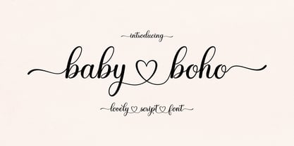 Introducing Baby Boho Baby Boho with a smooth handwriting style and very pretty and lovely. Baby Boho is perfect for branding projects, home appliance design, product packaging, use in business cards, invitation cards, etc. Just like a stylish text overlay to a wallpaper or anything that needs a touch of love. Thanks for checking! I really hope you enjoy it.
 - Hey Magdison by Amelia Studio,
$12.00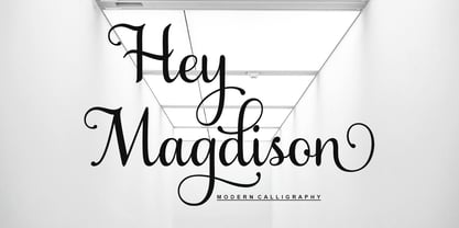 Introducing Hey Magdison Hey Magdison with a smooth handwriting style and very pretty and lovely. Hey Magdison is perfect for branding projects, home appliance design, product packaging, use in business cards, invitation cards, etc. Just like a stylish text overlay to a wallpaper or anything that needs a touch of love. Thanks for checking! I really hope you enjoy it.
 - Nordika by Scholtz Fonts,
$19.00Nordika is an understated, elegant, sans serif face with that clean legible corporate look. Its simple, trendy design makes it distinctive enough for display work. It makes a bold statement and is highly readable. Nordika is both condensed and quite bold and is therefore suitable for body text where some emphasis is required. Great for text and headlines - for just about any application. - Mr Mixter by Letterhead Studio-YG,
$34.00 Mr. Mixter designed to blend everything with everything. Mix Latin letters with Cyrillic letters, add numbers as letters — just have fun with the mixing process. As a result, you might get a funny and cute Christmas card. Attention! Work only by hand, using the Glyphs menu in Illustrator or InDesign. Look carefully and you will find a lot of fun.
 - Benetti Grotesk by Craft Supply Co,
$15.00 Benetti Grotesk is a modern sans serif inspired by grotesque typeface construction with few contemporary sense in the details that make it look more attractive for a display typeface. It can be used to create almost all types of design projects like print materials. Just use your imagination and your project will become more alive and look great than ever with this typeface.
 - Belhampton by Greater Albion Typefounders,
$18.00 Belhampton is a lively display family, full of the spirit of the Edwardian era. Six typefaces are offered: regular, bold, light, oblique, embossed and outline. All include an extensive range of stylistic alternates and discretionary ligatures, as well as lining and old-style numerals. Belhampton is ideal for poster and display work, or just the thing for any piece of Belle Epoque design.
 - FF Schulschrift by FontFont,
$131.99 Dutch type designer Just van Rossum created this script FontFont in 1991. The family has 20 weights and is ideally suited for advertising and packaging, book text, film and tv, editorial and publishing as well as logo, branding and creative industries. FF Schulschrift provides advanced typographical support with features such as alternate characters. It comes with tabular lining and proportional lining figures.
 - Lavatype AOE by Astigmatic,
$19.95Lavatype is an amorphous typestyle born from pools of bubbling magma. I highly reabable but playful typeface, it works well for headline and minimal text based needs. Just what is that sludge in those lava lamps anyways...? Add some spunk funk to your designs with Lavatype today! From a scary typestyle feel, to a distressed look, Lavatype is burning for you! - Speakons by Alex Schnaible,
$20.00 The Speakons are made out of 500 icons in three different styles. They change automatically into icons by typing the right words through its OpenType feature. It was specially designed to break down our language barriers. To be understood internationally. It’s also perfect if you just need a huge icon family. Give it a try! You don’t want to miss it.
 - Pardon Me Boy! by Greater Albion Typefounders,
$8.00 Pardon me boy, is that the Chattanooga Choo-choo? Well, not quite, but "Pardon Me Boy!" is a set of silhouette based ornaments capturing railway locomotives and rolling stock from around the world. Use it to form up trains to make suitable themed rules and borders, or just for fun anywhere a bit of locomotive power will add life and movement!
 - Matita Connected by Trine Rask,
$12.00 Warning: works with contextual alternate-feature, which is not showing here. Matita Connected is part of a larger type family developed from 2005-2019 with handwriting in mind. A solid script face in two weights and a dotted instructional version. With alternative glyphs based on different writing habits. For teaching, teaching material or just typography. An unchildish handwritten type family for many purposes.