8,998 search results
(0.021 seconds)
- Bilya Layered by Cerri Antonio,
$30.00 Since 2010 I started my research and experimentation in layered fonts, and I immediately understood that the future of creative graphic fonts is precisely the exploration of it. Over the years I have tried different expressions on the use of the layered system ... but I realized that my propensity to use colors in the font led me to the creation of BILYA. The real creative cue of BILYA is the wonderful childhood memories where nostalgia for them generated the creation of it, which I dedicate to all lovers of glass marbles classic game and beyond. BILYA Base, Outline, Color One, Two, Three, Four, Five and Color Six is a 8 font system that can be layered in different ways to create infinite title effects used commonly in poster and logo design, in flat gradient color style for spectacular 3D emboss styles or realistic 3D logos design projects. BILYA’s layer combinations give you complete control in producing styles like, modern, 3D, beveled. It can be used alone and/or in layered and allows you adjust leading and kerning. Each font contains the similar metrics, so when your title is set, copy and paste in same position to create different layers styles combinations to build out your desired effect. BILYA works great in any graphics application that allows you to utilize layers or 3D graphics effects.
 - Agathe Ledden by Sabrcreative,
$25.00 Discover Agathe Ledden, a captivating brush script font that brings a dynamic and expressive touch to your designs. With its fluid brush strokes, Agathe Ledden exudes a sense of energy and authenticity, making it perfect for adding a personal and artistic flair to your projects. Whether you're designing logos, branding materials, posters, or social media graphics, this versatile script font is sure to leave a lasting impression. Agathe Ledden offers a harmonious blend of uppercase and lowercase letters, ensuring a seamless flow and balance in your typography. Its natural and organic appearance creates a handcrafted feel, evoking a sense of warmth and personality in your designs. With the inclusion of numbers and punctuations, Agathe Ledden ensures that your message is communicated effectively and professionally. This script font is not limited by language barriers, as it features multilingual support. It allows you to reach a global audience and incorporate different languages seamlessly into your designs. Whether you're targeting local or international markets, Agathe Ledden enables you to connect with diverse audiences and create a truly inclusive experience. Agathe Ledden also features PUA encoding, granting easy access to a variety of ligatures. These ligatures add stylistic variations and decorative elements, giving you the freedom to customize and enhance your text. The versatility of Agathe Ledden allows you to create unique and captivating designs that reflect your individual style and vision.
 - Gelato Luxe by Eclectotype,
$60.00 Back in 2011, Gelato Script was the best-selling brush script font on MyFonts, and has remained popular, appearing on everything from designer handbags to primetime TV shows; from food blogs to wedding invitations; from glossy magazines to (not so imaginatively!) ice cream shops. All these years on, and it struck me that there is much that could be improved on; there are certain glyphs that never quite felt right. So I decided to update Gelato Script, and this is the result, Gelato Luxe. What started as a simple update quickly spiralled into a total overhaul. There is not a single glyph in the new version that’s the same. The entire font has been tweaked and tinkered with and redrawn and respaced and rekerned to get it to this point. While I wanted to maintain the feel of Gelato Script, Gelato Luxe represents a massive leap in sophistication, with new alternates for smoother connections, and a totally new OpenType engine, with no fewer than seventeen stylistic sets. Gelato Luxe is a truly versatile script font. You can effortlessly change the feel by playing with the many OpenType features. Make sure contextual alternates and standard ligatures are switched on, and it will work like a charm right out of the box. See also Gelato Fresco for a further updated version, this time with extra weights!
 - Le Havre Hand by insigne,
$- Le Havre. It's a family with no lack of characters diverse, yet none are as deep or tested in their appearance as the weathered, hand-drawn texture of Le Havre Hand. Tall and lean, the well-aged face carries with it the stories of a thousand miles. Starting with a sans as its origin, this handwritten font's layered structure has been shaped through time and trial, ultimately capturing the simple beauty of a wise, experienced character. This layer-based font family includes style variations and new layering solutions. Le Havre Hand includes 21 font files. It also includes an outline, crosshatched versions and five inline variations, several extruded variants including a unique wireframe options. There are two extruded fonts and two drop shadow fonts. For users that have Opentype programs, such as Adobe Illustrator, Photoshop, InDesign, Microsoft Publisher and Quark, each font also comes with an established set of art deco alternatives. Le Havre Hand's alternate characters come together to exhibit a clear sensitivity to the art deco style. Use them on their own or increase your options by using them with any of the other members of the Le Havre family. Take time to look deep into the soul of Le Havre Hand. It's often the tested, weathered hand that is most reliable to guide you to success.
 - Brinca by In-House International,
$7.50 Brinca is an intrepid ‘full spectrum’ typeface with emotional range and a dynamic heart. Morphing sharp tight pleats that relax into office ready neutral sans, then plump into joyful bouncy letters with mesmerizing fluency, Brinca is ready to adapt to a wide variety of expressive needs. Named after its jumping extremes of the type’s styles; from coiled spring to stuffed and bouncy, Brinca is also a leap into new possibilities for display type design. Because of its chameleon-like range of styles, Brinca is a versatile workhorse. It’s a great choice for brand identities ready to embrace expressive range, and it’s perfect for fine-tuned packaging, events promotions, merch, product lines, and much more. WIth its very wide spectrum of options, It’s a single typeface that can be used to design a library’s worth of book covers. (We put it to the test!) About Brinca was designed by Alexander Wright and Rodrigo Fuenzalida with Michu Benaim Steiner for In-House Int’l foundry, the type foundry of brand consultancy In-House International. It was developed by Rodrigo Fuenzalida at FragType, and available through YouWorkForThem. In-House foundry offers bold, fearless, and expressive, display typefaces that tell a story. Its previous releases have been featured on Design Milk, DesignBoom, Slanted, PAGE. They’ve also been used to create standout work by designers around the world, and even won some awards.
 - San Giuseppe by Mans Greback,
$59.00 San Giuseppe is a serif font with finesse and unique charm. Inspired by the romantic, ornate style of the Victorian era and the bold, captivating geometry of Art Deco, San Giuseppe is the perfect blend of neo-classic and vintage aesthetics. This serif font family is designed to infuse your work with an air of grace and refinement that is sure to leave a lasting impression. Ideal for wine labels, luxury branding and high-end packaging, San Giuseppe is an all-capitals font, featuring a stunning array of alternate characters that allow you to create a truly bespoke typographical experience. With its fine, intricate serifs and delicate, artistic letterforms, this font is a testament to the beauty and craftsmanship of yesteryear, created for a modern setting. The San Giuseppe font family consists of six high-quality styles: In addition to the Regular font, it is provided in both Bold and Light, and each of the weights as Italic. The font is built with advanced OpenType functionality and has a guaranteed top-notch quality, containing stylistic and contextual alternates, ligatures and more features; all to give you full control and customizability. It has extensive lingual support, covering all Latin-based languages, from Northern Europe to South Africa, from America to South-East Asia. It contains all characters and symbols you'll ever need, including all punctuation and numbers.
 - Lumina by Scholtz Fonts,
$21.00Lumina combines a fluid, informal look with an upright, fairly formal character structure. The font is reminiscent of leaded or stained glass, suggesting a trying to-be-solid outline with flowing inner spaces. Characters are softened by the use of staggered heights and slightly irregular widths, creating the impression of hand-crafted, ink-drawn shapes. Lumina is unusual in that it gives a medieval treatment to a modern character outline. The outline has been given an irregular, slightly hand-crafted look that is at variance with its modern character and hints at both the informality of a grunge font and the carefully hand-drawn quality of medieval illuminated scripts (hence its name). It is one of the few informal, compressed fonts that retains a high degree of legibility. Use it when you want your text to be both relaxed and readable, and yet take up very little space on the page. Lumina Regular is not an outline font in the usual sense, since it contains one or more rounded hollows or lacunae within its outline. Use Lumina for: —Ecclesiastical book headings and illustrations —Church posters —Book covers —Greeting card design —Advertisements —The "fine print" The font contains a full 256 character set (upper and lower case, punctuation, diacritical characters, special symbols and numerals), in which all characters have been fully kerned and letter-spaced. - Wooden Alphabet by Yumna Type,
$25.00 Wooden Alphabet is a peculiar wood texture and shape-inspiring display font having unique, attractive letter designs in prominent uppercases along with wood textures to express natural nuances. All of the font letters are very carefully, smoothly designed in detail as if they were made of real wood. In fact, wood textures on the letters leave the impressions of warmth and nature on the designs. Wooden Alphabet excels at the ability to create natural impressions and warm nuances in order to make your designs look interestingly different for increasing the product’s attractiveness. Such a wood-themed font is a perfect match for any nature, environment, or organic related products. To be greatly legible, you can use it for big text sizes. Wooden Alphabet provides a clipart in accordance with the font theme as a bonus and features you can enjoy. Features: Multilingual Supports PUA Encoded Numerals and Punctuations Wooden Alphabet fits best for various design projects, such as brandings, headings, magazine covers, quotes, printed products, merchandise, social media, etc. Find out more ways to use this font by taking a look at the font preview. Thanks for purchasing our fonts. Hopefully, you have a great time using our font. Feel free to contact us anytime for further information or when you have trouble with the font. Thanks a lot and happy designing.
 - TessieMiscellaneous by Ingrimayne Type,
$13.95 A tessellation is a shape that can be used to completely fill the plane—simple examples are isosceles triangles, squares, and hexagons. Tessellation patterns are eye-catching and visually appealing, which is the reason that they have long been popular in a variety of decorative situations. These Tessie fonts have two family members, a solid style that must have different colors when used and an outline style. They can be used separately or they can be used in layers with the outline style on top of the solid style. For rows to align properly, leading must be the same as point size. To see how patterns can be constructed, see the “Samples” file here. Shapes that tessellate and also resemble real-world objects are often called Escher-like tessellations. Most of the shapes contained in TessieMiscellaneous are Escher-like tessellations. Most or all of these shapes were discovered/created by the font designer during the past twenty years in the process of designing maze books, colorings books, and a book about tessellations. (Earlier tessellation fonts from IngrimayneType, the TessieDingies fonts, lack a black or filled version so cannot do colored patterns. The addition of a solid style that must be colored makes these new fonts a bit more difficult to use but offers far greater possibilities in getting visually interesting results.)
 - Parisi by Eurotypo,
$34.00 The Parisii was a small Gallic people settled in the current Paris region, which gave its name to the city of Paris. According to Caesar (53 BC.), their main town (oppidum) was Lutetia (Paris). Parisii was born of inspiration to be leafing through some old magazines on the terrace of a cafe in the beautiful city that is Paris. Parisi is like the city: casual, youth, romantic, free spirited and, at the same time, sophisticated, elegant and classic. The Parisi family font is a lovely and casual handlettering script, which is based on gestual calligraphy. Parisi has a slight bounce and intentional irregularity giving your words a wonderful flow. Fat and thin stroke in this font impresses the harmony. Parisi consists of 3 subfamilies: Regular, Italic and Condensed. This font includes Parisi font has OpenType features such as Stylistics and Contextual alternates, swashes, Standard and Discretional Ligatures, stylistic sets and ornaments that allow you to mix and match pairs of letters to fit your design. This will help your creativity and make it easier to make the impressive and elegant typographic work. This OpenType features may only be accessible via OpenType-aware applications, a Central European language support. Parisi looks lovely on wedding invitations, greeting cards, logos, business-cards and is perfect for using in ink or watercolour based designs, fashion, magazines, food packaging and menus, book covers and more!
 - Dominant Youth by Fikryal,
$25.00 Introducing Dominant Youth, a bold and impactful display serif font that exudes confidence and strength. With its commanding presence, Dominant Youth is designed to make a lasting impression on any creative project. The font’s robust and assertive letterforms showcase a unique blend of classic elegance and contemporary style. Its tall and slender structure adds a touch of sophistication, while the sharp serifs give it a distinctive edge. Dominant Youth is carefully crafted to capture attention and evoke a sense of boldness and youthfulness. Whether you’re working on branding, editorial design, headlines, posters, or any other project that demands attention, Dominant Youth is the perfect choice. Its versatile nature allows it to excel in both digital and print mediums, ensuring your message stands out in a captivating manner. The well-defined characters of Dominant Youth provide excellent legibility, even at smaller sizes. The font’s wide range of weights and styles offers flexibility, allowing you to experiment and find the perfect balance for your design needs. From light and elegant variations to bold and impactful options, Dominant Youth empowers you to create visually striking compositions that leave a lasting impression. Don’t settle for ordinary typography when you can make a statement with Dominant Youth. Embrace its commanding presence, embrace its youthful energy, and elevate your designs to a new level of distinction. Features: Dominant Youth Multilingual Support Thank you
 - Alimentary by Missy Meyer,
$12.00 Alimentary (adjective): relating to nourishment or sustenance. If you've seen my other fonts, you know I tend to lean into food-based names. This name has to do with food and science combined, so it's double nerdy in the ways I like to be nerdy! I started with Alimentary Medium, which was inspired by my shorter, wider font MacGuffin - I wanted something taller, narrower, with a hip and retro feel. When I finished the Medium weight, I felt like I wanted a Light weight. Then a Heavy weight. Then I figured, "what the heck," and made an outline version of the Medium weight too. In the end, I wound up with four members of the Alimentary family, each with over 700 glyphs! Not only do they all have the basics (A-Z, a-z, 0-9, and tons of punctuation), but they also each have 330 characters for European language support, and a limited selection of Greek, Coptic, and Cyrillic characters. Plus a double handful of alternates and ligatures to add a little variety to your designs! And of course, all of the Alimentary fonts are super-smoothed, with reduced nodes and clean curves, so whether you're cutting them out, printing them, engraving them, or using them in a way I haven't even thought of, these fonts will be sharp and crisp!
 - TessieAnimals by Ingrimayne Type,
$18.95 A tessellation is a shape that can be used to completely fill the plane. Simple examples are isosceles triangles, squares, and hexagons. Tessellation patterns are eye-catching and visually appealing, which is the reason that they have long been popular in a variety of decorative situations. These Tessie fonts have two family members, a solid style that must have different colors when used and an outline style. They can be used separately or they can be used in layers with the outline style on top of the solid style. For rows to align properly, leading must be the same as point size. To see how patterns can be constructed, see the “Samples” file here. Shapes that tessellate and also resemble real-world objects are often called Escher-like tessellations. This typeface contains many Escher-like tessellations that resemble animals including horses, goats, rabbits, fish, frogs, and other vertebrates. Most or all of these shapes were discovered/created by the font designer during the past twenty years in the process of designing maze books, coloring books, and a book about tessellations. (Earlier tessellation fonts from IngrimayneType, the TessieDingies fonts, lack a black or filled version so cannot do colored patterns. The addition of a solid style that must be colored makes these new fonts a bit more difficult to use but offers far greater possibilities in getting visually interesting results.)
 - TessieFlyingBirds by Ingrimayne Type,
$19.95 A tessellation is a shape that can be used to completely fill the plane—simple examples are isosceles triangles, squares, and hexagons. Tessellation patterns are eye-catching and visually appealing, which is the reason that they have long been popular in a variety of decorative situations. These Tessie fonts have two family members, a solid style that must have different colors when used and an outline style. They can be used separately or they can be used in layers with the outline style on top of the solid style. For rows to align properly, leading must be the same as point size. To see how patterns can be constructed, see the “Samples” file here. Shapes that tessellate and also resemble real-world objects are often called Escher-like tessellations. This typeface contains many Escher-like tessellations that resemble flying birds. Most or all of these shapes were discovered/created by the font designer during the past twenty years in the process of designing maze books, colorings books, and a book about tessellations. (Earlier tessellation fonts from IngrimayneType, the TessieDingies fonts, lack a black or filled version so cannot do colored patterns. The addition of a solid style that must be colored makes these new fonts a bit more difficult to use but offers far greater possibilities in getting visually interesting results.)
 - Southwest Serenade JNL by Jeff Levine,
$29.00 The 1940s-era hand-lettered title on vintage sheet music for the song hit "Donkey Serenade" had an interpretation of the classic typeface "Broadway" used in a Mexican/Southwest motif with wavy lines cutting through the letters. Adapting Playwright JNL (itself, a hand-lettered interpretation of "Broadway") to this style, the festive design is now a digital typeface called Southwest Serenade JNL.
 - Tango by ITC,
$40.99Colin Brignall designed the Tango typeface in 1974. A groovy swirl of a font, Tango looks like disco party ready to lift off. Tango is one of many fonts that have come to symbolize the party music of the 1970s, familiar forms can be found on countless album covers from that era. Tango is a child of it's times - flashy, lively, and fun! - Mancho by Ahmet Altun,
$-The Mancho Font was completely created by graphic tablet. This font family comes in two weights; regular and bold. They're all capital but lowercase and capital letters are different from each other. The name “Mancho” comes from Turkish Rock Music Singer "Barış Manço". The Mancho font can be a part of your stylish designs with its free and powerful outlook. - FF Softsoul by FontFont,
$41.99Dutch type designer Donald Beekman created this display FontFont in 2006. The family has 10 weights, ranging from Light to Ultra and is ideally suited for festive occasions, music and nightlife as well as poster and billboards. FF Softsoul provides advanced typographical support with features such as ligatures, case-sensitive forms, fractions, and super- and subscript characters. It comes with proportional lining figures. - Evening Wear JNL by Jeff Levine,
$29.00 Evening Wear JNL, drawn from the elegant monoline lettering used as titling on the sheet music for "Smoke Gets In Your Eyes", conjures up images of 1930s New York at its apex. Fine restaurants, elegant night clubs and couples decked out in their best evening apparel were of a time long past when "doing the town" meant really dressing up for the occasion.
 - Oxida OT by Sudtipos,
$79.00 The unmistakable hand of Angel Koziupa and the technical expertise of Alejandro Paul brings us once more the kind of calligraphy that reads softly yet commands attention. This time around, Angel's statement adds a slightly coarse and rusty aura to the usual elegance, which makes Oxida an indispensable typeface for use at large sizes, particularly in poster design, book covers and culinary packaging.
 - FF Tsunami by FontFont,
$41.99 Dutch type designer Donald Beekman created this display FontFont in 1999. The family has 8 weights, ranging from Regular to Bold in Normal and Expanded (including italics) and is ideally suited for music and nightlife and poster and billboards. FF Tsunami provides advanced typographical support with features such as ligatures and case-sensitive forms. It comes with proportional lining figures.
 - UNDERSTOOD by Studio Hello Good,
$12.00 Understood is a cool alternative for you to easily create a logo for your underground metal band. Using alternate front and ending letters brings the font to life, It comes with a basic character set and a small group of symbols and signs often used in the extreme music sector – the classics of Death- and Blackmetal like pentagram drops, roots, spikes and more.
 - FF Mambo by FontFont,
$41.99 Canadian type designer Val Fullard created this display FontFont in 1992. The family contains 3 weights: Light, Medium, and Bold and is ideally suited for festive occasions, music and nightlife as well as poster and billboards. FF Mambo provides advanced typographical support with features such as ligatures, titling alternates, alternate characters, and case-sensitive forms. It comes with tabular lining figures.
 - Oceanfront Property JNL by Jeff Levine,
$29.00 Oceanfront Property JNL was modeled from the hand lettered title on the cover of the 1932 sheet music for "There's Oceans of Love by the Beautiful Sea". A simple sans, it still reflects the beginnings of the Art Deco Era with its approach to letter forms and varying widths. This type design is available in both regular and oblique versions.
 - Hayride JNL by Jeff Levine,
$29.00 Based in part on the hand-lettered title for a piece of vintage sheet music, Hayride JNL gets both its inspiration and name from Michael Todd's 1948 production "Mexican Hayride". The original design was in outline form, and the letters with straight-lined shapes had slight curves to them. For Hayride JNL, those lines were straightened and the letters made solid in appearance.
 - Nouveau Display JNL by Jeff Levine,
$29.00 Vintage sheet music for the 1920s song "Where Did Robinson Crusoe Go with Friday on Saturday Night?" yielded the hand lettered Art Nouveau alphabet for Nouveau Display JNL. Because the Art Nouveau movement was so influential in the graphic designs of the 1960s "Love Generation" counter culture, this typeface blends itself well with projects crossing many decades and varying styles.
 - FF Hardsoul by FontFont,
$41.99 Dutch type designer Donald Beekman created this display FontFont in 2006. The family has 10 weights, ranging from Light to Ultra and is ideally suited for festive occasions, music and nightlife as well as poster and billboards. FF Soul provides advanced typographical support with features such as ligatures, case-sensitive forms, fractions, and super- and subscript characters. It comes with proportional lining figures.
 - Coachella by Sarid Ezra,
$15.00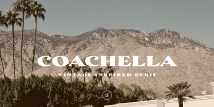 Introducing Coachella, a serif typeface with vintage vibes! Coachella is a vintage inspired serif that will make your project more vintage and modern. You can use this font for any project, such as poster, music concert announcement, or for your logo. This font have a rough detail that will make your design more handmade. This font also support multi language.
 - Queen Mestalla by ZetDesign,
$17.00 Queen Mestalla is a sherif font in gothic style with a good thickness making this font look bold and eye catching. This font is perfect for designing t-shirts, posters, music albums, magazines, billboards, and graffiti. This font is available in 2 style options, regular and italic, also comes with many alternative style options making it easy to create more awesome designs.
 - Industrialist JNL by Jeff Levine,
$29.00 The chamfered block style of lettering has been a workhorse for years. From the early signage of the 1800s to military markings to the techno fonts of the 1980s and beyond, its clean and simple look gets the message across easily and boldly. Industrialist JNL and its oblique partner were modeled from the title on a piece of sheet music from the 1940s.
 - Acceptable JNL by Jeff Levine,
$29.00 Acceptable JNL is a typeface modeled from hand lettering on a piece of 1940s sheet music, and has a distinctly casual, yet Art Deco flair. It's name can also be mischievous, for when you're asked "which font should I use for the job" you can answer "the Acceptable font". This may well start a dialogue reminiscent of Abbott and Costello's "Who's On First?"
 - Inferno Dingbats by Just in Type,
$20.00Nobody knows what God looks like but we know that the Devil has a thousand different faces. Samuel Casal sees the demon everywhere. In the streets, the movies, rock music, books, gambling, other things and even in Hell. Devilishly, he captures it all with his magical design. Purchase the font Inferno Dingbats now and take control of the forces of Evil. - Kinkajou Stew NF by Nick's Fonts,
$10.00This exuberant face was suggested by a piece of French sheet music from the 1930s for the song Sur un Air de Shimmy, The name comes from an Australian song from the 1950s about a noncompliant boomerang. Both versions of this font contain the Unicode 1252 (Latin) and Unicode 1250 (Central European) character sets, with localization for Romanian and Moldovan. - Rockadelic by Blankids,
$18.00 Introducing a new retro bold script called Rockadelic. Bring back to the 70's era Rockadelic inspired by posters and album covers of funk, disco and rockabilly music with bold and fun style. Rockadelic comes with OpenType features such stylistic alternates, stylistic sets, swash & ligatures and is good for logotype, poster, badge, book cover, t-shirt design, packaging and any more.
 - Bloody Nightmare by Mvmet,
$18.00 Bloody Nightmare is a fantastic ink drips font inspired by vintage horror movies, comics, and Metal music. It will be perfect for your horror and Halloween themed needs! You can use it for anything ranging from merchandise like t-shirts and clothing, for your scary book designs, Halloween party needs, greeting cards, stickers, posters, banners, or anything that needs a horror touch.
 - FF Localizer by FontFont,
$41.99 German type designer Critzla created this display FontFont in 1996. The family contains 4 weights and is ideally suited for advertising and packaging, festive occasions, logo, branding and creative industries as well as music and nightlife. FF Localizer provides advanced typographical support with features such as ligatures and case-sensitive forms. It comes with proportional oldstyle and proportional lining figures.
 - Penny Wise JNL by Jeff Levine,
$29.00 The unusually-shaped hand lettering of Penny Wise JNL was modeled from the cover of the 1936 sheet music for "You Dropped Me Like a Red Hot Penny", and is available in both regular and oblique versions. Although it was drawn during the Art Deco period, this type of lettering design style was revived during the Hippie movement of the 1960s and 1970s.
 - Flower Children JNL by Jeff Levine,
$29.00 At the apex of the 1960s-70s Hippie movement, San Franscisco's Haight-Ashbury district was the epicenter of the Love Generation, and the Fillmore (East and West) were the city's musical venues. Inspired by a 1970 concert poster, the Art Nouveau influence was strongly felt in the hand lettering from that poster, which is the basis for Flower Children JNL.
 - Dip Pen Deco JNL by Jeff Levine,
$29.00 The hand lettered title on the cover of the 1938 sheet music for “If It Rains – Who Cares” featured a condensed Art Deco typeface made with a round nib pen. The square shaped characters with rounded corners were a perfect subject for a digital font revival, and are now available as Dip Pen Deco JNL, in both regular and oblique versions.
 - Te Quirtez by Reyrey Blue Std,
$16.00 Te Quirtez is an elegant and classy serif typeface with strong character. Te Quirtez comes with some alternates and ligatures, so you can combine it to make a perfect typography design. It's perfect for branding, logo, packaging, header, title, t-shirt design, poster, band, music, album, and more. Features : · All Uppercase and Lowercase · Number & Symbol · Supported Languages · Alternates and Ligatures · PUA Encoded