10,000 search results
(0.032 seconds)
- Crowtig by Adante Creative,
$23.00 Crowtig is A Handwritten Brush Font Crowtig is perfect for product packaging, branding project, megazine, social media, wedding, or just used to express words above the background. Crowtig also multilingual support.
 - Goldsthink by Essentials Studio,
$16.00 Introducing by Essentials Studio Goldsthink Is a Modern Script Font Goldsthink is perfect for product packaging, branding project, megazine, social media, wedding, or just used to express words above the background.
 - Hasty Tasty by Hanoded,
$15.00 Hasty Tasty looks like a hastily penned down recipe, a quickly jotted down note or just someone's messy handwriting. It is legible, useful and comes with a full range of accents.
 - Verena by Autographis,
$39.50 Verena was written with a common felt marker pen, scanned and worked over, to keep just the right amount of roughness. The result is a very readable and usable handwritten font.
 - Misegar by Owl king project,
$39.00 Creambelly is a clean and slim sans-serif font. It is perfect for product packaging, branding project, magazine covers, social media, logotypes, or just used to express words above the background.
 - Smash Int'l by Comicraft,
$19.00Comicraft just want Puny Humans to leave Comicraft alone... Why soldiers shoot at Comicraft? PAH! Bullets do not hurt Comicraft... Bullets only make Comicraft Angry... and when Comicraft angry... COMICRAFT SMASH! - Golden Rainbow by Essentials Studio,
$16.00 Golden Rainbow Is a A Fat Handwritten Script Font Golden Rainbow is perfect for product packaging, branding project, magazine, social media, wedding, or just used to express words above the background.
 - Aberration by Mad Irishman Productions,
$22.00Aberration is a distressed display typeface with a flair for exploration. Suitable for headings where you want to convey just a hint of danger, this font includes Cyrillic and Greek characters. - Smash by Comicraft,
$19.00 Comicraft just want Puny Humans to leave Comicraft alone... Why soldiers shoot at Comicraft? PAH! Bullets do not hurt Comicraft... Bullets only make Comicraft Angry... and when Comicraft angry... COMICRAFT SMASH!
 - Mid Century Sans by Dharma Type,
$19.99 Mid Century Sans (MCS) is composed of high-geometric shapes. László Moholy-Nagy —professor in the Bauhaus— said “Typography is a tool of communication. It has to be communication in its most intense form. The emphasis must be on absolute clarity since this distinguishes the character of our own writing from that of ancient pictographic forms.” As same as you can see in modern typefaces in the early twentieth century, MCS has very efficient, clear and minima letterforms. There are not any decorative parts in the skeleton of letters. At the same time, Mid Century Sans has one more feature. In the middle of the twentieth century, one big movement which was called Mid-century modern had occurred. The Mid-century modern movement in the U.S. was an American reflection of the International and Bauhaus movements and it was slightly more organic in form and less formal than the International Bauhaus-style. In other words, it was friendly and stylish. We added Mid-century-spices to the Bauhaus-modernism. The basic letter form is geometric yet it has very friendly strokes and human touch. Mid Century Sans consists of 8 weights and their matching Italics for a wide range of usages. Farther, Mid Century Sans is supporting international Latin languages and basic Cyrillic languages including Basic Latin, Western Europe, Central and South-Eastern Europe. Also MCS covers Mac Roman, Windows1252, Adobe1 to 3. This wide range of international characters expands the capability of your works. Lowercase "a" has OpenType stylistic alternates for advanced typography.
 - Hipweee by Storictype,
$9.00 Introducing Hipweee Layered Font Hipweee, A new carefully crafted layered rounded Typeface. The Ideas of this fonts are from wide range of reference, baby, kids, school, cafe, food desert & beverages are our main focus for this fonts. So the looks of this fonts must be in the wide range of the reference above. It’s Versatile, Fun, Cute and Beauty feel that you get in Hipweee Typeface Hipweee Created with 7 Layer : Base, Extrude, Shadow, Dot, Flower, Hatch & Inline. Perfect fitted layer to give you a more contrast, more bold look of the title. Our creation on the display to give you a reference what it looks like on your project. such as Branding, Header, Logotype, Poster, and etc. It shows that Gemoy clearly can accommodate various design style. Language Support : Afrikaans, Albanian, AsuBasque, Bemba, Bena, Breton, Catalan, Chiga, Colognian, Cornish, Croatian, Czech, Danish, Dutch, English, Estonian, Faroese, Filipino, Finnish, French, Friulian, Galician, German, Gusii, Hungarian, Indonesian, IrishItalian, Kabuverdianu, Kalenjin, Kinyarwanda, Latvian, Lithuanian, Lower Sorbian, Luo, Luxembourgish, Luyia, Machame, Makhuwa, Meetto, Makonde, Malagasy, Maltese, Manx, Morisyen, North Ndebele, Norwegian , Bokmål, Norwegian Nynorsk, Nyankole, Oromo, Polish, Portuguese, Quechua, Romanian, Romansh, Rombo, Rundi, Rwa, Samburu, Sango, Sangu, Scottish Gaelic, Sena, Serbian, Shambala, Shona, Slovak, Soga, Somali, Spanish, Swahili, Swedish, Swiss, German, Taita, Teso, Turkish, Upper Sorbian, Uzbek (Latin), Volapük, Vunjo, Western, Frisian, Zulu
 - Rotis Semi Sans by Monotype,
$40.99 Rotis¿ is a comprehensive family group with Sans Serif, Semi Sans, Serif, and Semi Serif styles, for a total of 17 weights including italics. The four families have similar weights, heights and proportions; though the Sans is primarily monotone, the Semi Sans has swelling strokes, the Semi Serif has just a few serifs, and the Serif has serifs and strokes with mostly vertical axes. Designed by Otl Aicher for Agfa in 1989, Rotis has become something of a European zeitgeist. This highly rationalized yet intriguing type is seen everywhere, from book text to billboards. The blending of sans with serif was almost revolutionary when Aicher first started working on the idea. Traditionalists felt that discarding serifs from some forms and giving unusual curves and edges to others might be something new, but not something better. But Rotis was based on those principles, and has proven itself not only highly legible, but also remarkably successful on a wide scale. Rotis is easily identifiable in all its styles by the cap C and lowercase c and e: note the hooked tops, serifless bottoms, and underslung body curves. Aicher is a long-time teacher of design and has many years of practical experience as a graphic designer. He named Rotis after the small village in southern German where he lives. Rotis¿ is suitable for just about any use: book text, documentation, business reports, business correspondence, magazines, newspapers, posters, advertisements, multimedia, and corporate design.Today Rotis ia also available with pan european caracter set.
 - Rotis Semi Sans Paneuropean by Monotype,
$92.99Rotis¿ is a comprehensive family group with Sans Serif, Semi Sans, Serif, and Semi Serif styles, for a total of 17 weights including italics. The four families have similar weights, heights and proportions; though the Sans is primarily monotone, the Semi Sans has swelling strokes, the Semi Serif has just a few serifs, and the Serif has serifs and strokes with mostly vertical axes. Designed by Otl Aicher for Agfa in 1989, Rotis has become something of a European zeitgeist. This highly rationalized yet intriguing type is seen everywhere, from book text to billboards. The blending of sans with serif was almost revolutionary when Aicher first started working on the idea. Traditionalists felt that discarding serifs from some forms and giving unusual curves and edges to others might be something new, but not something better. But Rotis was based on those principles, and has proven itself not only highly legible, but also remarkably successful on a wide scale. Rotis is easily identifiable in all its styles by the cap C and lowercase c and e: note the hooked tops, serifless bottoms, and underslung body curves. Aicher is a long-time teacher of design and has many years of practical experience as a graphic designer. He named Rotis after the small village in southern German where he lives. Rotis¿ is suitable for just about any use: book text, documentation, business reports, business correspondence, magazines, newspapers, posters, advertisements, multimedia, and corporate design.Today Rotis ia also available with pan european caracter set. - Rotis Semi Serif Paneuropean by Monotype,
$92.99Rotis¿ is a comprehensive family group with Sans Serif, Semi Sans, Serif, and Semi Serif styles, for a total of 17 weights including italics. The four families have similar weights, heights and proportions; though the Sans is primarily monotone, the Semi Sans has swelling strokes, the Semi Serif has just a few serifs, and the Serif has serifs and strokes with mostly vertical axes. Designed by Otl Aicher for Agfa in 1989, Rotis has become something of a European zeitgeist. This highly rationalized yet intriguing type is seen everywhere, from book text to billboards. The blending of sans with serif was almost revolutionary when Aicher first started working on the idea. Traditionalists felt that discarding serifs from some forms and giving unusual curves and edges to others might be something new, but not something better. But Rotis was based on those principles, and has proven itself not only highly legible, but also remarkably successful on a wide scale. Rotis is easily identifiable in all its styles by the cap C and lowercase c and e: note the hooked tops, serifless bottoms, and underslung body curves. Aicher is a long-time teacher of design and has many years of practical experience as a graphic designer. He named Rotis after the small village in southern German where he lives. Rotis¿ is suitable for just about any use: book text, documentation, business reports, business correspondence, magazines, newspapers, posters, advertisements, multimedia, and corporate design. Today Rotis ia also available with paneuropean caracter set. - Rotis Semi Serif by Monotype,
$40.99 Rotis¿ is a comprehensive family group with Sans Serif, Semi Sans, Serif, and Semi Serif styles, for a total of 17 weights including italics. The four families have similar weights, heights and proportions; though the Sans is primarily monotone, the Semi Sans has swelling strokes, the Semi Serif has just a few serifs, and the Serif has serifs and strokes with mostly vertical axes. Designed by Otl Aicher for Agfa in 1989, Rotis has become something of a European zeitgeist. This highly rationalized yet intriguing type is seen everywhere, from book text to billboards. The blending of sans with serif was almost revolutionary when Aicher first started working on the idea. Traditionalists felt that discarding serifs from some forms and giving unusual curves and edges to others might be something new, but not something better. But Rotis was based on those principles, and has proven itself not only highly legible, but also remarkably successful on a wide scale. Rotis is easily identifiable in all its styles by the cap C and lowercase c and e: note the hooked tops, serifless bottoms, and underslung body curves. Aicher is a long-time teacher of design and has many years of practical experience as a graphic designer. He named Rotis after the small village in southern German where he lives. Rotis¿ is suitable for just about any use: book text, documentation, business reports, business correspondence, magazines, newspapers, posters, advertisements, multimedia, and corporate design. Today Rotis ia also available with paneuropean caracter set.
 - Lockal by Prominent and Affluent,
$30.00 Lockal - the ultimate font display that's here to take your designs to the next level. With a solid structure and an impressive collection of ligatures, this bad boy is bound to make your creations pop. But wait, there's more! Lockal comes in not one or two but THREE styles - Regular, Rounded, and Rough. And as if that wasn't enough, each style also has an oblique mode for when you need that extra edge. So whether you're working on a branding project or creating eye-catching posters, Lockal has got your back. Trust us; your clients will be blown away by the results. Don't settle for ordinary fonts when you can have something extraordinary like Lockal. Get it now and watch your creativity soar!
 - MGT Vallery Hills by Magetype,
$15.00 When I was surfing the internet, with rock n 'roll music. I accidentally found a picture of a hotel sign with a very unique style, namely: Mid-century Modern (MCM). It looks very pretty and charming to me. And inspired me to create Font Family. And I am proud to present the Vallery Hills Font Family. This font is in the Retro style of the 50s to 60s. Okay, here are the specifications. 1. Vallery Hills Schrift There is one unique thing about this font. Usually, script fonts with Retro style always have an angled anatomical shape, but I made this font upright. The goal is to make a difference with other script fonts I've seen. By the way, this font comes in two styles, namely: Regular and Bouncy. Why do I make it like that? Because I want to make this font into two different functions, namely: If you want to make it a Display Font, which is usually used for Headings, then use the Bouncy style. And if you want to use it as Bodytext, then use Regular. 2. Vallery Hills Sherift This second font is a font that is very synonymous with the Mid-century Modern (MCM) era. A very distinctive form of the serif font of that era. Similar to the first font, this font also has 2 styles, namely: Regular and Bouncy. You can combine this font with the other two fonts in Vallery Hills. It could be Title, or Bodytext. And you can also combine two styles, namely: Regular and Bouncy. Try! 3. Vallery Hills Suns Sherift This last font is Sans Serif. Also has 2 styles like his two brothers, namely: Regular and Bouncy. The goal is actually the same. I am sure you are cooler to create a design that uses this font family. Well, there is one advantage of this font from its two siblings, which is that it has a feature, namely: SMALLCAPS. Which will be an option when you are bored with the mediocre shape or style of Lowercase. Try combining the Smallcaps with Uppercase or Lowercase. Must be cool! : D Oops, almost forgot. This font consists of several font formats, namely: OTF, TTF, and Webfonts. And of course everything is MULTILANGUAGE. OK, friends. That's all I can describe about the Vallery Hills Family. Hopefully it will please all of you. Cheers!
 - Brayline by Surotype,
$30.00 Brayline is a monoline swashed script, a typeface inspired by old neon signs. It contains more than 400 glyphs, including alternative characters such as: titling, terminal forms, stylistic alternates, stylistic set, and swash variants. Brayline is very suitable to use on many of your design projects such as Signage, Book Covers, Invitation, Packaging, Logotype and more. To enable the opentype stylistic alternates, you need a program that supports opentype features such as adobe illustrator cs, adobe indesign & coreldraw x6-x7 and more.
 - Painless by Gassstype,
$25.00 Introducing Painless is a Textured Sans Serif Bold Font that is written casually and quickly. Letters are made with brushes on Procreate. Then crafted carefully drawn into vector format. That is why Painless has charming, authentic and relaxed characteristic more natural look to your text with a more natural look to your text.It also has many alternatives and underlines that make your text and design more interesting. Amicable is perfect for homeware designs,branding projects, Logo design, Quotes product packaging.
 - Butter Press by Gassstype,
$22.00 Introducing Butter Press - Grungy cartoon font brush that written casually and quickly. Letters are made with brushes on Procreate. Then crafted carefully drawn into a vector format. That is why Butter Press has authentic and relaxed characteristics and a more natural look to your text with a more natural look. You can activate Ligature OpenType panel to make these two styles.ligatures that make your text and design more interesting. Butterpress is perfect for homeware designs, branding projects, Logo design, Quotes product packaging
 - Siegra by Arterfak Project,
$22.00 Siegra is a cool combination of powerful, sporty, automotive, elegant, and futuristic. One of kind techno font that versatile to apply in various design styles. Wide, sharp, and curvy of the letterforms that speed up your energy and get more confidently design. Siegra is suitable for posters, branding, campaign, logo, keychains, stickers, t-shirts, automotive, and many more! Completed with a lot of stylish ligatures to gives your design more power! Multilingual support and PUA encoded. Get yours! Thank you.
 - Bobber Motorcycles by Vozzy,
$10.00 Introducing a vintage look label font named Bobber Motorcycles. It includes five styles - Base, Rough, Outline, Shadow and Light. This font will good viewed on any retro design like posters, t-shirts, labels, logos and more.
 - Flower and Theory by Adita Fonts,
$14.00 Flower and Theory is a modern and elegant serif font. Perfect for us on your logos, quotes social media, business cards, web designs and so much more. COMPATIBILITY Windows Apple/Mac Linux Easily convert to webfont
 - Floridian Script by Monotype,
$29.99Floridian Script is a contemporary script font, released in 1972, with a clean appearance. Floridian Script's uppercase M and Q are unusual while the lowercase script is more simple than standard scripts based on copperplate handwriting. - Aorytha by Namara Creative Studio,
$20.00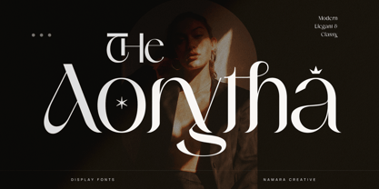 Modern display typeface with beautiful contrast. Decorative details on each character maintain its classy composure. Perfect for logo/branding identity, headline, wedding invitation, poster, and more, to create a project with a classy and luxury touch.
 - Quinton Script by Fargun Studio,
$12.00 Quinton is a beautiful collection of hand-lettered modern calligraphy fonts. It's made by decorative characters and a dancing baseline, and is so beautiful on invitations, greeting cards, branding materials, business cards, quotes, posters, and more.
 - Archimoto V01 by Owl king project,
$37.00 Archimoto V.01 Responded to the design of working drawing techniques in the world of architecture and letters on old stuff photography lens bodies, archimoto is designed with a more modern form, a little touch of detail in the corner area is so smooth that it aims to provide comfort to the eyes, by bringing 20 sizes including italic archimoto can be used more freely and can be adjusted more extensive exploration of its use. archimoto can be used as headlines and body text, the level of readability that looks comfortable makes the arrangement of letters more beautiful.
 - Heathen by Canada Type,
$24.95A few emails sent to Canada Type have asked for more “bad scripts”. A few others asked for "more Mascara-like treatments". And some asked for more fonts of “distressed elegance”. Whatever you like to call this style of doubled-script font, sightings of designs using it have become common within the last few years. Such fonts have become the standard in expressing elegant confusion, old chaos in modern settings, recycled histories, and rebellious ideas. This style is quite often seen on chic clothing, music packaging, some sports paraphernalia, surfer and skateboarder gear, even book covers. That said, the Heathen font was made to include an advantageous feature that other distressed scripts do not normally have: More intertwined over-swashing in the majuscules. This over-swashing is quite useful in settings where the stroke and fill colors differ, or complement each other. It is also quite the point of emphasis where the idea is to show elegance gone ancient, old thoughts in a modern wrapper, rust never sleeping, or the very basic limits of the world’s nature. The original Heathen was made by redrawing Phil Martin’s Polonaise majuscules and superposing them over the majuscules of Scroll, another Canada Type font. The lowercase is a superposition of Scroll’s lowercase atop a pre-release version of Sterling Script, yet another Canada Type font. Heathen Two was made in a similar way, by combining two pre-release Canada Type scripts. - Grange by Device,
$39.00 The Device interpretation of the classic “Grot” thick/thin sans style. Unlike the traditional models on which it is based, Grange takes a rational, consistent approach across wide range of weights and widths for contemporary use. The "Text" weights are designed for use at smaller sizes, and have more open character shapes and spacing for legibility. The font includes alternative curved and straighter versions of key characters, most obviously the lower-case ‘g' and capital ‘R', allowing the font to take on either a sharper or warmer, more playful appearance. These can be toggled on or off using the ‘Alts' feature in Illustrator, or ‘Stylistc Sets’ in Indesign. Contains proportional, lining and tabular numerals. Perfect for both headline and text.
 - Fungka City by Afkari Studio,
$15.00 Fungka City - Modern Stylish Sans Serif Font Fungka City is a Modern Stylish Sans Serif Font. This font pairs well with modern sans serif and stands strongly on its own beauty alternates characters and stylish that make your design more conceptual. Fungka City Modern Stylish Sans Serif Font is flexible for any styles of graphic designs, perfect for logo, headline, magazine, body text, quotes, and more. Features; - Uppercase, Lowercase, Number, and Punctuation - Special alternates - Works on PC & Mac - Simple installations - Accessible in Adobe Illustrator, Adobe Photoshop, Adobe InDesign, even work on Microsoft Word - Fully accessible without additional design software. - Mültîlíñgúãl Sùppört for; ä ö ü Ä Ö Ü ß ¿ ¡ etc. Hope you enjoy our font and this font is useful for your projects!
 - Mondo News by Untype,
$30.00 Mondo News is a typeface designed to fulfill digital and paper publication editorial needs, its cared equilibrium between slightly condensed proportions and generous «x» height, offers optimum performance without compromising legibility. The modulation of thick and thin strokes in the middle weights is balanced for extensive text reading, while on the heavy weights becomes more dramatic making them ideal for strong headlines. Equipped with 760+ glyphs, support for more than 200 languages, smallcaps, alternates, ligatures, dingbats and plenty of OpenType features, Mondo News modern interpretation of tradition performs excellent both on screen and on paper, satisfy the most demanding editorial needs and will nourish your pages with a convincing and reliable atmosphere. Mondo News is part of the Untype Mondo family typographic system.
 - Mangueira by Latinotype,
$29.00 Mangueira is a sans-serif geometric typeface that is made up of 2 sub-families: one standard more contemporary family perfectly suited for display use and one alternative version for short blocks of text and more neutral titles. Each subfamily comes in 9 weights and includes swashes, which can be easily accessed from the OpenType menu. One of its main features is the combination of geometric shapes and vertical terminals that resemble Humanist sans typefaces. A generous number of swashes along with unique details in some glyphs such as "g" and "k" make Mangueira a versatile font well-suited for editorial design, branding, packaging, web and broadcast use, etc. Mangueira contains a set of 502 characters, supporting over 200 Latin-based languages.
 - Shark Snack by Comicraft,
$19.00 Dumm DUM. Dumm DUM. Duh dum duh dum duh dum DUMMMM... Just when you thought it was safe to get back in the water, this font surfaces to take one last bite out of your summer vacation skinnydip! Scream and scream again — it won’t do you any good, SHARKSNACK is rough and ready to EAT YOU ALIVE! It’s too late to close the beaches, Chief Brody, this particular set of saw tooth letters has already consumed Dracula, the Werewolf, the Frankenstein Monster and any number of 70s comic book characters foolish enough to dip a toe in its maw!
 - Cervino by Typoforge Studio,
$29.00 Did you know that Cervino is the Italian name for one of the highest and most beautiful mountain in Europe - Matterhorn? Just like this majestic peak, our new family is HUGE. Cervino family consist of three width masters, with nine weights in each of them, giving the total amount of 54 instances. It is full of different features - from the wide set of numerals and math signs, by small caps to subscript and superscript. It covers full latin and Cyrillic script. Cervino would be a perfect choice for headlines, newspapers and for the longer texts as well.
 - Spellbind by Mix Fonts,
$13.00 If you’re a witch, or just prefer the look of a font that has hexes and wibbles, MIX SPELLBIND and MIX SPELLBIND SANS are the fonts for you. They’re perfect for posters, tarot cards, websites and all those other witchy things that need to be done… but don’t want to get “spooked” on. Grab this font family and make anything spell worthy! MIX SPELLBIND comes with the following glyphs: ABCDEFGHIJKLMNOPQRSTUVWXYZ abcdefghijklmnopqrstuvwxyz 0123456789 !@#$%^&*()`~•· ÷×+−±≈=≠[]:;’”,.|/?{}“”‘’-–—_ …‚„©®‹›«»°¹²³ªº¡¿₱¢€£¥¶§† ÁÀÂÄÃÅĂĀĄÆĆĈČÇÐĐÉÈÊËĖĒĘĜĤIÍÌÎÏĪĮĴŁŃÑŇ ÓÒÔÖÕŌŐØŒŔŘŚŜŠŞȘŤȚÚÙÛÜŮŰŬŪŲẂẀŴÝŶŸŹẐŽŻÞẞ áàâäãåăāąæćĉčçðđéèêëėēęĝĥıíìîïīįĵłńñň óòôöõōőøœŕřśŝšşșťțúùûüůűŭūųẃẁŵýŷÿźẑžżþß MIX SPELLBIND SANS comes with the following glyphs: ABCDEFGHIJKLMNOPQRSTUVWXYZ abcdefghijklmnopqrstuvwxyz 0123456789 !@#$%^&*()`~♥❤•· ÷×+−=[]:;’”,.|/?{}“”‘’-–—_…‚„ ©®™‹›«»°¹²³ªº¡¿₱¢€£¥¶§№† ÁÀÂÄÃÅĂĀĄÆĆĈČÇÐĐÉÈÊËĖĒĘĜĤIÍÌÎÏĪĮĴŁŃÑŇ ÓÒÔÖÕŌŐØŒŔŘŚŜŠŞȘŤȚÚÙÛÜŮŬŪŰŲẂẀŴÝŶŸŹẐŽŻÞẞ áàâäãåăāąæćĉčçðđéèêëėēęĝĥıíìîïīįĵłńñň óòôöõōőøœŕřśŝšşșťțúùûüůŭūűųẃẁŵýŷÿźẑžżþß
 - Xylo Script by Wiescher Design,
$49.50 XyloScript is my first script with a woodcut look to it. Still, it is very elegant. Xylo is Greek and means “wood”. This script is another one I designed in the tradition of the 18th-century English calligrapher George Bickham and the 19th-century American calligrapher Platt Rogers Spencer. I like it, your very crafty Gert Wiescher BTW if your font manager tells you that the font is corrupted, just ignore that! This script is very complex and that’s causing some font managers to say the font is corrupted. I have tested it and it works fine!
 - ITC Holistics by ITC,
$29.99Some words from the designer... Like a tree rooted in ancient philosophy with branches reaching into the new age, ITC Holistics encompasses 82 pictographs of astrology, healing, magic, nature and spirituality. In an illustration style that originates from hand-carved rubber stamps, west coast designer Teri Kahan shines new light on these timeless symbols. ITC Holistics is functional collectively and individually for graphics and logos. As with Teri's companion font ITC Connectivities, ITC Holistics can also be used as a divining tool. Just type your name in caps and lower case and see what the images tell you! - Bad Cake Recipe by Bogstav,
$15.00 I've had a lot of lovely cakes through the years (My wife is a great cook!) But I've also tried some really...ehem...not so good cakes. Actually, the worst cake I ever had, was at work - if you didn't know, I work as a kindergarten teacher - and the cake was made by one of the kids! Anyway, this font was made as a sort of tribute to that cake - the font may not represent something that is smooth and lovely, but it was made with lots of personality and love - just like that cake from that kindergarten kid!
 - Linotype Zensur by Linotype,
$29.99Linotype Zensur is part of the Take Type Library, chosen from the entries of the Linotype-sponsored International Digital Type Design Contests of 1994 and 1997. This fun font was created by French designer Gérarld Alexandre and contains one weight. The characters look as though parts of each of them were censored or removed, leaving just enough left over to know what was meant. The basic forms of this font are sans serif and the rounded corners give it an almost soft character. Linotype Zensur is a distinctive typeface which is especially good for headlines in larger point sizes. - Stolzl Display by Inhouse Type,
$33.78 Stolzl Display is an original font family designed for headlines, titles and subtitles. Based on the combination of contrasting shapes, the harmony of form and rhythm is fundamental to the design. Inspired by Bauhaus, Stolzl represents, not just the significant influence of this “crucible of modernism”, but aims at capturing its original idealism, commitment to creativity and experiment driven philosophy. Details include six weights, Cyrillic, 480 characters, alternative glyphs, manually edited kerning and Opentype features. Named after Gunta Stölzl, the Bauhaus’s only female master, Stolzl Display is the first subfamily of the Stolzl font collection to be released this year.