10,000 search results
(0.038 seconds)
- Acto by DSType,
$40.00 Acto is a type system designed as the sans serif counterpart of the previous released Acta. Both type families were designed in 2010 for the redesign of the Chilean newspaper La Tercera, but unlike some of our previous fonts (i.e., Leitura) Acto doesn't exactly match Acta in terms of structure, so they can live on their own. Acto is our first sans where the uppercase has the same height as the ascenders, so we decided to avoid common problems like the confusion between the I and the l, by drawing a curved l. We kept that spirit by removing the spurs on the b, g and q, resulting on a more warm typeface than Prelo, for instance. In the end it's a very powerful sans family, with eleven weights with matching italics, for editorial and corporate design.
 - Notes from Paris by PeachCreme,
$18.00 "Notes from Paris" will make your letters look très chic while still maintaining its functionality with easy-to-read letterforms. Furthermore, the comforting vibe of this font brings a touch of relaxation to your typography. The words flow with ease and grace, like a gentle breeze on a summer day in the city of love. So, whether you're crafting a logo design or wedding invite, "Notes from Paris" is a font that you must have for a chic and legible typographic journey. With 59 Opentype ligatures, this font blurs the line between script and handwriting, allowing for a seamless transition between letters and creating a truly genuine sensation.
 - Kinsale Display by Fontdation,
$15.00 Introducing our new font Kinsale Display. A bold and strong looking display font that not only heavily inspired by the vintage/classic letterforms, but also some touch of modern twists and absurdities. Mouse-crafted with high attention to details; clean lines, sharp edges and tempting curves. Its wide and blocky letterforms make Kinsale is a great spacekiller. Suits best for title/headline, logo/logotype, packaging/label designs, etc. Packed with 300+ glyphs, weaponized with standard upper/lower case characters, numerals, punctuations, some multilingual letters, alternate characters, and ligatures. This font is a must have item for your designing arsenal. Get yourself one and start creating something cool! THANKS AND ENJOY!!!
 - Albrecht Fraktur by New Renaissance Fonts,
$20.00 In his 1538 book on measurement, Albrecht Dürer gave clear descriptions and drawings about the proportions of the letters in both Roman and 'fraktur' alphabets (from Latin 'fractura', meaning that it's broken up with lots of different angles rather than smooth curves). Here is the fraktur alphabet as a font completed for use today, with a few characters modernised and some gaps filled. Of course there are countless examples of fraktur fonts already circulating, and indeed one foundry even has another version of this particular one; but we have different approaches to some of the questions raised, we have aimed at a more even tracking (horizontal spacing), and the 260 glyphs in our version include accents and other diacritics, and the modern symbols which Dürer would surely have embraced if he had had access to the internet.
 - Alius by Lucas Tillian,
$18.00 Alius is something else. Experimental shapes combined with traditional ones result in an extremely legible typeface that—because of its economically spaced characters—works extraordinarily well for copy texts as well as big striking headings. Alius has been created with great attention to detail which is particularly noticeable in smaller sizes where proportions and shapes remain intact. The Typeface includes stylistic alternates that provide the designer with endless possibilities for combinations and variations. Alius contains PS-Hinting and is therefore as legible on screen as it is on paper. The typeface comes with powerful OpenType features that will satisfy even the most demanding of designers. With more than 680 Glyphs and a coverage of over 130 languages, Alius is as versatile as it is beautiful. The development of the typeface started in the summer and concluded in the fall of 2021.
 - Asteric Vintage by BlackLotus,
$12.00 Asteric Vintage is a retro-vintage font family with an amazing set of ornaments. It comes in 3 different styles: Regular, Rough, Display, and also presents 26 beautiful and luxurious ornaments . The Rough Style has a characteristic that resembles rust on each character, thus creating results that seem strong and hard. The Display Style is very suitable for display, every work created with it becomes luxurious, wrapped in a classic atmosphere. The Regular Style is a style that has a clean character but still carries a classic scent that is thick and unique. This style is very suitable for use in magazines, books, newspapers, etc.
 - Blank Manuscript by Aah Yes,
$14.95Blank Manuscript allows you to produce sophisticated musical scoresheets even on basic Word Processors - anything from simple plain staves to complex full-page orchestral scores of your own design, to write in the notation yourself. The basic stuff is really easy and straightforward, but there's some quite advanced things you can do as well. So Copy and Save these Instructions. • The main stuff is simple and tends to follow the initial letter. Treble, Bass and Alto clefs are on upper case T B A (there are more clefs, below). The 5 Lines for the clefs are on L or l. • A small v will give a small vertical line (like a bar line) and a Big U will give a Big Upright - these can start or end a line or piece. • Time Signatures - type the following letters: Think of W for Waltz and it's easy to remember that 3/4 time is on W. Then from that they go up or down together like this: V=2/4 W=3/4 X=4/4 Y=5/4 Z=6/4 Compound Times are on H I J K like this: H=3/8 I=6/8 J=9/8 K=12/8 Common Time and Cut Common symbols can be found on semi-colon and colon respectively (all begin with Co- ). 2/2 3/2 are on lower case a and b, 7/4 and 7/8 are on lower case c and d, 5/8 is on small k (think POL-k-A) • Flat signs are on the numbers. Flat signs on LINES 1 to 5 are on numbers 1 to 5. Flat signs on SPACES 1 to 5 are on numbers 6 to 0 (space 1 being above line 1, space 5 being above the top line of the stave). Sharp signs are on the letters BELOW the long-row numbers. Which is q w e r t for the sharp signs on Lines 1 to 5, and y u i o p for sharp signs on spaces 1 to 5. Doing it this way means it works the same for all clefs, whether Treble, Bass, Alto, Tenor or any other. Sharp and Flat Signs always go in this order, depending on how many sharps or flats your key signature requires: Treble Clef Sharps t i p r u o e Flats 3 9 7 4 2 8 6 Bass Clef Sharps r u o e t i w Flats 2 8 6 3 1 7 = Alto Clef Sharps o e t i w r u Flats 7 4 2 8 6 3 1 • Guitar Chord Boxes are on G and g (G for Guitar) Upper Case G has a thick line across the top Lower case g has an open top, for chords up the fretboard TAB symbols are available: Six-string Tablature is on s & S for Six. Four-string Tablature is on f & F for Four. (Lower case has the "TAB" symbol on it, Upper Case has just the lines to continue.) Five-string tablature, is on lower case "j" (as in BAN-j-O) and of course L or l will continue the 5 lines. •RARE CLEF SIGNS including Tenor Clef, are on various punctuation marks, i.e. dollar, percent, circumflex, ampersand & asterisk, above the numbers 4 to 8. NOTE: The important symbols were kept on the letter and number keys, which are fairly standard all over, but some of the less important symbols are on various punctuation keys, which in different countries are not the same as on my keyboard. If it comes out wrong on your system, all I can say is it's right on the systems we've tried, and they'll be in here somewhere, probably on a different key. CLOSING THE ENDS OF THE LINES and BAR-LINES is done with the 3 varieties of brackets - brackets, brace and parentheses - Left/Right for the Left/Right end of the line. Parentheses L/R () which are above 9, 0 give a clef with a small vertical upright (the same as a bar line). Brace L/R and Brackets L/R (both on the 2 keys to the right of P on my keyboard) will close off a staff line with tall upright bars. Brace gives a double upright - one thick, one thin. Brackets give a single tall upright. A Big Upright is on Big U, (Big U for Big Upright) and a small vertical line is on small v (small v for small vertical). The Big Upright is the maximum height, and the small vertical is exactly the same height as a stave. And there's a tall upright Bar, on Bar (which is to the left of z on my keyboard, with Shift,) which is the same height as the bar on upper case U but twice as broad. • There's a staff intended for writing melodies, which is a little bit higher up than an ordinary treble clef giving a space underneath to put lyrics in - on m and M for Melody line. Lower case has the Treble Clef on, Upper case M has just the higher-up staff lines with no clef. (Use mMMMMMMM etc.) However this clef will be in the wrong place to put in sharp and flat signs, key signatures and so on, so if you use this clef you'll have to write the sharps, flats and key signature yourself. There's also a clef that's smaller (less tall) than the ordinary clef, but with the same horizontal spacing so it will align with other standard-sized clefs - on slash (a plain clef) and backslash (with a Treble Clef). • There are some large brackets for enclosing groups of staves, such as you'd use on large orchestral scores, on Upper Case N O P Q R, which can aid clarity. N and O on the left, Q and R on the right. P is a Perpendicular line to be used on both sides to increase the height of the enclosure, in this way but with the staff lines in between: N Q P P P P P P O R OTHERS —————————————— • Repeat marks are on comma (left) and period/full stop (right). • Hyphen is left as a sort of hyphen - it's a thin line like a single staff line, with the same horizontal spacing as ordinary staff lines - in case you want to draw a line across for a Percussion Instrument, or a Title or Lyric Line. • Space is a Space, but with HALF the width or horizontal spacing as ordinary staff lines, so 2 space symbols will be the same width as a clef symbol or line. • Grave (to the left of 1 on the long row, or hold down Alt and type 0096 then let go) gives a staff line that is one eighth the width of an ordinary staff line. • If you want manuscript in a clef and key which requires a flat or sharp sign in the space underneath the 5 lines, they’re on = equals and + plus . SYMBOLS • Many of these symbols will only be useful if you have worked out in advance which bars will need them, but they are here in case you've done that and wish to include them. • Symbols for p and f (piano and forte) are on 'less than' and 'greater than' < > (above comma and full stop) and m for mezzo is on Question, next to them. They can be combined to make mp, mf, ff, pp, etc. These signs -- and other signs and symbols like Pedal Sign, Coda Sign and so on -- can be found on various punctuation mark keys, including above 1, 2, 3 in the long row, and others around the keyboard. There's a sort of logic to their layout, but in different countries the keys are likely to give different results to what is stated here, so it's probably best to just try the punctuation and see if there's any you might want to use. (But on my keyboard a Coda sign is on circumflex - because of the visual similarity. Pedal sign is on underscore. A "Sign" symbol is on exclamation mark.) They were only included in case you really need them to be printed rather than handwritten. • However, a Copyright symbol is deemed necessary, and also included are a "Registered" symbol and a TradeMark symbol. They are found in the conventional places, and can be accessed by holding down ALT and typing 0169, 0174 or 0153 respectively in the numberpad section and letting go. • Staff lines with arco and pizz. above are on capital C and D respectively ---C for ar-C-o. • An empty circle above a staff line (to indicate sections by writing letters A, B, C or 1,2,3 inside for rehearsal marks) is on n. The actual signs for an A, B, C and D in a circle above the staff line can be produced by holding down ALT and typing 0188, 0189, 0190 and 0191 respectively and letting go. • The word "Page", for indicating page numbers, is on the numbersign key. • The two quotes keys, (quote single and quote double) have symbols representing "Tempo is", and "play as triplets", respectively. • INSTRUMENT NAMES There's a whole lot of Instrument Names built in (over a hundred) which can be printed out above the clef, and you do it like this. Hold down Alt and type in the given number in the numberpad section, then let go. For Piccolo it's 0130, for Flute it's 0131, Cornet is on 0154, Violin is on 0193, and the numbers go up to over 0250, it's a fairly complete set. There's also a blank which is used to align un-named clefs on 0096. Put them at the very beginning of the line for the best results. Here they are: WOODWIND Piccolo 0130 Flute 0131 Oboe 0132 Clarinet 0133 Eng Horn 0134 Bassoon 0135 Soprano Sax 0137 Alto Sax 0138 Tenor Sax 0139 Baritone Sax 0140 Saxophone 0142 Contrabassoon 0145 Recorder 0146 Alto Flute 0147 Bass Flute 0148 Oboe d'Amore 0149 Cor anglais 0152 Pipes 0241 Whistle 0242 BRASS Cornet 0154 Trumpet 0155 Flugelhorn 0156 Trombone 0158 Euphonium 0159 Tuba 0161 French Horn 0162 Horn 0163 Tenor Trombone 0164 Bass Trombone 0165 Alto Trombone 0166 Piccolo Cornet 0167 Piccolo Trumpet 0168 Bass Trumpet 0170 Bass Tuba 0171 Brass 0172 VOICES Vocal 0175 Melody 0176 Solo 0177 Harmony 0178 Soprano 0179 Alto 0180 Tenor 0181 Baritone 0182 Treble 0183 Bass 0197 (see also PLUCKED STRINGS) Descant 0184 Mezzo Soprano 0185 Contralto 0186 Counter Tenor 0187 Lead 0206 BOWED STRINGS Strings 0192 Violin 0193 Viola 0194 Cello 0195 Contrabass 0196 Bass 0197 Double Bass 0198 Violoncello 0199 Violin 1 0200 Violin 2 0201 Fiddle 0252 PLUCKED STRINGS Harp 0202 Guitar 0203 Ac. Gtr 0204 El. Gtr 0205 Lead 0206 Bass 0197 Ac. Bass 0207 El. Bass 0208 Slide Gtr 0209 Mandolin 0210 Banjo 0211 Ukelele 0212 Zither 0213 Sitar 0214 Lute 0215 Pedal Steel 0216 Nylon Gtr. 0238 Koto 0239 Fretless 0244 KEYBOARDS + ORGAN Piano 0217 El. Piano 0218 Organ 0219 El. Organ 0220 Harpsichord 0221 Celesta 0222 Accordion 0223 Clavinet 0224 Harmonium 0225 Synth 0226 Synth Bass 0227 Keyboards 0228 Sampler 0249 PERCUSSION and TUNED PERCUSSION Percussion 0229 Drums 0230 Vibes 0231 Marimba 0232 Glockenspiel 0233 Xylophone 0234 Bass marimba 0235 Tubular Bells 0236 Steel Drums 0237 Kalimba 0240 OTHERS Harmonica 0246 Mouth Organ 0247 FX 0251 Intro 0243 Verse 0245 Refrain 0248 Chorus 0250 un-named 0096 (this is a small spacer stave for aligning clefs without a name) ALSO copyright 0169 registered 0174 TradeMark 0153 Rehearsal marks 0188-0191 (giving A, B, C, D in a circle, an empty circle is on n ) Clef signs for Treble Bass Alto without any staff lines 0253-0255 An Alphabetic List of all signs: a 2/2 time b 3/2 time c 7/4 time d 7/8 time e sharp sign, centre line f Tab sign for 4-string tab g Guitar Chord Box, no nut h half-width stave I sharp sign, third space up j Tab sign for 5-string tab k 5/8 time l Lines - 5 horizontal lines for a stave m Melody Clef - a standard clef but placed higher up, with Treble sign n Stave with an empty circle above o sharp sign, fourth space up p sharp sign, space above stave q sharp sign, bottom line r sharp sign, fourth line up s Tab sign for 6-string tab t sharp sign, top line (fifth line up) u sharp sign, second space up v vertical line (bar-line) w sharp sign, second line up x Fretboard, four strings y sharp sign, first space up z Fretboard, five strings A Alto Clef B Bass Clef C “arco” above stave D “pizz.” above stave E Double Vertical Lines F Four Horizontal lines (for 4-string tab) G Guitar Chord Box with nut H 3/8 time I 6/8 time J 9/8 time K 12/8 time L Lines - 5 horizontal lines for a stave M Melody Clef - a standard clef but placed higher up, plain N Bounding Line for grouping clefs - top left O Bounding Line for grouping clefs - bottom left P Bounding Line for grouping clefs - Perpendicular Q Bounding Line for grouping clefs - top right R Bounding Line for grouping clefs - bottom right S Six Horizontal lines (for 6-string tab) T Treble Clef U tall, thin Upright line V 2/4 time W 3 / 4 time X 4/4 time Y 5/4 time Z 6/4 time 1 flat sign, first line up (the lowest line) 2 flat sign, second line up 3 flat sign, third line up 4 flat sign, fourth line up 5 flat sign, fifth line up (the top line) 6 flat sign, first space up (the lowest space) 7 flat sign, second space up 8 flat sign, third space up 9 flat sign, fourth space up 0 flat sign, space above stave - PF Scandal Pro by Parachute,
$79.00 “A couple of years ago, when I was designing a package for a marmalade range, I started having a go at creating a typeface that would suit the package I had in mind. The whole process was intensely appealing to me: from merely using typefaces as an intricate part of my work as an art director, I started exploring the function of each and every element that a typeface consists of. The two things on my mind in designing a typeface for a marmalade brand were firstly, that I wanted it to have a hand-written feel, so as to exude that old-fashioned, homemade quality, and secondly, that it ought to have a certain sweetness and gentleness that would match the product. However, PF Scandal managed to outgrow its original inspiration. As I continued working on it, I toned down some of its elements to make it more versatile. And so, PF Scandal evolved into a typeface that has a contemporary, and yet handwritten look, which makes it suitable for a wide range of uses. The ‘Pro’ version comes with the full array of European characters including Latin, Greek and Cyrillic as well as 120 matching pictograms". -A.S.
 - Aviano Sans by insigne,
$24.99 insigne returns to Aviano’s classically inspired forms with this sans serif variant. Wide and geometric, Aviano Sans is perfect for any job that calls for a chic and dignified sans serif as seen in this demonstration video. Aviano Sans has consistently topped insigne’s best-seller chart for more than seven years, earning its stripes as an expressive and versatile typeface that belongs in any designer’s tool chest. Aviano Sans' five weights of Regular, Thin, Light, Bold, and Black include 42 Art Deco-inspired alternate characters that can turn you and your project into a force to be reckoned with. The typeface family also includes 40 unique ligatures that add a bit of swagger to this serious sans. insigne released the first Aviano in early 2007. Its beautifully drawn extended letterforms were a hit with designers, and Aviano quickly became one of insigne’s most popular offerings. The simplified variant of Aviano Sans followed soon after, paring down the structure around the core concept. The Aviano series continues to develop further today with new variants on this classic form. Be sure to check out the rest of the Aviano series, including Aviano, Aviano Serif, Aviano Flare, and Aviano Contrast.
 - Giangu by Phoenix Group,
$9.00 Giangu is a typeface that describes strength and a formal impression, this typeface has an analogy about hopes and dreams that must be achieved.
 - Type Tiles JNL by Jeff Levine,
$29.00 Type Tiles JNL is based on a ‘completed’ version of ‘Alpha-Blox’ by American Type Founders, circa 1944. The capitals, lower case and numerals shown in the sample sheet put out by ATF depicted type made with five-high blocks comprised of modular units spaced two points apart. These units could be combined in varying ways to create custom type of varying heights and widths and was available for purchase in both linear (multi-line) and reverse (white on black) formats. Using the 'reverse' model shown on the sample sheet, all of the characters were re-created digitally, and missing punctuation, foreign characters and other glyphs found in a basic computer font were drawn and added. The 'J' and 'T' in the type sample had truncations, so a more complete character was created for each of those letters. For those wanting an unbroken string of words or blank end caps, there is a double column space on the vertical bar key. A single column space is located on the broken bar key for shorter end caps. Type Tiles JNL is available in both regular and oblique versions
 - Tiverton by Adam Fathony,
$15.00 The idea behind this typefaces was to combine something retro and vintage with a style of this century. A reference from Vintage Typography, Art Deco, Neo Deco. With an improvised and create something in between those styling. Tiverton created in Serif, Sans-Serif and Script. Within 3 Style, it more helping and easier for create something without "thinking" the font compartment. Features of Sans Serif and Serif are comes with stylistic alternates and you can activated with Contextual Swash button on Adobe Illustrator or Adobe Photoshop, And Catchword such as the preview above, activated with underscore in the beginning and end of the letters, for example : _ the _ (underscore)the(underscore). Features of Tiverton Script are Ligatures, Contextual alternates, Contextual Swashes. no alternates. but Tiverton Script available with 2 Weight, Light and Regular. For a bonus, I create an Ornament Fonts. Special shout for the ornament fonts are for the borders. on the Number Character 0-9 are created for connected borders. for Beginning and end the lines you can press Shift on the Number Character. For example : type !2222@ on the text preview below and see on the Tiverton Ornament.
 - SosaBravo by Alejandro Yñigo,
$12.00 “SosaBravo” is a font with a unique design... Its shapes are defined only by straight lines and the compositions that can be made communicate a casual and aggressive style that cannot be ignored. The structure of its glyphs and its anatomical details will transmit dynamism and freedom in each design where it appears. It is a font inspired by the work of the Cuban artist Manuel Alfredo Sosabravo, with his own very personal, pictorial and aggressive style, as this font is.
 - ITC Greengate by ITC,
$29.99ITC Greengate is the result of a time-traveling, intercontinental collaboration--one between 21st century South African designer Richard Every, and early 20th century Scottish artist Jessie Marion King. Jessie Marion King (1875-1949) began her professional career as a book designer and illustrator, but over time her creativity found its outlet in many forms, including posters, jewelry, ceramics, wallpaper, fabrics, murals, interior design and costumes. After eventually settling in Kirkcudbright, Scotland, she founded Green Gate Close, a center for women artists. Although her style is reminiscent of the Art Nouveau artist, Aubrey Beardsley, King's aesthetic was an offshoot of the “Glasgow Style,” a Scottish hybrid of the Arts and Crafts movement and Art Nouveau. Often, her illustrations included hand lettering. It was just this kind of lettering that gave Richard Every his inspiration for ITC Greengate. When he saw some children's book illustrations that King created in 1898, he knew on the spot he had to complete the hand lettering as a typographic font. He began working on the typeface in 1996, but it took six years to be released as an ITC typeface. Every simplified and harmonized King's letterforms slightly and, most importantly, added a suite of lowercase characters. The result is a somewhat earthy Art Nouveau design, with a character quite distinct from typical digital revivals. Every's career has been as diverse as King's. He was born in Durban, South Africa and studied graphic design at ML Sultan Technikon in Durban. He's been an art director, freelance designer, the owner and manager of a nightclub and co-manager of a South African band. “Through it all,” he says, “typography has always been one of my passions.” - Workhorse by Borges Lettering,
$35.00 Workhorse is a Sign Painter’s Gothic developed by Master Sign Painter Greg Reid. Workhorse captures the true essence of hand lettering. From the tapered waists to the elegant snaps of the brush; these elements present a warmth unseen in today’s mechanically stiff Gothics. Greg Reid and Charles Borges de Oliveira collaborated to bring this truly one of a kind typeface to fruition. With the power of Open type, Workhorse utilizes Contextual Alternates to create random variations of the capitals and lowercase letters. This allows your text to have subtle differences in the letters without losing form which helps to create an honest hand lettered look. This feature can be turned on or off to suit your individual style. You also have the ability to manually choose the glyph variations from the glyph pallet to help you create one of kind designs. Both versions of Workhorse feature complete variations of the capitals and lowercase letters (56 total), Small Caps and six alternates. The Small Caps are not just the capitals scaled down. They have been designed as a unique second set that adjusts the stroke thickness to match the existing letters, creating what we like to refer to as “Real Small Caps”. Workhorse is a timeless classic that can be used from early Americana advertising all the way up to present day modern use. No matter how you use Workhorse it always looks and reads well.
 - Hedgerow by Typodermic,
$11.95 Step into a world of magic and enchantment with Hedgerow, the phenomenal calligraphic typeface. Inspired by the liner notes of Led Zeppelin IV, Hedgerow captures the mysticism and wonder of a bygone era. With its Art Nouveau tone and intricate interlocking letters, Hedgerow adds a touch of elegance and sophistication to any design. But it’s not just beautiful; in OpenType savvy applications, Hedgerow’s capricious character pairs will surprise and delight you, taking your words to the next level. Hedgerow is more than just a typeface; it’s a journey through time. Let it add a touch of magic to your designs and captivate your audience with its bewitching voice. Most Latin-based European writing systems are supported, including the following languages. Afaan Oromo, Afar, Afrikaans, Albanian, Alsatian, Aromanian, Aymara, Bashkir (Latin), Basque, Belarusian (Latin), Bemba, Bikol, Bosnian, Breton, Cape Verdean, Creole, Catalan, Cebuano, Chamorro, Chavacano, Chichewa, Crimean Tatar (Latin), Croatian, Czech, Danish, Dawan, Dholuo, Dutch, English, Estonian, Faroese, Fijian, Filipino, Finnish, French, Frisian, Friulian, Gagauz (Latin), Galician, Ganda, Genoese, German, Greenlandic, Guadeloupean Creole, Haitian Creole, Hawaiian, Hiligaynon, Hungarian, Icelandic, Ilocano, Indonesian, Irish, Italian, Jamaican, Kaqchikel, Karakalpak (Latin), Kashubian, Kikongo, Kinyarwanda, Kirundi, Kurdish (Latin), Latvian, Lithuanian, Lombard, Low Saxon, Luxembourgish, Maasai, Makhuwa, Malay, Maltese, Māori, Moldovan, Montenegrin, Ndebele, Neapolitan, Norwegian, Novial, Occitan, Ossetian (Latin), Papiamento, Piedmontese, Polish, Portuguese, Quechua, Rarotongan, Romanian, Romansh, Sami, Sango, Saramaccan, Sardinian, Scottish Gaelic, Serbian (Latin), Shona, Sicilian, Silesian, Slovak, Slovenian, Somali, Sorbian, Sotho, Spanish, Swahili, Swazi, Swedish, Tagalog, Tahitian, Tetum, Tongan, Tshiluba, Tsonga, Tswana, Tumbuka, Turkish, Turkmen (Latin), Tuvaluan, Uzbek (Latin), Venetian, Vepsian, Võro, Walloon, Waray-Waray, Wayuu, Welsh, Wolof, Xhosa, Yapese, Zapotec Zulu and Zuni.
 - Satero Serif by Linotype,
$29.99 Satero was designed by Prof. Werner Schneider in 2007. Never before have we had so much written material to consume; this is the age of mass-communication. Unfortunately, the decision of which typeface to use is too often made lightly. The typeface is one of the most elementary means of language, and it can play a major role in a text's legibility and the amount of time the reader needs for it. The Satero Type System offers a high degree of legibility due to its dynamic and forms. The individual characters have been based on classical concepts. They are clearly made, and leave all unnecessary elements behind. The type works to create an environment of extreme legibility. Essential parts of the a, c, e, s, and r are to be found at the x-height line, which is the most important area of a line of text in determining legibility. The Satero Type System includes two members whose basic forms are the same. The Sans Serif members are more horizontally differentiated than common grotesques, which aides their legibility. The Serif design employs asymmetrical serifs, avoiding elephant feet" altogether. Their dynamic is progressive. The condensed nature of the seriffed counterparts is optimal for newspaper and magazine applications, where space is at a premium and paper must be saved. All fonts in the Satero Type System include a number of alternate glyphs, as well as ligatures and proportional lining figures; all weights except the Heavy and Heavy Italic fonts are also equipped with small caps, small cap figures, and oldstyle figures as OpenType features. "
 - Satero Sans by Linotype,
$29.99 Satero was designed by Prof. Werner Schneider in 2007. Never before have we had so much written material to consume; this is the age of mass-communication. Unfortunately, the decision of which typeface to use is too often made lightly. The typeface is one of the most elementary means of language, and it can play a major role in a text's legibility and the amount of time the reader needs for it. The Satero Type System offers a high degree of legibility due to its dynamic and forms. The individual characters have been based on classical concepts. They are clearly made, and leave all unnecessary elements behind. The type works to create an environment of extreme legibility. Essential parts of the a, c, e, s, and r are to be found at the x-height line, which is the most important area of a line of text in determining legibility. The Satero Type System includes two members whose basic forms are the same. The Sans Serif members are more horizontally differentiated than common grotesques, which aides their legibility. The Serif design employs asymmetrical serifs, avoiding elephant feet" altogether. Their dynamic is progressive. The condensed nature of the seriffed counterparts is optimal for newspaper and magazine applications, where space is at a premium and paper must be saved. All fonts in the Satero Type System include a number of alternate glyphs, as well as ligatures and proportional lining figures; all weights except the Heavy and Heavy Italic fonts are also equipped with small caps, small cap figures, and oldstyle figures as OpenType features. "
 - Aviano Royale by insigne,
$34.99 Aviano returns to lend its classic line to its newest variation, Aviano Royale--named so because of the rich flow the calligraphic capitals give the established font. The extended lowercase characters give an air of formality to the face as well and bestow on the family a deeper sense of wealth and power. This recent development of a timeless font, part of insigne’s annual tradition of adding to the Aviano family, was elected the clear winner in a poll of insigne design’s social media followers. And is it any wonder why? The long-handed elegance of Royale features graceful script capitals as well as widely tracked and smaller titling capitals, all which make Royale ideal in high-end applications and branding where titling with a taste of gentility is required. Royale’s suite boasts a number of OpenType alternates, most importantly of which are the alternate forms for the capitals. Whereas the default forms of the face are regal, it’s flourishes must be activated through the swash set. For a look more restrained, activate the stylistic alternates. It’s like having three different fonts in one! Additionally, there are baseline lowercase forms. The lowercase forms are 20% smaller in height than Aviano’s lowercase forms, so the families are not interchangeable. However, they can still be used well together. The script capitals could also be used separately as drop capitals and nicely complement any of the other 12 Aviano families. It’s time to look beyond common. For the look of refinement you desire, design with Aviano Royale.
 - Futurex Slab - Unknown license

- Futurex Metal-gear Bold - Unknown license

- Chemin De Fer NF by Nick's Fonts,
$10.00The basic letterforms for this typeface were found on a 1920s French poster for Les Arts de Feu by an unnamed artist. The stark geometric forms have been dressed up with an outline treatment, a drop-up shadow and a non-traditional small cap arrangement to make it even more striking, in a spooky kind of way. Both versions of the font include 1252 Latin, 1250 CE (with localization for Romanian and Moldovan). - Tuscaloosa by Greater Albion Typefounders,
$7.00 Tuscaloosa is a classic American 'Wild West' Tuscan typeface-we thought it would make a suitable Independence Day tribute to our many American clients. It's ideal for wherever that 'Western' feel is wanted. Posters, signage, the sides of stagecoaches etc... Three faces are offered, a pristine and sharp regular form, a somewhat distressed 'Rustic' face and the rather more distressed 'Extremely Rustic'. So why not mosey on down the saloon with Tuscaloosa!
 - Nicolas Cochin by Linotype,
$40.99Georges Peignot designed the font Nicolas Cochin based on copper engravings of the 18th century and Charles Malin cut the typeface in 1912 for the Paris foundry Deberny & Peignot. The font is named after the French engraver Charles Nicolas Cochin (1715-1790) although its style had little to do with that of the copper artist. Nicholas Cochin is a freer variation of another Peignot font, Cochin, a bit more balanced and elegant. - Luna Love by Attype Studio,
$10.00 Introducing Luna love - Inspired by Star on the space & cute display, Luna love is handwritten font cursive that perfect for children product. come with star layered font, make combination of this font to create amazing design! Two style Font: regular & Display Luna love is perfect for children product, branding, logo, invitation, stationery, wedding, product packaging, merchandise, monogram, blog design, game titles, cute style design, Book/Cover Title and more. Features : - Multilingual Support - stylistic set
 - The Beautyline by Putracetol,
$14.00 The Beautyline is a modern monoline typeface. Like the font name, this font is made of beautiful lines with additional lines in some characters which makes this font more beautiful. It’s perfect for branding, logos, wedding designs, social media posts, advertisements, invitations, stationery and any projects. The Beautyline comes with uppercase, lowercase, numerals, punctuation and many variations on each character, including OpenType alternates and common ligatures to let you customize your designs.
 - Birani by Attype Studio,
$16.00 Birani is lovely script font with swash on beginning & ending word. This font perfect for valentine & wedding theme design. Combine it with Birani beginning, ending swash & ligatures to make perfect design for yor projects. Birani perfect for valentine promotion, wedding invitation, branding, logo, invitation, stationery, social media post, product packaging, merchandise, blog design, game titles, cute style design, Book/Cover Title and more. What's Included : - Birani Family Font - Ligature - Multilingual Support - Beginning & Ending Swash
 - Decima Round by TipografiaRamis,
$39.00 Decima Round – one more addition to the Decima fonts family. It is a new version of recently released Decima Pro fonts with new content and styles. The main difference in the new version is a visual softer impressions of letter shapes made by the rounding of all glyphs’ corners and terminals. Decima Round is released in OpenType format with some OpenType features and support of most Latin languages as well as Cyrillic.
 - Iova Nova by profonts,
$41.99 Iova Nova is based on Jowa Script, designed by J. Wagner in 1967. The typeface has been redesigned, digitized, completed and expanded as OpenType Pro in the profonts studio. The resdesign includes the modification of the numerals which originally had capheight size. Besides, we complete the character set to cover Western and Eastern Europe including Turkey and Romania. The font contains more than 300 characters. Iova Nova is a young, fresh and casual design.
 - Mavericks Original by Bruised Goods,
$18.00 MAVERICKS ORIGINAL – A smooth and sturdy, handcrafted font, inspired by California surf culture and all things midcentury modern. Designed by Lauren Kilbane (on the other coast!) in sunny South Florida, USA. Use this font for: ads, album covers, apparel, cards, flyers, invitations, logos, menus, merchandise, packaging, signage, web, and more. 257 Glyphs Total: Uppercase, Lowercase, Numbers, Symbols, Punctuation, & Language Support. Language Support: Danish, English, French, German, Irish, Italian, Portuguese, Spanish, Swedish, & Swiss German.
 - Pinky Cupid by Attype Studio,
$15.00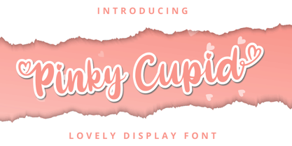 Pinky Cupid is lovely display font, including stylistic alternates that perfect for any combination for your design. Pinky Cupid perfectly macth for design with valentine theme, any product like book cover, t-shirt, branding, promotion, social media post, quotes, wedding, photography and more. What's included: - Multilingual Support - Support OpenType features - Works on PC & Mac - Simple installations - Accessible in the Adobe Illustrator, Adobe Photoshop, Adobe InDesign --- Hope you enjoy with our font! Attype Studio
 - Histeagin by Yahya Type,
$22.00 Histeagin – A New Serif Font with Fancy Curves, More Alternative Character, and Multilingual Support. Histeagin – this style works well for branding projects, logo, wedding designs, social media posts, advertisements, product packaging, product designs, label, photography, watermark, invitation, or whatever project you’re working on. WHAT’S INCLUDED? Uppercase & lowercase letters Numbers, punctuation Ligature & Huge Stylistic alternate Multilingual support. Still got a question? Send me a message and I’ll be happy to answer! qura.yahya@gmail.com
 - Crutsen by Surotype,
$35.00 Modern script typeface with a sense of calligraphy style that comes with clean style finishing. Some of the letters have an alternative character especially on ascender, descender and also lowercase. This typeface is great for Logotype, Poster, Digital Lettering Arts, Clean Design, Branding Design, Signs, etc. To enable Stylistic OpenType alternatives, you need a program that supports OpenType features like Adobe Photoshop CS, Adobe Illustrator CS, Adobe Indesign & CorelDraw X6-X7 and more.
 - Monita Signature by Aminmario Studio,
$20.00 Introducing Monita Signature font is a classy and elegant script. This font was created to look as close to a natural handwritten script, as possible by including some lowercase alternates, ligature and underlines. Comes with regular and italic. Perfect for any awesome projects that need hand writing taste. This is suitable for logos, watermarks on photography, signatures, branding, advertisement, quotes, invitations, stationery, wedding design,album covers, business cards, clothing, magazines, posters, and more!
 - Chicago Darling Serif by Gatype,
$14.00 Chicago Darling is a modern and classy minimalist design typography that features more alternative characters and lots of ties. Lifestyle friendly fonts with on-trend designs. The Chicago Darling is designed to be versatile, to match all your designs. This alternative makes the Chicago Darling very versatile. You can design beautiful, elegant and diverse typographic elements with it. It's perfect for logos, lettering artwork, t-shirt designs, editorial illustrations to name a few.
 - The Maggie Nut by Hydric Design,
$10.00 The Maggie Nut is a font with a retro style made to make your designs look more attractive. The Maggie Nut has 2 styles, namely Light (shining) and Regular, It will be very easy to use and will save you time on designing. The Maggie Nut also has many opentype features such as ligature, and alternate. This will be very suitable for use as a logo, poster, packaging, merchandise, social media & greeting cards.
 - Gregean Brush by Gatype,
$16.00 Gregean Brush is a relaxed brush font with a fine grit texture. This font has an irregular treatment between characters to give it a more realistic look. Suitable for use on title designs such as book titles, stationery designs, quotes, branding, logos, clothing, invitations, greeting cards, t-shirts, packaging designs, posters, and others. The Gregean Brush has the texture of a dry brush pen and the Solid is a slightly cleaner version. Thank You! - Gatype
 - Radio Stereo by Senekaligrafika,
$12.00 "Radio Stereo" is experimental vintage font style that to speak instant retro sensation, it was inspired by the inscription on the radio/televisiom in the 2000's era. "Radio Stereo" will help you to create special and touching typographical design for your nostalgic and oldschool projects.Perfect when you place them into magazines, book cover, cafe product, newspaper titles, poster, and many more. It is really universal and modern font. The owner of endless possibilities!
 - Notulen Serif Display by Siwox Studios,
$49.00 Notulen is an Serif Display Typeface, Extra Bold style and nicely balanced curves. Notulen is inspired by Classic typography and now come with modern serif nuance. Short serifs with slightly rounded corners make this font legible at small points. Having several alternative letter variations makes it easy to work on all design projects and works perfectly for Logos, Headlines, Posters, Packaging, T-shirts, Postcards, Invitation, Wedding Sign, Sign Painting, Signboard, and much more. Thank you,
 - Regnante by BustanType,
$19.00 Regnante was created with all of my heart. It has a luxury style, is stylish and lovely, and has a strong personality, so it will catch your attention. This font is ideal for a wide range of tasks including branding, logos, packaging, and more. Regnante includes 12 fonts, including 4 weight variations and Italic style. Regular and Alternate are come separately. You can make your selection based on your personal preferences and requirements.

