10,000 search results
(0.057 seconds)
- Jungle Man by PleasureFonts,
$14.00 Looking for a typeface with a unique appearance? Jungle Man is the right choice for advertising, graphic design and webdesign to make a personal statement. And when it comes to readability, you are on a safe side by using Jungle Man. There are numerous occasions where a handwritten font makes a great impression.
 - Amici by Greater Albion Typefounders,
$12.00 Amici means 'friends' and the Amici family was conceived as a big friendly Roman typeface for headings, posters, signs and anywhere else that an approachable easy-reading typeface is needed. It's the sort of thing you used to see in Magazine mastheads before everything went boringly sans serif. Three faces are offered within the family, Regular - solid and clear, Bold - with that bit more body and presence and italic - bringing in script elements to its design.
 - Maison Luxe by FontMesa,
$25.00 Maison Luxe is a revival of a very old font designed in France in or around the year 1820. You may have seen this font in the past under the names of Circus, Roma, Madame and Gillé Classic. As of November 2016 we have changed the name of this font from Gillé Classic to Maison Luxe which means Luxury House in French. For many years Joseph Gillé was credited as the original designer of this font however we've recently been contacted by a type historian in France reporting that he could not find any evidence supporting Joseph Gillé as the designer and to the best of his knowledge an artist by the name of Sylvestre may be the true designer. If you love this classic font then you're sure to enjoy the alternate version also with a matching lowercase available from FontMesa under the name of Home Style. This version of the classic with its squared off shadow is true to the original design where Home Style has diagonal lines creating a cast shadow. New in 2016 for Maison Luxe is a new matching lowercase, an uppercase German Double S (versal eszett), Greek character set, opentype features including case sensitive forms and old style numerals. We know you'll enjoy the new additions to this timeless classic design.
 - Fun Time Nouveau JNL by Jeff Levine,
$29.00 “One Hundred Alphabets for the Show Card Writer” was published in 1919 to afford sign artists the ability to create signs and show cards in then-contemporary lettering styles. One such alphabet was big, bold and representative of the Art Nouveau stylings popular in the early part of the 20th Century. Most likely it was applied to store sales and public events that were casual and informal, for its letter forms are free of any constraints. This design is now available as Fun Time Nouveau JNL in both regular and oblique versions.
 - RM Almanack by Ray Meadows,
$19.00 Based on William Caslon’s design (c1720) which was itself based on Dutch Baroque typefaces. The old saying “when in doubt, use Caslon.” can now be updated ... “use RM Almanack instead!” Includes: Western European, Central European, Baltic & Turkish sets Due to the modular nature of this design there may be a slight lack of smoothness to the curves at very large point sizes (around 100 pt and above).
 - Uppercut Angle by Delve Fonts,
$39.00 Joachim Müller-Lancé's Uppercut is a rather sporting fellow, originally developed for the Krav Maga training center of San Francisco (Krav Maga is a simple and efficient self-defense system that has become equally popular in Hollywood and with law enforcement). Joachim has spent several years training, hitting things and people whenever he needs a break from kerning. Uppercut can be seen on the school's t-shirts and other articles. Despite bearing the same moniker as an upwards punch to the chin, the name actually fell together quite naturally as Uppercut is an all uppercase typeface, and the word "cut" is also historically used to describe a type style in hot metal type. For this slanted look, "Angle" felt just right (with thanks to Mia McHatton). The design idea sprang from pencil sketches for the center's new identity. Uppercut's shapes are not calligraphic or handwritten, more like lettering seen in comics or sports logos. Its brush movements are imaginary, not too literally brushy. During development, details were simplified and reduced until a bit of a cut-paper feel emerged, but more fluid like writing. The shapes are economical and efficient; simplicity makes the font versatile, holding up in small as well as big sizes. Uppercut is decidedly analog, muscular but not bulky, with the fluid but determined movements of a boxer or martial artist - not theatrical but powerful, fast, confident and dynamic. Well... it has punch. In the proportions, there is emphasis on a strong upper edge "keeping its guard up", while several stems protrude downward, giving the impression of leaping or being "light on the feet". Use Uppercut to pick up the pace, add snap, verve and drive - on movie posters for action and adventure, to advertise your dojo, rumble or prizefight, racing team or tuning shop, or invite friends to your barbecue with old time rock'n'roll and homemade hot pepper sauce.
 - Yes Margo by Orenari,
$17.00 Yes Margo is an unique handwritten font. It has sweet and lovely touch. Yes Margo is perfect for many design purposes, just try on your creative project and it will be cool :)
 - Kaarna by LetterMaker,
$28.90 Kaarna is a rough hand drawn sans serif. The underlying shapes and structure are designed in the style of modern sans serifs which are made livelier by the hand drawn look. The condensed proportions make it especially suitable for use in large headlines and to achieve maximum impact. The hand drawn texture becomes clearly visible in big sizes and quiets down when used small. This allows you to use Kaarna for both headlines and short to medium length texts, ensuring visually unified typography. Because of its design and large character set, Kaarna is well suited for branding, advertising, packaging and editorial use.
 - Adobe Caslon by Adobe,
$35.00The Englishman William Caslon punchcut many roman, italic, and non-Latin typefaces from 1720 until his death in 1766. At that time most types were being imported to England from Dutch sources, so Caslon was influenced by the characteristics of Dutch types. He did, however, achieve a level of craft that enabled his recognition as the first great English punchcutter. Caslon's roman became so popular that it was known as the script of kings, although on the other side of the political spectrum (and the ocean), the Americans used it for their Declaration of Independence in 1776. The original Caslon specimen sheets and punches have long provided a fertile source for the range of types bearing his name. Identifying characteristics of most Caslons include a cap A with a scooped-out apex; a cap C with two full serifs; and in the italic, a swashed lowercase v and w. Caslon's types have achieved legendary status among printers and typographers, and are considered safe, solid, and dependable. Carol Twombly designed this Caslon revival for Adobe in 1990, after studying Caslon's own specimen sheets from the mid-eighteenth century. This elegant version is quite true to the source, and has been optimized for the demands of digital design and printing. Adobe Caslon? makes an excellent text font and includes just about everything needed by the discriminating typographer: small caps, Old style Figures, swash letters, alternates, ligatures, expert characters, central European characters, and a plethora of period ornaments. - DT Paperside by Dragon Tongue Foundry,
$15.00 Paperside: Neither Papyrus nor SSI Countryside. Inspired in some ways by the Papyrus form, but untextured and smoother, with the dimensions and proportions more open, like that of Countryside SSi, with its larger easily readable lowercase body, and more consistent, shorter stems. Paperside has an open scripted feel which is pleasing on the eye and easy to read. Paperside can enhance the first letter of most sentences automatically, and changes other letters to suit their position within words, and the letters they appear beside. Now comes in 5 weights plus italic. For best results, use this ‘smart font’ with Contextual Ligatures turned on. Mulitiple Stylistic Alternatives are included. Inspiration for this font came from two other fonts. Papyrus: was designed by Chris Costello and created in 1982, it is a hand-drawn textured typeface, emulating texts written in biblical times. One of the most used (and misused) fonts of all times. Owned by Letraset, and currently published by the Internation Typeface Corporating (ITC). Countryside SSi: The serif font of an unknown designer, is currently licensed by Southern Software Inc. Feel free to preview some of the Dragon Tongue fonts that are yet to be released, at https://www.dragon-tongue.com/fonts
 - Billstone Signature by Nathatype,
$29.00 Are you ready to make your branding stand out? Do you dream of creating headings that stand out and inspire creativity, imagination, modernity, and endless fun? Looking for an elegant and stylish font? We've got what you want. Billstone Signatture- A Siganture Font Billstone Signatture is a soft and sweet signature typeface, with characters dancing along the baseline. Designed primarily as a captivating font that has a casual and elegant touch. Can be used for various purposes such as logos, wedding invitations, headings, t-shirts, letterheads, signage, labels, news, posters, badges etc. Our font always includes Multilingual Support to make your branding reach a global audience. Features: Ligatures Stylistic Set Swashes PUA Encoded Numerals and Punctuation Thank you for downloading premium fonts from Din Studio
 - Devama SRF by Stella Roberts Fonts,
$25.00 Devama SRF was designed by Typodermic's Ray Larabie and provided for Stella Roberts Fonts. Available in Regular, Backlash and Forward, this typeface evokes a retro-80s look while still remaining clean and fresh. The net profits from my font sales help defer medical expenses for my siblings, who both suffer with Cystic Fibrosis and diabetes. Thank you.
 - Smiling Animal by Tlatous Type,
$19.00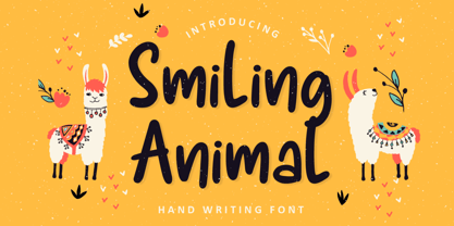 Introducing SMILING ANIMAL Font by Tlatoustype Smiling Animal is a Fun Modern Handdrawn Font. Smiling Animal is perfect for product packaging, branding project, magazine, social media, wedding, or just used to express words above the background. This font includes multilingual support.
 - Alexandra Calligraphy by Silverdav,
$18.00 Introducing, Alexandra Calligraphy is a unique calligraphy font, created to complement your designs and make your designs beautiful and more attractive. Alexandra Calligraphy is very well made, with very neat strokes that add a luxurious impression, there are many lowercase Alternate letters that you can use to enhance your design, this is really charming, please try it yourself. Alexandra Calligraphy is perfect for Branding, Logos, Wedding Invitations, Quotes, Magazines, and many more.
 - Whalebone by Hanoded,
$15.00 For some reason I had to think of Moby Dick (the classic book by Herman Melville) when I was busy working on this font. No, I don’t live near the sea, nor do I have a pet whale. It’s just one of those things… Whalebone (named after Captain Ahab’s prosthetic leg) is a handmade, all caps brush font. It wasn’t actually made with a brush; I used a broken satay skewer and Chinese ink. Whalebone comes with discretionary ligatures for double letter combinations.
 - Swissa Piccola by Jeremia Adatte,
$30.00 The Swiss typewriters were famous for their unique precision. As complex digitalizations and macro shots were a start for the inspiration and studies, each character has been carefully re-crafted from the ultra high def scans of the printouts made on a special bleed-proof paper. Today’s characters such as @, euro sign and most of accents have been crafted according the original alphabet design. The idea was to digitize and keep a saving of the original typewriter including all its functions (e.g. underlining key) . It’s surprisingly very legible at small sizes. Thanks to an x-height tighter and more spaced, a glyph design less detailed and more neutral/simple than other fonts found on american or italian typewriters. The final artwork can be set at very large sizes due to the highly detailed glyph design. Swissa Piccola Regular is loaded with more than 150 glyphs created with the typewriter to avoid letter repetition in a word. This OpenType feature can be accessed through the 'discretionary ligatures' option. Plus it comes with two stylistic sets : one with an original underlining feature, another with a slashed-x feature. In which all characters are unique and also have been originally typed with the typewriter. It contains more 600 glyphs in total. The two features are separated in another two fonts (Swissa Piccola Slashed x and Underlined) in case a non OT-savvy app is used. If you wish to obtain exactly the same prints as the original Swissa Piccola typewriter, you should set your font at 11.3 pt and 19.5 pt of line spacing. The Swissa Piccola font was originally offered in a dedicated limited edition packaging.
 - Mommie by Hubert Jocham Type,
$59.90 In the early 1980s, at the start of my career, I had the opportunity to work in a print shop with classic lead setting. In those days I would study issues of U&lc magazine from ITC. What really caught my attention were scripts in the Spencerian style. I’ve been fascinated by this American penmanship tradition ever since. A few years ago I developed a font. Boris Bencic used it when he was redesigning L’Officiel magazine in Paris. I took these initial forms and developed them into the font Mommie when I started my own foundry. Although I usually design text typefaces, working on Mommie taught me how complex it can be to create a script headline font. The biggest challenge in this process has been to keep it alive and fresh. The Regular weight is only made for very big headlines. The thin lines with the bold drops are very elegant. For smaller sizes use the Medium and Small weight. It won the TDC 2008 award and was Judges Choice of Christian Schwartz.
 - Qidung Swara by Creative17studio,
$20.00 Qidung Swara is a heritage typeface. Inspired by Aksara Jawa, character that has its own uniqueness and privilege. Qidung Swara was created to support use in all designs, such as branding, magazines, advertising brochures, music album covers and other uses. Qidung Swara also support multilingual language. Available in 2 styles: Regular and Italic. Grab this exclusive and awesome font fast. Don't miss it. Any question? Jusk Ask. Free update Thank You
 - Agency FB by Font Bureau,
$40.00 ATF Agency Gothic was designed by Morris Fuller Benton in 1932 as a lone titling typeface. In 1990, David Berlow saw potential in the squared forms of the narrow, monotone capitals. He designed a lowercase and added a bold to produce Font Bureau Agency, an immediately popular hit. Sensing its potential to be than just a useful condensed face, Font Bureau developed Agency into a major series offering five weights in five widths; FB 1990-95
 - Worriment by The Ampersand Forest,
$20.00 Worriment is a simple, one-off typeface; part of the Dreads collection from the Ampersand Forest. He was born of a whimsical sense of queasiness and unease — he's not just scary, he's Scary Fun! A little kitsch, a little horror. Great for use on Halloween-themed designs, and reminiscent of a "wizarding" look. In terms of letterforms, Worriment is a quirky blackletter-latin hybrid with a sharp, slightly bouncy baseline, and jangly angles, suitable for display use.
 - Banknote 1948 by Ingo,
$39.00 A very expanded sans serif font in capital letters inspired by the inscription on a bank note Old bank notes tend to have a very typical typography. Usually they carry decorative and elaborately designed markings. For one thing, they must be practically impossible to forge and for another, they should make a respectable and legitimate impression. And in the days of copper and steel engravings, that meant nothing less than creating ornate, shaded or otherwise complicated scripts. Designing the appropriate script was literally in the hands of the engraver. That’s why I noticed this bank note from 1948. It is the first 20 mark bill in the then newly created currency ”Deutsche Mark.“ All other bank notes of the 1948 series show daintier forms of typography with an obvious tendency toward modern face. The 1949 series which followed shortly thereafter reveals the more complicated script as well. For whatever reason, only this 20 mark bill displays this extremely expanded sans serif variation of the otherwise Roman form applied. This peculiarity led me in the year 2010 to create a complete font from the single word ”Banknote.“ Back to those days in the 40’s, the initial edition of DM bank notes was carried out by a special US-American printer who was under pressure of completing on time and whose engravers not only engraved but also designed. So that’s why the bank notes resemble dollars and don’t even look like European currency. That also explains some of the uniquely designed characters when looked at in detail. Especially the almost serif type form on the letters C, G, S and Z, but also L and T owe their look to the ”American touch.“ The ingoFont Banknote 1948 comprises all characters of the Latin typeface according to ISO 8859 for all European languages including Turkish and Baltic languages. In order to maintain the character of the original, the ”creation“ of lower case letters was waived. This factor doesn’t contribute to legibility, but this kind of type is not intended for long texts anyway; rather, it unfolds its entire attraction when used as a display font, for example on posters. Banknote 1948 is also very suitable for distortion and other alien techniques, without too much harm being done to the characteristic forms. With Banknote 1948 ingoFonts discloses a font like scripts which were used in advertising of the 1940’s and 50’s and were popular around the world. But even today the use of this kind of font can be expedient, especially considering how Banknote 1948, for its time of origin, impresses with amazingly modern detail.
 - london 2012 - Personal use only

- Black Scream by Ditatype,
$29.00 Black Scream is a spine-chilling serif display font designed to send shivers down your spine. Set in uppercase, each letter is meticulously crafted with a haunting ink dripping effect, adding an eerie and nightmarish vibe to your horror-themed designs. The letters of this font exude an unsettling aura, as if they were dipped in darkness and let ink slowly bleed down the page. The ink dripping effect adds a touch of realism and dread to the font, as if it were forged from the depths of a chilling nightmare. On the other side, the serif details of Black Scream add a sense of elegance to the font, contrasting with its nightmarish appearance. The fine lines and precise curves create a mesmerizing yet unsettling effect, making it a unique and captivating choice for horror-themed designs. For the best legibility you can use this font in the bigger text sizes. Enjoy the available features here. Features: Multilingual Supports PUA Encoded Numerals and Punctuations Black Scream fits in headlines, logos, horror movie posters, haunted house flyers, Halloween party invitations, any spine-tingling project, branding materials, print media, editorial layouts, website headers, and many more. Find out more ways to use this font by taking a look at the font preview. Thanks for purchasing our fonts. Hopefully, you have a great time using our font. Feel free to contact us anytime for further information or when you have trouble with the font. Thanks a lot and happy designing.
 - Blackduck by Eurotypo,
$60.00 “Blackduck” font is a typical Gothic, usually named “Blackletter” . This typeface was born with the name of “Textur” and developed from Carolingian cursive. It was used in the middle age as sacred script, became increasingly narrower, his vertical lines were emphasized and his strokes very compacted to save space. Along the time the early German print typefaces derived in others styles that were more readable such as Schwabacher and Fraktur, very popular in Germany and sometimes associated to the identity of the country. The font "Blackduck" was inspired mixing carefully the last two “Blackletters”. We try to joine some characteristics of both to reach good legibility without loosing the strong impact and powerfulness of the shapes. Some minuscules like the “o” “c” “e” “d” are rounded on both sides, while both strokes join in an angle at the top and at the bottom. Some other lower cases are formed by an angular and rounded stroke. This font contains a full set of OpenType features; swashes, stylistics alternates, old style figures (Arabic numeral were carefully shape integrated), ligatures and some extras ornaments were added to help in your design. "Blackduck" includes diacritic signs for Central European languages.
 - Rail Travel JNL by Jeff Levine,
$29.00 Here’s yet another interpretation of the classic “thick and thin” sans serif lettering most popular during the Art Deco era. This particular design comes to you through the courtesy of a hand lettered 1930s travel poster from the Pennsylvania Railroad. Some capitals are much wider than others, while the lower case ‘i’ is somewhat truncated. Rail Travel JNL is available in both regular and oblique versions.
 - Fort Collins by Letterhend,
$13.00 Fort Collins is a pair of fonts that bring the classy yet casual feel in the same time. The condensed sans combined with the natural hand writing script are the perfect match for you who needs a typeface for headline, logotype, apparel, invitation, branding, packaging, advertising etc. This typeface is comes in uppercase, lowercase, punctuation, symbols & numerals, stylistic set alternate, ligatures, etc also support multilingual.
 - Black Diamond by Set Sail Studios,
$16.00 Black Diamond isn't your average brush font, it’s raw, edgy & bursting with attitude! Hand-painted with extra attention to quick-strokes and dry textures, Black Diamond is guaranteed to deliver a loud, proud & unashamed message - ideal for logos, handwritten quotes, product packaging, merchandise, advertising, social media & branding projects. Black Diamond comes as a single font packed full of great features. It contains a full set of lower & uppercase letters, a large range of punctuation, numerals, and multilingual support. The font also contains several ligatures and stylistic alternates for those who have opentype capable software. Lastly you can add some finishing touches to your work with the added bonus extras; Just type out any of the square-bracket characters { } [ ] on your keyboard for quick and easy access to 4 different swashes, and the arrow up ^ key to produce paint splatters. Huge Language Update; Black Diamond has now been updated to support Greek & Cyrillic alphabets.
 - Hello Mellogia by IM Studio,
$18.00 Hello Mellogia is a modern vintage serif font packaged in a modern and classy style, complete with access your OpenType features to access a large selection of alternative fonts and bindings, Choose the font you like from large and small font variations for a luxurious and elegant look. A unique, fun and versatile serif family with 26+ binders and 100 alternatives to perfect any design you love. This font is perfect for branding projects, Logo design, Apparel Branding, packaging, magazine titles, advertisements, T-shirts, postcards and more. This typeface has been enriched with additional alternate characters of up to 350 glyphs. Hope it helps to capture the soul of any design. Finally, there are no words to say other than "Success and enjoy. Hello Mellogia is encoded with PUA Unicode, which allows full access to all additional characters without having to design any special software. Mac users can use Font Book, and Windows users can use Character Map to view and copy any additional characters to paste into your favorite text editor/app. How to access all alternative characters using Adobe Illustrator: https://www.youtube.com/watch?v=XzwjMkbB-wQ
 - Versals by Classic Font Company,
$14.95Versals is based on Lombardic style letters which are sufficiently broad to allow for decorated piercing and flourishes. They may also form the basis of illuminated capitals. The face is presented as capitals with reduced copies in the lower case locations. It is a full latin set with, uniquely, a set of roman numerals. - MGN Kinetic by Morgana Studio,
$18.00 MGN Kinetic is an innovative font iconography type product released by Morgana Studio in 2023. This unique font set offers a fresh and dynamic approach to incorporating icons into your designs. MGN Kinetic features a one-of-a-kind design that sets it apart from other font sets, making it an ideal choice for designers who want to create eye-catching and memorable designs. One of the standout features of MGN Kinetic is its ability to bring movement and energy to your designs through its dynamic icons. These icons are designed to convey a sense of motion and fluidity, adding a new dimension of interest to your work. With MGN Kinetic, you can create designs that are not only aesthetically pleasing but also convey a sense of action and movement, making your work more engaging and memorable. Whether you're designing for a website, app, or other digital media, MGN Kinetic is the perfect choice for designers who want to elevate their work and stand out from the crowd
 - Clichy by Eurotypo,
$32.00 Clichy is a delightfully handwritten font with strong character. Clichy is a font inspired by the successful Nuit font, looking for the same harmony and casual character, Nuit's rounded strokes are now straight. Clichy has even more stylistic alternatives, decorative characters, ligatures, initial and terminal forms in upper and lower case, that allow you to mix and match pairs of letters. Also, with Clichy it is possible to write in capital letters. Clichy will help your creativity and make your typographic work expressive and elegant.
 - Optima Nova by Linotype,
$57.99 With the clear, simple elegance of its sans serif forms and the warmly human touches of its tapering stems, the Optima family has proved popular around the world. In 2002, when it was finally possible to produce digital alphabets without technical limitations and compromises, and more than fifty years after the first sketches, an expansion and redesign of the Optima family was completed and released as Optima nova. Hermann Zapf and Japanese type designer, Akira Kobayashi, collaborated on the project, which included re-working of the existing weights and the addition of several new weights: small caps, old style figures, light, heavy, and condensed. The original Optima was never manufactured with a real italic, only an oblique version of the roman. Optima nova has a complete range of beautifully designed real italics; the new italic forms, of the e, f and g are especially notable. The titling face includes capital letters with special and unusual letter combinations and ligatures, making it an excellent choice for headlines, logos and advertising purposes. Optima continues to be an all-purpose typeface; and Optima nova works for just about anything from book text to signage. Optima Nova® font field guide including best practices, font pairings and alternatives.
 - Quinn Display Typeface by FoxType,
$50.00 Introducing Quinn Display new generation Typeface created for building brand identity. Quinn Typeface created with the vision of to attract the audience to your brand . The finest details of this typeface are methodically and mathematically created. Quinn is created with all the tasks of a corporate font and also for the usage in a variety of projects, including branding, logos, titles, headlines, servers, posters, screens, display, digital ads, and everything else. We are putting a lot of effort on this font as a long-term project.
 - Belkin Display Typeface by FoxType,
$12.00 Belkin Display new generation Typeface. Belkin Dispaly Typeface created with the vision of attract the audience to your brand . The finest details of this typeface are methodically and mathematically created. Belkin is created with all the tasks of a corporate font and also for the usage in a variety of projects, including branding product, logos, titles, headlines, servers, posters, screens, display, digital ads, and everything else. We are putting a lot of effort on this font as a long-term project. 6 Weights Included.
 - Moraco by FoxType,
$50.00 Introducing Moraco Display new generation Typeface created for building brand identity. Moraco Typeface created with the vision of to attract the audience to your brand. The finest details of this typeface are methodically and mathematically created. Moraco is created with all the tasks of a corporate font and also for the usage in a variety of projects, including branding, logos, titles, headlines, posters, screens, display, digital ads, and everything else. We are putting a lot of effort on this font as a long-term project.
 - Magistoe by Masinong Studio,
$15.00 Magistoe script a new fresh & modern script with a handmade calligraphy style, decorative characters and a dancing baseline! So beautiful on invitation like greeting cards, branding materials, business cards, quotes, posters, and more. Magistoe script come with 274+ glyphs. The alternative characters were divided into several Open Type features such as Swash, Alternates Set. The Open Type features can be accessed by using Open Type savvy programs such as Adobe Illustrator, Adobe InDesign, Adobe Photoshop Corel Draw X version, And Microsoft Word. And this Font has given PUA unicode (specially coded fonts). so that all the alternate characters can easily be accessed in full by a craftsman or designer. To enable the OpenType Stylistic alternates, you need a program that supports OpenType features such as Adobe Illustrator CS, Adobe Indesign & CorelDraw X6-X7. There are additional ways to access alternates, using Character Map (Windows), Nexus Font (Windows), Font Book (Mac) or a software program such as PopChar (for Windows and Mac). For use in office word, you all can read the following article to access alternate glyphs: http://www.magpiepaperworks.com/blog/using-opentype-fonts-in-microsoft-word/ If you have any question, don't hesitate to contact me by email masinong.studio@gmail.com Thanks and happy designing :-) Thank You for purchase!
 - Times New Roman PS Cyrillic by Monotype,
$67.99In 1931, The Times of London commissioned a new text type design from Stanley Morison and the Monotype Corporation, after Morison had written an article criticizing The Times for being badly printed and typographically behind the times. The new design was supervised by Stanley Morison and drawn by Victor Lardent, an artist from the advertising department of The Times. Morison used an older typeface, Plantin, as the basis for his design, but made revisions for legibility and economy of space (always important concerns for newspapers). As the old type used by the newspaper had been called Times Old Roman," Morison's revision became "Times New Roman." The Times of London debuted the new typeface in October 1932, and after one year the design was released for commercial sale. The Linotype version, called simply "Times," was optimized for line-casting technology, though the differences in the basic design are subtle. The typeface was very successful for the Times of London, which used a higher grade of newsprint than most newspapers. The better, whiter paper enhanced the new typeface's high degree of contrast and sharp serifs, and created a sparkling, modern look. In 1972, Walter Tracy designed Times Europa for The Times of London. This was a sturdier version, and it was needed to hold up to the newest demands of newspaper printing: faster presses and cheaper paper. In the United States, the Times font family has enjoyed popularity as a magazine and book type since the 1940s. Times continues to be very popular around the world because of its versatility and readability. And because it is a standard font on most computers and digital printers, it has become universally familiar as the office workhorse. Times?, Times? Europa, and Times New Roman? are sure bets for proposals, annual reports, office correspondence, magazines, and newspapers. Linotype offers many versions of this font: Times? is the universal version of Times, used formerly as the matrices for the Linotype hot metal line-casting machines. The basic four weights of roman, italic, bold and bold italic are standard fonts on most printers. There are also small caps, Old style Figures, phonetic characters, and Central European characters. Times? Ten is the version specially designed for smaller text (12 point and below); its characters are wider and the hairlines are a little stronger. Times Ten has many weights for Latin typography, as well as several weights for Central European, Cyrillic, and Greek typesetting. Times? Eighteen is the headline version, ideal for point sizes of 18 and larger. The characters are subtly condensed and the hairlines are finer." - Times New Roman Seven by Monotype,
$67.99In 1931, The Times of London commissioned a new text type design from Stanley Morison and the Monotype Corporation, after Morison had written an article criticizing The Times for being badly printed and typographically behind the times. The new design was supervised by Stanley Morison and drawn by Victor Lardent, an artist from the advertising department of The Times. Morison used an older typeface, Plantin, as the basis for his design, but made revisions for legibility and economy of space (always important concerns for newspapers). As the old type used by the newspaper had been called Times Old Roman," Morison's revision became "Times New Roman." The Times of London debuted the new typeface in October 1932, and after one year the design was released for commercial sale. The Linotype version, called simply "Times," was optimized for line-casting technology, though the differences in the basic design are subtle. The typeface was very successful for the Times of London, which used a higher grade of newsprint than most newspapers. The better, whiter paper enhanced the new typeface's high degree of contrast and sharp serifs, and created a sparkling, modern look. In 1972, Walter Tracy designed Times Europa for The Times of London. This was a sturdier version, and it was needed to hold up to the newest demands of newspaper printing: faster presses and cheaper paper. In the United States, the Times font family has enjoyed popularity as a magazine and book type since the 1940s. Times continues to be very popular around the world because of its versatility and readability. And because it is a standard font on most computers and digital printers, it has become universally familiar as the office workhorse. Times?, Times? Europa, and Times New Roman? are sure bets for proposals, annual reports, office correspondence, magazines, and newspapers. Linotype offers many versions of this font: Times? is the universal version of Times, used formerly as the matrices for the Linotype hot metal line-casting machines. The basic four weights of roman, italic, bold and bold italic are standard fonts on most printers. There are also small caps, Old style Figures, phonetic characters, and Central European characters. Times? Ten is the version specially designed for smaller text (12 point and below); its characters are wider and the hairlines are a little stronger. Times Ten has many weights for Latin typography, as well as several weights for Central European, Cyrillic, and Greek typesetting. Times? Eighteen is the headline version, ideal for point sizes of 18 and larger. The characters are subtly condensed and the hairlines are finer." - Times New Roman WGL by Monotype,
$67.99 In 1931, The Times of London commissioned a new text type design from Stanley Morison and the Monotype Corporation, after Morison had written an article criticizing The Times for being badly printed and typographically behind the times. The new design was supervised by Stanley Morison and drawn by Victor Lardent, an artist from the advertising department of The Times. Morison used an older typeface, Plantin, as the basis for his design, but made revisions for legibility and economy of space (always important concerns for newspapers). As the old type used by the newspaper had been called Times Old Roman," Morison's revision became "Times New Roman." The Times of London debuted the new typeface in October 1932, and after one year the design was released for commercial sale. The Linotype version, called simply "Times," was optimized for line-casting technology, though the differences in the basic design are subtle. The typeface was very successful for the Times of London, which used a higher grade of newsprint than most newspapers. The better, whiter paper enhanced the new typeface's high degree of contrast and sharp serifs, and created a sparkling, modern look. In 1972, Walter Tracy designed Times Europa for The Times of London. This was a sturdier version, and it was needed to hold up to the newest demands of newspaper printing: faster presses and cheaper paper. In the United States, the Times font family has enjoyed popularity as a magazine and book type since the 1940s. Times continues to be very popular around the world because of its versatility and readability. And because it is a standard font on most computers and digital printers, it has become universally familiar as the office workhorse. Times?, Times? Europa, and Times New Roman? are sure bets for proposals, annual reports, office correspondence, magazines, and newspapers. Linotype offers many versions of this font: Times? is the universal version of Times, used formerly as the matrices for the Linotype hot metal line-casting machines. The basic four weights of roman, italic, bold and bold italic are standard fonts on most printers. There are also small caps, Old style Figures, phonetic characters, and Central European characters. Times? Ten is the version specially designed for smaller text (12 point and below); its characters are wider and the hairlines are a little stronger. Times Ten has many weights for Latin typography, as well as several weights for Central European, Cyrillic, and Greek typesetting. Times? Eighteen is the headline version, ideal for point sizes of 18 and larger. The characters are subtly condensed and the hairlines are finer."
 - Times New Roman by Monotype,
$67.99 In 1931, The Times of London commissioned a new text type design from Stanley Morison and the Monotype Corporation, after Morison had written an article criticizing The Times for being badly printed and typographically behind the times. The new design was supervised by Stanley Morison and drawn by Victor Lardent, an artist from the advertising department of The Times. Morison used an older typeface, Plantin, as the basis for his design, but made revisions for legibility and economy of space (always important concerns for newspapers). As the old type used by the newspaper had been called Times Old Roman," Morison's revision became "Times New Roman." The Times of London debuted the new typeface in October 1932, and after one year the design was released for commercial sale. The Linotype version, called simply "Times," was optimized for line-casting technology, though the differences in the basic design are subtle. The typeface was very successful for the Times of London, which used a higher grade of newsprint than most newspapers. The better, whiter paper enhanced the new typeface's high degree of contrast and sharp serifs, and created a sparkling, modern look. In 1972, Walter Tracy designed Times Europa for The Times of London. This was a sturdier version, and it was needed to hold up to the newest demands of newspaper printing: faster presses and cheaper paper. In the United States, the Times font family has enjoyed popularity as a magazine and book type since the 1940s. Times continues to be very popular around the world because of its versatility and readability. And because it is a standard font on most computers and digital printers, it has become universally familiar as the office workhorse. Times?, Times? Europa, and Times New Roman? are sure bets for proposals, annual reports, office correspondence, magazines, and newspapers. Linotype offers many versions of this font: Times? is the universal version of Times, used formerly as the matrices for the Linotype hot metal line-casting machines. The basic four weights of roman, italic, bold and bold italic are standard fonts on most printers. There are also small caps, Old style Figures, phonetic characters, and Central European characters. Times? Ten is the version specially designed for smaller text (12 point and below); its characters are wider and the hairlines are a little stronger. Times Ten has many weights for Latin typography, as well as several weights for Central European, Cyrillic, and Greek typesetting. Times? Eighteen is the headline version, ideal for point sizes of 18 and larger. The characters are subtly condensed and the hairlines are finer."
