10,000 search results
(0.043 seconds)
- Volterra by Blank Is The New Black,
$25.00 In today's typographic landscape, few would still consider Bodoni to have a "modern" feel, but there was once a time when it's vertical axis and thinned horizontal strokes were considered radical. Volterra—inspired by the forms of Bodoni—finishes what Bodoni started and eliminates the horizontal stroke altogether, breathing an elegant new energy into a 200-year-old classic. Named for the artist hired to paint loincloths over Michelangelo's "Last Judgement" when nudity in religious art was condemned, Volterra acknowledges that it is no easy feat picking up where a master left off. Volterra takes what has grown to feel traditional and transforms it into a delicate mixture of classic and modern, with razor-edged serifs and ultra-sharp strokes. Strictly a display face, the larger Volterra is used, the better it looks.
 - Open Book ING by Ingrimayne Type,
$9.00 OpenBookING is a gimmick or novelty font that has letters on pages of a book. It is caps only and monospaced. The letters on the upper-case keys are on the left-handed pages of an open book and the letters on the lower-case keys are the same letters but on the right-handed pages of an open book. One could alternate upper and lower case keys to get letters on complete books, but the Opentype feature of contextual alternatives (calt) does this automatically. Several previous typefaces from IngrimayneType used the calt feature to alternate shapes that fit together in an interlocking pattern, such as alternating concave and convex shapes. OpenBookING uses the calt feature in a different way, to alternate two halves of a symmetrical shape. To provide two copies of numbers and common symbols, some non-alphabetical characters are unavailable because their slots were taken by the second form of the number or common symbol. If stylistic set one (ss01) is turned on, spaces are replaced with empty pages. This may leave you with unwanted spaces at the end of lines, and to eliminate them, turn off the feature (or change the font) for these spaces. The empty pages can be used in a layer to add color to the text. There is also a second set of empty pages with a filled page that can also be used in layers. (See poster for examples.) These pages are on the (logicalnot multiply) and (register divide) characters for the first set and on the (ordmasculine ellipsis) and (macron trademark) keys for the second set. Finally, OpenBookING has a large set of accented characters if anyone should need them. The letters used on the books were derived from the font Myhota-Bold. For a related typeface of letters on book covers, see NewLibrary. OpenBookING has limited uses and is priced accordingly.
 - Jantar Flow by CAST,
$45.00 Jantar Flow is a humanist sanserif type family tailored for continuous reading for both printing and screen. With its large x-height and low contrast it also performs very well in captions, side notes, and short paragraphs set in small sizes. Jantar Flow Italic is distinct and readable. Following a proper italic construction, it shows the fun side of the family yet keeps the features of the upright. Jantar Flow – as well as its teammate Jantar Sharp – comes in seven weights from ExtraLight to Heavy, each with accompanying italics. It has a tabular and proportional set of figures in both old style and lining options, and also a special set of hybrid figures sitting between x-height and capitals. Superscripts and subscripts are provided together with a vast collection of diacritics covering all European languages as well as a set of case-sensitive characters. Jantar, the pairing superfamily. ‘Jantar’ is an old Polish name for ‘amber’, a fossilised resin – a substance that is robust and organic at the same time. These qualities somehow reflect the feeling behind the Jantar families, ‘Flow’ and ‘Sharp’. Jantar Flow was designed along with Jantar Sharp. As part of the Jantar superfamily these two faces are perfectly paired: though not based on the same skeleton, they share the same design parameters and the same character set, but each one works independently with its peculiar features. Designed for publishing for print and web, as well as for branding, the Jantar superfamily was inspired by common font pairings of the digital age like Helvetica/Times or Verdana/Georgia. Jantar Flow and Jantar Sharp communicate with individual yet complementing voices, just like two trained acrobats can perform alone but also know well how to perform together.
 - Versatile EP by Borges Lettering,
$9.00 Versatile EP is a powerhouse of 9 fonts that make design and logo creation effortless. While other sans-serif fonts tend to be rigid and cold, Versatile stands out with it's warm and natural feel. It's generous x-height aids in its legibility and function, and the forms are classic yet modern allowing this font to live up to its name as a truly versatile workhorse for your next design or layout. Use it by itself, or in combination with Versatile 7 layer font package (Sold Separately.) https://www.myfonts.com/fonts/charlesborges/versatile-bold/ Versatile EP contains 3 body styles, and 6 shadow fonts including striped and solid in different weights. Versatile EP is not just for the Graphic Designer. It's well suited for the Sign Maker, Cricut and Silhouette users, and anyone else who uses a vinyl plotter. It weeds beautifully in cut vinyl. Its different layers allow the user to stack multi-colored vinyl to create one a kind signs and displays. Versatile EP is ideally suited for advertising and packaging, logo, branding and creative industries, poster and billboards, signage as well as web and screen design. What's included: 9 Fonts included in for one low price: 3 body fonts and 6 different shadows. 1,462 Glyphs (Characters) in each font for a total of 13,158 Glyphs per style pack. Over 200 Languages supported including Cyrillic, Bulgarian Cyrillic and Greek. A massive library of Alternate Characters: Latin, Extended Latin and Cyrillic Alternates including their Diacritic and Small Cap counterparts. Superscripts, Subscripts, Numerators, Denominators, and Scientific Inferiors. Small Caps in Latin, Extended Latin and Cyrillic include Numbers, Punctuation, Diacritics and Alternates. Extended currency symbols including Bitcoin. Fun assortment of speech bubbles. Unlimited fractions. PUA Encoded Versatile EP makes designing fun!
 - Barrista by Typodermic,
$11.95 Welcome to our cozy coffee shop! Come on in, take a seat and savor the aroma of freshly brewed coffee. Speaking of coffee, have you seen our new font? Meet Barrista! Its relaxed, curly script perfectly captures the whirling curls of steam rising from a hot cup of Joe. Barrista is not just any font. Thanks to OpenType ligatures, certain letter combinations will automatically be substituted with customer pairings. This creates a natural, relaxed look that’s perfect for our laid-back atmosphere. Imagine jotting down your order in Barrista, watching as our talented baristas create your perfect cup of coffee. As you wait for your order, you can admire the intricate details of Barrista’s flowing script, which is inspired by the art of coffee-making itself. So, come on down to our coffee shop and experience Barrista for yourself. Most Latin-based European writing systems are supported, including the following languages. Afaan Oromo, Afar, Afrikaans, Albanian, Alsatian, Aromanian, Aymara, Bashkir (Latin), Basque, Belarusian (Latin), Bemba, Bikol, Bosnian, Breton, Cape Verdean, Creole, Catalan, Cebuano, Chamorro, Chavacano, Chichewa, Crimean Tatar (Latin), Croatian, Czech, Danish, Dawan, Dholuo, Dutch, English, Estonian, Faroese, Fijian, Filipino, Finnish, French, Frisian, Friulian, Gagauz (Latin), Galician, Ganda, Genoese, German, Greenlandic, Guadeloupean Creole, Haitian Creole, Hawaiian, Hiligaynon, Hungarian, Icelandic, Ilocano, Indonesian, Irish, Italian, Jamaican, Kaqchikel, Karakalpak (Latin), Kashubian, Kikongo, Kinyarwanda, Kirundi, Kurdish (Latin), Latvian, Lithuanian, Lombard, Low Saxon, Luxembourgish, Maasai, Makhuwa, Malay, Maltese, Māori, Moldovan, Montenegrin, Ndebele, Neapolitan, Norwegian, Novial, Occitan, Ossetian (Latin), Papiamento, Piedmontese, Polish, Portuguese, Quechua, Rarotongan, Romanian, Romansh, Sami, Sango, Saramaccan, Sardinian, Scottish Gaelic, Serbian (Latin), Shona, Sicilian, Silesian, Slovak, Slovenian, Somali, Sorbian, Sotho, Spanish, Swahili, Swazi, Swedish, Tagalog, Tahitian, Tetum, Tongan, Tshiluba, Tsonga, Tswana, Tumbuka, Turkish, Turkmen (Latin), Tuvaluan, Uzbek (Latin), Venetian, Vepsian, Võro, Walloon, Waray-Waray, Wayuu, Welsh, Wolof, Xhosa, Yapese, Zapotec Zulu and Zuni.
 - TT Cometus by TypeType,
$19.00 Dynamic, attractive and catchy - the new TypeType display font! Please note! If you need OTF versions of the fonts, just email us at commercial@typetype.org TT Cometus is an expressive typeface that captivates from the first time you read a text set in it. Despite its massiveness, the typeface is malleable and dynamic, like a comet piercing the space in order to achieve the only goal - to capture the attention of the viewer. TT Cometus is a slab serif whose strong serifs are serifed at the junctions with the vertical stroke to give the typeface a dynamic and modern character. Thanks to this solution, some elements of the font evoke associations with calligraphic works, while display elements remain stable thanks to massive serifs. The pointed endings of the letters c, y, e, t and noticeable inflows of arches and semi-ovals make the character of TT Cometus dynamic. The contrast between the thicknesses of the horizontal and vertical elements is small, but in the serifs, inflows, and letter endings, the contrast is pronounced. The nature of the font is balanced, and its friendliness is supported by the smoothness of shapes. Oriented towards the viewer, flowing yet massive and dynamic, TT Cometus is suitable for use in eye-catching projects. This is a display font that shows its character better in a large body size and can be used in printed materials or on the web. The font looks flawless in headlines and logos, and is suitable for use in branding. TT Cometus consists of 5 faces: 4 upright and one variable font. Each face has 568 glyphs. The font contains 18 OpenType features, including a large number of ligatures, sets of alternative characters for the ampersand and the letter g.
 - PS Fournier Std by Typofonderie,
$59.00 Style and elegance in 14 styles PS Fournier, created by Stéphane Elbaz, is designed in tribute to Pierre Simon Fournier. Fournier was the prolific Parisian type designer whose work is best known for its iconic representation of French transitional style. PS Fournier elegantly represents the transition to the modern era of typography. Featuring three optical sizes, PS Fournier is designed to perform in any context. The Pierre Simon Fournier heritage Pierre Simon Fournier (1712—1768) was a leading innovative type designer of the mid-18th century. Early in his career, the young Pierre Simon developed a strong aesthetic that he cultivated throughout his life. His art is representative of the pre-revolutionary “Age of Enlightenment” (Siècle des Lumières). Precursor of the Modern style, Fournier’s body of work deeply influenced his times, and created the fertile ground from which the Didot family and Giambattista Bodoni developed their own styles. During the historical period of the 18th century, Fournier exemplified the intellectual pursuits of the times with his own research on type, documenting in detail the typefounding process. He also offered a unique vision: he is the first to clearly comprehend the concept of “type family,” sorting a set of similarly styled alphabets by sizes, width, and by x-heights. In addition, Fournier is one of the earliest advocates of the point system to organize the practice of typography, the point system that contemporary typographers continue to use to this day. The refined and discreet elegance of PS Fournier With a close look at the family, one finds you’ll find that the difference between the optical sizes (Petit, standard and Grand) is more than a contrast variation between the thin and the thick; the eye can also denote a palette of distinct tones: More streamlined and robust in the smaller sizes (Petit), more refined and detailed in the larger sizes (Grand). The PS Fournier standard family is designed to adapt to any situation with its intermediate optical size, from body copy to headlines. With a bit of tracking, PS Fournier Petit will make the smallest captions perfectly readable. However, Petit family is not limited to body and captions — its “slabby robustness” will make a relevant headline choice as well. PS Fournier Grand presents a higher contrast adapted to large text sizes, displays or banners. Its refined elegance makes it a perfect choice for Design, Fashion or Luxury publications. As a “modern” type PS Fournier Grand features a larger x-height than the preexistent old style typefaces such as Garamond or Jenson. These proportions provide any basic text set in PS Fournier Grand a strong typographic texture. As a result, the PS Fournier global family is a versatile alternative to the Modern typefaces commonly used in the publishing industry. The optical sizes, the large range of weights, and the design variations make this family adaptable to captions, paragraphs, and pages, as well as to large texts and displays. A leading-edge typography in the 18th century In the spirit of modernity, Pierre Simon Fournier did not find any use for the conventional swashes still produced by peers such as Caslon or Baskerville. Nevertheless the French designer created many inventive elements to decorate the page and set delightful variations in the text itself. To this regard PS Fournier includes a large set of glyphs variations, ligatures and more than one hundred glyphs for borders, rules and ornaments or — as called in French — “vignettes.” PS Fournier: A tribute to the French modern typography era by Stéphane Elbaz
 - Recons by Almarkha Type,
$25.00 Our new product Rekons - Sport Display, inspired by the title of the sports poster and We make it very energetically. Rekons font with strong and challenging nuances. very suitable for the title, typography, clothes, Poster, magazines, brochures, packaging,Websites and much more for your design needs, making your designs more modern and professional.
 - Abrupt by Akifatype,
$21.00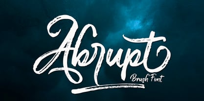 Abrupt is a textured brush font, a contemporary approach to design, naturally handmade and with underscores. It also has alternatives and ligatures that make your design more attractive.Suitable for use in title design such as clothing, invitations, tittle books, stationery designs, quotes, branding, logos, greeting cards, t-shirts, packaging designs, posters and more.
 - Meizda by Patria Ari,
$15.00 Introducing Meizda, a fun handwritten font with unique alternate and ligatures. Meizda can be played off easily to use for your project to make design more beautiful. Meizda suitable for book cover, tshirt, tote bags, merchandise, books, poster, title, quotes, and many more! Fonts featured : Uppercase Lowercase Numbers Punctuation & symbols Accented characters
 - Glitch by Roman Polishchuk,
$30.00 Glitch is an accentuated modern typeface. It emphasizes the digital identity of your product. More often than not, pixel fonts look rough. Glitch has a more elegant, subtle shape, improving perception. Gitch is suitable for crypto projects, programmers, and game design. It also has its place in printing, web design, and media.
 - Crazy Zombie by Goodigital13,
$20.00 It suitable for branding, crafting quote, t-shirt, poster, packaging, book cover, display design, cards, invitation and any cute handwriting needs and more. display font, this font is perfect for branding, logo, invitation, stationery, social media post, product packaging, merchandise, blog design, game titles, retro style design, Book/Cover Title and more.
 - Yellowish by Daily Studio,
$15.00 Yellowish - a typeface designed by Daily Studio. This font is a curls-style font, it can make your design more cheerful. you can enjoy and play with the uppercase or lowercase to make it more entertaining. Perfect for header, poster, title, and cards. Yellowish contains full uppercase, lowercase, punctuation, and multilingual letters.
 - Grown by Din Studio,
$29.00 Grown is a modern and clean display font. The design of typeface will make your design more beautiful and inspiring. This font will suitable for any project, like branding, print template, logo and more. Features : Accents (Multilingual characters) 18 Ligatures 19 Alternates PUA encoded Numerals and Punctuation (Open Type Standard) Full Support
 - Jilkyway by PizzaDude.dk,
$20.00Jilkyway is a truly weird font. Here and there you might spot some sanity in the weird font curves. But as you type, your text becomes more and more weird! The font is also suitable for text written in ALL CAPS! You will need to use OpenType supporting applications to use the autoligatures. - Bellasia Hawainis by Inermedia Studio,
$15.00 Introducing the beautiful and delicate handmade Bellasia Hawainis Font. Fonts designed for your design and business needs. It has beautiful and charming letters with more than 150 characters. Subtle curves will make your business stand out even more in the market. A few Glyph and Swash will add a punch to your masterpiece.
 - Choosing by OKSHUtypeCO,
$12.00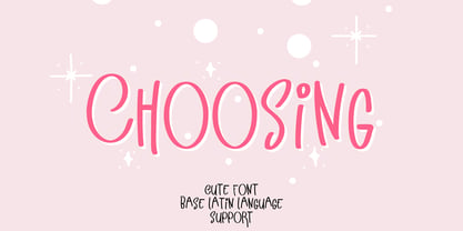 Choosing - a new fresh handmade calligraphy font. Very suitable for greeting cards, branding materials, business cards, quotes, posters, and more!This font are perfect for wedding postcard. Or you can create perfect and unique design of your logo, blog, stationery, marketing, magazines and more :) Features : UpperCase & Lowercase Numerals & Punctuations Multilingualcharacters(AÀÁÂÃÄÅCÇDÐEÈÉÊËIÌÍÎÏNÑOØÒÓÔÕÖUÙÜÚÛWYÝŸŸ ÆŒßÞàáâãäåæçèéêëìíîïðñòóôõöøùúûüýÿ)
 - Le Vin by Kellina James Designs,
$20.00 Le Vin is a calligraphy inspired font that was has a playful elegant design. It includes upper and lowercase letters, numerals, punctuation, and multilingual support. In addition, there are also special characters, alternates, and ligatures to add more flair to your projects. Great for invitations, headers, packaging, branding, wall art, and more.
 - Caliny by Marc Lohner,
$21.00 This cheerful font family combines cuteness and fun, making it a great choice for any kid’s app, book, toy, packaging, movie, theme park and so much more. Caliny’s curves are drawn with care and love. It covers more than 200 languages and has some advanced typographic features, like case sensitive forms to offer.
 - Bugmansta by OKSHUtypeCO,
$12.00 Bugmansta - a new fresh handmade calligraphy font. Very suitable for greeting cards, branding materials, business cards, quotes, posters, and more!This font are perfect for wedding postcard. Or you can create perfect and unique design of your logo, blog, stationery, marketing, magazines and more :) Features : UpperCase & Lowercase Numerals & Punctuations Multilingualcharacters(AÀÁÂÃÄÅCÇDÐEÈÉÊËIÌÍÎÏNÑOØÒÓÔÕÖUÙÜÚÛWYÝŸŸ ÆŒßÞàáâãäåæçèéêëìíîïðñòóôõöøùúûüýÿ)
 - Sporting by OKSHUtypeCO,
$14.00 Sporting- a new fresh handmade calligraphy font. Very suitable for greeting cards, branding materials, business cards, quotes, posters, and more!This font are perfect for wedding postcard. Or you can create perfect and unique design of your logo, blog, stationery, marketing, magazines and more :) Features : UpperCase & Lowercase Numerals & Punctuations Multilingualcharacters(AÀÁÂÃÄÅCÇDÐEÈÉÊËIÌÍÎÏNÑOØÒÓÔÕÖUÙÜÚÛWYÝŸŸ ÆŒßÞàáâãäåæçèéêëìíîïðñòóôõöøùúûüýÿ)
 - Pretty Dreaming by Lucky Type,
$18.00 Pretty Dreaming is a new Handwriting font with irregular baselines. a contemporary approach to design, handcrafted in nature, perfect for use in title designs such as clothing, invitations, book titles, stationery designs, quotes, branding, logos, greeting cards, t-shirts, packaging designs, posters and more. Pretty Dreaming also has more than 20 unique swashes.
 - Kailash by Akifatype,
$14.00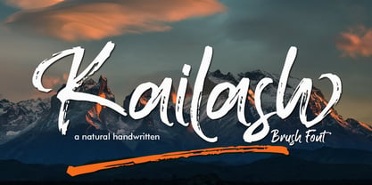 Kailash is a textured brush font, a contemporary approach to design, naturally handmade and with underscores. It also has alternatives and ligatures that make your design more attractive.Suitable for use in title design such as clothing, invitations, tittle books, stationery designs, quotes, branding, logos, greeting cards, t-shirts, packaging designs, posters and more.
 - Rocket Aviator by Dhan Studio,
$20.00 Rocket Aviator is a modern brush font, contemporary design approach, has a bold style and this font also has an underlines that makes your designs more interesting. Suitable for use in title designs such as clothing, invitations, booklets, stationery designs, quotes, branding, logos, greeting cards, t-shirts, packaging designs, posters, and more.
 - Baver Brush by Akifatype,
$14.00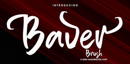 Baver Brush is a textured brush font, a contemporary approach to design, naturally handmade. It also has alternatives and ligatures that make your design more attractive. Suitable for use in title design such as clothing, invitations, book tittles, stationery designs, quotes, branding, logos, greeting cards, t-shirts, packaging designs, posters and more.
 - Wondrous by Sinfa,
$14.00 Wondrous with some new ideas with fonts that are perfect for all types of your project with alternative fonts both upper and lowercase and several types of underlines, such as advertising, branding, quotes, wedding designs, graphic designs, logos for online or offline business, photography, and more. . -other. Make your business more memorable!
 - Les Palmiers by Sarid Ezra,
$19.00 Introducing, Les Palmiers, an old handwritten script! Les Palmiers is a vintage and rough handwritten script. This font include alternates and swash that will make your project more attractive. With rough and imperfect side, this font will also make your design looks more vintage and old. Les Palmiers also support multi language!
 - Bollofora by Akifatype,
$14.00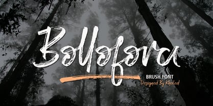 Bollofora is a textured brush font, a contemporary approach to design, naturally handmade and with underscores. It also has alternatives and ligatures that make your design more attractive.Suitable for use in title design such as clothing, invitations, tittle books, stationery designs, quotes, branding, logos, greeting cards, t-shirts, packaging designs, posters and more.
 - Imagine a font that decided to reject the monotonous life of straight lines and sharp edges for a more adventurous existence. Meet Letra Libre, the whimsical cousin in the font family that always has...
- MagicMedieval - Unknown license

- Afrika Motifs by CastleType,
$49.00 A collection of over 50 border patterns based on geometric motifs from various African tribes, including the Ashanti, Bushongo, and Zulu. Use for accents on stationery, greeting cards, etc.
 - Sumi Strokes by James J. Connell,
$9.00Sumi Strokes was created as a set of simple abstract brush stokes that could be used on their own or in conjunction with one another to form a painting. - KG By The Grace Of God by Kimberly Geswein,
$5.00 Inspired by the decayed lettering on the signs at Siesta Key beach painted on weather-worn old wood in Florida, these letters are made to look like peeling paint.
 - Kernig Braille by Echopraxium,
$5.00 This font is the younger sister of HexBraille with which it may be combined to create new patterns. This also explains why their introductory text are similar. Introduction The purpose of this monospace font is to display braille in an original and "steganographic" way. The Kernig prefix means "Robust" in German, this is because of the crank shapes . The core of the glyph design is a flat hexagon which can be read as 3 rows of 2 dots (i.e. regular braille glyph grid). Even if within a glyph, braille dots ("square dots" indeed) are placed on the vertices of a flat hexagon, the difference with HexBraille is that edges connecting vertices are not straight lines but "crank shapes" instead. This can be summarized by saying that the whole glyph is a Hexcrank (a flat hexagon where vertice pairs are connected by a crank shape) NB: The initial design is illustrated by glyphs 'ç' (no dot) and 'û' (6 dots) as shown by poster 6. A. "Kernig Lattice" In KernigBraille, glyphs are connected to each other, thus for each Hexcrank glyph there are 6 connections: 2 on left/right and 4 on top/bottom. In the final design some cranks were removed for esthetical reason (i.e. leave empty space for allowing patterns diversity). In summary, a text using this font won't display a honeycomb but a lattice instead. NB: Please notice that in order to obtain the lattice without vertical gaps, you must set the interline to 0. The lattice is made from 3 kind of shapes: a.1. Hexcrank a.2. Square a.3. Irregular cross (mostly unclosed) The design favored squares over crosses. The whole slightly resembling a PCB. B. Text Frames It's possible to frame the text with 4 sets of frame glyphs (as illustrated by poster 2) b.1. Kernig { € ° £ µ § ¥ ~ ¢ } b.2. Rectangular-High { è é ê ï î à â ä } b.3. Rectangular-Low { Â ù Ä Ê Ë Ô õ ö } b.4. Mixed Kernig+High: a mix of Kernig and Rectangular-High frame glyphs When using frame glyphs, it is advised to show Pilcrow (¶) and Non Breaking Space, which are replaced by empty shapes in this font (e.g. in Microsoft Word, use CTRL+8 or use [¶] button in the ribbon).
 - Blue Goblet Drawn by insigne,
$5.00 This best selling series has now been extended to include a new member, Blue Goblet Drawn. Blue Goblet is hand-drawn by the artist, Cory Godbey, and is organic, charming and exuberant. Characters bounce and dance above and below the baseline and x-height, making this a whimsical and fun script. Not only is Blue Goblet Drawn a excellent choice, it also is also a versatile member of a wide family of different fonts. You can use it side by side with the original Blue Goblet fonts, and there are a wide range of ornaments available in the supplemental ornament sets--over 370 illustrations! These illustrations include doodley frames, lovely florals and other text ornaments that can be inserted into your text and resized at will. This makes the Blue Goblet series a great pick when you want a type system for a very unique and consistent look. The Blue Goblet series also continues to expand, making any of these family members a valuable investment for the future. Blue Goblet Drawn comes in three weights and three widths in each weight, with complementary italics for maximum impact for a total of eighteen pro fonts. The compact thin weights are delicate and tall, while the Regular has just enough heft for those situations where subtlety doesn't work. If you don't need the professional features, there are three stripped down fonts that include only the basic character set! Blue Goblet Drawn also includes auto-replacing ligatures that make it appear that the script was drawn by the artistís own hand--just for you! Blue Goblet Drawn also includes a wide variety of alternates that can be accessed in any OpenType enabled application. Blue Goblet includes over 190 additional glyphs and is loaded with features including an even more unique alternate alphabet. Included are swash alternates, style sets, old style figures and small caps. Please see the informative PDF brochure to see these features in action. OpenType enabled applications such as the Adobe suite or Quark can take full advantage of the automatic replacing ligatures and alternates. This family also includes the glyphs to support a wide range of languages. Blue Goblet Drawn is a great choice for friendly display type in children's books, packaging, organic packaging or other unique applications. Use Blue Goblet whenever you want to inject a handmade sense of fun and whimsy to your designs. Give the Blue Goblet series a whirl today!
 - Gabriela by Latinotype Mexico,
$29.00 The Gabriela project is of great importance to us since it is the first font published by Latinotype México which is our brand-new sister foundry in Mexico. Gabriela, yet more versatile, shares all of its DNA with Gabriela Stencil. The font is an excellent choice for short and medium-length text. Gabriela is a Didone typeface well-suited to classy branding and editorial designs. Its alternate version includes swashes and more than 300 glyphs and 75 ligatures, allowing for more stylized designs. It may look different from its "regular" counterpart, but the essence of both is the same. Gabriela comes in 9 styles, ranging from Thin to Black, and includes matching true italics. Each font weight has an average of 750 characters which support more than 200 Latin-based languages.
 - Almond Pancake by Gassstype,
$23.00 Hello Everyone, Introduce our new collection Almond Pancake is a Unique Bold Display Font, Inspired from Modern logos of brands that have very strong characteristics, very suitable for posters,card to kids cute,and guaranteed to add a sweet touch to your next design,packaging, branding, logotype and more. This handmade font will make your design has a beautiful natural touch for each details. It is perfect for any design project as Invitation,logo, book cover, craft or any design purposes. That is Almond Pancake has charming, authentic and relaxed characteristic more natural look to your text with a more natural look to your text. You can activate Ligature OpenType panel design more interesting. Almond Pancake is perfect for homeware designs,branding projects, Logo design, Quotes product packaging.
 - The Arggh @$*# Lite font, crafted by GemFonts and the talented Graham Meade, stands out distinctly in the realm of typography for its imaginative and playful design. This font encapsulates the essenc...
- Capsbats by Typephases,
$25.00 Everything your head should not be or would rather not do is here. A complete collection of 225 illustrations (plus bonus shadows) in three fonts. The illustrations collected in the Capsbats keep the free-flowing lines of the ink-on-paper sketches. As a dingbat, or pictorial typeface, the Capsbats are very versatile: you can use them immediately in any application. The vectorial format of the font file means they are scalable with no loss of quality. And you can customize them in no time in your favourite graphics program. They can be used out of the box, as accents or spot illustration, or enlarged, combined, coloured, textured... to achieve an infinite variety of results easily. With Capsbats you have an incredible resource for your concept illustration needs: enlarge them and you can create a high impact page layout, posters, magazine covers and book jackets, advertising... The Capsbats Shadows are bonus silhouettes that you can use in very different situations. Use these shadows to fill them with your own patterns, or use them as a mask or clipping path, to paste the images you want inside them. The possibilities are endless. We didn't limit our imagination in drawing them, so why would you when using them? The book 1000 Heads is a compendium of the drawings featured in the Capsbats and Entestats and it gives a glimpse of the limitless applications of this collection.
 - MVB Magnesium by MVB,
$39.00Mark van Bronkhorst's MVB Magnesium is based on his impressions of a style of lettering often seen on early 20th century hand-painted signage. With its thick-thin strokes and angled terminals, MVB Magnesium is a warmer, less common alternative whenever one might use a sans serif in all-caps. It is available in two widths.
