10,000 search results
(0.067 seconds)
- Bodoni Classic Chancery by Wiescher Design,
$55.00 I became interested in designing Bodoni Classic because of a lazy graphic designer at Jacques Damase publishing house. He had to change a single letter on a bookcover about J. B. BODONI. The French call him Jean Baptiste instead of Giambattista! And that unknown graphic designer just took any old “J” from some newly cut Bodoni. All the new Bodoni cuts have square serifs, whereas the originals had rounded serifs and slightly concave feet. The single letter “J” with the squared off serif was for me like a road sign to start redesigning the entire Bodoni family. That’s exactly what I started in 1993 and a dozen years later I am finished. Okay, I am still adding new Bodoni Classics, but those are my personal additions. Yours very retro, Gert Wiescher
 - Pardner by Stiggy & Sands,
$29.00 Our Pardner font finds its inspiration from the title screens of the 1965 film “West and Soda”, an animated Italian film that was a parody on American Westerns. Director Bruno Bozetto claimed in an interview that he was in fact the originator of the Spaghetti Western, not Sergio Leone. This offbeat and animated serif typeface has characters of varying width and weighting incorporated into opentype scripting as well as numerous alternates to give a lot of fun and frolicking play in typesetting. You can type with just as much diversity as the titling themselves. Opentype features include: - 6 Stylistic Alternate Sets. - A collection of ligatures as well as programming to automatically alternates between Caps and Lowercase. - Full set of Inferiors and Superiors for limitless fractions. - 731 characters of pure joy.
 - Regards SS by Sensatype Studio,
$15.00 Regards is A Vintage Modern Retro Serif Regards font is a well-balanced retro modern vintage font with a fancy, playful, unique, and versatile vintage serif family with 100+ alternates that you can combine to get curves and beautiful shapes easily just in seconds. It is a display font with moderate contrast that perfect for branding projects, logo, wedding designs, social media posts, advertisements, product packaging, product designs, label, photography, watermark, invitation, stationery, and any projects, it makes with a high level of legibility. What's Included: Character set A-Z Uppercase & Lowercase Numerals & Punctuation Accented Characters (West Europe) Ligature & Huge Stylistic alternates Works on PC & Mac Recommended using Adobe Illustrator or Adobe Photoshop. Wish you enjoy our font and if you have any questions, don't hesitate to drop message & I'm happy to help :)
 - Bodoni Classic Text by Wiescher Design,
$55.00 I became interested in designing Bodoni Classic because of a lazy graphic designer at Jacques Damase publishing house. He had to change a single letter on a bookcover about J. B. BODONI. The French call him Jean Baptiste instead of Giambattista! And that unknown graphic designer just took any old “J” from some newly cut Bodoni. All the new Bodoni cuts have square serifs, whereas the originals had rounded serifs and slightly concave feet. The single letter “J” with the squared off serif was for me like a road sign to start redesigning the entire Bodoni family. That’s exactly what I started in 1993 and a dozen years later I am finished. Okay, I am still adding new Bodoni Classics, but those are my personal additions. Yours very retro, Gert Wiescher
 - HWT Star Ornaments by Hamilton Wood Type Collection,
$24.95 Star Ornaments are seen as a long standing companion to many wood type poster layouts. Various manufacturers managed to derive many variations of the five pointed star motif and offered them as a ubiquitous ornament option in almost all of their catalogs. Manufacturers such as Wm. H Page, Morgans & Wilcox, Tubbs Mfg. Co. and of course, Hamilton Wood Type each had their own slight variations. This digital font features almost 100 glyphs of mostly stars, but it also features a unique star border that can create boxes just like the modular offerings of the 19th century. The twist on this digital version is the inclusion of additional connection options that become a unique lettering 'kit' that can create typography or maze-like connections using a limited set of component parts.
 - Shaky Kane by Comicraft,
$39.00 He sees you! He can see everything YOU do! He wears X-Ray Spex! He glows in the dark! Top Pop Cult Comic Artist Shaky Kane pushes at the limits of taste, dragging a scalpel down the veil of your illusions to make you see the world as it really is, as HE sees it. You've wondered at his work in the pages of ELEPHANTMEN! THE BULLETPROOF COFFIN! CAP'N DINOSAUR! THAT'S BECAUSE YOU'RE A ROBOT! MONSTER TRUCK and DEADLINE! You've worn the HATEFUL DEAD t-shirt and drawn blood with the SHAKY KANE FAN CLUB pins. Now Shaky Kane isn't just a disaffected punk rock way of looking at the world, it's a font too. A little Shaky, a little Stirred, best served with a purple eyeball spiked on a cocktail stick.
 - The Philosopher Script by Colllab Studio,
$19.00 "Hi there, thank you for passing by. Colllab Studio is here. We crafted best collection of typefaces in a variety of styles to keep you covered for any project that comes your way! The Philosopher Script is a different take on what a monoline script should be. It’s not like anything else out there and it works in any context The conciseness of The Philosopher Script makes it well-suited not just for those seeking a new direction in design, but also for anyone producing art, looking to add their own style. Professional design and smoothed curves that are inherently better than a standard font. It comes with a vast array of ligatures, alternates, and many other helpful glyphs not found in any other typeface A Million Thanks Colllab Studio www.colllabstudio.com
 - Esteric by Flavortype,
$19.00 Esteric, originally created with a concept of happiness, fun and playful. Designed initially as an all-caps font. Lowercase are just slightly lower than Capitals. Also, Esteric is created with some OpenType features, such as stylistic alternates, interlocks, and tons of ligatures. Joy and Playful guaranteed! What is interlock? When you are using the stylistic of a rounded letter O and meet another letter with stylistic rounded forms like C and G, glyphs define the space and merged like a ligature. Best scene for using Esteric place like a Party, Happy Events, Fun projects. Any media is suitable based on the concept. But Esteric won’t fit with an serious type of project. Please note that OpenType features are only available in programs that support them, such as Illustrator, Indesign, Quark or Photoshop.
 - Bodoni Classic Hand by Wiescher Design,
$55.00 I became interested in designing Bodoni Classic because of a lazy graphic designer at Jacques Damase publishing house. He had to change a single letter on a bookcover about J. B. BODONI. The French call him Jean Baptiste instead of Giambattista! And that unknown graphic designer just took any old “J” from some newly cut Bodoni. All the new Bodoni cuts have square serifs, whereas the originals had rounded serifs and slightly concave feet. The single letter “J” with the squared off serif was for me like a road sign to start redesigning the entire Bodoni family. That’s exactly what I started in 1993 and a dozen years later I am finished. Okay, I am still adding new Bodoni Classics, but those are my personal additions. Yours very retro, Gert Wiescher
 - Ganley by Craft Supply Co,
$20.00 Introducing Ganley Cute Font Ganley cute font is a contemporary display font that radiates fun and playfulness, making it perfect for children’s themes and light-hearted designs. Playful Design Ganley’s design is characterized by whimsical and cheerful letterforms. Its cute and quirky appearance instantly adds a touch of joy to any project. The font embodies a sense of innocence and laughter. Child-Friendly Readability This font maintains readability while embracing a delightful style. The letter spacing and proportions are thoughtfully crafted for easy comprehension, ensuring that children can enjoy reading and interacting with it. Versatility in Design Ganley isn’t limited to just one application. It’s a versatile font that suits various creative endeavors, from children’s books and posters to party invitations and websites. Its adaptability knows no bounds.
 - Evereast by Nocturnal Workspace,
$9.00 Evereast Collection Display Font The beta version of the Evereast font has been published since 2020, and can be downloaded for free on the dafont website. At first this font was just a learning project from the 2nd type of font and because we saw the enthusiasm of the downloader, we developed it into 4 versions and 31 types of font files. WHAT YOU GET 4 versions. Evereast with style slab serif, western slab, soft edge, western edge 31 types of font files include Regular, Bold, Light, Hollows/Outlines, Rough, Italic, Stencil PUA Encode Characters, fully accessible without additional design software. Includes a range of multilingual characters. Evereast is suitable typeface for various purposes like logotype, signage, label, poster, dropcap, titles, letterhead, book cover and etc. Thank you!
 - Therhoernen by Proportional Lime,
$9.99 Arnold Therhoernen. (Arnoldus ther Hornen, Drucker des Dictys , Arnold ter Hoernen, Arnold ther Hoernen, Arnoldus TherHornen.) Who was this guy? He was a printer active in the city of Cologne, having graduating from the university there. He learned his craft under Ulrich Zell. He printed books from 1470 to 1482 when the plague carried him off. Was he just another printer of the era? No, he brought out the first edition of the "Fasciculus temporum'' (The most popular work by a living author at that time.) And he was the first to use both a title page and page numbers. His page numbers, an idea probably suggested to him by Werner Rolevinck, were interesting in that they were centered half way down the page on the outer margin and were set in Roman Numerals.
 - Liebling by Font-o-Rama,
$25.00Liebling (in English: Sweetheart) was developed according to the sans serif font Mein Schatz with the purpose of having two typefaces which match perfectly. The contrast between thicks and thins was set very low. Just enough to contrast with same-weight Mein Schatz. One of the typeface’s characteristic features, also like its partner, is the availability of ligatures within an expert set. Liebling offers the characters sh, sp, st, ty among others and alternative letters for v and w. The majuscules of the expert set have curved elements allowing the designer to put the typeface to a highly individualistic use for displays and headlines. Another feature of the typeface are two different figure systems. In addition to the old style figures for use in continuous text, Liebling offers regular table figures within the expert set. - Chalk Hand Lettering by Fontscafe,
$39.00 If you are into the vintage feel, you will love this one. This is as vintage as it probably gets. There are probably only a handful of places in the world where schools still use blackboards and chalk – they’ve given way to their white board and marker counterparts for decades now. White boards are definitely more practical and less messy when compared to chalk, but then if you are creatively inclined you will agree that a little bit of mess is worth it if you are going to get the effects that you desired! Well, we can give you the effects minus the mess with our chalk hand lettering fonts! As the name suggests, this font gives you that distinctly unique chalk on slate feel, and if you are wondering what’s distinct about it; writing on slate or blackboard was a slow process which required deliberated and concentrated efforts resulting in a handwriting which was usually quite different to a person’s handwriting on paper. Typography of chalk on slate was an everyday event in the classrooms of yesterday, and today we hardly ever get to see one of these if it all. Writing on a black board with chalk was quite an interesting achievement in its own right, if you ended up with anything legible and if your writing remained focused and ‘in-line’! But of course like everything else, his took time to master and when you did get it right, chalk hand lettering was quite an enjoyable experience! For semi-permanent designs, say for example an eventful day at school; students of the day would create beautiful typography on the boards, and add a solidarity to it sometimes by shading one side of the lettering – usual y the right side towards which the lettering leaned. This is the effect our chalk hands lettering shaded variation gives you. You could get this font individually, but we strongly advise you check out the “chalk hand lettering pack” font. It includes the simple “chalk hand lettering” (minus the shading effect) and also a “chalk hand elements” bag of tricks. The elements is a collection of graphic art which resemble shapes and designs that used to be added to chalk art, to beautify the typography. If you enjoyed seeing the effects of our Chalk Hands font, and the shaded variant – you are simply going to go gaga over Chalk Hand Elements! The chalk hand font of course enables you to make typographic art similar to the effect of chalks on slates and black boards. This was quite the art form in the days gone by! The shaded variation added a bit of solidarity and the technique was commonly used to make semi-permanent designs say for example a welcome note when somebody important was to visit. Classic chalk hand designs, especially the semi permanent ones often had little pieces of art to help beautify the creation as a whole. It could simply be symmetrical graphics appearing before and after the title and headings, maybe just an interesting shape to fill in an empty area on the board, and such…our Chalk Hand Elements offers you a ton of such graphics. The two chalk hand variations and the elements are all included in the Chalk Hand Family, and this is strongly recommended if you want to make designs that are truly reminiscent of the days of chalk on slate.
 - St Croce Pro by Storm Type Foundry,
$29.00 Our eye is able to join missing parts of worn letters back into undisturbed shapes. We tend to see things better than they really are. Thanks to this ability we ignore faults of those close to us as we can’t accept the fact that every once in a while we convene with an impaired entity. Typography is merely a man’s invention, hence imperfection and transience, albeit overlooked, are its key features. This typeface is based on worn-out letterings on tombstones in the St. Croce basilica in Florence. For hundreds of years, microscopic particles of marble are being taken away on the soles of visitors: the embossed figures become fossilised white clouds, fragments of inscriptions are nearing the limits of legibility. First missing are thin joins and serifs, then the main strokes finally slowly diminish into nothingness over time. Unlike an archaeologist, for whom even completely featureless stele is valuable, the typographer must capture the proper moment of wear, when the type is not too “new” but also not too much decimated. Such typeface is usable for catalogue jackets, invitations and posters. Calligraphy is a natural human trait. To write is to create characters of reasonable beauty and content, according to the nature of the writer. A natural characteristic of architecture is to create an aesthetic message very similar to the alphabet. A doric column, the gabled roof, the circle of the well plan: these are the basic shapes from which all text typeface is derived.
 - Backstroke by Eclectotype,
$50.00 Normal and upright italic script fonts line a well-trodden path; left-leaning fonts (or "rightalics" as they're confusingly called), on the other hand, are a rarity. Here at Eclectotype Fonts we don't like to do things too conventionally, so here's Backstroke, a laid back script with a unique voice. With contextual alternates for start and end forms of certain characters, swash versions of L, Q and Z (surely the most used initial caps!), and a handful of stylistic sets, Backstroke is a restrained script. Stylistic sets are: 1. the start forms of i, j, m, n, and p are used always instead of only at word starts. 2. lower case ascenders get a whole lot loopier. 3. alternate versions of G, N and Y. 4. swash L, Q and Z. 5. swaps the default Polish script lslash for a more familiar version While fonts that lean the wrong way may be a bit more difficult to fit into your layouts than boring old regular italics, they will reward you with their individuality. Why not give it a go?
 - Kage by Balibilly Design,
$12.00 Welcome to the old version of Kage. "Old does not mean obsolete" In April 2022, we updated whole letterforms. We redrew all glyphs and refined the nodes, corners, rounded shapes, flowing tails, etc. Of course, you can still use the update of an older version of Kage, although we highly recommend you move to the Pro version for the full benefits. Kage Pro has massive development, puts forward experimentation on alternate letters, and applies an oblique style to provide diverse style choices. Come with tons of swirly ligatures and advanced opentype features include case-sensitive forms, small caps, standard and discretionary ligatures, stylistic alternates, ordinals, fractions, numerator, denominator, superscript, subscript, circled number, slashed zero, old-style figure, tabular and lining figure. Learn more about Kage Pro here: Kage Pro 2.0 | Type Specimen About Kage The Inspiration: The radical exploration world of fashion inspires us. It leads our minds to the Neo-classical type style created during the age of enlightenment in the 18th century. It has a reasonably extreme contrast from the previous serif style, making the impression that it is emitted more expensive and classy. Organically, this Neo-Classical typeface is closely related to the fashion world, especially in Europe, and even spread across the globe. Fashion and this typeface reflect each other. After, we boldly observed Japanese fashion designer Rei Kawakubo. Famous for radical & deconstructive fashion, which makes the world of fashion more flexible and dynamic. The Design: As well as the typeface that we made, we started it with a cultural foundation of the Didone typeface. We tried to deconstruct the appearance. The decoration that better reflected the dynamic of fashion implemented in the fashionable alternate and calligraphical stylistic set ended with ball terminals. The versatile impression created is like taking off a scarf on the model's hair during a fashion show. The deconstructive image is combined with a legibility structure like the appearance of the Neo-Classical style. Kage is designed to visualize a costly and exclusive image of a thing, product, world clothing brand, famous fashion magazine, etc. The modern transitions of each letterform are softer, so when repositioning and escalating the size of this font, it will remain beautiful without injuring other elements. So, Kage is a bold choice on headlines and more prominent media with a portion of 50% even more. The Feature: Kage has 11 styles, from thin to black; all family-style consist of one variable font with two axes. The total number of glyphs is 748 in each style. She comes with tons of swirly ligatures and stylistic alternates in Advance OpenType features, including: discretionary ligatures, stylistic alternates, ordinals, fractions. Support multi-language including Western European, Central European, Southeastern European, South American, Oceanian, Vietnamese.
 - Contribute by Fontscafe,
$39.00 The Contribute font is one that takes you back to the days of the fountain pen. To those who are old enough to remember, fountain pens were tiresome to fill and use – but also a pleasure to own, something to cherish that became so much a part of your daily life, a symbol of etiquette and sometimes even a style statement! Our Contribute fonts will definitely remind you of that, and everything else to do with a touch of vintage class. This 30s-like font is sure to become one of your favorite cursive fonts, be it for use on a poster or a web page. This font is ideal for those situations where you need your viewer to connect on a more personal level than formal. Think ‘writing a letter rather than typing it out’, and you will know what we mean!
 - Thwaites by Eyad Al-Samman,
$20.00 ‘Thwaites’ typeface is fully dedicated to one of my best Canadian friends who I do cherish and value highly. This great and industrious Canadian friend is ‘James Douglas Thwaites’ who lives along with his good-natured family in British Columbia, Canada. For me, James is like a source of inspiration and I do consider him as an ideal in my life. Our strong friendship has started since 1999 and I hope that it will endure just to the last moment of my life. Sometimes I see him as the writer and poet that I learn a lot from, sometimes I see him as a devoted religious minister that I try to understand more about his teachings, and other times I see him as the educator that I strive to imitate verbatim in my life. When I want to talk more about this Canadian friend, I will not be able to give him his due in full. Thus, I will instead mention some excerpts of his biography that he wrote himself saying that: “James D. Thwaites is a self-accomplished man. Having worked in various fields including restaurant management and cleaning, he has achieved his goals of being a full-time teacher, past-time writer, and volunteer religious minister for the Christian Congregation of Jehovah's Witnesses. His personal and academic pursuits have led him to be published in various magazines, newspapers, self-published books, and websites, including his now defunct ‘poetryofthemonth.com’ website. He continues to learn and augment the craft of writing while working primarily in early literacy and delayed literacy learners, teaching reading and literature to a wide age range of students. He views his religious endeavors as an extension of his academic ones. He teaches others both as a public speaker and in one-on-one situations, teaching about the benefits of submission to God and to His teachings. His future goals include expanding his ministry and continuing his writing.” The name ‘Thwaites’ itself comes from Great Britain and originated from the last Viking raids upon England, being an Anglicized version of a Scandinavian term meaning—depending on the source material—either "a place that is difficult to approach" or "a small thicket of trees." Another recitation mentions that ‘Thwaites’ can be described also as an English surname but one of pre 7th century Norse-Viking origins. It may be either topographical or locational, and is derived from the word "thveit", meaning a clearing or farm. As a locational surname it originates from any one of the various places called "Thwaite", found in several parts of Northern England and East Anglia to the south. The various modern spelling forms include Thwaite, Thwaites, Thwaytes, Thoytes, Twaite, Twatt, Twaites, Tweats and Twite. The name, although often appearing unique to outsiders, can often be found within other famous names like Braithwaite, Goldthwaites, or Misslethwaites. With various spellings, some families not including the ‘e’ or the ‘s’ at the end, Thwaites and its derivations—although not exceedingly common—is a name found worldwide. ‘Thwaites’ typeface is simply a sans-serif streamlined, stylish, and versatile font. It is designed using a combination of thick and thin strokes for its +585 characters. Its character set supports nearly most of the Central, Eastern, and Western European languages using Latin scripts including the Irish language. The typeface is appropriate for any type of typographic and graphic designs in web, print, and other media. It is also absolutely preferable to be used in the wide fields related to publication, press, services, and production industries. It can create a very impressive impact when used in headlines, posters, titles, products’ surfaces, logos, medical packages, product and corporate branding, and also signage. It has also both of lining and old-style numerals which makes it more suitable for any printing or designing purposes. ‘Thwaites’ typeface is really the cannot-miss choice for anyone who wants to possess unique artistic and modern designs produced using this streamlined typeface.
 - Bombelli Light Hand by Wiescher Design,
$39.50 Bombelli is a font that looks like it has been handwritten by a meticulous architect in one of those hand-drawn blueprints of the old days. I chose the name to honor one of my ex-bosses -- a graphic designer-architect who taught me a lot of things when I was young and needed the money. One of the things he taught me – and probably the most important one – was to always be on time in the morning. He never said a word about me being late, but it worked. He taught me about being meticulous in detail and many other things I only appreciated much later. This clear and straightforward font deserves bearing his name. Your grateful type designer Gert Wiescher
 - Mostly Ghostly - 100% free

- Mariangelica by Allouse Studio,
$16.00 Proudly Presenting, Mariangelica A Handwritten Script Font. Mariangelica is perfect for any titles, logo, product packaging, branding project, megazine, social media, wedding, or just used to express words above the background. Mariangelica also come with Multi-Lingual Support. Enjoy the font, feel free to comment or feedback, send me PM or email. Thank You!
 - Historyline by Allouse Studio,
$16.00 Proudly Presenting, Historyline A Minimalist Monoline Font Historyline is perfect for any titles, logo, product packaging, branding project, megazine, social media, wedding, or just used to express words above the background. Historyline also come with Multi-Lingual Support. Enjoy the font, feel free to comment or feedback, send me PM or email. Thank You!
 - Qarllottey by Allouse Studio,
$16.00 Proudly Presenting, Qarllottey a Modern Elegant Script Font. Qarllottey is perfect for any titles, logo, product packaging, branding project, megazine, social media, wedding, or just used to express words above the background. Qarllottey also come with Multi-Lingual Support. Enjoy the font, feel free to comment or feedback, send me PM or email. Thank You!
 - Yoehline by Allouse Studio,
$16.00 Proudly Presenting, Yoehline A Handwritten Signature Font. Yoehline is perfect for any titles, logo, product packaging, branding project, megazine, social media, wedding, or just used to express words above the background. Yoehline also come with Multi-Lingual Support. Enjoy the font, feel free to comment or feedback, send me PM or email. Thank You!
 - Demigoldetty by Allouse Studio,
$16.00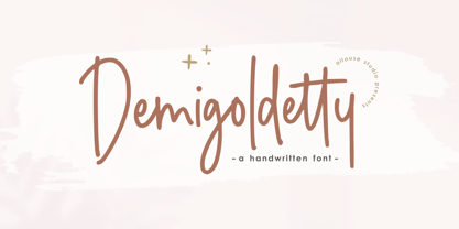 Proudly Presenting, Demigoldetty A Monoline Handwritten Font. Demigoldetty is perfect for any titles, logo, product packaging, branding project, megazine, social media, wedding, or just used to express words above the background. Demigoldetty also come with Multi-Lingual Support. Enjoy the font, feel free to comment or feedback, send me PM or email. Thank You!
 - Agnes Mozarela by Creative17studio,
$20.00 Introducing Agnes Mozarela is a modern and classic serif font that adopts a unique style. This font family is perfect for all kinds of elegant and stunning designs. Get this font immediately for your design use, especially for logo designs, branding, magazines and others. Multilingual support. Any question? just DM. Free update. Thank you
 - Renitha by Allouse Studio,
$16.00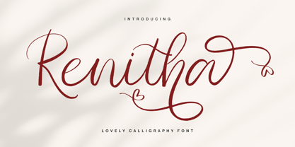 Proudly Presenting, Renitha a Lovely Calligraphy Font Renitha is perfect for any titles, logo, product packaging, branding project, megazine, social media, wedding, or just used to express words above the background. Renitha also come with Multi-Lingual Support. Enjoy the font, feel free to comment or feedback, send me PM or email. Thank You!
 - Minescript by Allouse Studio,
$16.00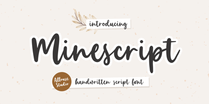 Proudly Presenting, Minescript A Handwritten Script Font. Minescript is perfect for any titles, logo, product packaging, branding project, megazine, social media, wedding, or just used to express words above the background. Minescript also come with Multi-Lingual Support. Enjoy the font, feel free to comment or feedback, send me PM or email. Thank You!
 - Clothingline by Allouse Studio,
$16.00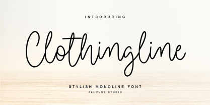 Proudly Presenting, Clothingline a Stylish Monoline Font. Clothingline is perfect for any titles, logo, product packaging, branding project, megazine, social media, wedding, or just used to express words above the background. Clothingline also come with Multi-Lingual Support. Enjoy the font, feel free to comment or feedback, send me PM or email. Thank You!
 - Juicetime by Allouse Studio,
$16.00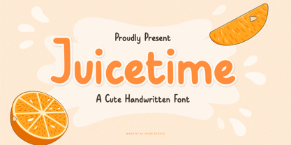 Proudly Presenting, Juicetime A Cute Handwriten Font. Juicetime is perfect for any titles, logo, product packaging, branding project, megazine, social media, wedding, or just used to express words above the background. Juicetime also come with Multi-Lingual Support. Enjoy the font, feel free to comment or feedback, send me PM or email. Thank You!
 - Galaxy Placebo by Adante Creative,
$23.00 Introducing by Adante.Creative Proudly Presenting Galaxy Placebo Galaxy Placebo is a bold Display font Galaxy Placebo is perfect for product packaging, branding projects, megazine, social media, wedding, or just used to express words above the background. Galaxy Placebo has multilingual support. Enjoy the font, feel free to comment or feedback, send me PM or email.
 - Mellorine by Allouse Studio,
$16.00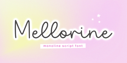 Proudly Presenting, Mellorine A Monoline Script Font Mellorine is perfect for any titles, logo, product packaging, branding project, megazine, social media, wedding, or just used to express words above the background. Mellorine also come with Multi-Lingual Support. Enjoy the font, feel free to comment or feedback, send me PM or email. Thank You!
 - Morfem by Allouse Studio,
$16.00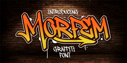 Proudly Presenting, Morfem A Graffiti Tagging Font Morfem is perfect for any titles, logo, product packaging, branding project, megazine, social media, wedding, or just used to express words above the background. Morfem also come with Multi-Lingual Support. Enjoy the font, feel free to comment or feedback, send me PM or email. Thank You!
 - Luckyfield by Allouse Studio,
$16.00 Proudly Presenting, Luckyfield a Fat Handwritten Font. Luckyfield is perfect for any titles, logo, product packaging, branding project, megazine, social media, wedding, or just used to express words above the background. Luckyfield also come with Multi-Lingual Support. Enjoy the font, feel free to comment or feedback, send me PM or email. Thank You!
 - Angelinea by Balpirick,
$15.00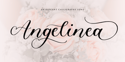 Angelinea is an Elegant Calligraphy Font. Angelinea is perfect for product packaging, branding project, megazine, social media, wedding, or just used to express words above the background. Angelinea also multilingual support. Uppercase & Lowercase font Stylistic Alternates Ligatures Symbols & Punctuation OpenType Features. Enjoy the font, feel free to comment or feedback, send me PM or email.
 - America Calligraphy by Adante Creative,
$23.00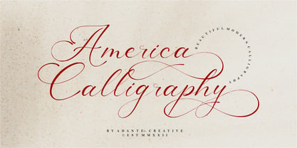 Introducing by Adante.Creative Proudly Present, America Calligraphy America Calligraphy A Beautiful Modern Calligraphy Font America Calligraphy is perfect for product packaging, branding project, megazine, social media, wedding, or just used to express words above the background. America Calligraphy also multilingual support. Enjoy the font, feel free to comment or feedback, send me PM or email.
 - Deathmore by Allouse Studio,
$16.00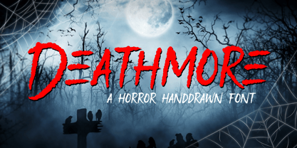 Proudly Presenting, Deathmore A Horror Handdrawn Font. Deathmore is perfect for any titles, logo, product packaging, branding project, megazine, social media, wedding, or just used to express words above the background. Deathmore also come with Multi-Lingual Support. Enjoy the font, feel free to comment or feedback, send me PM or email. Thank You!
 - Holykadot by Allouse Studio,
$16.00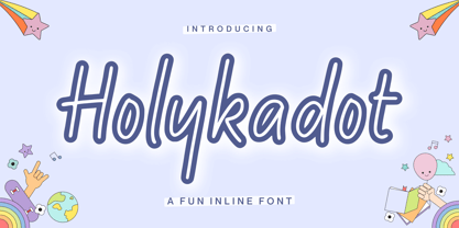 Proudly Presenting, Holykadot A Fun Inline Font Holykadot is perfect for any titles, logo, product packaging, branding project, megazine, social media, wedding, or just used to express words above the background. Holykadot also come with Multi-Lingual Support. Enjoy the font, feel free to comment or feedback, send me PM or email. Thank You!
 - Malibu Waves by Epiclinez,
$18.00 Sometimes you just need a little bit of that old-fashioned charm. That's why we created Malibu Waves. With a beautiful, handwritten style, this font is perfect for those who love the classic look with a modern twist. It’s timeless, perfect for adding some natural flair to your designs, and works great with any project.
