10,000 search results
(0.039 seconds)
- Rapsed Vintage by Craft Supply Co,
$20.00 Introduction to Rapsed Vintage – Stamp Font Rapsed – Vintage Font is a unique serif font, embodying a retro and vintage feel. It features a grunge, stamped, rough appearance, ideal for nostalgic designs. This font captures the essence of a bygone era, making it perfect for projects seeking a classic display. Design and Texture Rapsed’s design boasts large, prominent serifs, giving it a bold and distinct look. Its textured, rough edges simulate a stamped effect, adding an authentic vintage character. This grunge aesthetic is not only eye-catching but also adds depth to the font, enhancing its retro appeal. Versatility in Use Rapsed is versatile for various design applications, from branding to poster creation. Its vintage style is perfect for thematic restaurants, event flyers, and historical projects. Additionally, its distinct appearance makes it suitable for book covers and merchandise that require a touch of nostalgia. Accessibility and Appeal Designed to be user-friendly, Rapsed appeals to a wide range of audiences. Its simplicity in design ensures readability, while its unique character captures interest. This font is a valuable asset for designers aiming to infuse a vintage feel in their work, bridging the gap between past and present design trends.
 - Necosmic by limitype,
$21.00 Elevate your design to the next level with Necosmic – a display font that radiates futuristic and modern style. Specifically designed to seamlessly integrate into technology, futuristic, and outer space themes, each character reflects innovation, creating an extraordinary impression in every design. Perfect your visual presentation with the sophistication of Necosmic – where progress meets inspiring typography. Necosmic comes complete with : - Multilingual - Allcaps Font & - Symbols
 - Double Back by Comicraft,
$19.00 Great Scott, Marty! This font is your density, charged up to 1.21 gigawatts through the Power of Love! Originally created by Comicraft for the official BACK TO THE FUTURE fan club, Remastered DOUBLEBACK has been rebuilt from the ground up, with a new vertical “Curve” weight, six new “Parallel” weights, stylistic alternate letters AMNUWY, and language support for Western & Central Europe and Vietnamese. And if that weren't enough, we've traveled into the future and brought back Solid & Open Variable Fonts which provide precise control of Time and Warp! We cannot be held responsible for any ruptures in the space-time continuum due to use of these fonts. SPECIAL INTRO SALE: from October 21 through November 12, get DoubleBack at half price and we will donate $20.15 of each sale to the Michael J. Fox Foundation for Parkinson's Research. We love ya, Mike.
 - Elio & Oliver by SilverStag,
$19.00 I am thrilled to unveil my latest creation, the Elio & Oliver font family. Inspired by the timeless elegance and undeniable allure of Italy, this sans serif typeface captures the essence of sophistication and refinement. Named after the main protagonists of the beloved novel "Call Me by Your Name," Elio & Oliver is a testament to the power of passion, beauty, and the transcendent experiences that shape our lives. Just like their story, this font aims to evoke emotions and create a lasting impression. With nine meticulously crafted weights ranging from the delicate Ultra Light to the bold intensity of Black, Elio & Oliver offers a spectrum of possibilities. Each weight is thoughtfully designed to ensure versatility and harmonious visual aesthetics across various design projects. Intricate and purposeful, the font pack boasts over 30 ligatures that seamlessly combine letters, elevating the fluidity and legibility of your typography. These ligatures add an extra touch of sophistication to your designs, making them truly stand out. Recognizing the importance of language diversity, Elio & Oliver is equipped with full language support, enabling you to effortlessly communicate your message to a global audience. From English to Italian, French to Spanish, and beyond, this font embraces the richness and cultural nuances of different languages. Whether you're working on editorial layouts, branding projects, or digital interfaces, Elio & Oliver will infuse your designs with an air of refined elegance. It is the embodiment of style and grace, effortlessly capturing attention and leaving a lasting impression on viewers. Step into the world of Elio & Oliver, where every letter tells a story and every curve is a testament to the power of design. It's time to elevate your creative projects and evoke the spirit of Italian chicness with this exquisite typeface. Discover Elio & Oliver and let your designs speak the language of timeless elegance. If you end up publishing your designs on Instagram, tag me - @silverstagco and I will make sure to showcase your design and work to my audience as well! Elio & Oliver - Elegant Sans Serif Includes: Elio & Oliver Font Family - 9 Font Weights - From Ultra Light to Black Elio & Oliver Variable Font Over 30 ligatures and alternate letters Numerals & Punctuation Language Support Web Font Kit is included as well Detailed instructions on how to use alternates in most of the apps on your computer as well for Canva Happy creating everyone!
 - Household by Goodigital13,
$20.00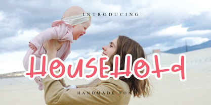 font suitable for logo, branding, greeting card, poster and any design that you create. andwritten font is a natural & modern handwritten font. I’ts Perfect for logo, invitation, stationery, wedding designs, social media posts, advertisements, product packaging, product designs, label, photography, watermark, special events or anything.
 - Floral Decay by Mircea Boboc,
$22.00 This is Floral Decay, your seasonal autumn font with jaded, weathered, and earthy contours of rustic lettering. As they blend into words, the characters evoke floral arrangements of a decaying beauty. It is versatile, playful, and perfect for Graphic Design decorations! This font is unique because, in order to create it, I had to answer some tricky questions: What makes autumn… autumn? Capturing the essence of the other seasons into your letters comes easier. For instance, in order to suggest summer, you only need to draw a few flowers. How about autumn? You could garnish your letters with a few grapes, you might think, but it would only result in a grape-themed font. The notion that is more directly associated with autumn is the image of falling and withering leaves, which brought me to the second question. How exactly are you going to create something beautiful out of a somewhat morbid premise, like wilted leaves? Well, I soon realized that by creating a handwritten font and preserving the right imperfections, you can actually portray collateral beauty. In this context, asymmetry is important because it suggests decay. Further on, the design concept required the letters to come very close together, so that every typed word can be regarded as a floral arrangement. How close together, though? As much as possible without confusing one with the other, risking a lack of legibility. Therefore, in contrast with the demo version of this font, this actual version provides the ideal kerning.
 - Cordel Interior by Ana Cordel Interior Font,
$15.00 Cordel Interior family draws inspiration from covers of 'cordel literature’, - small booklets of popular story-poems that played an essential role on the folk-popular cultural life of Brazil. Printed in coarse paper, usually with an woodcut illustration and lettering in the front, these booklets were sold on the streets, in marketplaces and town squares, hung in a cord - therefore the name ‘cordel’.
 - Harpsichord by Jonahfonts,
$35.00 Harpsichord (as I have named it) is from the late 1940s and was designed at Lucian Bernhard Studios in New York for Bernhard's Magnetype Collection. It was originally published as 'Community Low' along with 'Community Condensed'. Many of his Magnetype Fonts have been dormant which I hope to revive in the near future.
 - Ferrocarbon by Megami Studios,
$7.50 For the angular, blocky look, the future is Ferrocarbon! Designed primarily as a title font, I created it way back in 2013 and promptly forgot about, so I'm releasing it to the world now. it's meant to be used for your tech and sci-fi uses, but don't let us stop you there!
 - Kermel by La Boîte Graphique,
$25.00 Handwriting font. Usage recommendations: Title, short text, logo.
 - Proxemic by Sarid Ezra,
$15.00 Proxemic is a bold sans based font with unique lowercase that will make your logo and design looks advance and modern. With the unique characteristic lowercase, this font can make your logo even more stunning only with simple steps. You can use this font for any purpose, especially to make logotype. You can mix and match the uppercase and lowercase to make your logo more advanced. This font also comes with number, symbol, and multilingual support!
 - Sunday Popice by Nathatype,
$29.00 Sunday Popice is a delightful display font that brings a dose of cuteness and whimsy to your designs. With its rounded shapes and high contrast, this typeface exudes a unique charm that is perfect for adding a touch of playfulness to any project. Designed with love and attention to detail, Sunday Popice captures the essence of childlike joy and innocence. Each character is carefully crafted with rounded edges, creating a friendly and approachable appearance. The high contrast between thick and thin strokes adds a dynamic and lively quality to the font, making it truly stand out. This font's rounded and soft shapes evoke a sense of warmth and coziness, reminiscent of a Sunday afternoon spent in the company of loved ones. Because of the unique style, for the best readability use this font at large text sizes. Enjoy the available features here. Features: Multilingual Supports PUA Encoded Numerals and Punctuations Sunday Popice fits in children's books, product packaging, greeting cards, headlines, logos, and any design project that requires a touch of whimsical elegance. Find out more ways to use this font by taking a look at the font preview. Thanks for purchasing our fonts. Hopefully, you have a great time using our font. Feel free to contact us anytime for further information or when you have trouble with the font. Thanks a lot and happy designing.
 - Bay Tavern by FontMesa,
$25.00 Bay Tavern is the first weathered version of our Tavern font that's based on Algerian. With three weights, open faced and outline versions to choose from you're sure to find the right style for your new project, restaurant menu, logo, t-shirt design or Pirate costume party. Bay Tavern includes all the same alternates as our regular Tavern font family. While our original Tavern font has been increased to include five weights additional weights for Bay Tavern will have to wait for now, adding the notched cut in's were all done by hand which causes a lot of cramping so a long break is needed before creating the extra weights. The Fill fonts in the Bay Tavern family are meant to be used with Bay Tavern Open fonts, if you're using Bay Tavern Open then select Bay Tavern Fill, if you're using Bay Tavern Open L then select Bay Tavern Fill L, if you're using Bay Tavern Open S then select Bay Tavern Fill S, if you're using Bay Tavern Open SL then select Bay Tavern Fill SL, the same rule goes for the Open X version.
 - California Kingston by Crumphand,
$25.00 California Kingston display is a typography design product that is specifically created for use in the headlines, titles, or other prominent text elements of a design. This typeface is often characterized by its bold, attention-grabbing appearance and its ability to make text stand out on a page. The main goal of a California Kingston font display is to create an impact and draw the viewer's attention. This is typically achieved through the use of thicker and more pronounced strokes, unique shapes and design elements, and often, a more stylized appearance. California Kingston displays can be used in a variety of design projects, including posters, logos, packaging, advertisements, and more. They are often paired with complementary fonts to create a well-designed and cohesive visual identity. When choosing a California Kingston font display, it is important to consider the project's overall aesthetic and message, as well as the intended audience. It's also essential to ensure that the font is legible and easy to read, even at smaller sizes. Overall, a California Kingston font display is an excellent way to make a bold statement in a design and to capture the viewer's attention.
 - Sqwared by Monotype,
$25.00 Sqwared is a square sans serif type family... with flares! This typeface has a retro, hand-painted quality – the slight flaring of its verticals evoke the steady brush of a signwriter. Sqwared benefits from large, open counters and a generous x-height that aids clarity and legibility, while a wide footprint gives these fonts a degree of stature and an air of confidence. Each character was drawn while immersed in a late sixties/early seventies vibe, but there’s no reason why Sqwared can’t be used for your contemporary designs. There are 16 fonts altogether, ranging from Thin to Ultra weights in both roman and italic. It has a Latin character set that covers all Latin European languages. Sqwared will dazzle in headlines, add flair and distinction to your logo designs, bring flamboyance to your branding material, and your body text will most definitely be unique! Variable fonts are included in this family, so you can tune the weight of each font to your exact preference. Key features: 8 weights in Roman and Italic Old Style Figures included Full European character set (Latin only) 440 glyphs per font.
 - Aprilis by Eurotypo,
$34.00 Are you looking for a new casual and organic script font? Please, take a look to the Aprilis! In times of early Roman calendar, "Aprilis" followed and preceded "Martius" "Maius" when spring came, was green nature and flowers burst into colours to greet the sun. And Aprilis font was conceived in April... The Aprilis font is the perfect blend of elegant and casual. (It is best used in OpenType-aware software). With the total number of 625 glyphs, is equipped with plenty of OpenType features. Uppercase letters can alternate between at least two different forms and lowercase letters have leastways four choices more to avoid repetition. These effects include start and end forms of lowercase letters, which are automatically substituted in at beginnings or ends of words. To activate the optional glyphs you may click on Swash, Contextual, Standard Ligatures, Stylistic or Discretionary Ligatures buttons in any OpenType savvy program or manually choose the characters from Glyph Palette. Also, there’s a set of 50 ornaments designed to support the font (access the ornaments through the Glyph Palette). The Aprilis font might be the choice to use on creating headlines, logos & posters for branding and packaging purposes. Hope you enjoy.
 - Various by Ahmad Jamaludin,
$17.00 Say hello to VARIOUS! Completely unique and custom font with a 00s style, inspired by vintage and hand-painted retro signs :D Various is a font with a delightful retro touch perfect for capturing the essence of the 60s, 70s, 80s, 90s, and even Y2K designs! Its unique characteristics will transport you to those iconic eras, adding a nostalgic vibe to your creative projects. Various come in two versions - Regular and Outline. With two different style fonts, you can easily create eye-catching designs without any extra effort This font is perfect for a retro 00s theme and can be used for cover magazines, brochures, logos, headlines or quotes, stand-alone displays, and short paragraphs or content. Each font in the family is dynamic and authoritative on its own, making it perfect for any display project. What do you get? Various Various Outline Alternates and Ligatures Instructions ( Access special characters, even in circuit design ) Letters, numbers, symbols, and punctuation No special software is required to use this typeface even work in Canva Multilingual Support Let Various take you on a journey through time Enjoy your day! Dharmas Studio
 - Mayoras by Create Big Supply,
$15.00 Introducing Mayoras, a captivating handwriting script font that adds a touch of personality and charm to your creative projects. With its flowing lines and authentic handwritten feel, Mayoras brings a unique and artistic touch to any design. Whether you're working on invitations, logos, packaging, or any other creative endeavor, Mayoras offers a versatile and expressive solution. The font features a seamless combination of uppercase and lowercase letters, providing you with a wide range of design possibilities. With its extensive character set, Mayoras includes numbers, punctuations, and multilingual support, enabling you to communicate your message effectively across different languages and cultures. The font also incorporates ligatures, enhancing the natural flow and connectivity of the letterforms, adding an elegant touch to your typography. Mayoras is crafted with PUA (Private Use Area) Encoding, allowing you to access special characters and alternate glyphs effortlessly. This feature-rich font empowers you to create unique and captivating designs that stand out from the crowd. Explore the world of Mayoras at MyFont and unleash your creativity with this captivating handwriting script font. Download Mayoras today and add a personal and artistic touch to your next project.
 - AS Noqta by Sallam Type,
$25.00 AS Noqta Font is a modern Arabic typeface designed by Ahmed Salllam. The design is inspired by the circle style contemporary tastes with wide open counters and short ascenders and descenders that minimize the hight. And has a high - contrast between the vertical and the horizontal to line up in harmony with Latin. and ligatures set. This makes it suitable for branding, editorial, packaging and advertising. AS Noqta Font consists of 7-weight versions from thin to Heavy.
 - Soliden by Eko Bimantara,
$29.00 Soliden is a neo grotesk san serif font family with solid letterforms. Designed and published by Eko Bimantara in 2022, Soliden became a suitable choice for large display and functional purposes. The letterforms are built in large x-height with spacious counters. It consists of 8 weight from Thin to Black and 3 width; Condensed, Normal and Expanded, which make it a large font family with 48 styles. Soliden has 394 glyphs which cover broad latin languages.
 - La Jefa by Lauren Ashpole,
$15.00 A short font for short people* La Jefa is very, very loosely based on a Christmas card I received years ago from my boss at the time. Designed to capture that personalized touch, it's a hand lettered font with a short x-height and ample spacing. Although all of the letters are lowercase, the uppercase provides a unique set of characters that can be mixed in for a more natural handwritten feel. *also people of tall or average height
 - Uncanny Cat PB by Pink Broccoli,
$16.00 Inspired by the 1977 anthology horror film called "Uncanny", Uncanny Cat PB captures all the awkward fun of the film's titling sequence. Feline revenge has never looked so good. This typeface was oodles of fun to flesh out, and is true to that purposefully awkward appeal that a lot of Pink Broccoli fonts are imbued with. Loaded with a collection of ligatures that combine and nest letters against each other, lending to the unique typesetting of this "uncanny" font.
 - SYN Nova by Borutta Group,
$- SYN NOVA is a digitisation project of SYN – futuristic typeface designed by Wojeciech Freudenreich, famous polish graphic designer. Our concept, besides giving it a digital form, was to expand the character set, design minuscule and opentype features for the typeface. Together with Wojciech Freudenreich we created 4 new weights. The complete family (5 styles & Variable Font Version) is distributed under open and free font license. Subsidised by the National Centre for Culture under the programme Kultura w sieci
 - Bonrich by GuseType,
$12.00 Bonrich is a display font that is characterized by thick lines with rounded edges which makes Bonrich look playful. This font suitable for any design style such as retro, vintage, pop culture and many more. Bonrich has features such as uppercase, lowercase, numbers, punctuation, and multilingual support. Bonrich also has alternate and ligature features to make your writing more stylish and unique for various designs such as posters, headlines, magazines, logotypes, book covers and many more.
 - Clone Rounded PE by Rosetta,
$70.00 Clone Rounded is a retrofuturist typeface by Lasko Džurovski from Macedonia, fusing the vintage look of CRT monospaced forms with the organic mutability of a multi-weight, proportional family fit for reading. This lovechild of cyber-culture and genetic font modification takes inspiration from coding, technology, and architecture. Its quasi-monospaced design gives a nod to the quirkiness of engineered fonts but bends enough to never sacrifice a natural reading experience. Biomechanical morphology augmenting a laboratory-built frame.
 - Lectori Salutem by HoboArt,
$10.00Is it royal, or is it dandyish? Either way it's sure to catch the eye. Prepare for titling figures any movie executive would be jealous of using. Do you write sci-fi, fantasy, costume, or cult; or is your announcement for an off-beat wedding? Lectori Salutem offers salutations to the reader, and a kick. Lectori Salutem is the serif counterpart of the Lectori Salutem Sans font. A postmodern font with slightly romantic features, and playful ligatures. - Pind-O-Rama by PintassilgoPrints,
$24.00 Pind-O-Rama is quite an unconventional font, with strange counters and shapes and choices and interlocks that just stand out. For sometimes fitting in is absolutely not wanted. Pindorama is how the native Tupi people originally called Brazil before colonization by the Portuguese. This font draws inspiration from a book on Brazil colonial background, precisely from a 1961 edition - the book was first published in 1943. Unfortunately the cover design is uncredited. Why fit in? Let's stand out!
 - Mexican Pattern by Kaer,
$24.00 Mexican Pattern is my vision of classic Mexican style with colorful and ornate pattern. Mexican patterns appeared as a result of the fusion of two cultures. Aztec and Mayan heritage mingled with Spanish traditions in bright colors. You can use color fonts in PS CC 2017+, AI CC 2018+, ID CC 2019+, macOS 10.14 Mojave+ Please note that the Canva & Corel & Affinity doesn't support color fonts! Please feel free to request any help you need: kaer.pro@gmail.com Best, Roman.
 - Serway by Hazztype,
$20.00 Serway is a captivating typeface that seamlessly blends elegance with a touch of playfulness. This font's defining characteristic is its wavy stems, which give each character a dynamic and fluid appearance. The wavy stems gracefully meander, creating a harmonious rhythm that adds a unique visual appeal to any design. The wavy stems in Serway mimic the graceful movement of gentle waves, the bending of tall grasses in the wind, or the meandering path of a flowing river. These organic shapes infuse each character with a sense of fluidity and harmony. The sans serif structure of Serway maintains a contemporary and modern aesthetic. The clean lines and smooth curves of the letterforms offer a sense of simplicity and sophistication, perfectly complementing the nature-inspired wavy stems. Serway is an ideal choice for various design projects, including editorial design, packaging, headlines, web design, logo creation, and branding. Its wavy stems add a distinct touch that sets it apart from traditional sans serif fonts, making it perfect for designs that seek to capture attention and create a memorable visual impact.
 - Song Folio JNL by Jeff Levine,
$29.00 A 1940s Australian song folio featuring tunes performed by singer-actress Deanna Durbin had her name hand lettered in an interesting Art Deco style sans. This became the basis for Song Folio JNL, capturing all the nuances of the original in digital form.
 - Jaggy by ParaType,
$30.00 The script designed for ParaType in 2006 by Isabella Chaeva. Based on informal handwriting, its characters have rough jaggy contours. In small sizes, the face simulates an effect of handwriting by felt pen on rough paper. For use in advertising and display typography.
 - Hydrochlorica by MADType,
$21.00 This is a friendly display typeface with large ink inlets that make it look like the counters have been eaten away from the inside out by hydrochloric acid. It's legible at small sizes, but at large sizes the nice details make themselves apparent.
 - Candle Wax JNL by Jeff Levine,
$29.00 The design of Candle Wax JNL comes from an original movie poster for the movie "Bell, Book and Candle" starring James Stewart. The oddly erratic letter forms conjure up ideas of spells, witchcraft and other things found lurking on dark moonlit nights.
 - Liebestraum JNL by Jeff Levine,
$29.00 A Liebestraum, in German is a "dream of love" or "love dream". Based on the ornate sheet music title from a 1920s edition of Franz Liszt's composition, Liebestraum JNL captures and preserves the unique look and feel of this pen-on-paper lettering.
 - FS Aldrin by Fontsmith,
$80.00 Elegant and round Having harboured a desire for a rounded font within the Fontsmith library for some time, Phil Garnham recognised that FS Emeric offered the perfect skeleton around which to design it. Most new rounded fonts rely on scripts or other in-app automation to form their characters. For all their warmth and approachability, they too often conjure images of jelly sweets and sausages. Not so FS Aldrin, where every curve and transition has been crafted by hand, giving a distinctive look and elegant feel. Design highlights FS Aldrin enjoys wide-open ‘lunar’ counters and soft, tube-like terminals. These improve legibility, especially on backlit signage and screens. The open proportions and circular strokes are juxtaposed against a more serious technical aspect that exists within each counter shape. The lighter weights feel precise and efficient, perfect for notes on blueprints or technical drawings. The heavy weights are equally crafted but more playful by their rotund nature, and are perfect for strong headlines or packaging projects. UI icons A suite of 268 icons complement the typeface beautifully and extend the design language in all directions. They cover a range of commonly used applications and themes ranging from ecommerce to weather, and also serve as a solid starting point for a bespoke brand icon set or UI. In addition, born of FS Aldrin’s astronomical theme and playful nature is a special collection of space-themed icons, including rockets, shuttles and lunar modules (hint: if you type the word BUZZ with ligatures enabled, an astronaut appears). Earth to Buzz Buzz Aldrin was the pilot of Apollo 11’s lunar module, the one that put man on The Moon for the very first time. Early on in the project’s life, FS Aldrin emerged as the ideal hook on which to hang the font’s space helmet (hardly surprising given Phil’s fascination with space travel and astronomy). An approach was made to Buzz’s management to see if he would sanction the association. Not only was the great man himself happy to see his name on a typeface, he also asked to use it in his upcoming keynote talks, book launches and online projects.
 - Ring Soft by Ochakov,
$9.00 Ring Soft, soft as cashmere... Cute set of the Ring font family! It probably won't get any softer than this. Ring Soft is a cool, varied, and trendy-looking display font. No matter the topic, this font will be an incredible asset to your fonts’ library, as it has the potential to elevate any creation. Cuter than ever and much prettier. Ring Soft and other fonts of Ring family is still very cozy and comfortable.
 - Le Monde Journal Std by Typofonderie,
$59.00 A highly legible typeface in 4 series Le Monde Journal by definition is intended for newspaper use & at small sizes. It’s an economical and workshorse typeface adapted to any extrem condition of uses. Even though it has the same colour as Times, it appears more open. The reading flow has been made more fluent & less abrupt. The glyphs counters are bigger, as if they were “alluminating the interior.” The form, characterized by its serifs, remains embedded in our visual memory. Intermediate weights like Book can be considered as a grade supplement of the Regular. Italics accompany Le Monde Journal. With a more delicate design & a distinctive rhythm, they remain noticeable when used with the romans. Its companion, Le Monde Sans can extend your typographic palette. For beautiful page layout, use it in conjunction with Le Monde Livre for titling sizes. The verticals metrics and proportions of Le Monde Journal are calibrated to match perfectly others Typofonderie families. This family was designed in 1994 as bespoke typeface family for the French newspaper Le Monde. The family is not used any more by this newspaper from November 2005. Bukva:raz 2001 Type Directors Club .44 1998 European Design Awards 1998
 - American Gothic by MADType,
$24.00 A blocky and bold geometric sans with inner angles and outer curves. No ascenders; lower case characters are as big as the upper case. Mix cases for variety.
 - Syndication JNL by Jeff Levine,
$29.00 Syndication JNL was derived from Outline Sans JNL. By removing the outer letters, a thinner character set remained. This typeface is available in both regular and oblique versions.
 - Thiny Bunny by Sipanji21,
$17.00 hello i'm thiny bunny, a display font with thin characters, cute and funny look. This font is good to use for various graphic designs, such as logos, posters, banners, advertisements, crafting, packaging, stickers, kids, store logos, apparel and other designs.