10,000 search results
(0.043 seconds)
- Secca Stencil by astype,
$42.00Secca Stencil is a special display font for the Secca font series. For more info look for Secca and Secca Soft . - Bilanthy by Maulana Creative,
$13.00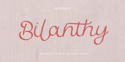 Give your designs an authentic handcrafted feel. � Bilanthy Handwritten Font� is perfectly suited to stationery, logos and much more. Many Thanks!
 - My Home by Typefactory,
$14.00 My Home is a Fun Handwritten Font, Perfectly suitable for creating quotes, kids book, t-shirts, poster, mockup, and many more.
 - Number5 Reg by Wooden Type Fonts,
$15.00 A William Page font, a variation of the William Page 500 font, with wider lower case, more clearly worked upper case.
 - Eggad by Ingrimayne Type,
$9.00 Eggad features letters on eggs. It can be a fun font to use at Easter or for any egg-related message. Some of the eggs - those on the upper-case keys - have their large end on the bottom and others - those on the lower-case keys - have their large end on the top. The font uses the contextual alternatives feature of OpenType to alternate the big-bottom and big-top eggs. If you only want eggs with big tops or with big bottoms, turn this feature off. Eggad comes in two styles, a regular style in which the eggs are outlined and a bold style in which the eggs are solid. Both are monospaced. The two styles can be layered to color the eggs. Alternatively, background color can be added (dot accent and ring characters) or the outline color can be changed (sterling and yen characters) using layers in the regular style. If you are typing numbers and you want the start to be big-bottom number, switch on OpenType style set 1.
 - Breathe by Lián Types,
$20.00 ATTENTION COSTUMERS! A new version of this font was released in 2019. Take a look: Breathe Neue Reaching a total of more than 1000 glyphs, Breathe Pro is Maximiliano R. Sproviero’s gift of the year. The aim of the designer was once more to give the user the chance to play and travel from very formal and conservative letterforms to the amazing world of swashes and flourishes. Possibilities of alternating and ligating characters in this font are absolutely fantastic. After his last creation, Parfait Script, Lián wanted to make a more universal font. Delighted by typographic works of Didot and his followers of the beginnings of 1800, Maximiliano R. Sproviero started what became another obsessive project, which is now named Breathe, “cuando las letras respiran...” what could be translated as “when letters breathe”, due to the feeling that you are reading letters that are alive. Breathe comes in two styles which have a significant difference as regards to the quantity of glyphs available inside. If you want to get the most complete style, with over 1000 glyphs, (including contextual alternates, stylistic alternates, swashes, terminal forms, titling alternates, historical forms, stylistic sets, standard ligatures, stylistic ligatures, decorative ligatures and frames) then your choice should be Breathe Pro. On the other hand, if you are interested in having a less decorative font with the nice touch of Lián’s style, then your choice should be Breathe Standard, a more limited version of Breathe, including terminal forms (leaves) and frames. With Breathe Pro you will surely have fun at the same time you are designing and that is not an unimportant thing. The world of type-designers is growing each year, and the features of Open-Type are letting them think their creations as if they were truly pieces of art. At least, Breathe Pro is inspired in the Art of our predecessors, those who with a pen loaded of ink would decorate each letter, each page in such a lovely way. Yes, -lovely- is the word. We would not have the amazing lettering artists, calligraphers, typographers of nowadays if that -love for letters- had not traveled from generation to generation. Breathe Pro is an example of this love. An example of what Maximiliano R. Sproviero feels about typography and letters. Pssst... Look for more images and the User’s Guide at the gallery section to see it in use! http://origin.myfonts.com/s/aw/original/89/0/46067.pdf
 - Bungnipper - Unknown license

- Messe Grotesk by Red Rooster Collection,
$45.00Based on the Albert Auspurg design, circa 1921-27. - Shmuot MF by Masterfont,
$59.00 Funny and crazy? Yes, all in one happy font.
 - Portobello by Red Rooster Collection,
$45.00 Loosely based on Pontecorvo, a design by Aldo Novarese.
 - Tide by Suomi,
$35.00 A surprisingly readable script based on flow of water.
 - Toffee Script by Suomi,
$25.00 Toffee is based on Art Noveau typeface Regina Cursive.
 - Fiorenza by Scriptorium,
$18.00Fiorenza is based on cursive calligraphy from Renaissance Italy. - Donald by Intellecta Design,
$9.00Donald is a slab font based on vintage woodtypes - Cafe Fumante by Funk King,
$5.00 A cup of coffee with every letter on it.
 - Hilde CAPS by JOEBOB graphics,
$9.00 Based on the lettering of Hilde Rikken (age 9).
 - Lapidary Capitals by Kostic,
$20.00 Based on Roman lapidary writing from 2nd century BC.
 - Hot Script by Lián Types,
$49.00 Say hello to another of my hot and trendy scripts, Hot Script! I got the inspiration for this one in the world of sign painters. My neighbourhood, and more specifically the avenue were I live, is very well known for its ''parrillas'': For those who don't know what this means, well, it may be better to live the experience rather than reading these lines. Villa Urquiza is full of restaurants with an argentinian flavour, with a ''gauchezco'' feel. Here you can taste some of the best ''asados'' in the entire world. Ok, this made me hungry, let's go back to type: These amazing venues still mantain genuine elements from the past, and try to preserve the beauty of the handcrafted. Parrillas of Buenos Aires have all their walls, windows and doors lettered with chalk or paint. I've always wanted to make a font out of that, and Hot Script is my first attempt. I believe the results are great! Hot Script follows some rules of the flat brush (see terminals, and tails especially in caps) but its contrast of thicks and thins was manually altered to make the font better for a wider range of uses. Although the sexy curves and versatility of Hot seemed to be enough, I decided to spice it a little more by creating some layers for it: Hot Script Shine Solo or Hot Script Shades Solo combined with Hot Script will give outstanding results. (Look for them combined in the posters above and dare to deny it!) Go make your project more savory! This font is Hot, hot, hot!
 - Hagrid by Zetafonts,
$39.00 Crypto-typography - the passion for unknown, weird and unusual character shapes - is a disease commonly affecting type designers. Cosimo Lorenzo Pancini has celebrated it in this typeface family, aptly named Hagrid after the half-blood giant with a passion for cryptozoology described by R. K. Rowling in her Harry Potter books. Extreme optical corrections, calligraphic counter-spaces, inverted contrast, over-the-top overshoots: all the inventions that abound in vernacular and experimental typography have been lovingly collected in this mongrel sans serif family, carefully balancing quirky solutions and solid grotesque design. Hagrid is a typeface designed for editorial & display use, bringing dynamism to the printed and digital page thanks to its extreme contrast and unique details. It has been developed in a range of six display weights ranging from the monolinear and more traditional thin to the expressive heavy weight. For better readability in small sizes and on the web, a companion text family has been developed, with a slightly different selection of weights, wider metrics, and fine adjustments to keep the dynamic expressivity of the design without sacrificing legibility. This is evident in the design of italics: while the display italics sport a cursive feel with calligraphic terminals to lowercase letters, the text design is more restrained, with a more classical geometric grotesque slanted look. Given the crypto-typographer love for foreign specimens of letters, special care has been put into making Hagrid ready for multilingual projects, giving it an extended character sets covering over two hundred languages that use Latin, Cyrillic and Arabic alphabets and adding a selected range of OpenType features to handle alternate forms and stylistic sets.
 - Aziga by Eclectotype,
$40.00 In a typeface category that has been sorely under-represented until now, Aziga is a high (occasionally reversed) contrast, postmodern, deconstructed-reconstructed, serifless (mostly), fashion didone! Aziga lends itself to being set loud and proud, and the consistent angles throughout the glyphs make it a good candidate for more abstract typographic compositions. For the really graphically inclined (excuse the pun) a rotation of 66° will make the main diagonals in the font horizontal and vertical. Cool right? Features include stylistic and contextual alternates, ligatures and case sensitive forms. This is an unusual font, that’s for sure, but give it a try and you'll be rewarded with layouts that really stand out from the crowd.
 - Grandecort by Ingrimayne Type,
$9.95Grandecort is derived from the OakPark family. It has lost the serifs, and has moved to a more traditional look. The upper case letters are a bit heavier than the lower case letters, but overall the letter shapes are fairly conventional for a bold, display face. In later 2018 the family was expanded to 9 fonts. GrancMitStripes was reworked to make four new faces: GrancAllStripes, GrancTopStripes, GrancBottomStripes, and GrancCaps. The last can be used as a background layer for the others. Also, The interior of GrandecortShadow was separated out to form GrandecortShadowInside. It has the same shapes as Grandecort-Regular but the spacing of GrandecortShadow and can be layered with the shadowed style to easily create bi-colored letters. - Antique by Storm Type Foundry,
$26.00The concept of the Baroque Roman type face is something which is remote from us. Ungrateful theorists gave Baroque type faces the ill-sounding attribute "Transitional", as if the Baroque Roman type face wilfully diverted from the tradition and at the same time did not manage to mature. This "transition" was originally meant as an intermediate stage between the Aldine/Garamond Roman face of the Renaissance, and its modern counterpart, as represented by Bodoni or Didot. Otherwise there was also a "transition" from a slanted axis of the shadow to a perpendicular one. What a petty detail led to the pejorative designation of Baroque type faces! If a bookseller were to tell his customers that they are about to choose a book which is set in some sort of transitional type face, he would probably go bust. After all, a reader, for his money, would not put up with some typographical experimentation. He wants to read a book without losing his eyesight while doing so. Nevertheless, it was Baroque typography which gave the world the most legible type faces. In those days the craft of punch-cutting was gradually separating itself from that of book-printing, but also from publishing and bookselling. Previously all these activities could be performed by a single person. The punch-cutter, who at that time was already fully occupied with the production of letters, achieved better results than he would have achieved if his creative talents were to be diffused in a printing office or a bookseller's shop. Thus it was possible that for example the printer John Baskerville did not cut a single letter in his entire lifetime, for he used the services of the accomplished punch-cutter John Handy. It became the custom that one type founder supplied type to multiple printing offices, so that the same type faces appeared in various parts of the world. The type face was losing its national character. In the Renaissance period it is still quite easy to distinguish for example a French Roman type face from a Venetian one; in the Baroque period this could be achieved only with great difficulties. Imagination and variety of shapes, which so far have been reserved only to the fine arts, now come into play. Thanks to technological progress, book printers are now able to reproduce hairstrokes and imitate calligraphic type faces. Scripts and elaborate ornaments are no longer the privilege of copper-engravers. Also the appearance of the basic, body design is slowly undergoing a change. The Renaissance canonical stiffness is now replaced with colour and contrast. The page of the book is suddenly darker, its lay-out more varied and its lines more compact. For Baroque type designers made a simple, yet ingenious discovery - they enlarged the x-height and reduced the ascenders to the cap-height. The type face thus became seemingly larger, and hence more legible, but at the same time more economical in composition; the type area was increasing to the detriment of the margins. Paper was expensive, and the aim of all the publishers was, therefore, to sell as many ideas in as small a book block as possible. A narrowed, bold majuscule, designed for use on the title page, appeared for the first time in the Late Baroque period. Also the title page was laid out with the highest possible economy. It comprised as a rule the brief contents of the book and the address of the bookseller, i.e. roughly that which is now placed on the flaps and in the imprint lines. Bold upper-case letters in the first line dramatically give way to the more subtle italics, the third line is highlighted with vermilion; a few words set in lower-case letters are scattered in-between, and then vermilion appears again. Somewhere in the middle there is an ornament, a monogram or an engraving as a kind of climax of the drama, while at the foot of the title-page all this din is quietened by a line with the name of the printer and the year expressed in Roman numerals, set in 8-point body size. Every Baroque title-page could well pass muster as a striking poster. The pride of every book printer was the publication of a type specimen book - a typographical manual. Among these manuals the one published by Fournier stands out - also as regards the selection of the texts for the specimen type matter. It reveals the scope of knowledge and education of the master typographers of that period. The same Fournier established a system of typographical measurement which, revised by Didot, is still used today. Baskerville introduced the smoothing of paper by a hot steel roller, in order that he could print astonishingly sharp letters, etc. ... In other words - Baroque typography deserves anything else but the attribute "transitional". In the first half of the 18th century, besides persons whose names are prominent and well-known up to the present, as was Caslon, there were many type founders who did not manage to publish their manuals or forgot to become famous in some other way. They often imitated the type faces of their more experienced contemporaries, but many of them arrived at a quite strange, even weird originality, which ran completely outside the mainstream of typographical art. The prints from which we have drawn inspiration for these six digital designs come from Paris, Vienna and Prague, from the period around 1750. The transcription of letters in their intact form is our firm principle. Does it mean, therefore, that the task of the digital restorer is to copy meticulously the outline of the letter with all inadequacies of the particular imprint? No. The type face should not to evoke the rustic atmosphere of letterpress after printing, but to analyze the appearance of the punches before they are imprinted. It is also necessary to take account of the size of the type face and to avoid excessive enlargement or reduction. Let us keep in mind that every size requires its own design. The longer we work on the computer where a change in size is child's play, the more we are convinced that the appearance of a letter is tied to its proportions, and therefore, to a fixed size. We are also aware of the fact that the computer is a straightjacket of the type face and that the dictate of mathematical vectors effectively kills any hint of naturalness. That is why we strive to preserve in these six alphabets the numerous anomalies to which later no type designer ever returned due to their obvious eccentricity. Please accept this PostScript study as an attempt (possibly futile, possibly inspirational) to brush up the warm magic of Baroque prints. Hopefully it will give pleasure in today's modern type designer's nihilism. - Quarca by insigne,
$24.75 Quarca's masculine power runs strong across the page with bold self-assurance and a raw energy that courses through its thick veins. Don't think the continuous, smooth geometry of this semi-modular face is captively chained to the grid, though. Quarca has been cautiously optimized to engage the reader's eye. Achieving an attractive balance to its sturdy design, the open forms of this "rounded square" geometric sans -together with a tall x-height- make the font legible even when using the compact widths. This high-impact typeface definitely doesn't sacrifice versatility for style. These compact widths, with their raw heart and strength, are perfect for callouts, while the extended widths provide you with the platform for a punchy and extremely efficient headline. The font has a thinner weight and transcends to an intense bold. The face's geometric or technological construction also tends to make it right at home on the web. The family consists of 36 fonts -six weights plus italics. Where Quarca truly stands out, though, is its wide number of OpenType typographic choices and optional glyphs, allowing you to design your piece with a personal, one-of-a-kind variant touch. These variations consist of Experimental Capitals, Angled Capital Terminals, and "Future Stencil". In all, you can find more than one hundred of these alternate glyphs. Quarca is well-suited for anything you are able to throw at it. Devised for today's multi-disciplined designer, this clear and infinitely versatile family provides tremendous value to your toolbox.
 - Rizado Script by Kostic,
$40.00 Rizado Script is a classy one-weight script typeface, made with “dolce vita” in mind. Its high contrast and pointy tone are recalling the fine nib handwriting of a meticulous and decisive person that hasn’t got free time to spare but surely knows how to enjoy his life. No quick and dry strokes, but rather wide, elegant and strong-minded temper that will bring a long-lasting touch to your packaging layouts. Sure, if you are looking for a good fit for some more ephemeral design such as a weekend high-class cocktail promotion, or a wedding invitation – this handy display typeface won’t let you down for a second. If you happen to go to Venice and enjoy their popular Aperitivo, you’ll be asked to choose between three types of bitter-reddish base drink. Rizado will bring you the same amount of pleasure, authority and uniqueness while you pick out one of the three ampersands or other alternate characters. According to the concept of Fellini’s lifestyle, “la dolce vita” is a luxury lifestyle full of cheerful worldly pleasure. But don’t let yourself be fooled by this moto, because Italians are famous for their modesty and sagacity as well. That’s why you’re always supposed to turn on the Contextual Alternates (to activate extra positional forms — isolated, initial and final) and keep your voice down and never set this typeface in all Capital letters. There are 391 total glyphs made to support West European, Central European and South East European languages.
 - Shock Graffiti by Riasyletter_Studio,
$19.00 Want to add an urban touch to your designs? Try using the Shock Graffiti font! This font offers a distinctive writing style and is very suitable for urban and street-themed designs. With Shock Graffiti, you can bring a strong and bold impression to every design you create. Shock Graffiti comes with a complete set of letters and fine details, so you can customize your design better. This font is also very easy to use and compatible with various design applications. Suitable for use in posters, merchandise, or even in t-shirt and hoodie designs. Get Shock Graffiti now and become a daring design creator! Available at an affordable price and with flexible licensing, so you can use it without limits on your future projects. What’s Included : - More than 200 of glyphs ( include Uppercase, Lowercase, Numerals & Punctuations ) - multilingual support - Works on PC & Mac - Simple installations - Accessible in the Adobe Illustrator, Adobe Photoshop, Adobe InDesign, even work on Microsoft Word. - PUA Encoded Characters (fully accessible without additional design software) Support For Language : Albanian, Basque, Breton, Chamorro, Danish, Dutch, English, Faroese, Finnish, French, Frisian, Galician, Italian, Malagasy, Norwegian, Portuguese, Spanish, Alsatian, Aragonese, Arapaho, Arrernte, Asturian, Aymara, Bislama, Cebuano, Corsican, Fijian, French_creole, Genoese, Gilbertese, Greenlandic, Haitian_creole, Hiligaynon, Hmong, Hopi, Ibanag, Iloko_ilokano, Indonesian, Interglossa_glosa, Interlingua, Irish_gaelic, Jerriais, Lojban, Lombard, Luxembourgeois, Manx, Mohawk, Norfolk_pitcairnese, Occitan, Oromo, Pangasinan, Papiamento, Piedmontese, Potawatomi, Rhaeto-romance, Romansh, Rotokas, Sami_lule, Samoan, Sardinian, Scots_gaelic, Seychelles_creole, Shona, Sicilian, Somali, Southern_ndebele, Swahili, Swati_swazi, Tagalog_filipino_pilipino, Tetum, Tok_pisin, Uyghur_latinized, Volapuk, Walloon, Warlpiri, Xhosa, Yapese, Zulu, Latinbasic, Ubasic, Demo
 - CAL Bodoni Casale by California Type Foundry,
$47.00 This typeface has been beloved throughout history. Bodoni used it to print his first masterwork, but it has never before been publicly available. Now available for the first time, CAL Bodoni Casale has been painstakingly crafted from hi-res scans of 4 original Bodoni printings. Unlike many Bodonis drawn from computerized straight lines, this Bodoni follows the original contours of the master himself. With small caps, old style numbers, special options for $, %, £, €, Bodoni Casale allows you to make elegant pricing, sales signs, or logos. Besides it's authentic origins, Casale's 21st century debut includes Features & Alternates never seen before, including Frankenfont (giving the font 6 fun alternative uses with 1 click!). Other alternates, such as the $ and €, give the user options when styling their work. Various word and letter spacing options are also automatically included so the user can choose to preserve Bodoni's original spacings or go with a more modern look. The Bodoni for White on Black Most Bodoni fonts will start to disappear on black. Bodoni Casale’s robust strokes don’t disappear, even when set to smaller sizes. The robust strokes of this Bodoni font also lend visibility and legibility at large sizes with dark background, such as on signage. What You Get ✓Bodoni's original font, Roman + Italic and small caps ✓Style Sets for quick and beautiful formatting ✓5 Unicase Options ✓An army of percentage signs, dollar signs, and money symbols. ✓Punctuation Options for any reading situation ✓A Realistic and Inky look ✓Designed by Bodoni Himself For a Full Tour of Bodoni Casale, here's a video!
 - Hello My Love Pro by Debi Sementelli Type Foundry,
$39.00 “Hello My Love” is a font love story. Inspired by my own long and happy marriage of 35 years, it was created to celebrate love! A classic hand-lettered script with a modern and fresh feel, it fits beautifully with current designs and yet is sure to stand the test of time. Made with invitation designers in mind, the Hello My Love Pro script font includes a total of 1985 glyphs plus a BONUS FONT, Hello My Love Ornaments! It has 91 hand illustrations including frames, florals and design elements. As a result, you will be able to create a variety of designs to highlight your special project. It’s especially well-suited for invitations for branding weddings and other special occasions! And it supports 129 languages! The font is loaded with features: Stylistic and Contextual Alternates, Swash Caps, Standard and Discretionary Ligatures, Beginning Swashes for lower case letters, Cross-less t and f that can be combined with a flourished letter to avoid clashing plus 3 ampersands, small word art "and" & "No.", Roman Numerals, Ordinals and Fractions. This font was created to make designing easy. Need to convert upper case letters into Roman numerals throughout a guest list? Just turn on contextual alternates in Open Type capable programs and presto, the caps become Roman! Want a variety of letter choices? There are 215 stylistic alternate upper cases and 259 stylistic alternate lower cases as well as 69 ligatures to give you plenty of options. You can choose from swashes in 4 different styles and 3 different lengths resulting in unique beginning lower case letters. Works for Cutting Machines! No special software is required to use Hello My Love. All of my fonts have been specially coded for PUA (Private Use Area) so you can access all of the swashes and alternates using Character Map (PC) or Character Viewer (Mac) or with any number of apps including PopChar. If you would like to purchase PopChar at a special discount email me and I will send you the link. For Microsoft Word users, you can easily access the Stylistic and Contextual Alternates and the Roman Numerals through the Typography feature. (Microsoft Word 2010 and later) For more details about how to use my fonts, check out my video tutorials on my YouTube channel: https://www.youtube.com/user/Letteringartstudio/videos
 - Anaglyph by Luxfont,
$18.00 Introducing incredible COLOR ANAGLYPH font. Unique font family with anaglyph stereo effect - a novelty in the field of color fonts. Inspired by global trends in contemporary design with a touch of retro 90s, electric music and minimalistic purity of glyphs. Truly a reflection of modern POP culture. Font is ideal in entertainment design. Night club poster design, fashionable business card, website title, magazine illustration - there are countless options for using it. Font family has two thicknesses - bold & regular, 3 types of stereo effect, 2 font colors with stereo effect (black and white). Font consists of letters of the same height without division into uppercase and lowercase glyphs. This font family is based on the Regular & Bold fonts Boldini - which means that if necessary you can combine these two families and they will be absolutely stylistically identical and complement each other. Check the quality before purchasing and try the FREE DEMO version of the font to make sure your software supports color fonts. Features: Free Demo font to check it works. 36 OTF SVG fonts in the family 2 thicknesses: Bold, Regular 3 types of stereo anaglyph effect 6 font colors with stereo effect Kerning IMPORTANT: - OTF SVG fonts contain vector letters with gradients and transparency. - Multicolor OTF version of this font will show up only in apps that are compatible with color fonts, like Adobe Photoshop CC 2017.0.1 and above, Illustrator CC 2018. Learn more about color fonts & their support in third-party apps on www.colorfonts.wtf - Don't worry about what you see all fonts in black and not in multicolor in the tab “Individual Styles” - all fonts are working and have passed technical inspection, but not displayed in multicolor they, just because the website MyFonts is not yet able to show a preview of colored fonts. Then if you have software with support colored fonts - you can be sure that after installing fonts into the system you will be able to use them like every other classic font. Question/answer: How to install a font? The procedure for installing the font in the system has not changed. Install the font as you would install the classic OTF | TTF fonts. How can I change the font color to my color? · Adobe Illustrator: Convert text to outline and easily change color to your taste as if you were repainting a simple vector shape. · Adobe Photoshop: You can easily repaint text layer with Layer effects and color overlay. ld.luxfont@gmail.com
 - 946 Latin by Roman Type,
$35.00 946 is a multilingual techno-style family developed by Berlin-based type designer Roman Wilhelm (RomanType). While more and more text families have recently been extended to a multilingual and multi-script level, not so much attention has been given to the more decorative styles. The 946 family does exactly that. A lot of care has been given to the various diacritics: they were designed a little more brutal, a little more European than with some other fonts of this category. Do also watch out for the non-Latin legs of this family. 946 is inspired by electronic music. When Roman found a second-hand Roland TR-606 drum machine in a store in his hometown back in 1995, he started to hang out with would-be DJs and musicians, trying to play the beats that went around the globe. When he started to study visual communication three years later, he was assigned the matriculation number of 946, which has now become the name of this family. Language support: Afrikaans, Albanian, Catalan, Croatian, Czech, Danish, Dutch, English, Estonian, Finnish, French, German, Hungarian, Icelandic, Italian, Latvian, Lithuanian, Maltese, Norwegian, Polish, Portuguese, Romanian, Slovak, Slovenian, Spanish, Swedish, Turkish, Vietnamese, Zulu. Do also watch out for the other script versions of this family!
 - Walnut by Typodermic,
$11.95 Introducing Walnut—the graffiti typeface that packs a punch! This font was not designed for the faint of heart. It’s tough, rugged and unapologetic. Walnut’s gritty spray-painted look will add a raw edge to your designs that will have people taking notice. With its realistic style, Walnut looks like it just sprang off the wall, ready to wreak havoc on the unsuspecting public. It’s the perfect typeface for any design project that requires a touch of vandalism. From posters to album covers, Walnut will give your work that extra edge that will make it stand out from the crowd. But what really sets Walnut apart are its unique combos. With OpenType ligatures support, Walnut will create custom letter combinations that will appear like they were created on the fly with a can of spray paint. Each character has a distinct personality, making this font perfect for creating custom logos or headlines that demand attention. So why settle for a boring, predictable typeface when you can unleash the power of Walnut? It’s time to take your designs to the next level and make a statement with this tough and gritty typeface. Get ready to make some noise with Walnut! Most Latin-based European writing systems are supported, including the following languages. Afaan Oromo, Afar, Afrikaans, Albanian, Alsatian, Aromanian, Aymara, Bashkir (Latin), Basque, Belarusian (Latin), Bemba, Bikol, Bosnian, Breton, Cape Verdean, Creole, Catalan, Cebuano, Chamorro, Chavacano, Chichewa, Crimean Tatar (Latin), Croatian, Czech, Danish, Dawan, Dholuo, Dutch, English, Estonian, Faroese, Fijian, Filipino, Finnish, French, Frisian, Friulian, Gagauz (Latin), Galician, Ganda, Genoese, German, Greenlandic, Guadeloupean Creole, Haitian Creole, Hawaiian, Hiligaynon, Hungarian, Icelandic, Ilocano, Indonesian, Irish, Italian, Jamaican, Kaqchikel, Karakalpak (Latin), Kashubian, Kikongo, Kinyarwanda, Kirundi, Kurdish (Latin), Latvian, Lithuanian, Lombard, Low Saxon, Luxembourgish, Maasai, Makhuwa, Malay, Maltese, Māori, Moldovan, Montenegrin, Ndebele, Neapolitan, Norwegian, Novial, Occitan, Ossetian (Latin), Papiamento, Piedmontese, Polish, Portuguese, Quechua, Rarotongan, Romanian, Romansh, Sami, Sango, Saramaccan, Sardinian, Scottish Gaelic, Serbian (Latin), Shona, Sicilian, Silesian, Slovak, Slovenian, Somali, Sorbian, Sotho, Spanish, Swahili, Swazi, Swedish, Tagalog, Tahitian, Tetum, Tongan, Tshiluba, Tsonga, Tswana, Tumbuka, Turkish, Turkmen (Latin), Tuvaluan, Uzbek (Latin), Venetian, Vepsian, Võro, Walloon, Waray-Waray, Wayuu, Welsh, Wolof, Xhosa, Yapese, Zapotec Zulu and Zuni.
 - Teeshirt by Typodermic,
$11.95 Hey there, so you want to look like a walking throwback to the 1980s? Well, lucky for you, Teeshirt is here to help you achieve that coveted slovenly appearance. If you’re looking for a typeface that screams, “I don’t care” then Teeshirt is your new best friend. It’s designed to mimic vintage t-shirt lettering, so you can rock that “I just rolled out of bed and put on the first thing I found on my floor” look. And if you’re worried about being too uniform with your letters, fear not! Teeshirt has got you covered with letter pair ligatures. Because who wants to look like they put any effort into their appearance, right? And if you’re feeling adventurous and want to shake things up a bit, you can always disable the “standard ligatures” feature in your application. Teeshirt comes in two styles: Regular and Pressed. The bouncy Regular style will make it look like your letters are ready to jump right off your shirt, while the orderly Pressed style will give you that crisp, just-ironed look (although let’s be real, who has time for ironing?). So what are you waiting for? Embrace your inner sloth and give Teeshirt a try. Because who needs effort and a polished appearance when you can look like a hot mess instead? Most Latin-based European writing systems are supported, including the following languages. Afaan Oromo, Afar, Afrikaans, Albanian, Alsatian, Aromanian, Aymara, Bashkir (Latin), Basque, Belarusian (Latin), Bemba, Bikol, Bosnian, Breton, Cape Verdean, Creole, Catalan, Cebuano, Chamorro, Chavacano, Chichewa, Crimean Tatar (Latin), Croatian, Czech, Danish, Dawan, Dholuo, Dutch, English, Estonian, Faroese, Fijian, Filipino, Finnish, French, Frisian, Friulian, Gagauz (Latin), Galician, Ganda, Genoese, German, Greenlandic, Guadeloupean Creole, Haitian Creole, Hawaiian, Hiligaynon, Hungarian, Icelandic, Ilocano, Indonesian, Irish, Italian, Jamaican, Kaqchikel, Karakalpak (Latin), Kashubian, Kikongo, Kinyarwanda, Kirundi, Kurdish (Latin), Latvian, Lithuanian, Lombard, Low Saxon, Luxembourgish, Maasai, Makhuwa, Malay, Maltese, Māori, Moldovan, Montenegrin, Ndebele, Neapolitan, Norwegian, Novial, Occitan, Ossetian (Latin), Papiamento, Piedmontese, Polish, Portuguese, Quechua, Rarotongan, Romanian, Romansh, Sami, Sango, Saramaccan, Sardinian, Scottish Gaelic, Serbian (Latin), Shona, Sicilian, Silesian, Slovak, Slovenian, Somali, Sorbian, Sotho, Spanish, Swahili, Swazi, Swedish, Tagalog, Tahitian, Tetum, Tongan, Tshiluba, Tsonga, Tswana, Tumbuka, Turkish, Turkmen (Latin), Tuvaluan, Uzbek (Latin), Venetian, Vepsian, Võro, Walloon, Waray-Waray, Wayuu, Welsh, Wolof, Xhosa, Yapese, Zapotec Zulu and Zuni.
 - Scalactic J - Unknown license

- Block Gothic by Red Rooster Collection,
$45.00 In 1992, Red Rooster Typefounders created Block Gothic Extra Condensed based on the TP Collection Block Gothic. In 1994, the company created and produced Block Gothic Condensed loosely based on the Extra Condensed; the weight range is markedly different than the earlier release.
 - P22 Mexican Relics by IHOF,
$24.95 Mexican Relics is a collection of over 100 dingbats in font format based on images found on a variety of clay stamps primarily from pre-Columbian Mexico. This font brings ancient artwork featuring fantastic animals and geometric shapes into the computer age.
 - North Bergen by Design is Culture,
$39.00 North Bergen is a dirty sans serif based on letterforms seen painted on a wall of a magazine store in North Bergen, New Jersey. Its unrefined, quirky forms reflect a typographic naivete and are meant to evoke a sense of hand painted signage.
 - Nomarch by Scriptorium,
$24.00Nomarch is a charming new Art Nouveau font based on samples of poster lettering from the beginning of the twentieth century. The relatively bold weighting of the characters makes Nomarch particularly good for use in large sizes for titles on posters and flyers. - Kardust by ARToni,
$9.00 Kardust is geometric basic typeface with smooth touch of rounded corner. It is based on single line brings consistent width and character on each style. Each style is crafted separately without auto transformation to maintain the consistency as well as the characteristic itself.
 - Love Princes by Sulthan Studio,
$10.00 Love Princes is a handwritten script font that was written using a marker on paper and then I made it into a charming and very natural font, with two very cool writing characters if paired or used in one of your works
 - Sweet Tea PW by Patty Whack Fonts,
$24.00 Sweet Tea is a thin, handwritten and simplistic font reminds me of the simple, yet serene days on the front porch swing with a Summer breeze. Sipping an ice cold glass of sweet tea on a hot, sunny day -- there's nothing better.
 - AM False Etruscan by Alberto Milli,
$30.00I created this font following my love for Etruscans, their culture and their myths. Many times I looked for a false, but similar, Etruscan TrueType font on the Internet, but I didn't find it, so one day I decided to make it myself.

