10,000 search results
(0.034 seconds)
- Cantoria by Monotype,
$29.99Cantoria was designed by Ron Carpenter in 1986. It is a serif font with characteristics of stone cut letters. Distinguished by its open forms and large capitals and available in 10 weights, Cantoria offers a wide range of possible applications. - Altogether Ooky by Comicraft,
$19.00 It’s Creepy and it’s Kooky, it’s Altogether Ooky! Created by Comicraft’s Festering Fontmeister, John Roshell, for “The New Addams Family” TV series, Altogether Ooky is just The Thing you'll be looking for when Gomez and Morticia come knocking at your door.
 - Pattia by AEN Creative Studio,
$14.00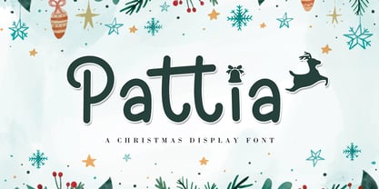 Pattia is a joyful and festive display font. It is ideal for Christmas Holiday-themed greeting cards and for any crafting project. This font is PUA encoded which means you can access all of the glyphs and swashes with ease!
 - Italican Script by Typotheticals,
$4.00 This font is an addition to the Italican Oblique family, where the lower case characters have been redeveloped to give an impression of script. While some characters join together, there was no intention to create this style throughout the whole font.
 - Cover Art JNL by Jeff Levine,
$29.00 Cover Art JNL was inspired by the hand-lettered sans serif title of an Art Deco era Portuguese magazine called Ilustraçáo. The mix of conventional and non-conventional letter forms made it a perfect candidate to turn into a digital font.
 - Santino by Sudtipos,
$39.00 Santino is a rounded monoline, post-bauhaus geometric font with smooth extremes and a touch of modern sensuality. It is named after Ariel "Negro" Di Lisio's son. The fonts were designed by Ariel Di Lisio and digitized by Alejandro Paul.
 - Kinderline Script by Letterhend,
$15.00 Kinderline Script is a joyful and playful monoline script typeface. Very suitable to be used as a headline, instagram post and stories, logos, magazines, books, greeting/wedding cards, packaging, fashion, make up, stationery, novels, labels or any type of advertising purpose.
 - Euroika by Ingrimayne Type,
$12.95 Crisp and clean with a non-traditional italics, Euroika is a decorative, serifed alphabet. The letters have high contrast between the thick and thin strokes and the lower-case letters have a small x-height. The family consists of ten members.
 - Demian by ITC,
$29.99Demian is the work of Dutch designer Jan Van Dijk. It is an informal script font whose capitals should serve as initials to the word settings of the lower case letters. Demian has the spontaneous, flowing look of true handwriting. - Lux by URW Type Foundry,
$35.99 Many times, when a new creative process is starting, it is triggered by an everyday action or item. In this case, the looks of a lady’s watch inspired Michael Herold to create his new typeface LUX. The sight of the chronograph sparked associations of the 1950s in Mr. Herold: While this decade was predominantly dominated by brush and feather scripts, there was also a bloom of strict and modern architecture. This special mix of strength and retro style is exactly what Michael Herold is trying to capture in his LUX. The result is a typeface which is perfectly suitable for use on book covers, posters and claims – thanks to its striking impression. The name LUX, Latin for light, is inspired by the high bright-dark contrast within the individual characters. Oft sind es alltägliche Gegenstände, die das Bestreben eines neuen kreativen Prozesses auslösen. So entspringt auch die Inspiration zur Erschaffung der LUX von Michael Herold dem Anblick einer Damenuhr. Der Chronograph löste bei Herrn Herold Assoziationen zu den 1950er Jahren aus: Während diese Zeit hauptsächlich von Schreibschriften aus Federn und Pinseln beherrscht wurde, nahm auch die streng und modern anmutende Architektur starken Einfluss auf die Epoche. Diese Mischung aus Strenge und 50er Jahre Retro-Stil soll in der LUX zum Ausdruck kommen. Das Ergebnis ist eine Schrift, die sich mit ihrer plakativen Wirkung perfekt für Buchumschläge, Poster und Claims eignet. Namensgebend war der starke hell-dunkel Kontrast innerhalb der Schrift – festgehalten in dem lateinischen Wort für Licht.
 - Kage by Balibilly Design,
$12.00 Welcome to the old version of Kage. "Old does not mean obsolete" In April 2022, we updated whole letterforms. We redrew all glyphs and refined the nodes, corners, rounded shapes, flowing tails, etc. Of course, you can still use the update of an older version of Kage, although we highly recommend you move to the Pro version for the full benefits. Kage Pro has massive development, puts forward experimentation on alternate letters, and applies an oblique style to provide diverse style choices. Come with tons of swirly ligatures and advanced opentype features include case-sensitive forms, small caps, standard and discretionary ligatures, stylistic alternates, ordinals, fractions, numerator, denominator, superscript, subscript, circled number, slashed zero, old-style figure, tabular and lining figure. Learn more about Kage Pro here: Kage Pro 2.0 | Type Specimen About Kage The Inspiration: The radical exploration world of fashion inspires us. It leads our minds to the Neo-classical type style created during the age of enlightenment in the 18th century. It has a reasonably extreme contrast from the previous serif style, making the impression that it is emitted more expensive and classy. Organically, this Neo-Classical typeface is closely related to the fashion world, especially in Europe, and even spread across the globe. Fashion and this typeface reflect each other. After, we boldly observed Japanese fashion designer Rei Kawakubo. Famous for radical & deconstructive fashion, which makes the world of fashion more flexible and dynamic. The Design: As well as the typeface that we made, we started it with a cultural foundation of the Didone typeface. We tried to deconstruct the appearance. The decoration that better reflected the dynamic of fashion implemented in the fashionable alternate and calligraphical stylistic set ended with ball terminals. The versatile impression created is like taking off a scarf on the model's hair during a fashion show. The deconstructive image is combined with a legibility structure like the appearance of the Neo-Classical style. Kage is designed to visualize a costly and exclusive image of a thing, product, world clothing brand, famous fashion magazine, etc. The modern transitions of each letterform are softer, so when repositioning and escalating the size of this font, it will remain beautiful without injuring other elements. So, Kage is a bold choice on headlines and more prominent media with a portion of 50% even more. The Feature: Kage has 11 styles, from thin to black; all family-style consist of one variable font with two axes. The total number of glyphs is 748 in each style. She comes with tons of swirly ligatures and stylistic alternates in Advance OpenType features, including: discretionary ligatures, stylistic alternates, ordinals, fractions. Support multi-language including Western European, Central European, Southeastern European, South American, Oceanian, Vietnamese.
 - Oceanwide Pro by California Type Foundry,
$47.00 A font perfect for not just one, but many projects! Introducing Oceanwide Pro, a sans that loves to be used in just about any situation! Designed with ultra clean lines and versatility in mind, Oceanwide wants to be your new favorite sans! Oceanwide’s ultra clean letters work anywhere you want to communicate orderliness and competence, and designed to build trust and rapport with your audience. Its wide proportions make it ideal for display and logo use. Oceanwide especially shines for white/bright letters on black/dark backgrounds! That’s because the inside shapes are nearly perfect circles in many weights. Here's a quick video tour of Oceanwide Pro by Dave Lawrence, including all the great things Oceanwide can be used for! We've tested Oceanwide for these industries, with stunning results!: Tech Arts Fashion & Style Business & Branding Corporations Logistics Architecture Food and many more... Oceanwide can be used for: Headers Subheadlines Logos Even body text, if tracked. Print & Screen The styles it can take are also many. It's great for: Modern/minimalist design Flat design Cut out design User Interface (UI) Technical designs In combination with text effects, even for grunge and other situations. And many others... DESIGN FEATURES Simplicity Tall x-height Hand-sloped obliques (italics) Narrow spacing Semi-wide proportions Expert kerning Well proportioned, usable lights & extra lights Large caps Great ALL CAPS MODE Uppercase punctuation Uppercase spacing with California Type Foundry’s Smart Tracking™ Advanced fraction support Proportional lining figures Thick joins Smooth curves Sturdy—great for textures and effects Variable font available Latin Pro character set for Central European languages. That's the writing for over 782 languages and transliterations worldwide! DESIGN STORY—THE FORGOTTEN SANS by Dave Lawrence, Lead Designer, California Type Foundry Adrian Frutiger was the 20th century master of sans, but I didn't realize he had made—not one—but TWO geometric sans! It wasn't until I had purchased the book “Adrian Frutiger: Typefaces”. I had hoped to someday meet Adrian Frutiger, but he passed away that very same year. Here is the story of Frutiger's forgotten sans. Back in 1968, Frutiger was approached by Pentagram to make a design for British Petroleum. They wanted a "new version of Futura". However, they wanted him to make a couple adjustments. First, they felt that Futura was "too fiddly." By this, they meant that it narrowed too much at the joins. (Joins are for example where the round and straight parts of the 'd' meet.) This is something that is necessary for small print text (to prevent ink clogging), but is not necessary at large sizes. Second, they wanted it to be entirely geometric, using the circular shape with minimal optical corrections. Unfortunately this font was not even used very consistently in the BP brand. A haphazard mix of Futura and Frutiger's BP font ensued. It was then replaced by another font design very soon after. My design is different in several ways. First, the commas and quotes are a more modern style. I tried his original commas, but these just didn’t work to 21st century eyes. Second, in his drawings, Frutiger went for a more standard u with a downstroke on the right. However, Oceanwide has a simpler u. Third, I made more optical adjustments. At the direction of his employer, Frutiger reluctantly put no font optical corrections into the letters. So I think my optical adjustments are similar to what Frutiger would have wanted. Fourth, I extended the weight into the light and extra light ranges. Fifth, the rest of the font I created according to the principles of Adrian Frutiger, but with no sources for inspiration. Here is Frutiger’s design philosophy, in his own words: “If you remember the shape of your spoon at lunch, it has to be the wrong shape. The spoon and the letter are tools; one to take food from the bowl, the other to take information off the page... When it is a good design, the reader has to feel comfortable because the letter is both banal and beautiful.” The words about the spoon were the ones I kept in my mind as I tried to make the curves ultra smooth, and the shapes ultra simple. Hopefully this font is a worthy successor to the font that inspired it. Released on the 93rd birthday of Adrian Frutiger, to celebrate the life and achievements of this amazing designer. ——————— Simplicity. Versatility. Oceanwide.
 - Sylfaen by Microsoft Corporation,
$49.00Sylfaen was designed for Microsoft in 1998 by John Hudson and W. Ross Mills of Tiro Typeworks, and Geraldine Wade of Monotype Typography. Sylfaen is a Welsh word meaning foundation"; an apt name since the font stemmed from research into the typographic requirements of many different scripts and languages. This version of Sylfaen supports the WGL4.0 character set, for Pan-European language coverage. In addition to Latin, Greek and Cyrillic letterforms, the font contains the characters necessary for support of the Armenian and Georgian languages. Font Designer: John Hudson, W. Ross Mills, Geraldine Wade. The Sylfaen font contains 729 glyphs including Latin 1, WGL Pan-European, Armenian and Georgian." - Ten Pounds by Up Up Creative,
$29.00 Introducing Ten Pounds, a fun, hand-drawn serif font with tons of character (and tons of characters!). Ten Pounds is perfect for branding, poster design, t-shirts, invitations, design for children, and editorial design. It comes with more than 1300 glyphs, including more than 100 ligatures. OpenType features include stylistic sets, character variants, initial and final forms, and multilingual support (including multiple currency symbols). The OpenType features can be very easily accessed by using OpenType-savvy programs such as Adobe Illustrator and Adobe InDesign. (To access these awesome features in Microsoft Word, you'll need to get comfortable with the advanced tab of Word's font menu.)
 - Scientia by ParaType,
$30.00Scientia (means 'knowledge', 'science' in Latin) is a neutral serif typeface in eight styles. It contains four weights (Regular, Medium, Bold, Black) with corresponding italics. All the styles support Western and Central European Latin, basic and Asian Cyrillic and Greek. Regular and Medium styles include smallcaps for all supported languages. In addition to the standard set of non-alphabetic characters Scientia has arrows and some supplemental mathematical symbols. The font was created by Natalia Vasilyeva. Being a professional book designer, Natalia uses Scientia in astronomy books. Scientia is a good choice for literary fiction and academic non-fiction texts. The typeface was released by ParaType in 2016. - Soulmotion by Akrtype Studio,
$19.00 Soulmotion is a seductive script font that is made with a touch of elegance and feeling to give the best look. Soulmotion an elegant combination of a script. It is slender, feminine and classy, while still maintaining a friendly feel. Soulmotion script is versatile and will work perfectly for fashion, e-commerce brands, trend blogs, wedding boutiques or any business that wants to appear upscale and chic. With its ton of ligatures variants and stylistic characters, Soulmotion is perfect for creating original and functional designs. It has extensive language support and tons of ligatures, alternates, stylistic sets that add visual interest to every letter.
 - Card Characters - Unknown license

- Yapa by TipoType,
$35.00 Yapa is a display font. Ideal for eye-catching titles, logos and labels, based on the Arya and Prevya typefaces. It is based on Roman proportions, but is accompanied by swashes and decorative ornaments.
 - Sanderyna by Sealoung,
$15.00 Sanderyna is a simple and dainty handwritten font. It looks beautiful on a variety of designs requiring a personalized style, such as wedding invitations, thank you cards, weddings, greeting cards, logos and so on.
 - Sofya by Gaslight,
$30.00 This funny script font based on the logo which we did. It will look great on the package, restaurant menus, logos and magazine headlines. A large number of ligatures help you vary your design.
 - Altra Mano by Kate Brankin,
$32.00 Altra Mano is based on the designer’s second style of handwriting, one that is more refined and controlled. Altra Mano is a decorative display typeface ideal for headlines, logotypes, magazines, posters and short text.
 - Pixapp Inter by Okaycat,
$29.50 Pixapp Inter is a pixel font optimized for display on screen. Highly suitable for small text display in apps or on web. Pixapp Inter is a multilingual font appropriate for publishing to international environments.
 - Slab Compact JNL by Jeff Levine,
$29.00 Slab Compact JNL was based on the printed title found on the box cover of a 1950s-era word games set called “Lex-O-Grams” and is available in both regular and oblique versions.
 - Los Vampiros by Comicraft,
$39.00 Wooden Stake? Check. Holy Water? Check. Gideon's Bible? Check. Crucifix? Check. One PC or Mac copy of the Los Vampiros font from the pages of Cliffhanger's CRIMSON? Check. Slayers shouldn't leave home without one.
 - Rolide by Craft Supply Co,
$20.00 Introducing Rolide – Expanded Sans Serif Contemporary Charm Rolide – Expanded Sans Serif presents a unique blend of contemporary charm with its wide and boxy shape. Versatile Design Solution This font is your versatile design solution, ideal for titles and body text. Its non-bold style strikes a harmonious balance between subtlety and impact. Wide & Expanded Rolide’s wide and expanded characters add a touch of modernity to your projects. They stand out without overwhelming the content. Perfect for Titles and Body Text Whether for titles or body text, Rolide is the perfect choice. It maintains clarity and readability, making your content engaging. Elegance in Simplicity In the world of fonts, Rolide embodies elegance through simplicity. Its clean lines and non-bold form offer a contemporary feel. In Conclusion In conclusion, Rolide – Expanded Sans Serif is the font that marries wide, expanded, and non-bold characters to create a contemporary and versatile design solution. It ensures your titles and body text are engaging, clear, and subtly impactful, appealing to a broad range of readers.
 - Closet Skeleton by Hanoded,
$20.00 Some time ago I stumbled upon a little book called 'De Sprookjeshoorn' ('Horn of Fairy Tales') by Anton Eijkens (1920 - 2012). It was published in 1946 and contains several authentic and unique fairy tales - unfortunately unreadable to modern children, as the language used is out of date. What caught my eye was the handwritten font on the cover of the booklet. Closet Skeleton is a fairytale font inspired by the one I found on the cover of De Sprookjeshoorn. It comes with several curly alternates and some end-ligatures as well. I added an 'old fashioned' ampersand and a modern one, so you can choose which one to use. Apart from that, Closet Skeleton comes with a closet choc-a-block full of diacritics.
 - Cling Vinyl JNL by Jeff Levine,
$29.00The Joseph Struhl Company of Long Island, NY pioneered the use of cling vinyl in the field of reusable signs. Along with sets of die-cut letters and numbers, one of their main products for many years was a set of letters and numbers silk screened onto vinyl panels for larger window displays. Cling Vinyl JNL is Jeff Levine's tribute to this sign kit and its innovative contribution to retail marketing. The font comes in two styles: Cling Vinyl JNL has white characters on a black background and Cling Vinyl Clear JNL has black characters on an open (clear) background. For those wanting a "panel" space between words, there are two different width ones on the < and > keys. Please note: limited character set. - Pitmaster by FontMesa,
$29.00 Pitmaster was designed with summertime barbecue in mind, with its straight pointed spurs Pitmaster is sure to get attention for any project western and BBQ related. Included in Pitmaster are a few alternates such as a half slab "A" and slab serif "I", also you'll find alternate "O, o" with spurs removed on one side or the other, this is useful when typing two O's together, you'll have the option of selecting one or both O's with the spurs removed between them for a closer fit on the letters. There's also alternate "D" with the right spur removed for a tighter fit with other letters if needed. Opentype case sensitive forms are also available. To all of you Pitmasters out there Keep On Smokin'
 - Lifeform by Supremat,
$12.00 Lifeform is a modern display font created as a result of my experiments on the forms of letters. While working on the font, I had ambivalent feelings, on the one hand I liked the individual curved lines, on the other hand they seemed very strange, alien and illogical. It was like looking into a microscope and seeing something strange. I wanted to develop and study these forms as something new, because I had never seen anything similar before. The result is a contrasting font that has both curves and sharp, and smooth lines that resemble some kind of organic matter. The font is well suited for large headlines, posters and covers. Its strange design catches the eye and will not leave the viewer indifferent.
 - Crepe Paper JNL by Jeff Levine,
$29.00 Crepe Paper JNL is an alphabet-only novelty font that creates a wavy ribbon headline with a vintage wood type alphabet that somewhat resembles an unfurled stretch of crepe paper. The upper case A-Z keys will produce a white ribbon banner with black letters, while the lower case a-z keys are white letters on a black background. The end caps for the white banner are on the left and right parenthesis keys, while the end caps for the black banner are on the bracket keys. A blank space is located on the period key for the white banner and on the comma key for the black banner. This will allow for a continuous text banner without an open break due to using the space key.
 - Bombelli Light Hand by Wiescher Design,
$39.50 Bombelli is a font that looks like it has been handwritten by a meticulous architect in one of those hand-drawn blueprints of the old days. I chose the name to honor one of my ex-bosses -- a graphic designer-architect who taught me a lot of things when I was young and needed the money. One of the things he taught me – and probably the most important one – was to always be on time in the morning. He never said a word about me being late, but it worked. He taught me about being meticulous in detail and many other things I only appreciated much later. This clear and straightforward font deserves bearing his name. Your grateful type designer Gert Wiescher
 - Easter Parade is a distinctive typeface designed by Harold Lohner that captures the whimsical essence and joy of the Easter season. This font stands out with its playful curvature and decorative elem...
- Ah, diving into the fun world of fonts, aren't we? Alright, let me introduce you to the whimsical world of the "Poke" font, crafted by the talented Ray Larabie. This particular font is like the bubbl...
- Dream Script by Lián Types,
$49.00 One of my dreams as a type-designer was making a good looking chancery cursive. Full of life, like some of the best calligraphers around the world do on their artworks. With Julian Waters, John Stevens and Denis Brown (just to name a few of them) (1) chancery, or italic script, was transformed into a new, exciting and very fresh style of calligraphy mainly at the end of 20th Century. Dream Script may be that dream named above made true. I have been practicing chancery in the way I learnt from those calligraphers for many years now. Making a font out of my ink-sketches was a tough work, since they were closer of -being art- than of -being type-. However, this font rescues many aspects of handmade calligraphy: You have to look at it really close to notice it is actually a font, and that was one of my goals. The secret of a good looking chancery is on its subtle details: pen angle is constantly changing, even on the strokes which seem straight. Capitals and swashes have to be done a little faster than lowercase letters. The rhythm has to be even, in spite of its playful look. The fact that makes Dream look alive is that it has many alternates per glyph. This makes each word look unique like it happens in calligraphy: you will find alternates for the beginning/ending of a word/phrase, some for the middle of it, some interchangeable. Also, to accompany the script, you will find Dream Caps, which was inspired in the eternally beautiful trajan capitals. Place them like I did on the posters and you will have great results for sure. The font works great in small, middle and big sizes and can be a great selection for magazines, wedding invitations, perfumes, and posters. Close your eyes, and Dream with me... TECHNICAL Dream Script Pro is the most complete style, it contains all the alternates and ligatures (OT programmed, better if you use Adobe applications) If you plan to use the font for text, be sure to activate the less decorative capitals, which are placed in the “salt” group of alternates. Dream Script Standard has less glyphs than the Pro one, it contains just some ligatures for a better legibility. (OT programmed, better if you use Adobe applications) NOTES (1) Not only are they great artists, but also good people, who are always willing to share with their students all what they know. I would also like to thank Ricardo Rousselot, whose work inspired me this time to make “The Dream Script” exlibris; and to Alisara Tareekes, a very talented friend which international calligraphy conferences gave me: She kindly helped me with some tips to make this font better.
 - Bebas Neue - 100% free

- Paltime by Typodermic,
$11.95 Step right up, ladies and gentlemen, and feast your eyes on the most dazzling typeface in the land! Paltime is the star of the show, with its all-caps display font and dotted “marquee lights” style that will light up any design like a three-ring circus. But that’s not all, folks! Paltime is a font that knows how to have fun, with layers of dots, hearts, and stars that can be stacked on top of the solid layer to create a multicolored effect that will leave your audience in awe! It’s like a carnival in your design, and everyone is invited. And even if you prefer to keep it simple, Paltime has got you covered. The Marquee, Love, and Glam styles are all standouts on their own, perfect for when you need a monochrome setting or just can’t get enough layer stacking in your life. So come on down to the Paltime font party and join the fun! With its circus barker style, this typeface will be the talk of the town and the star of your design! Most Latin-based European writing systems are supported, including the following languages. Afaan Oromo, Afar, Afrikaans, Albanian, Alsatian, Aromanian, Aymara, Bashkir (Latin), Basque, Belarusian (Latin), Bemba, Bikol, Bosnian, Breton, Cape Verdean, Creole, Catalan, Cebuano, Chamorro, Chavacano, Chichewa, Crimean Tatar (Latin), Croatian, Czech, Danish, Dawan, Dholuo, Dutch, English, Estonian, Faroese, Fijian, Filipino, Finnish, French, Frisian, Friulian, Gagauz (Latin), Galician, Ganda, Genoese, German, Greenlandic, Guadeloupean Creole, Haitian Creole, Hawaiian, Hiligaynon, Hungarian, Icelandic, Ilocano, Indonesian, Irish, Italian, Jamaican, Kaqchikel, Karakalpak (Latin), Kashubian, Kikongo, Kinyarwanda, Kirundi, Kurdish (Latin), Latvian, Lithuanian, Lombard, Low Saxon, Luxembourgish, Maasai, Makhuwa, Malay, Maltese, Māori, Moldovan, Montenegrin, Ndebele, Neapolitan, Norwegian, Novial, Occitan, Ossetian (Latin), Papiamento, Piedmontese, Polish, Portuguese, Quechua, Rarotongan, Romanian, Romansh, Sami, Sango, Saramaccan, Sardinian, Scottish Gaelic, Serbian (Latin), Shona, Sicilian, Silesian, Slovak, Slovenian, Somali, Sorbian, Sotho, Spanish, Swahili, Swazi, Swedish, Tagalog, Tahitian, Tetum, Tongan, Tshiluba, Tsonga, Tswana, Tumbuka, Turkish, Turkmen (Latin), Tuvaluan, Uzbek (Latin), Venetian, Vepsian, Võro, Walloon, Waray-Waray, Wayuu, Welsh, Wolof, Xhosa, Yapese, Zapotec Zulu and Zuni.
 - Padraig Nua by Tony Fahy Font Foundry,
$25.00 Padraig Nua is a font conceptualized and designed by Tony Fahy. It is a European Celtic font, contemporary to many languages, not just of Europe but of the world. It’s origin is influenced by events in Ireland in the 1960s when it was decided that the uncial letterform should not be used further in Irish schools for the Irish language—Gaelic—and that it should be replaced by the Roman letterform—the Cló Romhanach as it was called afterwards. This happened overnight without any apparent discussion. It probably had a lot to do with Ireland joining the EEC, as the EU was called then. It had a massive effect on the Irish language and culture, in that the distinguishing factor that gave the language it’s identity—the half uncial/uncial fonts that were in use in all school, government and society documentation and merchandise—were lost overnight. No one said how or why. It was just done. To this day, all documentation is bi-lingual in government and Gaelic is taught in schools and universities—and decreed so by the European Union—but the presentation for both languages is the Roman letterform. Throughout the world, there are millions of Irish Americans and Irish Canadians, Irish Europeans, Australian Irish, African Irish and many living in the Middle East and Asia—and this new font—Padraig Nua, will appeal to many of them, visually recalling their roots. No one had thought, in those days, of commissioning a design that might update the Gaelic language to a more contemporary appearance that would keep the cultural nature of it intact with a revised and updated font—at one with Europe, the US and the world. Tony Fahy designed Padraig Nua (New Patrick) to address the problem. It keeps an appearance that lends towards the Gaelic language but steers it in the direction of Roman fonts. Some characters reflect letterforms from the Irish/Gaelic manuscripts and uncial fonts.
 - Amor Serif by Storm Type Foundry,
$55.00Antique monumental incriptional majuscule, originally carved in stone, and sometimes called “Roman Capital”, is the origin of the upper-case part of our latin alphabet. Its narrowed form, derived from handwritten originals used between the first to third century A. D., served as the inspiration for the Mramor typeface, which I drew with ink on paper in 1988 under Jan Solpera’s leadership. After composing negative letters on a strip of film it was possible to use Mramor with the early phototypesetting devices. In 1994 with the help of Macintosh IIvi I added the lowercase letters and bolds, and issued this typeface as 14-font family. After some years of using Mramor for various purposes, I realized a need of modernization and humanizing its very fragile appearance, as well as removing numerous decorative and useless parts. Besides that, type design made a huge technical progress in past few years, so I was able to finish the remaining approximately 9600 glyphs contained in the present font system named Amor. It is already usual to combine sans and serif fonts within one family in order to distinguish (e. g. in a book) historical part from contemporary, a plain chapter from a special one, or, in quotations, to divide speaking persons. Sans-serif typefaces don't arise by simple removal of serifs; they have to be drawn completely separately, when occasionally many declined forms may be made, considered to the serifed original. Nevertheless, both parts of this type system appear consistent as for proportional, aesthetic and emotional atmosphere. Usage of type is often closely linked to its original inspiration, in this particular case with architecture and figurative sculpture. An inner “order” was also text setting in smaller sizes. A smooth scale of weights enriches the possibilities in designing of magazines, brochures, exposition catalogues and corporate identity. Economizing, but opened shape of characters is well legible and antique hint comes into play after longer reading. - Dynascript by Alphabet Soup,
$60.00 Typography enters the Space Age! Dynascript brings the ease of “Pushbutton Automatic” to your typesetting experience. Dynascript is actually Two fonts in One–without switching fonts you can instantly change from Dynascript’s connecting font to the non-connecting italic with the simple push of a button. For more details download “The Dynascript Manual” from the Gallery Section. What is Dynascript? Dynascript is the slanted script cousin of Dynatype. It shares many of the characteristics of it’s sibling, but is drawn entirely from scratch and has it’s own unique character. To some it may be reminiscent of various mid-century neon signage, and of sign writing, Speedball alphabets and even baseball scripts. The design of Dynascript also takes some cues from a historical typographic curiosity that began in Germany in the ‘20s and which lasted into the ‘60s—when Photo-Lettering gave it the name "Zip-Top". Basically it was believed to be the wave of the future—that by weighting an alphabet heavier in its top half, one could increase legibility and reading speed. The jury’s still out on whether or not there’s any validity to this claim, but I think you’ll agree that in the context of this design, the heavier weighting at the top of the letters helps to create some uniquely pleasing forms, and a script unlike any other. Typesetters across the planet will also be able to set copy in their language of choice. Dynascript’s 694 glyphs can be used to set copy in: Albanian, Basque, Catalan, Cornish, Croatian, Czech, Danish, Dutch, Esperanto, Estonian, Faroese, Finnish, French, Galician, German, Hungarian, Icelandic, Indonesian, Irish, Italian, Kalaallisut, Latvian, Lithuanian, Malay, Maltese, Manx, Norwegian Bokmål, Norwegian Nynorsk, Oromo, Polish, Portuguese, Slovak, Slovenian, Somali, Spanish, Swahili, Swedish, Turkish, and Welsh—and of course English. Sorry! Off-world languages not yet supported. PLEASE NOTE: When setting Dynascript one should ALWAYS select the “Standard Ligatures" and “Contextual Alternates” buttons in your OpenType palette. See the “Read Me First!” file in the Gallery section.
 - Rufina STD by TipoType,
$13.00 Rufina was as tall and thin as a reed. Elegant but with that distance that well-defined forms seem to impose. Her voice, however, was sweeter, closer, and when she spoke her name, like a slow whisper, one felt like what she had come to say could be read in her image. Rufina's story can only be told through a detour because her origin does not coincide with her birth. Rufina was born on a Sunday afternoon while her father was drawing black letters on a white background, and her mother was trying to join those same letters to form words that could tell a story. But her origin goes much further back, and that is why she is pierced by a story that precedes her, even though it is not her own. Maybe her origin can be traced back to that autumn night in which that tall man with that distant demeanor ran into that woman with that sweet smile and elegant aspect. He looked at her in such a way that he was trapped by that gaze, even though they found no words to say to each other, and they stayed in silence. Somehow, some words leaked into that gaze because since that moment they were never apart again. Later, after they started talking, projects started coming up and then coexistence and arguments, routines and mismatches. But in that chaos of crossed words in their life together, something was stable through the silence of the gazes. In those gazes, the silent words sustained that indescribable love that they didn't even try to understand. And in one of those silences, Rufina appeared, when that man told that woman that he needed a text to try out his new font, and she saw him look at her with that same fascination of the first time, and she started to write something with those forms that he was giving her as a gift. Rufina was as tall and thin as a reed, wrote her mother when Rufina was born.

