10,000 search results
(0.026 seconds)
- Ebenezer by Typodermic,
$11.95 Welcome to the world of darkness and fear, where shadows dance and nightmares come to life. Introducing Ebenezer, the typeface that will send shivers down your spine and make your message stand out like never before. With Goldburg-inspired letterforms and intricate, eerie details, Ebenezer is the perfect choice for any project that requires a macabre touch. Each character is carefully crafted to evoke a sense of dread and terror, making it the perfect typeface for horror movies, Halloween-themed designs, or any project that requires a dark and ominous feel. But Ebenezer is more than just a typeface. With its OpenType ligatures, common character sequences are automatically substituted with bespoke combos, ensuring that your message has an even more ghastly impact. Each word becomes a work of art, with letters combining and twisting into haunting shapes that will leave your audience speechless. So embrace the darkness and let Ebenezer lead the way. Its spooky, highly detailed design will take your project to the next level, ensuring that your message is unforgettable and truly terrifying. Whether you’re designing a poster, creating a logo, or simply looking to add a touch of macabre elegance to your text, Ebenezer is the perfect choice. Most Latin-based European writing systems are supported, including the following languages. Afaan Oromo, Afar, Afrikaans, Albanian, Alsatian, Aromanian, Aymara, Bashkir (Latin), Basque, Belarusian (Latin), Bemba, Bikol, Bosnian, Breton, Cape Verdean, Creole, Catalan, Cebuano, Chamorro, Chavacano, Chichewa, Crimean Tatar (Latin), Croatian, Czech, Danish, Dawan, Dholuo, Dutch, English, Estonian, Faroese, Fijian, Filipino, Finnish, French, Frisian, Friulian, Gagauz (Latin), Galician, Ganda, Genoese, German, Greenlandic, Guadeloupean Creole, Haitian Creole, Hawaiian, Hiligaynon, Hungarian, Icelandic, Ilocano, Indonesian, Irish, Italian, Jamaican, Kaqchikel, Karakalpak (Latin), Kashubian, Kikongo, Kinyarwanda, Kirundi, Kurdish (Latin), Latvian, Lithuanian, Lombard, Low Saxon, Luxembourgish, Maasai, Makhuwa, Malay, Maltese, Māori, Moldovan, Montenegrin, Ndebele, Neapolitan, Norwegian, Novial, Occitan, Ossetian (Latin), Papiamento, Piedmontese, Polish, Portuguese, Quechua, Rarotongan, Romanian, Romansh, Sami, Sango, Saramaccan, Sardinian, Scottish Gaelic, Serbian (Latin), Shona, Sicilian, Silesian, Slovak, Slovenian, Somali, Sorbian, Sotho, Spanish, Swahili, Swazi, Swedish, Tagalog, Tahitian, Tetum, Tongan, Tshiluba, Tsonga, Tswana, Tumbuka, Turkish, Turkmen (Latin), Tuvaluan, Uzbek (Latin), Venetian, Vepsian, Võro, Walloon, Waray-Waray, Wayuu, Welsh, Wolof, Xhosa, Yapese, Zapotec Zulu and Zuni.
 - Polyflec by Typodermic,
$11.95 Introducing Polyflec, the ultimate technical typeface that combines form and function with a cutting-edge design. With its square letterforms and intricate angles, Polyflec is the perfect choice for those seeking a modern, sleek and professional look. The unique design of Polyflec is inspired by the world of technology and industrial design, offering a truly unique and innovative aesthetic. Each letterform has been expertly crafted to convey a sense of precision and technical mastery, making it the ideal choice for those looking to make an impact in the digital age. Polyflec comes in four different weights and italics, giving you the freedom to choose the perfect style for your message. Whether you’re creating a bold and impactful headline, or a refined and elegant piece of text, Polyflec has everything you need to make a statement. So why settle for a plain and outdated typeface when you can harness the power of Polyflec? With its striking design and unmatched versatility, Polyflec is the perfect choice for anyone looking to take their message to the next level. Try it out today and experience the cutting-edge of technological typography! Most Latin-based European writing systems are supported, including the following languages. Afaan Oromo, Afar, Afrikaans, Albanian, Alsatian, Aromanian, Aymara, Bashkir (Latin), Basque, Belarusian (Latin), Bemba, Bikol, Bosnian, Breton, Cape Verdean, Creole, Catalan, Cebuano, Chamorro, Chavacano, Chichewa, Crimean Tatar (Latin), Croatian, Czech, Danish, Dawan, Dholuo, Dutch, English, Estonian, Faroese, Fijian, Filipino, Finnish, French, Frisian, Friulian, Gagauz (Latin), Galician, Ganda, Genoese, German, Greenlandic, Guadeloupean Creole, Haitian Creole, Hawaiian, Hiligaynon, Hungarian, Icelandic, Ilocano, Indonesian, Irish, Italian, Jamaican, Kaqchikel, Karakalpak (Latin), Kashubian, Kikongo, Kinyarwanda, Kirundi, Kurdish (Latin), Latvian, Lithuanian, Lombard, Low Saxon, Luxembourgish, Maasai, Makhuwa, Malay, Maltese, Māori, Moldovan, Montenegrin, Ndebele, Neapolitan, Norwegian, Novial, Occitan, Ossetian (Latin), Papiamento, Piedmontese, Polish, Portuguese, Quechua, Rarotongan, Romanian, Romansh, Sami, Sango, Saramaccan, Sardinian, Scottish Gaelic, Serbian (Latin), Shona, Sicilian, Silesian, Slovak, Slovenian, Somali, Sorbian, Sotho, Spanish, Swahili, Swazi, Swedish, Tagalog, Tahitian, Tetum, Tongan, Tshiluba, Tsonga, Tswana, Tumbuka, Turkish, Turkmen (Latin), Tuvaluan, Uzbek (Latin), Venetian, Vepsian, Võro, Walloon, Waray-Waray, Wayuu, Welsh, Wolof, Xhosa, Yapese, Zapotec Zulu and Zuni.
 - Areplos by Storm Type Foundry,
$53.00To design a text typeface "at the top with, at the bottom without" serifs was an idea which crossed my mind at the end of the sixties. I started from the fact that what one reads in the Latin alphabet is mainly the upper half of the letters, where good distinguishableness of the individual signs, and therefore, also good legibility, is aided by serifs. The first tests of the design, by which I checked up whether the basic principle could be used also for the then current technology of setting - for double-sign matrices -, were carried out in 1970. During the first half of the seventies I created first the basic design, then also the slanted Roman and the medium types. These drawings were not very successful. My greatest concern during this initial phase was the upper case A. I had to design it in such a way that the basic principle should be adhered to and the new alphabet, at the same time, should not look too complicated. The necessary prerequisite for a design of a new alphabet for double-sign matrices, i.e. to draw each letter of all the three fonts to the same width, did not agree with this typeface. What came to the greatest harm were the two styles used for emphasis: the italics even more than the medium type. That is why I fundamentally remodelled the basic design in 1980. In the course of this work I tried to forget about the previous technological limitations and to respect only the requirements then placed on typefaces intended for photosetting. As a matter of fact, this was not very difficult; this typeface was from the very beginning conceived in such a way as to have a large x-height of lower-case letters and upper serifs that could be joined without any problems in condensed setting. I gave much more thought to the proportional relations of the individual letters, the continuity of their outer and inner silhouettes, than to the requirements of their production. The greatest number of problems arose in the colour balancing of the individual signs, as it was necessary to achieve that the upper half of each letter should have a visual counterbalance in its lower, simpler half. Specifically, this meant to find the correct shape and degree of thickening of the lower parts of the letters. These had to counterbalance the upper parts of the letters emphasized by serifs, yet they should not look too romantic or decorative, for otherwise the typeface might lose its sober character. Also the shape, length and thickness of the upper serifs had to be resolved differently than in the previous design. In the seventies and at the beginning of the eighties a typeface conceived in this way, let alone one intended for setting of common texts in magazines and books, was to all intents and purposes an experiment with an uncertain end. At this time, before typographic postmodernism, it was not the custom to abandon in such typefaces the clear-cut formal categories, let alone to attempt to combine the serif and sans serif principles in a single design. I had already designed the basic, starting, alphabets of lower case and upper case letters with the intention to derive further styles from them, differing in colour and proportions. These fonts were not to serve merely for emphasis in the context of the basic design, but were to function, especially the bold versions, also as independent display alphabets. At this stage of my work it was, for a change, the upper case L that presented the greatest problem. Its lower left part had to counterbalance the symmetrical two-sided serif in the upper half of the letter. The ITC Company submitted this design to text tests, which, in their view, were successful. The director of this company Aaron Burns then invited me to add further styles, in order to create an entire, extensive typeface family. At that time, without the possibility to use a computer and given my other considerable workload, this was a task I could not manage. I tried to come back to this, by then already very large project, several times, but every time some other, at the moment very urgent, work diverted me from it. At the beginning of the nineties several alphabets appeared which were based on the same principle. It seemed to me that to continue working on my semi-finished designs was pointless. They were, therefore, abandoned until the spring of 2005, when František Štorm digitalized the basic design. František gave the typeface the working title Areplos and this name stuck. Then he made me add small capitals and the entire bold type, inducing me at the same time to consider what to do with the italics in order that they might be at least a little italic in character, and not merely slanted Roman alphabets, as was my original intention. In the course of the subsequent summer holidays, when the weather was bad, we met in his little cottage in South Bohemia, between two ponds, and resuscitated this more than twenty-five-years-old typeface. It was like this: We were drinking good tea, František worked on the computer, added accents and some remaining signs, inclined and interpolated, while I was looking over his shoulder. There is hardly any typeface that originated in a more harmonious setting. Solpera, summer 2005 I first encountered this typeface at the exhibition of Contemporary Czech Type Design in 1982. It was there, in the Portheim Summer Palace in Prague, that I, at the age of sixteen, decided to become a typographer. Having no knowledge about the technologies, the rules of construction of an alphabet or about cultural connections, I perceived Jan Solpera's typeface as the acme of excellence. Now, many years after, replete with experience of revitalization of typefaces of both living and deceased Czech type designers, I am able to compare their differing approaches. Jan Solpera put up a fight against the digital technology and exerted creative pressure to counteract my rather loose approach. Jan prepared dozens of fresh pencil drawings on thin sketching paper in which he elaborated in detail all the style-creating elements of the alphabet. I can say with full responsibility that I have never worked on anything as meticulous as the design of the Areplos typeface. I did not invent this name; it is the name of Jan Solpera's miniature publishing house, in which he issued for example an enchanting series of memoirs of a certain shopkeeper of Jindrichuv Hradec. The idea that the publishing house and the typeface might have the same name crossed my mind instinctively as a symbol of the original designation of Areplos - to serve for text setting. What you can see here originated in Trebon and in a cottage outside the village of Domanín - I even wanted to rename my firm to The Trebon Type Foundry. When mists enfold the pond and gloom pervades one's soul, the so-called typographic weather sets in - the time to sit, peer at the monitor and click the mouse, as also our students who were present would attest. Areplos is reminiscent of the essential inspirational period of a whole generation of Czech type designers - of the seventies and eighties, which were, however, at the same time the incubation period of my generation. I believe that this typeface will be received favourably, for it represents the better aspect of the eighties. Today, at the time when the infection by ITC typefaces has not been quite cured yet, it does absolutely no harm to remind ourselves of the high quality and timeless typefaces designed then in this country.In technical terms, this family consists of two times four OpenType designs, with five types of figures, ligatures and small capitals as well as an extensive assortment of both eastern and western diacritics. I can see as a basic text typeface of smaller periodicals and informative job-prints, a typeface usable for posters and programmes of various events, but also for corporate identity. Štorm, summer 2005 - Martin Luther by Harald Geisler,
$59.00 ❧ Useful links: Luther’s Manuscripts at the UNESCO Memory of the World at Google Arts and Culture Martin Luther font on Kickstarter (with Film about the creation) Each letter of the Martin Luther font is strictly based on original samples found in Martin Luther’s 500 year old handwritten manuscripts. Letters that occur more often for example vowels have two or more different versions stored in the font. (➶ Figure 4) These alternative forms are exchanged automatically by the font as you type, and create a vivid look that comes close to actual handwriting. The font avoids that two identical letters are placed next to each other like, for example the two “o” in the word “look”. ➸ What Historic Sources is the Font based on? Two historic documents were used to base the font on. The notes Luther took before giving his speech in Worms in 1521 and a 6 page letter he wrote immediately after to Emperor Charles V., summarising his speech (➶ Figure 2). Both documents have been added to the UNESCO “Memory of the World” and can be seen at the Google Arts and Culture website. ➸ The Creation of a Handwriting Font The creation of a handwriting font is very different from the creation of a regular font. Harald Geisler has specialised in recreating handwriting in preceding projects with Albert Einstein’s, Sigmund Freud’s and his own handwriting. His experience working with Archives and Museums has gone into this project. First Geisler analyses the movement in the writing to understand how each letter is drawn. This involves partially learning how to write like a person. In this process not the outlines of the sample are reproduced but the original movement path of the handwriting (➶ Figure 3). In a second step width and contrast is added to reproduce Martin Luther’s characteristic impetus and the writing tools used at the time. (Link: Youtube Playlist showcasing the creation of individual letters) How about signs that can’t be found in archives? Some Glyphs can not be found in 500 year old manuscripts, for example the @-sign. Towards the end of the creation one collects a profund amount of details about how a writer moves on paper and addresses certain tasks moving the pen. Keeping this knowledge in mind an improvisation can be based on similar letter forms. For example the @ sign is based on of the movement of a lowercase a and parenthesis. ➸ Features of the Martin Luther font ❶ Extensive Documentation of the creation of the font, including high quality reproduction of the used manuscripts. ❷ Additional texts from Historian Dr. Henning Jürgens and Palaeographer (and Luther handwriting expert) Prof. Ulrich Bubenheimer ❸ Alternating Letters - in handwriting every word looks a bit different. To avoid that two identical letterforms are placed next to each other (for example in the word look) the font actively changes between different versions of letters as you type. ❹ Ligatures - characteristic writing forms when two letters are combined (for example “ct”) (➶ Figure 5) ❺ Terminal Letterforms - renders a special letterform when letter is at the end of a word. (➶ Figure 8) ❻ ‘’’Initial and Medial Letterforms''' - some letterforms are different when placed in the beginning or middle of a word, for example the lowercase s. ❼ Luther Rose - is a seal Luther used to authorise his correspondence. Today it is a widely recognized symbol for Luther. When you enter the numbers of Luthers year of birth and death 14831546 using the Martin Luther PRO font, it will render a stylised version of the Luther Rose. (➶ Figure 7) ❽ Historic letter-forms - letter-forms that are specific to medieval writing around 1500. For example the long-s or h with a loop at the bottom. (➶ Figure 6) ⚑ Multi language support - see the technical information tab for a full list of supported languages. (➶ Figure 11) ➸ The different Styles explained ❋ Martin Luther PRO - this includes all features listed above and is geared towards writing texts that are more readable today. It features alternating letters to create a natural handwriting look as well as two stylistic sets accessible through the OpenType menu. Historic forms are available through the glyph picker. ❋ Martin Luther Historic - this font creates a historically correct reproduction (i.e. with long-s) of Luther’s medieval latin handwriting. It features alternating letters to create a natural handwriting look as well as two stylistic sets accessible through the OpenType menu. ❋ Martin Luther Expert-1 - Dedicated access to the first set of letters only. ❋ Martin Luther Expert-2 - Dedicated access to the second set of letters only. ❈❈❈ Family Pack - recieve all fonts at a discounted price. ❈❈❈ ➸ Kickstarter The creation and development of the Martin Luther font was financed by 500 supporters on ➸Kickstarter.
 - Culoare v.2 by Luxfont,
$19.00 Introducing Culoare V2.0 is the second version of the space bright color gradient font. (The first version is here - Culoare) This is a new set with completely new color combinations, bright and saturated like neon. 3 types of stylization in 9 different color gradient combinations with soft transitions. Letters seem to be backlit and it looks very original in addition to stylish minimalist glyphs. Lots of design use cases. Ideal for promotional illustrations, headlines and covers. Font family is based on the Regular font Boldini - which means that if necessary you can combine these two families and they will be absolutely stylistically identical and complement each other. Check the quality before purchasing and try the FREE DEMO version of the font to make sure your software supports color fonts. P.s. Have suggestions for color combinations? Write me an email with the subject "Culoare V2 Color" on: ld.luxfont@gmail.com Features: - Free Demo font to check it works. - Uppercase and lowercase the same size but different colors. - Transparency in letters. - Kerning. IMPORTANT: - Multicolor version of this font will show up only in apps that are compatible with color fonts, like Adobe Photoshop CC 2017.0.1 and above, Illustrator CC 2018. Learn more about color fonts & their support in third-party apps on www.colorfonts.wtf -Don't worry about what you can't see the preview of the font in the tab "Individual Styles" - all fonts are working and have passed technical inspection, but not displayed, they just because the website MyFonts is not yet able to show a preview of colored fonts. Then if you have software with support colored fonts - you can be sure that after installing fonts into the system you will be able to use them like every other classic font. Question/answer: How to install a font? The procedure for installing the font in the system has not changed. Install the font as you would install the classic fonts. How can I change the font color to my color? · Adobe Illustrator: Convert text to outline and easily change color to your taste as if you were repainting a simple vector shape. · Adobe Photoshop: You can easily repaint text layer with Layer effects and color overlay. ld.luxfont@gmail.com
 - Protura by MIX.Jpg,
$15.00 Protura Sans Serif Masculine - 9 Font Weights With Italics Introducing Protura Sans Serif Masculine, a versatile and powerful font family designed to make a bold statement in your creative projects. With nine distinct font weights and accompanying italics, Protura offers unmatched flexibility for all your design needs. Key Features: Nine Font Weights: Protura Sans Serif Masculine boasts an extensive range of weights, from Light to Ultra Bold. Whether you're crafting a subtle headline or a powerful logo, you'll find the perfect weight to convey your message. Italics Included: In addition to the standard weights, Protura also provides elegant italic versions for each weight. These italics add a touch of sophistication to your typography, making it ideal for editorial work and branding projects. Masculine Aesthetic: Protura's design exudes strength and masculinity, making it an excellent choice for projects aimed at a bold and assertive audience. Its clean lines and sharp edges give your text a contemporary and impactful look. Versatile Usage: This font family is highly adaptable, suitable for a wide range of design applications, including branding, packaging, editorial design, posters, websites, and more. It's a true workhorse font that performs well in various contexts. Legibility: Protura prioritizes legibility without compromising on style. Its well-crafted letterforms ensure that your text remains clear and readable, even at small sizes. OpenType Features: Take advantage of OpenType features such as ligatures and alternate characters to add subtle design nuances and improve overall visual appeal. Multilingual Support: Protura Sans Serif Masculine supports a multitude of languages, making it a globally accessible font choice for your projects. Applications: Branding: Create impactful logos and brand identities that leave a lasting impression. Editorial Design: Enhance the readability and visual appeal of magazines, newspapers, and books. Web Design: Craft modern and engaging websites that resonate with your target audience. Packaging: Design packaging that stands out on the shelf and communicates product quality. Posters and Flyers: Grab attention with bold and stylish promotional materials. Unleash the power of Protura Sans Serif Masculine to elevate your design projects with a masculine, contemporary, and highly versatile typographic solution. With its extensive weight range and italics, this font family empowers you to create impactful and visually stunning designs.
 - Bunken Tech Sans by Buntype,
$49.00 The Bunken Tech Sans superfamily: A reminiscence of constructed fonts of the modern age designed with considerably cleaner forms. Bunken Tech Sans follows in the best tradition of the straight-lined and somewhat angular structures of its predecessors while offering a much more open and mild design. The shapes of the letters are therefore reduced to the most essential elements: The spurs on a, b, n and other lower case letters occur just as little as decorative or style details, the lightly rounded inside edges are more pleasing to the eye than certain historic role models and make for a harmonic, flowing style. Use In particular Bunken Tech Sans stands out as an easy, distinctive headline font with its straight-lined, technical design. Open counters and large x-height make it equally suited for use in shorter texts. It is also perfectly complemented by Bunken Sans or Bunken Slab in longer texts (available soon). Features Available in 10 styles with widths ranging from Light to ExtraBold with associated Italics. All of the styles are very extensive: Support for at least 58 languages, Small Capitals, 9 number sets (e.g. Lining, Oldstyle, Tabular and Small Cap Figures), ligatures, alternate characters, numerous Opentype functions, and lots of other small features that make it more pleasant to work with the font on a daily basis as well as fulfilling typographic desires. Each style contains more than 870 characters! Each style is available in a professional (Pro) and standard (Std) edition with a reduced range of functions. (Language support, OpenType features and number of glyphs). Details can be found on the respective pages. Bunken Tech Sans is part of the Bunken Tech superfamily and is available in Condensed, Normal and Wide. Also of interest: The slab serif variation Bunken Tech Slab Features in Detail: 12 Weights: -Light -Book -Medium -SemiBold -Bold -ExtraBold and corresponding Italics 3 Widths: -Condensed -Normal -Wide Alternate Characters: A, E, F, L, S, e, f, t, s, y, etc. Small Capitals 5 Sets of Figures: -Lining Figures -Old Style Figures -Tabfigures -Old Style Tabfigures -Small Cap Figures Automatic Ordinals Automatic Fractions Extended Language Support and more...
 - Barberry by FontaZY,
$35.00 Barberry is a hand-made brush script typeface equipped with some decorative OTF features, made by Zakhar Yaschin (FontaZY). Barberry font contains stylistic alternates, initial and final alternates (which is duplicated by contextual alternates in the case when ini & fina are not supported), ligatures, titling alternates, small caps and large collection of swashes (additional variants - in Stylistic Set). The Barberry font is essential for hand-made lettering and design. The Barberry family also includes Barberry Vigniette font with over 200 icons and vigniettes in it. Barberry Letters supports most of Western languages (including Central Europian, Baltic and Eastern European languages) and also Cyrillic. Each lowercase letter has three positional versions of the design – basic (if the letter is in the middle of a word), initial (if the word starts with it) and the final (in the end of the word) that makes the set look more alive and expressive. Working with Barberry Letters you can enable and disable if needed such typographic tools as swashes, ligatures, small caps, titling alternates, stylistic alternates, additional swashes and the already mentioned initial and final alternates. If your design software does not support the use of the initial and final alternatives, they can be duplicated by contextual substitutions. There are more than 20 Latin and Cyrillic ligatures in the Barberry Letters. It works by default as the standard ligatures, but you can switch it off for design reasons or to select the more appropriate typographic solution in any particular case. Ornamental font Barberry Vigniette has more than 200 pictograms and vignettes that can decorate your typographic layout. All icons are drawn with a brush in the same style as the Barberry Letters. You can use them inside the text lines, or make the ornamental decoration for text, or use separately, without any letters. OpenType extensions of the Barberry Letters significantly expand the choice of typographical tools to design a better, more expressive layout. Choosing the optimal variant of certain letters in each case, you can receive a unique composition. Whether it is lettering for packaging or magazine headline, logotype or the name in the invitation – just one Barberry font-family gives you the very wide typographic possibilities.
 - Trevor by TypeTogether,
$36.80 Teo Tuominen’s Trevor took its first breath as a revival of an 18th century antiqua, but culminated in an entirely new and good-natured family. Trevor is an affable slab serif in nature: both heavy and kind. Known for their familiarity and their dark colour, the terminals of slab serifs put additional weight along the line to maintain an inky presence. Their clunky forms reveal slight immaturity and arouse the reader’s sympathy for the subject at hand. Trevor connects with others by consciously riding the line between being personal and commanding. One goal with Trevor was to pair the robust nature of a low contrast slab serif with more sophisticated elements, such as the ball terminals. So wherever one looks in Trevor, rounded corners rule the day, softening the overall appearance by mimicking ink spread made by old metal type. The easygoing look is tempered by very few inktraps and sharp corners, mostly to the inside of characters and in acute angles. Whatever Trevor is paired with, it has an altruistic outlook in that it sees the best in others. It’s the neighbourly type family — the neighbour you actually want. Trevor’s almost monolinear weight and high x-height give it a typewriter look in the extralight and light weights, but the whole family was made to work with many other font styles, design work, and information structures. It certainly finds its home in packaging and advertising, its sturdy verticality and narrowness fit the needs of headlines and intro text, and its seven weights are primed for plays and involved text needing many layers of distinction. The black weight is treated like a separate display style with altered ball terminals and serifs to capitalise on the added heft. Trevor’s seven roman weights cover the Latin A Extended glyph set to bring its kindly and commanding outlook to your projects. Along with alternate version of the ‘R’ in the black weight, its OpenType features include both tabular and proportional lining and oldstyle figures, ligatures, and fractions. The complete Trevor family, along with our entire catalogue, has been optimised for today’s varied screen uses.
 - Coco Gothic Pro by Zetafonts,
$39.00 Inspired by a biography of Coco Chanel and trying to capture the quintessential mood of classical fashion elegance, Cosimo Lorenzo Pancini designed Coco Gothic looking for the effect that the first geometric sans typefaces (like Futura, Kabel or the italian eponyms like Semplicità) had when printed on paper. The crisp modernist shapes acquired in printing charme and warmth through a slight rounding of the corners that is translated digitally in the design of Coco Gothic. This signature touch is enhanced by the inclusion of light humanist touches to the proportions of the letters, resulting in the unique mix that makes Coco Gothic one of our best sellers, with a look that is both contemporary and vintage. After six years from the original project (that has spawned in the meanwhile successful families like Cocogoose and Coco Sharp), we went back to the design to completely redraw and expand the original family, creating with a Pro version that has better on-screen readability, a wider weight range, variable type versions and more language coverage (with Coco Gothic Arabic adding a new script to the latin, greek and Cyrillic of the original). Coco Gothic Pro comes in three subfamilies, each with seven weights with matching italics and featuring an extended character set with open type support for small caps, ligatures, alternates, European languages, Greek and Cyrillic alphabets. The original, body-text optimised Coco Gothic and Coco Gothic Alternate subfamilies have been kept for compatibility with the previous version, while a new Coco Gothic Display subfamily has been developed with a complete redesign aimed at display usage, featuring tighter spacing and optimised letterforms. A distinguishing feature of Coco Gothic Pro is the inclusion of ten alternate historical sets that allow you to use the typeface as a true “typographic time machine”, selecting period letterforms that range from art deco and nouveau, to modernism and to eighties’ minimalism. Equipped with such an array of historical variants, Coco Gothic Pro becomes an encyclopedia of styles from the last century, ready to transform itself and adapt to the mood of your text.
 - Lady Rene by Sudtipos,
$59.00 Looking back on my production to date, neither so little nor so large, it does not come as a surprise to find myself now introducing Lady René. A brief review of my career would read as follows: graphic designer graduated from Buenos Aires University, a 10-year professorship in Typography in the same institution, an illustrator in the making. For almost 15 years now my work has focused on the design of editorial pieces, predominantly books and CD sleeves. Typography proper has always been central to my research projects. All my obsessions eventually embodied as much the search for a perfect, spotless text as for a daring and provoking one. In my view, "how-to-say-something" ranks highest amongst a graphic designer’s responsibilities. It was in this vein that I called in the written word to illustrate, to draw, to narrate. Why not reverse the saying and proclaim that “a word is worth a thousand images”? If so, one single word could trigger endless meanings, associations, ideas, and memories in every reader’s mind. Language, we know, has a strong power and is a living expression of a culture. In my illustrations, letters and drawings reunite in one synergy said and unsaid, the finiteness of the message and the freedom of the free reading. And this is how and when, Lady René, my first born type font sees the light of day conceived out of a love of illustration and a reverence for the written word, recalling the whimsicality of the handmade drawing and reflecting its sensitive, warmth and spontaneity. Enabled by the characteristics of Open Type and the hard, outstanding work of designer Ale Paul, Lady René succeeds in composing texts in a simple, organic way by means of its contextual and stylistic alternates, swash characters, ligatures and connecting words. A bundle of decorative miscellanea completes the set of signs, enabling the user considerable freedom to create new typographic landscapes. Lady René is then prepared, very much like a character in a short story, to come to life in the reader’s mind. I expect you will enjoy her as much as I did creating her. Laura Varsky
 - Echowarp by Luxfont,
$18.00 Introducing Echowarp is an unusual COLORED font family. Main idea of this font is that a colored echo spreads and fades from minimalistic letters to the sides. Distorted letters give the effect of temporary refraction. The originality of this family is primarily suitable for a bold design. And if you add a random distortion in a graphics program to the finished heading written in this font, the inscription will turn into an absolutely unique and inimitable one. Futuristic set has 23 fonts in the family! Do not limit your imagination, because the font opens up a huge space for creative experiments. Check the quality before purchasing and try the FREE DEMO version of the font to make sure your software supports color fonts. Features: Free Demo font to check it works Letters with color echo & distortion 23 OTF SVG color fonts in the family Gradient and hologram fonts Kerning IMPORTANT: - OTF SVG fonts contain vector letters with gradients and transparency. - Multicolor OTF version of this font will show up only in apps that are compatible with color fonts, like Adobe Photoshop CC 2017.0.1 and above, Illustrator CC 2018. Learn more about color fonts & their support in third-party apps on www.colorfonts.wtf - Don't worry about what you can't see the preview of the font in the tab "Individual Styles" - all fonts are working and have passed technical inspection, but not displayed, they just because the website MyFonts is not yet able to show a preview of colored fonts. Then if you have software with support colored fonts - you can be sure that after installing fonts into the system you will be able to use them like every other classic font. Question/answer: How to install a font? The procedure for installing the font in the system has not changed. Install the font as you would install the classic OTF | TTF fonts. How can I change the font color to my color? Adobe Illustrator: Convert text to outline and easily change color to your taste as if you were repainting a simple vector shape. Adobe Photoshop: You can easily repaint text layer with Layer effects and color overlay. ld.luxfont@gmail.com
 - Rabenau by Linotype,
$29.99 Rabenau (formerly Lucinde), the distinctly warm and legible type family For 30 years the graphic designer Axel Bertram worked at creating his typefaces: He developed complete new alphabets for magazines and typewriters as well as for the constant demand for typefaces for use by commercial artists. He has developed wall charts the size of advertising posters as teaching aids for training commercial and graphic artists to write in a clean, classic cursive script. In the eighties he used the American Chyron computer to design a screen font for television. In the mid-nineties he discovered for himself the fabulous possibilities offered by the Fontographer font software program and explored them playfully. From the results of these experiments, Axel Bertram selected a design for further development. From 2003 onwards the calligrapher and type designer Andreas Frohloff collaborated with him on the further development and production of the 16 fonts of the Rabenau™ typeface family.The Rabenau font was inspired by many factors: From the fonts used as book covers to typewriter fonts and even printed material from England dating from the beginning of the nineteenth century (e.g. those used by the skilled printer William Bulmer), Rabenau's relatively high contrast is offset by some organic tapers, subtley rounded bracketed serifs, and a fairly generous x-height. This makes for a typeface that looks especially good in print. Its broad repertoire of weights and styles - Condensed, Poster, and Shadow - give it added versatility, and make it ideal for setting both display and text in the same typeface. Throughout the heavier weights, the contrast is maintained. The Poster Italic sparkles, and will make a fine display type for dynamic headlines, or logotypes. This family of sixteen fonts works beautifully together. All Rabenau font styles have a large set of ligatures and thus cover typical letter combinations in many European languages. Besides the standard ligatures for ff, fi and fl, letter connections are also available for tt, th and fj or ffi, ffl and ffk. The range is completed with lovely arched transitions for the characters st, ck or ct. The latter gives the font that certain something, both in continuous text and above all in headlines.
 - TT Bells by TypeType,
$29.00 TT Bells useful links: Specimen PDF | Graphic presentation | Customization options About TT Bells: TT Bells combines the elegant softness of antiqua with a complex and daring temper reflected in straight stroke terminals and arrowheaded serifs. The family is based on broad nib, which was typically used for old style fonts and creates these hallmark terminals and serifs. We've taken the best from old style fonts created before the digital age and added sharp and contemporary geometric shapes to the traditional style. That’s how TT Bells refers the spectators and font enthusiasts to the origins and, at the same time, reminds us that we live in the digital era when geometry and screens rule the world. TT Bells is suited for different types of text–from the shortest headings to large text arrays. When the font size is decreased, the boldness and sharpness of the font soften, it becomes more classic. The font family is created according to the traditional TypeType formula (Thin, Light, Regular, Bold, Black & Italics). FOLLOW US: Instagram | Facebook | Website TT Bells OpenType features: tnum, onum, pnum, numr, dnom, frac, case, ordn, subs, sups. TT Bells language support: Acehnese, Afar, Albanian, Alsatian, Aragonese, Arumanian, Asu, Aymara, Banjar, Basque, Belarusian (cyr), Bemba, Bena, Betawi, Bislama, Boholano, Bosnian (cyr), Bosnian (lat), Breton, Bulgarian (cyr), Cebuano, Chamorro, Chiga, Colognian, Cornish, Corsican, Cree, Croatian, Czech, Danish, Embu, English, Erzya, Estonian, Faroese, Fijian, Filipino, Finnish, French, Friulian, Gaelic, Gagauz (lat), Galician, German, Gusii, Haitian Creole, Hawaiian, Hiri Motu, Hungarian, Icelandic, Ilocano, Indonesian, Innu-aimun, Interlingua, Irish, Italian, Javanese, Judaeo-Spanish, Judaeo-Spanish, Kalenjin, Karachay-Balkar (lat), Karaim (lat), Karakalpak (lat), Kashubian, Khasi, Khvarshi, Kinyarwanda, Kirundi, Kongo, Kumyk, Kurdish (lat), Ladin, Latvian, Laz, Leonese, Lithuanian, Luganda, Luo, Luxembourgish, Luyia, Macedonian, Machame, Makhuwa-Meetto, Makonde, Malay, Manx, Maori, Mauritian Creole, Minangkabau, Montenegrin (lat), Mordvin-moksha, Morisyen, Nahuatl, Nauruan, Ndebele, Nias, Nogai, Norwegian, Nyankole, Occitan, Oromo, Palauan, Polish, Portuguese, Quechua, Rheto-Romance, Rohingya, Romansh, Rombo, Rundi, Russian, Rusyn, Rwa, Salar, Samburu, Samoan, Sango, Sangu, Scots, Sena, Serbian (cyr), Serbian (lat), Seychellois Creole, Shambala, Shona, Slovak, Slovenian, Soga, Somali, Sorbian, Sotho, Spanish, Sundanese, Swahili, Swazi, Swedish, Swiss German, Swiss German, Tagalog, Tahitian, Taita, Tatar, Tetum, Tok Pisin, Tongan, Tsonga, Tswana, Turkish, Turkmen (lat), Ukrainian, Uyghur, Vepsian, Volapük, Võro, Vunjo, Xhosa, Zaza, Zulu.
 - Helvetica Now Variable by Monotype,
$328.99 Helvetica Now Variable Helvetica Now 2.0 builds on the groundbreaking work of 2019’s Helvetica Now release—all of the clarity, simplicity, and neutrality of classic Helvetica with everything 21st-century designers need. In this 2021 release, we introduce Helvetica Now Variable and add condensed weights to the Helvetica Now static fonts. Helvetica Now 2.0 includes 96 fonts in three distinct optical sizes (Micro, Text, and Display), now with 48 new condensed weights. The Helvetica Now Variable fonts include even more: 144 instances—48 normal, 48 condensed, and 48 compressed. Helvetica Now Variable gives you over a million new Helvetica styles in one state-of-the-art font file (over two-and-a-half million with italics!). Use it as an extension of the Helvetica Now family or make custom-blends from its weights (Hairline to ExtraBlack), optical sizes (four point to infinity), and new Compressed and Condensed widths. Create infinite shades of expression, incredible typographic animations, and ultra-refined typography. Its single font file makes it easier to use and wickedly fast. Load one file and access a million fonts—in a fraction of the size of a traditional font family. More freedom. More expression. More power. More. Helvetica. Now. Each one of the Helvetica Now static fonts has been carefully tailored to the demands of its size. The larger Display versions are drawn to show off the subtlety of Helvetica and spaced with headlines in mind, while the Text sizes focus on legibility, using robust strokes and comfortably loose spaces. Helvetica Now's Micro designs are simplified and exaggerated to maintain the impression of Helvetica in tiny type. There's also an extensive set of alternates, which allow designers the opportunity to experiment with and adapt Helvetica's tone of voice. The new Condensed weights put more type into smaller spaces—for intense emphasis, sophisticated contrast, or just everyday space-fitting. Helvetica Now 2.0 is, quite simply, more: more versatility; more power; and more creative possibilities. “For more than six decades, Helvetica has been the essential typeface,” says Monotype Type Director Charles Nix. “The release of Helvetica Now insures that it will be a typographic force for decades to come.”
 - Scriptuale by Linotype,
$29.00The Scriptuale family, which contains eight styles, is a contemporary upright calligraphic face. Designed by German designer Renate Weise in 2003, this family of typefaces speaks to the present, while at the same time reflecting on a lyrical past. The letterforms of the Scriptuale family are romanticized, they reference German calligraphic styles from the 19th and early 20th Centuries. For instance the design of Scriptuale's uppercase strays from the canon of classical proportion into romantic idealism. While the C and O are drawn according to the ancient quadratic proportions - almost twice as wide, optically, as the E or the L - the letter A is wider than would be expected, and the D narrower. These subtle differences introduce a different rhythm into text set in Scriptuale than Italic styles of calligraphy may offer. Scriptuale's Gs merit special notice: both the upper and lower case G lunge slightly forward, further enhancing the dynamic quality of the text. Also unique in Scriptuale's design is the lowercase width: the letterforms appear slightly condensed; they have large x-heights to compensate for this. In a delightful twist, the number 2's beak has been closed by drawing it full-circle, back into the stem: this references a style of letter design that was practiced, among other places, by artists from the old Klingspor foundry in Offenbach Germany. Typefaces constructed there easily captured the zeitgeist of the romantic period, but are less calligraphic than Scriptuale (e.g., Rudolf Koch's Koch Antiqua). A semi-serif face (like Prof. Hermann Zapf's Optima or Otl Aicher's Rotis Semi), some of Scriptuale's letters have serifs (D), and some do not (A). And although both the B and the E normally have the same "structure" on their left side, Weise has drawn them differently in Scriptuale. These strengthen the calligraphic-like quality of the family. Traces of the pen are easy to see in Scriptuale's design; it is a thoroughly calligraphic face. The eight typefaces in the Scriptuale family include Light, Regular, Semi Bold, and Bold weights. Each weight has a companion italic. Scriptuale is similar to one other contemporary calligraphic family in the Linotype portfolio, Anasdair , from British designer - Dulcinea by Re-Type,
$79.00 Dulcinea is the title of Ramiro Espinoza’s in-depth look at Spanish Baroque calligraphy’s most extreme tendencies, and especially at some of those produced by the writing masters Pedro Díaz Morante and Juan Claudio Aznar de Polanco. These 17th and 18th centuries alphabets with their plentiful calligraphic flourishes represented a marked break with the harmonic and angular Renaissance Cancellaresca style. It was Morante who first introduced and popularized the use of the pointed quill in Spain, and although his famous text entitled “Arte Nueva de escribir” – first volume published in 1616 – contains alphabets that have much in common with traditional broad nib Cancellaresca calligraphy, most of the examples therein are outgrowths of the new models put forward by the Italian master Gianfrancesco Cresci. The writing’s swashes are complex and intricate, but at the same time they feature a profusion of defects. Many of them sometimes come close to ugliness. However, these pages contain an artistic essence that bears a relationship to the ironic and sometimes somber character of Spanish Baroque. That’s why the name of the font pays homage to “Dulcinea del Toboso”, the fictional beauty from Miguel de Cervantes’s ‘Don Quixote’, a work that reveals many of the period’s conflicts, such as the contrast between utopian ideals and reality, uncertainty and madness. But Dulcinea is far from being just a revival. Its forms are not careful tracings of the outlines of Morante and Polanco’s letters, nor are they attempts to reproduce them digitally. In fact, the author of the letters says that had the font been created that way it would have been too archaic to serve as acceptable contemporary typography. However, he believes that there are myriad interesting details that can be rescued and preserved, along with the playful spirit of the original. The work of designing Dulcinea consisted of combining original historical elements with the creativity and calligraphy of the font’s author in order to produce a modern typography that isn’t based on the same traditional sources as many recently created scripts fonts. Dulcinea offers attractive options for the setting of texts and headlines: abundant ligatures and swashes along with intricate alternate characters. It sophisticated forms make it an ideal option for women’s magazines, recipe books, lingerie products or perfume packaging.
 - Ruthyne by DM Studio,
$25.00 The Ruthyne Handwritten Font is a captivating and versatile typeface that embodies the beauty and warmth of human handwriting. With its flowing strokes and authentic character, this font adds a personal and elegant touch to your designs, making it perfect for greeting cards, invitations, branding, and various creative projects. Features: 1. Authentic Handwritten Style: The Ruthyne Font captures the authenticity and charm of natural handwriting. Its flowing strokes and genuine character lend an intimate and genuine feel to your text, making it suitable for projects that require a personal and human touch. 2. Versatile Application: This font is versatile and well-suited for a wide range of design projects. Use it in greeting cards, invitations, social media graphics, branding materials, and more to add a touch of personal elegance to your designs. 3. Uppercase and Lowercase Letters: The font includes both uppercase and lowercase letters, providing flexibility and creative freedom in your designs. Mix and match the cases to create visually appealing and balanced typography. 4. Punctuation and Symbols: In addition to the alphabet, the Ruthyne Font includes a comprehensive set of punctuation marks, numerals, and common symbols. This ensures consistency and ease of use when incorporating the font into your design projects. 5. Ligatures and Special Characters: The font offers a variety of ligatures and special characters that add character and uniqueness to your text. These unique glyphs create interesting connections between letters and decorative elements, allowing you to create personalized and visually appealing typography. 6. Easy to Use: Installing and utilizing the Ruthyne Handwritten Font is user-friendly. It's compatible with both Windows and Mac operating systems and seamlessly integrates into popular design software such as Adobe Photoshop, Illustrator, and InDesign. This ensures a smooth and efficient design workflow. Elevate your designs with the authentic and personal touch of the Ruthyne Handwritten Font. Let its flowing strokes and genuine character add a touch of elegance and human warmth to your greeting cards, invitations, and branding materials. Embrace the natural beauty of this font and create designs that resonate with sincerity and authenticity.
 - Baluno by Luxfont,
$22.00 Introducing is a fun and playful pouty Baluno font. Font has embodied the graphic trend of cartoon flat illustrations and will successfully complement modern designs. The font has 2 types of faces, which can be used both independently and together by alternating letters in one word to avoid repeating letters, creating a unique heading. Family is ideal for children's themes, because the font resembles inflated balloons. Creates a relaxed mood and has fun. Set comes in many different carefully selected colors and gradient color options. Check the quality before purchasing and try the FREE DEMO version of the font to make sure your software supports color fonts. P.s. Have suggestions for color combinations? Write me an email with the subject "Baluno Color" on: ld.luxfont@gmail.com Features: Free Demo font to check it works. 2 types of faces. Lots of ready-made matched colors. Gradient color variants. Kerning. IMPORTANT: - Multicolor OTF version of this font will show up only in apps that are compatible with color fonts, like Adobe Photoshop CC 2017.0.1 and above, Illustrator CC 2018. Learn more about color fonts & their support in third-party apps on www.colorfonts.wtf -Don't worry about what you can't see the preview of the font in the tab "Individual Styles" - all fonts are working and have passed technical inspection, but not displayed, they just because the website MyFonts is not yet able to show a preview of colored fonts. Then if you have software with support colored fonts - you can be sure that after installing fonts into the system you will be able to use them like every other classic font. Question/answer: How to install a font? The procedure for installing the font in the system has not changed. Install the font as you would install the other fonts. How can I change the font color to my color? · Adobe Illustrator: Convert text to outline and easily change color to your taste as if you were repainting a simple vector shape. · Adobe Photoshop: You can easily repaint text layer with Layer effects and color overlay. ld.luxfont@gmail.com
 - Breakfast Noodles by Hanoded,
$15.00 I used to be a tour guide and spent a lot of time in Asia. One thing that I really liked, was having noodles, ANY kind of noodles, for breakfast! Breakfast Noodles is a very uncomplicated headline font: I made it while seriously renovating our ‘new’ home (a fixer upper farm), which means that this particular font was made over a period of almost 3 months… It wasn’t exactly a letter at a time, but close. I will try and make the next font in, say, under two months… Hopefully! In the meantime, enjoy this one!
 - Meritta Serif by Joelmaker,
$18.00 Meritta Serif is a multi purpose font. It is built with the inspiration of a vintage letter so that the authors compose it with a unique blend of ligatures and a little swirly embedding. The modern font is formed and ready to make a statement by adding elegant and unique flair to your next design project. Meritta Serif can be used for various purposes such as Magazine Title, Poster, Logo, T-Shirt, Sub Title, Business cards, Magazines, Book Covers, Wedding Invitations,Templates Instagram Story Post, Greeting Cards, Quotes, etc. Features: - Stylistic Alternates - Swashes - Titling Alternates - Stylistic Set (ss01 - ss07) - Ligatures - Discretionary Ligatures
 - Xylo Script by Wiescher Design,
$49.50 XyloScript is my first script with a woodcut look to it. Still, it is very elegant. Xylo is Greek and means “wood”. This script is another one I designed in the tradition of the 18th-century English calligrapher George Bickham and the 19th-century American calligrapher Platt Rogers Spencer. I like it, your very crafty Gert Wiescher BTW if your font manager tells you that the font is corrupted, just ignore that! This script is very complex and that’s causing some font managers to say the font is corrupted. I have tested it and it works fine!
 - Brasika Display by Nurrontype,
$14.00 Hello my name is Brasika Display, a fun, funk and swirly font. I was designed with versatility, easy to adapt to your needs. I'm playful enough to make you happy. Just look my styistic and anatomy, it's cool, isn't it ? You can put me in your logo project. Or your magazine title. In your Christmas greetings card, wedding invitation, perhaps use me in your Instagram feeds, Youtube title, and many more, you name it. All my friends called me Polyglat, because I'm speaking and understand many languages. I'm Brasika, buy me now, and I will help you to ignite your next project.
 - Andron Corpus Publix by SIAS,
$49.90 The two fonts Andron Corpus Publix-General and Andron Corpus Publix-Transport offer a selection of most useful public orientation signs as occurring in public spaces as well as in digital and printed media. The unusual feature of these fonts is a thorough and fancyful typographical detailing, which makes the characters appear more sophisticated and less schematic. The ductus of these fonts matches the style of Andreas Stötzner’s Andron typeface family. Use these fonts for signage systems, marking, catalogues and brochures. Test the unusual high recognisability – with small sizes and at large distances – and compare to other, more template-like fonts!
 - Queenssa by Gassstype,
$25.00 Hello Everyone, introduce our new product Font Queenssa it is Quick Brush Modern Font.This is a Textured Natural Style and classy style with a clear style and dramatic movement. This font Queenssa is great for your next creative project such as logos, printed quotes, invitations, cards, product packaging, headers, Logotype, Letterhead, Poster, Design this font is great for your creative projects such as watermark on photography, and perfect for logos & branding, invitation,advertisements,product designs, stationery, wedding designs,label ,product packaging, special events or anything that need handwritting taste. You can activate 12 Ligatures glyphs OpenType panel.
 - Leaf Spring by Letterara,
$14.00 leaf spring is a refined and delicate handwritten font. This lovely script font has a wide spectrum of applications ranging from greeting cards to headlines and is guaranteed to add a romantic feel to your next project. It will turn any design project into a true stand-out. Add it to your most creative ideas and notice how it makes them come alive! This font is PUA encoded which means you can access all of the amazing glyphs and swashes with ease! It also features a wealth of special features including alternate glyphs, swashes, and ligatures.
 - Emily Austin by Three Islands Press,
$39.00 An indomitable woman who traveled a lot, Emily Austin (Bryan) Perry was one of the children of Moses Austin, of Austinville, Virginia. Like her famous brother, Stephen F. Austin, she settled in Texas as one of that region's earliest colonists. While traveling about seeking treatment for a sickly daughter, she wrote many letters home -- letters that show a distinctively compact, legible hand. The challenge for me in designing the face: resisting the temptation to read and re-read her bossy directives and urgent appeals, all packed tightly together on a page. Emily Austin has a complete character set, and then some.
 - Aethelred NF by Nick's Fonts,
$10.00This unicase typeface, with alternate characters in several of the lowercase positions, is patterned after Mosaik, designed by Martin Kausche for Schriftgeißerei Stempel in 1954. A stencil treatment has been employed, and the outlines have been roughened to enhance its ancient feel. The typeface is named for a king of England, Æðelred the Unready, who ruled over a millenium ago. Unlike its namesake, this typeface is quite ready to do yeoman's duty on your next project. The Opentype, Truetype and Windows Postscript versions of this font contain both the Windows 1252/ANSI character set and the 1250/Central European character set. - Gringo Dingbats by Volcano Type,
$19.00Gringo is a type family that contains 27 different varieties. It is divided into three groups: Sans, Slab, and Tuscan = Europe - Texas. Due to its consistant structure, the single groups can be mixed as you wish. Furthermore every variety comes in Light, Medium, and Bold. There are three widths, from Narrow to Wide. Additionally, there is also a Dingbats font. The concept of Gringo is a fusion and a merging of type cultures to cross borders and create something new. Gringo won 3rd place in the "tdc2 2006 award" by the Type Directors Club New York. - Rockseed by Gassstype,
$25.00 Hello Everyone, introduce our new product Font Rockseed it is Brush Display Typeface .This is a Textured Natural Style and classy style with a clear style and dramatic movement. This font Rockseed is great for your next creative project such as logos, printed quotes, invitations, cards, product packaging, headers, Logotype, Letterhead, Poster, Design this font is great for your creative projects such as watermark on photography, and perfect for logos & branding, invitation,advertisements,product designs, stationery, wedding designs,label ,product packaging, special events or anything that need handwritting taste. You can activate 6 Ligatures and 12 Alternate glyphs OpenType panel.
 - Mental Health by Gassstype,
$23.00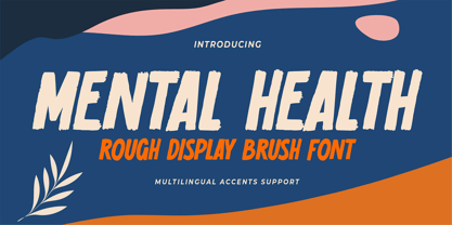 Hello Everyone, introduce our new product Font Mental Health is a Rough Display Brush Font.This is a Textured Natural Style and classy style with a clear style and dramatic movement. This font Mental Health is great for your next creative project such as logos, printed quotes, invitations, cards, product packaging, headers, Logotype, Letterhead, Poster, Design this font is great for your creative projects such as watermark on photography, and perfect for logos & branding, invitation,advertisements,product designs, stationery, wedding designs,label ,product packaging, special events or anything that need handwritting taste. You can activate 6 Alternates glyphs OpenType panel.
 - Sommerwerk Ink by Sommerwerk,
$29.00 This font is inspired by typography found on old German shop windows. It is a script font, but instead of imitating human handwriting and the gestures connected to it, the goal was to come up with a new writing flow and stroke order. As opposed to handwriting Latin script letters, which normally means drawing each character and then connecting it to the next one, the strokes of this font run across multiple glyphs. Intentionally, the design aims to achieve a flowing transition between each glyph without making use of contextual alternates, taking the limitations of classic machine lettering as a challenge.
 - Newsletter by Die Typonauten,
$19.00 Monospaced but no mono space. Created from 2002 to 2007 this font family is influenced by fonts like OCR-B, DIN and the work of Erik Spiekermann. Newsletter is not a real monospaced font but has the ease of recognition these fonts have - even though these fonts are often criticized for their aesthetic qualities. Newsletter has a computer-related impression but is more legible and aesthetic than real monospaced fonts are. Since 2006 Newsletter is the corporate font of the design agency "die Typonauten". It is eminently suitable for correspondence use. After a testing period and fine tuning it is now published.
 - Victorian Supremacy by Burntilldead,
$14.00 With over a year of design and development, Victorian Supremacy is ready to help you and your clients make a statement by adding elegance and unique flair to your next design project. Victorian Supremacy inspired by letterheads from the late 1800's and early 1900's. Set includes four major styles and layered version (gradient, outline & extrude). Victorian Supremacy offers an expansive set of options, making it the perfect choice for books, magazines, packaging, branding and signage. From period style and Victorian to modern and elegant, Victorian Supremacy is strong and stately, yet elegant and decorous.
 - Zaloga by Youthlabs,
$12.00 Introducing ZALOGA Display Serif Font. ZALOGA is a serif font that gives modern touch on your design. It looks so good for fashion brand logo. With different style of shape, ZALOGA will make it easier for you to use various design functions, be it for logos, typography, magazine, fashion, branding, advertising, and more. Need to test words in this font? Just type the box below, and see what it looks like For more information on accessing alternative flying machines, you can see this link (http://adobe.ly/1m1fn4Y) Thanks, stay safe and healthy, and have a nice day.
 - Mindless Games by Epiclinez,
$18.00 Are you looking for a classic and timeless idea for your next project? Let Mindless Games fuel your creativity! This fresh handwritten script font offers a natural look that's perfect for anything creative and fun. Use it on social media to spice up your posts, use it in logos to create a new brand, or use it in lettering to show off your versatility. So what’s included : Standard Latin Numbers, symbols, and punctuations Ligatures and Swashes Multilingual Support. Accented Characters : ÀÁÂÃÄÅÆÇÈÉÊËÌÍÎÏÑÒÓÔÕÖØŒŠÙÚÛÜŸÝŽàáâãäåæçèéêëìíîïñòóôõöøœšùúûüýÿžß PUA Encoded and fully accessible without additional design software Simple Installations Works on PC & Mac Thank You!
 - Tide Sans by Kyle Wayne Benson,
$6.00 Tide Sans’ fresh, carefree, look makes you almost forget that you’re staring at a monitor and not on the beach. When Tide Sans is not surfing, you’ll find it at community college parties, giving free henna tattoos, or tossing a Frisbee to the dachshund next door. The Tide Sans family includes beautiful italics and an equally affable condensed set. Tide Sans does the work for you by providing a ridiculously large stylistic alternates set, fine tuned small caps, and a whole beach of alternate (amper)sands to feel between your toes. Also check out its kid brother, Tide Sans Condensed.
 - Vageli by Valentino Vergan,
$14.00 Vageli is a unique font duo that combines a beautiful nostalgic uppercase and a wavy vintage lowercase, this combination gives the typeface a distinctive and trendy appearance. The typeface is very creative, this makes it perfect for creating projects that will really standout. Vageli comes with elegant ligatures, alternative characters and multi-language support. Vageli is perfect for making creative designs such as posters, brand packages, logos, social media designs and much more. If you are looking for something modern and unique for your next project, Vageli is the font for you. I hope you enjoy using the Vageli typeface.
 - Alkenyz by Aliptype,
$10.00 Intoducing Alkenyz, with a blackletter style, brings Alkenyz font more elegant, dense, and gothic. Complete by 2 Variation Family fonts with highly decorated caps. Alkenyz font sets come up with capital, lowercase letters, numerics, punctuation, and Multilingual Support. Alkenyz is perfect and suitable for logotype, Music Events, Tatto, Books title, Branding, Barbershops Lettering logos and many more can be discovered for stunning and gothic feels with this font. I really hope that you can work with this item and bring your design to the next level. Need any information or support about these items, please contact me : Thank you Aliptype
 - Quenda by Marc Lohner,
$25.00 Quenda is a small sans-serif family comprising six weights: thin to heavy. Due to its rounded terminals and a slight handwritten look, Quenda has a friendly and warm appearance. Its main purposes are for advertising and branding projects. You will find lots of ligatures and a total of 593 glyphs in each style. With extensive language support, lining-, old-style- and tabular-figures, a slashed zero, self-building fractions, superscript and subscript digits, a set of arrows as well as thousands of kerning pairs, Quenda is ready to contribute to your next design project. Designed by Marc Lohner in 2015.