6,233 search results
(0.023 seconds)
- Dalmatian Brush by Gassstype,
$25.00 Here comes our new font Dalmatian Brush this is a Unique Display Font that is written casually and quickly.this a Authentic brush and classy style This font are handmade with brushes on Procreate. Then crafted carefully drawn into vector format.this font is great for your creative projects such as watermark on photography, and perfect for logos & branding, photography, invitation, watermark,advertisements,product designs, stationery, wedding designs,label ,product packaging, special events or anything that need handwritting taste. This a natural handwritten feel. This handmade font will make your design has a beautiful natural touch for each details. It is perfect for any design project as Invitation,logo, book cover, craft or any design purposes. That is Dalmatian Brush is strong characteristic more natural look to your text with a more modern look to your text.
 - ITC Django by ITC,
$29.99Australian designer and art director Wayne Thompson has loved typography “ever since I received a battered second-hand Letraset catalog at the age of 10.” He based ITC Django on the handwriting of an acquaintance -- “a fellow I know who writes and illustrates children's books and is also a commercial artist” -- who called himself Django, after the jazz guitarist Django Reinhardt. “I felt that that name Django suited the funky, lively feel of the face,” says Thompson. But he adds, “Django has a split personality: it appears loose and easy at first, but after looking at it for some time I felt an edginess come through that was slightly psychotic.” The looseness of the lowercase contrasts with the spikiness of the capitals. The “edginess” is especially apparent in words in all caps. - Bluerocks by Zamjump,
$13.00 BLUEROCKS is a rough brush font, created by hand, sketched on paper. This font is designed to make your designs or handwriting look louder and bold with ease. Perfect & Ideal for Logos, Quotes, Packaging, Flyers, Posters, Book Covers, Social Media Banners and Event Merchandise Types. The BLUEROCKS feature comes with Uppercase & Lowercase, Numeral, Punctuation, Swash lines, and also Multi Language Support. Multi Language English, French, Portuguese, Italian, Spanish, Turkish, Dutch, Finnish, Norwegian, Swedish, Danish, Icelandic, Hungarian, Romanian, etc. The BLUEROCKS typeface also comes with a Webfont Kit __________________________________________________________________ If you press a_a (a + underscore + a) (a_a / a_b / a_c / a_d / a_e / a_f / a_g / a_h / a_i / a_j then the line swash will come out. I've included 10 different line swash types. _________________________________________________________________ Feel free to message me if you have any questions. Don't forget the ♥ Like button guys! :)
 - Expectation by Linotype,
$29.99Making a Christmas card takes a lot of work! Finding the right typeface can be tough, too. Have you ever spent hours searching for the right one? Well, in 2003, instead of spending hours searching, German designer Guido Bittner made his own. Expectation was first used on the Christmas card for Bittner's Wiesbaden design studio. This delicate series of letters maintains a handwritten feel, in part because it began as a digitalization of Bittner’s own handwriting. Expectation Swash includes additional swash letters, which can be paired with regular version of Expectation to create superior effects. Perhaps it is already time for you to begin working on next year’s holiday cards. Let these fonts be the starting port for your inspiration! Expectation was a winner in the 2003 International Type Design Contest, sponsored by Linotype GmbH. - Glaciar by TripleHely,
$16.00 Glaciar is a script typeface based on brush handwriting and inspired by old-style bas-reliefs. All contours were carefully cleaned of brush roughness, but at the same time, minor imperfections were left to create the unique character of this font Glaciar has a built-in auto replacement for lowercase letters without connecting strokes (in the case of word ends) and for ligatures (in the case of letter pairs that do not fit well together). In addition, there are alternates glyphs with starting and ending swashes - the last ones can be used with any OpenType software. And finally, the font has wide multilingual support and can be used in texts in 195 languages Glaciar is a good choice for branding and design projects as well as a cute text overlay to any background image
 - Carpenter Script by GroupType,
$19.95 Carpenter® is a beautiful script perfectly suited for invitations and announcements. Created by James West, the design was a facsimile of the penmanship of Mr. Carpenter of R. Hoe & Co. and released by the Cleveland Type Foundry as one weight in 1882. It is now also available in SemiBold and Bold. The style of this script is very reminiscent of formal handwriting popular in the late 19 and early 20th centuries. It is graceful with formal structure. Its x-height is very small, with unusually long ascenders and descenders. Although there are many script fonts available, Carpenter is a historical design with a truly unique personality that will add a truly unique look and feel to your design. From GroupType™, Carpenter is available in TrueType and OpenType.
 - Bright Lady by Sulthan Studio,
$12.00 Bright Lady is a natural handwriting that is beautifully written as a form of love for modern calligraphy. I cleaned some of the stains to make it look smoother and neater, so you can use it for the job you want. Bright Lady - including many alternative characters. Coded with Unicode PUA, which allows full access to all additional characters without having special design software. Mac users can use Font Book. Windows users can use the Character Map to view and copy one of the additional characters to paste into your favorite text editor. For people who have software capable of using OpenType: Alternatives can be accessed by turning on the "Alternative Style" and "Ligature" buttons on the Photoshop Characters panel, or through any software with glyph panels, such as Adobe Illustrator, Photoshop CC, Inkscape.
 - Silentgraph by Din Studio,
$29.00 Silentgraph is a script font made from handwriting in lovely designs to make your designs prominent. Every stroke expresses beauty and cursive styles of which letters are interconnected. Details of each letter show curvy wipes and high contrasts on its edges. Use this font for big-sized texts to be legible. Features: Stylistic Sets Multilingual Supports PUA Encoded Numerals and Punctuations Silentgraph fits for various design projects, such as posters, banners, logos, magazine covers, quotes, headings, printed products, invitations, name cards, merchandise, social media, etc. Find out more ways to use this font by taking a look at the font preview. Thanks for purchasing our fonts. Hopefully, you have a great experience using our font. Feel free to contact us for further information when you have a problem using the font. Thank you. Happy designing.
 - Analogous Script by OldStudioo,
$17.00 Introducing Analogous Script is elegant calligraphy font with a classic style and a touch of elegance, inspired by the handwriting and ancient manuscripts. Carefully designed to work together in harmony that makes it very suitable for wedding media, book covers, greeting cards, logos, branding, business cards and certificates, even for any design work that requires a classic, formal or luxurious. Analogous script, an elegant, full-featured script font with tons of alternate characters and OpenType features. Hand-lettered with a heavy right slant. Specific OpenType features include contextual alternates, stylistic alternates, initial and final forms, multiple alternate glyphs for many letters (accessed through the glyphs panel), multilingual support (including multiple currency symbols), ligatures, standard numbers, and six ampersand styles. What's Included: Analogous script .OTF Alternate Character Map for swashes, alternates, etc. PUA Support Thanks!
 - Chaletliness by Madhaline Studio,
$19.00 Chaletliness is a script brush font that has its own uniqueness and characteristics from brush fonts, because it is handwritten manually. This font is carefully crafted with a modern touch. This font looks elegant, luxurious, natural and rustic. Chaletliness would perfect for photography, watermark, social media posts, advertisements, logos & branding, invitation, product designs, label, stationery, wedding designs, product packaging, special events or anything that need handwriting taste. Your download will include 2 font files; Chaletliness ~ A hand-made, all characters brush font which has a complete set of A-z characters. Chaletliness Swashes ~ A bonus set of 52 swashes. Simply select this font and type any A-Z & a-z character to create one of the bonus elements. All font files are provided in OTF font formats. Includes a range of multilingual support
 - Restiany by Cooldesignlab,
$15.00 Restiany Script is a beautiful and attractive calligraphy handwriting font. You can see from scratches that give a challenging and modern style. You can use this font in your various design products. This font is casual and elegant. Ideal for wedding invitations, signage, headlines, logos, packaging, product branding, etc. Including OpenType Stylistic alternates, ligatures and international language support. To activate the OpenType Stylistic alternative, you need a program that supports OpenType features such as Adobe Illustrator CS, Adobe Photoshop CC (With Flying Machine Panel), Adobe Indesign & CorelDraw X6-X7, Microsoft Word 2010 or newer versions. Also supported by PUA encoded. Just copy and paste alternative characters using Character Map (Windows), Nexus Font (Windows), Font Book (Mac) or software programs like PopChar (for Windows and Mac) Thank you for your purchase!
 - Bethaine by Taznix Creative,
$19.00 Bethaine is font with a exclusive style and a touch of classic, inspired by the handwriting of ancient manuscripts. Carefully designed to work together in harmony that makes it very suitable for wedding media, book covers, greeting cards, logos, branding, business cards and certificates, even for any design work that requires a classic, formal or luxurious. Bethaine Typeface includes a full set of character A-Z, as well as multi-lingual support, currency figures, numerals, and punctuation. What's Included : Buonapati (OTF) Standard glyphs Ligature Works on PC & Mac Simple installations Accessible in the Adobe Illustrator, Adobe Photoshop, Adobe InDesign, even work on Microsoft Word. PUA Encoded Characters - Fully accessible without additional design software. Fonts include multilingual support for; ä ö ü Ä Ö Ü ß ¿ ¡ Hope you enjoy with our font! Taznix
 - Jengotan by Mans Greback,
$59.00 Jengotan is a rapid script, hand-painted with a brush to give a great contrast between thick and thin curves. It is drawn, scanned and vectorized from paper to screen, with the intent of being an authentic brush typeface, leaving the texture and imperfections the way they are, resulting in a vivid style for projects that requires dynamic handwriting. Use [ ] { } < > anywhere in a word to create a swash. Example: Jeng{otan In addition to the Jengotan font, also included is the Upright variation. The lettering is suitable for quotes, logos, watermarks on photography, signatures, branding, advertisement, album covers, business cards, clothing, magazines, posters, and more! It is a font of very extensive lingual support, covering all European Latin scripts. The font contains all characters you'll ever need, including all punctuation and numbers.
 - Annette Bradford by Letterhend,
$22.00 Introducing, Annette Bradford - Ballpoint Signature Script. This typeface made from a natural ballpoint handwriting, so if you need digital signature or natural hand writing for quotes, this is the perfect typeface for you! This font perfectly made to be applied especially in logo, and the other various formal forms such as invitations, labels, logos, magazines, books, greeting / wedding cards, packaging, fashion, make up, stationery, novels, labels or any type of advertising purpose. Features : uppercase & lowercase numbers and punctuation multilingual ligatures alternates extra doodle (in glyphs panel) PUA encoded We highly recommend using a program that supports OpenType features and Glyphs panels like many of Adobe apps and Corel Draw, so you can see and access all Glyph variations. Email us to letterhend@gmail.com if you need something! Happy Designing!
 - Romance Story by Runsell Type,
$9.00 Romance Story is a classy handwriting font with a distinctive curve, inside with some interesting features that are perfect for an authentic-style project. Romance Story is perfectly suited to signature, stationery, logo, typography quotes, magazine or book cover, website header, clothing, branding, packaging design and more. A handwritten script font containing upper and lowercase characters, numerals and a large range of punctuation. Romance Story Includes: - Basic Character ( Uppercase and Lowercase, Numerals, Symbol and punctuation ) - Multilingual support - Ligatures - PUA Encoded - This font including alternate glyph. To access the alternate glyphs, you need a program that supports OpenType features such as Adobe Illustrator CS, Adobe Photoshop CC, Adobe Indesign and Corel Draw. How to get access alternate glyphs with designing software to open type fonts check this link : http: //adobe.ly/1m1fn4Y
 - Quirky by Scholtz Fonts,
$19.95 The idea for Quirky was born while I was looking at a book of etchings by British artist Graham Clarke. His signature, crawling spider-like across the page, fascinated me with its casual, almost messy, inky dark and light drama. I started scribbling the alphabet as I imagined he would write it, based on his signature, then continued, adding curls, making the characters more angular, and refining the dramatic play between dark and light. Finally, Quirky appeared. Apparently casual, Quirky is, in fact, a true connected script. Quirky is characteristic of contemporary handwriting: It appears loose, angular, unstructured, and free, while maintaining good form and legibility. Its baseline is varied, creating an impression of impatient handwriting, without losing legibility. Quirky comes in five styles: condensed -- the most dramatic form, with great drama between thick and thin condensed black -- as with condensed but allows the user to provide exceptional emphasis wide -- increased readability wide black -- increased readability and emphasis splat -- messy and ink-blotted -- a hint of grunge Use Quirky for advertising, for humorous greeting cards, for a funky fashion look or tongue-in-cheek spooky media. Quirky is a fully professional font with extensive use of OpenType Ligatures. For example: most common double letter combinations such as "ee" are rendered as two, slightly different shaped "e"s. This variation in letter shapes removes the cues by which the reader identifies that he is viewing a FONT and thus conveys a strong sense of hand-lettered text. Language support includes all European character sets and has been designed to be used with the following languages: Afrikaans, Albanian, Basque, Bemba, Cornish, Danish, Dutch, English, Estonian, Faroese, Filipino, Finnish, French, Galician, Ganda, German, Icelandic, Indonesian, Irish, Italian, Kinyarwanda, Luo, Malagasy, Malay, Manx, Morisyen, North Ndebele, Norwegian Bokmål, Norwegian Nynorsk, Nyankole, Oromo, Portuguese, Romansh, Sango, Shona, Somali, Spanish, Swahili, Swedish, Swiss German and Zulu.
 - As of my last update in April 2023, the font "Jon Handwriting" specifically might be less well-known or perhaps even a custom or personal creation, rather than one of the widely recognized typefaces ...
- Othello by Monotype,
$29.99 Othello's dense graphic demeanor delivers a straightforward, no-nonsense message. This versatile revival has a direct, experiential quality that suggests action and the outdoors. Originally released by Monotype in 1928, Othello was offered as competition to Rudolf Koch's Neuland typeface. This new digital version includes a wide variety of previously unavailable characters. Small caps, alternate letters, ligatures, and special joined logotype" characters add to the versatility of this powerful communications tool. These many letter variants create new possibilities for headlines and short text blocks in advertisements, signage, and packaging, suggesting the immediacy of woodcuts or hand-drawn lettering."
 - Statement Sans by Sudtipos,
$39.00 Statement Sans is a versatile sans serif font family created by the Sudtipos team in the spirit of modern neo humanistic fonts, with a deep grotesk and industrial influence that can be discovered along the system. Developed to express its potential in UX and UI projects, corporative interfaces or editorial web and print layouts, Statement is available in 9 weights with matching real italics, extended latin language support, and also including classic and old style figures as well as plenty of stylistics alternates. Last but not least, Statement Sans includes a one file variable font to join the party.
 - Rockeby Brush by My Creative Land,
$25.00 Rockeby Brush is a new font family that joins a well known collection - Rockeby Typography Toolbox. It contains 3 brush fonts - Dry, Rough and Clean - and a Brush Extras font that contains different design elements and graphic to complement your design whether it is a logo, website or a more complex design project. The Rough Brush font has a unique feature - the grunge texture that is applied not only to the letters but to the surrounding space as well. You can successfully mix and match all 50 fonts within Rockeby Typography Toolbox to get your design a stylish look. Rockeby SemiSerif Family ; Rockeby .
 - Cassia by Hoftype,
$49.00 Cassia - a dynamic ‘Egyptienne’ with contrasting Italics and a classical appearance. More individual and agile and less cold than most Slab Serifs, it joins impetuosity with vitality. In display sizes it dazzles through its lusty appearance, and, even in the smallest sizes, it works superbly for large amounts of text. Cassia comes in ten styles, in OpenType format and with extended language support for more than 40 languages. All weights contain small caps, standard and discretional ligatures, proportional lining figures, tabular lining figures, proportional old style figures, lining old style figures, matching currency symbols, fraction- and scientific numerals.
 - Nipok by Gravitype,
$14.90 Nipok is a single weight display typeface, inspired by the aesthetics of different decades. Rounded terminals and playful intersections from the 60’s and 70’s, joined with straight and compact lines from the 80’s and 90’s. The particular style is given by the alternation of upper and lower case letters, chosen to fill the empty spaces greatly and create harmony. In addition, alternates are included to give you more stylistic options. While by default this font is a semi unicase, the alternative glyphs extend the Ascent and Descent metrics. Multilingual support is available.
 - Positronic Toaster by Brian Crick,
$25.00 Positronic Toaster is a modern interpretation of the French upright scripts of the nineteenth century. It started off as an attempt to make a stylized script that didn't feel like it belonged on a 1950s chrome appliance. Later on, however, the design grew to embrace the qualities of that style of lettering. The result is something playful and elegant, that is not tied to any particular time period. The distinctive angular loops on the ascenders will join together in words like 'bulb' or 'wallflower' using OpenType contextual alternates. It is suitable for cards, wedding invitations, or any project requiring a fashionable, upscale look.
 - Vandermark by TypeTrust,
$30.00Vandermark began as a simple daydream of what became the 'n' glyph. I considered the elegant balance of a terminal stroke that would never join its supporting stem. The premise was simple, but further experimentation was required for other parts of the alphabet. Vandermark follows a somewhat flexible array of structural rules and curve arrangements that called for considerable sketching to harmonize. The names I choose for my typefaces have to look decent when set in the signature type. Considering its improvisational development, it was only fitting that the namesake is a jazz musician and fellow Chicagoan, Ken Vandermark. - Pistol Twelve JNL by Jeff Levine,
$29.00Pistol Twelve JNL is a novelty version of Jeff Levine's Twelve Oaks JNL wood type font, with the addition of random bullet holes in the upper case characters. The font design was suggested by fellow type designer Ray Larabie. Pistol Twelve JNL is a two-fold pun. Initially, this conveys the obvious fact that the design is a variation of Twelve Oaks JNL with bullet holes... but the name is also a play on an old, old joke. One person asks the other: "Would you care to join the Pistol Club? You drink 'til twelve and..." Well, you get the picture! - Maestro by Canada Type,
$24.95 Out of a lifelong inner struggle, Philip Bouwsma unleashes a masterpiece that reconciles classic calligraphy with type in a way never before attempted. Maestro takes its cue from the Italian chancery cursive of the early sixteenth century. By this time type ruled the publishing world, but official court documents were still presented in calligraphy, in a new formal style of the high Renaissance that was integrated with Roman letters and matched the refined order of type. The copybooks of Arrighi and others, printed from engraved wood blocks, spread the Italian cancellaresca across Europe, but the medium was too clumsy and the size too small to show what was really happening in the stroke. Arrighi and others also made metal fonts that pushed type in the direction of calligraphy, but again the medium did not support the superb artistry of these masters or sustain the vitality in their work. As the elegant sensitive moving stroke of the broad pen was reduced to a static outline, the human quality, the variety and the excitement of a living act were lost. Because the high level of skill could not be reproduced, the broad pen was largely replaced by the pointed tool. The modern italic handwriting revival is based on a simplified model and does not approach the level of this formal calligraphy with its relationship to the Roman forms. Maestro is the font that Arrighi and his colleagues would have made if they had had digital technology. Like the calligraphic system of the papal chancery on which it is modelled, it was not drawn as a single finished alphabet, but evolved from a confluence of script and Roman; the script is formalized by the Roman to stand proudly in a world of type. Maestro came together on screen over the course of several years, through many versions ranging widely in style, formality, width, slant, weight and other parameters. On one end of the spectrum, looking back to tradition it embodies the formal harmony of the Roman capitals and the minuscule which became the lower case. On the other it is a flowing script letter drawing on the spirit of later pointed pen and engravers scripts. As its original designers intended, it works with simple Roman capitals and serifs or swash capitals and baroque flourishes. The broad pen supplies weight and substance to the stroke which carries energy through tension in balanced s-curves. Above all it is meant to convey the life and motion of formal calligraphy as a worthy counterbalance to the stolid gravity of metal type. The Maestro family consists of forty fonts distributed over two weights. The OpenType version compresses the family considerably down to two fonts, regular and bold, each containing the entire character set of twenty fonts, for a total of more than 3350 characters per font. These include a wide variety of stylistic alternates, ligatures, beginning and ending letters, flourishes, borders, rules, and other extras. The Pro version also includes extended linguistic support for Latin-based scripts (Western, Central and Eastern European, Baltic, Turkish, Welsh/Celtic, Maltese) as well as Greek. For more thoughts on Maestro, its background and character sets, please read the PDF accompanying the family.
 - Happiness by Omotu,
$18.00 Happiness! A handwrittent script font with 2 styles, regular and slant. Happiness font is suitable for branding, logotype, apparel, T-shirt, Hoodie, product packaging, quotes, flyer, poster, advertising, etc. Whats Include? 1. Uppercase and lowercase characters 2. Multilingual support. 3. Numerals, punctuations, end titling, alternate, and ligarures 4. Accessible in the Adobe Illustrator Glyphs panel, or under Stylistic Alternates in the Adobe Photoshop OpenType menu, Adobe InDesign, Corel Draw, even work on Microsoft Word. Please message me if you're unsure of any language support. Thanks for looking, and I hope you enjoy it! Please don't hesitate to drop me a message if you have any issues or queries. Omotu Studio
 - Wardah by Omotu,
$18.00 Wardah! A handwrittent signature font. Comes with two styles, regular and rounded. Wardah font is suitable for branding, logotype, apparel, T-shirt, Hoodie, product packaging, quotes, flyer, poster, book cover, advertising, etc. Whats Include? Opentype support Multilingual support PUA encoded Features: Uppercase, lowercase, numerals, punctuations, stylistic sets, alternate, and ligatures Accessible in the Adobe Illustrator Glyphs panel, or under Stylistic Alternates in the Adobe Photoshop OpenType menu, Adobe InDesign, Corel Draw, even work on Microsoft Word Please message me if you’re unsure of any language support. Thanks for looking, and I hope you enjoy it! Please don’t hesitate to drop me a message if you have any issues or queries.
 - Billy Signature by Omotu,
$16.00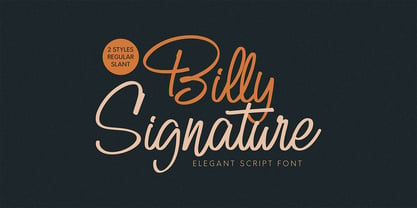 DETAILS Billy Signature! A handwrittent script font with 2 styles, regular and slant. Billy Signature font is suitable for branding, logotype, apparel, T-shirt, Hoodie, product packaging, quotes, flyer, poster, advertising, etc. Whats Include? 1. Uppercase and lowercase characters 2. Multilingual support. 3. Numerals, punctuations, and ligarures 4. Accessible in the Adobe Illustrator Glyphs panel, or under Stylistic Alternates in the Adobe Photoshop OpenType menu, Adobe InDesign, Corel Draw, even work on Microsoft Word. Please message me if you're unsure of any language support. Thanks for looking, and I hope you enjoy it! Please don't hesitate to drop me a message if you have any issues or queries. Omotu Studio
 - SCR-N by URW Type Foundry,
$39.99 SCR fonts are screen optimized (also called 'pixel fonts'). Unlike standard fonts (and like the few well-hinted fonts like Verdana or Arial), they give a crisp look on screen at very small sizes, thus increasing legibility. The perfect applications for those fonts are web pages and software user interfaces (computer, cellular phones, console games and any other system that uses a screen interface). Unlike most pixel fonts, SCR fonts contain kerning information. Kerning is the adjustment of space between certain pairs of characters (like 'AV') to make text look more fluid, thus increasing legibility and appeal. To benefit from this feature, auto-kerning must be activated in the application. In Photoshop, kerning must be set to 'Metrics'. Although SCR fonts are optimized for screen, they can be used for print (in Illustrator or Indesign for example) for a decorative 'computer text' effect. In this case, there is no constraint: they can be used as any other font. For screen use (in Photoshop, Fireworks, Flash... ), they have to keep aligned with the screen pixel grid not to look blurred or distorted. To achieve this, here are the guidelines to follow: RESOLUTION If the application permits it (Photoshop, Fireworks), document resolution must be set to 72 pixels per inch. SIZE The font size must be set to 10 (or multiples of 10) points. POSITIONING & ALIGNMENT The reference points of text fields and text blocks (upper left corner for left aligned text, upper right for right aligned text) must be positioned at integer values of pixels. In Photoshop, text can be precisely moved with [Edit Free Transform]. In Flash, movie clips containing text fields must also be positioned at integer values on the stage. Text must be aligned to the left or right only. Center alignment can be simulated with left alignment by adding spaces at the begin of each line. To dispense with the positioning and alignment constraints, text anti-aliasing can be turned off if the application permits it (Photoshop, Flash MX 2004). OTHER SETTINGS Leading (line spacing), tracking (letter spacing), manual kerning and baseline shift must be set either to integer values of points or to multiples of 100 units (depending on the application). Vertical and horizontal scaling must be set to 100%. Faux bold or Faux italic must not be used. The document must neither be resized on export, nor allow resizing (Flash Movies).
 - SCR-I by URW Type Foundry,
$39.99 SCR fonts are screen optimized (also called 'pixel fonts'). Unlike standard fonts (and like the few well-hinted fonts like Verdana or Arial), they give a crisp look on screen at very small sizes, thus increasing legibility. The perfect applications for those fonts are web pages and software user interfaces (computer, cellular phones, console games and any other system that uses a screen interface). Unlike most pixel fonts, SCR fonts contain kerning information. Kerning is the adjustment of space between certain pairs of characters (like 'AV') to make text look more fluid, thus increasing legibility and appeal. To benefit from this feature, auto-kerning must be activated in the application. In Photoshop, kerning must be set to 'Metrics'. Although SCR fonts are optimized for screen, they can be used for print (in Illustrator or Indesign for example) for a decorative 'computer text' effect. In this case, there is no constraint: they can be used as any other font. For screen use (in Photoshop, Fireworks, Flash... ), they have to keep aligned with the screen pixel grid not to look blurred or distorted. To achieve this, here are the guidelines to follow: RESOLUTION If the application permits it (Photoshop, Fireworks), document resolution must be set to 72 pixels per inch. SIZE The font size must be set to 10 (or multiples of 10) points. POSITIONING & ALIGNMENT The reference points of text fields and text blocks (upper left corner for left aligned text, upper right for right aligned text) must be positioned at integer values of pixels. In Photoshop, text can be precisely moved with [Edit Free Transform]. In Flash, movie clips containing text fields must also be positioned at integer values on the stage. Text must be aligned to the left or right only. Center alignment can be simulated with left alignment by adding spaces at the begin of each line. To dispense with the positioning and alignment constraints, text anti-aliasing can be turned off if the application permits it (Photoshop, Flash MX 2004). OTHER SETTINGS Leading (line spacing), tracking (letter spacing), manual kerning and baseline shift must be set either to integer values of points or to multiples of 100 units (depending on the application). Vertical and horizontal scaling must be set to 100%. Faux bold or Faux italic must not be used. The document must neither be resized on export, nor allow resizing (Flash Movies).
 - Kendrew by madeDeduk,
$16.00 Introducing The Kendrew is a kids handwriten playful font and will be perfect for book, title branding, product packaging, invitation, quotes, t-shirt, label, poster, logo etc. Feature Uppercase & Lowercase Number & Symbol International Glyphs Multilingual support Feel free to drop us a message any time and follow my shop for upcoming updates Shoot me on email at: dedukvic@gmail.com and find more previews on my Instagram here : https://www.instagram.com/acekelgondolayu/?hl=en Hope you enjoy it.
 - Thrifty by Typogama,
$19.00 Thrifty is a clean, contemporary typeface family created for branding and communication design. With a narrow form and clear letter forms, this family is both suited for display and title settings while equally remaining legible in smaller point sizes. Through it’s nine weights and accompanying italics plus a large glyph set that covers the majority of Latin based languages, Thrifty aims to offer a versatile and functional design. Thanks to the implementation of OpenType features, this family includes different sets of numerals, from tabular, hanging or scientific, it equally includes ligatures and free form fractions. Each weight equally offers a complete set of arrows and 99 different pictograms focused on themes of mobility and transport.
 - F2F Mekkaso Tomanik by Linotype,
$29.99The techno sound of the 1990s, a personal computer, font creation software, and some inspiration all came together to inspire the F2F (Face2Face) font series. Alessio Leonardi and his friends had the demand to create new unusual typefaces, which would be used in the leading German techno magazine of the day, Frontpage. Even typeset as small as 6-points, in nearly undecipherable layouts, it was a pleasure for the kids to read and try to decrypt the messages. F2F Mekkaso Tomanik is a font whose letters have had diamond holes punched into them. In fact, so many holes have been punched into the letters that one could ask whether this font is more letterforms, or more holes! - Pueblo by Monotype,
$29.99Like many of Jim Parkinson's alphabets, Pueblo began as poster lettering. It shows a range of influences: turn-of-the-century sign painting, old Speedball lettering books, and a touch of art nouveau. While developing Pueblo, Parkinson debated whether to make the ends of the serifs rounded or square. Rounded looked more like the work of a Speedball lettering pen, but squared stroke endings made the letters more legible at small sizes. The finished design sports serifs that are just slightly rounded. According to Parkinson, the design feature is “enough to be noticed at large sizes, while going virtually unnoticed at smaller point sizes,” adding to the versatility of this distinctive typeface. - Turbo Modul by PizzaDude.dk,
$15.00 The future is square! Well, at least according to Turbo Modul! Maybe the future is square, but it is also funky - just like Turbo Modul ... and its pretty unpredictable! Turbo Modul is loaded with alternative letters with arrows pointing in all directions, all made to pimp your designs! I've also added ligatures to substitute double letters, and there's a slight difference from caps and lowercase. Wow! That's a lot of different combinations! I tell you what ... I take a look at the posters I've made, and hopefully it will make you want to try out the font. I had a lot of fun doing the font, and maybe you will have a lot of fun using it! ;)
 - M Razor HK by Monotype HK,
$523.99 M Razor is so called ""neo Sung-style"" typefaces. Crossbars (橫) and stems (豎) are orthogonal and upright. Their entry and finial points are squarish, parallel without flare. Contrast of strokes is extremely high. This creates sharpness, stiffness in the midst of elegance of Sungti. Even distribution of space, careful positioning, size and proportion of radicals create a slightly expanded, opened and balanced construction. Zhonggong are slightly expanded, its relatively less inter-character spacing makes the line of text better coupled and aligned. Its features and construction create a feel of wholesome, elegance with contrasting sharpness and stiffness. It is best suited for casual, creative display eye-catching text, set upright (non-slanted), non-condensed.
 - Little Cecily by Olga Umpeleva,
$25.00 Little Cecily was designed on the base of a Russian calligraphy sample book for primary schools “Propisi pryamogo pis’ma” (Moscow, 1914). Such kind of scripts were implemented in school programs at the end of 19th-beginning of 20th century. There was an opinion that the straight writing is easier for learning and better for children from a medical point of view. The letterforms of the typeface are characterized by simplified constructions and upright design which distinguishes it from the list of typical school scripts and convey to it a naive charm and originality. The character set covers standard Western and Cyrillic code pages and it includes alternative letters and contextual forms for connected writing.
 - Bumbon by Luxfont,
$18.00 Introducing unusual Sans Serif font family. Font is concise and minimalistic. But behind the apparent simplicity of the font is hidden the original feature in the form of modernized uppercase glyphs, which can be used as an accent in the header or logo. Pure letterings with excellent readability have 2 thicknesses. Font will emphasize the high status of the business and complement modern branding design, and the general versatility of the font provides for its widespread use in various directions and is combined with different styles in design. Balanced glyphs will fit into the typographic design and will not distract attention from the main point. Features: Bold, Bold Italic, Regular, Regular Italic Upgraded uppercase letters Kerning ld.luxfont@gmail.com
 - Applbitz by Joey Maul,
$10.00 Applbitz is a set of three pixel style fonts which include a matching set of food related pix fonts. The regular style is a text font, which is optimal at 14 points when used in flash. Applbitz Pix Base and Pix Top are corresponding food related glyphs, with the top providing a bit of detail. These "friendly" pix characters can also be used in flash using some TLC (and snap to pixel grid). They are fun to add your own color combinations, and are great for a variety of food icons. View the PDF file in the gallery for color suggestions. Special note: to dress the hamburger use "{" and "½" (left brace and one-half) from Pix Top.