10,000 search results
(0.259 seconds)
- Florentine by SoftMaker,
$9.99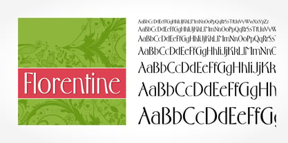 Florentine is a typeface published by SoftMaker.
 - LHF Matthews Thin by Letterhead Fonts,
$43.00 Inspired by E.C. Matthew's, circa 1940's.
 - Estelle by SoftMaker,
$9.99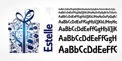 Estelle is a typeface published by SoftMaker.
 - Velvet Velour by Prototype Fonts,
$20.00Inspired by raves and Japanese pop culture. - Stich Me by Volcano Type,
$19.00 Stich Me was inspired by embroidery patterns
 - Cavalier by SoftMaker,
$9.99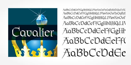 Cavalier is a typeface published by SoftMaker.
 - Spaceboy by Prototype Fonts,
$20.00Inspired by 80's Japanese pop culture. - Zyncho by Emboss,
$14.00 Inspired by fortune tellers and tarot cards.
 - Verie by Prototype Fonts,
$20.00Inspired by digital displays and mass transit. - Linotype Decoration Pi by Monotype,
$29.00Decorative symbols designed by Linotype Design Studio - Entebbe by SoftMaker,
$9.99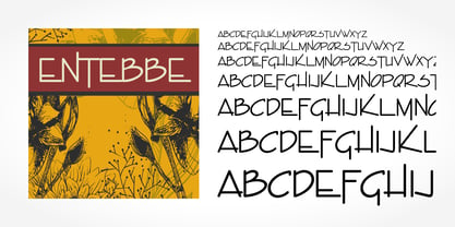 Entebbe is a typeface published by SoftMaker.
 - Decline by Prototype Fonts,
$20.00Inspired by 80's Japanese pop culture. - Messing by SoftMaker,
$9.99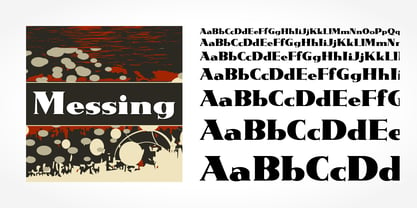 Messing is a typeface published by SoftMaker.
 - Frenzy by SoftMaker,
$9.99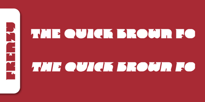 Frenzy is a typeface published by SoftMaker.
 - Boss by SoftMaker,
$9.99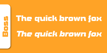 Boss is a font published by SoftMaker.
 - Vary Variable by Monotype,
$209.99The final text should look like this then:Vary by Olli Meier is a geometric sans serif typeface inspired by Bulgarian Cyrillic. Vary is fun and adaptable and was built with three feelings (variations): classic, modern, and loopy, offering an opportunity for designers to be playful in their creations. The inspiration in Bulgarian Cyrillic is seen mostly in the character “g,” which was inspired by a very uncommon handwritten “в” spotted by the designer in a shop window in Sofia, Bulgaria. When he flipped this design in 180°, the Latin character ‘g’ was born for Vary. Another example is the “R” in the modern stylistic set, which was inspired by the handwritten Cyrillic character “Я”. Vary is available as a variable font also and comes with 10 preset instances from Hairline to ExtraBlack. - Quo Vadis Quasimodo - Personal use only

- Craw Modern by GroupType,
$19.00 Craw Modern was designed by Freeman Craw in 1958 and first released by The American Typefounders Company, (ATF). In typography, 'Modern' is a style of typeface (classification) developed in the late 18th century that continued through much of the 19th century. Characterized by high contrast between thick and thin strokes and flat serifs. Bodoni is among the most popular of the Moderns. Moderns are also known as Didone and New Antiqua.
 - Nadia by Type Innovations,
$39.00 Nadia is an original design by Alex Kaczun. It is a modern stencil interpretation of Granjon Oldstyle, highlighted by large elongated serifs, generous proportions and a large x-height. It is an elegant display for headlines as well as text. Named after his daughter, Nadia has a distinctively vibrant and baroque quality which some would even call sensuous. It’s a truly unique stencil treatment characterized by crisp, clean, rounded shapes.
 - Odyssey Pro by Tim Rolands,
$29.00Odyssey Pro is an elegant and majestic face well suited for display work in books, magazines, posters, invitations, and more. Featuring an abundance of ligatures and alternates, as well as swash capitals. Its design was inspired by the letterforms of classical Roman inscriptions in stone but also strongly influenced by later calligraphic forms. The result is a chiseled authority and dignity tempered by a refined warmth and flow. - Allen Keys by Letters&Numbers,
$18.00 Rummaging through the toolbox recently, I was surprised by how many allen keys I had from years of assembling flat-pack furniture. After some experimenting with the keys to make up individual letters I was struck by their graphic quality. The typeface is defined by the slim, right-angled shape of the allen key; creating a geometrical, yet playful font. The typeface is suitable for logos and feature headings.
 - Donatello LP by LetterPerfect,
$39.00 Donatello is a classically proportioned design with subtly tapered strokes, inspired by the lettering on the fifteenth century cantoria by Luca della Robbia in the Museum of the Duomo, in Florence. The design, consisting of caps and small caps, also includes Donatello Alternates -- a compatible set of wider characters. It was designed by Paul Shaw and Garrett Boge in 1997. Donatello is part of the LetterPerfect Florentine Set.
 - Gillies Gothic by ITC,
$40.99Gillies Gothic font was originally designed by William S. Gillies for Bauer'sche Schriftgiesserei. The Extra Bold Weight was designed by Freda Sack at Letraset Design Studio and later the Extra Bold Shaded was designed by Phillip Kelly at Letraset. The extravagant capitals should be used as initials with the more reserved lowercase, and the lowercase should be set closely, overlapping where possible, to reproduce the look of true handwriting. - Din Condensed by ParaType,
$30.00 Designed at ParaType (ParaGraph) in 1997 by Tagir Safayev. Based on a condensed style of DIN type family (Linotype Staff designers). That is a group of sans serif faces made to conform to the German Industrial Standard. Based on geometric style, they vary in width but not in weight. Light style was added in 2014 by Manvel Schmavonyan. Demi Bold style was added in 2020 by Isabella Chaeva.
 - Cirulis Display by Asketic Design Studio,
$40.00 Cirulis is a display sans family of two weights. Inspired by the lettering of Ansis Cīrulus (1883-1942) one of the first Eastern European designers. The artist’s heritage is characterized by letters with asymmetric widths, sliced cuts and various intrinsic features. By carefully studying forms and origins of the letters Asketic designed a new typeface that in a contemporary fashion relives early 20th century national romanticism of Eastern Europe.
 - Finura by DSType,
$26.00 Finura was inspired by American lettering from the 60s, specially the Stunt Roman for ruling pen and compass presented in the Speedball Textbook for Pen & Brush Lettering by Ross F. George, but also by looking carefully to University Roman characteristics. Finura is an experience on very thin poster typefaces and the possibilities to design extreme delicate typefaces, with plenty details, that sheer simplicity and readability to the classic forms.
 - Suerte by Resistenza,
$39.00 Say hello to Suerte. This new typeface with inverted contrast and bifurcated serifs was inspired by Caslon’s Italian type and by Aldo Novarese’s Estro, published by the turinese foundry Nebiolo. Our aim was to develop a wood type typeface adding a new personality incorporating Tuscan serifs. The complete alphabet was designed with a flat long brush and Indian ink and then vectorized. Suerte contains a big set of icons and dingbats.
 - VLNL DBXLZX by VetteLetters,
$9.00 DBXLZX was inspired by the logo of the ZX Spectrum home computer, released in 1982 by Sinclair Research. For many designers the 8-bit pixel grid of the ZX Spectrum was one of the first steps into the realm of digital design. DBXLZX was initially developed by DBXL into a three weight family for use on the Armind record label of world famous trance deejay Armin van Buuren.
 - Enge Journal Antiqua by RMU,
$30.00 Hermann Zehnpfundt’s Enge Journal Antiqua, released by the Emil Gursch Foundry, Berlin, in 1910, revived and redesigned. This font contains also a long s, which can be reached by typing option + b, or turning the round s into the long one by using the OT feature historical forms. It is recommended to also use the OT feature discretionary ligatures to get access to all ligatures in this font.
 - Lehmann Egyptian by ParaType,
$30.00 Lehmann Egyptian is a font of three styles, based on the pre-revolutionary hand set fonts by Berthold and Lehmann type foundries in St. Petersburg. Designed mainly for display typography, the font works well in small texts too. There's also a quite useful bonus — a stylistic set of historical forms. Lehmann Egyptian was designed by Albert Kapitonov in cooperation with Dmitry Kirsanov and released by ParaType in 2018.
 - Brignell Slab by IB TYPE Inc.,
$40.00 BRIGNELL SLAB is an eight font family designed by Ian Brignell. Curvaceous and dynamic, this unique slab exudes honesty and personality. A slab serif characterized by a soft treatment where normally you would see vertical serifs. This feature allows for a smoother, less toothy, reading effect. Brignell Slab was born in 2008 and was inspired by the logo and custom font Ian designed for Naturalizer. Extended Latin set.
 - P22 Bauhaus by P22 Type Foundry,
$24.95 The P22 Bauhaus Set includes three type faces designed by Herbert Bayer, including the famous Universal font most commonly associated with the Bauhaus school. A collection of 72 graphic elements inspired by various Bauhaus works rounds out this collection. This set is authorized by the Herbert Bayer Estate. For more typefaces from the Bauhaus, see our Josef Albers set. © 2021 Artists Rights Society (ARS), New York / VG Bild-Kunst, Bonn
 - Gambado by Shinntype,
$39.00 ‘Bounced’ is the technical (!) term for a higgledy-piggledy style of lettering in which characters are shaken up by a combination of rotation and vertical displacement from the presumed norm of upright stance on a baseline. Now, by utilizing pseudo-random contextuality in the OpenType format, Nick Shinn has created complex, default bouncing automatically through the agency of a font, rather than letter-by-letter manual adjustments at the layout level.
 - Maree by Ashton,
$5.00 If you want to write something sincere and genuine but not too formal then this is the font for you. It is based on real handwriting, not some artificial calligraphy made to be either too haphazard or spiky or have loads of elegant flourishes but an ordinary person's writing, and designed to look as natural and as close to the original lettering as possible. Like any person's writing it is individual and distinctive, but so easy going on the eye those differences sit comfortably with you. It is friendly and open with easy to read glyphs both as lowercase and uppercase. The letters are relatively wide with clearly shaped distinct outlines. This font may be ideal for projects where you expect a wide readership with different reading abilities from young to old. When you are using this font a slightly bigger point size usually gives a better result so for a standard letter or similar you should size up to 15 points or more. Maree has been individually crafted to the smallest detail. To create a realistic handwriting font that looks relatively simple but works in a wide variety of languages requires a complexity and attention to detail most fonts will never require. This font in any ordinary business environment would never have been made, the effort required to make it too great, the length of time too long. There have been no shortcuts in this font, no automatic scanning or tracing, no automatic generation, no class kerning. Not only is each glyph individual but the width of letters, the height, the accents and the positions of the accents are all different. Even the line weight of the letters is designed to have natural variation but yet similar enough that the font appears as though it were written effortlessly in the same pen. And in order to keep the spacing consistent even though the letters have different widths, heights, lengths of descenders and so on, there are a vast number of kerning pairs, letter to letter, number to number, letter to number... All kerning has been individually assessed with an eye to proportionality taking in character shape, size and weight. For instance if you write a telephone number the numbers all sit close together but if you write a number before a letter such as in a UK post code or before a unit of measurement an extra little bit of space has been added which makes the number more distinct and therefore readable. That space is so natural to the eye that you don’t even know it is there. However even in the spacing allowance has been made for the fact it can’t be too perfect because when you write by hand the spacing is inconsistent. There have to be some letters which are too close or far apart otherwise the font would look artificial. For similar reasons if you are going to print out this font for a letter, etc, check the print version before you make any letter spacing changes because with the zoom functions in modern applications that uneven spacing and lettering can seem more pronounced than it actually is. When this font is printed out you will find it is surprisingly neat. This font is what it is, simple clear handwriting. You will not go wow. But if you want something unique and different and looks good on the page you won’t be disappointed. This font is not a work of art but it is a work of love. This font has a soul. How many fonts can you say that about?
 - LT Marathon - 100% free

- From Where You Are - Personal use only

- PiS Coffins and Ghosts - Unknown license

- Cone Of Silence - Unknown license

- KG Keep Your Head Up - Personal use only

- WC Rhesus A Bta - Unknown license


