10,000 search results
(0.052 seconds)
- Dialogist by Nathatype,
$29.00 Dialogist is a display serif font animated in balanced beauty with curvy lines on each letters’ edges to make it look elegant and classic. Due to its bigger size than any other serif fonts, it becomes a noticeable and eye-catching font design. Proportions among letters equal to low contrasts, but it is still legible due to the font’s wide spaces. As a result, you may apply this font for any text sizes. Additionally, you can enjoy various features available here. Features: Stylistic Sets Ligatures Multilingual Supports PUA Encoded Numerals and Punctuations Dialogist fits best for various design projects, such as posters, banners, logos, magazine covers, quotes, headings, printed products, invitations, name cards, merchandise, social media, etc. Find out more ways to use this font by taking a look at the font preview. Thanks for purchasing our fonts. Hopefully, you have a great time using our font. Feel free to contact us anytime for further information or when you have trouble with the font. Thanks a lot and happy designing.
 - Cisalpin by Linotype,
$29.99 The ideal typeface for cartography The Swiss designer/typographer Felix Arnold designed Cisalpin during the late 1990s, after he had challenged himself to create a contemporary typeface that could be used for cartographic uses. Arnold came to the subject of cartographic typefaces after analyzing many maps and atlases, and discovering that there was no standard typeface for these types of documents. Like any good cartographic type, Cisalpin is very legible at small sizes. While he was drawing this typeface on his computer, Arnold used a reduction glass to refine his design, making it work in these situations. Cisalpin is a linear sans serif face, with slight resemblance to renaissance serif types. The various weights are all clearly differentiated from one another. And because space is often a premium on maps, Cisalpin runs narrow. Words close in around themselves to help them become more identifiable. The letterforms in Cisalpin are durable, and can maintain their readability when placed over complex backgrounds. They have open interior forms, flattened curves, tall x-heights, and a capital height that almost reaches the tops of the ascenders. Cisalpin also has pronounced Italics, with a very clear angle of inclination. Each letterform in the family has been optimized so that they cannot be easily mistaken for another. This again helps minimize the misunderstandings that often occur because of illegibility. Although Cisalpin was developed for use in cartography, it may be used for countless other purposes; any font that can work well in small sizes on a map could be used almost anywhere else!
 - Seuchter Experimental by HiH,
$10.00 Seuchter Experimental is a product of the fertile Jugendstil period in Austria. Drawn by Bruno Seuchter, about whom little biographical information is available, the design first appeared in Seuchter’s publication, Die Fläche, in 1902. Die Fläche means “surface or expanse,” presumably a reference to a “tabula rasa” or clean slate. The implication is one of starting anew, rejecting the past and searching for fresh, different modes of visual expression — which is exactly what Art Nouveau attempted to do. Seuchter Experimental is a quirky and light-hearted font. Ligatures include AT, AV, CH, CK, FJ, LO and ST. Although basically an all-cap font, several of the accented letters in the lower case position represent the oft-seen desire to keep the accents below cap-height. The a-umlaut at 228 and u-umlaut at 252 reflect Seuchter’s original design. For a discussion of the difference between a diaresis and an umlaut, see Appendix B of Bringhurst’s The Elements of Typographical Style. In the meantime, give this font room to breathe.
 - Spry Roman by Stephen Rapp,
$49.00 Handmade, expressive, lively, organic— …words typically used to describe a script font or a casual sans. Spry Roman opens up new possibilities. It’s origin is handwritten letters created using a pointed nib on slightly toothy paper. While based on a Roman form, the letters are designed to break out of the mold and dance along the baseline. Spry Roman Pro is a fully featured opentype font. Among the 964 glyphs are loads of alternate characters and swash letters; a full set of small caps; simple fractions; case sensitive punctuation; and a variety of ornaments, border elements, and flourishes. It also includes a full dose of language support for not only main characters, but also for alternates and small caps. Ligatures have been kept to a minimum to allow users the option of tracking text. **Please note that the Pro version has all the glyphs of the others combined. The smaller versions are for those who don't have opentype savvy apps like Adobe Illustrator.
 - KK3045 Pro by HS Fonts,
$39.00 The font family KK30/45 is available in 3 weights: Light, Regular, and Bold. Type Designer: Kuncho Kunev The name of family - KK30/45 is from the first letters of the designer's name (K)uncho (K)unev and from the main angles of the slanted stems - 30° and 45°. Release date: December, 2001 HermesSOFT Ltd. The design of КК30/45 incorporates a geometric variety of shapes, and have been originally designed in such a way that all slanted stems are 30° and 45°, The very high x-height and low bottom parts allow typesetting with almost 100% leading. КК30/45 is a display face suited best to sizes 16-18 point and above. There are included also all Cyrillic vowels with accents that are really necessary for the professional typesetting in Cyrillic languages. Supported Languages: Western Europe (Greek not included), Central/Eastern Europe, Baltic, Turkish, Romanian, Cyrillic. Supported Code Pages: Macintosh and Windows, any for above languages. Opentype features includes kern, fractions, ordinals, superscripts.
 - William Costinavel by Hanzel Space,
$25.00 William Costinavel. i hope this font is perfect for creating signature logos and watermarks for photography studio or wedding invitation, Label, Logo, Magazine best for initial or branding logo signature. William Costinavel a full set of beautiful hand letters, numerals, a large range of punctuation and ligatures. Giving realistic hand-lettered style. What do you get, darling? In order to use the beautiful font, you need a program that supports OpenType features such as Adobe Illustrator CS, Adobe Photoshop CC, Adobe Indesign and Corel Draw. but if your software doesn't have the Glyphs panel, you can install additional swashes font files
 - Lupa Slim 1 by Melli Diete,
$50.00 Lupa Slim 1 – a warm and handsome family, giving texts a harmonic and pure, human atmosphere. Lupa's kind manners deliver clear and female qualities in Sans Serif environment. The family has a tiny handwritten touch. It can be used in any application, where feeling good and pleasant is necessity. This can be in daily business life, but also in kids surroundings, health, mood, spa, mothers, dads … Do spread some soft qualities! The 10 weights plus true Italics allow a fine tuning and include smallcaps, variable numbers, fractions, fleurons plus some other extras. Lupa Slim 1 is highly legible.
 - Ristella by Mans Greback,
$59.00 Ristella - a logotype script font. This high-quality typeface is created by Måns Grebäck. Its style is bold and has large, attention-grabbing uppercase letters. Ristella contains alternate and stylistic alternates, as well as multiple ligatures. With its hundreds of glyphs it also has support for a wide range of languages. How do you make a swash? Combine an ending and a tail to make a swash. Endings are found in the following symbols: [ ] { } Tails are found in the following symbols: < > § _ ¤ Example: Ristella}> With ligatures activated, write multiple tail symbols to make a longer swash. Example: Tailextender]¤¤¤
 - View Night by Gian Studio,
$12.00 View Night is this amazing typeface handmade script font we created in freestyle for those of you who do work and crafts. It's perfect for any type of work you're working various purposes such as logos, wedding invitations, headings, t-shirts, letterheads, signage, labels, news, posters, badges etc. OpenType features with alternative styles, ligatures, and multiple language support. To enable the OpenType Stylistic alternative, you need a program that supports OpenType features such as Adobe Illustrator CS, Adobe Indesign & CorelDraw X6-X7, Microsoft Word 2010 or later. How to access all alternative characters, using the Windows Character Map with Photoshop:
 - Thunderspeed by Tigade Std,
$15.00 Thunderspeed is a futuristic and sporty look font. It is sharp yet easy on eyes of readability. It is perfect for your branding and logo, mainly in design theme related to sports, futuristic, space, etc. Thunderspeed features complete set of upper case and lower case with standard International characters. Of course come with the numbers and punctuations. The font come in format: OTF TTF WOFF/WOFF2 That's a wrap! I do really hope you like this font, and please don't hesitate to contact me if you have any questions. Also, drop by to our instagram! Tigadestd | Doli Harahap
 - Brother Home by Letteralle,
$18.00 Brother Home is a charming handwritten brush font that will bring an attractive feel to your designs. Brother Home includes 2 fonts : - Brother Home Regular: The main font with uppercase, lowercase, numbers, punctuation, and also multi-lingual support. - Brother Home Alternate: You can access alternative characters from the Regular weight via OpenType in your application, or you can also install this alternative weight. Brother Home Alternate will give you alternative characters, which will add a natural impression. That’s it! Please do let me know what you think, feel free to comment if there are issues or queries. Happy designing, Thank You!
 - Tomato by Canada Type,
$22.95Tomato is the digitization and quite elaborate expansion of an early 1970s Franklin Photolettering film type called Viola Flare. This typeface is an obvious child of funk, the audio-visual revolution that swept America and put an end to the art nouveau period we now associate with the hippy era. Funk is of course little more than jazz with a chorus and an emphatic beat. Nevertheless, it became the definition of cool in the 1970s, thanks to blaxploitation movies with excellent soundtracks like Shaft and Superfly. Funk began as a commercial audio experience, then later expanded its signature to cover everything, from design to fashion to the later birth of disco, which is really a further simplification of funk. Funk had very strong and unique typographical elements, particularly a kind of titling with an essentially western, wooden core that suddenly changed and flared in unexpected areas until a very individual brand was achieved. Everything that can be tacked on to the alphabet was used towards that individuality. Things like curls, swirls, swashes, ligatures were always plentiful in funk, sometimes giving the titling a specific gender, sometimes bulging, sometimes speeding, sometimes fading in the distance, sometimes doing nothing but crazily aligning with other design elements, but the result was always a fascinating creature that seemed to invariably want to dance and have fun. Tomato was built in exactly that spirit. The original film type certainly had enough swashes and curls to be an unmistakable funk font in itself, but our further expansion of it cements it and makes it the definite font for the genre. With as many as 12 different possibilities for some letters, the designer's choices for a titling set in Tomato are virtually limitless. The Postscript and True Type versions of Tomato come in five fonts, including two fonts for alternates, one font for ligatures, and one font for swashes. These are split into two affordable packages. The entire family package is also available at an even more affordable price, and includes complimentary Cyrillic, Greek, Turkish, and Central European versions of Tomato. A Tomato Pro OpenType version is also available. It is a single font that includes over 650 characters, glued together with extensive programming for convenience of use in OpenType-friendly applications, where you can watch the letters morph and dance as you push the buttons and change the options of your OT palette. Now you know which font will come to mind when someone says the word "funky". - Banquet by Solotype,
$19.95In our early days of type hunting, we considered this to be the prize of our collection. Fonts of this late Victorian period seem to have less ruffles and flourishes than the earlier ones, which makes them easier to read. - Blacklunar by Din Studio,
$25.00 Do you want to create the vintage mood for your design? Blacklunar is set to captivate. Truly a style statement script font for your vintage vibes that will make heads turn. It's easy to read and works equally good as well in header and body text. The curvy and unique strokes at some particular characters give this font the sense of vintage. Even more, this font has fascinating features that helps you maximize your design. Features: Ligatures Stylistic Sets Multilingual Supports PUA Encoded Numerals and Punctuation It is perfect to be used for many design projects, such as poster, logo, book cover, branding, heading, printed product, merchandise, quotes, social media campaign, etc. Learn more about how to use it by seeing the font preview. Thank you for purchasing our fonts. Please don’t hesitate to contact us, if you have any further question or issues. We’re happy to help. Happy Designing.
 - Dismedia by Lee Mounsey,
$13.95 Dismedia: A Bold Display Typeface with a Subtle Retro Sci-Fi Aesthetic. While a lot of futuristic, cyberpunk and techno themed typefaces can often be over-the-top, unreadable or cheesy, Dismedia takes a more subtle approach with its design. Inspired by the wide futurist fonts of the 1970’s and 80’s, its rounded corners and bold linework was built to invoke the atmosphere of a future envisioned by the past. Whether on VHS covers in 1984; nightclub signs in 2084; or spaceship insignia in 2184, Dismedia will upgrade your design into a brand new era. [ Feature Set Includes: ] A Display Typeface A Bold Sans Serif with Rounded Corners 430+ Glyphs Ligatures & Stylistic Alternatives Extended Mathematics & Currency Symbols Language Support for 90+ Latin Languages Including: Afrikaans, English, French, Italian, Spanish & Swedish.
 - Ador by Fontador,
$24.99 Ador is a humanist sans serif especially designed for contemporary typography and comes up with 8 weights from ultralight to black plus true italics and 343 ligatures. A large x-height not only creates space in the letters for extra-bold styles, but also lends Ador an open and generous character in the more narrow and semi-bold versions. The nice balance between sharp ink trapped and soft, dynamic shapes helps to work in small sizes. Diagonal stress, angled finials and the 4 degree true italic styles give Ador a dynamic look. The font contains 981 glyphs including small caps, tabular, old style, fractions … and a wide range of flexibility for Latin language support for every typographical needs. Ador is a contemporary sans serif typeface, special for logotypes, brands, magazines and editorial.
 - Louisa by Julia Hanft,
$30.00 Louisa is a monospaced font-family designed and optimized specifically for small font sizes. But even as headline font it looks good. It has a very good distinguishability of letter forms and legibility even in longer text paragraphs. The character of Louisa is a combination of strong elements and warm, friendly forms. The font family is not only designed for coding and tabular layout, but can be used in different fields of communication design. Therefore it provides two stylistic sets with different letter forms: one with the look of serious modern typewriter font, the second with more soft letter forms and elements of a real italic. Additionally it consists oldstyle numbers (and of course tabular numbers) and a set arrows. The font is available in four styles: regular, italic, bold and bold italic.
 - Intramural JL - 100% free

- Bloody Skinny by Mvmet,
$12.00 Bloody Skinny is a kids friendly blood drips display font! Not only can be used for Halloween theme needs, you can use it too for other things for example graffiti tag or street style art needs. Use it on t-shirts and clothing, for your scary book designs, greeting cards, stickers, posters, banners, or anything that needs a fun touch. Try it to create fabulous designs and feel the fun and cool vibes with it!
 - Kandij by Hanoded,
$15.00 Kandij is a Dutch word and it means ‘Rock Sugar’. We Dutch use it in a lot of products, from ‘ontbijtkoek’ (a rye based spiced cake we sometimes eat for breakfast) to Fryske Sûkerbôle, A Frisian sweet bread. Kandij is a fat and happy font. I’d probably use it for any book or product aimed at children, as it has a certain lumpy cuteness. Comes with diacritics and swashes for the upper case letters.
 - Wedding Text by Monotype,
$40.99Wedding Text was designed by Morris Fuller Benton in 1901 for American Type Founders (ATF). The face was so popular that its forms soon began appearing with other font foundries under different names, Elite Kanzlei with D. Stempel AG, Comtesse with C.F. Rühl, Linotext with Linotype, etc. Its ornamental forms are not considered very legible by today's standards; therefore it should be used for headlines and short texts in point sizes 12 or larger. - Infectious Halloween by Ardyanatypes,
$20.00 Infectious is a Halloween themed font with unique shapes that invite curiosity. Each letter is inspired by ancient magical symbols, with sharp strokes and curved lines that create a mysterious atmosphere. The font is not only visually appealing, but also interactive thanks to its advanced OpenType feature. Users can combine letters, slashes, and ligatures to create creative and unexpected looks. Features: A – Z Character Set a – z Characters set Numerals & Punctuations OpenType Multilingual
 - CoffeeBreak by Andinistas,
$36.00 The coffee made typography. CoffeeBreak is a typefamily designed by Carlos Fabian Camargo G. Its purpose is to communicate similar feelings to the ones you get when you first try the best roasted Colombian coffee early in the morning. That is the reason of the waiting, accompanied, or when you only want to be, nuances your design with its fonts full of flavor, texture and passion. For each time, every time, it gives you hints of flavor to design your day. It unleashes your artistic streak mixing possibilities as you wish, to your taste or the taste of your friends or that special someone. From handwriting to every warm drop of your first mug of the morning, we've always got something for you. Eye catching, modern, beautiful, cool and adventurous styles in the CoffeeBrwak shop ready for you to purchase. - CoffeeBreak A & B: 2 typographic tools with countless swashes and ligatures ideal for use at the beginning, in the middle or end of words that need italics, flavored dancers and rhythm masterfully expressed in gestural strokes for his calligraphic experimental logic. - Coffee Break Script 1 & 2: write them you can easily with decorative letters advocating a return to the artisan product ingenuity of the primacy of man over machine so your upper and lower case letters travel in a single line. - CoffeeBreak Words & WordsBold: It contains words specially designed to attract attention. - CoffeeBreak Dingbats: They are figurative silhouettes with textures that add warmth and a highly communicative environment. All are easily activated glyphs using the Glyphs panel in Illustrator, InDesign and Photoshop. Special thanks: Ilustrations: Eduardo Gomes. Photos: Karen Salvatierra. Texts: Javier Lineares- Description: Ernesto Googolplex. French translation: Marta Cano
 - Jeles by Tour De Force,
$25.00 Inheriting the beauty and style of old type classics from this genre, Jeles is blended with very elegant modern approach featuring soft corners, round slab serifs and tasty ball terminals. Jeles is designed mostly for display use and it is highly recommended to get the whole family if you want to get the best result. It is designed in two styles Condensed and Normal. The Condensed version is developed in two weights each coming with corresponding italics. While the Normal styles are three ranging from Regular, Bold and Black. The total of 7 separate fonts inside the family are quite enough if you look for diversity and flexibility at one place. You could use the uprights for more serious and strong headlines while the Italics work perfectly for more fresh and live subheads. Of course editorial design is only one of the many directions where Jeles family could be used successfully as we all know typefaces with so visible contrast between thin and thick and combined with classic elegance, could be easily used in every design of cosmetic industry, fashion, food, jewelry, etc. Try to design a stylish boutique shop signboard and you will surely discover its beauty and potential. Easy-to-read, it is good for print design, revealing its authentic letterpress-like character as well as perfect for screen use note that the thin strokes and serifs are not that thin to vanish on a low resolution monitor. Professionally designed, they are solid enough yet very elegant and even gentle making Jeles a desired family design of attractive web banners, web sites, apps and e-books.
 - Casino Hand by MADType,
$39.00 Casino Hand is a handwriting font that comes with some exciting new OpenType features*. The font comes with an alternate glyph for every uppercase letter, lowercase letter, numbers and some punctuation. These alternates are extremely easy to use with OpenType doing all of the hard work for you! Plus, you get the cross platform compatibility that OpenType provides. When the Contextual Ligatures feature of Casino Hand is utilized in your graphics application, the font substitutes a duplicate letter with the alternate glyph for that letter. This automatically makes the font look less like a font and more like real handwriting! Casino Hand also allows you to switch to use the alternate glyphs as the default by using the Stylistic Alternates feature. You can even use the two OpenType features together! This means that you can have duplicate glyph substitution with either the standard letters, or the alternates. You can also use the Glyph window in the Adobe CS applications to selectively choose characters. You can simply go into the glyph window and replace a letter that you don't like with its alternate. With Casino Hand, you essentially get two fonts in one, and a handwriting font that is much easier to use than previous designs. * Contextual Ligatures and Stylistic Alternates require Adobe CS applications. Many more software applications will be supporting these features soon!
 - Galeiya by Craft Supply Co,
$20.00 Introducing Galeiya – Cute Script Font Adorable Playfulness Step into the enchanting world of Galeiya – Cute Script Font, where adorable playfulness takes center stage. This font is the embodiment of girly charm and fun. Joyful Whimsy Galeiya’s joyful whimsy adds a delightful and whimsical touch to your projects, making it the perfect choice for a wide range of creative endeavors. Versatile Delight Beyond its cute appearance, this font is exceptionally versatile. It effortlessly adapts to various design contexts, from invitations to branding, infusing each project with a joyful spirit. Expressive Typography Galeiya is more than just cute; it’s incredibly expressive. Its lovely script style injects character and a sense of fun into your content, ensuring it leaves a memorable impression. In Conclusion In summary, Galeiya – Cute Script Font is the font that seamlessly combines girly charm with a sense of playfulness. Its versatility and expressive nature ensure your content is not only cute but also highly engaging. Whether it’s invitations, branding, or an array of creative projects, Galeiya brings a unique, expressive touch that appeals to a broad audience, leaving behind a lasting and delightful impression.
 - Whiskey Sour by Fenotype,
$25.00 Whiskey Sour, a robust vintage serif that is as delightful as it is confident. With its soft and warm aesthetic, this typeface effortlessly captures the essence of approachable confidence, making it a tasteful choice for your typographic needs. Whiskey Sour is based on Tomato Ketchup, an earlier release of Fenotype. It has larger and taller uppercase and plenty of differences in lowercase characters, the most significant ones being letters a, h, m and n. Whiskey Sour is an excellent choice for modern graphic design, offering a distinctive touch of familiarity. Whether gracing logos, packaging, restaurant graphics, or any display application, this versatile typeface shines in headlines and shorter texts. Experiment with reduced tracking for a more compact visual impact, or, when using it in small sizes, add a touch of tracking to ensure legibility. Whiskey Sour is naturally equipped with lots of OpenType features: try spicing up your designs with Swash, Stylistic, or Titling Alternates or Discretionary Ligatures. In total Whiskey Sour has 134 Alternate glyphs that can be accessed from OpenType controls or Character Window. See the full selection of Alternates in the specimen posters.
 - Isabel by Letritas,
$30.00 Isabel was made out of necessity to create a new font for children and teenagers, that could be enough friendly and versatile for text in words or even easy-to- read long texts. The purpose of Isabel is to combine all the nice and friendly features of the simple letters that the teachers teach to the pupils at primary school, as they starting to learn to read, together with the normal editorial fonts we read every day. In this way it generates a very joyful serif font, or even friendly font, with some conservative aspects. In other words, Isabel is a font that, despite of being a “classic features” typography, is proud to show its innocent and ingenuous elements, this gives to the font a new point of view. The family is composed of 3 parts: the regular version, the italic version and the unicase version. Each one of them has 5 weights, 551 characters and is composed of 208 languages.
 - MFC Memoriam Initials by Monogram Fonts Co.,
$19.95 The inspiration source for Memoriam Initials is the 1934 Book of American Types by American Type Founders. In that specimen book, they had created a sophisticated two color initial design they called “University Initials” which was only available in metal type at 24, 36, and 48 points. This wonderfully detailed initial style is now digitally recreated and revived for modern use. Memoriam Initials is only capable of initial or single letter monograms due to its unique design. The two color aspect of the original design has been preserved and made accessible within all programs. The Capital character slots contain the background color glyphs, and the lowercase slots hold the outline art for the letters. You can choose a color, type a capital letter, then switch to black and type a lowercase letter for the two color effect, or just type a lowercase letter on its own. It’s that easy! Download and view the Memoriam Initials Guidebook if you would like to learn a little more.
 - Flirt Script by Positype,
$50.00 Young, playful, loopy, flirty. Flirt Script® carves out a niche for itself by concentrating on natural writing tendencies and not the simplified mechanics of script-to-font type design. A free-flowing monoline, the two weight typeface exploits the common letter-to-letter transitions of the typical cursive hand by utilizing three variable-height strike points controlled within the machinations of OpenType Contextual Alternates. The ease of writing (and the decisions made from letter to letter) is reflected as the structure and cadence of the writing evolves as the user types. To see it in action, click here USE CONTEXTUAL ALTS Flirt Script® is equipped for complex, conscientious, professional typography. As an exclusively OpenType release, these fonts feature over 2700 glyphs and an extended character set to support Central and Eastern European as well as Western European languages. So, to really let the font perform for you, be sure to have Contextual Alternates activated. Flirt Script® received the “Certificate of Excellence in Type Design” at the TDC2 (2014).
 - DIST Inking Bold - Unknown license

- Monokind Script by Putracetol,
$32.00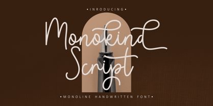 Monokind Script is a elegant monoline handwritten font. A handwritten with elegant style make this font looks natural and perfect for any projects that need handwriting taste. Come with open type feature with a lot of alternates, it's help you to make great lettering. Monokind Script perfect for signature, quote, branding, wedding invite and card, elegant logo, poster, packaging, stationery, website, and many more. This font also support mulilanguage.
 - Lyodra by Putracetol,
$16.00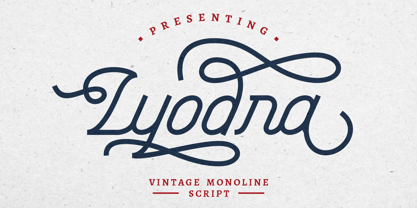 Lyodra is a vintage monoline script typeface. This font is inspired from a modern, vintage style, with added flourishes to add elements of beauty. It includes OpenType features with a lot of alternates to give you different options in lettering. This font is also includes multi-language support. Lyodra is perfect for vintage design, badges, logos, t-shirts, posters, branding, packaging, signage, book cover and so much more!
 - Faylake by Putracetol,
$14.00 Faylake is a bold monoline handwritten font and comes with both regular and rough versions. This font can also be used in various styles, casual, vintage, fun and simple letter. Faylake is perfect for branding design, posters, apparel, for logotype, website header, fashion design and much more. It comes with OpenType features and a lot of alternates, its help you to make great lettering. This font also supports multiple languages.
 - Amarithe by Putracetol,
$21.00 Amirithe is a beautiful modern calligraphy wedding font. This font is feminime, elegant, messy and modern. Amirithe perfect for wedding event, anniversary, birthday,greeting cards, logotype, branding, wedding invite and card, elegant logo, poster, packaging, stationery, website, and any other projects requiring a handwritten and luxurious touch. Come with open type feature with a lot of alternates, its help you to make great lettering. This font is also support multi language.
 - Miracly by Sensatype Studio,
$15.00 Mager is a A Modern Display serif font for Vintage, classic, and retro branding needs. Based on our experience as a graphic designer who works for a lot of companies. This is perfect for BRANDING and LOGO DESIGN. You will get vintage, classic, and certainly unique logos with this font. Mager is also included full set of: uppercase letters multilingual symbols numerals punctuation Wish you enjoy our font. :)
 - Deleplace by Typogama,
$29.00 Deleplace is a modern, delicate and refined typeface that is both contemporary and hints at a classical past. Featured in 3 weights, this family includes an extended language support that covers extended latin and cyrillic scripts. It equally includes a series of Opentype features, from ligatures, alternates, different number options and swash letters. Suited for bot text and large display, this versatile family will be a refined addition to your catalogue.
 - Masonic Lodge by Eclectotype,
$20.00 As part of the day job I had to trace an old hand drawn logo of a Masonic Lodge from a very poor scan. When I finally got to the end of it I had almost a whole alphabet and I really liked the hand drawn uneven quality, so I made up the rest of the letters and set about making it into a font. I roughened up all the edges for an even older look, added a host of OpenType features and hey presto, Masonic Lodge was born. There are two versions of each letter and number which automatically alternate when contextual alternates are set, more alternates for O and o characters, a good amount of interlock style L and T ligatures (uppercase) and a square & compass ornament. Use it for pub signs, secret society meetings, monster movie titles and pub menus.
 - Borex by Twinletter,
$17.00 Introducing Borex, the ultimate font for all your sport racing needs. With its bold and dynamic letterforms, it captures the excitement and energy of the race track. And with four unique variations, including regular, slant, and taper styles, you can customize your designs to fit the tone and theme of your project. Not to mention, the font also comes equipped with alternate characters and unique ligatures to add an extra touch of creativity. So rev up your designs with Borex and get ready for the finish line! What’s Included : - File font - All glyphs Iso Latin 1 - Alternate, Ligature - Simple installations - We highly recommend using a program that supports OpenType features and Glyphs panels like many Adobe apps and Corel Draw so that you can see and access all Glyph variations. - PUA Encoded Characters – Fully accessible without additional design software. - Fonts include Multilingual support
 - Mailbox Letters Two JNL by Jeff Levine,
$29.00Mailbox Letters Two JNL is the second typeface from Jeff Levine inspired by metal lettering used on mailboxes and homes. Each cast letter or number sat on a lower "rail" which was then slipped into a slot that held them firmly in place. Jeff's Inventory JNL looked close enough to the original type style to use as a model for this font, and for typographic purposes there are certain punctuation and other glyphs that "float" above the rail. Limited character set.

