10,000 search results
(0.056 seconds)
- Penabico by Intellecta Design,
$23.90 After 13 months of hard work, Iza W and Intellecta Design are proud to announce Penabico. This is a free interpretation of the copperplate script styles to be found in the Universal Penman . London, 1741 , the monumental publication of engraved work by George Bickham (along with collaborators Joseph Champion, Wellington Clark, Nathaniel Dove, Gabriel Brooks, William Leckey and many others). This enhanced OpenType version is a complete solution for producing documents and artworks which need this kind of calligraphic script: 100s of stylistic alternates for each letter (upper- and lowercase), accessed with the glyph palette; 250 ornaments and fleurons (mostly in the copperplate roundhand renaissance style) encoded in the dingbats range and accessed with the glyph palette (plus a special set with over 50 of these ornaments accessed with the ornaments feature); an extensive set of ligatures (100s of stylistic and contextual alternates plus discretionary ligatures) providing letterform variations that make your designs really special, resembling real handwriting on the page; complete, intricate, ready-made calligraphic words; abbreviations (in many languages). The principal font contains the complete Latin alphabet, including Central European, Vietnamese, Baltic and Turkish with all diacritic signs, punctuation marks (including interrobang ). The German ‘ß’ (germandbls, eszett, sharp s) even has over six different alternate forms. And we don't forget to add the unconventional germandbls uppercase. In non-OpenType-savvy applications it works well as an English commercial script style font. Because of its high number of alternate letters and combinations (over 1500 glyphs), we suggest the use of the glyph palette to find ideal solutions to specific designs. The sample illustrations will give you an idea of the possibilities. You have full access to this amazing stuff using InDesign, Illustrator, QuarkXpress and similar software. However, we still recommend exploring what this font has to offer using the glyphs palette. Two last things — we have placed some of the ornaments, catch-words and other material in supplementary fonts, for easier access in non-OpenType-savvy programs. They are: Penabico Words (see the pdf user guide in “Gallery”), Penabico Abbreviations (free font), and Penabico Extras (free font). And, when buying Penabico you get the 'Penabico EPS Bonus Set", a gift pack containing various highly intrincated frames in EPS format, easy and ready to work with your preferred vector design software like Corel or Illustrator (see the pdf in the Gallery). Know too our other superscript font : Van den Velde Script at http://new.myfonts.com/fonts/intellecta/van-den-velde-script/
 - Blushing by Crumphand,
$16.00 Hello, introducing new font, its called Blushing. Blushing is natural beauty handtype. im making this font for specific product. this font very match for your beauty product : Cosmetic, Cream product, Nail art, Spa & Beauty, Lipstick, Shampoo and etc. You can mix and match with regular font. what's included inside the font ? Uppercase Lowercase Numeral & Punctuation Multilinguals Standart Ligatures Thank You!
 - Jubileum by Hanoded,
$15.00 Some time ago, I found myself in a clinic with my wife: at the time she was 20 weeks pregnant and had to do an ultrasound. To pass the time, I leafed through some (ladies') magazines which were lying around. Most of them tackled big issues like which shoes to wear and what type of foundation to plaster on, but one glossy featured a photo shoot. The photographer had found an old building with a beautiful art deco tile mural and had placed his skinny model in front of it. Fortunately for me, the mural featured a lot of text in a beautiful frilly style. I re-created the font I saw and it became "Jubileum" - which just means Jubilee in Dutch.
 - Wisdom Teeth by DM Founts,
$20.00 Wisdom Teeth is the fifth typeface released by DM Founts. It's a modern and personal take on the original Baby Teeth font by Milton Glaser, and inspired by the lettering used for the Pac-Man series of games (and its clones). This typeface was around 25 years in the making, and was made in response to the large number of hideously bad clones of Baby Teeth circulating around the Internet. Version 1.0 Included in Version 1.0 are a number of accent characters, and alternate characters for A and Y, along with the usual ASCII characters. For the time being this is an all caps typeface. Please let me know your thoughts and suggestions, and I may add some more characters in the near future.
 - Protagonice by Invasi Studio,
$17.00 Designed by hand-drawn slab serif style font, Protagonice font comes in two varieties of regular and dotted textures. You can enhance your project with a retro-style using Protagonice Font. Ensuring carefully crafted styles result from the use of this font. Its imperfections keep it casual but allow it to still be legible. There is an incredibly wide range of uses for it, so give it a try and see how it inspires your creativity! It's ideal for headlines, flyers, posters, greeting cards, product packaging, book covers, printed quotes, logotype, and album covers, among other applications. Because this font is PUA encoded, you can easily access all of the glyphs and swashes!
 - Rightly So NF by Nick's Fonts,
$10.00An entry in the Palmer and Rey 1884 specimen book named, somewhat prosaically, Geometric Gothic provided the inspiration for this rectilinear romp through the alphabet. As apt as it is for a period piece of its time, it's also oddly and equally comfortable in a retro space-age environment. Both versions include complete Latin 1252, Central European 1250 and Turkish 1524 character sets, with localization for Moldovan, Romanian and Turkish. - Cold Daylight by Nathatype,
$25.00 Do you want to enhance your branding? Do you dream of getting playfu;, stylish, modern, and adventure font? What if we told you, you only need to change one element to engage and convert your clients? Cold Daylight-A Display Font Cold Daylight is a display font designed to bring your branding to life and add a touch of playfulness, cheerful, and style. We are hoping that through this font, you can maximize your designs! In turn, you’ll communicate the perfect idea to your audiences or clients. The best choice for branding projects, book/magazine cover, fashion designs, quotes, packaging, or even as a stylish text overlay to any background image. Our font always includes Multilingual Support to make your branding reach a global audience. Features: - Ligatures - Stylistic Sets - Swashes - PUA Encoded - Numerals and Punctuation Thank you for downloading premium fonts from Nathatype
 - Oliver Quin by Gittype,
$20.00 Oliver Quin, a beautiful and stylish low italic script handwriting font. Oliver Quin offers a harmonious pen movement for a diversity of design projects, including logos and branding, wedding designs, social media posts, advertisements, poster, watermark photography, and more.
 - Kingsroads by Essentials Studio,
$18.00 Introducing by Essentials Studio Proudly Present, Kingsroad Kingsroad Is a A Modern Retro Script Font With 100+ Alternate Kingsroad is perfect for product packaging, branding project, megazine, social media, wedding, or just used to express words above the background.
 - Fork Brush Vector by Nirmana Visual,
$22.00 Fork Brush inspired by realistic dry brush. all-caps font was hand-drawn with a real acrylic ink, Fork Brush offers beautiful typographic harmony for a diversity of design projects, including logos & branding, social media posts, advertisements & product designs.
 - Razkes Brush by Rvandtype,
$11.00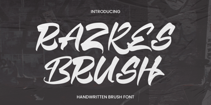 Razkes Brush is a cool urban style font. Its elegant and cool look makes it the perfect choice for logos, branding, invitations, stationery, wedding designs, social media posts, and so much more. Features : Numbers and punctuation Multilingual PUA encoded
 - Negentherophy by Fromletterel,
$12.00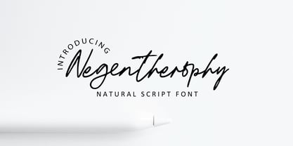 Negentherophy is a natural signature font to beautify your designs with its natural charm, suitable to create gorgeous wedding invitation, beautiful social media post, business card and other beautiful projects. It also contains ligature to add more natural charm.
 - Display Dots Three Sans by Gerald Gallo,
$20.00 Display Dots Three Sans and Serif are display fonts not intended for text use. They were designed specifically for display, headline, logotype, branding, and similar applications. Display Dots Three Sans and Serif include an uppercase alphabet, numbers, and punctuation.
 - Waskonia by Atelier laia,
$50.00 The old characters of the 8th century are the inspiration for this font. Specifically those used during a remote time of the Basque Country - or waskonia as the Franks would call it - in the old gravestones and doors entryways.
 - Display Dots Three Serif by Gerald Gallo,
$20.00 Display Dots Three Sans and Serif are display fonts not intended for text use. They were designed specifically for display, headline, logotype, branding, and similar applications. Display Dots Three Sans and Serif include an uppercase alphabet, numbers, and punctuation.
 - Display Dots Four Sans by Gerald Gallo,
$20.00 Display Dots Four Sans and Serif are display fonts not intended for text use. They were designed specifically for display, headline, logotype, branding, and similar applications. Display Dots Four Sans and Serif include an uppercase alphabet, numbers, and punctuation.
 - Display Dots Four Serif by Gerald Gallo,
$20.00 Display Dots Four Sans and Serif are display fonts not intended for text use. They were designed specifically for display, headline, logotype, branding, and similar applications. Display Dots Four Sans and Serif include an uppercase alphabet, numbers, and punctuation.
 - Marnilla Signature by AEN Creative Studio,
$15.00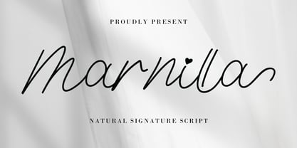 Marnilla Signature is a beautiful, elegant, yet casual and simple script font, featuring a natural look & feel. It has beautiful swashes and ligatures and it’s perfect for logos, wedding invitations, posters, social media posts, signatures, quotes, and much more!
 - Barbara Calligraphy by AEN Creative Studio,
$12.00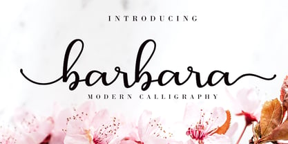 Barbara Calligraphy is a beautiful script font. It has a classy, elegant, and modern look which can be used for logos, branding, invitations, stationery, wedding designs, social media posts, and every other design in need of a handwritten touch.
 - Monstra Guthen by Essentials Studio,
$16.00 Introducing by Essentials Studio Proudly Present, Monstra Guthen Monstra Guthen Is a A Modern Groovy Display Font Monstra Guthen is perfect for product packaging, branding project, megazine, social media, wedding, or just used to express words above the background.
 - Leky Calgria by Hishand Studio,
$15.00 Leky Calgria is elegant serif font with beautiful and luxury touch good for gorgeous wedding invitations, beautiful stationary art, eye-catching social media posts, logo, branding and much more. Complete with ligatures alternates regular italic icon kerning multilingual support
 - Sparose by Dhan Studio,
$21.00 Sparose fonts is handwritten specifically designed to get texture, also have ligature and beautiful Swash. Suitable for use in design titles such as invitations, signboards, book titles, stationery designs, quotes, branding, logos, greeting cards, packaging designs, posters, and more.
 - Hamuna by AEN Creative Studio,
$12.00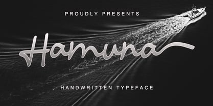 Hamuna is a great font for your project. Hamuna is a simple, casual and elegant script featuring a natural look in its ligatures and beautiful swashes. It is perfect for logos, posters, social media posts, signatures and much more!
 - Display University by Gerald Gallo,
$20.00 Display University is a display font not intended for text use. It was designed specifically for display, headline, logotype, branding, and similar applications. The character set is in outline but the uppercase letters are the same shapes but solid.
 - Palagio by Din Studio,
$25.00 The art of accumulation. If we can give you many options then why not? Palagio is a sans serif font package that will delight you. A font family that projects simple, warm, yet modern style. Palagio comes with 7 different weights. It is versatile enough to be used as title, body or button text. Features: Multilingual Supports Numerals and Punctuations PUA Encoded It is perfectly used for branding, logos, social media quotes, stickers, posters, vintage designs, wall art, merchandise, social media, and many more. Get more inspiration by seeing the preview. Thank you for purchasing premium fonts from Din Studio. If you have any further questions, don't hesitate to contact us. Happy Designing.
 - Nulato by Stefan Stoychev,
$29.88 NULATO is a sans serif font inspired by the great Alaskan outdoors and the clean shapes of the horizon. The font represents a modern and slick approach to a minimalist trend behind the core of great brand identity practices. Nulato took a year to develop, from the first sketches to the final 700+ glyphs the process took a significant amount of research and variables. The letters, specific ligatures, and symbols are a full stack. It was specifically designed with the classic approach to balance and appearance, but with a strongly advocated contemporary characteristic of font design and marks. NULATO evokes the perception of something familiar, but with that extra, needed for inspiring the new.
 - Callimba by Letterena Studios,
$10.00 Are you trying to make an elegant, modern, and stylish statement with your invitations, social media, website, or printed materials? Ready to enchant your audience and enhance your branding? Introducing Callimba - A Serif Font Callimba is a gorgeous serif font that will whisk you away to a place of style! We are hoping that through this elegance and passion edged font, you can maximize your designs, reign in sales or make lasting impressions. The ideal font for social media banners; posts, and ads, printed quotes, t-shirt designs, packaging, or even as a modern text overlay to any background image. Callimba includes Multilingual Options to make your branding globally acceptable. Features: Ligatures Alternates Multilingual Support PUA Encoded Numerals and Punctuation
 - MFC Spindler Borders by Monogram Fonts Co.,
$19.95 The inspiration source for MFC Spindler Borders is a collection of border treatments revived from the “Catalog 25 TYPE FACES” by Barnhart Brothers & Spindler. The border designs were recreated from two different border sets, “Classic Art Borders” and “Classic Black & White Borders”. This collection of borders represents a structured repetition of elements in various ways to create elegant patterns and backgrounds. You can start with a new document or work on a new layer within an existing document. Select MFC Spindler Borders from the font menu. (Some users may have font previewing enabled in the font menu which will cause the font name to appear as border elements, disable this option in order to choose the name) Make certain that the point size of the font is the same as the leading being applied to the font so the borders will meet up properly. While we’ve adjusted this within the font, your program may override these settings. For instance a 12 point font should have 12 points of leading. Download and view the MFC Spindler Borders Guidebook if you would like to learn a little more.
 - Winterbreak Trio by Ana's Fonts,
$14.00 Winterbreak is a playfont font and doodles set. It includes: 3 variations of the Winterbreak font that can be used together to create interesting hand-lettering compositions 1 set of doodles that complement the handwritten fonts perfectly Use Winterbreak in designs such as postcards and notes, posters, logotypes, social media posts, branding and packaging.
 - Angelinea by Balpirick,
$15.00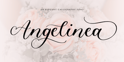 Angelinea is an Elegant Calligraphy Font. Angelinea is perfect for product packaging, branding project, megazine, social media, wedding, or just used to express words above the background. Angelinea also multilingual support. Uppercase & Lowercase font Stylistic Alternates Ligatures Symbols & Punctuation OpenType Features. Enjoy the font, feel free to comment or feedback, send me PM or email.
 - HeLLO MIAMI by Yoga Letter,
$15.00 "Hello Miami" is a unique display font. This font is complemented by palm tree and beach decorations. It is perfect for your summer season. In addition, this font can also be used for a variety of your needs (product promotion, holiday promotion, congratulations, invitations, quotes, social media status, logos, branding, banners, posters, prints, etc.)
 - Relista by Jos Gandos,
$15.00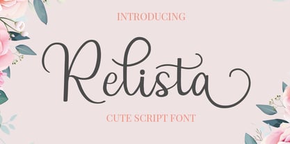 Relista is a beautiful handwritten font carefully created with a touch of elegance. This font is suitable for any projects such wedding cards, watermarks, quotes, social media, posters, invitations, and more. This font is PUA encoded so it will be accessible in the Adobe Illustrator, Adobe Photoshop, Adobe InDesign, even work on Microsoft Word.
 - Fresh Pineapple by Zeenesia Studio,
$12.00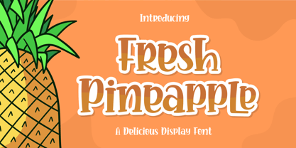 Fresh Pineapple, Delicious handwritten font. It is a beautiful quirky font that perfect for a lettering project like t-shirt design, mugs, advertisements, cutting vinyl, silhouettes, book covers, posters, business cards, social media and more. It supports multiple languages and offers PUA encoding. The doodles make this font so perfect. Hope you love it
 - Horizone Survive by Multype Studio,
$23.00 Horizone Survive is a brush style font. With a very detailed brush style that looks more authentic. This font makes your designs look natural. This font would perfect for logos, branding, product designs, product packaging, photography, watermark, social media posts, advertisements, invitation, stationery, labels, logos, magazines, books, greeting / wedding cards, fashion, make up, and etc.
 - Vintage Painting by Aestherica Studio,
$12.00 Introducing the new Handwritten Script Font by Aestherica Studio. Proudly Present, Vintage Painting Vintage Painting is perfect for product packaging, branding project, megazine, social media, wedding, or just used to express words above the background. This font includes multilingual support. Enjoy the font, feel free to comment or feedback, send me PM or email.
 - Violet Twinkle by Balpirick,
$15.00 Violet Twinkle Font. Violet Twinkle is a Modern Handwritten Script Font. Violet Twinkle is perfect for product packaging, branding project, megazine, social media, wedding, or just used to express words above the background. Violet Twinkle also multilingual support. Enjoy the font, feel free to comment or feedback, send me PM or email. Thank you!
 - History Valentine by Skinny Type,
$15.00 Proudly Present, History Valentine Font. History Valentine is a Modern Handwritten Font. History Valentine is perfect for product packaging, branding project, megaazine, social media, wedding, or just used to express words above the background. History Valentine also multilingual support. Enjoy the font, feel free to comment or feedback, send me PM or email. Thank you!
 - Sahhira Wishess by Rotterlab Studio,
$12.00 Proudly Present, Sahhira Wishess Font. Sahhira Wishess is a Modern Handwritten Font. Sahhira Wishess is perfect for product packaging, branding project, megaazine, social media, wedding, or just used to express words above the background. Sahhira Wishess also multilingual support. Enjoy the font, feel free to comment or feedback, send me PM or email. Thank you!
 - Audrena by Putracetol,
$19.00 Audrena is a new elegant modern script font. A lovely, elegant and sweet script font. Audrena is perfect for styling logos, stationery, wedding event, invitation, quote, social media, websites and so much more! Come with Opentype feature with a lot of alternates, its help you to make great lettering.This font is also support multi language.
 - Times New Roman PS Cyrillic by Monotype,
$67.99In 1931, The Times of London commissioned a new text type design from Stanley Morison and the Monotype Corporation, after Morison had written an article criticizing The Times for being badly printed and typographically behind the times. The new design was supervised by Stanley Morison and drawn by Victor Lardent, an artist from the advertising department of The Times. Morison used an older typeface, Plantin, as the basis for his design, but made revisions for legibility and economy of space (always important concerns for newspapers). As the old type used by the newspaper had been called Times Old Roman," Morison's revision became "Times New Roman." The Times of London debuted the new typeface in October 1932, and after one year the design was released for commercial sale. The Linotype version, called simply "Times," was optimized for line-casting technology, though the differences in the basic design are subtle. The typeface was very successful for the Times of London, which used a higher grade of newsprint than most newspapers. The better, whiter paper enhanced the new typeface's high degree of contrast and sharp serifs, and created a sparkling, modern look. In 1972, Walter Tracy designed Times Europa for The Times of London. This was a sturdier version, and it was needed to hold up to the newest demands of newspaper printing: faster presses and cheaper paper. In the United States, the Times font family has enjoyed popularity as a magazine and book type since the 1940s. Times continues to be very popular around the world because of its versatility and readability. And because it is a standard font on most computers and digital printers, it has become universally familiar as the office workhorse. Times?, Times? Europa, and Times New Roman? are sure bets for proposals, annual reports, office correspondence, magazines, and newspapers. Linotype offers many versions of this font: Times? is the universal version of Times, used formerly as the matrices for the Linotype hot metal line-casting machines. The basic four weights of roman, italic, bold and bold italic are standard fonts on most printers. There are also small caps, Old style Figures, phonetic characters, and Central European characters. Times? Ten is the version specially designed for smaller text (12 point and below); its characters are wider and the hairlines are a little stronger. Times Ten has many weights for Latin typography, as well as several weights for Central European, Cyrillic, and Greek typesetting. Times? Eighteen is the headline version, ideal for point sizes of 18 and larger. The characters are subtly condensed and the hairlines are finer."