10,000 search results
(0.175 seconds)
- Gabust by Twinletter,
$12.00 Gabust is a beautiful and elegant handwriting script font that has a feminine character and is sweet in its use, besides that this font is also very suitable for use in designs that require handwriting as well as others. This font is designed with a natural touch of handwriting which is refined to create a portion and composition that suits your needs. So this font is suitable for craft, children's writing, adventure posters, food banner titles, wedding invitations, product packaging logos, quotes, social media page covers, furniture banner headlines, book covers, and much more.
 - Arabico by Nathatype,
$29.00 Unveiling Arabico, a captivating typeface that bridges cultures and aesthetics with its exquisite design. Arabico is a tribute to the elegance and fluidity of Arabic script. Its letterforms are carefully crafted to echo the aesthetic beauty and expressive nature of Arabic writing. Every stroke and curve of its letters pays homage to the graceful artistry of the flow of Arabic calligraphy. Arabico fits in headlines, logos, posters, flyers, branding materials, print media, editorial layouts, and many more designs. Find out more ways to use this font by taking a look at the font preview.
 - 1634 René Descartes by GLC,
$38.00 This font was inspired by the well-known philosopher René Descartes' hand writing. In 1634, from Amsterdam, he wrote a famous letter to his friend Mersenne, a great scientist monk, in which he spoke about Gallileus works. The greatest part of our glyphs is based on this document. We have added some letters Descartes himself didn't use, like modern s and j (he used exclusively s long and i instead of j). A lot of ligatures and alternates are enriching the font, giving a better appearance of real handwriting.
 - Haweni by Twinletter,
$15.00 Halloween has never been so much fun. You don’t need to go near a spooky house in the dead of night or deal with creepy creatures while you wait for trick-or-treaters to pass out candy. With this Halloween font and our new Halloween-themed templates, it will be easy to get your Halloween party started without all that hard work! Of course with this font your various design projects will be perfect and amazing, get a beautiful title and start using our font for your special project.
 - Doctrine Stencil by Barnbrook Fonts,
$75.00 A display typeface with a muscular character, Doctrine Stencil is the revolutionary comrade of the text typeface Doctrine. Doctrine Stencil was developed from the North Korean national airline livery and, while it retains the idiosyncratic spirit of the original, it has evolved into a more contemporary headline face. Doctrine Stencil draws on elements of neo-grotesque, humanist and geometric styles, and combines them with a playful approach to the stencil model. Doctrine Stencil includes four alternate character sets as well as an array of ligatures and figure styles.
 - Nadier by Flawlessandco,
$9.00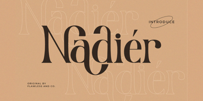 Nadier is a Modern Serif Font that made with a classic style in each character, so it's fitted for some wedding invitation display. There's some connected letters and some alternates that suitable for any graphic designs such as branding materials, t-shirt, print, business cards, logo, poster, t-shirt, photography, quotes .etc This font support for some multilingual. Also contains uppercase A-Z and lowercase a-z, alternate character, numbers 0-9, and some punctuation. If you need help, just write me! Thanks so much for checking out my shop!
 - Ballory by Flawlessandco,
$9.00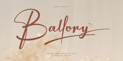 Introducing "Ballory" - An Elegant Signature Script Font. Unveil the essence of refined personal style with "Ballory," an exquisite signature script font that radiates elegance and sophistication. There's some connected letters and some alternates that suitable for any graphic designs such as branding materials, t-shirt, print, business cards, logo, poster, t-shirt, photography, quotes, etc. This font support for some multilingual. Also contains uppercase A-Z and lowercase a-z, alternate character, numbers 0-9, and some punctuation. If you need help, just write me! Thanks so much for checking out my shop!
 - ITC Novarese by ITC,
$40.99 Novarese font is the work of designer Aldo Novarese. He created 218 typeface cuts but as he was writing his book, Alfabeta, he decided to include only those he considered indispensable. He divided his fonts into 4 categories and in the designing of Novarese, took the best characteristics of each group and combined them into this font. In the style of Latin stone scripts of the second century BC. Novarese is a well-balanced and relatively wide text font with classic forms. ITC Novarese™ font field guide including best practices, font pairings and alternatives.
 - Play Kids by Canden Meutuah,
$20.00 is a beautiful handwritten font. this font is so simple that i write very carefully. Even though it looks simple, this font still looks cool and stylish. Handwritten script font. This Fonts are perfect for: logos, branding, wedding invitations, business cards, greeting cards, posters, magazines, social media, proliferate fonts, planner prints and websites. Get creative with their unique fun, and use them to brighten up any craft project! Get this font now and boost your creativity with it! If you have any questions, before or after your purchase, don't hesitate to contact us. Thank You
 - Anjani Script by Letterhend,
$14.00 Anjani is a modern calligraphy script with a romantic feel. The natural hand writing script is suitable for you who needs a typeface for headline, logotype, apparel, invitation, branding, packaging, advertising etc. This typeface is comes in uppercase, lowercase, punctuations, symbols and numerals, stylistic set alternate, ligatures, etc also support multilingual and already PUA encoded. We hope you enjoy the font, please feel free to comment if you have any thoughts or feedback. Or simply send me a PM or email me at letterhend@gmail.com Thanks for purchasing and have fun!
 - Juana by Latinotype,
$29.00 Juana is the result of a journey to self-discovery and part of a continuous exploration process. The font, based on Jazmín https://www.myfonts.com/fonts/latinotype/jazmin/ typeface, features a more developed design while still maintaining the essence of the original version. The extreme contrast between thick and thin strokes gives Juana a harmonic and stylish look. It comes in 8 weights with matching italics and includes an alternate version. The whole character set supports over 200 Latin-based languages. Juana is perfectly suited for editorial design, branding, magazines, logos, headings and more.
 - Ink Brush by NamelaType,
$19.00 The Ink Brush Font is a captivating addition to the world of typography. This versatile typeface offers two distinctive versions, adding a dynamic element to your creative projects. The textured version brings a sense of artistic spontaneity with its handmade appearance, while the solid version delivers clarity and precision. Whether you’re aiming for a rustic, handcrafted feel or a sleek, professional look, the Ink Brush Font has you covered. It’s perfect for a wide array of design applications, from branding and packaging to invitations and artistic endeavors, infusing your work with character and style.
 - Urban Tour by Roland Hüse Design,
$10.00 -This font has been basically designed for poster display in black weight and big size (mostly for capital letters). The rest of the family is a derivative work of it. I can’t guarantee if it works well on small size print. -Future updates may follow in the near future or on request. Please feel free to contact me via rolandhuse@aol.com about the following: -This family does not contain all the language extensions, but I am willing to create any extensions (including Cyrillic) on request; - Discovering kerning problems while using; Or any other question.
 - Arshaq by Flawlessandco,
$9.00 Arshaq is an Arabic display font that showcases an elegant and beautiful design. This font has been carefully crafted to provide a stunning appearance to every Arabic script. An Original typeface that suitable for any graphic designs such as branding materials, t-shirt, print, business cards, logo, poster, t-shirt, photography, quotes .etc This font support for some multilingual. Modern Sweet Retro that contains uppercase A-Z and lowercase a-z, alternate character, numbers 0-9, and some punctuation. If you need help, just write me! Thanks so much for checking out my shop!
 - Asgaria by Cooldesignlab,
$15.00 Asgaria is a serif font family with an elegant and classy look. Each letter is designed with natural and beautiful curves. These fonts are tailor-made for luxury themed projects, from bold magazine images, to wedding invitations, branding, poster designs, logos, business cards and more. If you're involved in a project that requires beautiful, professional writing, this font is perfect to help you get it done. The Asgaria font features open, ligature and alternative types that are packaged in 2 fonts: Regular, and Italic. Asgaria fonts include uppercase, lowercase, numbers, punctuation marks and multilingual support.
 - Goldest by Twinletter,
$12.00 Introduces "Goldest" font which is created in detail to meet the needs of a charming, elegant and modern design. Using this font creates harmony and beauty in each of your designs, especially designs that require a touch of natural handwriting This font is designed with a natural touch of handwriting which is refined to create a portion and composition that suits your needs. So this font is suitable for craft, children's writing, adventure posters, food banner titles, wedding invitations, product packaging logos, quotes, social media page covers, furniture banner headlines, book covers, and much more.
 - Bittergrace Script by Letterhend,
$15.00 Introducing Bittergrace, a romantic modern script with a twist of fun! The natural hand writing script is suitable for you who needs a typeface for headline, logotype, apparel, invitation, branding, packaging, advertising and others. This typeface comes with uppercase, lowercase, punctuations, symbols and numerals, stylistic alternate set, ligatures, and mor and also has multilingual support. It also already PUA Encoded. We hope you enjoy the font, please feel free to comment if you have any thoughts or feedback. Or simply send me a PM or email at letterhend@gmail.com Thanks for purchasing and have fun!
 - Renaf by Flawlessandco,
$9.00 Renaf is a Groovy Retro Font that made with an additional shiny mode in each character, so it's fitted for some retro project. There's some connected letters and some alternates that suitable for any graphic designs such as branding materials, t-shirt, print, business cards, logo, poster, t-shirt, photography, quotes .etc This font support for some multilingual. Also contains uppercase A-Z and lowercase a-z, alternate character, numbers 0-9, and some punctuation. If you need help, just write me! Thanks so much for checking out my shop!
 - Philliper by Gatype,
$14.00 Philliper is a signature bold script font, masterfully designed to become a true favorite. It maintains its modern classy influences while feeling contemporary and fresh. Fall in love with it and bring your projects to the highest levels! Philliper is perfect for product packaging, branding project, megazine, social media, wedding, or just used to express words above the background. Fonts featured : Uppercase, Lowercase, Numbers, Symbols, Accents, Stylistic, Swash, and Ligatures also Multilingual Support Enjoy the font, feel free to comment or feedback, send me PM or email. Thank you!
 - Killarney by Fontdation,
$15.00 Introducing our new font Killarney. A bold and heavy display font that inspired by the vintage/classic letterforms used in old-advertisements. Mouse-crafted with high attention to details; clean lines, sharp edges and tempting curves. Its square and blocky letterforms make Killarney a great for headlines and space killer. Packed with 500+ glyphs, Killarney composed of slanted version, standard upper/lower case characters, numerals, punctuations, some multilingual letters, alternate characters, stylistic sets, ligatures, etc. This font is a must have item for your designing arsenal. Go get yours now while it's hot. :D
 - Galaktik by ExFour,
$19.00 Galaktik is a fresh embodiment of the monospace font. Born out of creative ideation, it attempts to pay homage to a long history of display fonts while exhibiting contemporary, playful accents. This balance of geometric shapes and creative expression allows Galaktik to feel both familiar and yet unique. Features Numerals Punctuations Special Characters Galaktik's freshness fits modern typographic schemes, futuristic logos, and even command-line consoles. The limits are boundless. Thank you for your purchase! Feel free to reach out for any issues or if need any assistance.
 - Jus Hangin PB by Pink Broccoli,
$16.00 Jus Hangin was inspired by the lettering on the cover of the 1999 Counting Crows album, “This Desert Life”. It was one of those child-like lettering styles that was just begging to be fleshed out and made into a typeface that was as wild and carefree as the lettering inspiration. With an open spacing format, and an exuberant baseline bounce, Jus Hangin is fun to typeset with, while alternates and double letter ligatures keep things from getting repetitive. You’ll find Jus Hangin is ready and waiting to announce your festivities.
 - Wee Todd by Typadelic,
$19.95 Wee Todd is a well-connected script font in the rough style of a lefty. Several of my closest friends are lefties and I, over the years, have carefully observed their writing style. For the most part they have unique, interesting handwriting and Wee Todd is a reflection of that style. Notice how Wee Todd’s characters connect. I’ve designed additional ligatures and characters into the typeface so that characters are substituted as you type (in OpenType savvy applications), giving the appearance of natural, spontaneous handwriting. Try it and see!
 - Vernata by IbraCreative,
$17.00 Vernata, an enchanting and elegant serif font, captivates with its timeless sophistication and refined charm. Each letter is meticulously crafted, embodying a perfect balance of curves and straight lines that exude a sense of grace and luxury. The delicate serifs add a touch of classic flair, while the overall design maintains a modern sensibility. The spacing and proportions of Vernata are expertly calibrated, ensuring readability and an effortless flow of text. Whether used for invitations, branding, or editorial design, Vernata brings a magical allure to any project, seamlessly blending tradition with contemporary aesthetics.
 - Deflexure by Ony Studio,
$14.00 Features: Characters: Uppercase letters, Lowercase letters, numbers & extended punctuation Ligatures and Stylistic Alternates Non-English support for the international designer Deflexure is a luxury modern script font. This font is perfect for wedding event design, such as wedding invitations, wedding event organizer logo, and any design related to weddings. This font is also perfect for writing quotes, print-on-demand design like t-shirts and mugs. Each lowercase font also has alternates for each letter, so when you type lowercase for each font, the letters will have other style options.
 - Vicentina by Eurotypo,
$39.00 Vicentina has been created starting from gothic cursive calligraphy, widely used in Italy during XIV century. The ductus of Vicentina has been derived from the documents redacted by Master Domenico Dominici from Vicenza, while most of the inspiration comes from books preserved in the archives of Orvieto Cathedral (Archivi dell'Opera del Duomo di Orvieto). As a result, Vicentina takes form with an elegant, but fast and simplified ductus respect to gothic graphs, rich in ligatures and with over 400 OpenType glyphs, in perfect harmony with the rules of readability of a modern typeface.
 - VanderHand by JOEBOB graphics,
$29.00 The 'VanderHand' font is a friendly and easy to use handwritten font. It is so loaded with ligatures it could easily pass for actual handwriting. The font was created with a felt-tip brush pen and so there are natural thick and thin parts in the characters. All writing was done upright with tightly fit characters. As a result this font has a unique 'instant logo' quality. But you should really try this out for yourself. O, and the font was written by Jeroen van der Ham. It's his handwriting. That's why it's called VanderHand.
 - DEMONA The GUNTER by Tony Type Studio,
$5.00 Demona the Gunter is the result of a journey towards self-discovery and part of an ongoing process of exploration. A font featuring a more evolved design while maintaining a charmingly simple style. The extreme contrast between thick and thin strokes gives Demona the Gunter a harmonious and stylish look. It comes in 6 weights with matching regular and italic fonts and includes alternate and ligature versions. The entire character set supports many Latin based languages. Demona the Gunter is perfect for editorial design, movie titles, branding, magazines, logos, headers and more
 - Crostini by Scholtz Fonts,
$19.00 Crostini was designed as a fun-filled, vigorous brush script, originally intended for restaurant logos and menus. As it evolved, I realized that it was more versatile than I'd thought - great for feminine, girly media as well as for more “in your face” marketing. While the characters are bold and dramatic, they are also feminine and rounded. Crostini contains all the accented characters used in the major European languages. Use Crostini for invitations, scrap-booking, advertising media, fashion media, restaurant media, food media, greeting cards - it’s great fun!
 - Proza Display by Bureau Roffa,
$39.00 Proza Display is the eye-catching counterpart of Proza, consisting of 12 styles (6 weights + italics). Together, Proza and Proza Display form a large family of 24 styles, which are all equipped with plenty of language support and opentype features. Proza Display was made to function especially well at large sizes, drawing the reader's attention with its beautiful and slightly eccentric shapes. Its large character set (support for 200+ languages) and opentype features make sure that Proza Display doesn't let you down, while its classy design helps you to make a visual impact.
 - Mantika Book by Linotype,
$50.99 Mantika Book was originally conceived and drawn parallel to the first Agilita drawings. *[images: pencil drawings] It took several years before having a chance looking at these designs again. But then, my first impulse was to turn this alphabet into a new sanserif, which was to become Mantika Sans. This was the starting point to conceive a super family consisting of different design styles and corresponding weights. The initial drawings of Mantika Book were refined and an Italic was developed to go with it. The aim was to create a modern serif typeface which is reminiscent of humanistic Renaissance typefaces, yet without following a particular historic model. Its large x-height for one is far away from original Renaissance models. Mantika Book was designed as a companion serif typeface to Mantika Sans that can be set for lengthy texts as in books, hence its name. It shares the same x-height with Mantika Sans but has longer ascenders and descenders, making for better word shapes in long, continuous reading. The approach of an ›old-style‹ looking typeface with large minuscules makes Mantika Book also a choice for magazine text settings where one often needs smaller point sizes to fit in a multiple columns layout. The unique details of Mantika Book are the asymetric bracketed serifs in the upright font and its higher stroke contrast than usual in a Renaissance style. The stems are slightly curved inwards. Also, the Italics have a low degree of inclination, which makes longer passages of text set in Italic rather pleasing to read. Another feature Mantika Book shares with Mantika Sans is that all four weights take up the same line length. It covers all European languages plus Cyrillic and Greek, is equipped with lots of useful scientific symbols [double square brackets, angle brackets, empty set, arrows] and the regular weight has small caps. There is a kind of an old-style feeling to Mantika Book, yet these citations were turned into a contemporary serif typeface with a soft but sturdy character.
 - Wild Flowers by Jafar07,
$19.00 Wild Flowers is a unique and modern bold serif font that seamlessly blends traditional elements with contemporary style. Its bold and confident lines give it a strong presence, while the decorative serifs add a touch of elegance and sophistication. This font is perfect for a wide range of design projects, including branding, editorial, packaging, and headlines. Its versatility allows it to work well in both print and digital mediums, making it an ideal choice for both body text and larger display uses. One of the key benefits of "Wild Flowers" is its legibility. The clear, well-defined letterforms make it easy to read, even at smaller sizes, while its boldness and character make it ideal for designers looking to make an impact with their typography. In summary, "Wild Flowers" is a modern and unique serif font that will add a touch of sophistication and style to any design. Its blend of traditional and modern styles makes it a versatile font that will work well in a wide range of projects, and its legibility ensures that it will be easy to read no matter the application. What are you getting? - Special Ligatures & Alternates - Numbers & Punctuation - Multilingual Support Works onMac PC & Mobile - Simple Installations
 - Pocketknife by Blank Is The New Black,
$13.00 Pocketknife is a simple grid-based titling font on it’s surface, but it has a surprisingly prolific set of features under the surface. The most notable of these features is an abundant set of ligatures that give Pocketknife it’s unique look. There are very few kerning pairs contained within Pocketwatch, and these ligatures fill in most gaps that could be created by letters with more empty space, such as L and T, and also give a more playful look to an otherwise sharp-edged typeface. Pocketknife also contains with 2 full sets of alternate characters, one pairing with the uppercase set and one pairing with the lowercase—available as OpenType stylistic alternates or individually in the Glyphs panel. Pocketknife Regular is designed to be used on it’s own, while the Inline and Base fonts are designed to be used as a simple layered combination. The Base font is nearly identical to Regular, but contains a few specially adjusted characters that better accommodate the Inline style. Pocketknife Outline is a combination of the Inline/Base styles, to be used individually. Pocketknife is sharp, but playful. Simple, but sophisticated. Sporty, technical, and aggressive, yet elegant and fun. Pocketknife, while simple at first glance, is a deceivingly versatile typeface.
 - Carl Gauss by Mans Greback,
$59.00 Carl Gauss is a modern sans-serif font that combines geometric precision with the beauty of neo-classic design. Its clean lines and sleek appearance make it an excellent choice for logotypes, branding, and other projects that require a crisp, contemporary touch. The font's distinct elegance and attention to detail make it an attractive choice for a wide range of applications, from digital to print. Carl Gauss is designed to bring clarity and sophistication to your projects while maintaining a sense of warmth and approachability. The Carl Gauss font family includes eight high-quality styles to suit various design needs: Regular: A balanced, versatile style for everyday use Italic: Adds a touch of movement and expressiveness to the regular style Bold: A stronger, more assertive version for impactful designs Bold Italic: Combines the boldness of bold with the energy of italic Caps: An all-caps variant of the regular style for a more commanding presence The font is built with advanced OpenType functionality and has a guaranteed top-notch quality, containing stylistic and contextual alternates, ligatures and more features; all to give you full control and customizability. It has extensive lingual support, covering all Latin-based languages, from Northern Europe to South Africa, from America to South-East Asia. It contains all characters and symbols you'll ever need, including all punctuation and numbers.
 - Novin by Naghi Naghachian,
$85.00 Novin Font family is designed by Naghi Naghashian. This Font is developed on the basis of specific research and analysis on Arabic characters and definition of their structure. This innovation is a contribution to modernisation of Arabic typography, gives the font design of Arabic letters real typographic arrangement and provides more typographic flexibility. This step was necessary after more than two hundred years of relative stagnation in Arabic font design. Novin supports Arabic, Persian, and Urdu. It also includes proportional and tabular numerals for the supported languages. Novin Font is available in Light, Regular and Bold. Novin design fulfills the following needs: A Explicitly crafted for use in electronic media fulfills the demands of electronic communication. Novin is based on Aldo Novareses Eurostile Extended. B Suitability for multiple applications. Gives the widest potential acceptability. C Extreme legibility not only in small sizes, but also when the type is filtered or skewed, e.g., in Photoshop or Illustrator. Novin’s simplified forms may be artificial obliqued in InDesign or Illustrator, without any loss in quality for the effected text. D An attractive typographic image. Novin was developed for multiple languages and writing conventions. E The highest degree of geometric clarity and the necessary amount of calligraphic references. This typeface offers a fine balance between calligraphic tradition and the contemporary sans serif aesthetic now common in Latin typography.
 - Brahma by Tall Chai,
$15.00 Brahma V2 is here. The new version has been three years in the making. It has multiple new updates and improvements based on user feedback. The focus for this version has been improved readability while maintaining the unique, modern identity of Brahma type family that has received so much love since V1 was launched in Dec 2020. Brahma is a modern geometric sans-serif font family with weights ranging from Thin (100) to Black (900). Features: Available in 9 weights Over 550 glyphs supporting extended Latin Ideal for display texts: Titles, Logos and Headlines etc. Perfect for branding and rebranding Supports OpenTypes features like Ligatures and Stylistic Alternates Tabular Numerals included Symbols for 10 major currencies including Bitcoin provided in all weights Description: The name comes from Brahmā who is known as the god of creation. And manifesting the same spirit, the Brahma font family focuses on modern creativity. Every character effortlessly integrates with current design standards and interfaces. The fonts are professional yet have a hint of informal personality in them. This makes Brahma perfect for use in modern apps and websites. Brahma is built for the designing and marketing squads. It has a trendy geometric characteristic which is ideal for any branding and rebranding. Brahma has lot of OpenType features (like ligatures and tabular numerals) and the Extended Latin character set supports over a hundred languages. Start Creating!
 - Art Deco Arabic by Naghi Naghachian,
$102.00 Art Deco Arabic is a sans-serif Headline font. Designed by Naghi Naghashian as a sigle weight. Art Deco Arabic is reminiscence of Art Deco style, at the beginning of 20th century. The Latin part is a new design inspired from Art Deco style. It is extremely legible even in very small size. This font is a contribution to modernisation the Arabic typography, gives the font design of Arabic letters real typographic arrangement und provides more typographic flexibility. Art Deco Arabic supports Arabic, Persian ( Farsi ), Urdu and Latin.It also includes proportional and tabular numerals for the supported languages. Art Deco Arabic design fulfills the following needs: A Explicitly crafted for use in electronic media fulfils the demands of electronic communication. B Suitability for multiple applications. Gives the widest potential acceptability. C Extreme legibility not only in small sizes, but also when the type is filtered or skewed, e.g., in Photoshop, InDesgine or Illustrator. ArtDecoArabic’s simplified forms may be artificial obliqued in InDesign or Illustrator, without any loss in quality for the effected text. D An attractive typographic image. Art Deco Arabic was developed for multiple languages and writing conventions. Art Deco Arabic supports Arabic, Persian,Urdu and Latin. It also includes proportional and tabular numerals for the supported languages. E The highest degree of calligraphic grace and the clarity of geometric typography.
 - Weiss Rundgotisch by Linotype,
$67.99The German designer Emil Rudolf Weiss originally created Weiss Rundgotisch for the Bauer typefoundry in 1937. In their catalog for the typeface, Bauer began with this quote from Leonhard Wagner: The round gothic (rundgotisch) script is the most beautiful kind of script; she is called the mother and the queen of all the rest." While designing Weiss Rundgotisch, Weiss was inspired by Renaissance types cut by the Augsberg printer Erhard Ratdolt. Ratdolt had spent some time in Venice, which is most likely where he became familiar with round gothic letters. This sort of letterform was never as popular in Germany as Fraktur or Gotisch may have been, but round gothic types were used there for centuries to represent arts and craft feelings, as well as old-fashioned handwork. For a blackletter typeface, Weiss Rundgotisch is very similar to normal serif and sans serif designs, especially its uppercase letters, which seem to have some uncial influence in them as well. Therefore, Weiss Rundgotisch is more legible for contemporary readers, making this an excellent choice for anyone looking to set text, logos, or headlines with in blackletter. Weiss Rundgotisch was apparently quite a difficult typeface to design, even for a master designer like Weiss. He began work on the face in 1915; Weiss Rundgotisch's development took over 20 years to complete." - Kunstler Grotesk by HiH,
$12.00 Künstler Grotesk ML is one of a number of typeface designs that attempts to reconcile Germany’s blackletter tradition with the international familiarity of roman letterforms in a simple, robust design suitable for meeting the demands of a modern industrial economy, while rejecting the extraneous ornamentation of the departing Victorian era. It is an all-cap design with a number of playful ligatures. It has an appealing boldness that reverses well. Künstler means ‘artist’ in German. I had always assumed it was a person’s name until I came across the translation. Lesson: conjecture is not fact. Grotesk refers to a sans serif letterform tradition. Kunstler Grotesk was originally released by Bauer'sche Giesserei of Frankfurt am Main circa 1900. Künstler Grotesk ML represents a major extension of the original release, with the following changes: 1. Added glyphs for the 1250 Central Europe, the 1252 Turkish and the 1257 Baltic Code Pages. Added glyphs to complete standard 1252 Western Europe Code Page. Special glyphs relocated and assigned Unicode codepoints, some in Private Use area. Total of 350 glyphs, 260 kerning pairs. 2. Added OpenType GSUB layout features: pnum, salt, dlig (19) and hist. 3. Revised vertical metrics for improved cross-platform line spacing. 4. Redesigned mathematical operators. 5. Included tabular (std) & proportional (opt) numbers. 6. Refined various glyph outlines. 7. Made CcNnOoSsZz-kreska available (salt). 8. Incorporated alternate glyphs in lower case.
 - Yoon Gothic 700 by Yoon Design,
$400.00 YD Gothic 700 is a modern sans serif typeface consisting of 9 weights. It supports up to 13 different languages such as English in Latin and other scripts