10,000 search results
(0.036 seconds)
- Rosango - Unknown license

- Blue Highway D Type - Unknown license

- Xtreme Chrome - Unknown license

- SF Collegiate - Unknown license

- Synthetic BRK - 100% free

- Opulent - Unknown license

- twenty four - Unknown license

- Gilgongo Kaps - Unknown license

- stamPete - Unknown license

- ArtificeSSK - Unknown license

- ! Jamiroquai ! - Unknown license

- Chlorix - Unknown license

- pooplatter - Unknown license

- Fudd - Unknown license

- Lady Ice - Condensed - Unknown license

- SF Archery Black Outline - Unknown license

- Kaput Black - Personal use only

- Tighten Caps Light - Personal use only

- Kaput Black Black - Personal use only

- Octavus Black - Personal use only

- NeometraCaps Black - Personal use only

- Samman by Eyad Al-Samman,
$-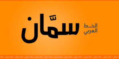 Samman is a Kufic simple Arabic typeface. It can be used to decorate public signs in streets, airports, hospitals, schools, malls, hotels, mosques, and other public places. My family's surname is "Samman" which stands for the person who sells fat especially the one produced by cows ("Samn" in Arabic). Consequently, "Samman" Typeface was designed for eternizing the memory of my family. The main characteristic of "Samman" Typeface is the leaf-shaped style for some of its Arabic characters such as "Dad", "Sad", "Faa", "Meem" and others. The distinguishing artistic design of its "Haa" character adds a unique feature to this typeface especially when connected with other characters. The shape of the characters' "dot", "dots", and "point" is innovative; a triangle with a semi-circle shape. "Samman" Typeface is suitable for books' covers, advertisement light boards, and titles in magazines and newspapers. Its characters' modern Kufic styles give the typeface more distinction when it is used also in posters, greeting cards, covers, exhibitions' signboards and external or internal walls of malls or metro's exits and entrances. It can also be used in titles for Arabic news and advertisements appeared in different Arabic and foreign satellite channels.
 - Gutenberg B by Alter Littera,
$25.00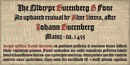 A clean, smooth rendition of the magnificent B42-type used by Johann Gutenberg in his famous 42-line Bible. In addition to the usual standard characters for typesetting modern texts, the font includes a comprehensive set of special characters, alternates and ligatures, plus Opentype features, that can be used for typesetting (almost) exactly as in Gutenberg’s Bible and later incunabula. Also available as The Oldtype “Gutenberg C” Font in a slightly roughened style simulating irregularities and ink spreads associated with old metal types, papers and parchments. The main historical sources used during the font design process were high-resolution scans from several printings of Gutenberg’s Bible. Other sources were as follows: Kapr, A. (1996), Johann Gutenberg - The Man and his Invention, Aldershot: Scolar Press (ch. 7); De Hamel, C. (2001), The Book - A History of The Bible, London: Phaidon Press (ch. 8); Füssel, S. (2005), Gutenberg and the impact of printing, Burlington: Ashgate (ch. 1); and Man, J. (2009), The Gutenberg Revolution, London: Bantam (ch. 7). Specimen, detailed character map, OpenType features, and font samples available at Alter Littera’s The Oldtype “Gutenberg B” Font Page.
 - Cynapse OT by Positype,
$29.00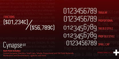 Several years ago I was faced with a project that required very small type to be used in a directory. In general, there was a need for a lot of 'fine print'. Faced with this, all of the tests I was making with existing faces were producing too much bleed of the individual glyphs...Cynapse was born. It evolved into this pseduo-techy looking type that standardized and glorified the ink trap (the small, tiny allowances of white space that reduces the amount of ink hitting the page, and in effect, reducing the appearance of bleed). The results was promising. The new OT version contains additional OpenType features that include expanded ligature sets, fractions, 5 sets of numerals as well as small caps and Central European diacritics.
 - Cling Vinyl JNL by Jeff Levine,
$29.00The Joseph Struhl Company of Long Island, NY pioneered the use of cling vinyl in the field of reusable signs. Along with sets of die-cut letters and numbers, one of their main products for many years was a set of letters and numbers silk screened onto vinyl panels for larger window displays. Cling Vinyl JNL is Jeff Levine's tribute to this sign kit and its innovative contribution to retail marketing. The font comes in two styles: Cling Vinyl JNL has white characters on a black background and Cling Vinyl Clear JNL has black characters on an open (clear) background. For those wanting a "panel" space between words, there are two different width ones on the < and > keys. Please note: limited character set. - Antique Price Tags JNL by Jeff Levine,
$29.00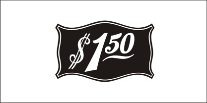 Antique Price Tags JNL is a collection of fifty-two decorative price cards recreating the look and charm of turn-of-the-last-century mercantile shops. The design is a hybrid of the decorative frame and dollar sign of antique price cards spotted in an online auction, and prices modeled from some gummed numerals once made by the Tablet and Ticket Company of Chicago under the brand name “Willson’s Gummed Letters” (after the company’s founder). Also included in the font are blank price cards with only a dollar sign, a cents sign or an empty frame, as well as a solid black frame for creating a backfill color. A companion font is available with the numbers in white on black panel backgrounds.
 - Wanted by ITC,
$29.99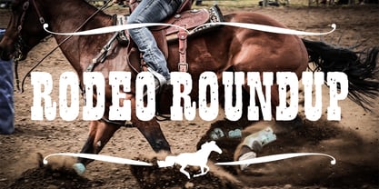 One look at the font Wanted brings to mind swinging saloon doors, double shots of whiskey and sheriff's badges. It belongs to the so-called Italienne typefaces which began to appear at the beginning of the 19th century. The distinguishing characteristic of such typefaces is the robustness of its serifs, which exceeds that of the base strokes. Wanted looks almost as though it were stamped on paper. Small white flecks appear in some of the strongest black strokes just as they would in a stamp which did not get quite enough ink...or are they perhaps the work of a sharp shooter? Wanted is best for short headlines and perfect for anything which should have the look and feel of the Wild West.
 - Blue Sugar by Aah Yes,
$5.95Blue Sugar is a grunge font which has one letter-shape in white set within a different grunge letter-shape in black. The Regular and Dirty versions have their characters in conventionally upright positions; and there are 3 varieties with the characters in various states of disorder and at slightly varied angles and sizes - called Twirled and Whirled. The Mixed Caps version introduces no new characters, but combines straight capitals and jumbled capitals in the same font, for convenience, in which Upper Case A-Z displays conventional upright Capitals, and lower case a-z displays jumbled Capitals. The package contains both OTF and TTF versions - install either OTF or TTF, not both versions of a font on the same machine. - Business Helpers JNL by Jeff Levine,
$29.00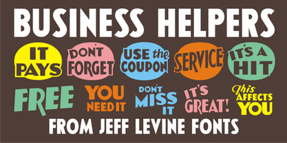 Duluth, Minnesota's Horace P. Brouillet Syndicate (later known as Syndicuts, Inc.) was one of a number of stock cuts providers to the letterpress trade in the decades preceding paper, then electronic clip art. Brouillet's "Typeps" catalogs offered a wide range of images covering numerous subjects, as well as cartoons, catch words and automotive logos. Many of these images have been reproduced in a number of royalty-free clip art publications over the years. Twenty-Six of these newly-redrawn catch words are found within Business Helpers JNL in two styles. On the capital keys are the original white-on-black designs, modeled from the vintage source material. The lower case keys have the phrases separated from the decorative ovals and are in black type.
 - Rodeo Clown by FontMesa,
$25.00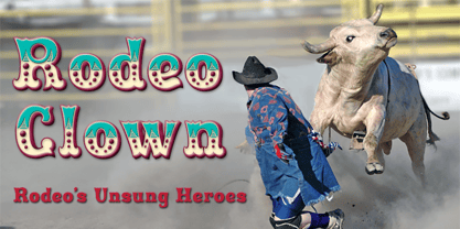 Rodeo Clown is a revival of an old classic font that you may have known under the name of Carnival. The Rodeo Clown family includes Fill fonts that you may layer behind the letters to add color or set to white so any background image doesn't show through the letters. The half fill should be layered on top to change the color of the top inlay design. The fill font for Rodeo Clown may also work as a stand alone black weight. In our sales images you'll see a sample of the fill font being used, we've intentionally offset the fill font to give it a misaligned printed look which was common to see with fill fonts in the 1800's
 - Liebfraumilch by Yanone,
$25.00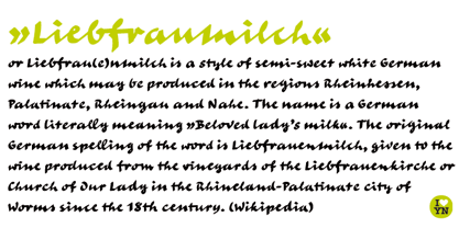 Liebfraumilch is a vivid handwriting script that relies on the OpenType features Contextual Alternates, Discretionary Ligatures and Stylistic Alternates, which are available only in OpenType-aware applications such as the Adobe Creative Suite or Quark Xpress. Liebfraumilch or Liebfrau(en)milch is a style of semi-sweet white German wine which may be produced in the regions Rheinhessen, Palatinate, Rheingau and Nahe. The name is a German word literally meaning "Beloved lady's milk". The original German spelling of the word is Liebfrauenmilch, given to the wine produced from the vineyards of the Liebfrauenkirche or Church of Our Lady in the Rhineland-Palatinate city of Worms since the 18th century. The spelling Liebfraumilch is more common on labels of exported wine. (Wikipedia)
 - Narcissus SG by Spiece Graphics,
$39.00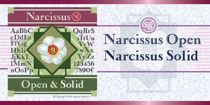 Narcissus Open is a heavy typeface designed by Walter Tiemann in 1921 for the Klingspor Foundry in Germany. It is a shaded wide roman using a very modest amount of white highlighting. Serifs are extremely delicate, almost ornamental. This elegant old typeface gives a feeling of importance and authority and is highly effective when used in large display sizes. Narcissus Solid lacks all highlighting and becomes more useful in smaller sizes. Narcissus Open and Solid are also available in the OpenType Std format. Some new characters have been added to this OpenType version. Advanced features currently work in Adobe Creative Suite InDesign, Creative Suite Illustrator, and Quark XPress 7. Check for OpenType advanced feature support in other applications as it gradually becomes available with upgrades.
 - Aabak by Polimateria,
$39.00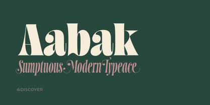 Aabak is a sumptuous modern typeface family. The high contrast, super elegant, didone like shapes were infused with a little fluidity from 60’s psychedelic lettering, the results is a contemporary face that screams freshness. It is ideal for branding, advertising, headlines, posters, movie titles, and much more! This design deliberately sabotages a lot of white space to have that compressed punchy look. The tear drop terminals and the melting serifs create a surprisingly superb combo. Sharp joints were smoothen to convey a warm and subtle feeling. Aabak comprises a total of 18 styles, 6 weights in 3 different cuts: Upright, Italic and Swash. The Swash styles have also a terminal forms feature that gives that extra lush feel. Have fun playing with it!
 - Satron by Aah Yes,
$3.95A reminder of the days of flower power, Satron is quite a bit different, slightly hippy and slightly grungy. Although it is not in any way an attempt to emulate the fonts used in that era, it evokes the mood of the time. There's two different shapes making up each character, with a grungy black one in front of a hippy white one. The combined effect however is quite novel and modern. There's also a jumbled version with the letters rotated and whacked around, in case you want it funky-flavored. There's all the main characters plus lots of extra accented letters as well. The package contains both OTF and TTF versions - install either OTF or TTF, not both versions on the same machine. - Sutro Deluxe by Parkinson,
$30.00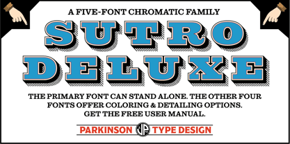 Sutro Deluxe is a bold slab serif with a double drop shadow. It was originally conceived as a simple black and white display alphabet. But it seemed unfinished, begging for something more. I decided to try adding a couple layers of fill and detail to try and make it interesting. The result is this five-layer chromatic font family. The Primary Font is the Main Font. The other fonts ( Fill, Inline Fill, Inline and Shaded Inline) only exist to support the Primary Font.There is some color trapping going on.To make sure you are laying the fonts on top of one another in the optimum order, I recommend the free PDF User Manual. The downloadable PDF Sutro Deluxe User Manual is in the Gallery section for this family.
 - Selfie by Lián Types,
$37.00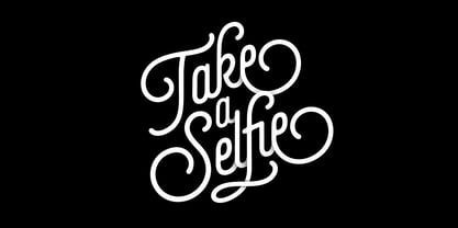 ATTENTION CUSTOMERS :) There's a new Selfie available, have a look here; Selfie Neue is better done and more complete in every aspect. However, you can stay here if you still prefer the classic version. -But first, let me take a Selfie!- said that girl of the song and almost all of you at least once this year. While some terms and actions get trendy, some font styles do it too. It wouldn't be crazy to combine these worlds, in fact it happens often. Selfie is a connected sans serif based in vintage signage scripts seen in Galerías of Buenos Aires. These places are, in general, very small shopping centres which pedestrians sometimes use as shortcuts to get to other parts of the city. Their dark corridors take you back in time, and all of a sudden you are surrounded by cassettes, piercings, and old fashioned cloth. For some reason, all these shops use monolined geometric scripts. Surely, neon strings are easier to manipulate when letterforms have simple shapes. My very first aim with Selfie was to make a font that would serve as a company to those self-shot pictures that have become so popular nowadays. However, the font turned into something more interesting: I realised it had enough potential to stand-alone. Selfie proves that geometry itself can be really attractive. In this font, elegance is not achieved with the already-known contrast between thicks and thins of calligraphy, but with the purity of form. Its curves were based in perfectly shaped circles which made the font easy to be used at different angles (some posters show it at a 24.7º angle) without having problems/deformities. In addition to its nice performance when used over photographs, the font can be a good option for packaging and wedding invitations. TIPS Adding some lights/shadows between letters will for sure catch the eye of the viewer: Words will look as if they were made with tape/strings; so trendy nowadays. Try using Selfie at a 24.7º angle so that the slanted strokes become perfectly vertical. Having the decorative ligatures feature (dlig) activated is a good option to see letters dance. TECHNICAL It is absolutely recommended to use this font with the standard ligatures feature (liga) activated. It makes letters ligate perfectly and also improves the space between words.
 - Fab by Canada Type,
$24.95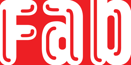 It's 1984 and everything has sideburns. Shoulder-padded "dress for success" is in, with power suits for women, black and white layers for men, neon brights for the youngsters. Maggie's "enemy within" and "no society" speeches preface the arrival of shopping malls and corporate status symbols. The economy is a philosophy and accountants carry ambiguous but very sophisticated-sounding titles. Thousands of words and expressions are reduced to initials or monosyllabic sounds. Synthesizers are very refined and the music is very catchy. The Macintosh and MTV are making waves. Brands are lifestyles. "Yuppy," Yummy," "Bobo," "Dinky" and "Woopie" are standard consumer categories in advertising lingo. The Volkswagen identity, only 5 years old now, is all the rage in design. VAG Rundschrift, by all appearances a rounded and slightly condensed Futura, is everywhere. Tube design is king. Fast forward two dozen years. Replay, but bigger and much louder. Fab. Let's dance. Fab is Canada Type's tribute to the Eighties. It's a five-font unicase family that brings tube design into the 21st century. The main font is an all-in-one treatment of the shiny roundness that the 1980s were. Fab White is a tightly packed thick outline font that conveys luscious contentedness like nothing else. The Fab Trio package is very useful for layered and colorful design, with the Black style serving as a backdrop, the Bold style as the front forms, and the Fill style for inlining. Fab comes in all popular formats and contains support for Western, Central and Eastern European languages, as well as Baltic, Esperanto, Maltese, Turkish and Celtic/Welsh languages.
 - Bullets by Wiescher Design,
$6.00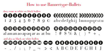 BulletNumbers come in very handy for all kinds of lists that don't exceed 100 categories. I have long since been using my own Bullets in positive and negative and four styles, serif, sans, engravers and script, a fitting one for every occasion. Now I added six more designs and perfected the Bullets for all of you. The following is a »must read«! Here is how to use them: (Important! Set letterspacing to '0', otherwise the two digit numbers will have gaps!!!) The numbers 1-0 reside on the standard keys. Two digit numbers 01-99 can be composed out of left and right half circles by using (lowercase) 'abcdefghij' for the first digit (left half circle) and 'lmnopqrstu' for the second digit (right half circle). The critical pairs (all combinations with 1) can be found in various places. Type '!' for 10, '#' for 11, '$' 12, '%' for 13, '&' for 14, '(' for 15, ')' for 16, '*' for 17, '+' for 18, ',' for 19, '-' for 21, '.' for 31, '/' for 41, ':' for 51, ';' for 61, '?' for 81, '_' for 91. The two arrows are on the < and > keys. '100' can be found with shift+option+1. Last but not least, the capital letter bullets A-Z can be found on the shift+letter A-Z. Your very practical Gert Wiescher
 - Bullet Numbers by Wiescher Design,
$9.50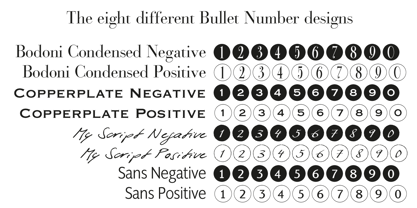 This is a must read!!! BulletNumbers come in very handy for all kinds of lists that don't exceed 100 categories. I have long since been using my own BulletNumbers in positive and negative and four styles, serif, sans, engravers and script, a fitting one for every occasion. Now I perfected them for all of you. Here is how to use them: (Important! Set letterspacing to '0', otherwise the two digit numbers will overlap!!!) The numbers 1-0 reside on the standard keys. Two digit numbers 01-99 can be composed out of left and right half circles by using (lowercase) 'abcdefghij' for the first digit (left half circle) and 'lmnopqrstu' for the second digit (right half circle). The critical pairs (all combinations with 1) can be found in various places. Type '!' for 10, '#' for 11, '$' 12, '%' for 13, '&' for 14, '(' for 15, ')' for 16, '*' for 17, '+' for 18, ',' for 19, '-' for 21, '.' for 31, '/' for 41, ':' for 51, ';' for 61, '?' for 81, '_' for 91. The two arrows are on the < and > keys. '100' can be found with shift+option+1. Last but not least, the capital letter bullets A-Z can be found on the shift+letter A-Z. Yours very practical Gert Wiescher
 - Slim James JNL by Jeff Levine,
$29.00Tall, condensed and square in shape... Slim James JNL balances well against bolder Deco-style sans or novelty type faces.


