10,000 search results
(0.116 seconds)
- Homa by Naghi Naghachian,
$108.00 Homa is a sans-serif sigle weight font designed by Naghi Naghashian. It is extremely legible even in very small size. This font is The contribution to modernisation of Arabic typography, gives the font design of Arabic letters real typographic arrangement und provides more typographic flexibility. Homa supports Arabic, Persian ( Farsi) and Urdu. It also includes proportional and tabular numerals for the supported languages. Homa design fulfills the following needs: A Explicitly crafted for use in electronic media fulfills the demands of electronic communication. B Suitability for multiple applications. Gives the widest potential acceptability. C Extreme legibility not only in small sizes, but also when the type is filtered or skewed, e.g., in Photoshop or Illustrator. Homa’s simplified forms may be artificial oblilqued in InDesign or Illustrator, without any loss in quality for the effected text. D An attractive typographic image. Homa was developed for multiple languages and writing conventions. Homa supports Arabic, Persian and Urdu. It also includes proportional and tabular numerals for the supported languages. E The highest degree of calligraphic grace and the clarity of geometric typography.
 - Pegah by Naghi Naghachian,
$98.00 Pegah is a sans-serif font family designed by Naghi Naghashian in three weights. Pegah Light, Pegah Regular and Pegah Bold. This font family is a contribution to modernisation of Arabic typography, gives the font design of Arabic letters real typographic arrangement und provides more typographic flexibility. Pegah supports Arabic, Persian and Urdu. It also includes proportional and tabular numerals for the supported languages. Pegah design fulfills the following needs: A Explicitly crafted for use in electronic media fulfills the demands of electronic communication. B Suitability for multiple applications. Gives the widest potential acceptability. C Extreme legibility not only in small sizes, but also when the type is filtered or skewed, e.g., in Photoshop or Illustrator. Nima’s simplified forms may be artificial oblilqued in InDesign or Illustrator, without any loss in quality for the effected text. D An attractive typographic image. BaBa was developed for multiple languages and writing conventions. BaBa supports Arabic, Persian and Urdu. It also includes proportional and tabular numerals for the supported languages. E The highest degree of calligraphic grace and the clarity of geometric typography.
 - Internacional by Los Andes,
$26.00 Internacional, inspired by the International Style, is a Latin American-flavored neo-grotesque sans serif typeface made with organic ingredients and sweetened with organic sugar and chocolate. Internacional is well-suited for corporate identity, branding, publishing projects, logotypes, magazines and advertising. Its large x-height and small difference between x-height and cap-height make it a high-impact font, ideal for powerful headings, while providing legibility. Internacional was designed for use with short and mid-length paragraphs that require a balanced type color. Internacional is an extended width font with rounded forms and angled terminal ends, in characters such as “c” or “a”, which make it suitable for use in advertising and branding. The proportional relation in height between uppercase and lowercase letters may be useful when composing text in German language. The Internacional font family comes in 7 weights with matching italics and includes an alternative version, with the same number of styles, yet it tastes differently. Special thanks to everyone in the Latinotype Team (especially to Rodrigo Fuenzalida) for their support, help with corrections and digital editing.
 - Sequel Geo by OGJ Type Design,
$35.00 Sequel Geo is a geometric/neo-grotesque hybrid superfamily, influenced by formalized sans-serif typefaces from Germany and Swiss modernist type design—particularly Max Bill’s greek-styled lettering. 8 subfamilies and 120 individual fonts allow for a wide range of typographic expressions. Sequel Geo’s hallmark features, such as the circular “G” and punctuation, simple “t”, and two-story “a” turning one-story in bolder weights, persist throughout all styles. But it’s the formal and functional differences between subfamilies that let you really fine-tune your layouts. The three optical sizes of the core collection, “Body Text”, “Headline”, and “Display”, boast optimized spacing for the intended use. “Extended” packs some extra punch with 18 display-oriented styles. Finally, 48 “Graphic” styles in 4 subfamilies push to the Geometric side, replacing horizontal and vertical stroke endings with angular ones, simplifying letterforms. Sequel Geo is a journey through time and space. From 1920s Germany to 1950s Switzerland. All the while, its archetypal shapes are neutral yet confident, its appearance is classic.
 - Pragmatik by Christopher Stahl,
$24.90 Pragmatik is a carefully crafted Square Sans by Christopher Stahl, awarded with a Commendation at the Art Director's Club Germany Junior Competition 2011 and selected as Font of the Week 42.2011 by Typolution.de. The design is influenced by the heritage of German industrial typesets like DIN, yet the use of forms and proportions feels modern and fresh. The family consists of three weights with matching italics, thus making a total of six fonts. The high x-Height and the sturdy design provide a good legibility in body text, while in larger sizes the exciting details and alternates create headlines full of atmosphere. Features: - 350 glyphs supporting central and western European languages as of DIN 16518 - over 500 manually adjusted kerning classes and pairs - available in Open Type with a host of Open Type features, such as: - proportional lining, lining table and proportional oldstyle number figures - 7 default and 16 discretionary ligatures that especially cater the needs of the German and English language - a variety of stylistic alternate figures like a stencil like i and j or an old-style Eszett.
 - Kardinal by Ani Dimitrova,
$30.00 Kardinal is a sans serif humanistic type family. The family has 16 weights, ranging from Thin to Black with extra drawn italics and small caps versions. The Kardinal type family is ideally suites for small text, books and magazines, branding, posters, as well as web and screen design, headlines and more. Kardinal comes in 16 styles with extended language support. All weights contain standard ligatures, proportional figures, tabular figures, old style figure, numerals and arrows, matching currency symbols and fraction. The construction of characters combines clean grotesque style and calligraphic features with humanist fragrance. Out standing for the designs are the small serifs. They are giving the letters movement and freshness, as well as contribute to a better readability in different volume texts and including lots of details that give it a unique personality. The Regular and Medium weights are perfect for body text while the italic give an interesting texture to the text. The range of styles give a good flexibility to this family. The fonts are carefully hinted and perfect for digital use.
 - BaBa by Naghi Naghachian,
$98.00 BaBa is a sans-serif font family designed by Naghi Naghashian in three weights. BaBa Light, Baba Regular and Baba Bold. This font family is a contribution to modernisation of Arabic typography, gives the font design of Arabic letters real typographic arrangement und provides more typographic flexibility. BaBa supports Arabic, Persian and Urdu. It also includes proportional and tabular numerals for the supported languages. BaBa design fulfills the following needs: A Explicitly crafted for use in electronic media fulfills the demands of electronic communication. B Suitability for multiple applications. Gives the widest potential acceptability. C Extreme legibility not only in small sizes, but also when the type is filtered or skewed, e.g., in Photoshop or Illustrator. Nima’s simplified forms may be artificial oblilqued in InDesign or Illustrator, without any loss in quality for the effected text. D An attractive typographic image. BaBa was developed for multiple languages and writing conventions. BaBa supports Arabic, Persian and Urdu. It also includes proportional and tabular numerals for the supported languages. E The highest degree of calligraphic grace and the clarity of geometric typography.
 - Metrock by Ditatype,
$29.00 Meet Metrock, a bold and distinctive brush sans-serif font that exudes strength, modernity, and artistic edge. Crafted with large letters, Metrock is the epitome of impactful design with a touch of rugged elegance. The characters in Metrock are deliberately bold, featuring boxy shapes that command attention. The thick weight adds a sense of solidity and substance, while the sharp corners and brush details introduce an element of raw creativity. This unique combination makes Metrock a font that stands out in any display setting. In addition, enjoy the features here. Features: Multilingual Supports PUA Encoded Numerals and Punctuations Metrock fits in headlines, logos, posters, flyers, branding materials, greeting cards, print media, editorial layouts, and many more designs. Find out more ways to use this font by taking a look at the font preview. Thanks for purchasing our fonts. Hopefully, you have a great time using our font. Feel free to contact us anytime for further information or when you have trouble with the font. Thanks a lot and happy designing.
 - Vocal by Ani Dimitrova,
$35.00 Vocal is a sans serif type family designed by Ani Dimitrova. The family has 28 weights, ranging from Hairline to Heavy with matching Italics and Small Caps. In addition, you get a nice alternate version of the Heavy weight with extra thin accents. Which is a pure joy for setting titles. Vocal comes with extended coverage of the Latin, Greek and Cyrillic Script. The Regular and Medium weights are perfect for body text while the extra drawn Italic gives an interesting texture to the text. The stems are a little tapered to the middle and the corners are cutted, which makes them a little rounded in small sizes. That gives the font an organic, warm and friendly touch. Vocal is equipped for complex, professional typography with Open Type Features including — small caps, localized forms, standard ligatures, subscripts, superscripts, numerators, denominators, numbers in circles arrows, currency symbols and fractions. The fonts are carefully hinted and its wide proportions make them a perfect choice for screen usage. Vocal suits also ideal for book and editorial design.
 - HD Anomie by HyperDeluxe,
$40.00 HD Anomie is a modern geometric sans built in 18 styles with variable support and is brought to you by HyperDeluxe®. Its subtle forms and nuanced curves create a simple structure that could be perceived as mundane, but our goal was to create a typeface that is both mechanical and organic in its forms so it seamlessly fits within the environment it is placed. It's clean, minimal approach gives it a wide array of offline uses such as branding, editorial & print, but its modern design and detailed build makes it perfect for UI & digital applications. The clean visual structure of the letter forms give it great readability at smaller sizes, while also being happy to be shown off at larger sizes. Built to be robust and as versatile as possible we have around 1150 Glyphs per weight including extended Latin & Cyrillic support as well as basic Greek. Anomie also features extras such as 2 arrow sets, circled numbers as well as stylistic alternates and case sensitive forms. Find beauty in the Mundane. Meet HD Anomie.
 - Hafez by Naghi Naghachian,
$88.00 Hafez is a sans-serif font family designed by Naghi Naghashian in three weights. Hafez Light, Hafez Regular and Hafez Bold. This font family is a contribution to modernisation of Arabic typography, gives the font design of Arabic letters real typographic arrangement und provides more typographic flexibility. Hafez supports Arabic, Persian and Urdu. It also includes proportional and tabular numerals for the supported languages. Hafez design fulfills the following needs: A Explicitly crafted for use in electronic media fulfills the demands of electronic communication. B Suitability for multiple applications. Gives the widest potential acceptability. C Extreme legibility not only in small sizes, but also when the type is filtered or skewed, e.g., in Photoshop or Illustrator. Nima’s simplified forms may be artificial oblilqued in InDesign or Illustrator, without any loss in quality for the effected text. D An attractive typographic image. BaBa was developed for multiple languages and writing conventions. BaBa supports Arabic, Persian and Urdu. It also includes proportional and tabular numerals for the supported languages. E The highest degree of calligraphic grace and the clarity of geometric typography.
 - Apadana by Naghi Naghachian,
$100.00 Apadana is a new creation of Naghi Naghashian. Apadana design fulfills the following needs: A. Explicitly crafted for use in electronic media fulfills the demands of electronic communication. Apadana is not based on any pre-digital typefaces. It is not a revival. Rather, its forms were created with today's technology in mind. B. Suitability for multiple applications. Gives the widest potential acceptability. C. Extreme legibility not only in small sizes, but also when the type is filtered or skewed, e.g., in Photoshop or Illustrator. Apadana's simplified forms may be artificial obliqued in InDesign or Illustrator, without any loss in quality for the effected text. D. An attractive typographic image. Apadana was developed for multiple languages and writing conventions. Apadana supports Arabic, Persian, and Urdu. It also includes proportional and tabular numerals for the supported languages. E. The highest degree of geometric clarity and the necessary amount of calligraphic references. This typeface offers a fine balance between calligraphic tradition and the contemporary sans serif aesthetic now common in Latin typography.
 - VLNL Kouseband by VetteLetters,
$30.00 The starting point for VLNL Kouseband was spotted by Donald DBXL Beekman on the Christian Reformed Church in the Dutch town of Naarden. The iron wire lettering contained a number of unusual characters and details, which eventually led to this five weight family. The Kouseband fonts mix elements of geometric sans serifs and upright unconnected scripts, with a hint of Dutch school writing. VLNL Kouseband is monolinear and has an very large cap height compared to the (lowercase) x-height, giving the capital letters an elongated condensed appearance. Kouseband is the Dutch word for ‘garter (belt)’ and also gave the name to a long tropical bean known as Yardlong bean. Kouseband beans are a common ingredient in Roti and other Surinamese dishes. As the Dutch Christian church is sometimes referred to as ‘Zwarte kousenkerk’ (Black stocking church), and stockings are held up by garter belts, we have come full circle and VLNL Kouseband has a name. VLNL Kouseband contains a set of oldstyle numbers matching the lowercase letters, and a couple of wider alternate capitals (HMNOQ) to enhance the liveliness of your designs.
 - Ekbatana by Naghi Naghachian,
$75.00 Ekbatana is a new creation of Naghi Naghashian. Ekbatan design fulfills the following needs: A. Explicitly crafted for use in electronic media fulfills the demands of electronic communication. Ekbatana is not based on any pre-digital typefaces. It is not a revival. Rather, its forms were created with today's technology in mind. B. Suitability for multiple applications. Gives the widest potential acceptability. C. Extreme legibility not only in small sizes, but also when the type is filtered or skewed, e.g., in Photoshop or Illustrator. Ekbatana's simplified forms may be artificial obliqued in InDesign or Illustrator, without any loss in quality for the effected text. D. An attractive typographic image. Ekbatana was developed for multiple languages and writing conventions. Ekbatana supports Arabic, Persian, and Urdu. It also includes proportional and tabular numerals for the supported languages. E. The highest degree of geometric clarity and the necessary amount of calligraphic references. This typeface offers a fine balance between calligraphic tradition and the contemporary sans serif aesthetic now common in Latin typography.
 - Bohemia by Linotype,
$29.99Argentinean designer Eduardo Manso created the Bohemia type family in 2003. Bohemia's cunning and elegant essence shows off refined letters that evoke the Transitional style typefaces like Baskerville, though most Baskerville-like designs tend not to be as curvaceous as Manso's! True to form, Bohemia shines in smaller text sizes, like 9 point and above, while still maintaining a unique character and spirit. Bohemia is a great alternative to better-known text faces. The critics have been raving. Bohemia came to Linotype via its fourth International Type Design Contest (ITDC) [Link] in 2003, where it received one of the three top awards. Under the name Argot, this typeface received a Certificate of Excellence in Type Design from the Type Directors Club of New York in 2004. Bohemia was also selected for inclusion in the 21st International Biennale of Graphic Design 2004 in Brno, Czech Republic, and was later named one of the most relevant works in the Bienal Letras Latinas 2004 exhibition, which traveled through Buenos Aires, San Paolo, Santiago, and Vera Cruz." - Homayoon by Naghi Naghachian,
$102.00 Homayoon is a sans-serif sigle weight font designed by Naghi Naghashian. It is extremely legible even in very small size. This font is The contribution to modernisation of Arabic typography, gives the font design of Arabic letters real typographic arrangement und provides more typographic flexibility. Homayoon supports Arabic, Persian (Farsi ) and Urdu. It also includes proportional and tabular numerals for the supported languages. Homayoon design fulfills the following needs: A Explicitly crafted for use in electronic media fulfills the demands of electronic communication. B Suitability for multiple applications. Gives the widest potential acceptability. C Extreme legibility not only in small sizes, but also when the type is filtered or skewed, e.g., in Photoshop or Illustrator. Homayoon’s simplified forms may be artificial oblilqued in InDesign or Illustrator, without any loss in quality for the effected text. D An attractive typographic image. Homayoon was developed for multiple languages and writing conventions. Homayoon supports Arabic, Persian and Urdu. It also includes proportional and tabular numerals for the supported languages. E The highest degree of calligraphic grace and the clarity of geometric typography.
 - Dara by Naghi Naghachian,
$88.00 Dara is a sans-serif sigle weight font designed by Naghi Naghashian. It is extremely legible even in very small size. This font is The contribution to modernisation of Arabic typography, gives the font design of Arabic letters real typographic arrangement und provides more typographic flexibility. Dara supports Arabic, Persian ( Farsi ) and Urdu. It also includes proportional and tabular numerals for the supported languages. Dara design fulfills the following needs: A Explicitly crafted for use in electronic media fulfills the demands of electronic communication. B Suitability for multiple applications. Gives the widest potential acceptability. C Extreme legibility not only in small sizes, but also when the type is filtered or skewed, e.g., in Photoshop or Illustrator. Dara’s simplified forms may be artificial oblilqued in InDesign or Illustrator, without any loss in quality for the effected text. D An attractive typographic image. Dara was developed for multiple languages and writing conventions. Dara supports Arabic, Persian and Urdu. It also includes proportional and tabular numerals for the supported languages. E The highest degree of calligraphic grace and the clarity of geometric typography.
 - Bitelover by Mercurial,
$10.00 Bitelover is an enchanting font duo brush script typeface with sans serif. clad in an exquisite accents, casual-chic, perfect for you who want a perfect and fabulous font! Suitable for many design projects such as logo design, branding, packaging, blog graphics, stylizing quotes, wedding stationery, art prints, collateral design, packaging, social media, and so on. I’ve truly enjoyed the process of creating this font collection and hope that it will bring some magic into your projects! Whats i get? Bitelover. OTF Bitelover Sans. OTF Whats Includes: Uppercase and Lowercase, Numbers and punctuation, Stylistic Alternate, Discretionary Ligatures, Multilingual Languages Support, Symbols and more. It's highly recommended to use it in opentype capable software - there are plenty out there nowadays as technology catches up with design. The Open Type features can be accessed by using Open Type savvy programs such as Adobe Illustrator, Adobe InDesign, Adobe Photoshop Corel Draw X version, And Microsoft Word. And this Font has given PUA unicode (specially coded fonts). so that all the alternate characters can easily be accessed in full by a craftsman or designer and also equipped with Multilingual support. So, let's get it! Thanks and enjoy your day ...!. :)
 - Tiverton by Adam Fathony,
$15.00 The idea behind this typefaces was to combine something retro and vintage with a style of this century. A reference from Vintage Typography, Art Deco, Neo Deco. With an improvised and create something in between those styling. Tiverton created in Serif, Sans-Serif and Script. Within 3 Style, it more helping and easier for create something without "thinking" the font compartment. Features of Sans Serif and Serif are comes with stylistic alternates and you can activated with Contextual Swash button on Adobe Illustrator or Adobe Photoshop, And Catchword such as the preview above, activated with underscore in the beginning and end of the letters, for example : _ the _ (underscore)the(underscore). Features of Tiverton Script are Ligatures, Contextual alternates, Contextual Swashes. no alternates. but Tiverton Script available with 2 Weight, Light and Regular. For a bonus, I create an Ornament Fonts. Special shout for the ornament fonts are for the borders. on the Number Character 0-9 are created for connected borders. for Beginning and end the lines you can press Shift on the Number Character. For example : type !2222@ on the text preview below and see on the Tiverton Ornament.
 - DS UstavHand - Unknown license

- SF Yazan by Sultan Fonts,
$19.99Yazan is a New Arabic display typeface for desktop applications, inspired by oriental kufi and Qairawani kufi . Designed and developed by Sultan M. Saeed, Yazan has updated proportions and details, and is distinguished by its traditional serenity, modern aesthetics, This makes it suitable for large display sizes, especially in the area of advertising, while still functioning well as a text face. - Hollenbeck JNL by Jeff Levine,
$29.00Hollenbeck JNL is the Art Deco, all-caps cousin of Jeff Levine's Hallandale JNL typeface. This version utilizes the thick-and-thin stroke weights so popular during the Art Deco era, while retaining the look of hand-lettered copy. Best suited at larger point sizes, this font is a nice alternative to the over-used display faces reminiscent of that time period. - Skinny Chalk by Mvmet,
$16.00 Skinny Chalk is a versatile and playful hand-drawn display font. It works great for creating cool designs that scream for attention. It’s ideal for anything ranging from t-shirts, book designs, restaurant menu, blog writing, greeting cards to stickers, or anything that needs a casual touch. Fall in love with its incredibly cool style, and use it to create lovely designs!
 - Steamship JNL by Jeff Levine,
$29.00 While viewing a YouTube video of film footage in and around New York in the mid-1930s, one scene showed some people “window shopping” by the storefront office of the French Line, an international steamship service. A screen capture allowed the storefront sign to be recreated as the digital typeface Steamship JNL, which is available in both regular and oblique versions.
 - PM Showman by Paper Moon Type & Graphic Supply,
$17.00 PM Showman is based on vintage hand-painted sign writing from the 1900s through the 1960s. Seen on everything from office signs to posters, it was a staple of business communication and entertainment advertising in the early 20th century. We meticulously hand-drew each font, modeling the spacing and quirkiness of the original letterforms to give PM Showman an authentic hand-painted look.
 - Moonart by Scratch Design,
$12.00 Introducing “Moonart” It's handwritten with natural and rough character. This font is suitable for designs that emphasize the authenticity of slightly rough writing. Perfect for creating Instagram quote posts, novel or book typefaces, branding, invitations, labels, packaging, stationery, etc. This is a full font, which features all uppercase and lowercase letters, numbers and punctuation, stylish alternates, multilingual, alternates and ligatures. Enjoy this font!
 - Evil Spin by PizzaDude.dk,
$20.00 Evil Spin is inspired by some old horror poster. It has this eerie feeling to it, which leaves you with terror...no matter what you write!!! I've made 4 different versions of each letter, and they automatically changes as you type. And that goes for every layer if Evil Spin - mix and match the layers for even more creepy effects!
 - Audica by Aqeela Studio,
$20.00 Audica is an exquisite vintage-style script font that exudes timeless elegance and sophistication. Its flowing cursive strokes and intricate details add a touch of charm to any design project. Perfect for invitations, logos, branding, and packaging, this font evokes a sense of nostalgia while maintaining a modern edge. With Audica, elevate your creations with its graceful and captivating allure.
 - Privé by TEKNIKE,
$39.00 Privé is a display handwriting font. The typeface is a distinct uppercased style hand drawn font and designed to be easy to read. Privé name is Old French for “private” or “participating in secret”. Privé is great for display work, invitations, writing, architecture, posters and headings. Privé is designed by Thoma Kikis and is currently available with Latin, Cyrillic and Greek character sets.
 - Kandinsky NF by Nick's Fonts,
$10.00While strolling through the Phillips Collection in Washington, DC, I came across a delightful painting by Wassily Kandinsky entitled “Succession”. Many of the forms seemed to me typographic so, of course, a font followed, and this is it: wild, wacky and delightfully different. Both versions of the font include 1252 Latin and 1250 CE (with localization for Romanian and Moldovan) character sets. - Arial by Monotype,
$45.99 Arial is one of the most widely used designs of the last 30 years. Drawn in 1982 by Robin Nicholas and Patricia Saunders for use in an early IBM® laser printer, Arial has become a staple for textual content. While it is widely believed that Arial's design was based on Helvetica, it is more accurate to consider Monotype Grotesque as its ancestor.
 - Hastynga by Golden Wraith Fonts,
$10.00 Golden Wraith Fonts designed the digital typeface Hastynga It began as an effort to find a solution to the digital aesthetic. By distorting digital fonts into a fluid style of writing with a variation in direction between strokes from one letter to the next, Hastynga allows for simulated text imperfection. Its layout creates textual tension, energetic movement, and vibrant vitality.
 - Sansdiego by Sealoung,
$15.00 Introducing our new exploratory Sansdiego, this typeface inspired by European empire-era forms of writing. Sansdiego typeface is perfect for classic Victorian themed designs, beer packaging, whiskey, barbershop, pomade, tattoo studio logos and so on. This font comes with additional effects: Normal - style - double - Shadow, packaged as a layered font. Sansdiego is an all caps font, carefully crafted with a great ornamental taste.
 - Mas dAsil by ParaType,
$25.00 The typeface was designed for ParaType in 2002 by Dmitry Kirsanov. Based on the Mesolithic images on stones were discovered in a prehistoric cave of Mas d’Asil, France. There is a great number of hypotheses explaining the function of the mysterious stones. They have been considered as vessels of souls, computation tools, fortune-telling and magic symbols, relics of prehistoric writing system.
 - TE Alnaskh Quraan by Tharwat Emara,
$10.00 It is known as the Alnaskh Quraan Font for its extensive use in the copying and transmission of books because it helps the writer to write more quickly than any other font since the Islamic times and then Alnaskh Quraan font wrote the "Quran"And the advantages of Alnaskh Quraan font are clarifying the letters and show their beauty and splendor.
 - Miyagi by Thinkdust,
$10.00 Miyagi brings the classic Yagi Link Double to the digital world, a modern form for a timeless typeface. Miyagi pays tribute to the decade it was created while pushing it into the boundaries of the future as well, a double image to match its double lines. Complex in design but easy to read, Miyagi embodies the stylistic ideas inherent in typeface design.
 - Good Monday by BaronWNM,
$14.00 Good Monday is a modern calligraphic style script font with a bold and thin touch like the one you get from writing with a brush. This font is traced from the handwriting so it looks very natural. Good Monday is perfect for use in invitation cards, fashion branding, shirt printing, product advertisements, posters, etc. This font has multilingual support, alternates, and ligatures.
 - Ribjoint by Chank,
$39.95 Created by Chank in 1992, Ribjoint was Chank’s first attempt at creating a Egyptian, cursive font on the computer. Writing cursive with a pencil sure is easy, but getting all the letters to link up correctly in computerized font format is a bit tricky. Not the most graceful script in the world, but it works good enough for a BBQ pit.
 - Bold Yeah by Mvmet,
$16.00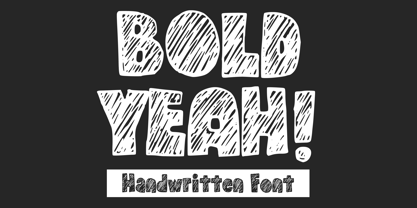 Bold Yeah is a bold and rough hand-drawn display font. It works great for creating cool designs that scream for attention. It’s ideal for anything ranging from t-shirts, book designs, restaurant menu, blog writing, greeting cards to stickers, or anything that needs a casual touch. Fall in love with its incredibly cool style, and use it to create lovely designs!
 - Glovy by RagamKata,
$12.00 Present to you new handwriting font, Glovy! Glovy - Made from my own actual handwriting. It’s not supposed to be neat... because I don’t write neat. It doesn’t align and it’s annoyingly all in caps (but it's kinda charming right?). Glovy - Includes 2 font styles for both regular and bold (A-Z and numerals), as well as standard and accented characters.
