10,000 search results
(0.036 seconds)
- Afternoon Tea by Open Window,
$19.95 Afternoon Tea is inspired by a lettering specimen featured in Letters and Lettering by Paul Carlyle and Guy Oring published in 1938. The striking features are the elegant balance between thick and thin strokes (demonstrating its obvious ink pen influence) while maintaining a sturdy presence which is ideal for titles and headings. Afternoon Tea is caps only.
 - Brefid by Gian Studio,
$16.00 Brefid is a luxurious yet elegant display font. characters that suit today's styles will be very interesting for you to create any design work with a classy model while still maintaining a calm and impressive style to look at. You're sure to have inspiration to match your creativity! Free updates for more versions in the future. Thank You
 - Shahrazed 2.0 by GrafikarFonts,
$49.00 Shahrazed 2.0 is an arabic and latin typeface. Shahrazed, Arabic glyphs are based on calligraphic writing inspired by Naskh and Maghrabi. (1366 Glyphs) It has more than 400 ligatures which add an aesthetic advantage in the connections of the glyphs. Also, stylistic set and variations that enrich the aesthetic aspect and the composition and layout needs.
 - PiS HansHand Pro by PiS,
$28.00 HansHand started out in 2003 as a simple free font, the adaption of my grimy handwriting. For its 10th anniversary it got a complete overhaul and lots of new characters. Now also available in BOLD for the first time, featuring scribbles, strokes, circles and boxes to underline the fast taking-notes-while-on-the-phone look!
 - Waiting For My Girl by Hanoded,
$15.00 Waiting For My Girl comes from a System of a Down song (Hypnotize). I was listening to it when I created this font and I liked the name! Waiting For My Girl is a script font - it’s quite loose and uneven, just like proper hand writing. It comes with double letter ligatures and a lot of character!
 - Beauty Green by BonjourType,
$13.00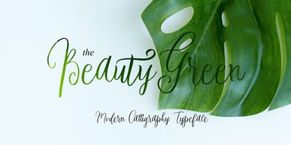 Proudly Present, BeautyGreen Font. BeautyGreen is a modern script font, masterfully designed to become a true favorite. It maintains its classy calligraphic influences while feeling contemporary and fresh. Fall in love with it and bring your projects to the highest levels! Fonts featured : Uppercase, Lowercase, Numbers, Symbols, Accents, Stylistic, Swash, and Ligatures. BeautyGreen also multilingual support
 - Prospect Heights JNL by Jeff Levine,
$29.00 While the inspiration for Prospect Heights JNL may have been a piece of vintage sheet music entitled "My Ohio Lullaby", the name is classically New York. To be precise, it's a neighborhood in the Borough of Brooklyn. Prospect Heights JNL is available in both the regular version (with an engraving line) and a solid (plain) version.
 - Smoothes Inline by Lucky Type,
$18.00 Smoothes Inline is a new handwritten script font featuring a playful style and will suit all kinds of design goals. This font would be perfect especially for print design projects or website needs. Smoothes Inline has multiple language support and has more than 50 ligatures that will enhance your writing. thank you very much for looking.
 - Yourladies by Balpirick,
$15.00 Yourladies is a Modern Handwritten Font. Yourladies is a sweet and delicate handwritten font. Dainty and joyful, this font will be ideal for writing wedding invitations, cards or any other design that may need a romantic, personalized touch! Yourladies also multilingual support. Enjoy the font, feel free to comment or feedback, send me PM or email. Thank you!
 - Arakne by Scriptorium,
$12.00While working on a font based on Spencerian Script (a popular late 19th century handwriting style) we did some experimenting with original designs which created the general feel of Spencerian and brought to mind the spidery handwriting of old ladies and Dickensian clerks. The result was Arakne, a spidery script font with a really striking look. - Tattoo Scratch by Ech000,
$10.99 Tattoo scratch is a carefully constructed abstract and artistic font made with over 190 different glyphs for latin and extended latin usage. Useable in English and latin based languages. The font is inspired by ignorant tattoo style art and by the "chicken scratch" style of hand writing. Each letter is individually crafted to make the font overall highly unique.
 - Night Life JNL by Jeff Levine,
$29.00 Night Life JNL follows the classic lettering forms of the Art Deco era of the 1930s and 1940s. On the upper case letters, the A,B,E,F,H,K,P and R have extended horizontals, while the lower case a,b,e,f,h,k,p and r have those extensions removed and are more traditional in design.
 - Ladislav by Suitcase Type Foundry,
$39.00 The Ladislav font revitalises Sutnar’s legacy, while not explicitly copying any of his original fonts. It however keeps true to their technicist character and initial principles of character creation - a simple modular system of combined geometrical segments. This approach affects all round shapes of capital and lowercase letters, as well as the shapes of the majority of numbers.
 - Loyola Soft by RodrigoTypo,
$25.00 The "Loyola Soft" typeface is a highly versatile and attractive option, as it presents a wide variety of 14 variants, making it a font with great potential for various projects and applications. By having support for the Cyrillic alphabet, this font becomes even more useful, allowing its use in multiple languages and regions where this writing system is used.
 - Mane by BaronWNM,
$14.00 Mane is a display font with a slant block shape. thick on the vertical line and thin on the horizontal line. have a firm and solid impression. Suitable for writing titles, posters, games, ad taglines, sports, space, etc. has an alternate start and end on each capital letter and several ligatures in order to add variations to each usage.
 - Adlery Pro by Zetafonts,
$39.00 Adlery is a brush typeface designed by Cosimo Lorenzo Pancini for display use. It has a handmade feel and it’s optimized for maximum readability at medium sizes. The typeface comes in three styles: Basic, Swash and Blockletter Uppercase and has a double set of lowercase alphabets that alternate in writing, so that no double letters are the same.
 - Vecta by Wilton Foundry,
$29.00I think it is one of our most useful fonts in that it doesn't draw much attention to itself while it is quite refreshingly different. Almost all shapes in Vecta are rounded to provide a friendly effect. Proportions are somewhat condensed providing economic space usage. Vecta looks equally at home in headlines as well as body text. - On The Ground by Fascination Workshop,
$10.00 On the Ground is a picture font made from drawings of found objects. These object were found on the ground while walking around different cities in the United States. The font uses varying drawing styles (from detailed to pictographic) but they all have a similar irregularity, unifying the characters. Perfect for animations, signs, greeting cards, posters, etc.
 - P22 Hiromina 03 by IHOF,
$24.95 Hiromina03 is named after the wife of its designer, Hajime Kawakami. The three fonts in the set are based on Hiromi Kawakami's unique hand-lettering style. The distinctly feminine character of Hiromina03 is harmoniously integrated in all three writing systems, Katakana, Hiragana and Latin. The enclosed key charts give instructions for character placement in Katakana and Hiragana.
 - Okay Crayon by Okaycat,
$29.95 One waxy black crayon was used up, entirely down to the tiniest nub, by the making of this font. It’s fun! Perfect for creating crayon written text, or to get the look of chalk-board writing, conte, or charcoal. Okay Crayon is extended, containing West European diacritics & ligatures, making it also suitable for multilingual environments & publications.
 - Callonsky Script by Letterhend,
$15.00 Introducing, Callonsky, a romantic modern script with a twist of fun! The natural hand writing script is suitable for you who needs a typeface for headline, logotype, apparel, invitation, branding, packaging, advertising etc. This typeface is comes in uppercase, lowercase, punctuations, symbols & numerals, stylistic set alternate, ligatures, etc also support multilingual. It also already PUA Encoded.
 - Samplex by Tipo Pèpel,
$22.00 Neutral and universal are two words that could describe a kind of perfection. The search for neutrality and universality is part of history in type design; it was specially important in the so-called Swiss Style. Samplex is a typeface that joins this particular search. The design gets rid of unnecessary elements and stays away from style conflicts. The large and slightly condensed body of lowercase letters makes Samplex a good choice for long paragraphs, and especially appropriate for screen devices. Letters with a blocky appearance give shape to a text in perfect order, ideal for grid lovers and layouts with a strict structure. The design of Samplex is clean and efficient. The diagonal cuts are reserved to the italic letterforms, setting some distance between the solid upright characters and the dynamic oblique forms.
 - Lucida Handwriting by Monotype,
$40.99 Lucida Handwriting is a casual, connected script designed for smooth and fun reading on screens and in print. Its relaxed personality and vigorous energy sends a distinctive message. Lucida Handwriting was originally released in one weight. It is now available in five weights, from Thin to Black. Lucida Handwriting was designed by Kris Holmes and Charles Bigelow based on historic blackletter style cursives. As with other joining script typefaces, all capital letters usage is not recommended: it is best to use upper and lowercase for optimal legibility. Lucida Handwriting is part of the Lucida superfamily of fonts from Bigelow & Holmes. Lucida is highly regarded for legibility and its extensive range of type styles. The Lucida Handwriting typeface family has a Standard character set with 255 glyphs supporting the basic range of Latin languages.
 - Alpha Bravo by Wiescher Design,
$39.50 AlphaBravo was born on a napkin. I was just doodling, playing around with letterforms when the ballpoint glided a little bit too far and suddenly I had my first letter with the dash sticking out on the left of the e’s horizontal line. I quickly checked on how many letters I could let a line stick out! Then I wrote a couple of words that way and letters joined in the most unusual places, creating new closed forms. I gave the font a try and quickly discovered, that I had stumbled onto an interesting new typeface. I didn't know how to call it, so I simply used the first two letters of the alphabet, Alpha and Bravo. Looking forward to Charlie and Delta, your very curious, Gert Wiescher.
 - 1756 Dutch by GLC,
$42.00 This family is inspired from the set of two styles, Roman normal and Italic, and the ornaments used by an unknown printer working around East Switzerland, circa 1750's. It is a Dutch style font, slightly bolder than usual Fournier's or Caslon's Roman fonts, with some emphasized serifs and finals parts and special letters as capital "U" for example. A set of initials, fleurons, ornaments and frame elements is joined to the family as a supplement. The two styles, Normal and Italic, are containing standard ligatures, a few alternative characters and titlings (who are more preferable than enlarged capitals). They are "small eye" or "Small x-eight" fonts. The standard characters set is completed with accented or specific characters for Western (Including Celtic) and Central Europe, Baltic, Eastern Europe and Turkish.
 - Bronzetti by Greater Albion Typefounders,
$10.00 A typographic revolution-Bronzetti has been a long term project for Greater Albion Typefounders, aimed at filling a large gap in the range of typefaces available today. The Bronzetti family of 22 text typefaces combines modern requirements for legibility and readability with the charm of traditional Roman faces in the spirit of those carefully constructed by small scale quality foundries such as the Kelmscott and Vale presses. In short, Bronzetti is traditional letterpress meets modern publishing, offering a real opportunity to make your material stand out from today’s ‘run of the mill’ crowd. The range of typefaces on offer includes five widths of type, as well as small capitals and italic forms and regular and bold weights. Try out Bronzetti today, make your work stand out from the crowd and join the revolution!
 - Janeiro by IKIIKOWRK,
$19.00 Proudly present Janeiro - Vintage Bold Font, created by ikiiko. Janeiro a bold font that personifies masculinity and retro vibes! This font dances in a contemporary setting with a fluidity that evokes the energy of the past. In a world where conformity sometimes takes center stage, Janeiro boldly challenges convention and invites everyone to join in a colorful and energetic parade. It's more than just a font; it's a typographic carnival that welcomes you to experience the joy of expression and the flow of creativity. This font is very suitable for making a poster, vintage or retro stuff, fashion brand, magazine layout, food & beverages packaging, quotes, or simply as a stylish text overlay to any background image. What's Included? Uppercase & Lowercase Numbers & Punctuation Multilingual Support Works on PC & Mac
 - FF Fago Monospaced by FontFont,
$67.99 FF Fago Thanks to his many years of involvement in major corporate type projects, Ole Schäfer had the necessary resources from which to construct his FF Fago™. The result is an extended family that provides comprehensive typographic support and whose qualities come to the fore in all relevant contexts ? from print to office through internet and wayfinding systems. FF Fago The sizable x-height together with the generous and open design of the characters ensure that the sans serif Fago remains clearly legible even in small point sizes or in potentially difficult situations, such as on wayfinding systems. A subtle contrast in line weight and letter forms that are reminiscent of those of an antiqua typeface provide the font with a restrained yet friendly and lively tone. Available in five weights, each with three different kerning widths and matching genuine italic variants, FF Fago is equipped for practically every situation. There are also small caps, oldstyle and lining figures, a selection of ligatures and geometric symbols. The range of potential applications of this universal font is almost inexhaustible ? it can be used in packaging design, on signs, posters and even for setting longer text sections. Fago is the ideal partner for those working on major corporate projects! FF Fago Correspondence Sans und Correspondence SerifThe Correspondence versions of Fago have been optimized for use in the business environment and in office communication. The carefully modified characters have a particularly robust feel, so that the clear, easily differentiated glyphs allow for straightforward communication even on screen. With these aims in mind, Schäfer has not only adjusted the x-height, but has provided certain letters in the sans variant ? such as the lowercase "i", the "r" and the uppercase "I" ? with serifs. Correspondence Serif, on the other hand, has been conceived as a slab serif throughout and in appearance has the look of the letters produced by the old office typewriting machines. An individual note has been added by providing a few unusual serif forms, as for example in the case of the "m", the "v" and the "y". Both Correspondence Sans and Serif are available in two weights with complementary italic versions and thus are ideally suited for use with standard office programs. This is all rounded off with a selection of office symbols. FF Fago Monospaced The use of a few typographic tricks is necessary to ensure that the letters of the alphabet appear to have the same width. Narrow letters such as "r" and "i" have been made to seem more expansive by using prominent serifs while the broader letters ? a good example is the "m" ? have the forms seen in a condensed font. And it is thanks to this design strategy that Fago Monospaced has the character of old typewriter text. What was once unavoidable because of the technology of the time is now a welcome alternative that can be used for the purposes of emphasis. As an additional supplement to the Fago superfamily, Fago Monospaced can be used, for example, to set short notes or draw attention to special text passages. There are three weights, in their original form without italic variants or small caps, but offering an alternative, technical form of the "0" with a crossbar.
 - Aqueo by R9 Type+Design,
$38.00 Aqueo™ is a versatile display font family inspired by the cylindrical wireframe of a water glass. The one-sided round corner details added a contemporary feel to this unique typeface. It comes in 6 weights and 12 styles. To ensure the accuracy of the letterforms, we painstakingly drew a master set for each weight. And with over 1,350 glyphs each, Aqueo™ fonts support most Latin-based languages and feature an extensive set of stylistic alternates; The standard uppercase set takes more traditional forms, while the alternate uppercase set sports unorthodox lowercase forms. The standards exude confidence and dependability yet are friendly and approachable, and the alternates elicit more fun, quirky and whimsical. The More Opentype Features, the More Zing for Your Design Projects. Aqueo™ Display Sans Serif comes loaded with Opentype features such as case-sensitive marks, punctuations and mathematic symbols. It also has an extensive set of discretionary ligatures, stylistic alternates, and over 80 essential UX/UI icons, each in three design options. These various Opentype features help improve your user experience, streamline your workflow, and unlock a broader range of typography details you can choose for your design. If you’re looking for a unique contemporary typeface, try Aqueo™ on your packaging design, logo design, infographic, print design, store signages, and UX/UI projects today! To find out more about Aqueo™ Opentype features and type specimens, please visit https://r9typedesign.com/aqueo-font-features-specimen
 - Averta Standard by Intelligent Design,
$10.00 Averta Standard is the basic version of Averta. Bringing together features from early European grotesques and American gothics, Kostas Bartokas’ (Greek: ‘αβέρτα’ – to act or speak openly, bluntly or without moderation, without hiding) Averta is a geometric sans serif family with a simple, yet appealing, personality. The purely geometric rounds, open apertures, and its low contrast strokes manage to express an unmoderated, straightforward tone resulting in a modernist, neutral and friendly typeface. Averta Standard is intended for use in a variety of media. The central styles (Light through Bold) are drawn to perform at text sizes, while the extremes are spaced tighter to form more coherent headlines. The dynamism of the true italics adds a complementary touch to the whole family and provides extra versatility, making Averta Standard an excellent tool for a range of uses, from signage to branding and editorial design. Averta Standard comes with alternate glyphs, case sensitive forms and contextual alternates, in eight weights with matching italics and supports over two hundred languages with an extended Latin, Cyrillic (Russian, Bulgarian, and Serbian/Macedonian alternates), Greek and Vietnamese character set. It ships in three different packages offering different script coverage according to your needs: Averta Standard PE (Pan-European: Latin, Cyrillic, Greek), Averta Standard CY (Latin and Cyrillic), and Averta Standard (Latin and Greek). Averta's Cyrillic have received the 3rd Prize in the 2017 Granshan Awards in the Cyrillic Category.
 - ABTS Oklahoma by Albatross,
$19.95 A fun, clean, retro sans serif.
 - Liteweit by TypeArt Foundry,
$45.00 Ultra light sans serif for labelling.
 - Disorder by TypeArt Foundry,
$45.00 Photocopied sans serif with some attitude.
 - PJCT by Prototype Fonts,
$25.00A modern sans serif text font. - Half Flower by Intellecta Design,
$9.00a naive sans serif decorative font - Clark by Typemade,
$24.00 Clark Hairline is a sans serif with calligraphic touch, it is part of a large Type System still in production. The main idea is to create a sans serif for use as a text face.
 - Gelion by Halbfett,
$30.00 Gelion is a large family of geometric sans serif fonts. It ships both as two Variable Fonts or as 16 traditional fonts. Those static fonts span eight different weights, ranging from Extralight to Black. Each has an upright and an italic font on offer. The italics are carefully crafted, with an 8° slope. Gelion is inspired by 20th-century geometric sans serifs and classic neo-grotesque designs from the late 19th century and the middle of the 20th century. Its forms remain true to the gracefully geometric look of its classic predecessors, which will surely tick off any client’s long list of branding requirements. Letters in all of Gelion’s weights are drawn with virtually monolinear strokes. Its lowercase letters have a tall x-height. Yet, that still leaves enough room for the fonts’ diacritical marks. Gelion’s default “a” and “g” each have single-storey forms by default. The dots on the ‘i’, ‘j’, and diacritics are round, as are the punctuation marks. Gelion is an excellent choice for both corporate design and editorial design projects, thanks to its range of weights and its legibility in text. The fonts include a lot of ligatures, some monochromatic emoji, a set of arrows, lovely Roman Numerals, and more. Thanks to Gelion’s stylistic alternates, if a project comes up where you do not need a geometric vibe, you can activate Stylistic Set 1. That will replace many of the fonts’ letters with more humanistic-sans alternates, giving your text the feeling of a whole other type design with just one click. Last but not least, the descending “f” available in Gelion’s italics is a nice typographic trait.
 - Alskar Extended by S6 Foundry,
$15.00 Alskar sans is an elegant contemporary wide sans-serif typeface with strong stylistic geometric, authentic contrasts, drawing on the aesthetics and representing the shifting contemporary aesthetics. The distinctive stance gives the right visual consistency for branding and communications. Alskar sans is perfectly suited for headlines, large-format prints, brand identities, social media, advertising, editorial design, posters, magazines, logos, headings, body copy, digital and more.
 - Aldero by R9 Type+Design,
$48.00 Aldero™ strives to be as useful to any design environment as Alder trees are to the forest. Wildlife and insects feed on Alder leaves and seeds. The tree also provides shelter for animals in winter while its shades keep streams from getting too hot in summer. The trunks and branches are excellent habitats for lichens and mosses. The nitrogen-rich leaves help fertilize the soil where they landed. Alder’s utilitarian nature inspires us to create Aldero™, a handy, versatile, go-to type family for all professional designers. To achieve what we set out to do, we gave Aldero™ the two-in-one looks, doubled the sets of ligatures, and loaded it with plenty more of Opentype features. We put in long hours, months after months, until we are proud of the outcome. And we truly believe that you will enjoy working with this typeface as much as we do. With five weights, ten styles, and 1,100+ glyphs per style, this versatile typeface comes with virtually two looks. The standard glyph set is perfect for formal, corporate design, while the stylistic alternate set elicits a fun, friendly, and casual feel. You can use each style separately or mix and match them to achieve your design aesthetic. Thanks to these options, a wide range of design possibilities are at your fingertips. In addition to the two large sets of ligatures (for both the standard and the stylistic glyph sets), we also pack tons of Opentype features into Aldero™ to improve your user experience while working with this typeface. To activate the case-sensitive features, for example, highlight the phrase with the type tool, then hit the “All Caps” button; or select each mark, punctuations, or symbols with the type tool, then choose the case-sensitive option from the Opentype popup window. Hope you enjoy working with Aldero™ as much as we do! To find out more about Aldero™ Opentype features and type specimen, please visit https://r9typedesign.com/aldero-features
 - Winsel by insigne,
$29.00 You stand, poised at the brink. If you do not choose the right, the best typeface, this may be one of the greatest disasters in your history. The whole root and core and brain on which and around which your project is built seems about to perish into an ignominious end. But I do not for a moment fail to believe that Winsel shall prevail for you. This bold new face, founded from the tested mind of insigne design, will in the moment of need wield for you the full might of its ancestors. The entire strength of the British Empire’s vernacular poster lettering spanning the 1920’s to the 1950’s drives the very heart of every feature and weight this font has to offer. Winsel’s expanded design is sharp and angular, based on pointed brush strokes. Its thick, sturdy appearance will draw and direct your reader’s mind to the weight and importance of your messages and titling. Within the font’s full forces work a range of styles to achieve victory in the contest ahead: thick weights that are compact and muscular for carrying a heavier load and lighter, finer weights to lead you through your more sensitive operations. It stands equipped with OpenType features, ready to support most European Latin-based languages and providing features such as Small Caps and Titling Caps in all nine of its weights. Well-honed for the task ahead, Winsel has been crafted to ride out the storm of mediocrity and to outlive the merits of inconsequence, if necessary for years, if necessary alone. There has never been in all the world such an opportunity for you. With Winsel, you shall go on till the end. You shall write on the beaches. You shall write on the landing grounds. You shall write with growing confidence and growing strength in print or on the air. Every morn has brought forth a noble chance. Your chance this day is Winsel.