2,480 search results
(0.033 seconds)
- Komix Eighties by Figuree Studio,
$18.00 Say hello to Komix Eighties font. Made with love and joy. Comic look, so it will make your design more beautiful, cute, fun, and colorful. It comes With three awesome styles. Features: - Character Set A-Z (All-caps) - Numerals and Punctuation (OpenType Standard) - Accents (Multilingual characters) - PUA Encode I hope you can enjoy the font :)
 - Rainmark by Haiku Monkey,
$20.00 Rainmark is a joyful display font that can help make your designs stand out from the crowd. Use the regular version on its own, or layer it on top of the shadow style for extra oomph! Rainmark works beautifully on posters, labels, T-shirts,... anything where a bold, fun font is what you need.
 - Avenida by ITC,
$29.00Avenida was created by architect and designer John Chippindale in 1994 and is a constructed typeface that leaves a cool, sophisticated impression. An Art Deco typeface inspired lettering found on buildings constructed in Spain's Andalucian region in the 1930's and 1940's. Avenida is best suited to headlines and short to middle length texts. - Acantha by Solotype,
$19.95Originally made in seven sizes, 6 to 48 point. Our font was digitized from the 24 point which we found in 1947 in a Sparks, Nevada, newspaper shop. Typical of the late nineteenth century types for job printers, where the rule was “never start a line with a font used in the line above”. - Wiramatra by Beewest Studio,
$25.00 Wiramatra is a modern Wire-Metric style font. This neat display font with unique wire cable on each character. Dainty and joyful, this font will be ideal for Sci fi Novel Tittle book, or writing techno modern wedding style invitations, cards or any other design that may need a techno futuristic romantic, personalized touch!
 - Blobs, Brushstrokes & Balloons by Outside the Line,
$19.00 50 blobs, brush strokes, balloons, ovals, scribbles and a few characters. Outline, color, flip or flop. Reverse type out of brush strokes and or use them to underline type. Best used in large sizes as clip art. An easy and quick way to add a creative and artistic flare to any job. Lots of variation.
 - Kitchen Doodles by Outside the Line,
$19.00 Julia Child said, "I didn't start cooking until I was 32: up until then I just ate". Whether you cook or eat, design menus or place cards or cookbooks this set of 30 fresh Kitchen Doodle illustrations makes the job easier. Baking, cooking, mixing, chopping, grating, this little font has it all. Bon Appétit!
 - Times Eighteen by Linotype,
$29.00In 1931, The Times of London commissioned a new text type design from Stanley Morison and the Monotype Corporation, after Morison had written an article criticizing The Times for being badly printed and typographically behind the times. The new design was supervised by Stanley Morison and drawn by Victor Lardent, an artist from the advertising department of The Times. Morison used an older typeface, Plantin, as the basis for his design, but made revisions for legibility and economy of space (always important concerns for newspapers). As the old type used by the newspaper had been called Times Old Roman," Morison's revision became "Times New Roman." The Times of London debuted the new typeface in October 1932, and after one year the design was released for commercial sale. The Linotype version, called simply "Times," was optimized for line-casting technology, though the differences in the basic design are subtle. The typeface was very successful for the Times of London, which used a higher grade of newsprint than most newspapers. The better, whiter paper enhanced the new typeface's high degree of contrast and sharp serifs, and created a sparkling, modern look. In 1972, Walter Tracy designed Times Europa for The Times of London. This was a sturdier version, and it was needed to hold up to the newest demands of newspaper printing: faster presses and cheaper paper. In the United States, the Times font family has enjoyed popularity as a magazine and book type since the 1940s. Times continues to be very popular around the world because of its versatility and readability. And because it is a standard font on most computers and digital printers, it has become universally familiar as the office workhorse. Times™, Times™ Europa, and Times New Roman™ are sure bets for proposals, annual reports, office correspondence, magazines, and newspapers. Linotype offers many versions of this font: Times™ is the universal version of Times, used formerly as the matrices for the Linotype hot metal line-casting machines. The basic four weights of roman, italic, bold and bold italic are standard fonts on most printers. There are also small caps, Old style Figures, phonetic characters, and Central European characters. Times™ Ten is the version specially designed for smaller text (12 point and below); its characters are wider and the hairlines are a little stronger. Times Ten has many weights for Latin typography, as well as several weights for Central European, Cyrillic, and Greek typesetting. Times™ Eighteen is the headline version, ideal for point sizes of 18 and larger. The characters are subtly condensed and the hairlines are finer. Times™ Europa is the Walter Tracy re-design of 1972, its sturdier characters and open counterspaces maintain readability in rougher printing conditions. Times New Roman™ is the historic font version first drawn by Victor Lardent and Stanley Morison for the Monotype hot metal caster." - Times Europa LT by Linotype,
$29.99In 1931, The Times of London commissioned a new text type design from Stanley Morison and the Monotype Corporation, after Morison had written an article criticizing The Times for being badly printed and typographically behind the times. The new design was supervised by Stanley Morison and drawn by Victor Lardent, an artist from the advertising department of The Times. Morison used an older typeface, Plantin, as the basis for his design, but made revisions for legibility and economy of space (always important concerns for newspapers). As the old type used by the newspaper had been called Times Old Roman," Morison's revision became "Times New Roman." The Times of London debuted the new typeface in October 1932, and after one year the design was released for commercial sale. The Linotype version, called simply "Times," was optimized for line-casting technology, though the differences in the basic design are subtle. The typeface was very successful for the Times of London, which used a higher grade of newsprint than most newspapers. The better, whiter paper enhanced the new typeface's high degree of contrast and sharp serifs, and created a sparkling, modern look. In 1972, Walter Tracy designed Times Europa for The Times of London. This was a sturdier version, and it was needed to hold up to the newest demands of newspaper printing: faster presses and cheaper paper. In the United States, the Times font family has enjoyed popularity as a magazine and book type since the 1940s. Times continues to be very popular around the world because of its versatility and readability. And because it is a standard font on most computers and digital printers, it has become universally familiar as the office workhorse. Times™, Times™ Europa, and Times New Roman™ are sure bets for proposals, annual reports, office correspondence, magazines, and newspapers. Linotype offers many versions of this font: Times™ is the universal version of Times, used formerly as the matrices for the Linotype hot metal line-casting machines. The basic four weights of roman, italic, bold and bold italic are standard fonts on most printers. There are also small caps, Old style Figures, phonetic characters, and Central European characters. Times™ Ten is the version specially designed for smaller text (12 point and below); its characters are wider and the hairlines are a little stronger. Times Ten has many weights for Latin typography, as well as several weights for Central European, Cyrillic, and Greek typesetting. Times™ Eighteen is the headline version, ideal for point sizes of 18 and larger. The characters are subtly condensed and the hairlines are finer. Times™ Europa is the Walter Tracy re-design of 1972, its sturdier characters and open counterspaces maintain readability in rougher printing conditions. Times New Roman™ is the historic font version first drawn by Victor Lardent and Stanley Morison for the Monotype hot metal caster." - Times Ten by Linotype,
$40.99In 1931, The Times of London commissioned a new text type design from Stanley Morison and the Monotype Corporation, after Morison had written an article criticizing The Times for being badly printed and typographically behind the times. The new design was supervised by Stanley Morison and drawn by Victor Lardent, an artist from the advertising department of The Times. Morison used an older typeface, Plantin, as the basis for his design, but made revisions for legibility and economy of space (always important concerns for newspapers). As the old type used by the newspaper had been called Times Old Roman," Morison's revision became "Times New Roman." The Times of London debuted the new typeface in October 1932, and after one year the design was released for commercial sale. The Linotype version, called simply "Times," was optimized for line-casting technology, though the differences in the basic design are subtle. The typeface was very successful for the Times of London, which used a higher grade of newsprint than most newspapers. The better, whiter paper enhanced the new typeface's high degree of contrast and sharp serifs, and created a sparkling, modern look. In 1972, Walter Tracy designed Times Europa for The Times of London. This was a sturdier version, and it was needed to hold up to the newest demands of newspaper printing: faster presses and cheaper paper. In the United States, the Times font family has enjoyed popularity as a magazine and book type since the 1940s. Times continues to be very popular around the world because of its versatility and readability. And because it is a standard font on most computers and digital printers, it has become universally familiar as the office workhorse. Times™, Times™ Europa, and Times New Roman™ are sure bets for proposals, annual reports, office correspondence, magazines, and newspapers. Linotype offers many versions of this font: Times™ is the universal version of Times, used formerly as the matrices for the Linotype hot metal line-casting machines. The basic four weights of roman, italic, bold and bold italic are standard fonts on most printers. There are also small caps, Old style Figures, phonetic characters, and Central European characters. Times™ Ten is the version specially designed for smaller text (12 point and below); its characters are wider and the hairlines are a little stronger. Times Ten has many weights for Latin typography, as well as several weights for Central European, Cyrillic, and Greek typesetting. Times™ Eighteen is the headline version, ideal for point sizes of 18 and larger. The characters are subtly condensed and the hairlines are finer. Times™ Europa is the Walter Tracy re-design of 1972, its sturdier characters and open counterspaces maintain readability in rougher printing conditions. Times New Roman™ is the historic font version first drawn by Victor Lardent and Stanley Morison for the Monotype hot metal caster." - Times Ten Paneuropean by Linotype,
$92.99In 1931, The Times of London commissioned a new text type design from Stanley Morison and the Monotype Corporation, after Morison had written an article criticizing The Times for being badly printed and typographically behind the times. The new design was supervised by Stanley Morison and drawn by Victor Lardent, an artist from the advertising department of The Times. Morison used an older typeface, Plantin, as the basis for his design, but made revisions for legibility and economy of space (always important concerns for newspapers). As the old type used by the newspaper had been called Times Old Roman," Morison's revision became "Times New Roman." The Times of London debuted the new typeface in October 1932, and after one year the design was released for commercial sale. The Linotype version, called simply "Times," was optimized for line-casting technology, though the differences in the basic design are subtle. The typeface was very successful for the Times of London, which used a higher grade of newsprint than most newspapers. The better, whiter paper enhanced the new typeface's high degree of contrast and sharp serifs, and created a sparkling, modern look. In 1972, Walter Tracy designed Times Europa for The Times of London. This was a sturdier version, and it was needed to hold up to the newest demands of newspaper printing: faster presses and cheaper paper. In the United States, the Times font family has enjoyed popularity as a magazine and book type since the 1940s. Times continues to be very popular around the world because of its versatility and readability. And because it is a standard font on most computers and digital printers, it has become universally familiar as the office workhorse. Times™, Times™ Europa, and Times New Roman™ are sure bets for proposals, annual reports, office correspondence, magazines, and newspapers. Linotype offers many versions of this font: Times™ is the universal version of Times, used formerly as the matrices for the Linotype hot metal line-casting machines. The basic four weights of roman, italic, bold and bold italic are standard fonts on most printers. There are also small caps, Old style Figures, phonetic characters, and Central European characters. Times™ Ten is the version specially designed for smaller text (12 point and below); its characters are wider and the hairlines are a little stronger. Times Ten has many weights for Latin typography, as well as several weights for Central European, Cyrillic, and Greek typesetting. Times™ Eighteen is the headline version, ideal for point sizes of 18 and larger. The characters are subtly condensed and the hairlines are finer. Times™ Europa is the Walter Tracy re-design of 1972, its sturdier characters and open counterspaces maintain readability in rougher printing conditions. Times New Roman™ is the historic font version first drawn by Victor Lardent and Stanley Morison for the Monotype hot metal caster." - Times by Linotype,
$40.99In 1931, The Times of London commissioned a new text type design from Stanley Morison and the Monotype Corporation, after Morison had written an article criticizing The Times for being badly printed and typographically behind the times. The new design was supervised by Stanley Morison and drawn by Victor Lardent, an artist from the advertising department of The Times. Morison used an older typeface, Plantin, as the basis for his design, but made revisions for legibility and economy of space (always important concerns for newspapers). As the old type used by the newspaper had been called Times Old Roman," Morison's revision became "Times New Roman." The Times of London debuted the new typeface in October 1932, and after one year the design was released for commercial sale. The Linotype version, called simply "Times," was optimized for line-casting technology, though the differences in the basic design are subtle. The typeface was very successful for the Times of London, which used a higher grade of newsprint than most newspapers. The better, whiter paper enhanced the new typeface's high degree of contrast and sharp serifs, and created a sparkling, modern look. In 1972, Walter Tracy designed Times Europa for The Times of London. This was a sturdier version, and it was needed to hold up to the newest demands of newspaper printing: faster presses and cheaper paper. In the United States, the Times font family has enjoyed popularity as a magazine and book type since the 1940s. Times continues to be very popular around the world because of its versatility and readability. And because it is a standard font on most computers and digital printers, it has become universally familiar as the office workhorse. Times™, Times™ Europa, and Times New Roman™ are sure bets for proposals, annual reports, office correspondence, magazines, and newspapers. Linotype offers many versions of this font: Times™ is the universal version of Times, used formerly as the matrices for the Linotype hot metal line-casting machines. The basic four weights of roman, italic, bold and bold italic are standard fonts on most printers. There are also small caps, Old style Figures, phonetic characters, and Central European characters. Times™ Ten is the version specially designed for smaller text (12 point and below); its characters are wider and the hairlines are a little stronger. Times Ten has many weights for Latin typography, as well as several weights for Central European, Cyrillic, and Greek typesetting. Times™ Eighteen is the headline version, ideal for point sizes of 18 and larger. The characters are subtly condensed and the hairlines are finer. Times™ Europa is the Walter Tracy re-design of 1972, its sturdier characters and open counterspaces maintain readability in rougher printing conditions. Times New Roman™ is the historic font version first drawn by Victor Lardent and Stanley Morison for the Monotype hot metal caster." - joeHand 3 - Personal use only

- Unconscious by Pavel Boog,
$18.00 When we fall asleep, we become free in our thoughts, in our judgments, in our choice, we decide on bold actions and words. This font will bring all this to life. UNCONSCIOUS-This font is for brave, free and liberated creators. For people with a good sense of humor and able to derive joy even from bad things.
 - Cangela by Sulthan Studio,
$13.00 Cangela Light, beautiful handwritten script fonts get a distinct impression with a touch of style that is unique to every job you do. Cangela is perfect for branding projects, homeware design, product packaging, use in business cards, invitation cards, etc. Simply as a stylish text overlay onto a background image or anything that requires a touch of elegance.
 - Best Regardz by Outside the Line,
$19.00 Best Regardz is a casual, quirky handprinted font. A headline font that is kerned to be used at 24 pt or larger. This is the latest font in the Love Letters Series. Others in that series include Dearest John , Yourz Truly and Sincerely Yourz . Best Regardz was in the 2011 Typodarium Page-A-Day Calendar on 10-4-2011.
 - Happy Teas by Kellina James Designs,
$20.00 Happy Teas is a handwritten script font that was designed to create a sense of joy and fun. It includes upper and lowercase letters, numerals, punctuation, and multilingual support. In addition, there are also special characters, alternates, and ligatures to add more flair to your projects. Great for invitations, headers, packaging, branding, wall art, and more.
 - Bohemik by Lemonthe,
$12.00 Bohemik is a delightful bouncy script font that adds a playful touch to any design. With its charming curves and energetic strokes, it brings joy and liveliness to your projects. Comes with regular and outline styles. Perfect for logos, quotes, social media posts, invitations, and creative branding materials, this font infuses your work with a cheerful and dynamic spirit.
 - BROKEN STORM by Aminmario Studio,
$30.00 This is a supercharged font, with natural brush, quick strokes and sharp details. Contains ALL CAPS, numbers, some punctuation and ligature. Perfect for challenging jobs, titles, movie,logos, apparel, t-shirts, hoodies, quotes, product packaging, or anything that needs a typographic turbo-boost and a typographic unique style. Thanks for checking out this font. I hope you enjoy it!
 - BLACK PRANK by Aminmario Studio,
$20.00 This is a supercharged font, with natural brush, quick strokes and sharp details. Contains ALL CAPS, numbers, some punctuation and ligature. Perfect for challenging jobs, titles, movie,logos, apparel, t-shirts, hoodies, quotes, product packaging, or anything that needs a typographic turbo-boost and a typographic unique style. Thanks for checking out this font. I hope you enjoy it!
 - Summer Sunshine by Figuree Studio,
$18.00 This time for Summer Sunshine! Made with love and joy, inspired by the warmth of summer. Comic look, so it will make your design more beautiful, cute, fun, and colorful. Features: Character Set A-Z (All-caps) Numerals and Punctuation (OpenType Standard) Accents (Multilingual characters) PUA Encode I hope you can enjoy the font :) Regards Figuree Studio
 - Alchemite by Comicraft,
$19.00 Turn base letters into gold, bring a norse flavor to your dialogue, and may you live happily ever after! Conjured up by John Roshell of Comicraft for Kurt Busiek and David Wenzel's 'Wizard's Tale', this font should be handled with great care, lest it turn you into a toad. Artwork from The Wizard's Tale by Busiek & Wenzel
 - Dreamy Doodles by Typebae,
$12.00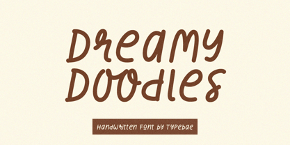 Dreamy Doodles is a stylish and joyful that captures the essence of a modern handwritten marker. It exudes a delightful and lively vibe, perfect for those seeking a refreshing and vibrant aesthetic. This font effortlessly conveys a cool and fashionable impression, making it an excellent choice for those looking to create eye-catching and trendy designs.
 - Anbery by Craft Supply Co,
$20.00 Anbery – Handwriting Font is a playful script typeface that exudes a carefree and fun-loving vibe, perfect for adding a touch of whimsy to your display designs. With its charming, handwritten style, Anbery captures the essence of spontaneity and creativity, making it an ideal choice for projects that aim to convey a sense of playfulness and joy.
 - Wrought by Jon Cartagena,
$10.00 Wrought is a bold geometric display font by Jon Cartagena. It's purpose is to give a rugged, heavy feeling to your designs. Wrought is available in four weights: Thin, Light, Regular, and Bold. Each character is carefully designed to be vertically aligned at the center. This gives Wrought a unique flair, while promoting a harmonious look through each word.
 - Alber New by moretype,
$35.00 Alber New is the revamped version of Alber originally released in 2006. While retaining its original appeal Alber New has been overhauled from the ground up with improved outlines, spacing and kerning. Alber New also boasts an extending character set including small caps, subscript and superscript allowing it to cope with the most demanding of jobs.
 - DEAD MARKER by Aminmario Studio,
$30.00 This is a supercharged font, with natural brush, quick strokes and sharp details. Contains ALL CAPS, numbers, some punctuation and ligature. Perfect for challenging jobs, titles, movie,logos, apparel, t-shirts, hoodies, quotes, product packaging, or anything that needs a typographic turbo-boost and a typographic unique style. Thanks for checking out this font. I hope you enjoy it!
 - Snappy Fingers by Kitchen Table Type Foundry,
$11.00 Description: Snappy Fingers is a remake of a really old font, called Joe Schmoe, which I made for my other foundry years ago. I really like this font, but it needed a lower case and some serious tweaking. Snappy Fingers is a fun, handwritten font. I (now) comes with fantastic language support and a new lease on life!
 - Yourladies by Balpirick,
$15.00 Yourladies is a Modern Handwritten Font. Yourladies is a sweet and delicate handwritten font. Dainty and joyful, this font will be ideal for writing wedding invitations, cards or any other design that may need a romantic, personalized touch! Yourladies also multilingual support. Enjoy the font, feel free to comment or feedback, send me PM or email. Thank you!
 - PF Diplomat Serif by Parachute,
$45.00 Diplomat Serif is a modern serif typeface with Didone characteristics, quite useful for intense editorial jobs. Its open character shapes, low contrast and discreet serifs enhance legibility and provide a fresh, clean and contemporary look. Its matching sans-serif version Diplomat Sans was designed to complement it for demanding publishing and corporate applications. Supports Latin and Greek.
 - Dudek PRO by Hotniedog Studio,
$22.00 Dudek is a highly functional font family. Styles from thin to black with italics for each one, allows to create wide and consistent design systems. I wanted Dudek to be soft and simple. Not too much geometrical, but also not calligraphic in detail. Dudek can help in every day jobs and wide multilingual support leaves no one behind.
 - Brush King by Subectype,
$17.00 Brush King is a supercharged, street-wise brush font bursting with energy, with extra attention to quick strokes and sharp details. This font is perfect for challenging jobs, titles, t-shirts, websites, hoodies, and various print and digital media with energy. Brush King is ideal for logos, apparel, quotes, product packaging, or anything which needs a typographic turbo-boost.
 - LT Hakuna Matata by Latam Type Foundry,
$15.00 Introducing "LT Hakuna Matata" font collection, inspired by The Classic Movie Lion King. Styles: Normal, Outline, Shadow, Ink. Captures Timon and Pumbaa's essence. Normal exudes joy, Outline adds an artistic touch. Shadow creates depth, Ink offers handcrafted charm. Experience African savannah's energy in typography.- Where typography meets the magic of The Lion King. Enjoy! Thank's for Support!
 - Plastic Template JNL by Jeff Levine,
$29.00 Prior to the advent of digital type, many architectural layouts, amateur print projects and a myriad of other lettering jobs were created by the use of routed plastic templates and ink pens. Plastic Template JNL was designed from just one strip of a multi-part template set and replicates the clean lines of the original design.
 - Olpal by Bunny Dojo,
$16.00 A Display Serif, a Monoweight Sans, and an Inline form combining the two, Olpal is a versatile companion for your next adventure. With surprising vitality for a workhorse font, Olpal embraces any job – and whistles while it works. Neutral – with a hint of pizzazz – the font's strong legibility and compressed footprint make it a brilliant fit in any environment.
 - ITC Johnston by ITC,
$29.00ITC Johnston is the result of the combined talents of Dave Farey and Richard Dawson, based on the work of Edward Johnston. In developing ITC Johnston, says London type designer Dave Farey, he did “lots of research on not only the face but the man.” Edward Johnston was something of an eccentric, “famous for sitting in a deck chair and carrying toast in his pockets.” (The deck chair was his preferred furniture in his own living room; the toast was so that he’d always have sustenance near at hand.) Johnston was also almost single-handedly responsible, early in this century, for the revival in Britain of the Renaissance calligraphic tradition of the chancery italic. His book Writing & Illuminating, & Lettering (with its peculiar extraneous comma in the title) is a classic on its subject, and his influence on his contemporaries was tremendous. He is perhaps best remembered, however, for the alphabet that he designed in 1916 for the London Underground Railway (now London Transport), which was based on his original “block letter” model. Johnston’s letters were constructed very carefully, based on his study of historical writing techniques at the British Museum. His capital letters took their form from the best classical Roman inscriptions. “He had serious rules for his sans serif style,” says Farey, “particularly the height-to-weight ratio of 1:7 for the construction of line weight, and therefore horizontals and verticals were to be the same thickness. Johnston’s O’s and C’s and G’s and even his S’s were constructions of perfect circles. This was a bit of a problem as far as text sizes were concerned, or in reality sizes smaller than half an inch. It also precluded any other weight but medium ‘ any weight lighter or heavier than his 1:7 relationship.” Johnston was famously slow at any project he undertook, says Farey. “He did eventually, under protest, create a bolder weight, in capitals only ‘ which took twenty years to complete.” Farey and his colleague Richard Dawson have based ITC Johnston on Edward Johnston’s original block letters, expanding them into a three-weight type family. Johnston himself never called his Underground lettering a typeface, according to Farey. It was an alphabet meant for signage and other display purposes, designed to be legible at a glance rather than readable in passages of text. Farey and Dawson’s adaptation retains the sparkling starkness of Johnston’s letters while combining comfortably into text. Johnston’s block letter bears an obvious resemblance to Gill Sans, the highly successful type family developed by Monotype in the 1920s. The young Eric Gill had studied under Johnston at the London College of Printing, worked on the Underground project with him, and followed many of the same principles in developing his own sans serif typeface. The Johnston letters gave a characteristic look to London’s transport system after the First World War, but it was Gill Sans that became the emblematic letter form of British graphic design for decades. (Johnston’s sans serif continued in use in the Underground until the early ‘80s, when a revised and modernized version, with a tighter fit and a larger x-height, was designed by the London design firm Banks and Miles.) Farey and Dawson, working from their studio in London’s Clerkenwell, wanted to create a type family that was neither a museum piece nor a bastardization, and that would “provide an alternative of the same school” to the omnipresent Gill Sans. “These alphabets,” says Farey, referring to the Johnston letters, “have never been developed as contemporary styles.” He and Dawson not only devised three weights of ITC Johnston but gave it a full set of small capitals in each weight ‘ something that neither the original Johnston face nor the Gill faces have ‘ as well as old-style figures and several alternate characters. - Lemon Grass by Zain Fahroni is a captivating typeface that embodies the essence of modernity blended with a touch of organic whimsy. Its design is a refreshing departure from the conventional, bringi...
- Arabella by profonts,
$51.99 Ralph M. Unger, (Arno Drescher), 2006, (1936) Originally, Arabella Pro was designed by Arnold Drescher around 1936/1939. Drescher created this wonderful script for former Germany type foundry Joh. Wagner. The typeface has been redesigned, digitized, completed and expanded as OpenType Pro in the profonts studio.Arabella Pro comes in two versions, light and medium, each with a large selection of manually designed ligatures and alternates, i.e. swashed upper case to make this naturally flowing script design a perfect font for OTF-savvy applications like e.g. InDesign or Quark Xpress 7.Arabella Pro light and medium are perfect partners for any sans serif, especially for Futura. It is perfectly suited for anything in the area of headlines, posters, invitations etc. However, since it is very well legible, it can also be used individually for small text blocks.
 - Stampoo by Typodermic,
$11.95 Welcome to the world of Stampoo, where creativity meets typography. This isn’t your run-of-the-mill typeface—this is a joyful, wild, and curvaceous font that is guaranteed to make your words pop. When you use Stampoo, your message will be transformed from a mundane statement to a laid-back expression of kindness. It’s like giving your words a warm hug, but without the awkwardness of physical contact. The rubber stamp letterforms are as natural as the grass under your feet, and the bespoke pairs will make your text flow like a mountain stream. But Stampoo isn’t just a pretty face. Oh no! This font is a true workhorse, designed to make your life easier. With OpenType ligatures, those tricky letter combinations are replaced by bespoke pairs, making your text look more natural and realistic. It’s like having a personal typographer at your fingertips, without the exorbitant hourly rate. So why settle for boring, run-of-the-mill typography when you can have the natural, creative, and joyful letterforms of Stampoo? Add a touch of whimsy to your next project, and let Stampoo do the heavy lifting. Your audience will thank you for it. Some Latin-based European writing systems are supported, including the following languages. Afaan Oromo, Afar, Afrikaans, Albanian, Alsatian, Aymara, Basque, Bemba, Bikol, Breton, Cape Verdean, Creole, Catalan, Cebuano, Chamorro, Chavacano, Danish, Dawan, Dholuo, Dutch, English, Estonian, Faroese, Fijian, Filipino, Finnish, French, Frisian, Friulian, Galician, Genoese, German, Guadeloupean Creole, Haitian Creole, Hiligaynon, Icelandic, Ilocano, Indonesian, Irish, Italian, Jamaican, Kaqchikel, Kikongo, Kinyarwanda, Kirundi, Lombard, Low Saxon, Luxembourgish, Makhuwa, Malay, Ndebele, Neapolitan, Norwegian, Novial, Occitan, Papiamento, Piedmontese, Portuguese, Quechua, Rarotongan, Romansh, Sango, Saramaccan, Sardinian, Scottish Gaelic, Shona, Sicilian, Silesian, Slovak, Slovenian, Somali, Sotho, Spanish, Swahili, Swazi, Swedish, Tagalog, Tetum, Tshiluba, Tsonga, Tswana, Tumbuka, Uzbek (Latin), Venetian, Võro, Walloon, Waray-Waray, Wayuu, Xhosa, Yapese, Zapotec Zulu and Zuni.
 - Birmingham New Street by Greater Albion Typefounders,
$12.50 Birmingham New Street is the latest updated development of a typeface family inspired by the hand lettered title on a 19th century railway map. The map, prepared by the London and North Western Railway was headed "Birmingham and environs". New Street, meanwhile is the great 19th century commercial road linking the city centre of Birmingham with the train station of the same name. So, in a spirit of 19th century enterprise, we present "Birmingham New Street", a fun family of three display faces, laden with open type features and late Victorian charm, ideal for posters, book covers and any other high flown design you might have in mind.
