10,000 search results
(0.058 seconds)
- Tooned Out JNL by Jeff Levine,
$29.00Tooned Out JNL gives a serif treatment to the cartoon-inspired lettering of Toon-In JNL. Both fonts are great for any casual or fun messages or themes. - House Easter by Gilar Studio,
$16.00 House Easte a Handwritten Display Font With 3 Style (Regular,Outline and Shadow) You Can Mix And Match for Your Awesome Project This fonts is ideal for crafting, branding and decorate your any project. This fonts are perfect for wedding invitation or your blog. Also with their help, you can create a logo or beautiful frame for your home. Or just use for your business, book covers, stationery, marketing, magazines and more. FEATURES : Uppercase & Lowercase Number & Punctuation More than 244 of glyphs PUA Encode 10 Ligatures Alternate 8 OpenType features were detected in the font (aalt dlig frac liga ordn salt sups kern) Support for 67 languages detected The alternative characters were divided into several Open Type features can be accessed by using Open Type savvy programs such as Adobe Illustrator, Adobe InDesign, Adobe Photoshop Corel Draw X version, And Microsoft Word. And this Font has given PUA unicode (specially coded fonts). so that all the alternate characters can easily be accessed in full by a craftsman or designer. Check my other Font here https://gilarstudio.com/
 - Magical Story by Gilar Studio,
$16.00 Magical Story a Handwritten Display Font With 3 Style (Regular,Outline and Shadow) You Can Mix And Match for Your Awesome Project This fonts is ideal for crafting, branding and decorate your any project. This fonts are perfect for wedding invitation or your blog. Also with their help, you can create a logo or beautiful frame for your home. Or just use for your business, book covers, stationery, marketing, magazines and more. FEATURES : Uppercase & Lowercase Number & Punctuation More than 240 of glyphs PUA Encode 14 Ligatures Alternate 8 OpenType features were detected in the font (aalt dlig frac liga ordn salt sups kern) Support for 67 languages detected The alternative characters were divided into several Open Type features can be accessed by using Open Type savvy programs such as Adobe Illustrator, Adobe InDesign, Adobe Photoshop Corel Draw X version, And Microsoft Word. And this Font has given PUA unicode (specially coded fonts). so that all the alternate characters can easily be accessed in full by a craftsman or designer. Check my other Font here https://gilarstudio.com/
 - Nona Manis by Gilar Studio,
$16.00 Nona Manis is a Handwritten Display Font With 3 Style (Regular,Outline and Shadow) You Can Mix And Match for Your Awesome Project This fonts is ideal for crafting, branding and decorate your any project. This fonts are perfect for wedding invitation or your blog. Also with their help, you can create a logo or beautiful frame for your home. Or just use for your business, book covers, stationery, marketing, magazines and more. FEATURES : Uppercase & Lowercase Number & Punctuation More than 244 of glyphs Support for 60+ Multilingual languages PUA Encode 12 Ligatures Alternate 7 OpenType features ( aalt dlig frac liga ordn sups kern ) The font Nona Manis contains 18 ligatures in 3 OpenType features The alternative characters were divided into several Open Type features can be accessed by using Open Type savvy programs such as Adobe Illustrator, Adobe InDesign, Adobe Photoshop Corel Draw X version, And Microsoft Word. And this Font has given PUA unicode (specially coded fonts). so that all the alternate characters can easily be accessed in full by a craftsman or designer. Check my other Font here https://gilarstudio.com/
 - Mavitya by Dora Typefoundry,
$19.00 Mavitya is a serif font with a classic but modern style with smooth curves and beautiful binding, consisting of regular and condensed versions with four types. allowing for a very sophisticated and contemporary approach to typography and the unique look of the font it also features ligatures and multi-language support. This font is made perfect for application especially on logos, and many other formal forms Mavitya provides a distinct, creative and expressive message for your branding, advertising, packaging, headlines, magazines, websites and other large projects. Feature: - 4 Font Weights — Regular, Condensed - Numbers & Symbols - Supported Languages - Alternatives and Ligatures - PUA coded What's included: - Mavitya Regular + Oblique - Mavitya Condensed + Oblique We strongly recommend using programs that support OpenType features and Glyphs panels such as Adobe and Corel Draw applications, so you can view and access all Glyph variations. Families like this have become a true labor of love, making it as easy and enjoyable as possible. I really hope you enjoy it! Thank you Enjoy the font and be creative :)
 - Wolpe Fanfare by Monotype,
$50.99 “Fanfare is such a fun typeface,” says Toshi Omagari, who revived the design for The Wolpe Collection. “It was my happiest discovery when I was digging through the Monotype archive. I came across it and had to check the designer’s name.” No wonder: Fanfare is modern, light and playful – not what you’d expect from an 80-year old design. From the original, very heavy weight design, Omagari started by creating a black weight, followed by four lighter weights for Wolpe Fanfare, preserving the character of the letterforms all the way down to a thin version. “I wanted to do more than digitize the original weight,” he says. “It’s surprisingly modern, and its skeleton, its basic structure, is so beautiful.” The new design packs more into a small space than most typefaces. It’s a natural for publication and advertising design. With displays capable of revealing fine details such as Fanfare’s subtly slanted baseline, its lovely forms will easily translate to mobile devices. With an extended European character set that includes Greek and Cyrillic language support, Wolpe Fanfare can speak in many languages.
 - ITC Johnston by ITC,
$29.00ITC Johnston is the result of the combined talents of Dave Farey and Richard Dawson, based on the work of Edward Johnston. In developing ITC Johnston, says London type designer Dave Farey, he did “lots of research on not only the face but the man.” Edward Johnston was something of an eccentric, “famous for sitting in a deck chair and carrying toast in his pockets.” (The deck chair was his preferred furniture in his own living room; the toast was so that he’d always have sustenance near at hand.) Johnston was also almost single-handedly responsible, early in this century, for the revival in Britain of the Renaissance calligraphic tradition of the chancery italic. His book Writing & Illuminating, & Lettering (with its peculiar extraneous comma in the title) is a classic on its subject, and his influence on his contemporaries was tremendous. He is perhaps best remembered, however, for the alphabet that he designed in 1916 for the London Underground Railway (now London Transport), which was based on his original “block letter” model. Johnston’s letters were constructed very carefully, based on his study of historical writing techniques at the British Museum. His capital letters took their form from the best classical Roman inscriptions. “He had serious rules for his sans serif style,” says Farey, “particularly the height-to-weight ratio of 1:7 for the construction of line weight, and therefore horizontals and verticals were to be the same thickness. Johnston’s O’s and C’s and G’s and even his S’s were constructions of perfect circles. This was a bit of a problem as far as text sizes were concerned, or in reality sizes smaller than half an inch. It also precluded any other weight but medium ‘ any weight lighter or heavier than his 1:7 relationship.” Johnston was famously slow at any project he undertook, says Farey. “He did eventually, under protest, create a bolder weight, in capitals only ‘ which took twenty years to complete.” Farey and his colleague Richard Dawson have based ITC Johnston on Edward Johnston’s original block letters, expanding them into a three-weight type family. Johnston himself never called his Underground lettering a typeface, according to Farey. It was an alphabet meant for signage and other display purposes, designed to be legible at a glance rather than readable in passages of text. Farey and Dawson’s adaptation retains the sparkling starkness of Johnston’s letters while combining comfortably into text. Johnston’s block letter bears an obvious resemblance to Gill Sans, the highly successful type family developed by Monotype in the 1920s. The young Eric Gill had studied under Johnston at the London College of Printing, worked on the Underground project with him, and followed many of the same principles in developing his own sans serif typeface. The Johnston letters gave a characteristic look to London’s transport system after the First World War, but it was Gill Sans that became the emblematic letter form of British graphic design for decades. (Johnston’s sans serif continued in use in the Underground until the early ‘80s, when a revised and modernized version, with a tighter fit and a larger x-height, was designed by the London design firm Banks and Miles.) Farey and Dawson, working from their studio in London’s Clerkenwell, wanted to create a type family that was neither a museum piece nor a bastardization, and that would “provide an alternative of the same school” to the omnipresent Gill Sans. “These alphabets,” says Farey, referring to the Johnston letters, “have never been developed as contemporary styles.” He and Dawson not only devised three weights of ITC Johnston but gave it a full set of small capitals in each weight ‘ something that neither the original Johnston face nor the Gill faces have ‘ as well as old-style figures and several alternate characters. - Old Kharkiv by Bohdan Hdal,
$24.00 Old Kharkiv was inspired by the first half of the 20th century photo with a signage on the building of the Ivan Kotlyarevsky Kharkiv National University of Arts. During the development, the font has acquired unique features not from the original signage, for example, drops in uppercase were replaced with sharp serifs. This font contains the letters of all the main European languages, Cyrillic and basic special characters. Some uppercase letters (where allowed their form) have decorative elements (swashes) to use them as drop caps or initials. There are stylistic alternatives for some Ukrainian letters. Also, as a bonus, this font contains up to a dozen graphic elements that you can use in your layout.
 - Tangier by Viswell,
$17.00 Tangier is a contemporary display serif font that embodies a refined sense of style and elegance. With its sleek and modern design, Tangier is perfect for use in a variety of creative projects, such as logos, titles, and headlines. The font comes in two styles - regular and italic - both of which feature strong contrast between thick and thin lines. The regular style is perfect for creating attention-grabbing headlines or adding a touch of sophistication to body text, while the italic style can be used to add a stylish flair to subheadings or pull quotes. Tangier's strong serifs give it a classic and timeless feel, while its modern design adds a touch of contemporary flair. Its versatility makes it suitable for use in a wide range of settings, from high-end branding and marketing materials to editorial and fashion layouts.
 - Vintagedeck by Ditatype,
$29.00 Vintagedeck is a charming script font that gracefully combines vintage elegance with contemporary style. Each character in Vintagedeck is crafted with care. Designed with a fairly thick weight and a shape that gently nods to rounded forms, Vintagedeck is a versatile font that brings a touch of welcoming feel. The overall looks create a warm, approachable aesthetic reminiscent of classic handwriting, yet perfectly suited for the demands of current design trends. To truly appreciate the beauty and clarity of this font, it is recommended to use it in a larger font size. This not only improves readability but also allows its unique characteristics to shine. In addition, enjoy the features here. Features: Ligatures Stylistic Sets Multilingual Supports PUA Encoded Numerals and Punctuations Vintagedeck fits in headlines, logos, posters, flyers, branding materials, greeting cards, print media, editorial layouts, and many more designs. Find out more ways to use this font by taking a look at the font preview. Thanks for purchasing our fonts. Hopefully, you have a great time using our font. Feel free to contact us anytime for further information or when you have trouble with the font. Thanks a lot and happy designing.
 - Tropical Times by Sarid Ezra,
$19.00 Introducing Tropical Times - a handwritten tropical vibes font Tropical Times is a bold handwritten typeface with tropical and summer vibes. You can use this font for any purpose, especially for quotes, branding, book cover, or even merchandise. With stylish ligatures that will make your project more natural and handmade.This font also support multilingual.
 - Looky Cookie NF by Nick's Fonts,
$10.00Hey, take a look at this! This typeface is just for fun, whenever you want to invite folks to take a gander, cast their eyes your way or otherwise check you out. Both versions include complete Latin 1252, Central European 1250 and Turkish 1524 character sets, with localization for Moldovan, Romanian and Turkish. - Brillany by Solidtype,
$14.00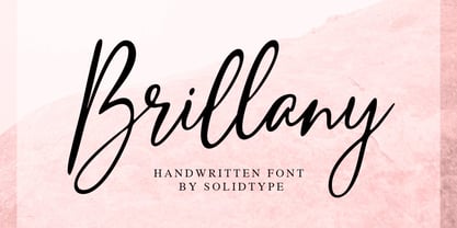 Brillany is a simple handwritten script font, modern and fashionable. This elegant font is legible and looks great as a headline or in body text. This font will perfect for many different project for blogging, social media, branding, wedding invites, cards etc. Including ligatures, uppercase and lowercase, punctuation and multiple languages support.
 - Power Smash by Crumphand,
$20.00 Power Smash is a cool and bold display font. Whether you use it for cartoon-related designs, children’s games, or just any creation that requires a playful touch, this font will be an amazing choice. Whats Included ? Uppercase Lowercase Symbols Numerals European Multilingual Also Outline, Shadow One, Shadow Two Thank for stopping by.
 - Hypnotica by Deniart Systems,
$15.00 Hypnotize your audience! For a truly unusual eye-catching experience, this modern-day series, containing 52 geometrical and optical mofifs, can bewitch and fool the eyes with unexpected shifts in focus. Whether your documents are for print or screen, these symbols are sure to add a little fun to all your presentations.
 - Ready Kid by Flying Fuzzball,
$22.00 Ready Kid is a versatile, funky display typeface that is inspired by freehand signpainting with a dose of childhood nostalgia. It's perfect for children's birthday party invitations, punk band marketing, or packaging for art supplies. There are six sets of stylistic alternatives, 340+ ligatures, and 1200+ glyphs that cover over 200 languages.
 - Just Kidding by Gassstype,
$23.00 Here comes a New font,Introducing Just Kidding is Sans Display Font,This Font Authentic that is written casually and quickly. Then scanned and carefully drawn into vector format. This handmade font will make your design has a beautiful natural touch for each details. It is perfect for any design project as Invitation,logo, book cover, craft or any design purposes.this font is great for your creative projects such as watermark on photography, and perfect for logos & branding, invitation,advertisements,product designs, stationery, wedding designs,label ,product packaging, special events or anything that need handwritting taste.
 - The Blackport by Ironbird Creative,
$15.00 The Blackport Font Pack! is a Hand Drawn Font Pack. This Fonts gives a feel of vintage, classic, old, handmade looked like. This font also already PUA Encoded and I think this font is perfect for people looking for vintage aesthetic or Hand Made font. Come with 2 font styles, Regular and Stamp (Except The Blackport hand-drawn). Suitable for any graphic designs such as branding materials, t-shirt, print, label, logo, poster, t-shirt, photography, quotes .etc NOTE : For all the characters are also available, accessible in the Adobe Illustrator Glyphs Panel, or in Adobe Photoshop Character Open Type Panel.
 - FS Untitled Variable by Fontsmith,
$319.99Developer-friendly The studio has developed a wide array of weights for FS Untitled – 12 in all, in roman and italic – with the intention of meeting every on-screen need. All recognisably part of a family, each weight brings a different edge or personality to headline or body copy. There’s more. Type on screen has a tendency to fill in or blow so for each weight, there’s the choice of two marginally different versions, allowing designers and developers to go up or down a touch in weight. They’re free to use the font at any size on any background colour without fear of causing optical obstacles. And to make life even easier for developers, the 12 weight pairs have each been designated with a number from 100 (Thin) to 750 (Bold), corresponding to the system used to denote font weight in CSS code. Selecting a weight is always light work. Easy on the pixels ‘It’s a digital-first world,’ says Jason Smith, ‘and I wanted to make something that was really functional for digital brands’. FS Untitled was made for modern screens. Its shapes and proportions, x-height and cap height were modelled around the pixel grids of even low-resolution displays. So there are no angles in the A, V and W, just gently curving strokes that fit, not fight, with the pixels, and reduce the dependency on font hinting. Forms are simplified and modular – there are no spurs on the r or d, for example – and the space between the dot of the i and its stem is larger than usual. The result is a clearer, more legible typeface – functional but with bags of character. Screen beginnings FS Untitled got its start on the box. Its roots lie in Fontsmith’s creation of the typeface for Channel 4’s rebrand in 2005: the classic, quirky, edgy C4 headline font, with its rounded square shapes (inspired by the classic cartoon TV shape of a squidgy rectangle), and a toned-down version for use in text, captions and content graphics. The studio has built on the characteristics that made the original face so pixel-friendly: its blend of almost-flat horizontals and verticals with just enough openness and curve at the corners to keep the font looking friendly. The curves of the o, c and e are classic Fontsmith – typical of the dedication its designers puts into sculpting letterforms. Look out for… FS Untitled wouldn’t be a Fontsmith typeface if it didn’t have its quirks, some warranted, some wanton. There’s the rounded junction at the base of the E, for example, and the strong, solid contours of the punctuation marks and numerals. Notice, too, the distinctive, open shape of the A, V, W, X and Y, created by strokes that start off straight before curving into their diagonal path. Some would call the look bow-legged; we’d call it big-hearted. - FS Untitled by Fontsmith,
$80.00 Developer-friendly The studio has developed a wide array of weights for FS Untitled – 12 in all, in roman and italic – with the intention of meeting every on-screen need. All recognisably part of a family, each weight brings a different edge or personality to headline or body copy. There’s more. Type on screen has a tendency to fill in or blow so for each weight, there’s the choice of two marginally different versions, allowing designers and developers to go up or down a touch in weight. They’re free to use the font at any size on any background colour without fear of causing optical obstacles. And to make life even easier for developers, the 12 weight pairs have each been designated with a number from 100 (Thin) to 750 (Bold), corresponding to the system used to denote font weight in CSS code. Selecting a weight is always light work. Easy on the pixels ‘It’s a digital-first world,’ says Jason Smith, ‘and I wanted to make something that was really functional for digital brands’. FS Untitled was made for modern screens. Its shapes and proportions, x-height and cap height were modelled around the pixel grids of even low-resolution displays. So there are no angles in the A, V and W, just gently curving strokes that fit, not fight, with the pixels, and reduce the dependency on font hinting. Forms are simplified and modular – there are no spurs on the r or d, for example – and the space between the dot of the i and its stem is larger than usual. The result is a clearer, more legible typeface – functional but with bags of character. Screen beginnings FS Untitled got its start on the box. Its roots lie in Fontsmith’s creation of the typeface for Channel 4’s rebrand in 2005: the classic, quirky, edgy C4 headline font, with its rounded square shapes (inspired by the classic cartoon TV shape of a squidgy rectangle), and a toned-down version for use in text, captions and content graphics. The studio has built on the characteristics that made the original face so pixel-friendly: its blend of almost-flat horizontals and verticals with just enough openness and curve at the corners to keep the font looking friendly. The curves of the o, c and e are classic Fontsmith – typical of the dedication its designers puts into sculpting letterforms. Look out for… FS Untitled wouldn’t be a Fontsmith typeface if it didn’t have its quirks, some warranted, some wanton. There’s the rounded junction at the base of the E, for example, and the strong, solid contours of the punctuation marks and numerals. Notice, too, the distinctive, open shape of the A, V, W, X and Y, created by strokes that start off straight before curving into their diagonal path. Some would call the look bow-legged; we’d call it big-hearted.
 - Mymra by TipografiaRamis,
$35.00 Mymra fonts – an upgraded version of Mymra Forte and Mymra Mono (2009), with a careful re-dress of glyph shapes, and the extension of glyph amounts – which enables support of more Latin languages. One more weight – Black – has been added to the original three of Mymra Forte fonts. Fonts are intended for use in a vast variety of publications.
 - Nerut by Ergibi Studio,
$16.00 "SULTAN" is a serif font. It has a vintage form with the addition of modern decorative and minimalist shape. Fonts consist of special uppercase letters and alternate characters. fonts are multilingual support and are perfect for logos, branding, mockups, t-shirts, branding, and various needs that want this vintage form I hope you like our font Ergibi Studio
 - Estika by ZetDesign,
$15.00 estika is a modern handwritten font and pays attention to the anatomy of some text to create a flexible yet elegant form. This font is available in regular and italic forms with open type features to enrich the choice of style when used. This font is perfect for informal uses while maintaining the beauty of writing
 - Aphrodite Slim by Typesenses,
$57.00 Aphrodite Slim Pro is not just a lighter version of its sister Aphrodite Pro. Aphrodite Slim Pro has duplicated the quantity of characters of its partner, and that means more than 500 new glyphs, reaching a total of more than 1000. More delicate and meticulous, Aphrodite Slim Pro is once more a new typography with deep calligraphic ideals: We immersed ourselves into the world of each calligraphy ductus and each calligraphy masters by studying from decoration to lettering books. This was the key for the logic of Aphrodite Slim’s behavior. The new concept of Aphrodite Slim Pro was to join diverse styles of calligraphy in one in order to achieve an autonomous expressiveness, in fact, this is what calligraphy aims to, and we agreed to bring those ideals to the world of typography: It is justifiable to be inspired in hundred-year-old calligraphies, but it is even better if the results you obtain have a plus. A personal plus. During the creation process we were wondering whether it was possible to mix certain strokes of such rigid styles as uncial, (Li·n’s favourite style), with strokes of the copperplate, (Sav’s favourite style), and also to take and mix cualities of cancelleresca cursiva, formata and moderna; finally giving our creation a roman-transition italic look. So Aphrodite Slim takes ideals and aspects from those formal styles, following its own logic though, and emphasizing the fact of being a decorative typography. Calligraphy masters of our past are who we are in debt with. They are the cause we have lovely letters now. They have been spontaneous at the moment of creation, what differs from the type-designers of nowadays, whose spontaneity is more limited. Digital faces that we are used to see these days are a result of long hours of optical adjustments, grids, macros and inspirations of other existing typography, but without personal contributions. Aphrodite Slim wants to refute this. Its mission is to rescue de spontaneity of the artesanal lettering in order to obtain unique words; those which only calligraphy masters of our past or lettering artists of our present could give us. We have worked hard to achieve this, making Aphrodite the most universal font we could: It was necessary to study the most common words, focalizing more in the ones referring to “sensitivity”, of four of the most spoken languages in the world. Aphrodite Slim has an enormous quantity of decorative characters and special ligatures for phrases and words in English, French, Spanish and German. (See English, Français, Español, Deutsch PDF in the gallery section). We promise there is no existing type that decorates/ligates glyphs and words like Aphrodite Slim does: It is the first time a font like this really considers its purpose. -The way glyphs are ligated is insane- : Aphrodite Slim rescues some ideals of persons like Jan van den Velde (Italian cancilleresca writing of XVI Century) who understands ascenders and descenders as possibilities to beautify the lines of writing with curved strokes that seem to be dancing above and below of the words. This master also creates ascenders and descenders even where they are not necessary, on letters that do not actually need them: Aphrodite Slim takes this ideal. The font counts with a wide range of glyphs that seem not to be satisfied with its more primitive form and prefer to extreme their parts to be decorative. It also existed masters of calligraphy like José de Casanova of XVII Century, who, with a magnificant skill and a really personal mark, had the particularity of ligating words that were actually separated with spaces. This is another innovative feature in Aphrodite Slim. An investigation of the most common beginnings and endings words of the English language was done. Having that feature activated (discretionary ligatures), common words will start to ligate or to be decorated even when they are separated by spaces. Impossible to forget Francesco Periccioli of XVII Century and our experience us designers to face with works of him: His letters, that today are included in the group of cancellerescas modernas, have been a direct inspiration to the oldstyle figures and historical forms variables in Aphrodite Slim. Giovanni Antonio Tagliente (XVI Century) and his particular way of making tails and diagonals longer than usual, qualities that our creation reflects too. Finally, our adventures in Biblioteca Nacional and Barrio San Telmo, Buenos Aires, were essential for us to make Aphrodite Slim more complete and interesting: Sav did an excellent work when studying how the decorative miscellanea and swirls of early XX century were. She also investigated what particularities made those roman titling characters look antique so she could rescue some ideals for the oldstyle figures and historical forms variables. This also leaded her to create the ornaments variable in Aphrodite Slim. We are really proud of presenting Aphrodite Slim Pro, a typography that was the result of days and nights of working hard, because we do love what we do; and we are glad we are living in a present that gives us the possibility to spread this kind of art, because that is the way we consider our job: Aphrodite Slim Pro is Art. Hope you can appreciate the enormous work this type has. Features. Aphrodite Slim Pro is the most complete variable. It includes more than 1000 glyphs. Thanks to the Open-Type programming, it counts with a easy way to change/alternate glyphs if the application in which the font is used supports this. The variables contained in Aphrodite Slim Pro are also offered separately. Aphrodite Slim Text: It is the variable for lines and paragraphs. Thus it is the least ornamental and the most accurate to achieve a satisfying legibility. It has the Standard Ligatures feature in order to improve the possible conflicts some glyphs could have by others. Aphrodite Slim Contextual: It is the one that makes emphasis in decorating. It has the particularity of ligating/decorating words of common use in English, French, Spanish and German. It also has the quality of ligating common beginnings and endings of the common words in English. Aphrodite Slim Stylistic: With similar features of Slim Contextual. It includes a set of decorative numbers for a display use. Aphrodite Slim Swash: This one has special beginnings and endings to decorate words. Aphrodite Slim Endings: It makes words look as a signature. Aphrodite Slim Historical: It adds an antique look to the written word. It also has the special historical ligature function. Aphrodite Slim Titling: This one is the most decorative. Its copperplate inspired ornaments give words a special color, in order to handle the quantity of decoration, it comes with the standard ligature feature, which has the most common ligatures plus others that make decorative swirls not to be conflictive. Aphrodite Slim Ornaments: A set of 52 ornaments. Aphrodite Slim Pro includes all this features plus the Stylistic Set 1; Stylistic Set 2 and the possibility of Slashed Zero. We recommend you to check out the gallery in order to see all these features in action.
 - Droid Sans Mono by Ascender,
$92.99 Droid Sans Pro Mono is a humanist sans serif typeface designed by Steve Matteson, Type Director of Ascender Corp. Droid Sans Mono features a fixed width (non-proportional) which is useful for developers to see code in a tabular setting and for viewing emails and other screens. Droid Sans is an approachable, friendly set of typefaces optimized for display on screen. Droid Sans Mono was designed to provide optimal quality and legibility. It features upright stress, open forms and a neutral appearance. Droid Sans Mono was optimized for user interfaces and to be comfortable for reading on a mobile handset in menus, web browser and other screen text. The Droid Sans Pro Mono Regular font contains Old Style Figures (requires an application that support advanced OpenType typographic features) and extensive character set coverage including Western Europe, Eastern/Central Europe, Baltic, Cyrillic, Greek and Turkish support.
 - AC Honey Bee by Will Albin-Clark,
$35.00 Honey Bee is a type family developed over the course of 2020. Consisting of two sub-families that share the same DNA of two opposing styles. Honey Bee Serif is a transitional modern serif with some reference to fundamental letterforms. Honey Bee Sans is a low contrast semi-geometric sans serif with bold rounded letterforms. These typefaces were made in unison, designed for perfect font pairing for a variety of projects and intensions. It’s design is ideal for small and large scale, with the distinct characters of the Sans family and funky headlines or titles with the stylistic Serif Italic. Super legible and a variety of characters allow for multi-lingual use.
 - Hello Cantika Script by madjack.font,
$18.00 Introduce, Hello Cantika Script with beautiful handwriting style. Equipped with a flying machine. Hello Cantika Script is perfect for branding projects, home appliance design, product packaging, use in business cards, invitation cards, etc. Simply as a stylish text overlay onto a background image or anything else that needs a touch of elegance. To enable the OpenType Stylistic alternative, you need a program that supports OpenType features such as Adobe Illustrator CS, Adobe Indesign & CorelDraw X6-X7, Microsoft Word 2010 or later. There are additional ways to swash, using the Character Map (Windows), Nexus Font (Windows), Font Book (Mac) or a software program such as PopChar (for Windows and Mac). How to access all alternative characters, using Windows Character Map with Photoshop: https://www.youtube.com/watch?v=Go9vacoYmBw How to access all alternative characters using Adobe Illustrator: http://youtu.be/iptSFA7feQ0 How to use the font style set in Microsoft Word 2010 or later versions: https://youtu.be/x1A_ilsBsGs Thanks for checking! I really hope you enjoy it. Thank you.
 - Kettiy Zalliya Script by Supotype Studio,
$16.00 Kettiy Zalliya Script with beautiful handwriting style. Equipped with a flying machine. Kettiy Zalliya Script is perfect for branding projects, home appliance design, product packaging, use in business cards, invitation cards, etc. Just as a stylish text overlay onto a wallpaper or anything else that needs a touch of elegance. To enable the OpenType Stylistic alternative, you need a program that supports OpenType features such as Adobe Illustrator CS, Adobe Indesign & CorelDraw X6-X7, Microsoft Word 2010 or later. There are additional ways to swash, using the Character Map (Windows), Nexus Font (Windows), Font Book (Mac) or a software program such as PopChar (for Windows and Mac). How to access all alternative characters, using Windows Character Map with Photoshop: https://www.youtube.com/watch?v=Go9vacoYmBw How to access all alternative characters using Adobe Illustrator: http://youtu.be/iptSFA7feQ0 How to use the font style set in Microsoft Word 2010 or later versions: https://youtu.be/x1A_ilsBsGs Thanks for checking! I really hope you enjoy it. Thank you.
 - Glowing Shine by Nk Studio,
$18.00 introduce Glowing Shine with beautiful handwriting style. Equipped with 300+ glyphs. Glowing Shine is perfect for branding projects, home appliance design, product packaging, use in business cards, invitation cards, etc. Just like a stylish text overlay to a background image or anything else that needs a touch of elegance. To enable the OpenType Stylistic alternative, you need a program that supports OpenType features such as Adobe Illustrator CS, Adobe Indesign & CorelDraw X6-X7, Microsoft Word 2010 or a later version. There are additional ways to swash, using the Character Map (Windows), Nexus Font (Windows), Font Book (Mac) or a software program like PopChar (for Windows and Mac). How to access all alternative characters, using the Windows Character Map with Photoshop: https://www.youtube.com/watch?v=Go9vacoYmBw How to access all alternative characters using Adobe Illustrator: http://youtu.be/iptSFA7feQ0 How to use the font style set in Microsoft Word 2010 or later versions: https://youtu.be/x1A_ilsBsGs Thanks for checking! I really hope you enjoy it. Regards Nk Studio
 - Alleghieri by Scriptorium,
$18.00Alleghieri was developed from several different examples of late Renaissance lettering. While it is based on a style which is clearly intended for quick, easy writing, we've preserved many of the unusual character forms and elaborations to give it a lot of personality. The result is stylish and unique, with a real feel of the Renaissance, but great readability as well. The full version includes a large selection of variant character forms and special characters. - Mokka by Ludwig Type,
$45.00 Mokka is a robust and crisp typeface with strong serifs and individual forms. Even in text and striking in display, it is suitable for a wide variety of uses. The style-linked family includes oldstyle and lining figures both tabular and proportional.
 - Science Fair JNL by Jeff Levine,
$29.00 Science Fair JNL emulates the effect of connecting the broken lines of a stencil alphabet into a solid letter form, such as many students did for posters on their science project. In this case, the base font was Jeff Levine's Paramilitary JNL.
 - Aqua Bubble by Rachel McBride Creative,
$9.00 Aquarian Bubble is a stackable font that's perfect for any project that needs quirk, youth, or fun without being illegible or exaggeratively dramatic. It comes with eight styles to suit any aesthetic or occasion. With a glyph count of 433, Aquarian Bubble supports most western languages.
 - DT Meman by DT Foundry,
$25.00 Meman is a practical sans serif that was enthusiastic about adding details to have more personality compared to a neo-grotesque typeface. The typeface was crafted between the concepts of mechanical oval forms and serpentine curves, with the help from open terminals, contrast joints. These 2 concepts are very different, but they balanced each other to help remain the neutral feeling as a whole. Many details are optimized so that on small scales, Meman has nothing special. But when use on bigger scales, letters are revealed to have been dived in visual flourishes, such as the "e". Also, to avoid broken fragments and remain neutral, some details were converted to alternatives. Meman has 9 upright weights (from Thin to Black), and some OpenType features like fractions, ligatures, custom decorative icons, and alternatives for "A", "E", "V", "Z", ... or "a". There are more than 660 glyphs, which support a wide range of Latin languages, including Vietnamese. For usability, the typeface was balanced and versatile, it can be pinned up as a headline or logo, and can still blend in a small paragraph.
 - Kotadaila by Gatype,
$17.00 Kotadaila is a script font that includes a complete set of uppercase and lowercase letters, multilingual symbols, numbers, punctuation, alternatives and ligatures. This font has a Modern Elegant Style, perfect for branding, logos, invitations, masterheads and more. Kotadaila features OpenType style alternatives, International binders and support for most Western Languages included. To enable the OpenType Stylistic alternative, you need a program that supports OpenType features such as Adobe Illustrator CS, Adobe Indesign & CorelDraw X6-X7, Microsoft Word 2010 or later. Thank you very much for viewing and Enjoying it.
 - Hermit by Davide Romito,
$106.00 Hermit was born like a modern and personal reinterpretation of Gothic-style alphabets, where improvisation and personal taste have led the design towards a new aesthetic mix between gothic and modern typefaces, creating new glyphs with tweaked strokes to achieve a good level of legibility. Hermit is a modern gothic font designed for brave designers and for epic designs, available in three weights and variable fonts. It is good to use for Branding and Editorial projects with texts not too small, Advertising, Packaging, Labeling, and Book or Magazine titles.
 - Rumbles Arena by Hanzel Space,
$25.00 Rumble sans serif. Combines elegant in letters, making this font look exclusive and elegant. With high letters display and thin in the anatomy of each letter. Rumble is a gorgeous sans-serif typeface that is both classically elegant and inherently modern. Create beautiful wedding invitations, use it as an elegant solution for your next magazine layout, or choose Rumble for any graphics that require a Elegant look with a vintage flair.. Rumble is based on classic letterforms for publishing and display graphics, so you can give your text a classic, elegant feel with Rumble clean.
 - Badjigoer by Gatra Std,
$10.00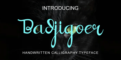 Introducing a cute handwriting "Badjigoer" Handwritten Calligraphy Typeface! If you are needing a touch of casual modern display for your designs, this font was created for you! What's Included: Uppercase and Lowercase Number and Punctuation Support Language This font works best in a program that supports OpenType features such as Adobe Indesign, Adobe Illustrator CC and CS, or Adobe Photoshop CC and CS also CorelDraw More Questions? Here are some (potential) answers! Do not to resell this font in any way. Multilingual Support is included for Western European Languages Have a Wonderful Day, Gatra Std
 - Rafting by Gatra Std,
$10.00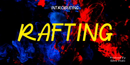 Introducing a cute handwriting "RAFTING" Handwritten Display Font! If you are needing a touch of casual modern display for your designs, this font was created for you! What's Included: Uppercase and Lowercase Number and Punctuation Support Language This font works best in a program that supports OpenType features such as Adobe Indesign, Adobe Illustrator CC and CS, or Adobe Photoshop CC and CS also CorelDraw More Questions? Here are some (potential) answers! Do not to resell this font in any way. Multilingual Support is included for Western European Languages Have a Wonderful Day, Gatra Std
 - Creslina by Rometheme,
$22.00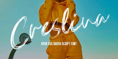 Creslina – Open SVG Brush Script font. It has a elegant, classy look and beauty. It’s a great font for fashion, apparel projects, signature, album cover, logo, branding, magazine, social media, & advertisements, but also works great for other projects. Highlight : Standard glyphs (Uppercase, Lowercase, Numeral & Punction) Work on PC or Mac PUA Encoded Support Fonts include multilingual support for; ä ö ü Ä Ö Ü ß ¿ ¡ No special software is required, The fonts can be opened and used in Adobe Illustrator, Adobe Photoshop, Adobe InDesign, even work on Microsoft Word.