10,000 search results
(0.066 seconds)
- Hanthem Script by Fargun Studio,
$14.00 Hanthem Script is modern script that perfect for photography, branding, signature. It is so beautiful and classy for your projects. This Font has given PUA code (specially coded fonts). So that all the alternate characters can easily be accessed in full by a craftsman or designer.
 - Bataler by Eldertype Studio,
$13.00 Introducing Bataler Vintage Font with elegent and professional style, perfect for adding some romance and charm to your designs. This script functions most strongly as a display or headline font. suitable for logo, logotype, branding,wedding, fashion, label, book cover, t-shirt, instagram post, and other
 - Bubble Dubble family by OKSHUtypeCO,
$9.00 Bubble Dubble- a new fresh handmade playful font. Very suitable for greeting cards, branding materials, business cards, quotes, posters, and more!This font are perfect for wedding postcard. Or you can create perfect and unique design of your logo, blog, stationery, marketing, magazines and more :) Multilingual OK
 - Allrounder Antiqua by Identity Letters,
$40.00 Timeless Renaissance looks, gently updated. For novels and billboards alike. Allrounder Antiqua is an old-style serif member of the Allrounder superfamily. A timeless typeface based on classical proportions, Allrounder Antiqua is perfectly suitable for advanced book and editorial design well as packaging and branding. True: its main purpose is to set flawless body copy and to generate an evenly textured page—but its refined shapes work fantastically in display applications, too. Some details, such as the small and sharp bowl of the lowercase a, are fully appreciated in large sizes only. If you need a sophisticated serif typeface for packaging, food, fashion, consumer goods, or lifestyle branding, Allrounder Antiqua is up for it. It's also apt as an outstanding corporate typeface, be it for a more conservative venture or the latest hipster start-up. This classy serif typeface comes in four weights with corresponding true italics. Just like its sans-serif counterpart, Allrounder Grotesk, Allrounder Antiqua is equipped with plenty of Opentype Features like small caps, six sets of figures, case-sensitive forms, superiors, fractions and many ligatures. You will find alternate letters with swashes within this extended character set, as well as all the accented glyphs necessary to support more than 200 Latin-based languages. Historical Background The (French) Renaissance-influenced typeface started as Moritz Kleinsorge's graduation project within the "Expert Class Type design" course of the Plantin Institute for Typography, located in the famous Museum Plantin-Moretus in Antwerp, Belgium. There, Moritz Kleinsorge decided to create a revival of Robert Granjon's "Ascendonica Romain", described as "a beautiful face; typical of Granjon's mature style" in the inventory list of available material. "To touch punches and matrices cut by Robert Granjon back in 1567 was an invaluable inspiration", Moritz explains. Over time, the typeface moved away from being a true revival. Rather, it evolved into a Granjon-inspired typeface. That typeface is now available as Allrounder Antiqua. Perfect Pairing: Allrounder Antiqua + Allrounder Grotesk Allrounder Grotesk is the ideal complement to Allrounder Antiqua. They both share common vertical metrics and a common color. This allows you to pair both typefaces within the same layout—even within the same paragraph—without creating visual disruption. Head over to the Family Page of Allrounder Grotesk to get more information about this typeface. Design Trick: Bilingual Design With the Allrounder Superfamily Combining Allrounder Grotesk with Allrounder Antiqua is an ideal approach for bilingual designs, wherein both languages get the same emphasis yet are distinguished with two different typefaces. It's also best practice to set headlines in a different typeface than the body text if they harmonize with each other. Allrounder Grotesk and Allrounder Antiqua provide you with the perfect pair for this purpose.
 - Melon Script by Eurotypo,
$90.00 The melon (Cucumis melo) is an herbaceous plant monoecious trailing stems. It is known for its fruit, a berry summer season with a high water content and sweet taste. The Melon font, like the fruit in which has been inspired, is characterized by its organic shapes “soft” and heavy weight. Carefully traced and drawn by hand, offers the possibility to use linked or unlinked characters, and any combination of them, because the kerning pairs have been specifically regulated. Melon Script fonts are presented as family of four widths: Condensed, Regular, Expanded and Ultra-expanded. Each of them contains 623 glyphs, a full set of stylistic alternates, swashes, ligatures, ending letters, underlines and all diacritic signs support for Central European languages. We strongly recommend these fonts for use in packaging, web sites, advertising, magazines and logotypes. You may use these fonts when you must to generate visual impact with friendly seductive atmosphere and legibility.
 - Gumboots by Hanoded,
$15.00 I bought a pair of green gumboots (or Wellingtons) the other day. I have a little wilderness outside and it is quite muddy, so I thought a pair of boots would be a good buy. Gumboots is a handmade comic font. It comes in a regular and a fat style and you can use it for just about anything that needs a bit of comic relief.
 - Aerle by Hackberry Font Foundry,
$24.95 My first font for 2009 was Aerle. It is a new dark sans serif font in my continuing objective of designing book fonts that I can really use. It made a little ripple in the industry, but more than that I found that I loved it with Aramus and Artimas — my latest book font family with the same proportions. In many ways, Aerle is a very different direction for me built on what I have learned on Aramus and other recent developments in my style. The concept came to me while using Bitstream's Mister Earl on a site online—though there is no direct reference. I wanted a more playful heavy sans with a much smaller x-height than I have been using lately, plus taller ascenders. As I was using Aerle, I constantly needed a light and bold version. The new direction I am taking is a result of a decision that my fonts, though I loved the character shapes, produced an even type color that is too dark or a little dense. Aerle was an attempt to get away from that look even though the letterspacing is quite tight. For Aerle Thin I pushed a little further in that direction and increased the letterspacing. The hand-drawn shapes vary a lot, many pushing the boundaries of the normal character. This gives a little looseness and helps the lightness in feel I am looking for. It will be interesting to see where this all goes. Most new type around the world is far too perfect for my taste. While the shapes are exquisite, the feel is not human but digital mechanical. I find myself wanting to draw fonts that feel human — as if a person crafted them. In most ways this is a normal font for me in that it has caps, lowercase, small caps with the appropriate figures for each case. These small caps were very small (x-height as is proper). So Aerle's small caps are a little oversize because they plugged up too bad at x-height size. The bold is halfway between. These size variations seem important and work well in the text. This font has all the OpenType features in the set for 2009. There are several ligatures for your fun and enjoyment: bb gg sh sp st ch ck ff fi fl ffi ffl ffy fj ft tt ty Wh Th and more. Like all of my fonts, there are: caps, lowercase, & small caps; proportional lining figures, proportional oldstyle figures, & small cap figures; plus numerators, denominators, superiors, inferiors, and a complete set of ordinals 1st through infinity. Enjoy!
 - Areplos by Storm Type Foundry,
$53.00To design a text typeface "at the top with, at the bottom without" serifs was an idea which crossed my mind at the end of the sixties. I started from the fact that what one reads in the Latin alphabet is mainly the upper half of the letters, where good distinguishableness of the individual signs, and therefore, also good legibility, is aided by serifs. The first tests of the design, by which I checked up whether the basic principle could be used also for the then current technology of setting - for double-sign matrices -, were carried out in 1970. During the first half of the seventies I created first the basic design, then also the slanted Roman and the medium types. These drawings were not very successful. My greatest concern during this initial phase was the upper case A. I had to design it in such a way that the basic principle should be adhered to and the new alphabet, at the same time, should not look too complicated. The necessary prerequisite for a design of a new alphabet for double-sign matrices, i.e. to draw each letter of all the three fonts to the same width, did not agree with this typeface. What came to the greatest harm were the two styles used for emphasis: the italics even more than the medium type. That is why I fundamentally remodelled the basic design in 1980. In the course of this work I tried to forget about the previous technological limitations and to respect only the requirements then placed on typefaces intended for photosetting. As a matter of fact, this was not very difficult; this typeface was from the very beginning conceived in such a way as to have a large x-height of lower-case letters and upper serifs that could be joined without any problems in condensed setting. I gave much more thought to the proportional relations of the individual letters, the continuity of their outer and inner silhouettes, than to the requirements of their production. The greatest number of problems arose in the colour balancing of the individual signs, as it was necessary to achieve that the upper half of each letter should have a visual counterbalance in its lower, simpler half. Specifically, this meant to find the correct shape and degree of thickening of the lower parts of the letters. These had to counterbalance the upper parts of the letters emphasized by serifs, yet they should not look too romantic or decorative, for otherwise the typeface might lose its sober character. Also the shape, length and thickness of the upper serifs had to be resolved differently than in the previous design. In the seventies and at the beginning of the eighties a typeface conceived in this way, let alone one intended for setting of common texts in magazines and books, was to all intents and purposes an experiment with an uncertain end. At this time, before typographic postmodernism, it was not the custom to abandon in such typefaces the clear-cut formal categories, let alone to attempt to combine the serif and sans serif principles in a single design. I had already designed the basic, starting, alphabets of lower case and upper case letters with the intention to derive further styles from them, differing in colour and proportions. These fonts were not to serve merely for emphasis in the context of the basic design, but were to function, especially the bold versions, also as independent display alphabets. At this stage of my work it was, for a change, the upper case L that presented the greatest problem. Its lower left part had to counterbalance the symmetrical two-sided serif in the upper half of the letter. The ITC Company submitted this design to text tests, which, in their view, were successful. The director of this company Aaron Burns then invited me to add further styles, in order to create an entire, extensive typeface family. At that time, without the possibility to use a computer and given my other considerable workload, this was a task I could not manage. I tried to come back to this, by then already very large project, several times, but every time some other, at the moment very urgent, work diverted me from it. At the beginning of the nineties several alphabets appeared which were based on the same principle. It seemed to me that to continue working on my semi-finished designs was pointless. They were, therefore, abandoned until the spring of 2005, when František Štorm digitalized the basic design. František gave the typeface the working title Areplos and this name stuck. Then he made me add small capitals and the entire bold type, inducing me at the same time to consider what to do with the italics in order that they might be at least a little italic in character, and not merely slanted Roman alphabets, as was my original intention. In the course of the subsequent summer holidays, when the weather was bad, we met in his little cottage in South Bohemia, between two ponds, and resuscitated this more than twenty-five-years-old typeface. It was like this: We were drinking good tea, František worked on the computer, added accents and some remaining signs, inclined and interpolated, while I was looking over his shoulder. There is hardly any typeface that originated in a more harmonious setting. Solpera, summer 2005 I first encountered this typeface at the exhibition of Contemporary Czech Type Design in 1982. It was there, in the Portheim Summer Palace in Prague, that I, at the age of sixteen, decided to become a typographer. Having no knowledge about the technologies, the rules of construction of an alphabet or about cultural connections, I perceived Jan Solpera's typeface as the acme of excellence. Now, many years after, replete with experience of revitalization of typefaces of both living and deceased Czech type designers, I am able to compare their differing approaches. Jan Solpera put up a fight against the digital technology and exerted creative pressure to counteract my rather loose approach. Jan prepared dozens of fresh pencil drawings on thin sketching paper in which he elaborated in detail all the style-creating elements of the alphabet. I can say with full responsibility that I have never worked on anything as meticulous as the design of the Areplos typeface. I did not invent this name; it is the name of Jan Solpera's miniature publishing house, in which he issued for example an enchanting series of memoirs of a certain shopkeeper of Jindrichuv Hradec. The idea that the publishing house and the typeface might have the same name crossed my mind instinctively as a symbol of the original designation of Areplos - to serve for text setting. What you can see here originated in Trebon and in a cottage outside the village of Domanín - I even wanted to rename my firm to The Trebon Type Foundry. When mists enfold the pond and gloom pervades one's soul, the so-called typographic weather sets in - the time to sit, peer at the monitor and click the mouse, as also our students who were present would attest. Areplos is reminiscent of the essential inspirational period of a whole generation of Czech type designers - of the seventies and eighties, which were, however, at the same time the incubation period of my generation. I believe that this typeface will be received favourably, for it represents the better aspect of the eighties. Today, at the time when the infection by ITC typefaces has not been quite cured yet, it does absolutely no harm to remind ourselves of the high quality and timeless typefaces designed then in this country.In technical terms, this family consists of two times four OpenType designs, with five types of figures, ligatures and small capitals as well as an extensive assortment of both eastern and western diacritics. I can see as a basic text typeface of smaller periodicals and informative job-prints, a typeface usable for posters and programmes of various events, but also for corporate identity. Štorm, summer 2005 - Holly Jolly by Bosstypestudio,
$12.00 Holly Jolly in a beautiful handwritten style. Equipped with 300 glyphs. Holly Jolly is perfect for branding projects, home appliance design, product packaging, use in business cards, invitation cards, etc. Simply as a stylish text overlay onto a background image or anything that requires a touch of elegance. To enable OpenType Stylistic alternates, you need a program that supports OpenType features such as Adobe Illustrator CS, Adobe Indesign & CorelDraw X6-X7, Microsoft Word 2010 or a later version.
 - Stay Gracious by Bosstypestudio,
$12.00 Stay Gracious in a beautiful handwritten style. Equipped with 300 glyphs.Stay Gracious is perfect for branding projects, home appliance design, product packaging, use in business cards, invitation cards, etc. Simply as a stylish text overlay onto a background image or anything that requires a touch of elegance. To enable OpenType Stylistic alternates, you need a program that supports OpenType features such as Adobe Illustrator CS, Adobe Indesign & CorelDraw X6-X7, Microsoft Word 2010 or a later version.
 - Pretty Sweet by Bosstypestudio,
$12.00 Pretty Sweet in a beautiful handwritten style. Equipped with 300 glyphs. Pretty Sweet is perfect for branding projects, home appliance design, product packaging, use in business cards, invitation cards, etc. Simply as a stylish text overlay onto a background image or anything that requires a touch of elegance. To enable OpenType Stylistic alternates, you need a program that supports OpenType features such as Adobe Illustrator CS, Adobe Indesign & CorelDraw X6-X7, Microsoft Word 2010 or a later version.
 - James Sophia by Bosstypestudio,
$12.00 James Sophia in a beautiful handwritten style. Equipped with 400 glyphs. James Sophia is perfect for branding projects, home appliance design, product packaging, use in business cards, invitation cards, etc. Simply as a stylish text overlay onto a background image or anything that requires a touch of elegance. To enable OpenType Stylistic alternates, you need a program that supports OpenType features such as Adobe Illustrator CS, Adobe Indesign & CorelDraw X6-X7, Microsoft Word 2010 or a later version.
 - Baby Morgana by Bosstypestudio,
$12.00 Baby Morgana in a beautiful handwritten style. Equipped with 300 glyphs. Baby Morgana is perfect for branding projects, home appliance design, product packaging, use in business cards, invitation cards, etc. Simply as a stylish text overlay onto a background image or anything that requires a touch of elegance. To enable OpenType Stylistic alternates, you need a program that supports OpenType features such as Adobe Illustrator CS, Adobe Indesign & CorelDraw X6-X7, Microsoft Word 2010 or a later version.
 - Glamour Script by Bosstypestudio,
$12.00 Glamour Script in a beautiful handwritten style. Equipped with 380 glyphs. Glamour Script is perfect for branding projects, home appliance design, product packaging, use in business cards, invitation cards, etc. Simply as a stylish text overlay onto a background image or anything that requires a touch of elegance. To enable OpenType Stylistic alternates, you need a program that supports OpenType features such as Adobe Illustrator CS, Adobe Indesign & CorelDraw X6-X7, Microsoft Word 2010 or a later version.
 - Angatha by Amelia Studio,
$13.00 Angatha in a beautiful handwritten style. Equipped with 350 glyphs. Angatha is perfect for branding projects, home appliance design, product packaging, use in business cards, invitation cards, etc. Simply as a stylish text overlay onto a background image or anything that requires a touch of elegance. To enable OpenType Stylistic alternates, you need a program that supports OpenType features such as Adobe Illustrator CS, Adobe Indesign & CorelDraw X6-X7, Microsoft Word 2010 or a later version.
 - ATF Railroad Gothic by ATF Collection,
$59.00 First introduced by the American Type Founders Company in 1906, Railroad Gothic was the quintessential typographic expression of turn-of-the-century industrial spirit—bold and brash in tone, and a little rough around the edges. A favorite for the plain speak of big headlines, Railroad Gothic quickly gained popularity among printers. Its condensed but robust forms were likely a source of inspiration for later families of industrial sans serifs. The design feels like a cleaned-up version of some earlier Victorian gothics, notable for their uneven proportions and awkward letterforms. ATF offered a number of sizes of Railroad Gothic as metal type, with cuts varying in design considerably from size to size. Creating this new digital version involved interpreting the characteristics of different sizes and making some aesthetic choices: where to retain the design’s familiar unstudied gawkiness, and where to make improvements. The new ATF® Railroad Gothic features a measured, harmonious interpretation of the original, and has been extended with four new weights (each bolder than the last). The heaviest weights are carefully designed to keep counters open, no matter how dense the overall effect may be, maintaining legibility at any display size. This contemporary rendition of a historic American design boasts a full Latin character set, including glyphs undreamed-of in the heyday of railroads.
 - Scholastyca Typeface by Almeera Studio,
$17.00 Introducing the new Scholastica Modern & Classic Typeface!!! Scholastica is a luxury and glamour serif typeface.This font is both modern and nostalgic and works great for logos, magazine, social media. Already matched up and ready to be used together for your next design! For those of you who are needing a touch of elegant, stylish, classy, chic and modernity for your designs, this font was created for you! Perfect for editorial projects, Logo design, Clothing Branding, product packaging, magazine headers, or simply as a stylish text overlay to any background image. No special software is required to type out the standard characters of the Typeface. To access the Opentype Ligatures, you will need software that supports Opentype features in fonts. Current Language Support : Danish, English, Finnish, French, German, German (Switzerland), Norwegian Bokmål, Norwegian Nynorsk, Portuguese, Spanish, Swedish, Swiss German.
 - Galeoge by Almeera Studio,
$15.00 Introducing the new Galeoge!!! Galeoge is a modern and retro san serif typeface. This font is both modern and nostalgic and works great for logos, magazine, social media. Already matched up and ready to be used together for your next design! For those of you who are needing a touch of elegant, stylish, classy, vintage and modernity for your designs, this font was created for you! Perfect for editorial projects, Logo design, Cover album, Branding, product packaging, magazine headers, or simply as a stylish text overlay to any background image. No special software is required to type out the standard characters of the Typeface. To access the Opentype Ligatures, you will need software that supports Opentype features in fonts. Current Language Support : Danish, English, Finnish, French, German, German (Switzerland), Norwegian Bokmål, Norwegian Nynorsk, Portuguese, Spanish, Swedish, Swiss German.
 - Astralie by Almeera Studio,
$15.00 Introducing the new Astralie Typeface!!! Astralie is a luxury and glamour serif typeface. This font is both modern and nostalgic and works great for logos, magazine, social media. Already matched up and ready to be used together for your next design! For those of you who are needing a touch of elegant, stylish, classy, chic and modernity for your designs, this font was created for you! Perfect for editorial projects, Logo design, Clothing Branding, product packaging, magazine headers, or simply as a stylish text overlay to any background image. No special software is required to type out the standard characters of the Typeface. To access the Opentype Ligatures, you will need software that supports Opentype features in fonts. Current Language Support : Danish, English, Finnish, French, German, German (Switzerland), Norwegian Bokmål, Norwegian Nynorsk, Portuguese, Spanish, Swedish, Swiss German.
 - Futurino by Larin Type Co,
$10.00 Futurino - a new fun display font collection. This is a fun font that is perfect for creating your project, it can be used to create a beautiful inscription for t-shirts, children's books, branding for small business, book covers, stationery, marketing, blog, magazines and more.
 - Rullen by Inumocca,
$15.00 Rullen is A Retro typeface the 70s font style great choice for expressing a summer. The Typeface comes with Stylistic Set Exellent typeface to use for covering your Project, like Branding, Movie Title, Headline Letter, Bookcover or Book Content, Magazine cover, Poster, Quotes Lettering, Logos, and more your project design. - Unique glyphs - Multilingual Characters Support - UPPERCASE - Lowercase - Numeric - Symbol - Punctuation Character - Stylistic Set inumocca type Studio
 - Mighty Rooster by Invasi Studio,
$13.00 Introducing a versatile Vintage Sans Serif. Mighty Rooster includes 2 font files with Regular and Rough style. Mighty Rooster is a great font for achieving an authentic vintage aesthetic as seen in the display images or Body text project, it is perfect for headings, flyers, greeting cards, product packaging, book cover, printed quotes, logotype, apparel design, album covers. Mighty Rooster Features: Ligatures Alternate Multi-language Punctuation
 - Newsbreaker JNL by Jeff Levine,
$29.00 Based on scans of some 1906 newspaper headlines detailing the devastation of the San Francisco earthquake, Newsbreaker JNL is a modern take on vintage typography. With a few letterform characteristics somewhat reminiscent of DeVinne, this typeface was perfect in its day for expressing news headlines - and it holds up just as well today for titling or banner ad copy. Available in regular and oblique versions.
 - Arkham by Harvester Type,
$16.00 Arkham - a font that was created from the title of the cover of the comic book "Batman Absolution". The font conveys the Gothic and darkness that is inherent in this comic. The font is perfect for headlines, texts, posters, covers, merch, prints and more. Great language support. If you find an error in the font or kerning, write to: bunineugene@gmail.com, for a quick fix!
 - Bookbag by Letradora,
$15.00 Bookbag is a font for teaching kids to read and write. It comes in 4 weights, from light to extrabold, and has dotted and lined versions for students to practice. Many glyphs have alternate versions, that can be accessed either through OpenType stylistic alternates, or using the Alt versions of the font. Bookbag has a very wide language support, with most latin languages supported.
 - Poster Casual JNL by Jeff Levine,
$29.00 Poster Casual JNL is based on the hand lettered title on the cover of the 1929 sheet music for the song "Give Yourself a Pat on the Back"; touted at the time as being "the cheer-up song of England". Available in both regular and oblique versions, the font is perfect for applications where a less-formal look is desired in headlines or brief text.
 - Planet Gamers by Sarid Ezra,
$17.00 Introducing, Planet Gamers, a serif logo font with unique ligatures! Planet Gamers is a serif based font with unique and carefully crafted ligatures that will make your logo stand out clean and modern. You can use this font for any purpose, especially to make logotype. This font is suitable for e-sport logo, game, or hi-tech company logo. This font also support multilingual.
 - NorB Marker by NorFonts,
$28.00 NorB Marker is a handwritten text font emulating a marker pen. The fonts set can be used with any word processing program for text and display use, print and web projects, apps and ePub, comic books, graphic identities, branding, editorial, advertising, scrapbooking, cards and invitations and any casual lettering purpose… or even just for fun! The fonts set features 4 weights: Regular Italic Bold Bold Italic
 - Stockers by Azzam Ridhamalik,
$14.00 Stockers is a high contrast serif font. It's long serifs make it looks mixed between classic and modern. Stockers support multilingual language, numbers, punctuation, alternative, standard and discretionary ligatures. A must have for any modern graphic designer as an elegant solution for your next magazine layout or any graphics design that require an elegant flair! FEATURES : Uppercase Lowercase Number Punctuation Multilingual PUA Encode Opentype
 - Motte by TypeClassHeroes,
$14.00 Introducing Motte is a tall and wide sans comes with classic casual family to get more stunning. Use this font family for any branding, product packaging, invitation, quotes, t-shirt, label, poster, logo etc. Character Set Uppercase & Lowercase Number & Symbol International Glyphs Ligatures Multilingual support Feel free to drop us a message or shoot me on message any time and follow my shop for upcoming updates
 - Driven Unicase Extended by Typekirk,
$12.00 Driven Unicase Extended is sleek and modern, yet hearkens back to the first advertising to catch my eye as a kid in the glorious 1970s – automobile ads that captured the thrill of speed, for sports cars I dreamed of experiencing. Driven is available in 6 individual weights or as a family of 6 fonts, plus ornaments. Includes accented characters supporting for many European languages.
 - Reverie by District,
$15.00 Reverie is a cheerful band of letters that bounce across the page and get together to create words in three weights. Generous spacing and a modest x-height project an airy typeface that's open but not frail. Quirky without being too whimsical. Use the regular weight for surprisingly readable text or put the light and bold weights to use for decorative headlines and titles.
 - Graela by Muksal Creatives,
$15.00 Graela is a Display Sans Serif A new Display Sans serif that we created special for branding needs, with extra ligature in unique shape add value of your brand. It so nice to leverage designer or product owner that need solutions to make their design look more stylish and modern.We prepared any ligatures, characters to help you create unlimited variations for your creative needs.
 - Viking Drink by Fo Da,
$15.00 Viking Drink is a display font derivative from serif family of eight weights ranging from Regular to Bold and matching Italics, which gives it a full range of expression and suitability for advertising, interfaces and corporate design. Viking Drink provides 3 FREE weights ( Regular, Italic and Bold ). It has 17 ligatures that add powerful effect when used for creating logos or headlines. It also supports many languages.
 - Auberjean by Abbyland,
$15.00 Auberjean is a playful handmade display font, great for social posts, editorial design, posters, book covers, signs, and more! This font has a hip and contemporary feel. It works well for headlines as both uppercase and lowercase, as well as short blocks of text like quotes and info blurbs. The thick, rounded style means it looks great with an outside stroke or offset outline.
 - Lesser Arcana NF by Nick's Fonts,
$10.00The uppercase letters of this magical, mystical face is based on various alchemical symbols used from the thirteenth through the sixteenth century; the lowercase letters are based on those found on a 1935 poster, signed simply “Strekalovsky.” Ideal for adding a little pocus to your hocus, or cadabra to your abra. Both versions of the font include 1252 Latin, 1250 CE (with localization for Romanian and Moldovan). - Earth Tone by Sarid Ezra,
$15.00 Introducing, Earth Tone - Organic Sans Family Earth Tone is a handmade font family with natural and organic feels! Contain three weight. Including Light - Regular - Bold. You can use this font for every project. Suitable for branding logo, hand lettering, or apparel design. When you want a handmade touch in your design, this font will never disappoint. This font family also support multilingual, number and symbol.
 - Espadrille by Atlantic Fonts,
$21.00 Step into your next project with comfort. Espadrille is handmade, clean, and friendly, without being loud. Appealing for a casual, but style conscious crowd - whether brightening t-shirts, posters, packaging, or publications, its one-height upper and lower case make it fun for creative blocks of text and mixing cases at will. It features double-letter discretionary ligatures as well as a few extras.
 - Kramps by Mvmet,
$16.00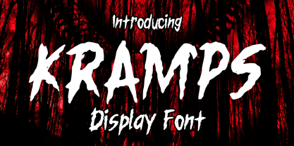 Kramps is a very cool horror display font. It will be perfect for your horror and Halloween-themed needs! You can use it for anything ranging from t-shirts and clothing, to your scary book designs, Halloween party needs, greeting cards, stickers, posters, banners, or anything that needs a horror touch. Try it to create fabulous designs and feel the horror and Halloween vibes with it!
 - Commuters Sans by Dharma Type,
$19.99 Commuters Sans is a daily type. Classic but Modern. Very simple geometry and wide type with warm clearness. Useful for both body-text and titling by their minimal glyph shapes and slightly wide and eye-catching proportion. Consists of eight weights and their matching italics. Supporting almost all latin languages. All-caps text for one line or a few is as wonderful as normal mixed-case typesetting.