10,000 search results
(0.067 seconds)
- Cristabel by Gatype,
$10.00 Cristabel Script is a modern calligraphy typeface, with casual and pretty with swashes. It can be used for many purposes such as titles, signatures, logos, wedding invitations, letterhead, signage, labels, newsletters, posters, badges and more. Cristabel Script features OpenType, including the initial and terminal letters, alternates, ligatures and International support for most Western languages included. To activate OpenType Stylistic alternative, you need a program that supports OpenType features such as Adobe Illustrator CS, Adobe Indesign and CorelDraw X6-X7, Microsoft Word 2010 or later. How to access all of the alternate characters, using the Windows Character Map to Photoshop: https://www.youtube.com/watch?v=Go9vacoYmBw Cristabel Script is PUA encoded, which allows full access to all the extra characters without having to design special software. Mac users can use Font Book, and Windows users can use the Character Map to view and copy one additional character to paste into your text editor / favorite applications.
 - Thalweg Poetica by Ani Dimitrova,
$29.00 Thalweg Poetica is a revival font that comes with a story created in 1993 by the Bulgarian artist Ivan Kyosev. It is a sequel to the Thalweg font family completed in 2020. The construction of characters combines the upright character of the Thalweg font and the handwritten character of Thalweg Italic. The font partners perfectly with the Talweg font family and gives designers a new opportunity for expression. Thalweg Poetica contains 4 widths / Normal, Semi Condensed, Condensed & Extra Condensed / and 8 weights ranging from Thin to Black with small caps versions, each style containing more than 1100 glyphs. The font comes with extended coverage of the Latin, Cyrillic, and Greek Scripts. All of the weights are specifically equipped for complex, professional typography with Open Type Features. These features include Small Caps, Ligatures, Discretionary Ligatures, Superscript, Subscript, Tabular Figures, Old-Style Figures, Circled Figures, Arrows, Matching currency symbols, and fraction. The Thalweg Poetica family is ideally suited for small text, books and magazines, branding, posters, as well as web and screen design, headlines, and more. The Regular and Medium weights are perfect for body text and they give an interesting texture to the text. The range of styles gives good flexibility to this family.
 - Radiant Extra Condensed CT by CastleType,
$59.00 I was commissioned by the Emporium (now Macys) to digitize Radiant Bold Extra Condensed (originally designed by Robert Middleton in 1940) for use in their Sunday supplement to the San Francisco Examiner. For several years, I stubbornly refused to add the lowercase letters to the font, because I thought it looked best just used with caps, but finally relented, added the lowercase letters and at the same time created two more weights as well: Light and Medium. Used very large and carefully, these faces can be quite elegant.
 - The Geantdum by Josstype,
$13.00 The Geantdum Script is modern script font, every single letters have been carefully crafted to make your text looks beautiful. With modern script style this font will perfect for many different project ex: quotes, blog header, poster, wedding, branding, logo, fashion, apparel, letter, invitation, stationery, etc. The Geantdum Script including alternate glyph and beautiful swirl. How to access alternate glyphs: Windows Character Map: https://www.youtube.com/watch?v=BScPsiubM1k Adobe Illustrator: https://www.youtube.com/watch?v=y5XTaWYwWA4 Thank you for your purchase! and please let me know if you have any questions. via email: joelpopon@gmail.com
 - FHA Eccentric French by The Fontry,
$25.00 The curves are vintage and the serifs are big. They're so big that for years I never had the courage to tackle this intimidating font. But when fellow signmaker Frank Smith laid the groundwork for this intriguing typeface by Frank H. Atkinson, I couldn't pass on the opportunity to take it from paper to keyboard. After all, at over 100 years old, I felt this alphabet had never been given a proper, digital treatment. So how did this face survive the last century? Well, for those who don't know the history, it survived in Atkinson's ubiquitous book, Sign Painting, published first in 1908, the generational standard for anyone interested in sign-related type design. The layouts and lettering treatments in this book have influenced countless designers for more than a hundred years, but most haunting to me was this strange face with the big serifs. Well, I'm haunted no more. The work is done, the kerning is complete, and nothing but a mouse-click separates a very old idea from the modern world. It's wide, it's big, and with those crazy serifs, it is definitely eccentric-!!!
 - Plinc Hasler Circus by House Industries,
$33.00 Hasler Circus packs amusement park, Old West, folk art, and tattoo shop all into one colorful font. Characteristic of reverse-contrast faces, Hasler Circus swaps the weight of its stems and serifs creating an unexpected yet charming rhythm. The font also features an added bonus: split stroke endings to crank up the flavor. Inject a dose of novelty into toy packaging, candy wrappers, cook books, vintage signs, or festival marketing. Drawn in the 1950s for Photo-Lettering, Inc. by influential British designer and typographer Charles Hasler, Circus was digitized by Erik van Blokland in 2011, with a helping hand from Ken Barber. HASLER CIRCUS CREDITS: Typeface Design: Charles Hasler Typeface Digitization: Erik van Blokland, Ken Barber Typeface Production: Ben Kiel Like all good subversives, House Industries hides in plain sight while amplifying the look, feel and style of the world’s most interesting brands, products and people. Based in Delaware, visually influencing the world.
 - Gendouki by Typodermic,
$11.95 Introducing Gendouki, the ultimate futuristic typeface that will transport your designs to the cutting-edge of technology. With its striking filament stencil lines, reminiscent of spacecraft access panels, Gendouki is the perfect choice for projects that demand a bold and hyper-futuristic look. Imagine using Gendouki as a large, low-contrast backdrop element, setting the stage for your content to shine. The sleek and modern lines of the font will add depth and dimension to your design, creating a dynamic visual experience that’s sure to capture your audience’s attention. But that’s not all. Gendouki is also perfect for producing movement in your paragraphs when applied as a techno drop-cap. Watch as your text springs to life, animating your words and drawing your reader in with its captivating energy. So if you’re looking for a font that combines the sleek, hyper-futuristic look of a spacecraft with the sharp, clean lines of modern design, look no further than Gendouki. Try it today and take your designs to a whole new level of cool. Most Latin-based European writing systems are supported, including the following languages. Afaan Oromo, Afar, Afrikaans, Albanian, Alsatian, Aromanian, Aymara, Bashkir (Latin), Basque, Belarusian (Latin), Bemba, Bikol, Bosnian, Breton, Cape Verdean, Creole, Catalan, Cebuano, Chamorro, Chavacano, Chichewa, Crimean Tatar (Latin), Croatian, Czech, Danish, Dawan, Dholuo, Dutch, English, Estonian, Faroese, Fijian, Filipino, Finnish, French, Frisian, Friulian, Gagauz (Latin), Galician, Ganda, Genoese, German, Greenlandic, Guadeloupean Creole, Haitian Creole, Hawaiian, Hiligaynon, Hungarian, Icelandic, Ilocano, Indonesian, Irish, Italian, Jamaican, Kaqchikel, Karakalpak (Latin), Kashubian, Kikongo, Kinyarwanda, Kirundi, Kurdish (Latin), Latvian, Lithuanian, Lombard, Low Saxon, Luxembourgish, Maasai, Makhuwa, Malay, Maltese, Māori, Moldovan, Montenegrin, Ndebele, Neapolitan, Norwegian, Novial, Occitan, Ossetian (Latin), Papiamento, Piedmontese, Polish, Portuguese, Quechua, Rarotongan, Romanian, Romansh, Sami, Sango, Saramaccan, Sardinian, Scottish Gaelic, Serbian (Latin), Shona, Sicilian, Silesian, Slovak, Slovenian, Somali, Sorbian, Sotho, Spanish, Swahili, Swazi, Swedish, Tagalog, Tahitian, Tetum, Tongan, Tshiluba, Tsonga, Tswana, Tumbuka, Turkish, Turkmen (Latin), Tuvaluan, Uzbek (Latin), Venetian, Vepsian, Võro, Walloon, Waray-Waray, Wayuu, Welsh, Wolof, Xhosa, Yapese, Zapotec Zulu and Zuni.
 - DF Dudok by Dutchfonts,
$33.00 The DF Dudok is a minimal bitmap typeface which works very well in small sizes both on your screen and on paper. I am connected in a culinary way with the architects’ name W.M. Dudok. It was the first restaurant where I cooked under the critical eye of my chef Gerhard Braun. (Now La Stanza in Rotterdam) Well, it is incidently getting into my typeface work, the cook, the architect, his wife and...who knows
 - TT Neoris by TypeType,
$39.00 The future of Neo-Grotesques is now! Introducing TT Neoris—a new ambitious font from TypeType. TT Neoris is an ideal sans with: 21 font styles: 10 upright, 10 italics, and 1 variable font; 1832 characters; 41 OpenType features; 14 stylistic sets with Soft character and Upright cursive in Latin and Cyrillic character sets; 230+ languages support; Special condensed italics designed to create a 'highlighting' effect when used in specific text segments.
 - Decutto by Michael Rafailyk,
$15.00 Decutto is a neo-grotesque that packs the Marionette formula and some blackletter ideas into a low-contrast sans serif design. Its name plays on the phrases “off cut” and “cut to” which express the key feature – the contemporary legible letter shape is decorated with cut carved edges and counters, giving the typeface crisp and simplistic look, like that of an old minted coin. Scripts: Latin, Greek, Cyrillic, Hebrew. Hinting: Manual PostScript.
 - Aribau Grotesk by Emtype Foundry,
$69.00 Born from the intersection of the geometric and grotesque typefaces. Aribau Grotesk combines low contrast and generous width proportions with typical traits of american gothics from the early 20th century, like the counters aperture and a double story ‘g’. Driven by the process, some details that come from the geometric style arose, like the clean-shaped figures and the circular dots that convey a more affable and contemporary look. Aribau Grotesk PDF.
 - Aerioz by Letrasupply Typefoundry,
$18.00 Aerioz is a monoline all caps font, comes with over 600 characters including 324 alternate letters. Smooth with rounded lines, simple, elegant, and perfect in any layout project such a headline magazines, custom name, neon sign and more typography work. Aerioz is packed with ornaments and OpenType alternates, you can combine the regular font with the ornament to make it more perfect. How to get access alternate glyphs from open type fonts : http://adobe.ly/1m1fn4Y
 - Asterisk Sans Pro by Eclectotype,
$45.00 The market for humanistic sans serif type families is saturated, so what can a new release add, and what does it take to stand out from the crowd? Asterisk Sans Pro (named after my favourite glyph to make) aims to be a highly versatile type family; massively useful due to its pan-European language support and bounty of OpenType features which make it the ideal choice for demanding typography. The look is contemporary; details which give the fonts character at large sizes all but disappear when small, making the middle weights suitable for large chunks of text. The family ranges from a hairline ultra light to a pretty weighty black – a must in a new typeface. Asterisk Sans Pro supports Latin, modern Greek and Cyrillic, with localized forms for Bulgarian, Serbian and Macedonian to boot. This is rare enough, but to have small caps for all these scripts in both upright and italic fonts is a big plus. Your client may not need all this language support right now, but this typeface gives them the option to grow while keeping a consistent look, and at a similar price point to families with a much narrower scope. The ability to customize Asterisk Sans Pro through the use of Stylistic Sets in OpenType savvy layout programs means you are really in control. Want more italic forms in the uprights? Go for it. A more Roman italic? Easy! The spurless m, n, r and u, accessible through SS13 give a graphic, almost bauhaus feel. The Dutch IJ glyph can be changed to a much cooler thing using SS14, and the family even supports ij-acute. Other OpenType features include a wealth of numeral styles (tabular and proportional, lining and oldstyle, plus small cap figures, numerators, denominators, subscript and superscript) and automatic fractions. There are also case-sensitive forms for all caps settings, a bunch of useful arrows, and superscript lower case Latin letters. All in, there are well over 1200 glyphs per font, making Asterisk Sans Pro an invaluable tool in your typeface arsenal, great for everything from corporate identities to editorial work, apps to cookbooks.
 - So Much Love by Seemly Fonts,
$14.00 So Much Love is an incomparable handwritten font. It can easily be matched to an incredibly large set of projects, so add it to your creative ideas and notice how it makes them stand out!
 - Aries by FontHaus,
$19.00 In 1995, FontHaus came upon a rare opportunity to create a revival of Aries, a little known and previously unavailable typeface designed by the legendary Eric Gill in 1931. Discovering a lost typeface by one of the major designers of the 20th Century, was the discovery of a buried treasure, and being the first type company to release it in a digital format was an honor. Aries® is now in the fonts catalog of GroupType who owns the the registered trademark and has licensed this historical typeface exclusively to FontHaus as distributor.
 - Gator by Canada Type,
$24.95 Cooper Black's second coming to American design in the mid-sixties, after almost four decades of slumber, can arguably be credited with (or, depending on design ideology, blamed for) the domino effect that triggered the whole art nouveau pop poster jam of the 1960s and 1970s. By the early 1970s, though Cooper Black still held its popular status (and, for better or for worse, still does), countless so-called hippie and funk faces were competing for packaging and paper space. The American evolution of the genre would trip deeper into psychedelia, drawing on a rich history of flared, flourished and rounded design until it all dwindled and came to a halt a few years into the 1980s. But the European (particularly German) response to that whole display type trend remained for the most part cool and reserved, drawing more on traditional art nouveau and art deco sources rather than the bottomless jug of new ideas being poured on the other side of the pond. One of the humorous responses to the "hamburgering" of typography was Friedrich Poppl's Poppl Heavy, done in 1972, when Cooper Black was celebrating its 50th anniversary. It is presented here in a fresh digitization under the name Gator (a tongue-in-cheek reference to Ray Kroc, the father of the fast food chain). To borrow the title of a classic rock album, Gator is meaty, beaty, big and bouncy. It is one of the finest examples of how expressively animated a thick brush can be, and one of the better substitutes to the much overused Cooper Black. Gator comes in all popular font formats, and sports an extended character set covering the majority of Latin-based languages. Many alternates and ligatures are included in the font.
 - Nice Trendy by Arendxstudio,
$13.00 Nice Trendy - A Groovy Typeface is a font with distinctive handwritten characters perfect for branding projects, logos, wedding designs, media posts, advertisements, product packaging, product designs, labels, photography, watermarks, invitations, stationery, and any project who need handwritten dishes. Features : • Character Set A-Z • Numerals & Punctuations (OpenType Standard) • Accents (Multilingual characters) • Ligature Multilingual Support : Afrikaans, Albanian, Asu, Basque, Bemba, Bena, Catalan, Chiga, Cornish, Danish, English, Estonian, Faroese, Filipino, Finnish, French, Friulian, Galician, German, Gusii, Icelandic, Indonesian, Irish, Italian, Kabuverdianu, Kalenjin, Kinyarwanda, Low German, Luo, Luxembourgish, Luyia, Machame, Makhuwa-Meetto, Makonde, Malagasy, Malay, Manx, Morisyen, North Ndebele, Norwegian Bokmål, Norwegian Nynorsk, Nyankole, Oromo, Portuguese, Romansh, Rombo, Rundi, Rwa, Samburu, Sango, Sangu, Scottish Gaelic, Sena, Shambala, Shona, Soga, Somali, Spanish, Swahili, Swedish, Swiss German, Taita, Teso, Vunjo, Zulu
 - Marian Churchland by Comicraft,
$39.00 Tall, thin and elegant, Marian Churchland’s fonts are very much like her.. and now available from those awfully nice chaps at Comicraft to allow you to pretend that you are too! Marian Churchland was born in Canada in 1982, and was raised on a strict diet of fine literature and epic fantasy video games. She has a BA in Interdisciplinary Studies (English Literature and Visual Arts) from the University of British Columbia, and has been doing professional illustration work, including book covers and magazine articles, since she was 17. Last year, she became the first woman to solo-illustrate a CONAN story, and this year she’s illustrating three issues of ELEPHANTMEN for Image Comics. See the families related to Marian Churchland: Marian Churchland Journal.
 - Mr. and Mrs. Peter by Khaito Gengo,
$23.00 Mr. Peter is a warm and friendly handwritten san-serif font which has two weights, Regular and Bold. He also features multi languages, some alternative letters, and 35 ligatures. He is good for an eye catching title, display as well as small text. Mrs. Peter is a handwritten script font based on Mr Peter. She also provides two weights, Regular and Bold, and features multi languages, automatic ligatures, and beginning and end-changing effect. It will be in good taste if you combine and use Mr. & Mrs. Peter together. Jr Peter consists of around 100 unique icons and ornaments. Also you can simply create multiple faces by using this font. The description of how to make a face is on the promotion poster.
 - Vallassina by Wilton Foundry,
$29.00 Vallassina is named after Vallassina, a village in the valley of the upper tract of the river Lambro in northern Italy. The most important settlement in the area is the town of Asso, from which the valley takes its name. Spasell is a slang of Insubric language, spoken until 19th century by inhabitants of Vallassina, when they used to go out from the valley for business and they didn't want to be understood by the people. What makes this valley unique is that the locals use a unique whistle language to communicate to each other. Vallasina is confidently irreverent yet curiously attractive. How many ways can you use Vallassina to whistle to your neighbors? Vallasina is available in OpenType format.
 - Cosmic Rock by Arendxstudio,
$13.00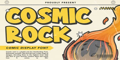 Cosmic Rock - A Comic Display Font is a font with distinctive handwritten characters perfect for branding projects, logos, wedding designs, media posts, advertisements, product packaging, product designs, labels, photography, watermarks, invitations, stationery, and any project who need handwritten dishes. Features : • Character Set A-Z • Numerals & Punctuations (OpenType Standard) • Accents (Multilingual characters) • Ligature Multilingual Support : Afrikaans, Albanian, Asu, Basque, Bemba, Bena, Catalan, Chiga, Cornish, Danish, English, Estonian, Faroese, Filipino, Finnish, French, Friulian, Galician, German, Gusii, Icelandic, Indonesian, Irish, Italian, Kabuverdianu, Kalenjin, Kinyarwanda, Low German, Luo, Luxembourgish, Luyia, Machame, Makhuwa-Meetto, Makonde, Malagasy, Malay, Manx, Morisyen, North Ndebele, Norwegian Bokmål, Norwegian Nynorsk, Nyankole, Oromo, Portuguese, Romansh, Rombo, Rundi, Rwa, Samburu, Sango, Sangu, Scottish Gaelic, Sena, Shambala, Shona, Soga, Somali, Spanish, Swahili, Swedish, Swiss German, Taita, Teso, Vunjo, Zulu
 - Tropical Wind by Arendxstudio,
$13.00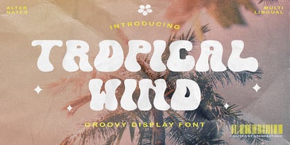 Tropical Wind - A Groovy Font Style is a font with distinctive handwritten characters perfect for branding projects, logos, wedding designs, media posts, advertisements, product packaging, product designs, labels, photography, watermarks, invitations, stationery, and any project who need handwritten dishes. Features : • Character Set A-Z • Numerals & Punctuations (OpenType Standard) • Accents (Multilingual characters) • Ligature Multilingual Support : Afrikaans, Albanian, Asu, Basque, Bemba, Bena, Catalan, Chiga, Cornish, Danish, English, Estonian, Faroese, Filipino, Finnish, French, Friulian, Galician, German, Gusii, Icelandic, Indonesian, Irish, Italian, Kabuverdianu, Kalenjin, Kinyarwanda, Low German, Luo, Luxembourgish, Luyia, Machame, Makhuwa-Meetto, Makonde, Malagasy, Malay, Manx, Morisyen, North Ndebele, Norwegian Bokmål, Norwegian Nynorsk, Nyankole, Oromo, Portuguese, Romansh, Rombo, Rundi, Rwa, Samburu, Sango, Sangu, Scottish Gaelic, Sena, Shambala, Shona, Soga, Somali, Spanish, Swahili, Swedish, Swiss German, Taita, Teso, Vunjo, Zulu
 - Flora Inside by Arendxstudio,
$10.00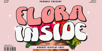 FloraI Inside - A Groovy Display Font is a font with distinctive handwritten characters perfect for branding projects, logos, media posts, advertisements, product packaging, product designs, labels, photography, watermarks, invitations, stationery, and any project who need handwritten dishes. Features : • Character Set A-Z • Numerals & Punctuations (OpenType Standard) • Accents (Multilingual characters) Multilingual Support : Afrikaans, Albanian, Asu, Basque, Bemba, Bena, Catalan, Chiga, Cornish, Danish, English, Estonian, Faroese, Filipino, Finnish, French, Friulian, Galician, German, Gusii, Icelandic, Indonesian, Irish, Italian, Kabuverdianu, Kalenjin, Kinyarwanda, Low German, Luo, Luxembourgish, Luyia, Machame, Makhuwa-Meetto, Makonde, Malagasy, Malay, Manx, Morisyen, North Ndebele, Norwegian Bokmål, Norwegian Nynorsk, Nyankole, Oromo, Portuguese, Romansh, Rombo, Rundi, Rwa, Samburu, Sango, Sangu, Scottish Gaelic, Sena, Shambala, Shona, Soga, Somali, Spanish, Swahili, Swedish, Swiss German, Taita, Teso, Vunjo, Zulu
 - Ful • Fruitful & Universal Labels by S P I C I O,
$88.88 What is ful? ful is a useful and universal language of symbols for food products. Why use ful? ful is a simple visual system. With ful, you’ll never have to read the entire label to know the basic information. With ful, you have access to the basic information much faster. Answering the questions: • What kind of diet is it? [Diet] • How to store, prepare, and use? [Use] • Can I eat it? [Warnings] Why create ful? • To have the basic information quickly, anywhere in the world. • To create a more homogeneous design. • To solve some of the basic problems with the old designs. • To accelerate the process of consumer choice. • To provide as much information as possible in the least possible space. http://ful.graphics/
 - Bochan by HansCo,
$15.00 Bochan is incredibly elegant and beautifully rounded sans serif and also include with serif version font that will add a timeless look to any design project!. Very suitable for logo, brand identity pack, packaging designs, wedding invitations, quotes, advertisements and many more.. This font is PUA encoded which means you can access all of the glyphs and swashes with ease! Features : uppercase & lowercase numbers and punctuation multilingual alternates PUA encoded We highly recommend using a program that supports OpenType features and Glyphs panels like many of Adobe apps and Corel Draw, so you can see and access all Glyph variations. Tutorial how to Install & use Alternate / Special Character : https://hanscostudio.com/tutorial/ Enjoy!
 - Fermo TRF by TipografiaRamis,
$20.00 Taking into consideration some complaints about lack of capital letters and deficiency of heavier weight styles, the Fermo typeface was redesigned to replace the existing font, dated 2002. New Fermo includes two subfamilies—Fermo TRF and Fermo-Uni TRF. Both fonts now consist of three weight styles—light, regular and bold—with significant contrast. During the updating process some minor glyph shape adjustments and changes have been made. Fermo TRF's main distinctions from the previous font are the new capital letters and additional weight (light) style. Fermo-Uni TRF is a unicase font with an additional lightweight style. Fermo is recommended for use as a display font. In large size settings negative tracking is recommended.
 - Piolin by JVB,
$13.00 Piolin So new. So different. Piolin is a memorable display font inspired by the circus universe. This typeface, which has the same name of the most renowned brazilian clown, is full of magical tricks like several characters alternates, swashes and discretionary ligatures. Please, explore the opentype features included in this typeface at their best and go deep inside the circus imaginary. Piolin is suitable for brand identities, book design, editorial design, campaigns, exhibitions and other promotional materials that seek a special flavour to stand out an astonishing message. If used in big sizes, Piolin reveals its marvellous details which make us feel bewitched by how carefully it is designed. Feel the magic up close!
 - Riser by Yumna Type,
$15.00 Riser is an uppercase display font. It projects warm, cute, and slightly futuristic aesthetic. It is a cleanly designed outline font that’s easy to read and will look great in a variety of header and title sizes. This font becomes more special with illustrations as the extras. Features: Ligatures Stylistic Sets Multilingual Supports Uppercase and lowercase PUA Encoded Numerals and Punctuation This font would looks great on your branding, logos, social media quotes, stickers, posters, wall art, merchandise, social media, and many more. Get more inspiration about how to use it by seeing the font preview. Thank you for purchasing our fonts. If you have any further questions, don't hesitate to contact us. Happy Designing.
 - Madison Ave. by Funk King,
$10.00 The Madison Ave. family started from Madison Ave. at Fontstruct.com. As my most downloaded font, this was an easy, although not necessarily logical choice to make – regarding taking an existing free font and attempting to offer it for purchase. The font is very basic and simple in its layout, but has achieved popularity over at Dafont with almost 80,000 downloads with its cool, understated nature and inherent sophistication. The original Madison Ave. is now 95 Madison Ave. A couple of glyphs have changed from the original, but mostly the set is the same. The big news here is the availability of multiple variations on the original. Ninety-five refers to the filter settings used to achieve the faint cross lines in the font. The sequence 95-100 provides a gradual fade to solid effect when used together. The other versions use variations on the filter settings that allow each its own distinctive flavor, while at the same time maintaining inherent characteristics of the original. Ninety-five is now joined by 55, 75, 97, 99, 100, 102, 105, 155, 175, 201, 202, and 275. 100 is the solid version which doesn’t contain the trademark lines found in 95. In 95-99, the line width varies to achieve subtle effects. 50 and 85 are distorted by reducing the filter settings in a somewhat minimizing fashion. In 102-205, these are distorted by increasing the filter settings above the normal which is what 100 represents. While some of the effects are extreme and challenge the legibility of text, these can be fun or edgy. They offer a cohesion that can be used to advantage for different projects that require the use of a modern font family.
 - Pragmatik by Christopher Stahl,
$24.90 Pragmatik is a carefully crafted Square Sans by Christopher Stahl, awarded with a Commendation at the Art Director's Club Germany Junior Competition 2011 and selected as Font of the Week 42.2011 by Typolution.de. The design is influenced by the heritage of German industrial typesets like DIN, yet the use of forms and proportions feels modern and fresh. The family consists of three weights with matching italics, thus making a total of six fonts. The high x-Height and the sturdy design provide a good legibility in body text, while in larger sizes the exciting details and alternates create headlines full of atmosphere. Features: - 350 glyphs supporting central and western European languages as of DIN 16518 - over 500 manually adjusted kerning classes and pairs - available in Open Type with a host of Open Type features, such as: - proportional lining, lining table and proportional oldstyle number figures - 7 default and 16 discretionary ligatures that especially cater the needs of the German and English language - a variety of stylistic alternate figures like a stencil like i and j or an old-style Eszett.
 - Casting Call JNL by Jeff Levine,
$29.00 Casting Call JNL is a simple condensed sans modeled from the hand-lettered title of a piece of vintage sheet music entitled "Somebody Else is Taking My Place"; a 1940s song co-authored and made famous by bandleader Russ Morgan.
 - Gradl Zierschriften by HiH,
$10.00 Here is another design by jewelry designer Max Joseph Gradl. Zier is a verb, meaning to decorate, adorn or ornament; zierlich means decorative, elegant, fine, neat. Schrift means type. Zierschrift, therefore, means decorative type. Gradl Zierschriften is a decorative type in the Art Nouveau style, rather than the more ornate Victorian style. Very modern, very young, with an elegant simplicity of form. Maria Makela, in her book The Munich Secession (Princeton 1990) suggests that the frequent use of simple, flowing, organic forms that was so characteristic of Art Nouveau was a reaction against the growing complexity and rapid urbanization that resulted from 19th century industrialization. In keeping with that reaction is the hand-drawn quality that intentionally rejects a mechanistic mathematic precision of line rendering. Gradl Zierschriften preserves that hand-drawn quality. Designed with upper case only, this face was obviously intended for short headlines only and is best set at 18 points or larger. However, I don't think you really get to experience the grace of this design until you get to 36 points or more. In the larger sizes, it is simply stunning. Please note that while most of the uppercase letterforms are repeated in the lower case for convenience, the ‘F’,‘L’ and ‘T’ are rendered a little narrower than in the uppercase to provide for visual variety. The font also includes a generous supply of ligatures for just the right fit ... and just for the fun of using them. Three common ways of inserting a ligature, accented letter or other special character are: 1) Key in “ALT”+“0”+[ascii #]; for example ALT+0233 for the e-acute, 2) From within your application program, go to the INSERT menu and look for something like “Insert Symbol,” (this function is NOT available in all application programs) & 3) Cut & Paste from the CHARACTER MAP display that has been supplied by every generation of Windows Operating System that I can recall (All Programs>Accessories>System Tools). Isn't it amazing what you can do? Don't be afraid to experiment. If you back up your work, you have very little to lose and a lot to gain. Not only do you acquire a new tool, but by the very process you have learned how to continually expand your knowledge and skill base.
 - Miluero by Luxfont,
$18.00 Introducing the stylized Miluero family. Graceful cut, rounded corners combined with austere shapes. Accent fonts with color padding and a classic basic monochrome version in the set. Perfect for logos, headlines and captions. Looks elegant in a minimalist modern design. An assortment of colors will help you get started quickly. This font family is based on the Regular font Pacardo - which means that if necessary you can combine these two families and they will be absolutely stylistically identical and complement each other. Check the quality before purchasing and try the FREE DEMO version of the font to make sure your software supports color fonts. P.s. Have suggestions for color combinations? Write me an email with the subject "Miluero Color" on: ld.luxfont@gmail.com Features: - Free Demo font to check it works. - Uppercase and lowercase the same size but different forms. - Color in letters. - Kerning. IMPORTANT: - Multicolor version of this font will show up only in apps that are compatible with color fonts, like Adobe Photoshop CC 2017.0.1 and above, Illustrator CC 2018. Learn more about color fonts & their support in third-party apps on www.colorfonts.wtf -Don't worry about what you can't see the preview of the font in the tab "Individual Styles" - all fonts are working and have passed technical inspection, but not displayed, they just because the website MyFonts is not yet able to show a preview of colored fonts. Then if you have software with support colored fonts - you can be sure that after installing fonts into the system you will be able to use them like every other classic font. Question/answer: How to install a font? The procedure for installing the font in the system has not changed. Install the font as you would install the classic fonts. How can I change the font color to my color? · Adobe Illustrator: Convert text to outline and easily change color to your taste as if you were repainting a simple vector shape. · Adobe Photoshop: You can easily repaint text layer with Layer effects and color overlay. ld.luxfont@gmail.com
 - Cenzo Flare by W Type Foundry,
$20.00 Cenzo Flare is a mixture of modern sans serif base with a touch of flare to it. The inspiration is drawn from all kinds of old Americana advertising, Italian posters, old century logos and signs. All that plus the strong trend on retro fonts now displayed on tv series and current music imagery results on Cenzo Flare. A typeface designed for headlines, posters, advertising and corporate identity. With its appealing curvy smooth edges it is sure to catch the eye. Also enjoy multiple styles that work on their own or as overlapping layers with the InLine & Line variants to create colorful designs. This 40 font family consists of four 5-weight subfamilies: Regular, InLine, Line & Condensed. All of them with matching italics. Designed with powerful opentype features, each weight includes alternate characters to play with, extended language support and many more. We’re proud to introduce: Cenzo Flare. Learn about upcoming releases, work in progress and get to know us better! On Instagram W Foundry On facebook W Foundry wtypefoundry.com
 - Scala Pro by Martin Majoor,
$49.00 The award-winning Scala family (1990-1993) is a worldwide bestseller and has established itself as a ‘classic’ among digital fonts. It was one of the first serious digital text fonts to support small caps, ligatures and different set of numbers. In fact Scala and Scala Sans (1990-1993) are two different typefaces sharing a common form principle: the skeletons of both Scala and Scala Sans are identical. Scala’s dark colour and low contrast works to prevent the thin parts from breaking up. The generous length of Scala italic’s serifs gives it a strong rhythm. The bold weight has the same character widths as the normal weight, so changing a text from normal into bold does not affect the set width. Another part of Scala is very popular among its users: Scala Hands, containing more than one hundred decorative hands and pointers, is a free bonus. Scala Jewels is a set of four highly decorative typefaces, based on the bold capitals of Scala.
 - Albiona by Device,
$39.00 A contemporary slab-serif which revisits aspects of Robert Besley’s all-time classic Clarendon, designed around 1842 for Thorowgood and Co. and named after the Clarendon Press in Oxford. The original design was subsequently extended by Sheffield foundry Stephenson Blake in the 1950s into a widely-used, robust workhorse family. Albiona uses the inwardly curved stroke terminals of the same foundry’s Grotesque series, while rationalising or removing entirely Clarendon’s ball serifs, flicked tails and other eccentricities to make it more functional in contemporary settings. The family consists of five weights plus italics and a stencil, and includes oldstyle and tabular numerals. Its clean readable style suits both text and headline setting.
 - Flirt by Canada Type,
$25.00It's a very happy day when we stumble upon beautiful alphabets that were never digitized. It is even a happier day when the beautiful alphabet finds its way to us through friends and people who like our work. Some two months ago, the forms of this gorgeous font were pointed to us by a friend who saw it in an old Dover Publications specimen book showcasing historical alphabets. It was there under the name Vanessa, with nothing else to go by. We looked and researched for further information but found nothing else. So this gem comes to you like a coal that winked its way out of the ashes because it wanted to shine again. Flirt is very authentic art deco with a noticeable element of artistic pride, swashy delicate majuscules and very aristocratic, fashionable and flirty minuscules. The majuscules can be used as every other capitals usually are, or as initial caps. The minuscules can very nicely stand on their own quite independently from the caps whenever desired. These letters are quite similar to the hand lettering used on of the kind of theater posters, specifically burlesque and opera entertainment, which are now considered very retro-chic and fashionable to see hanging on walls in home or office. The initial specimen we worked from showed a single basic art deco alphabet with numerals which seemed as they belonged to another font. That alphabet became the base Flirt font, the numerals were redrawn to fit much better with the minuscules, and the character set was greatly expanded to include punctuation, accented characters, and many many alternates, especially for the majuscules. Majuscules with a descending right vertical stroke were a common artistic touch in the high days of theater posters, so we thought they would be great additions to the character set. These alternates can be found all over the font. So to maximize the design fun, have a character map or glyphs palette handy when you use Flirt. After the base font was finished, we thought it would be a good idea to give it a bold treatment unlike anything seen out there, and the farthest thing from the mechanical bolds seen everywhere now. This bolding treatment consisted of thickening the lowercase's vertical strokes inwards, but leaving the horizontal stroke weight as is, and thickening only the thicker vertical strokes of the uppercase. The result is quite the visual feat. We encourage you to test both the regular and bold weights and see for yourself. - CRAY AN? by Skydog is an intriguing and visually captivating font that manages to transport users back to their childhood days, evoking memories of carefree doodles on the edges of notebooks. This fo...
- Samo Sans by CarnokyType,
$- Samo Sans is a modern sans-serif typeface with low contrast strokes and is balanced between technical shapes and dynamic feeling. The primary type family is consisted of complete set of Latin glyphs for lower and upper case. It also supports diacritics of all European languages including lining numerals, standard ligatures and other characters sufficient for regular typesetting. Characteristic features are lower spurs (a, b, d, u), and upper spurs (m, n, p, q, r) with distinctive wedge-shaped cuts. These parts are complemented by homogeneously designed diacritics, which is not disturbing and harmonizing with the whole unit. Another very strong feature of the type drawing are lower terminals of the round glyphs, which are finished by moderate narrowing. The type has got decreased caps height, also decreased numerals and optimal x-height, which makes it suitable for more extensive text typesetting. It can be effectively applied in corporate identities or in display typesetting. The narrowness of the basic set of Samo Sans typeface is supplemented by extended type family Samo Sans Pro .
 - FF Attribute Text by FontFont,
$72.99 FF Attribute™ Text is a proportional design with a faux monospace appearance. It has an industrial strength, minimalist vibe, making it perfect for attention getting, theme-based headlines, posters, banners and navigational links. And, because it is such a robust family, FF Attribute can also be used for branding of blogs, games, web sites and tech products. FF Attribute comes in two families; Mono and Text. The Mono is a fixed width (monospace) design, while the Text is a proportional design. FF Attribute was, in fact, initially designed for the use in code editor software. Its seven roman and italic monospaced weights and extended character set supporting a many languages, also make it a powerful communications tool. But this is only the tip of the iceberg. In addition to the monospaced version, where all characters share a fixed width, there is also a proportional, “faux monospaced” version: FF Attribute Text. The Text family keeps the visual character of a monospaced typeface, but wide letters are given more space while narrow characters have been drawn with correct proportions and spacing. FF Attribute Text looks monospaced – but it’s not. Drawn by Viktor Nübel, FF Attribute Text’s 14 designs, huge character set, including box-drawing characters and user interface-icons, make it the Swiss Army Knife® of monospaced fonts.