10,000 search results
(0.017 seconds)
- Ailey Display by Graptail,
$15.00 Ailey Display is inspired by the work of charming lettering artists with a combination of Old Style Display Bold. Each letter is modified so that the distance, width and weight can give the beauty of the alternates given. A passionate curve gives a touch of beauty to this font.
 - Netherland Perpendicular by Greater Albion Typefounders,
$16.00 Netherland Perpendicular, a family of five typefaces, is Greater Albion’s end of year Blackletter release for 2015. It is designed in the fine traditions of Victorian Revival Blackletter, where historical veracity is ever sacrificed to aesthetic calm. The five typefaces share uniform metrics, making for charming colour overlay effects.
 - Honnitta by Letterara,
$12.00 Honnitta is a handwritten signature script with a modern look. It has a good readability and contains lots of glyph’s which give you the chance to give your designs a different look, each time you use Honnitta. Because of its diversity, Honnitta can be used for almost every design.
 - School Age by Jeff Levine,
$29.00 The “Trixy Toy Educator” was a 1930s-era set of letters and numbers (along with a few animal shapes) for teaching children, and was manufactured by the Durrel Company of Gardner, Massachusetts. Die cut from thick cardboard, the 40 piece set also included a rack to display the characters, presumably for little ones to practice the correct order of the alphabet and basic numerals or to spell simple words like ‘dog’ or ‘cat’. Whomever came up with the idea, they used the most rudimentary and unusual ‘type design’ shapes in the A-Z and 0-9, but they were just odd enough to inspire a digital type version of them. School Age JNL is available in both regular and oblique versions.
 - Gladiora by Owl king project,
$37.00 Gladiora Sans serif font family with tapered accents in some of the letters gives it a modern and bold character, even being quite prominent in thin characters. This font aims to give an elegant impression and also looks so luxurious in short wording for a letter-based title and logo. With 20 types and support for multi-languages, this font provides a wider range of exploration, which can be useful also for reading sentences and giving variety to each sentence by combining it with several sizes.
 - Pizza Mania by Epiclinez,
$18.00 Pizza. It's our life, it's your life. It's what you live for. We can't live without it, so it's time to get to the root of the problem. As food lovers ourselves, we wanted to create a font that captured our love for pizzas. Pizza Mania is a quirky & lively display font that will make all your designs pop! So what’s included : Basic Latin Uppercase and Lowercase Numbers, symbols, and punctuations Multilingual Support. Fully accessible without additional design software Simple Installations works on PC & Mac Thank You!
 - Lemon Twist by Art Grootfontein,
$20.00 Modern and bold, LemonTwist gives your designs a little zest of fresh feeling...
 - Granny Smith by BA Graphics,
$45.00Angular serifs give this font a unique look. Works well in all applications. - Vibration by Funk King,
$5.00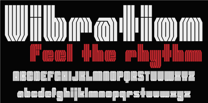 Vibration is a modular font. Use it to give energy to your designs.
 - Tchig Mono by Eclectotype,
$30.00 This is Tchig Mono, a monospaced type family that doesn't take itself too seriously. Why make a monospaced font? For coding, sure, but display? It’s my humble opinion that it’s the aesthetic choices driven by the constraints of the monospaced environment that makes them attractive. It’s a challenge for the type designer to squash and expand glyphs into a rigid bounding box, and the more unorthodox shapes that spring from this have a feel about them which lends them to postmodernist layouts and hipsterish anti-design. And the payoff for the type designer - no kerning! Yay. So what’s different about Tchig? Like I said before, it doesn't take itself too seriously. Even the name Tchig is just a stupid, fun sound (although it does show off that nice g!). There are a selection of playful alternates that give text a slightly alien feel. Stylistic set 1 chops off ascenders and descenders of lowercase letters, giving it a kind of small caps meets unicase feel (it is also accessible using the small caps feature). The other sets (or stylistic alternates if you don't have access to stylistic sets) make certain letters more twirly, more square, more “experimental”. Automatic fractions use a half-width numerator and denominator so fractions like one half and five eighths have the same width as figures (and every other glyph). There you go then - a monospaced type family not initially intended for use in the usual ways monospaced families are intended to be used. Give it a try. You could even do some coding with it if you like.
 - Night Light Neon by Wing's Art Studio,
$24.00 Night Light is a specially created collection of seven neon inspired fonts giving designers the power to replicate traditionally hand-made lettering from the comfort of their own computer. Choose from the selection of script, sans serif and outline fonts to set your text. Then apply our custom graphic styles for a life giving jolt of electricity! The appeal of neon lettering lives in its power to display a message in a functional, eye-catching and timelessly cool way. How many times have you stopped in the street to admire a bar sign or shop front blazing with neon colors? It's aesthetic works equally well for a Hot Dog stand or high-end fashion brand, providing a tried and tested technique for grabbing customer attention. I've designed these fonts to make the power of neon accessible to all, investing time to research real neon signs and how they are made, paying attention to their human imperfections and inherent limitations (all of which makes them). This research has been distilled into these essential styles; Script, Outline, Inline, Square and Compressed. These seven core fonts give designers a new opportunity to take advantage of realistic neon lettering in their print and online projects, perfect for music promotion, film titles, YouTube tutorials and gig posters. Ready to be moulded to any requirement, the power of neon is in your hands. Neon Graphic Style Presets Available Here The link above provides access to the graphic styles seen in the visuals with support for Adobe Photoshop, Adobe Illustrator, Adobe After Effects. Simply download and follow the instructions provided.
 - Mix Modern by Mix Fonts,
$13.00 MIX MODERN is a layering family of fonts—a bundle of five different styles. These fonts can be used alone or in combination. Switch up among five of my favorite fonts to create fun and whimsical variations. Get creative! This font family is perfect for handmade and DIY themed projects.
 - Circuito by Katherin Funez,
$10.00 Looking for a font that give you an electrifying feeling? Circuito is a fun display font that can be used in your projects to give some character and style to your design. Inspired by the visual representation of electrical circuits, Circuito is the font that is energetic, happy and daring.
 - Actium by Type Mafia,
$45.00 Actium is a contemporary multilingual sans serif typeface developed to help perfect typography automatically. Type Mafia has focussed on words with odd combinations of capital letters and numbers, such as product names and postal codes such as WD40 and H1N5, jump out of the text. They sit awkwardly together as the numerals have been designed to work with the lowercase, not the uppercase letters – affecting readability.To fix this Type Mafia invented Smart Capo™. Smart Capo™ Smart Capo is a feature that automatically activates once you type an uppercase letter together with a number. When a capital letter is sat next to a numeral, Smart Capo converts the letter to a mid-cap — a contemporary alternative to small caps — and the default old-style numeral to a lining numeral. Actium’s mid-caps and lining numerals have been designed with the same height (between cap and x-height) so they sit comfortably next to each other and fit more harmoniously into text. Smart Capo applies equal attention to capitalised words without any numbers, such as NAVO and USA, and are also automatically set into mid-capitals. Working on its own, Smart Capo saves time and money for the typographer — taking the pain out of text formatting — and makes it a more pleasurable experience for the reader. This feature is made possible by the use of ‘contextual alternates’, an OpenType feature used in modern font software, working with a set of characters specially designed at mid-cap height. By default these changes automatically take place so it doesn't need to be switched on, it will just work. Actium Actium’s design has an unusual diagonal contrast — much more common in a serifed face than in a sans serif — giving it more bite. The typeface looks elegant when set in large sizes and remains very legible when shown in small sizes. The family consists of six weights in two styles, making a dozen fonts. Weights range from light to black in roman and true italic. All fonts are fully loaded with functional elements. Actium boasts an extended Latin character set and with Greek. This means a wide range of Western languages are supported: perfect for use in bilingual publications and packaging. For numerals, each font includes old-style and lining figures in both proportional and tabular widths, with superiors and inferiors. These allow you to select the right set of numbers for the right task.
 - Ondo by JAM Type Design,
$23.00 Ondo is a low contrast geometric sans serif with large open counters which give the typeface a somewhat bold and contemporary appearance. This feature gives Ondo a fun yet sensible feel which can be used for both large chunks of text as well as for short headlines. Ondo comes with more than 370 glyphs, supporting a wide range of languages. With its 10 fonts, Ondo is an ideal font family for text, branding, signage, print and digital design. Give Ondo Demo Medium a try on your personal projects – completely FREE.
 - Perrywood by Monotype,
$29.99Loosely based on Bembo and Plantin, the Perrywood font family retains some old style characteristics which give the face a familiar feel, however much attention has been paid to optimizing the design to give good quality output at small point sizes and from low resolution output devices. The consistency of character shapes allows close letter spacing to give compact word shapes, excellent word recognition and an overall economy in text. Perrywood offers good legibility and, coupled with an even text color will be very useful for text setting, in correspondence, for faxes and reports. - Helnore by Owl king project,
$39.00 Helnore is a sans serif font family with tapered accents in some of the letters giving it a modern and bold character, even being quite prominent in thin characters. This font aims to give an elegant impression and also looks so luxurious in short words for a letter-based title and logo. Helnore bring 20 style/Italic and support multi-languages, this font provides a wider range of exploration, which can be useful also for reading sentences and giving variety in each sentence by combining it with several sizes.
 - KG Party On The Rooftop by Kimberly Geswein,
$5.00 In both chunky and tilted/3D versions, this font gives a dose of fun!
 - Monica by Weknow,
$25.00 Give a groovy fun simple rounded, fancy, a cute looks to any text project
 - Basset by Red Rooster Collection,
$45.00 Digitally engineered by Steve Jackaman. Originally in five weights, Steve produced three additional weights.
 - Pargrid by Linotype,
$29.99Pargrid is a grid-based typographic experiment from the young Swiss designer Michael Parson. In the Pargrid family, which contains three separate weights, Parson has created an intriguing system of small circles-similar to LED's or light bulbs-that live separately on a grid, creating unique letterforms. In small sizes, these circles blend together to create seemingly fluid lines, giving Pargrid's letters a wide, rectangular appearance. In larger sizes, the letterforms transform themselves into objects d'art-virtual and ordered communities populated by various points. Fantastic in both display settings as well as short strings of text, Pargrid may offer the exact look that your next project is looking for. Pargrid and nine other constructed type designs from Parson are included in Take Type 5 collection, from Linotype GmbH." - Gemsea by Product Type,
$17.00 With Gemsea Fonts, you open the door to a world of limitless creativity. A display theme that celebrates the power of the ocean, bringing a strong, bold, and fun touch to any of your projects. Gemsea is the perfect solution for projects that require a unique theme. From epic films to stunning games and unforgettable streaming events, this font offers durability and appeal in various languages. Stunning Features: Five different family styles: Regular, Blur, Engrave, Outline, and 3D. This gives you the flexibility to create a variety of nuances in your designs. It supports multilingual so that you can connect with a global audience without restrictions. Gemsea creates not just projects, but unforgettable works of art. Get the Gemsea Font now and bring the magic of the ocean into your designs!
 - Rock Painting by Morganismi,
$9.00 Rock Painting is based on ancient Northern rock paintings and I edited the glyphs to resemble latin letters, runelike. So it's quite writable and the characters can also be used separately in bigger shape. Some of the glyphs are idols of old Finnish gods and spirits: A - Ahti, god of (usually) water element or a spirit that lives in a pond, a lake or a river etc. I - Ilmarinen, god of the air K - Kaleva, ancient giant blacksmith, the great ancestor of Finns L - Luonnotar, the spirit of all nature, gives birth to creatures T - Tapio, god of the forest or the forest itself N - Nyyrikki/Nyrki, son of Tapio, a great hunter and so on. The font also includes glyphs resembling animals and things like moose, beaver, swan, fish, sickle, boat and more.
 - Sharpe Variable by Mans Greback,
$19.00 Sharpe Variable is a stylish serif typeface family. The original type was drawn between 2018 and 2019, and the variable font and its updated styles was created in 2020. It is clear, sharp and has brave, lively letter forms but with a conservative backbone. This font is provided as a Variable Font. It is only one font file, but this file contains multiple styles. Use the sliders in Illustrator, Photoshop or InDesign to manually set any weight and width. This gives you not only the 15 predefined styles, but instead more than half a million steps to customize the type to the exact look your project requires. Each style contains ligatures and support for a wide range of languages. More info about Variable Fonts: https://mansgreback.com/s/About_Variable_Fonts.pdf
 - Hello Fresh by Resistenza,
$29.00 Fresh is best! Say hello to this playful and bouncing font designed by Resistenza. This all-caps have been specially created to add a lively mood to your graphics. You’ll be able to create catchy quotes combining these all-caps fonts or you can use them individually. Including 2 sets of letters on each font (uppercase & lowercase), so you can choose an alternate for each glyph just using your keyboard or the opentype glyphs panel on Indesign, illustrator and other apps with opentype features. Have fun with this friendly font family and give a whimsical touch to your projects. Perfect to create headlines, posters, DIY hand-lettered artwork, books, holiday cards, wrapping paper, invitations, T-shirts, labels, packaging, fashion supplies, food products, artisanal goods, and an endless array of options.
 - Black Ridge by ZP Fonts,
$16.00 Black Ridge is a strong and rugged typeface, supplemented by its tall x-height, angled cuts, and quirky curves—all giving it a unique touch of character. It was inspired by the bold, modern, and condensed sans-serif typefaces created by typographic pioneers such as El Lissitszky, Herbert Bayer, and Jan Tschichold of the early twentieth century. This typeface is intended for display headlines and comes with a customary set of Latin characters, including diacritics, accents, symbols, mathematical glyphs, and more. Black Ridge comes in five styles—thin, light, regular, bold, and black—and supports over 80 different languages. Each weight contains a set of alternate glyphs and discretionary ligatures specially designed for better spacing and aesthetic enhancements for the more awkward character pairs such as fi, fl, rv, TY, FT, and more.
 - HS Aleman by Hiba Studio,
$59.00 HS Aleman is a modern OpenType Arabic Typeface. It is a modern Kufi / Naskh hybrid and keeps the balance between its construction and its flexibility in the transition between the thick and thin parts and it also contains a harmonious smooth curve at its parts in all characters, numbers and marks. This font contains some extended characters (swash), some variants of some characters (Stylistic Set), which gives the user some flexibility in using some characters. The font weights are refined with enhanced legibility and are ideally suited to advertising, extended texts in magazines, newspapers, book and publishing, and creative industries, meeting the purposes of various designs. This typeface supports Arabic, Persian, Pashtu, Kurdish Sorani, Kurdish Kirmanji and Urdu variants and it is available in '''five weights: light, regular, medium, bold and black.
 - Le Havre Titling by insigne,
$24.00 Throughout time, history’s architects have incorporated some of the finest illustrations of type into their great works--cuneiform on Mesopotamian ziggurats; Greek etched into the temples of the gods; inscriptions marking the monuments of mighty Rome. From these Roman inscriptions specifically, we take our capital letters of today; and while we've lost the need for serifs over time, our current characters maintain the classical foundations, even after being distilled to their simplistic forms. Here’s where we have the basis for Le Havre Titling. This updated face is a carefully optimized version of Le Havre that uses purely capital lettering. Originally inspired by the golden period of the passenger ship and the French port that bid a rich bon voyage to so many famed, luxurious ocean liners of the Roaring Twenties and Thirties, the typeface includes an exciting array of ligatures that brings it into the present day and gives designers a tremendous amount of versatility in their work. With its seven weights, Titling looks equally at home on the side of a building as it does in a finely crafted invitation. With over five hundred glyphs, Le Havre Titling offers a multiplicity of options for your projects. Combine ligatures, play around with two sets of art deco forms, use original caps, and more; every one of these is obtainable with the OpenType functionality. The new design also shares five weights with the original Le Havre, allowing you to maximize your potential through its interchangeability. Titling’s Thin weights are delicate but not too fragile, and its geometric forms give each individual composition you create an exquisite and beautiful sense of emotion. Without a doubt, this fresh, fashionable take on the classical forms offers your reader refined, yet unanticipated approach as he or she travels through your text.
 - Barricada by Sudtipos,
$49.00 Barricada is a loud-voiced typeface with small counters that gives an interesting strong weight. Moreover, it has a solid structure providing strength. Its curved serifs and swashes give a touch of softness and make the letters a little playful. This is the right option to set a fresh and solid text.
 - Galexica by Ingrimayne Type,
$6.00 Galexica is a geometric, modernistic, sans-serif typeface. The original family had five members, but an upgrade in 2019 expanded that to ten, with five weights and italics for each of those weights. The eccentric letter forms have a techno or futuristic look. There is also a monospaced version of this design,
 - React BTL by BoxTube Labs,
$22.00 React is modern athletic display block font family. It's timeless shapes and features will give you an instant athletic feel to your project. React features both chamfered corners and rounded giving it a unique approach. These fonts are perfect for sports logos, branding, posters, apparel design, magazine headlines, labels and so much more.
 - Estilo Pro by DSType,
$26.00 Five years later, DSType proudly introduces Estilo Pro: the Ultimate version of Estilo. Now with sharp edges and five weights from Hairline to Bold, Estilo Pro includes an extraordinary set of features like alternate characters, initial swashes, ending swashes, ligatures, ornaments and drop caps in a total of 1000 glyphs per weight.
 - Casual Mark Script by Pedro Teixeira,
$14.00 Casual Mark Script with ligatures and alternate lowercase gives a personalized feeling to your work.
 - Green by ITC,
$29.99Green is the work of British designer Timothy Donaldson, known for his experimentation with letter forms. This typeface features a sharp stroke contrast and eccentric lower case letters, giving it a vital, clean-cut style. Green is perfect in both large display sizes and small text sizes and gives any work a fresh, new look. - FunFair by Andrew Footit,
$14.00 This fun sans-hand typeface gives your designs and layouts a personal touch that leaves a smile. FUNFAIR has two weights each with italics. FunFair has tall letters and tight kerning to give a natural hand written style. It’s great for posters, cards and headings but also versatile enough for many kinds of typographic layouts.
 - Basenji by Typodermic,
$11.95 Basenji is a flowing headline typeface influenced by the modular geometric design trend of the 1970s. Herbert Bayer published his highly influential Universal Alphabet in 1924, which was based on circles and straight lines and had a modern, industrial appearance. Jan Tschischold’s typography popularized this simple, unconventional style but by the late 1950s, it had fallen by the wayside. Type designers Joe Taylor and Herb Lubalin inaugurated the 1970s with fresh takes on an old concept. These new typefaces were more practical than the original, and their blend of futuristic curves and funky curls fit the zeitgeist. The popularity of these types spawned a flood of similar designs like Pink Mouse, Bauhaus, Pump, and Harry. These typefaces were popular throughout the decade then fell out of favor by the mid-1980s, making a comeback in the year 2000. Many contemporary font designs have drawn inspiration from the beginnings of the Universal Alphabet, but Basenji is unique. This typeface amplifies of the 1970s elements of Rondo, Pump, Bauhaus and Blippo, and packs them into a practical, versatile design toolset. Basenji comes in nine weights and italics. Most Latin-based European, Vietnamese, Greek, and most Cyrillic-based writing systems are supported, including the following languages. Afaan Oromo, Afar, Afrikaans, Albanian, Alsatian, Aromanian, Aymara, Azerbaijani, Bashkir, Bashkir (Latin), Basque, Belarusian, Belarusian (Latin), Bemba, Bikol, Bosnian, Breton, Bulgarian, Buryat, Cape Verdean, Creole, Catalan, Cebuano, Chamorro, Chavacano, Chichewa, Crimean Tatar (Latin), Croatian, Czech, Danish, Dawan, Dholuo, Dungan, Dutch, English, Estonian, Faroese, Fijian, Filipino, Finnish, French, Frisian, Friulian, Gagauz (Latin), Galician, Ganda, Genoese, German, Gikuyu, Greenlandic, Guadeloupean Creole, Haitian Creole, Hawaiian, Hiligaynon, Hungarian, Icelandic, Igbo, Ilocano, Indonesian, Irish, Italian, Jamaican, Kaingang, Khalkha, Kalmyk, Kanuri, Kaqchikel, Karakalpak (Latin), Kashubian, Kazakh, Kikongo, Kinyarwanda, Kirundi, Komi-Permyak, Kurdish, Kurdish (Latin), Kyrgyz, Latvian, Lithuanian, Lombard, Low Saxon, Luxembourgish, Maasai, Macedonian, Makhuwa, Malay, Maltese, Māori, Moldovan, Montenegrin, Nahuatl, Ndebele, Neapolitan, Norwegian, Novial, Occitan, Ossetian, Ossetian (Latin), Papiamento, Piedmontese, Polish, Portuguese, Quechua, Rarotongan, Romanian, Romansh, Russian, Rusyn, Sami, Sango, Saramaccan, Sardinian, Scottish Gaelic, Serbian, Serbian (Latin), Shona, Sicilian, Silesian, Slovak, Slovenian, Somali, Sorbian, Sotho, Spanish, Swahili, Swazi, Swedish, Tagalog, Tahitian, Tajik, Tatar, Tetum, Tongan, Tshiluba, Tsonga, Tswana, Tumbuka, Turkish, Turkmen (Latin), Tuvaluan, Ukrainian, Uzbek, Uzbek (Latin), Venda, Venetian, Vepsian, Vietnamese, Võro, Walloon, Waray-Waray, Wayuu, Welsh, Wolof, Xavante, Xhosa, Yapese, Zapotec, Zarma, Zazaki, Zulu and Zuni.
 - Rougon by VanderKeur,
$30.00 The reason for Nicolien van der Keur to design the Rougon font was the translation of twenty novels written by Emile Zola, a French writer, and translated by Martine Delfos. It follows the lives of the members of the two titular branches of a fictional family living during the Second French Empire (1852–1870) and is one of the most prominent works of the French naturalism literary movement. This series deserved a font with French roots and corresponded to the period in which Zola’s books were written and published, the period between 1870 and 1893, the end of the nineteenth century. Extensive research into French historical typefaces has led to a type specimen from the French type foundry Deberny et Cie in Paris around 1907. It turned out to be good and helpful source as it contained a sample of a typeface that reflected the content and style of the novels, but also represented the period in which the books were written in France. A large part of the novels are about the generations of Rougon, so it seemed a natural choice to give the font that name. It is available in one weight and contains stylized portraits of Emile Zola and the French Marianne. This font also contains various ornaments.
 - Gonzi by Mans Greback,
$49.00 Gonzi is a geometric sans-serif typeface in 30 styles. Its circular lowercase letters and large, expressive capitals combine to create a modern, clean typesetting with a distinct personality; all the while keeping accessible and legible. Gonzi consists of five weights, each one as narrow, medium and wide: Thin, Light, Regular, Bold, Black Condensed, Medium, Extended Each one of font styles is also provided as Italic, totalling 30 high-quality styles. Also includes a variable font! Only one font file, but the file contains multiple styles. Use the sliders in Illustrator, Photoshop or InDesign to manually set any weight and width. This gives you not only the predefined styles, but instead more than a thousand ways to customize the type to the exact look your project requires. More info about Variable Fonts: https://mansgreback.com/variable-fonts The font is built with advanced OpenType functionality and has a guaranteed top-notch quality, containing stylistic and contextual alternates, ligatures and more features; all to give you full control and customizability. It has extensive lingual support, covering all Latin-based languages, from North Europe to South Africa, from America to South-East Asia. It contains all characters and symbols you'll ever need, including all punctuation and numbers.
 - Stereotype by studiocharlie,
$17.00 Stereotype is a geometrical font in five weights based on the same square. It's a gradient!
 - KnewFont by Ingrimayne Type,
$9.95 KnewFont simulates neat and meticulous hand printing. Its letters slant left and come in five weights.