4,120 search results
(0.017 seconds)
- 1610 Cancellaresca by GLC,
$38.00 This font was inspired by the “Cancellaresca moderna ” type, which was calligraphed by Francesco Periccioli (published in 1610 in Siena, Italy). It was entirely handwritten by the designer for each circumstance, using quill pen and medieval ink on a rough paper, with added characters as accented ones and a lot of ligatures with respect for the original design. This font includes “long s” and also a lot of ligatures as “ff”, “ffi” “fij” “pp”... It can be used for web-site titles, posters and flier designs, editing ancient texts or greeting cards, or as a very decorative and elegant font. This font retains its qualities and beauty over a wide range of sizes.
 - Railham by OhType!,
$25.00 RAILHAM is a slab typeface with more than 330 glyphs including uppercase, lowercase, numbers, small caps, accents, punctuation, currencies, etc. Inspired by the tracks of a railroad, with stems that narrow at the top, Railham typeface, like a train looks to the future without forgetting the fundamentals of a long road, detaining in the detail of every element to form a strong, fast and versatile family. Retaking and uniting essential concepts of typography, rounded serifs with especially wide base, forms and counterblocks that complement together, RailHam typeface neatly adapts to any topic, besides being practical and readily legible in small and large formats, joining a select list of modern slab serif fonts.
 - 1536 Civilite Manual by GLC,
$42.00 This font was created inspired from a handwritten copy of the "Brief story of the second journey in Canada" (1535) by French explorer Jacques Cartier. It is an early "Civilité" manual style, closely looking like the "Civilité" script font carved by Robert Granjon a few years later and still strongly influenced by blackletters forms, clearly visible in the capitals or long s, d, e, f or t forms. (Look at our "1557 Civilite Granjon Pro" and the latest "1638 Civilite Manual"). It is containing Western (including Celtic) and Northern European, Icelandic, Baltic, Eastern, Central European and Turquish diacritics. Historical forms, titling alternates and the numerous lower alternates or ligatures made the font looking like a real various hand.
 - Istoria by Hooper Type,
$12.00 New foundry on the block, Hooper Type, kicks off it's catalogue with a versatile, story-telling serif font. With a love of the magical and a yearning for adventure, Istoria pushes away from the static, drawing in whisps and whirls that entice and excite, without distracting. Unassuming in it's long form, with delicate strokes that draw the eye, it commands attention when used in short punchy titles, or set in caps. Istoria (meaing both history and story in Greek) delights in having unusual curves, curvy straights and twisty feet which emulate those adventures and myths from days gone by. Type shouldn't interfere with the content, but it absolutely can enhance it. Hope you enjoy it!
 - Mellnik Text by ParaType,
$25.00Mellnik is a sans serif of humanist style (in a way) that was developed by Oleg Karpinsky and released by ParaType in 2006. The type family contains 9 styles with a number of alternate characters in each ones. For use as a text font in long text passages of advertising booklets, catalogues or magazines, as well as for accident setting. Mellnik may be also applied as a corporate typeface. Giant ink traps (or something like that) produce an original image of the family. Five condensed styles were added in 2007 by the same designer. Mellnik Text in 12 styles (added in 2008) has more narrow proportions and it is rather appropriate for text setting. - Modern MT for Dior JP by Monotype,
$29.99Cut by Monotype between 1900 and 1902, the Monotype Modern font family was based on Miller & Richards News 23 and 28; slightly condensed news text types of the 1890s. Monotype Modern is a lively typeface, with long, fine hairlines and well rounded letterforms, representing the best of nineteenth century modern face design. A classic text face, and typical of the moderns that were produced in the United Kingdom at that time, being less extreme in its rendering than some of the models of purer form being produced elsewhere. Monotype Modern is an excellent text face for magazines, newspapers and books, the heavier and more condensed versions are useful in headlines and display. - Acustica by Andinistas,
$49.67 Acústica is a display font family designed by Carlos Fabian Camargo G. Its styles were designed to form words and phrases related to delicate and feminine contexts. Acústica Caps, Italic, Swashes and Ornaments are drawn investigations with flexible tip pen inspired by Didot capitals. All ideal for mixing with Acústica Script whose idea represents the volatile sound of a fine tip brush against rapid tracing paper. Its script path in width condensed lowercase and uppercase letters in loose horizontal proportions are generous between letters laced with long, agile and thin connecting strokes. Its script sensitivity is in Italian calligraphy with uninterrupted lines of cursive English. Acústica was selected at the Bienal Tipos Latinos 2014. Photos by http://www.desdeesteladodemimundo.blogspot.com
 - Blacklist by Great Studio,
$18.00 Blacklist is a high-contrast typography inspired by transitional and contemporary typography. Fonts extend their use by giving weights ranging from thin to black. The natural curve, a swollen and sloping stem, grows in character as the font gains weight. While the thinner weight has lowered contrast and optical correction to create a warm and soft look. Featuring beautiful italics, excellent weight and extensive language support. Blacklist excels in display settings such as headlines, titles, branding projects, Logo design, packaging, magazine headings, advertising, short or long text. Blacklist also comes with two versions of Variable Regular and Italic to make it easier for designers to explore and perfect beautiful designs, unearthing lots of visual tones and hidden secrets.
 - Apollo by Monotype,
$29.99 Apollo is oddly one of the lesser known typefaces of Frutiger, perhaps due to the extreme fame of some of his other works, like the typefaces Frutiger® and Univers®. Stylistically, the very legible and harmonic Apollo is an old face. Frutiger designed it especially for the photosetting used at the time. The Apollo typeface family consists of the weights roman and semibold and their respective italics as well as expert sets. Frutiger optimized the relation between the two weights so that the roman is robust enough to present a legible text on soft paper but light enough to contrast with the semibold. The clear, elegant Apollo is perfect for headlines as well as long texts.
 - Tall Skinny Condensed by Outside the Line,
$19.00 This is the tallest, skinniest, most condensed, non serif font I know of. I designed this because I felt a serious need for that one big, thin word to fit in a narrow space. It is great for ‘SALE!’ in a one column ad. Also is a life saver for several long words in a narrow space like Merry Christmas... If you need a full character set take a look at the new Ultra Condensed 3 font family. Ultra Condensed was based on Tall Skinny Condensed with some changes and a full character set. Ultra Condensed Lettered is a hand lettered version and Ultra Condensed Line is a lighter hand drawn version
 - Holgada by Graviton,
$24.00 Holgada font family has been designed for Graviton Font Foundry by Pablo Balcells in 2020. It is a geometric sans serif typeface with refined rounded endings that provide a soft and friendly appearance. Its generic shapes make it suitable for any kind of project, text length and size. Thanks to its clear legibility, it can be used in long body texts in very small sizes, in big size headlines and everything in between. The rounded endings not only provide a particular softness when used in body text, but also a distinctive touch when used in display situations such as logos and headlines. Holgada consists of 12 styles, each containing small caps and glyph coverage for several languages.
 - Modern MT for Dior KO by Monotype,
$29.99Cut by Monotype between 1900 and 1902, the Monotype Modern font family was based on Miller & Richards News 23 and 28; slightly condensed news text types of the 1890s. Monotype Modern is a lively typeface, with long, fine hairlines and well rounded letterforms, representing the best of nineteenth century modern face design. A classic text face, and typical of the moderns that were produced in the United Kingdom at that time, being less extreme in its rendering than some of the models of purer form being produced elsewhere. Monotype Modern is an excellent text face for magazines, newspapers and books, the heavier and more condensed versions are useful in headlines and display. - Marlina Melvin by Silverdav,
$15.00 Marlina Melvin is a modern calligraphy font with handwritten, sophisticated flows. It is full of hearts and glyphs. It is perfect for branding, wedding invites, and cards. Marlina Melvin includes a full set of lovely uppercase and lowercase letters, multilingual symbols, numerals, punctuation and ligatures. Also it includes: -short lowercase beginning and ending swashes -lowercase ending heart swashes, which serve to connect two words or letters (This is so perfect for invitations, monograms) -long lowercase beginning and ending heart swashes. The font has a smooth texture, so it would be perfect for all types of printing techniques you can do embroidery, laser-cut, gold foil, and is ideal for cutting. Marlin Melvin supports 162 languages.
 - Albollón by Salsipuedes,
$16.00 In the last years our society has change a lot. Nowadays cities and countries are no longer static territories with well-drawn borders and a population perfectly defined. Globalization is a fact and the best consequence of it is the mixture of races, ideas and cultures, and this is exactly what this typography aims to show. Albollón is at once a semi-serif and a semi-sans serif typeface; it is a mixture made with the best parts from both sides. This way is how I understand a healthy society and a healthy design too. Albollón is designed to work in all types of text, both long and shorts, big and small ones.
 - Ricardo by Bureau Roffa,
$19.00 Rather than confining itself to a single style, Ricardo combines the best of two worlds: the conceptual clarity of a geometric design with the legibility and warmth of a humanist design. Its open counters, crisp joints, and even texture allow for effective use in long-form text settings, while its simple geometric shapes combined with some unexpected details make it highly suitable for display settings such as branding and marketing. Ricardo contains seven carefully chosen weights, ranging from ExtraLight to ExtraBold. The Medium weight functions as a slightly darker alternative to the Regular. Ricardo’s 812 glyphs per style support over a hundred languages, and also include arrows and case-sensitive punctuation. The Ricardo family consists of three subfamilies: Ricardo, Ricardo ALT, and Ricardo ITA. Ricardo contains the most conventional forms, and is the most suitable option for long-form text. Ricardo ALT contains simplified shapes for the a, j, u, and t, which are also accessible through Stylistic Set 2 within Ricardo (in opentype-savvy applications). The cursive-like italics of Ricardo ITA provide a slightly more eccentric alternative to the standard italics. Furthermore, all styles contain stylistic alternates that swap the blunt apexes in A, M, N, V, W, v, w, y, and 1 for pointier ones. These are also accessible through Stylistic Set 1. Other opentype goodness includes: (discretionary) ligatures, smallcaps, case-sensitive forms, fractions, nine sets of numerals, and more. David Ricardo (1772-1823) is considered the first of the classical economists, and combined ground-breaking mathematical abstractions with an understandable down-to-earth way of explaining his ideas.
 - Southwest Serenade JNL by Jeff Levine,
$29.00 The 1940s-era hand-lettered title on vintage sheet music for the song hit "Donkey Serenade" had an interpretation of the classic typeface "Broadway" used in a Mexican/Southwest motif with wavy lines cutting through the letters. Adapting Playwright JNL (itself, a hand-lettered interpretation of "Broadway") to this style, the festive design is now a digital typeface called Southwest Serenade JNL.
 - Jeames by Kyle Wayne Benson,
$6.00 Jeames brings familiarity to the often detached feeling extended serif genre. The curved, heavy, joints let the letters bounce along while the proportions and contrast keep your eyes grounded. This mid century inspired family of three weights is intended for large titles and display. The set includes language support, opentype fractions, and other fun glyphs. You can learn more about its development here.
 - Running Board JNL by Jeff Levine,
$29.00 During the early years of the 20th Century, America's fascination with automobiles was just beginning. The cover for a 1916 piece of sheet music for the comedy song "On the Old Back Seat of the Henry Ford" had the title hand lettered by a round nib pen in an Art Nouveau style. This is now available digitally as Running Board JNL.
 - Compilation Grotesk by Estudio Calderon,
$14.00 Compilation Grotesk is a variable font concept that includes 9 sort of adjustable heights inspired principally on Matterhorn Headliners 2. The "height" axis allowes the glyphs expand along the Y-axis upward from the baseline as the values increases from 700 to 1100. Due to it, the system adapts keeping the contrast and the original proportions. Don't stretch it out, just adjust it!
 - Kenjo by Anthony James,
$16.00 Kenjo I & Kenjo II is an elegant font collection, with Japanese & Art Deco influence. An uppercase character set for display purposes, it houses the standard more versatile Serif (Kenjo I), along with a more fashion-based, stylised option (Kenjo II). Kenjo also includes a versatile collection of unique ligatures, to add a more creative approach to the standard sensibility of Serif based fonts.
 - Nouveau Display JNL by Jeff Levine,
$29.00 Vintage sheet music for the 1920s song "Where Did Robinson Crusoe Go with Friday on Saturday Night?" yielded the hand lettered Art Nouveau alphabet for Nouveau Display JNL. Because the Art Nouveau movement was so influential in the graphic designs of the 1960s "Love Generation" counter culture, this typeface blends itself well with projects crossing many decades and varying styles.
 - Allencon by Scriptorium,
$18.00Allencon is a lovely font based on freehand calligraphy. It has a bold, decisive look, with various aspects of the characters regularized to give a consistent appearance in print while preserving the personality of the lettering. It includes variant versions of many of the characters, particularly elongated characters for the ends of words at the ends of lines - great for poetry. - Standard Jeglek by Allouse Studio,
$16.00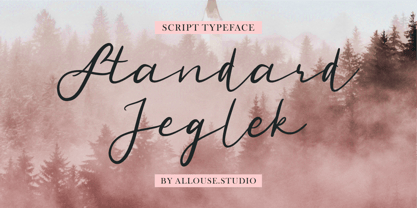 Standard Jeglek a Script Typeface Font. Standard Jeglek come along with Ligatures, Swash, and Multi-Lingual Support to fulfill your need. Standard Jeglek is perfect for any tittle, logo, product packaging, branding project, megazine, social media, wedding, or just used to express words above the background. Enjoy the font, feel free to comment or feedback, send me PM or email. Thank You!
 - Printers Impressions JNL by Jeff Levine,
$29.00 Printers Impressions JNL is an assortment of various letterpress ornaments, corner pieces, catch words and other designs, along with some shipping labels with perforated edges; all re-drawn from vintage source material. For the shipping labels, print them in red and you will recreate the standard form of gummed label so popular for years before self-adhesives took over the market.
 - Tarot by Great Lakes Lettering,
$25.00 Let Tarot wisp you away onto an enchanted journey. This whimsical serif typeface is perfect for headlines, small bodies of text, and feels like magic when paired with scripted type. Inspired partly by Helsing, Tarot features a similar essence, along with an alluring and spontaneous handwritten presence. Tarot is a charming font used to make anything created feel bewitched. Presto!
 - Homes Honey by Multype Studio,
$14.00 Homes Honey is a romantic and sweet calligraphy typeface with characters that dance along the baseline. It will add a luxury spark to branding, wedding invitations, label, logo and other romantic projects. Font Features : Lowercase beginning and ending swash, Connecting heart This font is PUA encoded which means you can access all of the amazing glyphs and ligatures with ease!
 - Golca by Pepper Type,
$30.00 Golca is a humanist, slightly elongated sans-serif font family with open aperture. It features rich language support and includes Cyrillic and Greek scripts for your international projects. It is perfect for branding purposes, as well as UI/UX applications and web appearance. Friendly and highly legible, it is also suitable as a body copy typeface for various printed media.
 - Moonlight Serenade by Hanoded,
$15.00 Moonlight Serenade is a 1939 song composed by Glenn Miller, with lyrics by Mitchell Parish. Moonlight Serenade font is an all caps affair - very legible, very recognizable and very useful. Upper and lower case differ slightly and are quite happy to mingle. In the words of Mitchell Parish: I bring you and sing you a Moonlight Serenade! Comes with a universe of diacritics.
 - XXII Yonia by Doubletwo Studios,
$59.99 XXII Yonia most of all likes packaging, headlines on posters and flyers, and it really loves to be a logo for something with food or toys. It comes along with a lot of alternate letters so you can customize the look with swashes and alternates here and there. For further details click here or download the pdf in the gallery.
 - Koralle NF by Nick's Fonts,
$10.00This typeface made its first appearance in Schelter & Giesecke's 1915 specimen book. It exhibits the cleanness and crispness one might expect in a sans-serif face, along with a few unexpected grace notes that make it warm and friendly, as well. Both versions of this font include the complete Unicode Latin 1252, Central European 1250 and Turkish 1254 character sets. - Gandhi by Skiiller Studio,
$20.00 Gandhi is a beautiful font script, suitable for promotion of products, companies, logos, websites, song titles, and many others. What's include: more than 200+ of glyphs Ligature Stylistic alternate for lowercase PUA Encoded Characters - Fully accessible without additional design software. Basic Latin Language Support (AÀÁÂÃÄÅCÇDÐEÈÉÊËIÌÍÎÏÑOØÒÓÔÕÖUÙÜÚÛWYÝŸÆß ) How to access alternate glyphs? you can see it on this link ( http://goo.gl/1vy2fv )
 - Santi by Latinotype,
$39.00 Santi, our new grotesque font offers 9 weight variants along with their corresponding italics. This typeface perfectly blends a classic character with sublime modern touches, creating a striking aesthetic without resorting to fanfare. Santi's versatility transcends current trends and gives it a timeless quality. This typeface blends effortlessly into classic or contemporary projects, offering a perfect balance between the familiar and the innovative.
 - Show Card Deco JNL by Jeff Levine,
$29.00 Show Card Deco JNL is a hybrid of examples from hand lettered titles found on various song folios from the Carl Fischer Music Library circa the 1930s and is available in both regular and oblique versions. This particular typeface lends itself perfectly to show cards, posters, headlines and display titling which captures the modern, streamlined design of the Art Deco era.
 - Primavera by Sudtipos,
$49.00 Primavera is a fresh and spirited take on casual handwriting. The usual playfulness and expertise of Angel Koziupa's forms, along with the smooth, crisp outlines of Alejandro Paul, provide a humorous and lively typeface in two styles that fit perfectly on food packaging labels, greeting cards, journals or wherever a design needs to convey freshness, young spirit, and a cool spring breeze.
 - Farquharson by Quadrat,
$25.00Farquharson is an all-caps display face, adapted from an early American woodtype, and designed especially for use in the book Charlie Farquharson’s Unyverse. The complete family consists of two fonts: a regular version and a stencil version. Alternate versions with slightly elongated feet are provided for A, H, K, M, N and R. Very eccentric, it is best used in small doses. - Goat by Oliveira 37,
$30.00 Goat is a font display with extremely fine and sharp serifs, inspired by Gothic architecture, which brings a vertical elongation in extent and an allusion to the typical ogival vaults of the style. A font that not only carries a texture of writing with magnitude and elegance, but also causes some kind of strangeness for the subversion of some typographic laws.
 - Wagerton by PizzaDude.dk,
$20.00 Wagerton is my very legible scribbled font! The fine scribbled details are very visible at large sizes, but also leaves a good impression when used in small sizes as well. Comes with ligatures for double letters and double numbers - along with alternative letters for both upper- and lowercase! You will need to use OpenType supporting applications to use the autoligatures.
 - Town And Country JNL by Jeff Levine,
$29.00 Town and Country JNL features a mix of block-style characters along with rounded ones found so often in the Art Deco fonts of the 1940s. Modeled from the hand-lettered title on a piece of sheet music from that era, this unusual coupling of two distinct design styles works despite it breaking all of the obvious rules of typography.
 - Terrapin by Missy Meyer,
$12.00 Introducing Terrapin! I named this after listening to a song called "Terrapin on a Tightrope." Considering the fact that a terrapin is a kind of turtle, it makes that song title seem pretty harrowing! This font has heavy roots in one of my favorite lettering styles. It's rough, scrappy, and likes to do its own thing. It has a full uppercase and lowercase set, numbers, punctuation, and lots of extended Latin characters for language support. It also includes alternate versions of 17 lowercase letters. Where Terrapin really shines is in the ligatures. I've written separate two- and three-letter combined forms for some of the most common letter combinations, and a few uncommon ones to boot. There are almost 100 ligatures in here, all PUA-encoded so everyone can access them (and also coded so if your software does automatic ligature replacement, they'll pop right in).
 - Chordette for Education - Ukulele by Ukefarm,
$8.00 What is it? Chordette for Education is a ukulele chord font created specifically for schools and individual instructors. It can be used for creating song sheets, presentations, or adding chords to videos. This education version has a basic chord set for beginners which include finger positions and an option for 3D chords. It’s a favorite tool for teachers, music therapists, and musicians. What instruments are supported? Chordette for Education supports ukulele tuned GCEA. The fonts are available in black and white for Windows and Macintosh. The 2D chords include fingering numbers and the chords can be used for song sheets, presentation software, and video tutorials. Alternate chords and 3D chords for presentations are included. Is it free? Chordette for Education is priced at $8, which includes chord font sets for both Mac and Windows. How do I use it? For help and support, please visit https://ukefarm.com/chordetteEd/help.html