10,000 search results
(0.041 seconds)
- Neue Frutiger Cyrillic by Linotype,
$89.00During planning for the new Roissy Charles de Gaulle airport in Paris at the beginning of the 1970s, it was determined that the airport's signage system had to include the clearest and most legible lettering possible. The development of all signage was put into the hands of Adrian Frutiger and his studio. The team carried out their task so effectively that a huge demand for their typeface soon arose from customers who wanted to employ it in other signage systems, and in printed materials as well. The Frutiger® typeface not only established new standards for signage, but also for a range of other areas in which a clear and legible design would be required, especially for small point sizes and bread-and-butter type. The typeface family that which emerged as a result of this demand was added into the Linotype library as "Frutiger" in 1977. Frutiger Next, created in 1999, is a further development of Frutiger, not necessarily a rethinking of the design itself. It was based on a new concept, the most obvious visual characteristics of which is the larger x-height, as well as a more pronounced ascender height and descender depth for lower case letters in relation to capitals. This new design created a balanced image and included considerably narrower letterspacing. Frutiger Next meets the demand for a space-saving, modern humanist sans. 2009's Neue Frutiger is a rethink of the 1977 Frutiger family, now revised and improved by Akira Kobayashi in close collaboration with Adrian Frutiger. Despite the various changes, this "New Frutiger" still fits perfectly with the original Frutiger family, and serves to harmoniously enhance the weights and styles already in existence. The perfect mix, guaranteed Neue Frutiger has the same character height as Frutiger. As a result of this, already existing Frutiger styles can be mixed with Neue Frutiger where necessary. Likewise, Neue Frutiger is perfect for use alongside Frutiger Serif. Newly added are the "Neue Frutiger 1450" weights. Especially for the requirements of the newly released German DIN 1450 norm we have built together with Adrian Frutiger specific weights of the Neue Frutiger. The lowercase l" is curved at the baseline to better differentiate between the cap "I", additionally the number "0" has a dot inside to better differentiate between the cap "O", and the number "1" is now a serifed 1. The font contains additionally the origin letterforms from the regular Neue Frutiger font which can be accessed through an Opentype feature." - Neue Frutiger 1450 by Linotype,
$71.99 During planning for the new Roissy Charles de Gaulle airport in Paris at the beginning of the 1970s, it was determined that the airport's signage system had to include the clearest and most legible lettering possible. The development of all signage was put into the hands of Adrian Frutiger and his studio. The team carried out their task so effectively that a huge demand for their typeface soon arose from customers who wanted to employ it in other signage systems, and in printed materials as well. The Frutiger® typeface not only established new standards for signage, but also for a range of other areas in which a clear and legible design would be required, especially for small point sizes and bread-and-butter type. The typeface family that which emerged as a result of this demand was added into the Linotype library as "Frutiger" in 1977. Frutiger Next, created in 1999, is a further development of Frutiger, not necessarily a rethinking of the design itself. It was based on a new concept, the most obvious visual characteristics of which is the larger x-height, as well as a more pronounced ascender height and descender depth for lower case letters in relation to capitals. This new design created a balanced image and included considerably narrower letterspacing. Frutiger Next meets the demand for a space-saving, modern humanist sans. 2009's Neue Frutiger is a rethink of the 1977 Frutiger family, now revised and improved by Akira Kobayashi in close collaboration with Adrian Frutiger. Despite the various changes, this "New Frutiger" still fits perfectly with the original Frutiger family, and serves to harmoniously enhance the weights and styles already in existence. The perfect mix, guaranteed Neue Frutiger has the same character height as Frutiger. As a result of this, already existing Frutiger styles can be mixed with Neue Frutiger where necessary. Likewise, Neue Frutiger is perfect for use alongside Frutiger Serif. Newly added are the "Neue Frutiger 1450" weights. Especially for the requirements of the newly released German DIN 1450 norm we have built together with Adrian Frutiger specific weights of the Neue Frutiger. The lowercase l" is curved at the baseline to better differentiate between the cap "I", additionally the number "0" has a dot inside to better differentiate between the cap "O", and the number "1" is now a serifed 1. The font contains additionally the origin letterforms from the regular Neue Frutiger font which can be accessed through an Opentype feature."
 - Breathe Neue by Lián Types,
$37.00 Breathe Neue is not just an update of my renowned Breathe of 2010, this is something else... Many times I find myself looking for inspiration in my previous creations. The original Breathe has something on its essence: Something that almost 10 years later still caught my attention. Like its name suggests, letters seem to be breathing, moving, alive. Many years passed so I asked myself if there was still something I could do for it, something to get the most of that beautiful essence... Suddenly, I was already working on its curves: Many new loops, more polished, more refined. Also the proportion and spacing were altered to embellish the font. Breathe Neue’s swashes are addictive. I couldn't find another word. Irresistible? Maybe. Once you see some of its loops you want to see more. I believe this might be due to its very geometrical feel, which match well with the bodonian curves of the font. See also how well it works with Breathe Caps. And what if you combine them with Breathe Special? wow. I'm still young (yeah, sure) and I believe there're still many years ahead to enjoy this great profession, and to make many new (and astonishing, I hope) fonts. But I also think, it’s time to pamper my first creations. They deserve the best treatment, after all, they were once a success! This is what I did with my lovely Breathe. I hope you like it.
 - Andhibath by Sabrcreative,
$17.00 Introducing Andhibath Bold Script Font, a captivating script typeface that exudes elegance and versatility. With its bold strokes and graceful curves, this font is perfect for adding a touch of sophistication to your design projects. Whether you're creating invitations, branding materials, packaging, or any other creative work, Andhibath will elevate your designs with its unique charm. The Andhibath font features both uppercase and lowercase letters, allowing you to mix and match different letterforms for a customized look. It also includes numbers and punctuation, ensuring that your compositions are comprehensive and well-rounded. With multilingual support, you can effortlessly incorporate various languages into your designs, making it suitable for projects with a global reach. One of the standout features of Andhibath is its PUA encoding. This means that accessing the font's special ligatures and glyphs is a breeze, giving you even more creative possibilities. The ligatures add a natural and handcrafted feel to your text, enhancing its visual appeal. With its script style, Andhibath captures the essence of handwritten elegance. It is ideal for a wide range of design applications, from wedding stationery and logos to social media graphics and advertising materials. The versatility of this font allows you to adapt it to different themes and moods, whether you're aiming for a classic, modern, or whimsical look. Experience the beauty and versatility of Andhibath Bold Script Font. Let its graceful curves and bold presence make a lasting impression in your designs.
 - PackardClipperNF - 100% free

- LittleRickeyNF - Unknown license

- IndochineNF - 100% free

- PonsonbyNF - 100% free

- DrumagStudioNF - 100% free

- PointsWest - 100% free

- BuenosAiresNF - 100% free

- MarchMadnessNF - 100% free

- Namaste by Latinotype,
$49.00 With open palms, place your hands together at the center of your chest, close your eyes and bow the head slightly. Namaste! Welcome to a beautiful spiritual journey. Namaste is a font collection, designed by Coto Mendoza, consisting of two variants: a capital sans and a script font (based on watercolor calligraphy strokes). Each variant comes in 5 weights—Thin, Light, Regular, Bold and Black—and 2 versions: Essential and Pro. The script font, in its Pro version, provides a wide range of OpenType features such as swashes, alternates, ligatures and different stylistic sets. The Namaste family also includes a set of ornaments inspired by Hindu and Buddhist symbols—that Coto Mendoza saw virtually everywhere on her trip to India—like Mandalas and Yantras, and others found in textiles and monuments. Namaste is the perfect choice for wellness, healing and therapy oriented products. Its smooth shape and soft curves allow the user to create beautiful designs for essential oils, bath salts, quartz crystals, mindfoodness, candles, incense and aromatherapy products packaging. The font is well-suited for publishing design (short text); self-help and healing handbooks; tarot and divination cards; and women’s empowerment and spirituality publications. Namaste is an ideal typeface for yoga (and other body disciplines) center branding; holistic centers; and group meditation, womb blessing and circle of women invitations. Namaste is a beautiful journey full of love and inspiration. Namaste: a spiritual journey.
 - Thaun by Scholtz Fonts,
$19.00 I can best describe the Thaun family as a general purpose display family, inspired by Scholtz Fonts' " "Delikat". I wanted to produce a display font that was more robust than Delikat, without losing the delicacy of the original. In order to do this I thinned solid, curved strokes toward the baseline, and let them dwindle to gently rounded points. As a graphic designer I became aware that designs that used a number of styles from the same family seemed to work well. This was easily done using a standard sans serif font such as Arial or Helvetica. However, when a different look is needed, display fonts do not always have a the variety of different styles that are necessary to produce a coherent design. Thus with Thaun, the challenge was to create a coherent family based on a display font. The archetype of this family is Thaun Regular with six different widths forming closely related styles. There are also two variants of the archetype i.e. Thaun Black & Thaun Rough to add variety to the primary style. An additional sub-family, Thaun Accord, appears in two widths. Thaun Jazz is a wide three dimensional variation. Thaun has all the features usually included in a fully professional font. Language support includes all European character sets, Greek symbols and all punctuation. Opentype features include automatic replacement of some characters and discretionary replacement of stylistic alternatives.
 - Jetworld by Nelson Borhek Press,
$12.00 Jetworld is the space-age typeface with the retro-forward look. Jetworld’s tapered and weighted parabolic-arch curves interplay with its rigid, straight verticals and horizontals to create an unexpected but pleasing motion and a rhythm that is constantly changing. Jetworld is an OpenType font that speaks of clean space-age design, midcentury optimism, and the promise of new frontiers. Jetworld gives a midcentury-modern or retro-futuristic look to book covers, magazine layouts, posters, and album covers. But Jetworld is adaptable, too. With hints of ancient cuneiform writings mixed with the look of markings on an alien spaceship, Jetworld spans eons. And Jetworld’s large character set includes multi-lingual support and many other special characters. That means Jetworld can be used for more than just headlines and more than just English. Jetworld combines a distinctive personality with surprising readability. Jetworld is unusual in that it is not descended from handwriting or calligraphy. Instead, Jetworld was inspired by midcentury modern architecture and consumer goods. Think of the parabolic arches seen in midcentury masterpieces like the Theme Building at Los Angeles International Airport, the TWA terminal at JFK Airport in New York, and even the cartoon architecture of “The Jetsons” television show. Think of boomerang-patterned Formica countertops and tabletops, or arch-shaped “hairpin” legs on midcentury furniture. Jetworld’s character shapes were inspired by all of these. Jetworld—direct from the world of the future to you.
 - Qene G by Balibilly Design,
$21.44 Say hello to Qene-G Typeface, Qene-G is based on a problem that often occurs when I design, which is to combining typefaces in typographic art. I am pretty sure you also in this problem, so Qene-G Typeface comes to solve the problem. Qene-G is a complete package consisting of serif fonts and signature scripts. A careful approach makes this font give a luxurious and elegant taste to your project. Smooth curves, some flowy terminals, and flirty tails will make your project looks unique. The handmade signature combination emphasizes the style that you create in the natural beauty atmosphere. Qene-G consists of 5 families, they are Qene-G-Regular, Qene-G-Regular Italic, Qene-G-Outline, Qene-G-Outline Italic, and Qene-G-Script. You will get all caps letters with 2 styles that you can access via uppercase and lowercase buttons, charming script fonts, and tons of ligatures and stylistic alternates. Complete with Unicode and PUA which allows you to access all features without graphic design software. Your project will travel around the world with 131 languages of this font. Qene-G is a strikingly versatile font, It is a bold choice for branding projects, fashion magazine imagery, social media text overlays, posters, website headers, and more. Let's start creating stand out designs with this font. We are pleased to tell you about our newest product made with totality, please CLICK HERE
 - TE Classic 2 by Tharwat Emara,
$79.00 TE Classic2 Tharwat Emara is an exquisite Arabic Thuluth font that is designed to add a touch of elegance and sophistication to any project. This font is named after the renowned calligrapher Tharwat Emara, who is widely celebrated for his outstanding work in the field of Arabic calligraphy. One of the most remarkable features of TE Classic2 Tharwat Emara is its impeccable balance between the thick and thin lines. The font's curves and strokes are carefully crafted to create a seamless and harmonious flow, giving it a unique and mesmerizing appearance. The intricacies and details of the font's characters reflect the skill and artistry of the calligrapher and demonstrate the perfect balance between tradition and modernity. TE Classic2 Tharwat Emara is a perfect choice for designers and artists who want to add a touch of Arabic culture and tradition to their projects. The font comes with a full set of Arabic characters, including ligatures, diacritical marks, and numerals. The characters are designed to be easily legible and readable, making it suitable for use in both print and digital media. One of the most striking aspects of TE Classic2 Tharwat Emara is its versatility. It can be used for a wide range of applications, from branding and advertising to editorial and publishing. Its unique and captivating design will make any project stand out and attract customers, making it a valuable investment for designers and artists. The font's exquisite design is not only limited to its characters, but it extends to its overall layout and spacing. TE Classic2 Tharwat Emara has a perfect balance between its characters' shapes and spaces, giving it a smooth and consistent look. The font's spacing is also carefully crafted to ensure that the characters are well-organized and easy to read. TE Classic2 Tharwat Emara is not just a font; it's a work of art. Its unique design and intricate details make it stand out from other Arabic fonts in the market. The font's exquisite design is a result of the meticulous attention to detail paid by the calligrapher, which is evident in every stroke and curve of the font's characters. Overall, TE Classic2 Tharwat Emara is a font that celebrates the beauty and elegance of Arabic calligraphy. Its captivating design and versatility make it an excellent choice for designers and artists who want to add a touch of tradition and culture to their projects. With its unique and mesmerizing appearance, TE Classic2 Tharwat Emara is sure to attract customers and make any project stand out.
 - Mashiny by Multype Studio,
$23.00 Mashiny is a handwritten font with unique curves and an elegant inky flow. Features : uppercase, lowercase, symbol, number, ligature, and also support multi language. Mashiny is perfect for photography, watermark, social media posts, advertisements, logos & branding, invitation, product designs, label, stationery, wedding designs, product packaging, special events or anything that need handwriting taste.
 - Dragon Scribble by Sipanji21,
$10.00 Dragon Scribble Graffiti is a display font with Curved graffiti style. It will elevate a wide range of design projects to the highest level, be it branding, headings, wedding designs, tittle, signatures, logos, labels, movie, video, magazine, logotype, crafting, packaging, advertising and much more! thank you very much, and have a nice day.
 - Anderella by Sabrcreative,
$25.00 Unleash the beauty of flowing script with the Anderella Script Font. This typeface is a symphony of graceful curves and exquisite details, perfect for adding a touch of sophistication to your creative projects. With a harmonious blend of uppercase and lowercase characters, Anderella brings a sense of balance and versatility to your typography.
 - Barricada by Sudtipos,
$49.00 Barricada is a loud-voiced typeface with small counters that gives an interesting strong weight. Moreover, it has a solid structure providing strength. Its curved serifs and swashes give a touch of softness and make the letters a little playful. This is the right option to set a fresh and solid text.
 - Endymion by Greater Albion Typefounders,
$10.00 Endymion is a Tuscan display face that speaks of traditional fairgrounds and circuses, or 19th century poster design and even of the wild west. Its name derives from its ogee curves, which have been likened to the bluebell (Endymion) flower. Bring a sense of lively fun to your next design with Endymion.
 - Jemina by Creativemedialab,
$20.00 Jemina is a modern, unique serif font. The dynamic curve of each letter looks elegant and charismatic and will be the center of attention for the eye which sees it. The abstract feel of its characters strikes a balance between modern and classic typography. Perfect for branding, logo, and fashion-related concepts.
 - Embossanova by Emboss,
$29.00 Embossanova was initially sketched to be a monospaced typeface but quickly took on a life of its own. It developed serifs and numerous arcs and stroke weights. I wanted it to retain a pre computer/unmathematical feel so there is a slight variation on curved characters and their relationship to the X height.
 - Hunters Think by Lettersiro,
$8,990.00 Hunters Think is modern bold script font. Made carefully to get the best curves and unique form that never exist before. Hunters Think is Suitable for any graphic designs such as branding materials, t-shirt, print, business cards, logo, poster, t-shirt, photography, quotes .etc. this font special for big company only
 - Calliform by Lemonthe,
$12.00 Calliform is a modern script calligraphy font with an elegant classical touch, featuring sharp strokes and carefully designed curves. Equipped with 70 decorative alternate characters, it is a suitable choice for various design projects such as logos, branding, greeting cards, wedding designs, printing, advertising, packaging, wall decoration, titles, web design, and more.
 - Belora Vintage by Mainelli,
$17.00 Introducing Belora Vintage, a bold serif font with soft, bold edges and curves giving it a groovy 70s feel. Belora Vintage has separate lowercase and uppercase letters, as well as numbers, punctuation, and multilingual letters. With alternates and ligatures it's perfect for fancy retro-style logos, or bold header text and much more.
 - Moon Time by Supfonts,
$17.00 This modern calligraphy monoline script has been attentively written with gentle curves to produce a font that's completely distinctive and original. It contains a full set of lower & uppercase letters, a large range of punctuation, numerals, and multilingual support. Perfect for adding an elegant and unique touch to your lettering projects and branding.
 - Backslash by Silverdav,
$16.00 Backslash is a new display serif typeface with nicely balanced curves, tons of alternative characters, ornaments, multilingual support and unique ligatures. Its wide range of stylistic alternates allows for versatile design options and works perfectly for headlines, logos, posters, packaging, T-shirts, postcards, bold magazine imagery, wedding invitations, branding and so much more.
 - Risa by K-Type,
$20.00 Risa is an easygoing sans serif for display and text. With a dash of deco and a soupçon of sixties, gentle curves grace diagonal strokes bestowing a sensual tenderness that is further enhanced by subtle soft cornering throughout and a swollen fullness at the baseline, bottom-heaviness that helps make Risa highly legible.
 - Measly by Amarlettering,
$15.00 Measly Script is a delicate and elegant script font with a modern and sophisticated appearance. Its thin letterforms feature fluid strokes and subtle curves, creating a graceful and refined feel. The font is perfect for designs that require a sense of elegance and sophistication, such as wedding invitations, branding, or editorial design.
 - Mahgony by Multype Studio,
$23.00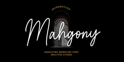 Mahgony is a signature monoline script font with unique and elegant curves. Features : uppercase, lowercase, symbol, number, ligature, and also support multi language. Mahgony is perfect for photography, watermark, social media posts, advertisements, logos & branding, invitation, product designs, label, stationery, wedding designs, product packaging, special events or anything that need handwriting taste.
 - Regan by The Northern Block,
$19.30 A finely crafted sans serif typeface with an uncomplicated appearance. Soft curves are mixed with minimal angles to create a readable font ideally suited for identity, editorial and online uses. Details include 10 weights with italics, 540 characters, 5 variations of numerals, small caps, stylistic alternatives, manually edited kerning and Opentype features.
 - Caliny by Marc Lohner,
$21.00 This cheerful font family combines cuteness and fun, making it a great choice for any kid’s app, book, toy, packaging, movie, theme park and so much more. Caliny’s curves are drawn with care and love. It covers more than 200 languages and has some advanced typographic features, like case sensitive forms to offer.
 - Bigotedly by Ali Hamidi,
$12.00 Bigotedly is a casual script and handwritten font. Bigotedly have a chic and simple curves to add charm impression for your design. This Font is perfect for many design needs such as merch, branding, T-shirts, fashion logo, cosmetic, signature logo, wedding invitation, book covers, social media posts, websites, events, and many more.
 - Begova by Mevstory Studio,
$40.00 Introducing BegovaStylish Classic Serif. Begova is a classic and stylis display serif with rich stylistic alternates, best used as a display for headings, logos, branding, magazines, product packaging and invitations. Begova equipped with Ligature and many Alternates and come with clean lines and smooth curves give any project an extra touch of class.
 - Hollens by Supfonts,
$17.00 This modern calligraphy script has been attentively written, with gentle curves to produce a font thats completely distinctive and original. It contains a full set of lower & uppercase letters, a large range of punctuation, numerals, and multilingual support. Perfect for adding a elegant and unique touch to your lettering projects and branding
 - AT Lagermont by Amera Type,
$20.00 Lagermont is inspired by console games, labels and print media from the 19th century. With a strong and bold serif font style comes with an elegant, where every curve is made very gracefully and gently. It will be a perfect choice for graphic design, clothing, books, logos and many other visual displays
 - Bismika by SimpleType Studios,
$15.00 Exquisite and elegant, our Script Font showcases the artistry of beautiful calligraphy. With its flowing curves, delicate strokes, and stylish flourishes, this font adds a touch of sophistication to your designs. Perfect for wedding invitations, branding materials, and refined projects that demand a timeless charm. Elevate your typography with our captivating Script Font.
 - Sigmathin by Typebae,
$15.00 Sigmathin is a graceful and refined script font designed to resemble a handwritten signature. Its smooth curves and delicate strokes give it an elegant and sophisticated appearance. This font exudes a sense of style and professionalism, making it an excellent choice for projects that require a personal touch or a touch of class.


