4,990 search results
(0.027 seconds)
- Dear Diary by Comicraft,
$19.00 Dear diary, what a day it's been. Dear diary, it's been just like a dream. Woke up late. Wasn't where I should have been. For goodness sake what's happening to me? Write lightly, yours truly, dear diary. At last, a font to help you overcome those moody blues… Features: Four fonts (Regular, Underline, Strikethrough & Small caps) with upper and lower case alphabets.
 - Eutopia by Tipofil,
$- I was inspired by the letters of the mythical “Ideales” tobacco package, designed in 1936 in Barcelona by Carlos Vives, director of the designers studio of the Rieusset graphical industry. We have also studied other geometrical models from the 1920s, to be highlighted among them the alphabet drawn by Cornelis André Vlaanderen at Amsterdam in 1928, which would have been very probably the inspiration for the famous tobacco package. Eutopia has been born with the aim to be useful for the current graphic communications. For that purpose almost 400 glyphs have been designed and more than 2200 kerning pairs have been defined. The multiple diacritic signs have been prepared to allow a multilingual use in most of the languages based on Latin alphabet. The OpenType features have been used to get alternate characters of “A” and “g”, and also ligatures, lowercase numbers and other typographic refinements.
 - Written In The Stars by Kimberly Geswein,
$5.00 Curly, cute teen girl handwriting.
 - Home Style by FontMesa,
$25.00 Home Style is a revival of a very old font previously thought to have been designed by Joseph Gillé in or around the year 1820, however recent evidence from France suggests that an artist by the name of Silvestre from the same time period may be the true designer of this font. You may have seen this font in the past under the names of Circus, Roma, Madame and Gillé Classic. Originally designed in France, this very decorative font was only available in uppercase including numbers. Today this font has been re-mastered and updated with the addition of a newly designed lowercase set of letters. Home Style with its diagonal or cast shadow lines breaks away from the original design which has squared off shadows. If you're looking for the original version of this font please refer to the FontMesa version named Maison Luxe. New in 2016 for Home Style is an uppercase German Double S (versal eszett), opentype features including case sensitive forms and old style numerals.
 - Ongunkan Sweden Dalecarlian Run by Runic World Tamgacı,
$50.00 The Dalecarlian runes, or dalrunes, was a late version of the runic script that was in use in the Swedish province of Dalarna until the 20th century.The province has consequently been called the "last stronghold of the Germanic script. When Carl Linnaeus visited Älvdalen in Dalarna in 1734, he made the following note in his diary: The peasants in the community here, apart from using rune staves, still today write their names and ownership marks with runic letters, as is seen on walls, corner stones, bowls, etc. Which one does not know to be still continued anywhere else in Sweden. The Dalecarlian runes were derived from the medieval runes, but the runic letters were combined with Latin ones, and Latin letters would progressively replace the runes. At the end of the 16th century, the Dalecarlian runic inventory was almost exclusively runic, but during the following centuries more and more individual runes were replaced with Latin characters. In its last stage almost every rune had been replaced with a Latin letter, or with special versions that were influenced by Latin characters.
 - KG Beneath Your Beautiful by Kimberly Geswein,
$5.00 Quirky teen unicase handwriting with personality.
 - KG Love Somebody by Kimberly Geswein,
$5.00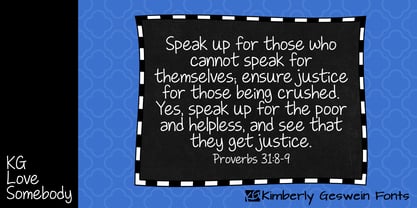 Upright, neat, and legible teen handwriting.
 - Face Your Fears II by Hanoded,
$15.00 When I created Face Your Fears some years ago, it was an instant hit. I have seen it on Gangsta Rap albums, metal albums, books and on movie posters. It has been used for T-shirts, websites and, believe it or not, for a beer label as well. I have always toyed with the idea of redoing the original font, as some of the glyphs were a bit off. Face Your Fears II is similar in nature to the original font, but comes with a lot of improvements, has slightly altered glyphs and (probably) better kerning. But maybe, just maybe, it isn't your cup o' tea. In that case, you can always just go for the original!
 - KG Girl On Fire by Kimberly Geswein,
$5.00 The cute handwriting of a teen girl.
 - A Hundred Miles by Kimberly Geswein,
$5.00 The adorable handwriting of a teen girl.
 - Follow You Into The World by Kimberly Geswein,
$5.00 The handwriting of an Australian teen girl.
 - Carrig by Monotype,
$25.99 IMPORTANT – Please consider the superior Carrig Pro before making a purchase decision. Carrig started its life in 1998. I was working for a design agency in Cork, Ireland and was given a new brand identity project for a lakeside hotel in County Kerry. While visiting the hotel I made various sketches of the surroundings and upon returning to the studio, it was clear that my strongest ideas for the identity would be based on these freehand drawings. I wanted a classic, rough, hand-drawn typeface to complement this style but at that time, the studio didn’t have anything suitable, so I decided to draw my own. I found a Trajan-esque typeface that I really liked the look of in an old calligraphy workbook. I set about drawing my own version and then digitised it. Once the client had seen and approved my design, I began working on creating a complete all caps typeface to use for the hotel’s stationery. With ‘carrig’ being the Gaelic word for ‘rock’, my new typeface was all the more appropriate as it had the appearance of letterforms that had been carved into stone and weathered by time. With the project completed and the client happy, Carrig then sat in my unused fonts folder for several years... but there was always a nagging feeling at the back of my mind that I should do something more with it. So, in the autumn of 2014, I finally set about doing just that and created the font family you now find at MyFonts. Carrig’s form and structure was influenced by a hybrid of Classic Roman and Garalde typeface designs. The original calligraphic elements from the 1998 version of Carrig have been retained to add personality—as can be seen in the serifs, strokes, spurs, terminals and open bowls. Perhaps its most distinctive trait is a high x-height combined with relatively short ascenders. I wanted Carrig to immediately resonate with the reader and have designed it to be familiar and friendly. I imagine designers might choose Carrig as an alternative to such typefaces as Trajan, Garamond and Baskerville. I see Carrig as primarily a display typeface for titles/headlines in printed materials. I would also love to see it being used for branding, packaging and promotional material and am keen to hear from designers who use it in their own work.
 - KG Ray Of Sunshine by Kimberly Geswein,
$5.00 Teen handwriting with heart accents and unique styling.
 - KG Faith Hope And Love by Kimberly Geswein,
$5.00 The cute, fun handwriting of a teen girl.
 - Materhorn NF by Nick's Fonts,
$10.00This is a new and improved version of an old freeware font named Materhorn, hased on a design originally called Fanfare, designed by Louis Oppenheim in 1927 for H Berthold AG. The outlines have been completely redrawn, the entire font has been thoughtfully hand-kerned, and OpenType features have been added. Additionally, the font contains not only the complete Latin language character set (Unicode 1252) plus also support for Central European (Unicode 1250) languages - Eurostile Candy by Linotype,
$40.99Eurostile Candy is a fun spinoff from Akira Kobayashi's Eurostile Next family. As the name implies, it is based on Eurostile but with many striking new features. Most obviously, the corners and joints have been rounded off to give it a more friendly and softer feel. On top of those changes, the main skeleton of many characters have been modified. Any extra strokes have been removed - such as in the a, s, or t - and joints have been simplified to create even more square shapes - like in the n and r. With these contemporary and futuristic-styled alterations, Eurostile Candy is a cool new design great for many display projects. - Evil Doings by Comicraft,
$19.00 In isolated Eastern European states, atop cold castle towers, nefarious nonbelievers are discussing their diabolical devises with their minions, acolytes and sweet little Yorkshire terriers! Evil Doings is a font that gives form to the softly spoken schemes and terrifying tweets of these psychopaths, sociopaths and just plain naughty boys and girls. Will Good Triumph and Defeat the EvilDoings of EvilDoers?! Only if we listen to the cries of the oppressed proletariat and quash the devilish dreams and evil schemes of Fascist Dictators EVERYWHERE! Features: Four fonts (Regular, Italic, Bold & Bold Italic) with upper and lowercase characters. Includes Western European international characters.
 - Beautiful Every Time by Kimberly Geswein,
$5.00 Bubbly, authentic teen girl handwriting. Loopy and cute but legible.
 - Throw My Hands Up In The Air by Kimberly Geswein,
$5.00 Cute, messy (yet still legible) teen girl handwriting with flair.
 - Modern West JNL by Jeff Levine,
$29.00 Presenting… a Western style alphabet from the 1960 edition of Samuel Welo’s “Studio Handbook for Artists and Advertisers”… Extra bold, featuring slab serifs and concave corners, this type style could easily have been found on building signage in the Old West… but in redrawing it digitally, it’s been named Modern West JNL because at one time, this would have been considered a modern style of lettering. Modern West JNL is available in both regular and oblique versions.
 - Kwodsity by Ingrimayne Type,
$12.95 The two Kwodsity fonts are derived from Kwersity, a narrow, blocky typeface with slab serifs and a high x-height. In Kwodsity Up the bottom edges and bottom serifs have been thickened, while in Kwodsity Down the top edges and serifs have been thickened.
 - Kestrel Script by Alan Meeks,
$45.00 Originally designed in 1985 and released by Letraset for dry transfer Lettering, Kestrel has, until now, never been digitized. The face now has been completely re-drawn and digitized for all formats. It is a heavy formal script similar in form to Commercial Script.
 - Stigna by Kufic Studio,
$20.00 Stigna (All Caps) is a branding font to enhance and beautify your designs. A modern factor has been applied to bring a classy and elegant look. All characters have been manually designed to bring more into your graphics. The font has been created keeping in mind the modern and trending factors for web or printing. The font can be best used with Websites, magazines, and Social Media Posts. Stigna Font Family Includes: Stinga Regular, Stigna Italic, Stigna Bold, Stigna Expanded Regular, Stigna Expanded Italic, Stigna Expanded Bold, and Stigna Expanded Bold. Kufic Studio is a platform that provides professional and high-quality designs & fonts to fill the gap that has been missing in the market.
 - A Year Without Rain by Kimberly Geswein,
$5.00 The handwriting of a teen girl- bubbly, round, legible, and cute.
 - Fiendstar Shaded by AVP,
$29.00Fiendstar Shaded has been designed to complement the Fiendstar family of fonts. - Fiendstar Cameo by AVP,
$29.00Fiendstar Cameo has been designed to complement the Fiendstar family of fonts. - Fiendstar Outline by AVP,
$29.00Fiendstar Outline has been designed to complement the Fiendstar family of fonts. - Albion's Very Old Masthead by Greater Albion Typefounders,
$15.00 Albion’s Very Old Masthead is inspired by traditional newspaper mastheads. A heavy Black Letter which brooks no argument, and can be emphatic and refined (emphatically refined?) at the same time. Very Old Masthead has been deliberately weather to suggest that it has been set with timeworn, well-used, type.
 - Blob by Superfried,
$32.50 Blob, designed by Superfried, is available in two formats Round and Square. It is an experimental, sans-serif display typeface based on simple geometric shapes. Although unorthodox, care has been taken to ensure that it is completely legible. Blob has been featured on the Behance curated typographic gallery TypographyServed.com.
 - Nova Caere by Eurotypo,
$39.00 Nova Caere is a typical urban calligraphy, gestural with its fast lines, with short and slightly noticeable ascender and descender traits. Condensed lower case and rounded capital letters are quite similar in height. Nova Caere has been studied for alternating upper and lower case inside the words of the text, so as to reinforce their expressive content. Stylistic variations that combine particular couples of letters have been developed, as well as some descender traits have been highlighted that can be employed to characterize words and phrases.
 - Chlorine Serif by Victory Type,
$12.50The Chlorines are two unique fonts, for they look as if they have been corroded with some sort of caustic material. Could it have been chlorine? Who knows? Both fonts have a modern appeal to them and fancy up any document. And when you can pick both of 'em up for only $45 how can you resist that corrosive, yet clean appeal? Chlorine Serif is a unique font, for it looks as if it has been cleanly corroded with some sort of caustic material. Could it have been chlorine? Who knows? This font has a modern appeal to them and fancy up any document. And when you can pick it up for only $25 how can you resist that corrosive, yet clean appeal? - Chlorine Sans by Victory Type,
$12.50The Chlorines are two unique fonts, for they look as if they have been corroded with some sort of caustic material. Could it have been chlorine? Who knows? Both fonts have a modern appeal to them and fancy up any document. And when you can pick both of 'em up for only $45 how can you resist that corrosive, yet clean appeal? Chlorine Sans is a unique font, for it looks as if it has been cleanly corroded with some sort of caustic material. Could it have been chlorine? Who knows? This font has a modern appeal to them and fancy up any document. And when you can pick it up for only $25 how can you resist that corrosive, yet clean appeal? - Alphaville by Shinntype,
$39.00 All has been said, unless words change their meanings and meanings their words.
 - Phrosheen - Unknown license

- Badger Pro by Red Rooster Collection,
$60.00 Badger Pro has been completely redrawn and remastered by Steve Jackaman and Ashley Muir. The new Badger Pro family has been fleshed out with a glyph set that is over 40% larger than the original Badger release, and contains all the high-end features expected in a quality OpenType Pro font.
 - Glasgow Pro by Red Rooster Collection,
$60.00 Glasgow Pro has been completely redrawn and remastered by Steve Jackaman and Ashley Muir. The new Glasgow Pro family has been fleshed out with a glyph set that is over 40% larger than the original Glasgow release, and contains all the high-end features expected in a quality OpenType Pro font.
 - Asia by Superfried,
$32.50 Asia by Superfried is an ornate, display typeface inspired by trips throughout the continent. Its distinct, bold style has been designed to evoke the curves and beautiful intricacy of Asian typographic characters and patterns. Asia has been featured on Creative Boom and named font of the day by Creative Bloq.
 - KG Keep Your Head Up by Kimberly Geswein,
$5.00 This is based on the handwriting of a teen girl- bubbly, round, optimistic handwriting.
 - Deutsche Bahn AG by Linotype,
$40.99Pi fonts which had been used for the time tables of the Deutsche Bahn - Aetna JY Pro by JY&A,
$49.00 JY Ætna was designed originally by Francesco Griffo in 1495, and appeared in a book by Cardinal Bembo the following year. The typeface was re-created by Jack Yan in 1994, in time for its 500th anniversary. The original x-heights, quaint letters and other niceties have been restored. An italic complement, based on the design by Giovantonio Tagliente, has also been developed. JY Ætna has been one of JY&A Fonts’ more popular families over the years, with some typographers preferring its taller ascenders and descenders for headline work.
