1,305 search results
(0.009 seconds)
- Uncia Black by Greater Albion Typefounders,
$12.00 Greater Albion Has been toying with thoughts of a “unicase” typeface for a while. On the other hand we’ve always wondered just what practical use they are. It is also a while since we’ve introduced a ‘handwritten’ design. Therefore, It struck us that one answer was something ‘hand-lettered’. These days many people do write in a sort of informal unicase don’t they? But, at the same time, we wanted it to have a little character. So here it is, a bit calligraphic, with a touch of black-letter and a cunning mix of upper- and lower-case forms Uncia Black!
 - Aparo by DSType,
$40.00 Typography or Calligraphy. Unconnected or Connected. For us, at DSType Foundry, that was the main question. With Aparo, we tried to bring the best of the two worlds into a single, yet complex, typeface. Aparo appears to be a very simple bold italic roman typeface, but it has plenty of calligraphic flair, including swashes that make your words stand out, collision detectors so that you don't get weird combinations, alternate characters activated by default for improved calligraphic effect and a very extended character set in a total of 897 glyphs. Download our detailed type specimen for complete information on Aparo.
 - Gridlock by I Can Be Your Type,
$10.00A condensed font using constructivism history to convey the cold hearted steel of machinery and progress. Gridlock tries it's best to fit as much info as possible in a small space neatly in line and with the subtle curves and smoothness of bent steel. The inspiration for Gridlock actually came accidentally after designing some lettering for a self-promo project and it needed something that just was condensed with visual appear. So imagining about how condensed fonts feel, I imagined them being squished together just like cars in traffic are forced to work together to make it to their end destination. - M Qing Hua PRC by Monotype HK,
$523.99 Among the world of Chinese commercial fonts, M Qing Hua has a relatively high flexibility to be used in different areas, for instance, media of advertising. Its design concept is to combine the neatness of Hei typeface with the roundedness of Yuen typeface. The typeface tries to revitalize the boring traditional design by adding energy, simplicity and modernness to it, which could be shown in the small features in strokes like delicate and curvy finishings. More is the appropriate mix of masculinity and femininity, so as to enable a more effective communication, stronger visual attractiveness and higher affections.
 - Jocham by Hubert Jocham Type,
$39.00 Since I have my new logotype people are asking me about the typeface it is based on. But it did not exist and I did not believe that it would actually work. I still love my logotype and so I went on to try to make it work as a font. After many different versions and some doubts I am glad to present Jocham. It is the first typeface with my name. For an obvious reason. There is only one weight with an italic. I tried different weight, but they were all not as strong as the final.
 - Stannard by Greater Albion Typefounders,
$12.95 Stannard speaks to us of the happy days of the inter-war period, of enamel advertising 'street-jewelry' as seen on the railways and in all the best shops, of youngsters' train set boxes and toy catalogues, of traditional magazine mastheads, of a simpler, happier and just maybe better era, when summers lasted for ever and all was well with the world. It's a great family of faces for use in nostalic poster design, for nostalgic packaging design or signage or book covers, or even just for making a bold statement anywhere. Four decorative faces are offered.
 - Burning Hammer by Putracetol,
$28.00 Burning Hammer is a fire display font. This font is inspired by the fire flame shape. There is a version of fire that has sparks on it and there is also one that doesn't, it becomes an alternate character in this font. In addition, this font also has a ligature that makes the fire impression of this font more real. With these variations, it will make it easier for you to create creativity for your project. Burning Hammer would be perfect for branding, logo, product, title, quotes, doodle, comic, books, greeting cards, toys, posters, baby clothing, picture books, etc.
 - Stencil Box JNL by Jeff Levine,
$29.00 The lettering for Stencil Box JNL was found on the packaging of a children's toy stencil set circa the 1940s. Popular for years, Pencil Stencils were a series of "connect the line" stencils where a series of dashed lines were traced from the cutouts and the lines connected to complete pictures of animals or other subjects. Although the packaging itself was often updated to reflect the current times during the life of the product, it was this hand-lettered example of stencil-meets-Art Deco from the 40s that proved worthy of saving as a digital typeface.
 - Atomette by Device,
$39.00 Atomette is a bouncy sans that is friendly without being flippant, warm yet still stylish. The upper case and lower case options provide letters with less or more animation. Five weights plus an inline provide a neat mini-family to cover all your requirements. Suitable for snack packaging, comic books, toys, celebratory banners, book covers and games. Contains two or three options for each letter, including automatically-substituting letter-pairs to prevent repetition, plus an alternate set of numbers in circles. These can be chosen from the Glyphs palette or toggled on and off in the Opentype panel.
 - 1483 Rotunda Lyon by GLC,
$38.00 Towards the end of the 1400s, in Lyon (France), was living Barthélémy Buyer, descendant of a rich family of merchants. In the end of 1472, he engaged a typographist from Liège (Belgium): Guillaume Le Roy. The first book stemming from their print shop was the Compendium breve ( by Pope Innocent III.) using Blackletter “textura”. Many books followed, most often illustrated with wood carving. In 1483, to print a French translated “Eneide”, they used a venetian “Rotunda” blackletter. Our font was inspired by this “Rotunda” set, with historical forms and ligatures enriched with accented letters and other characters not existing in the original.
 - Redaktor by Spinefonts,
$10.00 My friends didn't use capitals when sending me text messages, e-mails and using all their digital toys. At the beginning, I was feeling ignored. But after time I thought, that... I can do something for them. And so, I've made Redaktor. Redaktor is a cute monospaced family of four fonts, which has only lowercase characters and large x-height. If you want to write an uppercase character, you can't do it. (OK, to be fair, there will be small underline, just to show you, what you have done...) You may find Redaktor useful for posters, titling, info-graphics or websites.
 - Willow by Adobe,
$29.00Willow is an Adobe Originals typeface designed in 1990 by Joy Redick for the Adobe Wood Type series. Willow is a condensed typeface modeled on nineteenth-century wood types known as Clarendons (wood type Clarendons do not resemble the English metal types of that name). Clarendon condensed faces were originally so well-designed that words or a line of display type have an even color that is remarkable for wood types. Taken from proofs of type in the Rob Roy Kelly Collection housed at the University of Texas at Austin, Willow can be used for display work such packaging, advertising, and posters. - ITC Juanita by ITC,
$29.99 ITC Juanita is the work of Argentinian-born designer Luis Siquot and was inspired by a text set only with woodcuts which he was reading during a long international flight. ITC Juanita is a series of six distinct typefaces which Siquot sees as a personal reinterpretation of designs that originated in the 1930s and 40s and were still popular during his childhood in the 1950s. For me, Juanita is like a toy, charming, expressive, and also dramatic," says Siquot. The ITC Juanita series offers designers a range of variations based on similar structures, each variation with its own look."
 - As of my last update, there isn't a widely recognized font explicitly named "Playtoy" within mainstream design resources or typographic libraries. However, the fantasy or imaginative concept of a fon...
- Bright Dream by Supersemarletter,
$11.00 Bright Dream is a cute and quirky handwritten font. It will add an incredibly sweet and joyful touch to your designs. Add this beautiful font to each of your creative ideas and notice how it makes them stand out! Honestly it's works perfectly for headlines, logos, posters, packaging, T-shirts and much more. Font Features : Regular Version Character set A-Z in Uppercase and Lowercase Numerals and Punctuation Accented Characters Multiple Languange Supported Format File OTF Recomended to use in Adobe Illustrator or Adobe Photoshop with opentype feature. If you have any questions, just send me a message and I'm glad to help.
 - Praha Nouveau by Matt Frost,
$30.00 I found this type specimen on the statue of Jan Hus in Prague’s Old Town Square. The statue was designed in 1903 by Ladislav Saloun, and its writing is the cutest Nouveau font I've ever seen. Filling in the blanks, I realized the need for a standard lower case because the caps are so wild. The result is a very type-able and dynamic Nouveau. I encourage you to mix up your upper and lower cases for curious results. Use the lower case for running type. Go to http://facebook.com/frostfoundry to share this and see more!
 - TT Compotes by TypeType,
$25.00 Fontfamily “Compotes” was created with love and with care about small collections of "hand-made" fonts. We have created a perfect product for the decoration of home design, small barber’s shops, cafes and bakeries. This fonts is ideally combined with any type of design, for example, you can use them on labels homemade jams and pickles and “Compotes” perfectly can be used in logos and in the press. We did 5 main main typefaces by alphabetical list: A - Apple, B - Basilic, C - Citro, D - Dew, E - Espresso In addition, we have developed five “supplements” for each font!
 - Lucky Organics by IbraCreative,
$12.00 Lucky Organic is an endearing and charming handwritten bubble font that radiates pure cuteness and playfulness. With its whimsical and rounded letterforms, Lucky Organic captures the essence of joyful innocence. Each letter is nestled within a delightful bubble, creating a captivating and cheerful visual effect. The font's organic curves and friendly design make it an ideal choice for projects that crave a touch of adorable charm, such as children's books, playful logos, and vibrant signage. Lucky Organic effortlessly transforms any text into a lively display of creativity, bringing a smile to faces and a sense of light-hearted wonder to designs.
 - Sattinda by MC Creative,
$10.00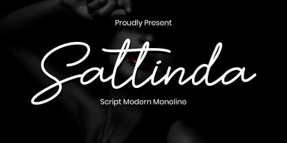 Sattinda is a thin and elegant handwritten font. It features a cute and joyful style that will take your designs to the next level! perfect for branding projects, logo, wedding designs, social media posts, advertisements, product packaging, product designs, label, photography, watermark, invitation, stationery and any projects that need handwriting taste. What’s Included : Standard Glyphs Ligature Works on PC & Mac Simple installations Accessible in the Adobe Illustrator, Adobe Photoshop, Adobe InDesign, even work on Microsoft Word. PUA Encoded Characters – Fully accessible without additional design software. Fonts include multilingual support for; ä ö ü Ä Ö Ü ß ¿ ¡
 - Rastely by Craft Supply Co,
$20.00 Unleash Your Joy with Rastely Dive into the fun with Rastely – Funky Typeface. It’s a joyful escape, perfect for creative minds. Inspired by psychedelic vibes, this font keeps it chill. Its playful curves promise a good time. Every letter brings a smile, designed for fun at first sight. Playful to the Core Rastely isn’t just a font; it’s a party invitation. Crafted with a relaxed approach, it’s easy-going yet bold. Let each character tell a story of cheer. Imagine your projects with a touch of whimsy. Moreover, its easy legibility makes it perfect for all ages.
 - ITC Airstream by ITC,
$29.00Timothy Donaldson creates letterforms anywhere using anything: he is just as happy making letters with pens and brushes, many of which he makes himself. Applying his personal commitment to the beauty of hand-drawn letterforms to modern type design methods has ensured that his fonts frequently reveal the presence of a joyful creativity behind the design. Airstreams alphabet is composed of consciously irregular handwriting characters and the overall tone is set by the emphasized vertical strokes. The erratic Airstream with its cheerful, unconventional character is intended for shorter texts and headlines and should be used in point sizes 10 and larger. - FF OCR-F by FontFont,
$68.99 German type designer Albert-Jan Pool created this sans FontFont in 1995. The family contains 3 weights: Light, Regular, and Bold and is ideally suited for film and tv, small text as well as software and gaming. FF OCR-F provides advanced typographical support with features such as ligatures, alternate characters, case-sensitive forms, fractions, super- and subscript characters, and stylistic alternates. It comes with a complete range of figure set options – oldstyle and lining figures, each in tabular and proportional widths. As well as Latin-based languages, the typeface family also supports the Cyrillic writing system.
 - Compotes by Piñata,
$9.90 Fontfamily “Compotes” was created with love and with care about small collections of hand-made" fonts. We have created a perfect product for the decoration of home design, small barber’s shops, cafes and bakeries. This fonts is ideally combined with any type of design, for example, you can use them on labels of homemade jams and pickles and “Compotes” perfectly can be used in logos and in the press. We did 5 main main typefaces by alphabetical list: A - Apple, B - Basilic, C - Citro, D - Dew, E - Espresso In addition, we have developed five “supplements” for each font!
 - FF Marselis by FontFont,
$62.99 Danish type designer Jan Maack created this sans FontFont in 2012. The family has 8 weights, ranging from Light to Black (including italics) and is ideally suited for advertising and packaging, logo, branding and creative industries as well as web and screen design. FF Marselis provides advanced typographical support with features such as ligatures, alternate characters, case-sensitive forms, fractions, super- and subscript characters, and stylistic alternates.The typeface was selected as one of Typographica’s favorite typefaces of 2012. It comes with a complete range of figure set options – oldstyle and lining figures, each in tabular and proportional widths.
 - AW Conqueror Std Sans by Typofonderie,
$59.00 AW Conqueror Sans was born out of this desire to fuse geometric and humanistic sans. It remains a typeface fundamentally influenced by both Bauhaus spirit — with its simplified geometric forms — and Jan Tschichold’s attempts to link this modular spirit to Eric Gill’s humanist sans serif. AW Conqueror Sans is a claimed French synthesis of Germanic Modernism and English classical tradition. Spheres of influence The core set of capitals are based on the proportions of the Roman capitals like Futura, Erbar, Nobel, Johnston, Gill Sans. During the 1930s, the Futura was a true success. Since then, Monotype offered a geometric version of the Gill Sans, and Linotype added Futura-like variants to WA Dwiggins’ Metro. AW Conqueror Sans is kind of a “fusion” of this approach. The lower case “b, d, p, q” are also directly influenced by Eric Gill’s, while the “y” is influenced by some of Jan Tschichold’s alphabets. In italics, drawn narrower, AW Conqueror Sans reinterprets Gill’s idea: a rigorous italic like a roman but which sometimes reveals some aspects of a Renaissance italic. AW Conqueror Sans and its extensions AW Conqueror Sans is the initial reference point for an extended family, including AW Conqueror Inline, Slab, Carved, Didot. The potential of these mixed families is powerful. Because AW Conqueror typefaces are based on an identical structure, and compatible proportions.
 - Looks Like The Toys R Us Font. ...
- Scurvy Dog by Hanoded,
$15.00 Aye, me lovelies, this be Scurvy Dog, a grand font! The letters were etched into a dead man's chest with a blunt rapier, pickled in brine and covered in spew. Ye could be using this crafty penmanship for yer logs or writing yer dear ol' mothers a letter.
 - Raclette by Linotype,
$29.99Raclette grills are an ingenious Swiss invention. This tabletop grill is used to cook raclette cheese, a unique sort of cheese produced by the happy cows of Valais. Swiss designer Michael Parson created a typeface in 2002 that speaks endearingly to his hearty homeland tradition - endearingly enough, he named it Raclette. Raclette most likely started out as a bold, condensed sans serif. But then, just as one pulls little trays off of a raclette grill, Parsons quickly removed many rectilinear bits from the edges of each letter. Text set in Raclette looks like an old brick wall, or perhaps like a raclette party for several hundred people, that ended an hour ago! Raclette is one of ten of Michael Parson's experiments in type design featured in the Take Type 5 collection from Linotype GmbH." - Karina by Flawlessandco,
$9.00 Introducing "Karina" is a modern playful font. Step into a world of contemporary charm with "Karina," a font designed to infuse your projects with a perfect blend of modern aesthetics and playful whimsy. Karina doesn't just bring letters to life; it introduces a dynamic trio of styles — regular, extrude, and fun — adorned with patterns in fun styles that add an extra layer of delight to your designs. There's some connected letters and some alternates that suitable for any graphic designs such as branding materials, t-shirt, print, business cards, logo, poster, t-shirt, photography, quotes .etc This font support for some multilingual. Also contains uppercase A-Z and lowercase a-z, alternate character, numbers 0-9, and some punctuation. If you need help, just write me! Thanks so much for checking out my shop!
 - Rinzler AOE by Astigmatic,
$19.00 Rinzler AOE is a revival of a LetterGraphics film type called Caren. A modular, mechanical, sans-serif stencil all rolled up into one retro typeface. It's not an all-purpose typeface, it's not an everyday typeface, but it is a cool typeface for the right design projects. Rinzler AOE carries itself with a bold weighted style, and stencil cutouts that don't follow standard stencil formatting. It might be considered more of a techno stencil (if there is such a thing). It reminded me in a vague way of TRON, hence the main poster graphic styling, although it looks NOTHING like the Tron titling typeface. Nevertheless, it's a fun typeface that needed to be preserved and used again. WHAT'S INCLUDED: Extensive language support. Rinzler has accented and special characters that support the following languages: Afrikaans, Albanian, Basque, Bosnian, Breton, Catalan Cornish, Corsican, Croatian, Czech, Danish, Dutch, Embu, English, Esperanto, Estonian, Faroese, Filipino, Finnish, French, Galician, German, Hungarian, Icelandic, Irish, Indonesian, Italian, Kurdish, Leonese, Luxenbourgish, Malay, Maltese, Manx, Maori, Meru, Morisyen, North Ndebele, Norwegian Bokmål, Norwegian Nynorsk, Nyankole, Occitan, Oromo, Polish, Portuguese, Rhaeto-Romanic, Romanian, Scottish Gaelic, Scots, Serbian (Latin), Slovak, Slovenian, Spanish, Swahili, Swedish, Tagalog, Turkish, Walloon, & Welsh. One of my guilty pleasures is in taking the time to recreate historical typefaces as digital fonts, but a lot of incredible historical typestyles created as wood or metal or film type usually have bare bones character sets and have been lost or only exist as limited specimen proofs in old books. These typefaces may have more niché uses than modern typefaces, but I believe it is important nonetheless to preserve these typefaces for future generations. These typefaces, if nothing else, can often inspire new creations.
 - Prototype by Barnbrook Fonts,
$30.00 Prototype is a typeface with a very contemporary identity crisis—is it old or new? uppercase or lowercase? serif or sans-serif? Prototype tries to be all things to all people. There have been many attempts at creating a universal typeface, one that rationalises the alphabet and removes the inconsistencies of upper and lower case, applying an unreasonable logic to something that has grown organically ...and is already perfectly usable! Prototype was the same experiment carried out at a time when design was experiencing an identity crisis of its own—letterforms that try to be all things to all people but end up being something else entirely.
 - Challah Display by Typophobia,
$25.00 Challah is a display font containing 295 glyphs. Letters are very diverse, but because they contain several shapes characteristic for each other - they retain a certain coherence. When creating the font, the main inspiration was to take from the Brazilian graffiti trend - Pichação and Korean typography. Most of the letters are the same size and width, however, when designing, we also tried to include at certain moments small "surprises" that will surely interest and surprise the user of the above-mentioned typeface. The font fits very well into the urban structure, therefore it perfectly matches the art on the walls with the art on the billboards, creating a kind of dialogue.
 - Quintet by Lauren Ashpole,
$15.00 Quintet is a narrow, stylized sans serif font made up of thin, looping lines. This font tries to walk the line between retro and modern and to incorporate some hand drawn imperfections without being too obvious about it. I kicked off designing without any particular inspiration in mind but, as time went on, started associating it in my head with an old-timey, swingy jazz aesthetic. So hopefully it captures the spirit of the Jeeves and Wooster throwback theme song and opening credits, the music of Stéphane Grappelli and Django Reinhardt (who the name is a nod to), and countless album covers from that era.
 - Gradl Max by Fresh Air Fonts,
$14.00 Max J. Gradl was a German jewelry designer. A Web search today turns up several examples of his work from the turn of the 20th century. He seemed to favor green stones in silver metalwork. Gradl also did advertising work and co-authored a book on architectural design. Most important for our purposes, though, are the incredible hand lettered alphabets and monograms the man left behind. I’ve digitized one of those delightful alphabets and tried to keep it true to the original. Beyond the base character set of letters, numerals and basic punctuation, I had to extrapolate forms that, I hope, hold true to Gradl’s design. Enjoy!
 - New Yorker Type by Wiescher Design,
$55.00 NewYorkerType was one of the first typefaces I tried my hand at in 1985. I meant it as a revival of the typeface used by the New Yorker magazine. I did not scan it in, I just looked at the type and redrew it completely by hand. So it is not just a copy, but rather a redesign. Only much later did I come to know, that there is a bundle of similar typefaces of that period. Rea Irvin's design for New-Yorker magazine was just one of them, but the best. Yours, sincerely honoring Rea Irvin a great type- and magazine-designer Gert Wiescher
 - Colophon by Roy Cole,
$34.00 During development of Colophon 30, the base font of the typeface family, two requirements emerged; namely that it should demonstrate good legibility and robustness when used for text composition, and where individual characters become more apparent, as in much larger sizes, these should appear well formed. Colophon 60 and 90 progressively increase in x-height to allow the counters to retain openness. The italics lean towards informality, this being apparent in the descender tails. On account of its neutrality there are few instances where the use of Colophon would be inappropriate; a quality that can also be attributed to Roy Cole's other typeface families: Lina, Zeta and Coleface.
 - Vigran Maroll by Ergibi Studio,
$19.00 Introducing Vigran Maroll Inspired by today's modern logo with a unique style but with an elegant shape. So we tried to do and create fonts as per the current market needs. VIGRAN MAROLL is perfect for BRANDING and LOGO DESIGN. You will get a classy, elegant, and of course aesthetic logo with this font. Besides that, this font has a unique ligature which is very suitable for various types of work such as posters, packaging, T-shirts, coffee shops, restaurants, magazine's headers, signs or gift/post cards, cafe's and weddings or any type of advertising purpose. if you have any questions, don’t hesitate to contact us Ergibi Studio
 - Rumpled by Ingrimayne Type,
$9.00 TapedUp, Tinkerer, and Rumpled are based on the template I used for several letterbat fonts—fonts made of wrenches and bolts, hammers, or paper clips. TapedUp can be thought of as a font made from masking tape, and Rumpled is the same design but the tape pieces are wavy. Tinkerer is the same design but with elements that resemble what might happen if one constructed letters from Tinker Toys. All are caps only, but some of the shapes on the lower-case keys differ from the corresponding shapes on the upper-case keys. The Rumpled family has four members, the regular, an oblique, a shadowed, and an oblique shadowed.
 - TDL Ruha Hairline by Tipos Das Letras,
$15.00 Ruha Harline is a modern and mechanical serif typeface and is the result of stencil's RUHA development. Being the first typeface of the family, it sets the basic concepts for further development, on each version to come. The design approach, results from a rigid geometrical connection with the Roman du Roi, since the letterforms are imposed by the constraints of the RUHA ruler. The main typographic proportions are connected with the modern typefaces, like Didot or Bodoni. Maintaining the same structure with different typographical and stylistic properties, the stencil allows to explore a modern typeface, with vertical stress, high contrast between the thick and thin strokes and hairline serifs.
 - Mortice by ArtyType,
$24.00 I set out to create a solid, bold, strong, rugged font, one that would lend itself to any industrial type of use, and by that I mean industry in general, but probably sectors that would still be considered male preserves such as carpentry or metalwork. I thought specifically of mortice & tenon joints, whilst toying with shape and form for this self imposed challenge. I was also visualizing a router tool used for producing most wood joints nowadays. I think the general premise worked out well; in the end I settled on the name Mortice, referring to the slots or negative spaces that the matching part, or tenon would fit into.