10,000 search results
(0.25 seconds)
- Flame On by Comicraft,
$19.00 The Heat is On! Comicraft's ace lettering artists Richard Starkings and John 'JG' Roshell created this font for Marvel's Fantastic Four title. Now, you don't have to be Johnny Storm to light up, but we would like to remind you that The Human Torch is a comic book character and you are not! Also, smoking is bad for your health.
 - Green On Green by Gerald Gallo,
$20.00 Green On Green is a display font not intended for text use. It was designed specifically for display, headline, logotype, branding, and similar applications. Green On Green has an uppercase alphabet, numbers, and punctuation. For convenience, the uppercase alphabet is repeated under the lowercase keys. Only the portions of the characters that are outlined by the 3D-simulated depth are visible.
 - Bolshy by K-Type,
$20.00 Bolshy is a stroppy font whose x-height has got ideas above its station, it’s ended up being equal to the cap height. Bolshy doesn’t go completely Bauhaus, and although the boundaries are somewhat blurred, the distinction between upper and lower case just about remains intact. There is something slightly Cyrillic about Bolshy’s bulbous terminals, exotic shapes and condensed curvature.
 - NewLibrary by Ingrimayne Type,
$9.95 In NewLibrary the letters are on books, not in them. (The letters are from the typeface BeneScriptine). The NewLibrary fonts have characters with blank books, both solid and outlined, that can increase coloring possibilities. Instructions on how to form the layers or alternatively to get the effects with a string of characters, some with zero width, are given in this pdf file.
 - F line by alphabeet.at,
$30.00 f-line is a special handwriting monoline font face, with one constant line from glyph to glyph and variable width. It was drawn for the designer’s thesis in 2010 and expanded until 2021 with a lot of open type features. It’s built up with three glyph sets to let the glyphs rotate automatically, and amongst other type features initial forms are available.
 - Funp by Outerend,
$20.00 A fun and playful display font to be explored for your projects! “Funp” (fun & jump) has been created with the themes of manga, anime, and cosplay from Japanese animation culture. It’ll be a great fit not only for all the print materials like party and event invitations, logos, packaging, and more but also for social media ads and your website designs.
 - Heidenberg by Motokiwo,
$19.00 Heidenberg is a hand lettering work with retro style. This well designed font was inspired from classic typography designs in 60's to 80's. Heidenberg was packed with a lot of alternates and swashes (please check preview images), it will give you more choices to custom your words with this OpenType features. It also has multilingual support for standard latin characters.
 - Bit Part JNL by Jeff Levine,
$29.00 Bit Part JNL is an extra condensed monoline sans serif typeface that's well suited for movie credits, disclaimers and other forms of tight-fit word copy. Inspired by just the numbers "65" on the cover of a 1965 high school yearbook, this retro font will fit a lot of copy into a small area. The typeface is available in regular and oblique versions.
 - Big Ballpen by Simonkoba,
$18.00 Big Ballpen is a modern, slightly naive handwriting typeface, which has the feel of graffiti with its rough lines. The font lines are basically fat and the thickness is not regular from letter to letter. Some numbers are inspired from Tony Buzan concept of picture-number. For example, the number 2 resembles a swan. Some special characters like €$*#@&{Ç~• are available.
 - Valkyrie by Brave Lion Fonts,
$9.49 Valkyrie was designed following the idea to have realy strong letters taking a lot of room. This results in a heavy appearance and gives Valkyrie its special look. It is possible to give it an even more uniform look by using the alternate characters. What can a strong font be used for? Valkyrie hopes to break rules. Use its power.
 - Ultimate Class by Putracetol,
$28.00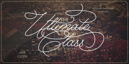 Ultimate Class is an elegant, classy and stylish script typeface. This font also have plenty of beautiful swashes with swirls, 13 - 17 alternate character for lowercase letter. Ultimate Class perfect for signatures, quotes, branding, wedding invite and card, elegant logo, poster, packaging, stationery, website, and many more. It include OpenType feature with a lot of alternates which help you to make great lettering.
 - Uncle Sam Slim NF by Nick's Fonts,
$10.00Based on Morris Fuller Benton's 1905 oeuvre American Extra Condensed, this titling face packs a lot of information into very little horizontal space. Its champfered corners give the font an industrial feel which remains fresh even after more than a century. Both versions include the complete Latin 1252, Central European 1250 and Turkish 1254 character sets, with localization for Lithuanian, Moldovan and Romanian. - Backy by Canden Meutuah,
$20.00 Introducing Bucky is a simple, minimalist and neat Display font. It can be easily adapted to a very large range of projects, such as advertising, titles, blogs, logos, branding, invitations, business cards and more! So add it to your creative ideas and watch how it makes it stand out! are also used in various languages. you will not be disappointed with the results.
 - White On White by Gerald Gallo,
$20.00 White On White is a display font not intended for text use. It was designed specifically for display, headline, logotype, branding, and similar applications. White On White has an uppercase alphabet, numbers, and punctuation. For convenience, the uppercase alphabet is repeated under the lowercase keys. Only the portions of the characters that are outlined by the 3D-simulated depth are visible.
 - Funky Fat Jiggly PW by Patty Whack Fonts,
$15.00Funky Fat Jiggly PW is intended and suitable for Display use and Titles. It's not very suitable for long paragraphs of text. This font is meant for fun, fun, fun! It contains the basic characters. Uppercase, lowercase, numerals, and basic punctuation. See the character map for all of the included characters. Funky Fat Jiggly PW is available in OpenType, PostScript and TrueType format. - Grumpy by Suomi,
$40.00 An extreme headline font with six optical variants. Black 24 is loosely based on ITC Grouch (1970) by Tom Carnase. It has some 2000 hand-adjusted kerning pairs for TNT (that’s Tight, Not Touching), a very popular type treatment from the seventies and eighties. Take your pick, or get them all, so you don’t have to buy another one later on.
 - Reaf Singer by Dicubit,
$13.00 Reaf Singer is a modern monoline typeface/font designed with carefully handcrafted. This perfectly made to be applied in logo or branding, stationery, books, packaging, fashion, magazines, t-shirt, novels, labels and many advertising purposes. Features: Uppercase, Lowercase, Number, Punctuation, Symbol, Multilingual, Ligature, Alternate, Swash. All the pictures used in the preview are not included. They are intended only for illustration purpose.
 - Orange On Orange by Gerald Gallo,
$20.00 Orange On Orange is a display font not intended for text use. It was designed specifically for display, headline, logotype, branding, and similar applications. Orange On Orange has an uppercase alphabet, numbers, and punctuation. For convenience, the uppercase alphabet is repeated under the lowercase keys. Only the portions of the characters that are outlined by the 3D-simulated depth are visible.
 - Gaston by JBFoundry,
$5.00 Gaston is a complete solution for teachers and pupils. A wide choice of styles allows to create varied and homogeneous documents. Gaston uses a lot of contextual alternates so it's necessary to use friendly OpentType applications. Note: Previews don't render the font accurately (Contextual Alternate aren't shown). To have a fair idea of how it will appear, look at the presentation here.
 - Minthy Stones by Dicubit,
$15.00 Minthy Stones is a modern script typeface/font designed with carefully handcrafted. This perfectly made to be applied in logo or branding, stationery, books, packaging, fashion, magazines, t-shirt, novels, labels and many advertising purposes. Features: Uppercase, Lowercase, Number, Punctuation, Symbol, Multilingual, Ligature, Alternate, Swash. All the pictures used in the preview are not included. They are intended only for illustration purpose.
 - Saddle Tramp JNL by Jeff Levine,
$29.00 The designers of wood type in the 1880s did not lack for inspiration or imagination. From extremely ornate designs to ultra compressed or condensed alphabets, there was no shortage of variety. Saddle Tramp JNL is one such compressed font. Its wide, bold design coupled with its squat appearance allows for multiple words in a headline without overuse of page space.
 - Neverland by Mirror Types,
$30.00 Neverland is my attemp of a lettering font. I was inspired by the letters in displays of retaurants. It will work great in posters, shirts, magazines and displays because it has a charming feel. I received a lot of help from my good friend Maximiliano Sproviero (Lián Types). The name is based on the tale of Peter Pan from James Matthew Barrie.
 - MB Picture House by Ben Burford Fonts,
$30.00 Small caps art deco font inspired by the golden age of Hollywood and childhood trips to the Majestic Cinema. Two styles, each with three weights. Picture House One is sharp and crisp, Picture House Two has a slightly 'Out of Focus' look to it. Both come with extended language support and oldstyle numbers, giving a lot of scope for may uses.
 - Nouvelle by Mina Arko,
$45.00Nouvelle is an elegant sans serif family of six fonts (light, regular, semibold and italics). This modular typeface works just as well as display typeface as it does in body text. Because of the high x-hight it stays readable in very small sizes. It has 1884 characters: oldstyle numerals, ligatures and extra characters that support almost all European languages. - Mary Read by Melli Diete,
$50.00 Mary Read is a modern handwritten Display Font, showing its fancy curves best in headlines as well as short texts. For typographic variety the typeface offers a range of features and extras. Give your texts a quite playful and handwritten note. Being chi chi is not a crime, don’t hesitate to pepper some sweetness in the midst of people’s attention.
 - La Belman Pro by Gleb Guralnyk,
$14.00 Presenting a font family La Belman Pro. This capital vintage style typeface is perfect for label design and different headers. It has 5 weights wich makes it more usable in different sizes and usecases. Lots of ligatures can help you to create a unique lettering compositions. West european characters set is available. Thank you for your attention and have a nice day!
 - Display Uncanny by Gerald Gallo,
$20.00 Display Uncanny is a display font not intended for text use. It was designed specifically for display, headline, logotype, branding, and similar applications. The same A to Z characters are located under the shift+character set and character set keys with the ones under the character set keys reduced in size. There are numbers and punctuation located under their respective keys.
 - Monem by Wiescher Design,
$39.50 Monem is the word for the smallest significance-carrying part of a language. I thought that was a good name for a clean, straightforward Sans typeface. Monem is very sturdy and usable for lots of occasions. I am using this font myself for those of my clients that want to convey a clean unobtrusive image. Your very restrained Gert Wiescher
 - Maiers Nr 42 Pro by Ingo,
$42.00 A handwritten decorative font with brush characteristics This attractive decorative script is found in a pamphlet of script samples from around 1900 which was issued by Otto Maier publishing house in Ravensburg/Germany. The forms and flow of Maier’s Nr. 42 are obviously influenced by Art Nouveau. In the original sample, only the Latin alphabet appears. All other characters, especially the Greek and Cyrillic letters, were modeled on elements of the original. A typeface can first reveal a true "handmade" character when the letter forms do not continually repeat themselves – a completely normal occurrence with handwriting. Thanks to OpenType, some key letters of Maier’s Nr. 42 appear in various alternative forms depending on the combination of letters. For example, the difference is obvious between an e followed by i and an e followed by l. Using this principle, a number of letter combinations are presented with alternative character forms so that overall a very lively impression is created.
 - Greather by dotHK Studio,
$28.00 Greather is a casual script and clean brush script with a bouncing baseline. Include OpenType alternates and common ligatures. Try the alternates and ligatures to give your designs looks good, fresh, casual, stylish, and modern. Greather is equipped with 357 glyphs with a variety of alternate options and ligatures to suit your choice. 40 glyph ligature style. by having many of these glyphs will be able to select the letters according to your likes, many variations and options for each letter, so you can customize on your design choices. To use a variety of flying machines, you need a program that supports OpenType features such as Adobe Photoshop Cs / Adobe Photoshop CC, Adobe Illustrator CS / Adobe Illustrator CC, Adobe Indesign and Corel Draw and many more programs that support OpenType. If you do not have a program that supports OpenType, you can access all the alternate glyphs using Font Book (Mac) or Character Map (Windows)
 - Anger Styles - Personal use only

- BudNull - Unknown license

- BudHand - Unknown license

- Symbologica JL - Unknown license

- Who - Unknown license

- joeHand 1 by JOEBOB graphics,
$- JoeHand was one of the first scripts by JOEBOB graphics. A complete character set with numbers and most (but not all) special signs.
 - Bronc Stomper by FontMesa,
$20.00 Introducing Bronc Stomper; Bronc Stomper got its start from an old logo design used by the New York and Harlem Railroad in 1904.
 - Informational Sign JNL by Jeff Levine,
$29.00 A vintage metal sign saying "No Dogs Allowed" was the model for the ultra-bold Art Deco-influenced lettering comprising Informational Sign JNL.
 - No Parking JNL by Jeff Levine,
$29.00 No Parking JNL was inspired by a hand-cut stencil of those words painted in an area of a department store's parking lot.
 - Printers Pictures JNL by Jeff Levine,
$29.00 Printers Pictures JNL is another volume of vintage letterpress stock cuts, cartoons, embellishments and what-nots for those who enjoy these charming illustrations.


