10,000 search results
(0.024 seconds)
- FS Albert by Fontsmith,
$80.00 The x factor How do you make a font like FS Albert unique, distinctive? “When designing a font I try to question every letter,” says Jason Smith, “but all you need is a few that have an x factor. With FS Albert, they’re the lowercase ‘a’ and ‘g’ and the uppercase ‘I’ and ‘J’. “I remember a friend saying, ‘Why on earth have you designed the ‘a’ like that? Isn’t it too friendly for this kind of font?’ And, in a way, that’s what I wanted – honesty and warmth, because a lot of big brands at the time really needed to show a more human side.” Range of weights and styles FS Albert is a charismatic type: a warm, friendly sans serif face with a big personality. Open, strong and amenable, and available in a wide range of weights and styles, FS Albert suits almost every task you put it to. Fontsmith has crafted five finely-tuned upright Roman weights and four italic weights, as well as a special Narrow version to provide the best coverage and give headlines and text an easy-going character. The chunky kid “FS Albert was inspired by – and named after – my son, who was a bit of a chunky kid,” says Jason Smith. “I designed an extra bold weight because I always felt that the really big font heavy weights had the most personality. “I recently told Albert this story. He laughed, and forgave me for thinking he was a fat baby. He liked the big personality bit, though.” 1000s of glyphs Not content with a character set that covered Europe and the whole of the Western world, the studio decided to go further afield. There are now FS Albert character sets that cover western and eastern European languages, including those of Russia, as well as Cyrillic, Arabic and Greek scripts. In fact, the font now covers more than 100 languages, making it ideal for bringing a consistent typographic style to the communications of global brands.
 - FS Albert Paneuropean by Fontsmith,
$90.00The x factor How do you make a font like FS Albert unique, distinctive? “When designing a font I try to question every letter,” says Jason Smith, “but all you need is a few that have an x factor. With FS Albert, they’re the lowercase ‘a’ and ‘g’ and the uppercase ‘I’ and ‘J’. “I remember a friend saying, ‘Why on earth have you designed the ‘a’ like that? Isn’t it too friendly for this kind of font?’ And, in a way, that’s what I wanted – honesty and warmth, because a lot of big brands at the time really needed to show a more human side.” Range of weights and styles FS Albert is a charismatic type: a warm, friendly sans serif face with a big personality. Open, strong and amenable, and available in a wide range of weights and styles, FS Albert suits almost every task you put it to. Fontsmith has crafted five finely-tuned upright Roman weights and four italic weights, as well as a special Narrow version to provide the best coverage and give headlines and text an easy-going character. The chunky kid “FS Albert was inspired by – and named after – my son, who was a bit of a chunky kid,” says Jason Smith. “I designed an extra bold weight because I always felt that the really big font heavy weights had the most personality. “I recently told Albert this story. He laughed, and forgave me for thinking he was a fat baby. He liked the big personality bit, though.” 1000s of glyphs Not content with a character set that covered Europe and the whole of the Western world, the studio decided to go further afield. There are now FS Albert character sets that cover western and eastern European languages, including those of Russia, as well as Cyrillic, Arabic and Greek scripts. In fact, the font now covers more than 100 languages, making it ideal for bringing a consistent typographic style to the communications of global brands. - Posh by Lián Types,
$49.00 I've always been in love with fat didones. That’s the reason of Posh. In search of something unique, I started this family back in 2013 with the aim of creating the fattest yet readable bodonian typeface in the market: It was a challenge, because roman fonts need generous counters (or what some call white spaces) and taking them to the extreme of inexistence attempted against the construction of many glyphs. Ears, dots, terminals and serifs always need some extra space so I had to find the exact point of boldness to make characters which have those attributes work well in the middle of those which haven't. (1) After a while, I felt I was again ‘in my element’: Big contrasted letters, sexy and elegant curves, and that Lubalinesque feeling that characterise my fonts. (2) Words written with Posh are a explosion of elegance and sensuality due to the fact that its didone attributes were exaggerated. Since it’s full of alternate glyphs, one can change and choose them until a nice block of ‘‘black’’ is achieved. (3) To accompany the regular style, I designed Posh Inline, a font with the same quantity of glyphs than the regular one; an all caps style called Posh Capitals, and also a really playful Italic version. I hope you find this one delicious like I do! This font is dedicated to all who understand letters are not just meant to be read, but also to be appreciated in group and individually. Enjoy it. NOTES (1) In example, it can be easy to design a fat letter ‘n’ with almost no counter, but really tough to make a satisfactory letter ‘s’ with serifs to match that ‘n’. (2) Also, it wasn't my first attempt in fat didones. Take a look at my font Reina, made in 2012. (3) Posters above show many words with ball terminals that seem to dance above and below the words in order to fill those “undesired” blank spaces.
 - Equality Serif by Mans Greback,
$69.00 Equality Serif is a font that radiates classiness and luxury. This beautiful serif font features delicate and intricate details that add finesse and sophistication to any design. Designed with an aristocratic feel, this font is perfect for high-end projects that require a touch of elegance and refinement. With its clean lines and precise angles, Equality Serif is the epitome of top class design. This uppercase font is perfect for headlines, logos, and branding projects that demand attention and make a statement. The font also features a set of ligatures that add a touch of fluidity and grace to your designs. Whether you're working on a wedding invitation or a high-end fashion project, Equality Serif is the perfect font for adding a touch of class and elegance to your work. Equality Serif is available in two styles: Regular and Italic. The font is built with advanced OpenType functionality and has a guaranteed top-notch quality, containing stylistic and contextual alternates, ligatures and more features; all to give you full control and customizability. It has extensive lingual support, covering all Latin-based languages, from Northern Europe to South Africa, from America to South-East Asia. It contains all characters and symbols you'll ever need, including all punctuation and numbers.
 - Denmas by Beewest Studio,
$50.00 Denmas Font is Engaved Bold Decorative Font that ornamental. This Font is Best as tittle of the novel, Poster, Theatre, Logo and also tatoo. This font is bold , strong , classic and luxurious in the same time.
 - Hamasa by Arendxstudio,
$15.00 Hamasa is a very cute font with lots of variation in it that make the atmosphere happy .
 - Space Cadet by Device,
$39.00 Rayguns on stun! A retro science fiction font that evokes a golden age of intergalactic pulp adventure.
 - Embossed by Gerald Gallo,
$20.00 Embossed is a family of fonts whose characters are composed of squares that appear to be embossed.
 - Happy Heinrich by PizzaDude.dk,
$20.00Happy Heinrich has the looks of a typewriter font, but he's far to funky just for that! - Angulatte by Gerald Gallo,
$20.00 Angulatte is a sans serif font made up of characters that are drawn with only straight lines.
 - LD Astoria by Illustration Ink,
$3.00This stylish font has that ornamental curly look. It would be excellent for the formal scrapbook layout. - Domestic Bliss by Funk King,
$10.00 Domestic Bliss is a perky dot fonts that can bring some fun and bounce to your project.
 - Vehicle JNL by Jeff Levine,
$29.00Vehicle JNL is a condensed block font similar to that found on many state auto license plates. - Trilium JNL by Jeff Levine,
$29.00Trilium JNL is a tri-line sans serif font that was modeled from some 1970s retail packaging. - Mati by Sudtipos,
$19.00 Father's Day, or June 17 of this year, is in the middle of Argentinian winter. And like people do on wintery Sunday mornings, I was bundled up in bed with too many covers, pillows and comforters. Feeling good and not thinking about anything in particular, Father's Day was nowhere in the vicinity of my mind. My eleven year old son, Matías, came into the room with a handmade present for me. Up to this point, my Father's Day gift history was nothing unusual. Books, socks, hand-painted wooden spoons, the kind of thing any father would expect from his pre-teen son. So you can understand when I say I was bracing myself to fake excitement at my son's present. But this Father's Day was special. I didn't have to fake excitement. I was in fact excited beyond my own belief. Matí's handmade present was a complete alphabet drawn on an A4 paper. Grungy, childish, and sweeter than a ton of honey. He'd spent days making it, three-dimensioning the letters, wiggle-shadowing them. Incredible. A common annoyance for graphic designers is explaining to people, even those close to them, what they do for a living. You have to somehow make it understandable that you are a visual communicator, not an artist. Part of the problem is the fact that "graphic designer" and "visual communicator" are just not in the dictionary of standard professions out there. If you're a plumber, you can wrap all the duties of your job with 3.5 words: I'm a plumber. If you're a graphic designer, no wrapper, 3.5 or 300 words, will ever cover it. I've spent many hours throughout the years explaining to my own family and friends what I do for a living, but most of them still come back and ask what it is exactly that I do for dough. When you're a type designer, that problem magnifies itself considerably. When someone asks you what you do for a living, you start looking for the nearest exit, but none of the ones you can find is any good. All the one-line descriptions are vague, and every single one of them queues a long, one-sided conversation that usually ends with someone getting too drunk listening, or too tired of talking. Now imagine being a type designer, with a curious eleven year old son. The kid is curious as to why daddy keeps writing huge letters on the computer screen. Let's go play some ball, dad. As soon as I finish working, son. He looks over my shoulder and sees a big twirly H on the screen. To him it looks like a game, like I'm not working. And I have to explain it to him again. This Father's Day, my son gave me the one present that tells me he finally understands what I do for a living. Perhaps he is even comfortable with it, or curious enough about that he wants to try it out himself. Either way, it was the happiest Father's Day I've ever had, and I'm prouder of my son than of everything else I've done in my life. This is Matí's font. I hope you find it useful.
 - Fifty Holliwing by Attract Studio,
$17.00 Fifty Holliwing is a modern classic serif font inspired by a classy eighties magazine with soft curves and a sharp eye for detail that makes it a must for any project that requires high-end. Fifty Holliwing also comes with an italic version that really helps with your designs as well as lots of unique alternatives and ligatures that are really versatile. Include: Regular & Italic Alternates & Ligatures OpenType support Multilingual PUA Encoded.
 - Bethlehem Star by HiH,
$10.00 For much of the world, the last half of December encompasses the beginning of winter and the a season of gift-giving, marked by Hanukkah and Christmas. It is generally accepted that the tradition of giving of gifts at this time was begun by The Three Wisemen. As described in The Gospel According to Matthew, the wisemen, led by a star from a distant land to the east, found the baby Jesus. First, they worshipped him and then, "they presented him with gifts: gold, frankincense and myrrh." (Matthew 2:11). Thus began the tradition of celebrating the birth of Christ with the giving of gifts. There is a parallel tradition in the Jewish faith of the giving of gelt or gold at Hanakkuh to help support poor students, in keeping with the rich history of scholarship that is fundamental to the rabbinic system. Inevitably, in our secular culture, there has been a blending and a secularization of these traditions. The reasons have gotton lost in the “gimme.” What is often overlooked is what Paul realized when he told Timothy, “Neglect not the gift that is in thee.” The most importent gift is the gift inside of us, the gift of sacrificial love for others. When we let that gift be diminished in our minds amid the clutter of modern day material seeking, we can recall the prophesy of Micah over 2800 years ago, But thou, Bethlehem Ephratah, though thou be little among the thousands of Judah, yet out of thee shall he come forth unto me that is to be ruler in Israel: whose goings forth have been from of old, from everlasting." (Micah 5:2 KJV) Never underestimate the impact you have on others. Words of kindness can change people’s lives. The Talmud says that the highest form of wisdom is kindness. Be wise this holiday season. The font BETHLEHEM STAR was originally designed for the church to which I belong, The Star Bethlehem Church of Ansonia, Connecticut, USA and is based on the typeface Accent with the permission of URW++ of Hamburg, Germany. You might choose BETHLEHEM STAR for your personal greetings as well as for flyers and programs at your church this holiday season. Like most display fonts, it is most effective at 18 points and larger. Like most script fonts, it is most effective when set with both upper and lower case. All caps with this font is like eating two pieces of pecan pie — too much of a good thing.
 - Sonrisa by CastleType,
$59.00 Sonrisa is a design that evolved from my sketches of the skeletal structure of Jakob Erbar’s Koloss, trying to discover its underlying essence without all the contrast and bulkiness of the original design. Sonrisa Thin was the resulting font, from which the other weights of the family were developed. Gentle curves, open counters, generous x-height, and sleekly tapered terminals give Sonrisa a very legible, modern, elegant appearance. When she saw the first draft of this typeface, the smile on my friend Jennifer’s face gave me the idea to call it “Sonrisa” (Spanish for “smile”). Jennifer, a clinical psychologist, described Sonrisa’s personality as: "happy, clean, clear, open, joyful, spacious, playful, calm. I can see it being used for body product lines such as oils and lotions. Can see it being used in home/travel magazines or even Architectural Digest. Yoga magazine, definitely." Sonrisa is what some foundries call a “Pro” typeface family with all the bells and whistles that provide typographic versatility: true small caps, oldstyle numerals, arbitrary fractions, discretionary ligatures, and other powerful OpenType features. All fonts in the family, except Sonrisa Titling, support most European languages, including modern Greek and languages that use the Cyrillic Alphabet. (Cyrillic glyphs designed in consultation with Ukrainian type designer, Sergiy S. Tkachenko.) Sonrisa is available in the original Thin, monoline version as well as six weights (Light, Regular, Medium, Bold, Extra Bold, Black), and a Titling font that is essentially a display font construction kit. If you enjoy using Sonrisa even half as much as I enjoyed creating it, then I know you will have a “sonrisa” (smile) on your face!
 - The Giant Monster by Sipanji21,
$20.00 "The Giant Monster" is a bold 3D display font featuring solid, inner, and shadow characters. Fonts like this offer various styles within the same typeface, providing depth and dimension to the text. The solid characters provide a bold and straightforward appearance, while the inner characters offer depth and a three-dimensional effect within the letterforms. The shadow characters contribute to the font's depth by adding shadowing or highlighting behind each character. With its multi-layered design, "The Giant Monster" allows you to create text that appears voluminous and impactful. This font is suitable for projects such as posters, titles, or any design endeavor that requires a bold and dynamic typographic style with a three-dimensional effect.
 - Miamo by Larin Type Co,
$14.00 Miamo is an elegant and modern font family. It includes script font and sans serif in six weights from Thin to Bold. Sans serif font is a multi-purpose font that is perfect for any project, it is contrasted, modern and easy to read. With it, you can create logos, use in advertising, packaging, book covers and magazines, headings, descriptions and much more. Handwritten script font elegant and charming, it includes alternatives and a variety of ligatures that will make your project unique. This font is easy to use has OpenType features.
 - Aront by BaronWNM,
$14.00 Aront is a font with a modern and simple style. Having round and triangular geometric shapes adds a simple and stable impression to this font, plus a slight curve at each corner so that this font doesn't look stiff. The Aront font is perfect for logos, branding, film titles, games, and other techno-themed projects. Not only limited to techno themes, this font is also suitable for use in other themes that seem clean and simple. Aront font has multilingual support, alternate, and several ligatures as a plus.
 - The Lord Music by Java Pep,
$19.00 Introducing, proudly present the newest and fresh product from the oven. The Lord Music font is a decorative serif font made with collaborating of beauty and elegant looks. This font made with a lot of alternate features that every letter has a minimal 3 alternates for change and mix with your style do you want. This font will to giving more valuable projects that outstanding and elegant. The Lord Music font is perfect for a title, headline, logo, branding, quote, tagline, and etc. The font also supports more than 20 languages.
 - Barle by Locomotype,
$18.00 Big is beautiful. Barle font has an extremly heavy weight and wide shape. A sans-serif display font that's perfect for large headlines, posters, packaging and any graphic design that requires a font that will stand out to audiences. Barle font has two faces, a standard character and a sliced version which can be accessed through the Stylistic Alternates feature. This font consists of 4 fonts; upright and italic style in the normal version and the outlined version. If you just want to use the sliced version, you just need to purchase Barle Alt.
 - Asgaria by Cooldesignlab,
$15.00 Asgaria is a serif font family with an elegant and classy look. Each letter is designed with natural and beautiful curves. These fonts are tailor-made for luxury themed projects, from bold magazine images, to wedding invitations, branding, poster designs, logos, business cards and more. If you're involved in a project that requires beautiful, professional writing, this font is perfect to help you get it done. The Asgaria font features open, ligature and alternative types that are packaged in 2 fonts: Regular, and Italic. Asgaria fonts include uppercase, lowercase, numbers, punctuation marks and multilingual support.
 - Smiley by Dear Alison,
$24.00Ever think that supermarkets are becoming less personal and more clinical and cold? What will cost you less than a trip to the supermarket and put a smile on your face? Smiley was inspired by the hand-brush lettered signage at country grocery stores. There's something about the feeling you get when you visit a small town and stroll on over to the corner market. Everyone is pleasant, courteous, and they all have a smile on their face. You can have that local small town grocery store charm for yourself when you buy Smiley today. - Julienne by Wiescher Design,
$39.50 Cooks call thinly cut - like matchsticks - vegetables "Julienne". I found that was a fitting name for this very narrow typeface. Julienne Slim is the extreme cut of the two. Personally I do not use narrow typefaces very often, but from time to time they come in handy if there is much text to be crammed into little space. I could make a typeface that was even narrower, but I will not do it. This is as narrow as my typefaces get. Enjoy what I cut for you, Gert Wiescher.
 - Rosalline Handwritten by Ditatype,
$29.00 Rossaline Handwritten is a lovely script font of which characteristics are the connections between letters to look like a naturally connected handwriting that leaves the impression of this font being organically, spontaneously written in order to add a firm personal touch. This font has various line thicknesses to show high letter contrasts to strengthen the font’s firm, clear impressions. Besides, the letters’ height variety, meaning that some of the letters are higher than the others, makes Rossaline Handwritten more interesting and dynamic. However, the connected letters can cause difficulty to read in small text sizes, so that you need to be more careful to use this font by adjusting it to your needs. In addition, you may enjoy the available features here as well. Features: Ligatures Multilingual Supports PUA Encoded Numerals and Punctuations Rossaline Handwritten fits best for various design projects, such as brandings, quotes, invitations, name cards, greeting cards, printed products, merchandise, social media, etc. Find out more ways to use this font by taking a look at the font preview. Thanks for purchasing our fonts. Hopefully, you have a great time using our font. Feel free to contact us anytime for further information or when you have trouble with the font. Thanks a lot and happy designing.
 - Mousse Script by Sudtipos,
$79.00 Mousse Script is based on Glenmoy, a 1932 Stephenson Blake typeface. Glenmoy a prime example of what display typography was in pre-WWII American ad art. It graced the pages of magazines, sold numerous products and services, then simply died out when the typographic trends shifted towards the more personalized, stylized and handwritten types of calligraphy. The current trend in typography is a revivalism that brings all of the distinctive display typography of the 20th century, without chronological discrimination, back in the name of ‘retro’. Who are we to deny the masses what they want? Mousse Script doesn’t just bring Glenmoy back from the ashes of the 20th century. It expands upon the limited metal character set nearly twice over and takes advantage of the latest type technologies. This makes Mousse Script a striking typeface, both functionally and visually. A simple, attractive display font on the surface, Mousse Script is unique in its bold upright calligraphy, something rarely found these days. The OpenType version of Mousse Script combines both the regular and alternate character sets into a single, cross-platform package that takes advantage of the extended typographic features of the OpenType format.
 - News Nook by Mix Fonts,
$13.00 Introducing NEWS NOOK – a font family that captures the essence of newspaper headlines and front pages, with a rugged twist. This versatile sans-serif pairing is perfect for creating a modern, professional look that is both eye-catching and easy to read. With its unique ruggedness, it makes it stand out and suitable for outdoor designs. The font family includes two distinct styles: NEWS NOOK, a bold headline font, and NEWS NOOK MINI, a thin and stout sans-serif font. Together, they provide a range of options for creating headlines, subheadings, and body text that are sure to grab attention. The headline font is particularly great for creating bold and sturdy design elements. Inspired by the traditional newspaper style, NEWS NOOK brings a touch of nostalgia to any design project. But this font family is not just a replication of traditional newspaper style, it’s more of a modern take on publishing type with a handwritten spin. This makes it perfect for any print project, including magazines, newspapers, and more, creating a polished and professional look that is suitable for outdoor designs. NEWS NOOK (Regular) comes with the following glyphs: ABCDEFGHIJKLMNOPQRSTUVWXYZ abcdefghijklmnopqrstuvwxyz 0123456789 !@#$%^&*()`~♥❤✿•· ÷×+−±≈=≠≥≤[]:;’”,.|/?{}“”‘’-–—_ …‚„©®™‹›«»°¹²³ªº¡¿₱¢€£¥¶§№† ÁÀÂÄÃÅĂĀĄÆĆĈČĊÇÐĐÉÈÊËĖĒĘḞǴĜǦḠĠĤȞḦḢIÍÌÎÏĪĮĴḰǨŁḾṀŃÑŇ ÓÒÔÖÕŌŐØŒṔṖŔŘṘŚŜŠŞȘŤṪȚÚÙÛÜŨŮŬŪŰŲẂẀŴẄẆÝŶŸŹẐŽŻƵ áàâäãåăāąæćĉčċçðđéèêëėēęḟǵĝǧḡġĥȟḧḣıíìîïīįĵḱǩłḿṁńñň óòôöõōőøœṕṗŕřṙśŝšşșťṫțúùûüũůŭūűųẃẁŵẅẇýŷÿźẑžżƶ NEWS NOOK MINI comes with the following glyphs: ABCDEFGHIJKLMNOPQRSTUVWXYZ abcdefghijklmnopqrstuvwxyz 0123456789 !@#$%^&*()`~♥❤✿•· ÷×+−±≈=≠≥≤[]:;’”,.|/?{}“”‘’-–—_ …‚„©®™‹›«»°¹²³ªº¡¿₱¢€£¥¶§№† ÁÀÂÄÃÅĂĀĄÆĆĈČĊÇÐĐÉÈÊËĖĒĘḞǴĜǦḠĠĤȞḦḢIÍÌÎÏĪĮĴḰǨŁḾṀŃÑŇ ÓÒÔÖÕŌŐØŒṔṖŔŘṘŚŜŠŞȘŤṪȚÚÙÛÜŨŮŬŪŰŲẂẀŴẄẆÝŶŸŹẐŽŻƵ áàâäãåăāąæćĉčċçðđéèêëėēęḟǵĝǧḡġĥȟḧḣıíìîïīįĵḱǩłḿṁńñň óòôöõōőøœṕṗŕřṙśŝšşșťṫțúùûüũůŭūűųẃẁŵẅẇýŷÿźẑžżƶ
 - Chittenden by Haiku Monkey,
$10.00 Chittenden is a painstakingly hand-crafted, hand-drawn decorative font that get its inspiration from classic serif fonts, and adds some double-stroked panache of its own.
 - Ghula Vista by Rockboys Studio,
$17.00 Southeast is a chic, paint brushed script font that emanates sophistication and elegance. Its stylish alternates and ligatures make this font the perfect match for any project.
 - Golden Bloom by Ardian Nuvianto,
$18.00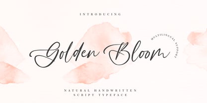 Golden Bloom is a chic, refined script font that emanates sophistication and elegance. Its stylish alternates and ligatures make this font the perfect match for any project.
 - Drawzing by Fonthead Design,
$19.00 Drawzing is a font designed by Ethan Dunham that mimics the looks of either chalk or crayon. The font is well balanced and is not overly childish.
 - Amonus by Ronin Design,
$15.00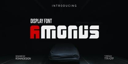 Amonus is a modern and simple display font. This font is ideal for logo design, labels, posters, or pretty much anything else that requires a unique touch.
 - Hellena by Motokiwo,
$17.00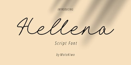 Hellena, an elegant script font that great for fashion, quote, and many more. This font was designed with uppercase, lowercase, ligature, numbers, punctuation, and also multilingual support.
 - RefSpecialty by Microsoft Corporation,
$29.00RefSpecialty is a unique font that was originally developed for inclusion in a Microsoft product. The RefSpecialty font is available in TrueType with a custom character set. - Sarmal by Ahmet Altun,
$19.00 The sarmal font contains ligatures that are functional and useful. It can be a stylish font choice for your posters, t-shirts, prints and many more works.
 - Megans by Sealoung,
$17.00 Imagine a slender serif font that effortlessly combines classic elegance with modern sophistication. This font features delicate, fine lines that evoke a sense of refinement and grace. Its letters are meticulously crafted, and it comes with a range of ligatures and alternate characters that add a unique touch to your design projects. These ligatures and alternates seamlessly blend together, creating a harmonious and seamless flow of text. Whether you're working on a vintage-inspired poster or a contemporary wedding invitation, this font's ligatures and alternates will allow you to infuse a touch of artistic flair into your designs, making it the perfect choice for those seeking a balance of tradition and innovation. Included : Uppercase & Lowercase Numeral & Punctuation Ligatures & Alternates Multilingual Support PUA Encode Thank you for visiting our shop and happy designing.
 - Happy Twigs by Yumna Type,
$25.00 Fonts are sometimes so limited and boring that it is hard to stand out your designs. What is worse is that you want unique, visually interesting designs, but you still have to use common fonts people have already used. Therefore, Happy Twigs can be your interesting alternatives. Happy Twigs is a twig branch-inspiring display font of which letters are made in a lot of lines forming complex, attractive displays. Its unique character is due to the complex, detailed displays with which you can apply for any artistic, creative designs. Such a display font is applicable for any nature related products. Its complex, attractive letters will help you emphasize the messages you deliver and express different nuances depending on the design and color choices. In addition, it shows crowded and detailed, yet artistic and attractive nuances. Happy Twigs provides a clipart in accordance with the font theme as a bonus and features you can enjoy. Features: Multilingual Supports PUA Encoded Numerals and Punctuations Happy Twigs fits best for various design projects, such as brandings, headings, magazine covers, quotes, printed products, merchandise, social media, etc. Find out more ways to use this font by taking a look at the font preview. Thanks for purchasing our fonts. Hopefully, you have a great time using our font. Feel free to contact us anytime for further information or when you have trouble with the font. Thanks a lot and happy designing.
 - Batmeton by Aqeela Studio,
$20.00 Batmeton Script is a free-flowing script font created for packaging products, invitation cards, flyers, mockups, event posters, and anything else that requires high-quality vibes. It has a beautiful and balanced character, that fits well with the large design pool.