10,000 search results
(0.858 seconds)
- Abdo Master by Abdo Fonts,
$49.50 Abdo Master is a geometrical style. This is an OpenType Font supporting Arabic, Persian, Urdu, and English. The combination of modern Kufi and Geometrical styles and varying between straight and curved parts made it a beautiful typeface appropriate to the titles and text, and able to meet the desire of the user in the design of ads and modern designs of various types of audio and visual. it comes in fourteen weights from Thin to Black and Outline style.
 - Lavolta by Fauzistudio,
$10.00 Introducing - Lavolta is a fancy and functional serif font family, featuring two distinct style combinations. Lavolta has a mordern style, great for invitations, product branding, packaging, movie titles, book covers, magazines, websites and much more. Lavolta Swash has a slightly vintage style, there are 130+ alternative characters and is equipped with a contextual alternates (CALT) feature to make your life easier when using it on long texts. Lavolta Swash Decoratif with stars creates a lively and festive atmosphere.
 - Kasepi Sans by Yukita Creative,
$15.00 Kasepi Sans Display Typeface is a font that combines a modern style with a classic touch. With bold lines and balanced proportions, this font gives off an attractive and classy impression. Great for use in titles, headers and headline designs that need a strong visual appeal. This font style is a font that combines strength, clarity, and elegance. With its modern style and classic touch, it is ready to give your design an attractive and classy impression.
 - Casinova by Vozzy,
$10.00 Introducing vintage label font named Casinova. The font is inspired by vintage signs from the mid-20th century, as well as neon casino signs. This font has a multilingual support (check out all available characters on previews). The font family has two styles: Regular and Color. Also the font has six layer effect styles you can see them on preview. This font will look good on any vintage styled designs like a poster, T-shirt, label, logo, etc.
 - Inhabits by Gassstype,
$23.00 Hello Everyone, introduce our new product Font Inhabits it is Handwritten Brush Font,This is a Textured Natural Style and classy style with a clear style and dramatic movement. This font Inhabits is great for your next creative project such as logos, printed quotes, invitations, cards, product packaging, headers, invitation,advertisements,product designs, stationery, wedding designs,label ,product packaging, special events or anything that need handwritting taste. You can activate 16 Ligatures glyphs and 13 Alternates glyphs OpenType panel.
 - Shining Holiday by Zeenesia Studio,
$15.00 Shining Holiday is a calligraphic script font that comes with a lovely alternative character. mix of copper calligraphy in a handlettering style. Designed to convey an elegant style. Shocking Script is attractive because it is smooth, clean, feminine, sensual, glamorous, simple and very legible. Its classic style is very suitable to be applied to all types of formal items such as invitations, labels, menus, logos, fashion, make up, stationery, letterpresses, romantic novels, magazines, books, greeting / wedding cards, packaging, labels.
 - Terrasick by Gassstype,
$27.00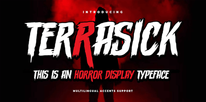 Hello Everyone, introduce our new product Font Terrasick is a Rough Brush Font.This is a Textured Natural Style and classy style with a clear style and dramatic movement. This font Terrasick is great for your next creative project such as logos, printed quotes, invitations, cards, product packaging, headers, Logotype, Letterhead, Poster, Design this font is great for your creative projects such as watermark on photography, and perfect for logos & branding. You can activate Alternate OpenType panel.
 - Orgon Plan by Hoftype,
$49.00 Orgon Plan is the square-cut sister of the Orgon. It represents the crispy counterpart to the sucsessfull Orgon family and was published in 2020. Orgon Plan consists of 20 styles and is well equipped for advanced typography. It comes in OpenType format with extended language support. All weights contain small caps, ligatures, superior characters, proportional lining figures, tabular lining figures, proportional old style figures, lining old style figures, matching currency symbols, fraction- and scientific numerals and matching arrows.
 - Mellnik by ParaType,
$25.00Mellnik is a sans serif of humanist style (in a way) that was developed by Oleg Karpinsky for ParaType in 2006. The type family contains nine styles with a number of alternate characters in each ones. For use as a text font in long text passages of advertising booklets, catalogues or magazines, as well as for accident setting. Mellnik may be also applied as a corporate typeface. Five condensed styles were added in 2007 by the same designer. - Florensans by Milan Pleva,
$18.00 Florensans is an all caps display sans serif typeface in elegant & modern style with ligatures, special alternative glyphs and old style figures. The Florensans family contains three weights: Light, Regular and Medium. Florensans is ideal for headlines, headers, logos, labels, packaging, postcards, presentations, magazines, invitations, etc. Features: 3 Weights - Light, Regular and Medium Basic latin alphabet A-Z 64 Ligatures & Alternates 56 Accented characters Numbers, Punctuation, Currency, Symbols, Math symbols & Diacritics Old style figures Enjoy Florensans!
 - Boulevard Sans by takoliko,
$16.00 Boulevard Sans typeface designed by Takoliko Studio. This Sans Serif font inspired by retro geometric style especially the radio and vhs era.The simplicity and geometric style is a timeless choice for your design. It comes with reguler and Bold, also oblique style for a different feel. Its bold characteristics makes it suitable for attention grabbing design projects such as headlines, posters, social media displays and editorials. And You can combine the family to make a larger design concept.
 - Humanism by Prominent and Affluent,
$30.00 Inspired by the urban typography, which later led to a grotesque style. It can be used for bold editorial statements graphic heavy prints or just as a simple logo. This new type will definitely make your designs stand out and unique. Its robust, strong and contemporary form makes it perfect for any project that needs the extra strength. Humanism is available from A to Z in the regular and italic style, developed in an urban style.
 - Bronzier by Arterfak Project,
$13.00 Bronzier is a strong serif display family with 8 different styles. Bronzier was designed with a strong and sharp serif which gives it a more manly look. Sporty, vintage and modern taste at the same time which mean you can use this font family for many design styles. Inspired by old-school typography and modern style. Create a perfect design with Bronzier! Because Bronzier is suitable for logos, logotypes, apparel, jersey, tags, labels, posters, stickers, branding and more.
 - Meltifex by Aah Yes,
$4.95Meltifex is a heavy font with melting letters, disappearing at the bottom. - Quick Handle AOE by Astigmatic,
$19.95A casual retro script refined and developed from some old handwritten letters. - Stencil Allround by Letterwerk,
$20.00 Stencil Allround is a rounded capital letter font made for display use.
 - Licorice by TypeSETit,
$24.95 Handwritten letters are great for scrapbooking, cards, invitations and other fun things.
 - Eiger by Intellecta Design,
$26.90 Eiger, a great display font by Intellecta Design. Contain only capital letters.
 - KG Camden Market Script by Kimberly Geswein,
$5.00 KG Camden Market Script is a whimsical, hand-lettered brushstroke watercolor font.
 - Hadoar MF by Masterfont,
$59.00 Inspired by hand written letters on a street sign in Tel Aviv
 - Campi by Intellecta Design,
$33.00 Campi, a great display font by Intellecta Design. Contains only capital letters.
 - Kindred by Rachel Kick,
$9.00 Kindred is an organic and hand-lettered sans typeface. It has a friendly and organic feel that works great for branding, social media, and marketing! Kindred is inspired by hand lettering art - incorporating many letters that fit into each other and swashes that add a hand-drawn feel. The corners are slightly rounded to give it an organic and friendly feel. With so many alternatives and ligatures, each word can be customized to fit the needs of your project. The Details: 34 Standard Ligatures: Enabled by default to create a hand-drawn feel! (Make sure your open-type features are enabled!) These can also be switched out depending on the look you're going for. Over 90 Alternatives: These are the perfect way to make the type look custom-made for your project. Add small details, change double letters, or add swatches that fit around surrounding letters. Language Support: Danish, English, French, German, Irish, Italian, Portuguese, Spanish, Swedish, & Swiss German.
 - Enagol Math by deFharo,
$12.00 The Enagol Math family consists of 4 weight plus True italics. It is a typeface with rounded Slab-Serif of Semi-Condensed proportions. I have composed all the proportions of the character based on a study of mathematical proportions related to the golden sequences of Perrin, Lucas and Fibonacci. From an initial matrix of golden proportions applied in the letters 'H' for capital letters and 'n' for lowercase letters, calculated for the versions of the extremes of the Light and Bold type, below I do the whole calculation of proportions using my formula of three axes and by interpolation I generate the intermediate versions Regular and Medium. For the Italic versions I have drawn a complete set of lowercase letters that give these fonts an aspect close to the Italic writing. In these versions I have also applied many optical corrections to balance the deformations created in many curves by the mere inclination of the letters, which in the case of this type is 11°.
 - Maiers Nr 42 Pro by Ingo,
$42.00 A handwritten decorative font with brush characteristics This attractive decorative script is found in a pamphlet of script samples from around 1900 which was issued by Otto Maier publishing house in Ravensburg/Germany. The forms and flow of Maier’s Nr. 42 are obviously influenced by Art Nouveau. In the original sample, only the Latin alphabet appears. All other characters, especially the Greek and Cyrillic letters, were modeled on elements of the original. A typeface can first reveal a true "handmade" character when the letter forms do not continually repeat themselves – a completely normal occurrence with handwriting. Thanks to OpenType, some key letters of Maier’s Nr. 42 appear in various alternative forms depending on the combination of letters. For example, the difference is obvious between an e followed by i and an e followed by l. Using this principle, a number of letter combinations are presented with alternative character forms so that overall a very lively impression is created.
 - Bussi by Schriftlabor,
$29.99 Bussi is an inline font family full of extras. It is rich with alternatives and symbols, which makes it a playful font to use. It was inspired by hand lettering and bullet journaling. The font is perfect for branding and packaging to bring your extra brand personality—an ideal font to use for stationery design or even movie titles. Versatile and high-quality Bussi will be your new font love. Bussi was inspired by hand lettering and bullet journaling. The first drafts were designed during studying for my high school graduation, where I would focus more on the headline lettering than on the actual content. I tried to motivate myself by lettering joyful, swirly headlines, and keywords. Originally designed as a caps-only headline font, over the years more and more letters and symbols were added, resulting in nearly 1400 glyphs and 5 different stylistic sets. Designed by Stella Chupik and Schriftlabor team.
 - Kalender Serif by Gurup Stüdyo,
$10.00 ∙Kalender is designed as a high-contrast modern serif for display use. Kalender is provides you an elegant and luxurious typographic colour. ∙When Kalender's lines invisible at small sizes you can use Kalender No 2 which have thicker lines and serifs to assist readability. ∙Kalender Blok is arranged for situations which are diacritical marks overflow to leadings of the headline and headline typographical color is affected negatively from this situation. For this purpose, majiscule diacritical letters are resolved within the letter height. However, when this is done, new forms are obtained by integrated diacritical marks with letters instead of directly merging them. The idea behind this approach is to preserve the typographic value of diacritical marks and emphasize the semantic value of diacritical letters. 68 letters have been redesigned in this way. And also Kalender have different meanings in Turkish: large, humble etc. I considered this name appropriate because it described the structure of this font well.
 - Sassoon Infant Pro by Sassoon-Williams,
$66.00 An upright typeface family developed to meet the demand for letters to produce pupil material for handwriting as well as for reading. Upright letters with extended ascenders and descenders are ideal on screen. They facilitate word recognition. The exit strokes link words together visually, and in handwriting they lead to spontaneous joins along the baseline leading logically to a joined-up hand. Teachers can print desk strips, charts of letter families and alphabet friezes, as well as consistent material across the curriculum. Together these typefaces provide a valuable resource for special needs teachers. Typefaces developed to meet demand for letters that can be used to produce pupil material for reading as well as handwriting. Regular and Bold typefaces covering pan-European languages: 9 Latin, 6 Cyrillic, Greek, Turkish, 13 Baltic, 8 Rusyn, 6 Nordic, Vietnamese. How to access Stylistic Sets of alternative letters in these fonts Cyrillic Stylistic Sets examples Greek Stylistic Sets examples Vietnamese Stylistic Sets examples
 - Ruskye by LetterStock,
$25.00 Introducing "Ruskye" - Your Original Hand-Drawn Retro Lettering Font Step into the nostalgic embrace of "Ruskye," a font crafted with a blend of original hand-drawn charm and retro lettering vibes. Perfect for posters, invitations, and vintage-themed branding projects, this font encapsulates the essence of a bygone era, offering a timeless touch to your designs. Key Features: Original Hand-Drawn Craftsmanship: Each character in "Ruskye" is meticulously hand-drawn, adding a touch of authenticity to your projects. Retro Lettering Vibes: Immerse your designs in the classic charm of retro lettering, making "Ruskye" an ideal choice for projects seeking a vintage aesthetic. Why Choose "Ruskye": Craft posters that evoke the timeless spirit of hand-drawn artistry. Design invitations that transport recipients to the golden era of retro aesthetics. Establish a brand presence with a font that effortlessly captures the essence of vintage lettering. Download "Ruskye" Now and Infuse Your Designs with Timeless Retro Charm!
 - Flefixx by Sun Young Oh,
$54.00 Flefixx is a typeface designed to support a project "Flefixx", an idiosyncratic visual language and typeface system that unfolds narratives based on common combinations of letters. In this visual language, just as individual letters come together like puzzle pieces to form different meanings or words based on combinations, the typeface is also constructed from fragmentary elements, each playing a distinct role as if they are individual pieces. The intentional exposure of the intersections of these fragments emphasizes the typeface's creation through interconnected elements. Furthermore, diacritics and dots are strategically positioned as ornaments, enhancing their presence within the gaps between letters. This concept aligns with the theme of composition and connectivity among fragments, allowing strong rhythmic patterns to emerge as letters and symbols blend in a paragraph. Additionally, the prominent and bold punctuation marks serve to provide pauses and clarity within sentences that incorporate both letters and the visual language. They contribute to articulating sentence structure amidst the dynamic flow of sentences with combined characters and visuals.
 - Cursivo Saxonio by Intellecta Design,
$21.90 Cursivo Saxonio is a typeface inspired in the famous book The Case of Charles Dexter Ward, by H P Lovecraft. It shows better than I get with my studies the authentic "Insularis" or "Cursivo Saxonio" handlettering of the VIII and XI centuries used by some people in Britain. The text on the accompanying poster reads: “Corwinus necandus est. Cadaver aq(ua) forti dissolvendum, nec aliq(ui)d retinendum. Tace ut potes”
 - Umba Soft by TypeThis!Studio,
$54.00 The best thing about Umba is its surprise! UMBA Soft is a mellow sans serif typeface designed by Anita Jürgeleit. Your creation should be soft and gentle and you need a suitable font? Something that should be cuddly, sweet and soft but a serious type family that covers all your concerns? Umba Soft is your match! Your typographic composition will improve with your new favourite font. Thirty styles from thin to bold and matching italics helps you to create a highly appealing design product. Alternates and small caps are accessible in separate styles. There is no need for any special software to use them. The styles will appear in your font menu to make sure you stay aware of the many possibilities that your new font offers. 30 styles Italics Alternates Small Capitals Predefined Fractions Sub-/Superscript Numerator/Denominator Old style figures Tabular figures Ligatures Let’s get in touch! www.typethis.studio
 - Quadrim by Artisticandunique,
$40.00 Quadrim - Serif Font Family - Multilingual -12 Style (2020) On the basis of Quadrim, it is a mix of the old-fashioned Roman serif family. The old style serif combination combines, modern aesthetics with fantasy and Art Nouveau serif fonts, making Quadrim a versatile family that can be used in many different design projects. This font offers a wide variety of styles to help you discover the best mood for your projects, from body text to large titles, from classic styles to modern and bold styles. It is very suitable for book and magazines, magazine covers, editorial, titles, websites, logos, invitations, branding, advertising and more. CHARACTER RANGES : Basic Latin, Latin-1 Supplement, Latin Extended-A, Latin Extended-B, General Punctuation, Currency Symbols, CJK Symbols And Punctuation, Private Use Area (plane 0), With this font you can create your unique designs. If you have a question, please contact me. Have a good time.
 - Cairo by Viswell,
$19.00 CAIRO is a modern and sleek font that exudes simplicity and sophistication. This minimalist sans-serif font features clean, crisp lines with subtle contrasting strokes, adding just the right amount of edge to its overall design. The font's simple and unassuming style makes it a versatile choice for a wide range of design projects, from branding and advertising to editorial layouts and web design. The font comes in two styles: Regular and Oblique. The Regular style is perfect for headlines and titles, while the Oblique style adds a touch of elegance. The Oblique style is also ideal for creating emphasis and drawing attention to key elements within a design. CAIRO's design is inspired by the contemporary architecture. Its clean, minimalist look reflects the modern and forward-thinking nature of the city, making it a perfect choice for designers who want to create a bold, sophisticated look for their projects.
 - Invitation Script by Intellecta Design,
$69.00 Iza W and Intellecta Design are proud to announce Invitation Script, a modern and clean revival of the classic work of the Portuguese master penman Manuel de Andrade de Figueiredo, whose work can be seen in “Nova Escola para aprender a ler, escrever, e contar (...)'' (1722). Invitation Script is the third script superfamily published by Intellecta Design, after Penabico and Van den Velde Script. Invitation Script has original letters designed by Iza W. Creative direction and core programming were provided by Paulo W. Chyrllene K assisted with some work on unusual and archaic styles, resulting in a special font - Invitation Script Archaic (soon available). Invitation started out from Andrade’s script style and evolved into a voluptuous script font family. The result is a typeface ideal for beautiful headings, signatures, art work typography, titles and short pieces of hand-lettered text. Invitation family includes two multi-table Opentype fonts, three supplementary fonts for ornaments and fleurons, and the Archaic font with some of the Andrade’s original characters. Embedded in the regular fonts are additional sets of letters. Over 40 variations are available for certain letters via the Special Sets Opentype table. The two regular versions of Invitation Script contains the following: (i) An extensive set of ligatures providing letterform variations that make eye-popping designs or simulate real handwriting. These are accessible via contextual alternates and other open-type features. (ii) Many stylistic alternates for each letter (upper and lowercase, accessed via the glyph palette, encoded in the ranges of the Special Set Opentype feature). Since there are over 1100 glyphs in each font, we suggest using the glyph palette. (iii) A set of ornaments and fleurons accessed with the glyph palette or using the Ornaments feature. Additional ornaments can be found in the two Invitation Script Ornaments fonts. (iv) Initial and final letters with artistic variations accessible using the initial and final form open-type features. (v) Major kerning work: over 6000 kerning pairs, hand-set to avoid collisions and to create intricate combinations of letters, using swashes and other resources. These powerful features are all accessible in InDesign, Illustrator, QuarkXpress and similar software. We recommend exploring the magic of this font using the glyph palette. Our sample illustrations and PDF brochures showcase the power and pizzazz of this calligraphic script. Let your imagination go wild and use Invitation Script in ways that Andrade could not have foreseen. In non-OpenType-savvy applications, Invitation Script is still an exceptionally beautiful calligraphic typeface that stands up to the competition. The regular fonts contains the complete Latin alphabet, including Central European, Vietnamese, Baltic and Turkish, with a full set of diacritics and punctuation marks. --- 1 FIGUEIREDO, Manuel de Andrade de, 1670-1735 Nova Escola para aprender a ler, escrever, e contar. Offerecida á Augusta Magestade do Senhor Dom Joaõ V. Rey de Portugal. Primeira parte / por Manoel de Andrade de Figueiredo, Mestre desta Arte nas cidades de Lisboa Occidental, e Oriental. - Lisboa Occidental: na Officina de Bernardo da Costa de Carvalho, Impressor do Serenissimo Senhor Infante, 1722. - [18], 156 p., 44 f. grav. a buril : il., ; 2º (31 cm)Engraved royal coat of arms supported by angels over the city of Lisbon, engraved portrait of the author (both of the foregoing by Bernard Picart), (12)ff., 156pp., engraved calligraphic section title, 44 engraved plates. Wood-engraved culs-de-lampe and lettrines. Sm. folio. “Andrade de Figueiredo was born in Espirito Santo, where his father was Governor of the ‘Capitania.’ The fine portrait is dated 1721 and is showing Figueiredo at the age of 48. He was an eminent calligrapher and a creator of the Portuguese handwriting until the reign of Don José I (ca. 1755). His work follows the style of the great Italian masters in its use of clubbed ascenders and descenders, and of Diaz Morante, the famous Spanish writing master, in its very elaborate show of command of hand. By his contemporaries, he was known as the ‘Morante portugues’” (Ekström). “Ce livre est un manuel, composé de quatre parties, destiné à apprendre à lire, à écrire, à conter ainsi que l’orthographe. Les planches comportent des examples d’écritures, d’alphabets et de textes ornés de remarquables traits de plume exécutés d’une main sûre et enjouée” (Jammes).
 - XXII ARMY - Unknown license

- Copacabana by Alan Meeks,
$45.00 Copacabana is heavily based on one of my favourite typefaces Goudy Old Style Italic. It is sharper and more clearly defined than Goudy yet still retains it old style characteristics. The face is slightly angled so is basically upright whilst still retaining Italic characteristics.
 - Dunscans Mills by Deeezy,
$14.00 Trendy or modern style sans font for your fancy projects. Bold, elegant and retro style on Dunscans Mills font will be great for any branding project. Lot of alternates and ligatures will help you to create unique and original logo design or website header! Enjoy :)
 - Hubba by Green Type,
$19.00 Hubba is a modular geometric typeface. Its heavy weight is excellent for headlines and display. There is a plain, oblique, and opposite oblique styles. The variable version will give you the opportunity to be more free in design and not limited to standard styles.
 - Rengkox by Twinletter,
$15.00 Introducing our newest Rengkox Blackletter font. This font can be used in a variety of projects to create a vintage and elegant style. Use to elevate visual projects, titles, or banners, packaging with a bold, classic look that exudes style, elegance, and strong personality.
 - Auliya Rahmah by Nandatype Studio,
$12.00 Auliya Rahmah is a bold serif font, and is trendy, contemporary in style. This font is PUA coded which means you can access all the glyphs and swashes easily! Fall in love with her incredibly versatile style and use it to create spectacular designs!
