10,000 search results
(0.082 seconds)
- Newsreel Text JNL by Jeff Levine,
$29.00 Intertitle cards from a 1942 newsreel inspired the like-named Newsreel Text JNL, which is available in both regular and oblique versions.
 - Kamerik 105 Text by Talbot Type,
$19.50 Kamerik 105 Text is the text specific variation of stablemate, Kamerik 105. With a shallower x-height and longer ascenders and descenders, its more traditional proportions make it more economical with space and better suited to continuous text. It's a well-balanced, versatile, modern sans, highly legible as a text font and with a clean, elegant look as a display font at larger sizes. The Kamerik 105 Text family comprises of four weights and includes old style non-aligning (lower case) numbers, both proportional and tabular as well as accented characters for Central European languages. It is closely related to Kamerik 205 Text, which offers variations in some characters, most notably a two-storey lower case a and g.
 - Archive German Text by Archive Type,
$19.95Blackletter typeface. - Realtime Text Rounded by Juri Zaech,
$30.00 Realtime Text Rounded is the proportional alternative to the monospaced Realtime type family. Nevertheless Realtime Text Rounded includes a monospaced design already built into the font. It is employable through OpenType by activating alternate characters. Realtime Text Rounded is a technical yet friendly design with details that serve function and visual impact alike and lends itself to tabular designs, sturdy columns and tidy layouts. It comes in five weights, from light to black, and with a character set that covers over 200 latin languages.
 - PF DIN Text by Parachute,
$79.00 The purpose of the original DIN 1451 standard was to lay down a style of lettering which is timeless and easily legible. Unfortunately, these early letters lacked elegance and were not properly designed for typographic applications. Ever since its first publication in the 1930’s, several type foundries adopted the original designs for digital photocomposition. By early 2000, it became apparent that the existing DIN-based fonts did not fulfil the ever-increasing demand for a diverse set of weights and additional support for non-Latin languages. Parachute® was set out to fill this gap by introducing the PF DIN series which has become ever since the most comprehensive and sophisticated set of DIN typefaces. It was based on the original standards but was specifically designed to fit typographic requirements. Its letterforms divert from the stiff geometric structure of the original and introduce instead elements which are familiar, softer and easier to read. The first set of fonts was completed in 2002 as a group of 3 families which included condensed and compressed versions. With its vast array of weights, the extended language support, but most of all its meticulous and elaborate design, it has proved itself valuable to numerous design agencies around the world. Ever since its first release, it has been used in diverse editorials, packaging, branding and advertising campaigns as well as a great number of websites. It was quoted by Publish magazine as being “an overkill series for complex corporate identity projects”. The whole PF DIN Text type system (with normal, condensed and compressed styles) includes 45 weights from Hairline to Extra Black including true-italics. Additionally, every font in the Pro series is powered by 270 very useful symbols for packaging, environmental graphics, signage, transportation, computing, fabric care. There are 2 versions to choose from: The PRO version is the most powerful. All weights support Latin, Cyrillic, Greek, Central/Eastern European, Romanian, Baltic and Turkish, with 20 advanced opentype features including small caps. The standard STD version is more economic. All weights support Latin, Central/Eastern European, Romanian, Baltic and Turkish, with 18 advanced opentype features including small caps. In 2010 Parachute® released 4 new families DIN Monospace, DIN Stencil, DIN Text Arabic and DIN Text Universal. All these are complemented by the popular DIN Display version. Altogether the Parachute DIN series is a set of 8 superfamilies with a total of 96 weights.
 - Rosenberg Text MF by Masterfont,
$59.00 - HT Fera Text by Hype Type,
$34.00 Transitional serif font inspired by the italian’s lettering tradition, in particular by the street sign letters you can find around Florence. All elements are designed to be elegant and easy-to-read, even in a long blocks of text. -- The HT Fera Text is freely inspired by the typographical tradition of Florence's municipality and its streets. Letters shape, contrasts, junctions, stems, teardrops, they are all the result of careful research carried out on the Dante's streets, redesigned in a contemporary mood. -- hype-type.com / kidstudio.it
 - Baroque Text JF by Jukebox Collection,
$32.99
- Planet Benson 2 - Unknown license

- Jensen Old Style by Wooden Type Fonts,
$15.00 Based on the original design of Nicholas Jenson 1470-76, this is a revival of one of the popular wooden type fonts of the 19th century. This font was also created in a slightly different version by William Morris circa 1890. Suitable for text.
 - Jackson Park NF by Nick's Fonts,
$10.00Handlettering in an ad from the 1920s for a Chicago engraving company provided the inspiration for this fine, fat, flowing face, full of fun and antique charm. Both versions of this font include the complete Unicode 1252 Latin and Unicode 1250 Central European character sets. - La Maison Brush by Allouse Studio,
$16.00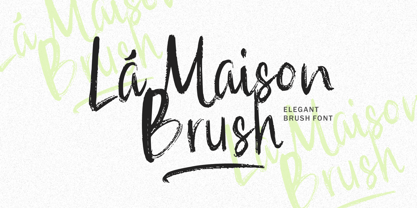 La Maison Brush a Elegant Brush Font with many options underline styles for your need! La Maison Brush is perfect for any tittle, logo, product packaging, branding project, megazine, social media, wedding, or just used to express words above the background. La Maison Brush also come with Multi-Lingual Support. Enjoy the font, feel free to comment or feedback, send me PM or email. Thank You!
 - MFC Carson Monogram by Monogram Fonts Co.,
$24.95 The source of inspiration for Carson Monogram is a letter set from the book, Art Monogram and Lettering by J.M. Bergling, Vol. 1, Fifth Edition published in 1912. This elegant historical style was simply labeled, "New Antique 53". Carson Monogram can create one, two, or three letter monograms as well as basic headline and titling settings. By default, Carson Monogram types in a horizontal format, but by utilizing OpenType Contextual Alternates, you can typeset in a three smallcap diagonal format as well! It is a refined look that is perfect for a wide array of classic personalization settings. Download and view the MFC Carson Monogram Guidebook if you would like to learn a little more.
 - Mansions Brush Script by Joelmaker,
$16.00 Mansions Brush Script is a handwritten font, which is so soft and modern, perfect for those who like logo designs, printed T-shirts, quotes, branding, stickers, and posters. Get this package right away, make your graphic imagination come true with Mansions Brush Script.
 - MVB Chanson d'Amour by MVB,
$39.00An old book found at a Paris bouquiniste contained samples of the typeface “Caractère de finance,” a bâtarde design by 18th century typefounder Pierre Simon Fournier. Rather than revive the type, Kanna Aoki decided to reinvent it, using a felt pen to achieve a rustic, handwritten quality, departing from the 18th century model as she saw fit. MVB Chanson d'Amour conveys a soulful elegance that stops short of the ostentatious, overwrought found in many formal scripts. It is lovely and sweet, but never saccharine. - Palm Canyon Drive by RetroSupply Co.,
$19.00 Mid-century California was a magical place. Post-war optimism fueled the popularity of everything from Hollywood to roadside diners. Palm Canyon Drive is a monoline script inspired by retro matchbook covers, travel postcards, Tiki bars and Hollywood. With a classy yet unpretentious tone Palm Canyon Drive is as comfortable on a Tiki bar matchbook cover as it is on a Hollywood movie poster.
 - Mr Palker Dadson by Letterhead Studio-YG,
$35.00 Mr Palker Dadson — has appeared in a natural evolution of the Palker-Palkerson family. Its closest relative - burly slab serif Mr Palker Dad. This generation is more stout than the previous one. One may even be brave enough to use them for composing small texts. Notably Mr Parker Dad has become one of the frequently sold typefaces on the «Peterburg. The city speaks» map as it is highly readable while remaining extremely tight. Mr Parker Dadson has all the features of P&P’s family.
 - Nuixyber Next - Personal use only

- Next Star - Unknown license

- CoolHandLuke ttext - Unknown license

- Texas LED - Unknown license

- Next Star - Unknown license

- Alethia Next by Pepper Type,
$40.00 Alethia Next is a grotesque sans-serif typeface with high contrast in all weights. It has been designed to serve as a display typeface in various editorial projects, such as magazines or corporate brochures, as a sans-serif pair to serif types of modern style. Alethia Next comes in 7 weights + matching italics and upright italics, each supporting numerous Latin-based languages as well as major Cyrillic languages including Bulgarian local forms. It is packed with OpenType features like ligatures, small caps, and numerous alternatives.
 - Konga Next by RodrigoTypo,
$25.00 Konga has gone through different changes, the first idea was born in 2014 with the help of Andrey Kudryavtsev, then some time passed and the Rough version was developed, and a long time passed and in 2022 the idea of redesigning was taken with Bruno Jara, in addition to making many styles such as Rough, Inline, Shadow, as well as dingbats which was based on Stefania Ahumada's graphics, which results in a family of 6 styles, with different Alternatives, perfect for informal titles.
 - Okomito Next by Hanken Design Co.,
$30.00 Okomito Next is a sans serif inspired by the classic typefaces that were imbued with a sense of functionality, boldness and industrial strength. OpenType features: Access All Alternates, Case-Sensitive Forms, Glyph Composition / Decomposition, Discretionary Ligatures, Fractions, Kerning, Standard Ligatures, Localized Forms, Mark Positioning, Mark to Mark Positioning, Ordinals, Proportional Figures, Stylistic Alternates, Stylistic Set 1, Superscript, Tabular Figures
 - Sabon eText by Linotype,
$34.99 A clear and enjoyable reading experience hinges on the legibility of text copy, especially when reading on screen. This is why Monotype has developed the eText collection of fonts specifically tailored for the text-heavy display environments of e-readers, tablets, mobile devices, and the Web.
 - Aaux Next by Positype,
$22.00 When the original Aaux was introduced in 2002, I intended to go back and expand the family to offer more versatility. Years went by before I was willing to pick it up again and invest the proper time into building a viable and useful recut. Just putting a new designation and tweaking a few glyphs here and there would not do the designer or the typeface justice; instead, I chose to redraw each glyph's skeleton from scratch for the four main subsets of the super family along with their italics. Each glyph across the super family is 'connected at the hip' with each style—each character carries the no frills, simple architecture that endeared so many users to it. The new recut expands the family to an enormous 72 typefaces! The original has spawned Compressed, Condensed and Wide subsets—all with corresponding weights—for complete flexibility. Additionally, all of the original weight variants have all been incorporated within the OpenType shell: Small Caps and Old Style Figures are there along with new tabular figures, numerators and denominators, expanded f-ligatures and a complete Central European character set.
 - Placard Next by Monotype,
$50.99 Based on a Monotype 1930s condensed poster typeface, Placard Next is bursting with personality. Unexpected details appear throughout the design, from its wedged diagonals and single storey a to its round tittles – which would more ordinarily be square, and mechanical. The warmth and quirkiness of its character really shines through when set at larger sizes, making this a typeface for posters, headlines, and anywhere else designers need to make a statement. Designer Malou Verlomme has paid particular attention to the typeface's 'word images', further amping up its impact, and added some vintage flavor with Placard Next Round. As well as a striking display typeface, Placard Next's four widths and six weights – hairline to bold - mean it's a versatile design, that can be adapted for use in almost any environment. The complete family contains 48 fonts: 24 in Placard Next and 24 in Placard Next Round. It includes a large multilingual character set.
 - Amasis eText by Monotype,
$49.00A clear and enjoyable reading experience hinges on the legibility of text copy, especially when reading on screen. This is why Monotype has developed the eText collection of fonts specifically tailored for the text-heavy display environments of e-readers, tablets, mobile devices, and the Web. - Texas Moliqu by Evo Studio,
$15.00 Texas Moliqu is a retro and western-looking display font. This bold, and vintage font can easily become your favorite. It can be used for books, magazine covers, social media posts, invitations, and so much more! So add this to your creations and take your designs to the next level!
 - AC Texto by Antoine Crama,
$- Texto is a synonym of SMS (Short Message Service) in french. As a SMS that you would send or receive from a friend, this typeface is friendly, warm and informal. It is a humanist sans-serif typeface that comes in 9 weights to meet all needs.
 - Syntax Next by Linotype,
$50.99 Syntax was designed by Swiss typographer Hans Eduard Meier, and issued in 1968 by the D. Stempel AG type foundry as their last hot metal type family. Meier used an unusual rationale in the design of this sans serif typeface; it has the shapes of humanist letters or oldstyle types (such as Sabon), but with a modified monoline treatment. The original drawings were done in 1954; first by writing the letters with a brush, then redrawing their essential linear forms, and finally adding balanced amounts of weight to the skeletons to produce optically monoline letterforms. Meier wanted to subtly express the rhythmical dynamism of written letters and at the same time produce a legible sans serif typeface. This theme was supported by using a very slight slope in the roman, tall ascenders, terminals at right angles to stroke direction, caps with classical proportions, and the humanist style a and g. The original foundry metal type was digitized in 1989 to make this family of four romans and one italic. Meier completely reworked Syntax in 2000, completing an expanded and improved font family that is available exclusively from Linotype GmbH as Linotype Syntax. In 2009 the typeface family was renamed into a more logical naming of "Syntax Next" to fit better in the Platinum Collection naming." Syntax® Next font field guide including best practices, font pairings and alternatives.
 - Texas Hero by Three Islands Press,
$39.00 It occurred to me years ago that the graphic arts community might find useful a digital typeface that mimicked the classic look of nineteenth-century handwriting. Conveniently, my mother then still volunteered at the Center for American History at the University of Texas at Austin, my hometown. She made copies of the letters of a few famous Texans -- Houston, Austin, Travis, Burnet, Rusk. Thomas J. Rusk’s penmanship caught my eye as the most accessible of the bunch. I hadn't realized at the time what a challenge it'd be to render a realistic-looking script face, but the result has, in fact, filled a niche.
 - Tipperary eText by Monotype,
$57.99Tipperary was designed by Steve Matteson and named for a favorite 'single track' bike trail, Tipperary is a monoline Humanist Sans Serif typeface. The clear, open, letter forms curve abruptly in an almost squarish geometry much like the sharp turns on the Tipperary trail. The clear, austere forms offer exceptional legibility for both interface designs and extended reading. Small size package labels and crisp branding programs benefit from Tipperary's emphasis on clean, readable design. eText typefaces are designed to meet the challenges of extended reading in digital environments such as mobile devices or desktop screens. Their forerunners are among the world's most popular and important book typefaces for print media. These classic designs were reinterpreted to conform to technological constraints of LCD and e-Paper while retaining the properties of proportion and form which made them favorites for print. - Logopedia Next by Bülent Yüksel,
$19.00 What makes "Logopedia Next" unique is that it has a strong body, upper and lower case letters are the same size and work in perfect harmony. All letters in the character have "alternatives" in various numbers. This feature provides you variety in your designs. It is possible to take your designs to the next level by using "Logopedia Next". "Logopedia Next" is ideal for especially logo design, advertising and packaging, branding and creative industries, banners and billboards and signage as well as web and screen design. "Logopedia Next" provides advanced typographical support for Latin-based languages. An extended character set, supporting Central, Western and Eastern European languages, rounds up the family. The designation “Logopedia Next 500 Regular” forms the central point. Logopedia Next comes 3 weights and italics total 6 types. The family contains a set of 543 glyphs. Classes and Features, Stilistic Style, Fractions and Old Style Numerator just one touch easy In all graphic programs. Logopedia Next"" is the perfect font for web use. Be sure to check out the other siblings of "Logopedia". - Logopedia Now - Logopedia Now Soft - Logopedia Next - Logopedia Next Soft You can enjoy using it.
 - Praxis Next by Linotype,
$57.99 Praxis® Next has the same robust shapes and proportions as the original 1976 Praxis design. Its large x-height, substantial counters and open apertures guarantee high levels of legibility and reading ease in print and on screen. More weights, condensed designs and true cursive italics differentiate Praxis Next from the older design. Praxis Next shines where space is at a premium. The regular designs are modestly narrow while the condensed typefaces perform with grace in the most crowded of environments. The bold designs create powerful headlines and banners and the lighter weights are ideal for both long and short-form text copy. Because of its many weights and proportions, Praxis Next is also an ideal design to build a brand identity. Praxis Next Variables are font files which are featuring two axis and have a preset instance from Light to Ultra and Condensed to Roman. Pair Praxis Next with old-style designs like Bembo® Book and Stempel Garamond™ to create a dynamic typographic contrast. Or complement the design with its serifed counterpart, Demos® Next . Unger also drew ITC Flora® as an alternative italic design. Looking for something a little different? Pair Praxis Next with Masqualero™ .
 - Galpon Next by RodrigoTypo,
$25.00 The "Galpon Next" typeface is a gestural and dynamic font specially designed for informal or children's texts. The idea behind this typeface is to capture the energy and spontaneity of handwriting, creating a sense of joy and fun in the designs.
 - Demos Next by Linotype,
$50.99 The Demos® Next typeface family is a complete renewal and expansion to Dutch type designer Gerard Unger’s classic from 1975. This enhanced typeface design introduces subtle changes to character shapes, proportions and spacing to improve legibility and readability in print and on screen. The new expanded family now has 6 weights of regular and condensed designs, each with a complementary italic for a total of 24 typefaces, and provides a welcome set of OpenType® typographic features.
 - Tobi Next by RodrigoTypo,
$35.00 Tobi Next is the improved version of Tobi pro, which in the extended version contains 213 ligatures, contains Greek and Cyrillic, as well as contains its basic version at a lower cost
 - Univers Next by Linotype,
$53.99 Linotype Univers is a completely reworked version of the original Univers typeface family designed by Adrian Frutiger in 1957. After a long process of painstakingly detailed revision, Frutiger and the design staff at Linotype completed this large joint project in 1997. The result: a brilliant and cohesive font family of 63 weights and styles including the 4 monospaced typewriter weights. All the existing weights were completely redrawn, with careful attention paid to making the proportions more consistent with each other and improving fine details such as curves and thick-to-thin stroke ratios. The family was expanded from 27 to 63 weights, providing a much larger framework to graphic designers for choosing just the right style. The bold and condensed weights were reworked for improved legibility and on-screen application. The stroke weights were revised for consistency within each face as well as in relationship to the other weights. By following Frutiger's original designs, the humanist character of the sans serif Univers now comes through more distinctly. T he systemized numbering system has also been updated. With its sturdy, clean forms Univers can facilitate an expression of cool elegance and rational competence. In fact, the strong familial relationships between all the styles and weights make it a serviceable choice for large graphic design projects that require versatility with consistency. Frutiger was successful in staying true to his initial aims; the new Linotype Univers does indeed work in longer texts as well as for display settings. In 2010 the typeface family was extended and renamed into a more logical naming of "Univers Next" to fit better in the Platinum Collection naming. Univers Next Variable are font files which are featuring two axis and have a preset instance from Light to Heavy and Condensed to Extended. Univers® Next font field guide including best practices, font pairings and alternatives.


