10,000 search results
(0.036 seconds)
- Bluset Now Mono by Elsner+Flake,
$35.00 Bluset Monospaced enlarges the re-worked and expanded text- and headline typeface family Bluest Now with 6 new cuts. The concept for Bluest Now was based, in its original form, on a corporate design typeface by Elsner+Flake in 2004, ordered by the Landor Agency for a large German energy corporation. Regularly re-worked and brought up to modern standards, the typeface is still used to this day. Because of its large x-height and its well-balanced appearance, Bluset Now Mono is also excellent for use in small typesizes. The three Roman cuts, Regular, Medium and Bold, and the corresponding obliques, allow a clear differentiation of base- and display applications for every typesize. The character complement has been created for 72 Latin-based language areas and thus allows a neutral text exchange across language borders. Translation Inga Wennik
 - Trajan 3 by Adobe,
$35.00Since its initial release in 1989, Trajan has risen to international popularity as a distinctive and versatile display typeface. First released as a Roman, and later a contemporary and stylish sans. - Solid Serif JNL by Jeff Levine,
$29.00 Solid Serif JNL adds tiny serifs to the letter forms of Parkitecture JNL and changes the look and feel into an Art Deco Roman face for display, titling and period pieces.
 - Trajan Sans by Adobe,
$35.00Since its initial release in 1989, Trajan has risen to international popularity as a distinctive and versatile display typeface. First released as a Roman, and later a contemporary and stylish sans. - Arsis by URW Type Foundry,
$35.99 Arsis Regular Font was designed by Gerry Powell in 1937. It is a Serif (Antiqua) Modern Style font. Arsis Regular font attributes include roman serif, Didone, elegant, formal, modern style, feminine.
 - Gazeta Stencil Ds by Vanarchiv,
$31.00 This display stencil typeface is extension from Gazeta font family, where the letterform cuts are more mechanical without loosing their own natural structure. Italic versions are not available, only roman characters.
 - Moving Van JNL by Jeff Levine,
$29.00Moving Van JNL is a classic sign painter's block Roman with angled [instead of rounded] corners and slab serifs. This style of lettering was most popular in the 1920s and 1930s. - Duesenberg by Zang-O-Fonts,
$25.00Duesenberg was designed to be similar to turn of the century fonts used primarily in newspapers. It has roman characteristics, yet is clearly not, and really doesn't fall under any category. - Vampire by Otto Maurer,
$17.00 Inspired by a famous vampire movie. This font is based on the character shapes of Free Serif, a sample font bundled with FontLab applications; it is quite similar to Times Roman.
 - Hamerslag by Paweł Burgiel,
$38.00 Hamerslag is an ultra-condensed serif type family with uncomplicated, regular appearance, large x-height, relatively high contrast and modern glyphs shapes. Available in four styles, contain fraction- and scientific numerals, standard ligatures, currency symbols, proportional and tabular lining figures. Its wide character set support 200 Latin-script languages, 50 Cyrillic-script languages and 190+ romanizations/transliterations, e.g. The United Nations romanizations, Chinese official romanization (Hanyu Pinyin), BGN/PCGN (United States Board on Geographic Names and the Permanent Committee on Geographical Names for British Official Use), American Library Association / Library of Congress romanizations and others. The OpenType PostScript CFF (.otf) and OpenType TrueType TTF (.ttf) support encodings: Windows 1250 Latin 2 (Eastern European), Windows 1251 Cyrillic, Windows 1252 Latin 1 (ANSI), Windows 1254 Turkish, Windows 1257 Baltic, ISO 8859-1 Latin 1 (Western), ISO 8859-2 Latin 2 (Central Europe), ISO 8859-3 Latin 3 (Turkish, Maltese, Esperanto), ISO 8859-4 Latin 4 (Baltic), ISO 8859-5 Cyrillic, ISO 8859-9 Latin 5 (Turkish), ISO 8859-10 Latin 6 (Scandinavian), ISO 8859-13 Latin 7 (Baltic 2), ISO 8859-14 Latin 8 (Celtic), ISO 8859-15 Latin 9, ISO 8859-16 Latin 10, Macintosh Character Set (US Roman). Supported OpenType features: Acces All Alternates, Capital Spacing, Case-Sensitive Forms, Denominators, Fractions, Glyph Composition/Decomposition, Historical Forms, Kerning, Localized Forms, Numerators, Ordinals, Proportional Figures, Scientific Inferiors, Slashed Zero, Standard Ligatures, Stylistic Alternates, Subscript, Superscript, Tabular Figures. Kerning is prepared as single ('flat') table for maximum possible compatibility with older software.
 - Sapphire Script by Design by Laney,
$32.00 Sapphire Script is a hand-lettered modern calligraphy font based on the signature script of Design by Laney. Made with wedding invitations in mind, this font with over 500 playful, romantic characters is perfect for branding, stationery, packaging, social media templates, magazine layouts, artist prints, and more! With 3 or more characters for each uppercase letter and 35 stunning standard ligatures, you'll be able to create that perfectly imperfect calligraphy style. Sapphire Script contains over 500 unique, coded features for a realistic, handwritten look: 35 standard ligatures, full Western European language support, over 100 stylistic alternates, ordinals (1st, 2nd, 3rd, etc.), 2 alternate number sets including 1-10 Roman Numerals, and a few word glyphs (for, to, from, and). Sapphire Script was named for the street where Design by Laney began, and where I moved in downstairs from my future husband!
 - schizophrenia Queue - Unknown license

- Heart on a string by PizzaDude.dk,
$15.00 "Heart on a string" is from a song by Paul McCartney, and is one of his romantic ones. I tried to do the same by creating a font that has the same romantic feeling.
 - DM PopCap by DM Founts,
$20.00 DM PopCap is the third typeface released by DM Founts. It was created to accompany a 2013 LEGO-based project, which itself was inspired by the music video for Scream by Michael and Janet Jackson. I had to create the typeface in order to make title cards, as no such typeface appeared to exist. Although the resulting typeface looks similar to the text appearing in the music video, I also set myself the challenge of creating the remaining characters of the alphabet, as well as others that some would find useful. As suggested by the music video, the typeface would be ideal for a futuristic or technological setting, particularly concerning space travel. In the project I had paired this typeface with Myriad Pro. As with my other offerings, this font is intended for use heading or standalone title use - but it also appears to work on its own for small paragraphs of text.
 - Arepo by Stone Type Foundry,
$49.00 Arepo is a display typeface inspired both by the Imperial Roman letter and the forms of Giambattista Bodoni. Together with Stone Print, SFPL, and Cycles it makes up a superfamily of typefaces.
 - LHF Birgitta by Letterhead Fonts,
$43.00 This beautiful roman style typeface is inspired from an E.C. Matthews book. Although the book we have is dated 1967, the style appears to have been created in the 1920s or 30s.
 - Plumrose Signature by Typetemp Studio,
$20.00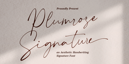 Plumrose Signature Script Font is an adorable, chic, and visual elegance signature script font. Comes with alternatives, ligatures, multilingual suport. Perfect for editorial projects, branding, weddings, social media, product design, stationery, advertising other romantic projects or simply as a stylish text overlay to any background image. Features : Uppercase and Lowercase Stylistic Alternates & Ligatures Numerals & Punctuation Multilanguange PUA Encoded Web Font Included Contact me with an inbox message If you have any question. Thank you! Happy Creating.
 - Evuschka by Petra Sucic Roje,
$33.00 A dramatic contrast between thick and thin strokes, “ball” shapes at stroke terminals, and straight hairline serifs are main Evuschka characteristics. In this font, the x-height is specifically accentuated in relation to body height. In spite of its extreme geometrical shape, Evuschka exudes fairytale romance. Belonging to decorative type fonts, it is best suited for headlines, titles, and small amounts of text in large sizes. Evuschka was selected for TDC Certificate of Typographic Excellence 2017.
 - Gens De Baton by HiH,
$10.00 Gens De Baton is based on a charming lower case alphabet that appeared in the Almanach des Enfants pour 1886 (Paris 1886) under the heading “Amusing Grammar Lessons.” Gens De Baton means simply “Stick People.” The unknown designer turned the bare letter forms into drawings of people for the enjoyment of the children for whom the almanac was intended. The letter forms themselves were based on the French Romain du Roi (King’s Roman), except for the ‘g’ and the ‘j’ -- which were based on Baskerville. The letters ‘w’ and ‘y’ were not included, as they are seldom seen in French. We have left the letters somewhat rough, as they appeared in the Almanach des Enfants , resisting the temptation to clean up all the lines and render them with digital perfection. We have used our HiH Firmin Didot to supply an upper case and auxiliary characters, as Didot was originally a modified version of Romain du Roi. It is interesting to observe the contrast between the polished look of the Didot upper case and the rough, hand-drawn look of the lower case. Purchasers of this font have our permission to use it for the amusement of adults as well as children. We recommend setting Gens De Baton at 24 points or larger.
 - Classroom Stencil JNL by Jeff Levine,
$29.00 Roman-style stencil fonts have been around for much longer than most people realize - from the interlocking brass stencils of the 1880s to the laser-cut plastic stencils of today. A 1 inch Roman lettering guide [die-cut from oil board with spacing holes for correct alignment] made by the now-defunct Zipatone Corporation in the 1970s was a clone of an existing design of another company; but with variations in certain character shapes. This then became the working model for Classroom Stencil JNL, which is available in both regular and oblique versions.
 - Monotype Bernard by Monotype,
$40.99In the early years of the twentieth century a number of romans with a soft and slightly script like quality were evolved. Although they did not represent the future in terms of the major design influences that were to appear after the First World War, they were a break with the past, and were developed further in the nineteen twenties and thirties. Monotype Bernard Condensed is closely associated with this period, a condensed roman evoking an easy charm. The Monotype Bernard Condensed font offers many display applications where warmth and friendliness is required. - FS Clerkenwell by Fontsmith,
$80.00 A creative context 2003. Fontsmith was sharing a small, cold, whitewashed studio space in Northburgh Street, Clerkenwell. But things were on the up following prestigious custom type commissions for The Post Office and E4. “Slab serifs were on the brink of another revival, we could feel it,” says Jason Smith. “All we wanted to do was have a play with these slabs, go as far as we could within what was acceptable and readable.” “It wasn’t initially clear what was happening,” recalls Phil Garnham. “We were becoming very influenced by our surroundings, outside the studio space. We absorbed the essence and the designer grime of where we were.” Process Jason began by drawing stems on-screen. “The key aspect of the font is the upward bend of the leading shoulder serif, the way it kind of ramps up and then plummets back down the stem. “The regular and light characters are quite narrow – great for text but the bold is quite wide and chunky – better for headlines. I think ‘y’ is quite different for a slab design. We call it the Fontsmith ‘y’.” Promotion Fontsmith were determined to get FS Clerkenwell noticed. To launch the font, Ian Whalley, a designer friend of Fontsmith, captured words heard on the streets of Clerkenwell, set them in the new font and crafted a small book of typographic conversations. It was a first for Fontsmith. “I think that’s part of why this font has been so successful,” says Phil. “It really does embody the spirit of the area, as a special place for design, arts and crafts. And designers love that.” Contemporary twist FS Clerkenwell, based on influences in and around this part of London with a rich tradition of printing and design, mixes tradition with creation. Old-fashioned values meet new-school trends. Its quirky, contemporary character lends an edge to headlines, logotypes and any large-size text.
 - Brioso by Adobe,
$35.00Brioso Pro is a new typeface family designed in the calligraphic tradition of the Latin alphabet. Brioso displays the look of a finely-penned roman and italic script, retaining the immediacy of hand lettering while having the scope and functionality of a contemporary composition family. Brioso blends the humanity of written forms with the clarity of digital design, allowing designers to set pages of refined elegance. Designed by Robert Slimbach, this energetic type family is modeled on his formal roman and italic script. In the modern calligrapher?s repertoire of lettering styles, roman script is the hand that most closely mirrors the oldstyle types that we commonly use today; it is also among the most challenging styles to master. Named after the Italian word for ?lively,? Brioso moves rhythmically across the page with an energy that is tempered by an ordered structure and lucidity of form. - Senpai Coder by Dharma Type,
$9.99 Senpai Coder is a family of typewrighter-style monospaced font for developing, programming, coding, and table layout. Some desirable features in monospaced fonts are listed below. 1.Easy to distinguish 2.Easy to identify 3.Easy to read Senpai Coder has very distinguishing letterforms for confusable letters such as Zero&Oh, One&I, and Two&Z. A lot of ingenuity makes this family very distinguishable. Italics have somewhat large inclination angle to be distinguished from their Roman. For the same reason, Italics are slightly lighter than Romans. Italic is not cursive Italic. It is near the slanted Roman. This is an intentional design to identify Italic letters. Cursive is not suitable for programming font. Typewriter letterform (serif) is good for reading. Common elements for each letterform makes harmony and a sense of unity. Senpai Coder supports almost all Latin languages. Try this all-new experiment.
 - Bloque by Corradine Fonts,
$19.95 Bloque is a heavy slab font family which contains six fonts. It has three layers for both roman and italic styles, including an inline and a shadow versions to make different color combinations
 - Glosilla Castellana by Intellecta Design,
$21.90 Glosilla Castellana is a classic font design remastered by the type foundry Intellecta Design. The letter forms of this traditional Roman type style make it ideal wherever a refined, classical appearance is desired.
 - Mythica by K-Type,
$20.00 MYTHICA is a slightly condensed roman with spur serifs, derived from incised lettering on early twentieth century memorial stones and monuments. The typeface is available in 3 weights each with a complimentary italic.
 - Deseada by Type-Ø-Tones,
$40.00 Deseada is a blurred roman face with a small x-height —actually a modified Caslon— that fits perfectly into retro environments. Use it as a parody, it's just a sort of Catalan custom.
 - Good Taste by Grummedia,
$24.00Inspired by early 20th century hand lettered display advertising, Good Taste is a traditional, elegant roman face best used at larger sizes where its well rounded character can be shown off to advantage. - Stencil Work JNL by Jeff Levine,
$29.00 Stencil Work JNL was re-drawn from a vintage paper stencil with one inch high Roman letters and numbers, often found in stationery, drug and variety stores in the 1950s through the 1980s.
 - Dot Grid by Essqué Productions,
$35.00 A font that can be used to simulate old dot-matrix style printing, older receipts, or even as marquee light lettering. Includes extended Latin diacritics, Roman Numerals, and Greek, Hebrew, and Cyrillic Alphabets.
 - P22 Mayflower by IHOF,
$39.95 P22 Mayflower is a classical Roman font taken from a Bible of 1610, the edition likely carried to America by the pilgrims on the Mayflower. Good for period reproductions, with its companion italic.
 - Plantin by Monotype,
$29.99 Plantin is a Renaissance Roman as seen through a late–industrial-revolution paradigm. Its forms aim to celebrate fine sixteenth century book typography with the requirements of mechanized typesetting and mass production in mind. How did this anomalous design come about? In 1912 Frank Hinman Pierpont of English Monotype visited the Plantin-Moretus Museum in Antwerp, returning home with “knowledge, hundreds of photographs, and a stack of antique typeset specimens including a few examples of Robert Granjon’s.” Together with Fritz Stelzer of the Monotype Drawing Office, Pierpont took one of these overinked proofs taken from worn type to use as the basis of a new text face for machine composition. Body text set in Plantin produces a dark, rich texture that’s suited to editorial and book work, though it also performs its tasks on screen with ease. Its historical roots lend the message it sets a sense of gravity and authenticity. The family covers four text weights complete with italics, with four condensed headline styles and a caps-only titling cut. Plantin font field guide including best practices, font pairings and alternatives.
 - Binario by Tarallo Design,
$14.99 Binario is a simple and friendly font with three weights and matching obliques. The geometric and modular characteristics of this typeface subtly reference the Art Deco and early modernist periods. It is an ideal choice for achieving a clean, distinctive, and contemporary aesthetic, making it suitable for branding, posters, and screen-based designs. The light weight of Binario is good for body text. The regular weight exudes confidence, making it suitable for both body and heading text. For impactful headlines, the bold weight is superb. The clear weight distinction of this family make it easy to create organized text. Binario was designed in Siena, Italy taking some inspiration from train stations and shop signage. The name Binario means train platform in Italian. Other aspects that informed the design of this font are modularity and efficiency. The interior rounded forms of the letters (counterforms) are based on shape of the Roman arch. Binario has a sibling, Binario Soft. This version has gently rounded stroke ends, which make a softer impression on the page.
 - Avendica by Mokatype Studio,
$24.00 Avendica is an experimental typeface inspired by Celtic Roman font. It’s developed with a modern serif style design so it looks elegant and luxurious. This font is only used in Uppercase form with some different styles between the uppercase and the lowercase. This font is suitable for short-text designs like headlines, logos, brands, and more. Works on PC & Mac, simple installations, accessible in Adobe Illustrator, Adobe Photoshop, Adobe InDesign, and even works on Microsoft Word. PUA Encoded Characters - Fully accessible without additional design software. Fonts include multilingual support Image used: All photographs/pictures/vectors used in the preview are not included, they are intended for illustration only. Thank You
 - Brogue by The Type Fetish,
$29.00 Brogue was designed to be a display typeface, but it can be used for a small body of text. At its core it is an uncial influenced typeface that has been allowed to stray from its roots. Embracing other alphabets, Brogue mixes in some unexpected letterforms that really give it a quirky and unusual look. Because Brogue is unicase it allows the designer to mix and match the roman, italic, upper and lowercase letters together for a truly unique design. Brogue's character set will support the following languages: Azerbaijani (Latin), Belarusian (Latin), Czech, Danish, Dutch, English, Esperanto, Finnish, French, German, Hungarian, Iclandic, Italian, Polish, Portuguese, Romanian, Slovac, Spanish, Swedish, and Turkish
 - ITC Angryhog by ITC,
$29.00The name Angryhog came out of nowhere out of free association. "When you're working on a typeface on the Mac it demands a name from you which I find a bit confrontational" says Donaldson. ITC Angryhog brings together Roman and Gothic influences in a quirky and sophisticated display face. Characteristic of this typeface are its sharp, pointed forms, especially noticeable in the serifs, which give ITC Angryhog a restless, almost aggressive feel. It is as though the letters have a mind of their own and ignore all rules and regulations. ITC Angryhog is a perfect typeface for comics or satire, best suited to short to middle length texts and headlines. - Bookman Old Style by Monotype,
$40.99 The origins of Bookman Old Style lie in the typeface called Oldstyle Antique, designed by A C Phemister circa 1858 for the Miller and Richard foundry in Edinburgh, Scotland. Many American foundries made versions of this type which eventually became known as Bookman. Monotype Bookman Old Style roman is based on earlier Lanston Monotype and ATF models. The italic has been re drawn following the style of the Oldstyle Antique italics of Miller and Richard. Although called Old Style, the near vertical stress of the face puts it into the transitional category. The Bookman Old Style font family is a legible and robust text face.
 - Mozzart Sketch by Posterizer KG,
$19.00 Mozzart Sketch is a decorative version of Mozzart Sans, slightly rounded, Neo-Grotesque corporate font, created for MOZZART D.O.O. company from Belgrade, Serbia. Mozzart Sketch is a decorative hand-sketched font for headlines and short texts, and also very readable in small weights. All glyphs were carefully hand drawn, with marker as a tool, then traced and digitized. The family contains: 5 Weights, 3 Condensed and 1 Oblique versions of the font, complementing each other perfectly. All versions contains completely MacOS Roman and MacOS Cyrillic code pages, tabular figures, small caps... perfect for profesional designers and very useful for artistic things, catalogues, music... and many other sensual and beautiful things. Enjoy!
 - Rundgotisch by HiH,
$10.00 One of my favorites. Rundgotisch is a easy to read for eyes that are accustomed to roman letterforms, yet keeps in touch with its blackletter roots. It was released around 1900 by Schelter & Giesecke of Leipzig, Germany. Can be used to set short text passages and pairs easily with many different decorative initials of the period. A very useful typeface. Don't leave home without it. According to Bringhurst, Schelter & Giesecke was formed in 1819 by Johann Gottfied Schelter and Christian Friedrich Giesecke. This old German printing house was sucked up by state-owned Typoart in 1946, after Marshall Zhukov and the Red Army had established Soviet dominion over East Germany.
