7,114 search results
(0.02 seconds)
- Jansta by Vishnu Sathyan,
$12.00 A pixel font designed to add a retro, digital feel to your projects. Inspired by classic video game fonts, Jansta's precise and clean pixel design creates a unique aesthetic that's perfect for any project that requires a futuristic or vintage look. Its versatility and readability make it a great choice for both print and digital designs.
 - Jansina by Twinletter,
$15.00 Jansina is a Japanese-style display typeface with a unique shape that is ideal for making your project stand out in Japanese culture. This typeface will make all of your projects consist of a graphic presentation that fits and is precise, but it is not restricted to that. Logotypes, food banners, branding, brochure, posters, movie titles, book titles, quotes, and more may all benefit from this font. Of course, using this font in your various design projects will make them excellent and outstanding; many viewers are drawn to the striking and unusual graphic display. Start utilizing this typeface in your projects to make them stand out.
 - Lawson by Okaycat,
$29.50 Okaycat Font Foundry proudly presents "Lawson"! A retro classic style font, perhaps futuristic, containing European accents. Beautifully connected cursive with high legibility and style for your design, great for print and publication. See the new textured version Lawson Vintage please.
 - Jantan by Sulthan Studio,
$13.00 Jantan is a new fresh & modern script with a handmade calligraphy style, decorative characters and a dancing baseline! So beautiful on invitation like greeting cards, branding materials, business cards, quotes, posters, and more. The alternative characters were divided into several OpenType features such as Stylistic Alternates, and Ligatures. The OpenType features can be accessed by using OpenType savvy programs such as Adobe Illustrator, Adobe InDesign, Adobe Photoshop Corel Draw X version, And Microsoft Word. And this Font has given PUA unicode (specially coded fonts). so that all the alternate characters can easily be accessed in full by a craftsman or designer.
 - Fansan by W Type Foundry,
$25.00 Organic and sublime, Fansan is an Art Nouveau type family that includes roman, italic, and optical sizes. Its roots can be found in famous works such as Benguiat, Windsor, and Melbourne — worldwide typographic references which all have a sense of being imperfectly appealing. The aesthetic influence of Art Nouveau on Fansan can be seen in the top-heavy stress found in most characters. Applying this stress consistently throughout the character set was a significant challenge in the design of the family. The sharp terminals of numerous lowercase characters — including the a, f and g — provide a visual link between the upper and lowercase forms. As a result, Fansan is able to be elegant and pointed in its lighter weights, and playful and full of character in its heavier styles. Fansan is ideally suited for use at display sizes where personality is needed.
 - Danton by Hoftype,
$49.00 Danton is a serif dominated face with a crisp and distinct graphical flavor. Designed especially for use in magazines and newspapers, It is superb in headlines and, because of its solid structure, it is also an excellent choice for text applications. The Danton family consists of 14 styles and is well suited for ambitious typography. It comes in OpenType format with extended language support. All weights contain small caps, ordinals, ligatures, proportional lining figures, tabular lining figures, proportional old style figures, lining old style figures, matching currency symbols, fraction- and scientific numerals, and arrows.
 - Jasson Gillen by Din Studio,
$29.00 Introducing Jasson Gillen Font. Made with naturally handwritten, it will make your design project more beautiful. This font is suitable for any design like branding, quotes, t-shirt printing and etc. Features: Accents (Multilingual characters) Beautiful ligatures Stylistics set PUA encoded Numerals and Punctuations Customer support I hope you enjoy it !!Thanks for visiting and purchasing my font.
 - Jannon Sans by Storm Type Foundry,
$59.00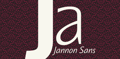
- Phinney Jenson by HiH,
$12.00 Phinney Jenson ML is a font with deep historical roots firmly planted in the fertile soil of the Italian Renaissance. Twenty years after Lorenzo Ghiberti finished his famous East Doors, the Gates of Paradise, of Santa Maria del Fiore in Florence and about fifteen years before Sandro Botticelli painted his “Birth of Venus,” a French printer by the name of Nicolas Jenson set up a small print shop in the powerful city-state of Venice. The fifteenth century marked the end of the plague and the rise of Venetian power, as the merchants of Venice controlled the lucrative trade of the eastern Mediterranean and sent their ships as far as London and even the Baltic. In 1470, Jenson introduced his Roman type with the printing of De Praeparatio Evangelica by Eusebuis. He continued to use his type for over 150 editions until he died in 1480. In 1890 a leader of the Arts & Crafts movement in England named William Morris founded Kelmscott Press. He was an admirer of Jenson’s Roman and drew his own somewhat darker version called GOLDEN, which he used for the hand-printing of limited editions on homemade paper, initiating the revival of fine printing in England. Morris' efforts came to the attention of Joseph Warren Phinney, manager of the Dickinson Type Foundry of Boston. Phinney requested permission to issue a commercial version, but Morris was philosophically opposed and flatly refused. So Phinney designed a commercial variation of Golden type and released it in 1893 as Jenson Oldstyle. Phinney Jenson is our version of Phinney’s version of Morris' version of Nicolas Jenson’s Roman. We selected a view of the Piazza San Marco in Venice for our gallery illustration of Phinney Jenson ML because most of the principal buildings on the Piazza were already standing when Jenson arrived in Vienna in 1470. The original Campanile was completed in 1173 (the 1912 replacement is partially visible on the left). The Basilica di San Marco was substantially complete by 1300. The Doge’s Palace (not in the photo, but next to the Basilica) was substantially complete by 1450. Even the Torre dell'Orologio (Clock Tower) may have been completed by 1470—certainly by 1500. Phinney Jenson ML has a "rough-and-ready" strength, suitable for headlines and short blocks of text. We have sought to preserve some of the crudeness of the nineteenth-century original. For comparison, see the more refined Centaur, Bruce Rogers's interpretation of Jenson Roman. Phinney Jenson ML has a strong presence that will help your documents stand out from the Times New Roman blizzard that threatens to cover us all. Phinney Jenson ML Features: 1. Glyphs for the 1252 Western Europe, 1250 Central Europe, the 1252 Turkish and the 1257 Baltic Code Pages. Accented glyphs for Cornish and Old Gaelic. Total of 393 glyphs. 400 kerning pairs. 2. OpenType GSUB layout features: onum, pnum, salt, liga, dlig, hisy and ornm. 3. Tabular (std), proportional (opt) & old-style numbers (opt). 5. CcNnOoSsZz-kreska available (salt).
 - OL Jenson by Dennis Ortiz-Lopez,
$30.00 - LTC Jenson by Lanston Type Co.,
$24.95 Jenson Oldstyle was designed by J. W. Phinney of the Dickinson Type Foundry in 1893. Jenson is based on the 'Golden Type' designed by William Morris in 1890 for his private press editions under the imprint of the Kelmscott Press. The original digital Lanston version of this face included a companion Oblique. This remastered set instead features a true italic based on the 1893 ATF italic version as well as a newly digitized Jenson Heavyface based on Phinney's design of 1899. Jenson Italic Pro features alternate lowercase forms based on ATFs then contemporary Cushing Oldstyle Italic.
 - Adobe Jenson by Adobe,
$35.00 - Jannon Pro by Storm Type Foundry,
$55.00 The engraver Jean Jannon ranks among the significant representatives of French typography of the first half of the 17th century. From 1610 he worked in the printing office of the Calvinist Academy in Sedan, where he was awarded the title "Imprimeur de son Excellence et de l'Academie Sédanoise". He began working on his own alphabet in 1615, so that he would not have to order type for his printing office from Paris, Holland and Germany, which at that time was rather difficult. The other reason was that not only the existing type faces, but also the respective punches were rapidly wearing out. Their restoration was extremely painstaking, not to mention the fact that the result would have been just a poor shadow of the original elegance. Thus a new type face came into existence, standing on a traditional basis, but with a life-giving sparkle from its creator. In 1621 Jannon published a Roman type face and italics, derived from the shapes of Garamond's type faces. As late as the start of the 20th century Jannon's type face was mistakenly called Garamond, because it looked like that type face at first sight. Jannon's Early Baroque Roman type face, however, differs from Garamond in contrast and in having grander forms. Jannon's italics rank among the most successful italics of all time – they are brilliantly cut and elegant.
 - Jenson Classico by Linotype,
$29.99In 1458, Charles VII sent the Frenchman Nicolas Jenson to learn the craft of movable type in Mainz, the city where Gutenberg was working. Jenson was supposed to return to France with his newly learned skills, but instead he traveled to Italy, as did other itinerant printers of the time. From 1468 on, he was in Venice, where he flourished as a punchcutter, printer and publisher. He was probably the first non-German printer of movable type, and he produced about 150 editions. Though his punches have vanished, his books have not, and those produced from about 1470 until his death in 1480 have served as a source of inspiration for type designers over centuries. His Roman type is often called the first true Roman." Notable in almost all Jensonian Romans is the angled crossbar on the lowercase e, which is known as the "Venetian Oldstyle e." In the 1990s, Robert Slimbach designed his contemporary interpretation, Adobe Jenson™. It was first released by Adobe in 1996, and re-released in 2000 as a full-featured OpenType font with extended language support and many typographic refinements. A remarkable tour de force, Adobe Jenson provides flexibility for a complete range of text and display composition; it has huge character sets in specially designed optical sizes for captions, text, subheads, and display. The weight range includes light, regular, semibold, and bold. Jenson did not design an italic type to accompany his roman, so Slimbach used the italic types cut by Ludovico degli Arrighi in 1524-27 as his models for the italics in Adobe Jenson. Use this family for book and magazine composition, or for display work when the design calls for a sense of graciousness and dignity. - Jannson Map by RM&WD,
$35.00 For best results, use of OpenType features is strongly recommend. This font is inspired by Johannes Janssonius, well know as Jan Janszoon o Jan Janssonius (Arnhem, 1588 – Amsterdam, 1664), was a Dutch cartographer, publisher and engraver. Married to Hondius's daughter. He was the author of many masterpieces of cartography of the 1700s like Willem Blaeu and Hondius, famous maps with heavy use of decorations in the letterig to fill the spaces of oceans, seas, lakes and scrolls. Now you can easily recreate not just ancient maps without effort, but you can use this font creatively, to make unique, modern logos, product names, fresh packaging, hip fashion outfits, refined labels, signs, coordinated images ... Hundreds of alternatives to choose from and maybe to combine with other fonts in an original way. One extra font with 27 castles in Janszoon style are also usefull for map, of course, but also for many different creative artworks. Warning: Jannson Map having oversized swashes compared to the normal standards cannot be used with Windows Word because Word does not give the possibility to manage the line spacing professionally. Jannson Map works great with applications like Illustrator, In Design, quark Xpress, mac Text etc ...
 - Jason Uncial by URW Type Foundry,
$49.99 Jason Uncial, a unicase font, was created by Dutch designer Coen Hofmann. Uncial hand writing began to spread in Europe at the time of the late Roman Empire (200 A.D.). It influenced both the Carolingian Minuscule as well as our present lower case letter forms. Uncial fonts are still very much in use. It is used for headlines, display, titles, certificates, and not surprisingly, very much in Ireland or for anything with a Gaelic/Irish or Celtic touch.
 - Jason Barry by Insan Perkasya,
$12.00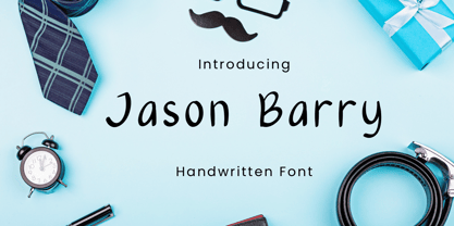 Jason Barry is a handwritten font with a simple and minimalist character. Crafted with sincerity, each letter reflects a friendly and full-of-character personality. This font is perfect for various designs, from greeting cards to branding projects that seek a minimalistic and appealing touch. If you have any question, please contact us.
 - FG Jason by YOFF,
$13.95FG Jason is a casual male handwriting with special i's without a dot - really unique! - Letter Gothic MT by Monotype,
$29.99Letter Gothic font was designed by Roger Roberson for IBM sometime between 1956 and 1962. Inspired by Optima, the typeface originally had flared stems. A monospaced sans serif font designed for use on an IBM Selectric typewriter, Letter Gothic font is a good choice for tabular material. - Monotype Script MT by Monotype,
$29.99 - Monotype Modern MT by Monotype,
$29.99 Monotype Modern, the first typeface produced by Lanston Monotype, was released in 1896, the same year the company introduced its hot metal typeseting machine. It is a Victorian variation on the vertically stressed, high-contrast Bodoni model.
 - Goudy Ornate MT by Monotype,
$29.99Over the course of 50 years, the charismatic and enterprising Frederic W. Goudy designed more than 100 typefaces; he was the American master of type design in the first half of the twentieth century. Goudy Old Style, designed for American Type Founders in 1915-1916, is the best known of his designs, and forms the basis for a large family of variants. Goudy said he was initially inspired by the cap lettering on a Renaissance painting, but most of the flavor of this design reflects Goudy's own individualistic style. Recognizable Goudy-isms include the upward pointing ear of the g, the diamond-shaped dots over the i and j, and the roundish upward swelling of the horizontal strokes at the base of the E and L. The italic was completed by Goudy in 1918, and is notable for its minimal slope. Goudy Bold (1916-1919) and Goudy Extra Bold (1927) were drawn not by Goudy, but by Morris Fuller Benton, who was ATF's skillful in-house designer. Goudy Catalogue was drawn by Benton in 1919-1921 and was meant to be a medium weight of Goudy Old Style. Goudy Heavyface was designed by Goudy for Monotype in 1925, and was intended to be a rival to the successful Cooper Black. Goudy Modern was designed by Goudy in 1918; its small x-height, tall ascenders and shorter caps impart a spacious and elegant feeling. Benton designed Goudy Handtooled, the shaded version that has just a hairline of white through its bold strokes. The Goudy faces, especially the bolder weights, have long been popular for display and advertising design. They continue to pop up all over the world, and still look reassuring to our modern eyes." - Dorchester Script MT by Monotype,
$29.99Dorchester Script font, released in 1939 by Monotype, was widely accepted by high society for calling cards, announcements, and invitations. Dorchester Script is nearly upright with lowercase letters that have loops and generous ascenders and descenders and capitals with delicate, curly flourishes. Besides the usual job work, such as letterhead and business cards, Dorchester Script font can be used sparingly for serious display work. - New Berolina MT by Monotype,
$29.99 Martin Wilke designed the dynamic calligraphic typeface New Berolina in 1965. The light line of the strokes and the strong stroke contrast lets New Berolina dance across the page. Broad, generous capitals complement beautifully the narrower lower case characters with their low x-height. The capitals can also be used as initials. Used carefully and with generous line spacing, New Berolina will lend any text a fresh, lively look.
 - Gill Sans MT by Monotype,
$45.99 Gill Sans is a humanistic sans serif family that, while is considered by many to be quintessentially British in tone and concept, has been used in virtually every country and in nearly every application imaginable. Gill Sans has reached this level of near-ubiquity for one simple—and very good—reason: it is an exceptionally distinctive design with a potential range of use that is almost limitless. This toolkit family includes a wide range of styles including the standards such as Light—which is open and elegant—and a Regular that, with its flat-bottomed d, flat-topped p and q and triangular-topped t, has a more compact and muscular appearance. Its Bold styles tend to echo the softer, more open style of the light while the extra bold and ultra bold have their own vivid personalities, but each of them would make for an eye-catching headline. Take into account the family’s many weights, including condensed and extra condensed designs, and extended language support and you have yourself a tool you’ll be thrilled to return to, time and again. Gill Sans was designed by Eric Gill: a versatile, brilliant, and prolifically successful designer of the early part of the last century. One of the main reasons for the enduring success of his namesake design is that it is based on Roman character shapes and proportions, making it unlike virtually any other sans serif out there. Gill also worked his own warmth and humanity into his design, resulting in a typeface in which each weight retains a distinct personality of its own. Pair with serif fonts like Gill's own Joanna; or more modern offerings like Frutiger® Serif, Malabar™, Syntax® Serif, FF Scala®, or DIN Next™ Slab.
 - Robam Khmer MT by Monotype,
$142.99 - BN Manson Nights - Unknown license

- 1543 Humane Jenson by GLC,
$38.00 In 1543 the well-known “De humani corporis fabrica” treatise on anatomy by André Vesale, was printed by Johann Oporinus in Basel (Switzerland). Various typefaces were used for this work, mostly in Latin but including Greek characters. Its Jenson-type font was the one which inspired this font. It is a very elegant one, including the “long s”, a few abbreviation forms and ligatures. As it was a Latin text, there were no accented characters and a few capitals were absent. I had to reconstruct them. A render sheet, in the font file, makes all characters easy to identify on the keyboard. This font may be used as a “modern” one for web-site titles, posters and flier designs, publishing ancient texts... and anything else you want! One of the most elegant types ever cut, it stands up very well to enlargement, remaining as readable as in its original small size.
 - Jenson Old Style by ITC,
$29.00In 1458, Charles VII sent the Frenchman Nicolas Jenson to learn the craft of movable type in Mainz, the city where Gutenberg was working. Jenson was supposed to return to France with his newly learned skills, but instead he traveled to Italy, as did other itinerant printers of the time. From 1468 on, he was in Venice, where he flourished as a punchcutter, printer and publisher. He was probably the first non-German printer of movable type, and he produced about 150 editions. Though his punches have vanished, his books have not, and those produced from about 1470 until his death in 1480 have served as a source of inspiration for type designers over centuries. His Roman type is often called the first true Roman." Notable in almost all Jensonian Romans is the angled crossbar on the lowercase e, which is known as the "Venetian Oldstyle e." Jenson Old Style™ was designed by Freda Sack and Colin Brignall for Letraset in 1982. Because of its darkness, this version is best used for display designs that call for a sense of old-world elegance and solidity." - 1470 Jenson Latin by GLC,
$38.00 This family was inspired by the pure Jenson set of fonts used in Venice to print De preparatio evangelica in the year 1470. The present font contains all of the specific latin abbreviations and ligatures used in the original. Added are the accented characters and a few others not in use in this early period of printing, also small caps, these, contained in a separate file in the Mac TT version. This font supports strong enlargements as easily than small size remaining very smart, elegant and fine. Decorated letters like 1512 Initials, 1550 Arabesques, 1565 Venetian 1584 Rinceau or other fonts from GLC Foundry, can be used with this family without anachronism. If Italic style is required, we recommend the use of 1557 Italique.
 - Nicolas Jenson SG by Spiece Graphics,
$39.00 It was the original work of fifteenth century designer Nicolas Jenson that formed the basis for this roman serif style developed by Ernst Detterer in 1923. Similar in spirit to other early twentieth century revivals such as Centaur, Cloister Old Style, and Italian Old Style, Nicolas Jenson is distinguished by its pristine and delicate nature. A gifted young apprentice to Detterer, Robert Hunter Middleton, greatly expanded the family. And by 1929, bold, italic, and open were part of the Ludlow Foundry’s beautiful Nicolas Jenson Series. It was reintroduced under a new name, Eusebius, in 1941. This digital version includes a new medium and extrabold weight with intermediate small caps and swash alternates throughout the family. There is also a regular expert version with a variety of currency symbols plus a regular petite caps (regular x-height small caps) and old style figures version. Nicolas Jenson is now available in the OpenType Std format. Small caps, old style figures, and swash alternates have all been combined into one style for ease of use. You will also find an additional regular petite caps version included with the regular style. Some new characters have been added as stylistic alternates and historical forms. These advanced features work in current versions of Adobe Creative Suite InDesign, Creative Suite Illustrator, and Quark XPress. Check for OpenType advanced feature support in other applications as it gradually becomes available with upgrades.
 - Action Jackson - Unknown license

- Janken BRK - Unknown license

- Planet Benson - Unknown license

- Grand Canyon by Red Rooster Collection,
$45.00 Based on an early wood type design. An original creation, that kept growing...!
 - Thenie Dawson by Grezline Studio,
$15.00 Thenie Dawson is a stylish serif font with classy and timeless charm. This font was designed to enhance the beauty of your projects. Very suitable for headlines, titles, advertising, vintage mood board, branding, logotypes, packaging, editorial design, blog/websites, social media quotes, wedding branding, vintage designs and much more. Add this font to your collection and let its beauty tell your story. Feature : Alternates and Ligatures Multilingual Language Works on PC & Mac Simple installations Accessible in the Adobe Illustrator, Adobe Photoshop, Adobe InDesign, even works on Microsoft Word. We highly recommend using a program that supports OpenType features and Glyphs panels like many of Adobe apps and Corel Draw, so you can see and access all Glyph variations. Thank You! Grezline Studio – Akhmad Reza Fauzi
 - Haunted Mansion by Arendxstudio,
$13.00 Introducing "Haunted Mansion" Haunted Mansion - A Halloween Font You Can Mix And Match for Your Awesome Project This fonts is ideal for crafting, branding and decorate your any project. This fonts are perfect for wedding invitation or your blog. Also with their help, you can create a logo or beautiful frame for your home. Or just use for your business, book covers, stationery, marketing, magazines and more. FEATURES : Uppercase & Lowercase Number & Punctuation Multilingual Language Outline
 - Johnson Black by BBA Key,
$10.00 Jonhson Black Script New fresh & modern style with handmade calligraphy, decorative characters and dancing lineage! It's so wonderful for invitations, greeting cards, branding material, business cards, quotes, posters, and more. Jonhson Black Script comes with 330 glyphs. Alternate characters are divided into several OpenType features such as Swash, Stylistic Sets, Stylistic Alternate, Contextual Alternate. OpenType features are accessible by using OpenType savvy programs such as Adobe Illustrator, Adobe InDesign, Adobe Photoshop Corel Draw X versions, and Microsoft Word. And this font has code PUA unicode (font with special code), so that all alternative characters can be easily accessed by craftsmen or designers.
 - Panton Rust by Fontfabric,
$30.00 The long-awaited Rust Bundle addition to our Panton type family has arrived, featuring the headliner Panton Rust and its trusted partner Panton Script Rust. Start your engines and get ready for 72 fonts, grouped into five weights ranging from SemiBold to Heavy, and including multiple Base combinations with different Shadows and Grunge Textures. All of the above is also a part of the accompanying Panton Rust Script, whose natural flow is further emphasized with specifically adjusted Contextual Alternates. The list of OpenType features wouldn’t be complete without localizations, figures, fractions, superiors and inferiors, numerators and denominators, as well as tabular numerals for Panton Rust. The Rust Bundle includes Extended Latin and Cyrillic coverage, providing support for more than 130 languages. This handcrafted package was created to bring about authentic and original vintage type, making it especially suitable for any design that speaks of craftsmanship, a sublime human touch, and a mature signature with undeniable flavor. In Rust we trust! Features: • Textures, Shadows and Inline versions of the fonts which can be combined for a multicolor effects • 72 styles in total, including 42 fonts for Panton Rust and 30 fonts for Panton Script Rust; • 5 weights from SemiBold to Heavy; • Extended Latin and Cyrillic coverage with support for more than 130 languages; • A broad set of contextual alternates and ligatures for Panton Script Rust
 - William Jameson by Letterhanna Studio,
$19.00 William Jameson is a monoline signature handwritten font. Its distinct and well rounded letters make this font a masterpiece. Fall in love with its incredibly versatile style and use it to create spectacular designs! William Jameson is made using opentype technology which makes the connection between letters more fluid, there are 3 types of tails in each letter that will automatically change according to the letters in front of it.


