6,966 search results
(0.016 seconds)
- Happy - Unknown license
- Quickie - 100% free
- GemFont One - Personal use only
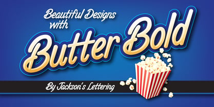
- Butter Bold by Jackson's Lettering,
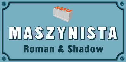
$19.95 - Maszynista by RMU,
$35.00 - Schwaben Alt - Unknown license
- HumboldtFraktur - Unknown license
- Merced by Latinotype,
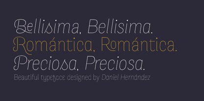
$49.00A fresh, curly and delicious sans serif. Designed by Daniel Hernandez, Merced is a sans serif font that can be given different uses due to its wide variety of alternate types. Its main virtue is the endless number of possibilities for you to write words, texts or paragraphs. Languages include: Basic Latin, Western European, Euro, Catalan, Baltic, Turkish, Central European, Romanian and Pan Africa Latin. - Life by URW Type Foundry,
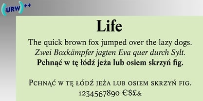
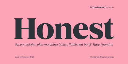
$35.99Life is an elegant roman face, designed by W. Bilz and developed by Francesco Simoncini at Ludwig & Mayer in 1964. It is a contemporary design based on the Transitional designs of the eighteenth century. The Life font can be used for almost any kind of copy. Life is especially suitable for newspapers, both in editorial and advertising due to its high degree of legibility. - Honest by W Type Foundry,
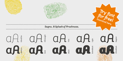
$28.00Honest draws inspiration from the serif fonts prevalent in print media during the 1970s and 1980s. Its letter shapes are well-suited for prominent uses like logos and striking headlines due to their distinctive style. The font's large x-height makes it suitable for tight leading in headlines. Honest offers a variety of options, including seven different weights and two styles: Standard and Italic. - Segno Brush by FSdesign-Salmina,
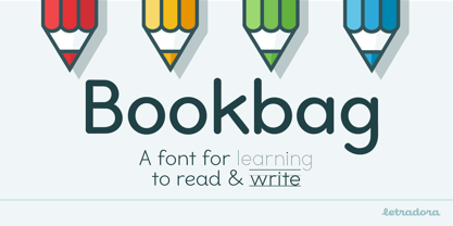
$39.00Segno. A Splash of Freshness. Cool, young and fresh, Segno surprises with his informal character and convinces for its careful execution. Its rounded forms and serifs evoke discretely the flow of a brush. Due to its moderate inclination Segno is easily readable and suits to more typographic purposes than you probably would expect from an informal typeface. Add a splash of freshness to your artwork, with Segno. - Bookbag by Letradora,
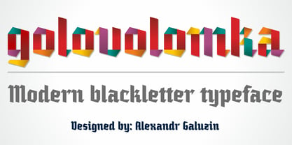
$15.00Bookbag is a font for teaching kids to read and write. It comes in 4 weights, from light to extrabold, and has dotted and lined versions for students to practice. Many glyphs have alternate versions, that can be accessed either through OpenType stylistic alternates, or using the Alt versions of the font. Bookbag has a very wide language support, with most latin languages supported. - Golovolomka by Alexandr Galuzin,
$30.00This font is reminiscent of the Middle Ages texture fonts. But geometric shapes make it more modern. It will work well in large and short inscriptions. The large array of text readability is reduced due to the characteristic rhythm of the font. It has the standard ligatures and ligature to failed pairs. There are two sets of numbers: the proportional and the Old style. - Killer Ants by Cool Fonts,
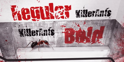
$24.00There are two versions of Killer Ants, regular and bold. Regular is a very cool cracked up looking font that will be great for all kinds of stuff. Bold is on of the most distressed fonts I've ever seen - there's crap everywhere - adjust your leading (line spacing) so the grunge overlaps and you have one awesome effect. Yes, those dots are actually smashed ants. Killer! - M Stiff Hei PRC by Monotype HK,
$523.99Stems (豎) and crossbars (橫) are direct and simple, dots (點) are short but authoritative, downstrokes (撇、捺) are no longer curvy but straight and sharp, thus, a smart and straightforward typeface. Bold in this family is rough and tough, demonstrating a high extent of muscularity. Meanwhile Light is neatly, naturally and nicely crafted, aiming to achieve high legibility. A popular choice for advertising with diverse usages. - Thursday Afternoon by Bogstav,
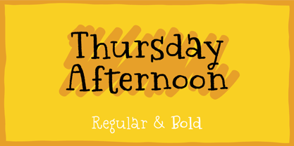
$15.00Nothing is as it really should be with Thursday Afternoon. The x-height is jumpy, letters are not in their right places, lines are crunchy, serifs are uneven...the list goes on...but in the end, Thursday Afternoon turns out as a legible and functional font. It has most of the moves from classic serif fonts, but then again it has a mind of its own! - Sixties Flashback by Mysterylab,
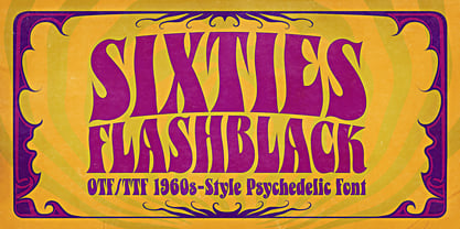
$15.00Here's a lettering style that just might be exactly on your wavelength. Add just the right dose of vintage freak-a-delia to your retro graphics with this original psychedelic-style design. Great for music posters, album graphics, book titles, etc. Evoke a warpy, wavy, whimsical vibe that harks back to the carefree 1960s or early 1970s era with Sixties Flashback; it's pure hippie, trippy fun! - Norden Retro Round by Asgeir Pedersen,
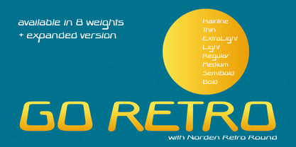
$14.99Norden Retro Round is based on Norden Round, but Retro comes with an added perspective, giving it a "retro-futuristic" look. It has a lower x-height than its parent, due to it being slightly tilted. Norden Retro Round can be used in any setting, but given its lively style, it will excel as a display font; in headings, titlings, logos and so on. - Filet by Emily Lime,
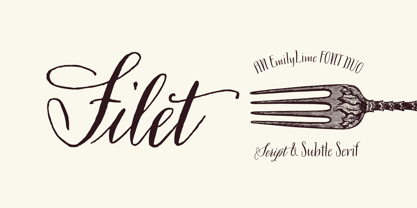
$24.00This font is big on 2 things: Class & Quirk. Inspired by hand-scripted menus. This modern hand-calligraphy font isn't just for one or two-word logos. Designed to make a statement when used in large amounts. Great in large & small doses alike. Slightly irregular texture for that perfect hand-lettering touch on the page. Beautiful Duo for your next event or project! Multilingual support. - Corkboard JNL by Jeff Levine,
$29.00Corkboard JNL is a bold, yet fun rounded-ends typeface that was popular in the 1970s and enjoying a revival amongst students and teachers via die-cut bulletin board letters. Five variations are offered—Regular, Slanted, Shadow, Shadow Slanted and Kiddies. Corkboard Kiddies JNL has a limited character set and eccentric spacing that emulates the way a child might put letters onto a bulletin board. - Thick Fun by PizzaDude.dk,
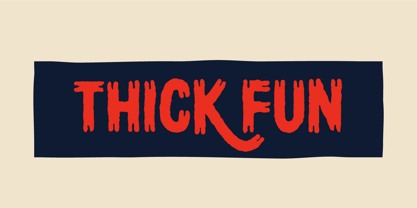
$17.00This is not a brush font! This is an imitation of brushstrokes, done by pen. But I guess you've already noticed that - the brushstrokes are way too obvious, to have been made by brush. Although being a "fake", the letters leaves you with quite a good impression. Letters were inspired by an old horror movie poster, but is very useful for something less terrifying! - Cover Charge JNL by Jeff Levine,
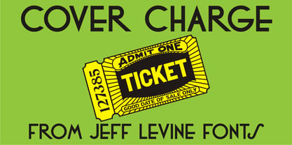
$29.00Although less prevalent today, a cover charge was added to better class night clubs of the 1930s and 1940s to discourage patronage by people of questionable social graces. The general idea was that the lower strata of society (meaning the "average Joe" or "hoi polloi") would balk at paying an extra fee just for entrance to a place of good entertainment and fine dining. - Hybrid by ParaType,
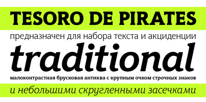
$30.00Designed for ParaType in 1999-2003 by Manvel Shmavonyan. This is a low-contrast serif typeface with large x-height and small square cove serifs. For use for text and display typography. Due to its open letterforms and big number of styles the face is a good companion to open humanist Sans. Hybrid design was awarded special prize at Kyrillitsa'99 international type design competition. - Svolta by Stefano Giliberti,
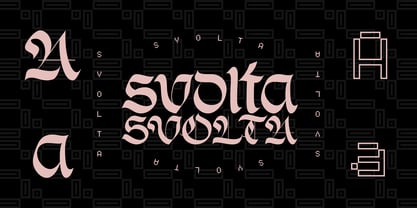
$15.00SVOLTA is a font family designed by Stefano Giliberti — each character handwritten on paper to form something truly unreplicable, a reinterpretation and celebration of blackletter Germanic typefaces. But its uniqueness goes beyond form: SVOLTA integrates in its styles PARTITA 1990, a pixel typeface aiming in the opposite direction of time, the present and future, resulting in a duo that adds personality and depth to your designs. - Masifa by Hurufatfont,
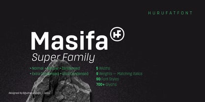
$19.00Masifa has compact, simple, functional and neutral body structure. It has 5 widths from Normal to Ultra Condensed. Each width includes 9 weights from Hairline to Black and their matching italics. Also, every weight includes rich OpenType Features like Small Caps and custom number styles. Due to its large family, it is ideal for a wide range of usage from large-scale designs to small product labels. - Regatta Condensed by ITC,
$29.00Regatta is a bold, narrow sans serif designed by Alan Meeks in 1987. Its strong, robust figures makes it a particularly good font for headlines in larger point sizes. Regatta is distinguished by its diamond shaped dots on i and j as well as the slanted strokes of several figures. These characteristics relax the closed, static image of Regatta and let the font seem cheerful and friendly. - After Nightfall by Hanoded,
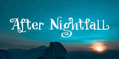
$10.00After Nightfall is a handmade fairytale font. It was called Bunting Nook first (after a spooky story of a black dog that haunts a town in Britain), but I figured it was a bit of a weird name, so I settled for After Nightfall. This font comes with some lovely swashes, which should be used sparingly. But that, of course, is entirely up to you. - Musical Score JNL by Jeff Levine,
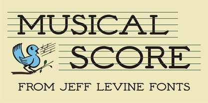
$29.00A number of pieces of antique sheet music utilizing the same Roman typeface were the inspirational basis for Musical Score JNL. This antique design closely resembles pen lettering and its hand-made charm due to the rounded stroke ends and varying character widths. Informal, yet attractive - the character design evokes the feeling of the turn of the previous century and simplicity of life at that time. - RM Almanack by Ray Meadows,
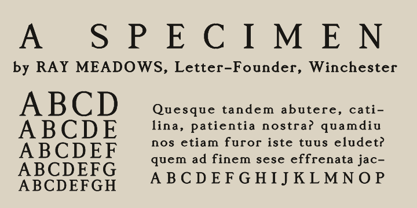
$19.00Based on William Caslon’s design (c1720) which was itself based on Dutch Baroque typefaces. The old saying “when in doubt, use Caslon.” can now be updated ... “use RM Almanack instead!” Includes: Western European, Central European, Baltic & Turkish sets Due to the modular nature of this design there may be a slight lack of smoothness to the curves at very large point sizes (around 100 pt and above). - All for you by HOHOHtype,
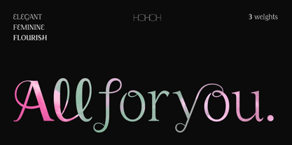
$28.00‘Allforyou’ is an elegant serif type family. The family has 3 different weights. It was designed to have the flexibility of italics in the form of serifs. It has a feminine and elegant feeling due to its smooth curves. It was designed with applications such as advertising and packaging, editorial and publishing, logo, branding and creative industries, poster and social media, and marketing in mind. - Rhea by Dominik Krotscheck,
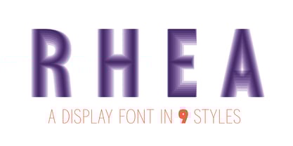
$7.00Rhea is a family of condensed all-caps sans serif fonts. It is equipped with a bunch of accented characters. There are alternate letterforms for M & W, easily accessible via opentype features. Due to its nine styles, ranging from an elegant thin to a blatant fat, it gives you the opportunity to easily define a hierarchy between your headlines or the content on your poster, etc. - Popty Ping by Hanoded,
$15.00Popty Ping is Welsh slang for microwave oven. It literally means ‘oven that goes ping’. Popty Ping was sort of based on an older font of mine called Jambo. It is a very happy cartoon font, ideal for children’s book covers, ice cream packaging and microwave popcorn (preferably the non GM kind). Comes in two great styles and more diacritics than you can pop in an oven! - Balcony Seats JNL by Jeff Levine,
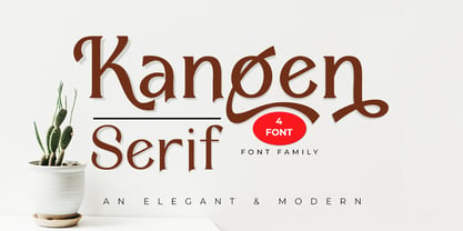
$29.00Balcony Seats JNL is a different take on Jeff Levine's Aisle Seats JNL. The original font was modeled from Redikut die-cut cardboard letters - used in the 1940's and 1950's for display and show card work). Although the basic letter shapes are similar, the horizontal stroke weights have been narrowed, providing a type variation with a classic Art Deco "thick and thin" look. - Kangen Serif by Cooldesignlab,
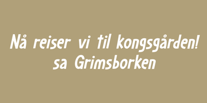
$10.00"Kangen Serif " is a powerful neoclassical font family designed for a variety of uses — from editorial and corporate design to web, interaction, and product design. It's a contemporary look with high-contrast typography that never goes out of style — defined by elegance, tradition, and timelessness. Although "Kangen Serif " seems like a display font at first glance, its proportions and design convey hard work and strong character. - Dapplegrim by Hanoded,
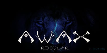
$15.00Dapplegrim is a Norwegian fairytale collected by Peter Christen Asbjørnsen and Jørgen Moe in their book ‘Norske Folkeeventyr’. The story is about a boy who inherits a big horse (called Dapplegrim, or Grimsborken in Norwegian) and sets off to rescue the king’s daughter from a nasty troll. Dapplegrim is a handmade fairytale font. Use it for your book covers, product packaging and fairytale collections! - Awax by Arkilion,
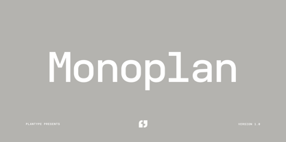
$19.90This font is the result of many years of research between full and empty. The combination of capital letters is very powerful while remaining in the traditional art of an ancestral Zen style. AWAX is perfect for your titles and logos and can also be used in paragraphs. You have to go very very closely to admire the detail work done while scrupulously respecting legibility and balance. - Monoplan by Plantype,
$30.00Monoplan is a versatile monospaced sans serif typeface. Minimal shapes and straight sides are definitive features of the typeface. Tables, headers, code blocks, signages or other small informative texts are the standard places where Monoplan shines. Different alternatives such as square dots, alternate /a /y /6 /9, coverage of 94 Latin languages, various Opentype features, and 5 styles expand the usage area of Monoplan. - Komunidad Hebrew Script by Jonahfonts,
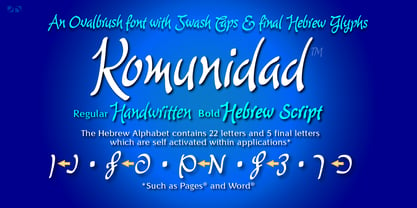
$42.00Komunidad is the Hebrew version of ”Quintana Light”. Suitable for logos and packaging statements. Invoking the OpenType / CONTEXTUAL variant produces the word terminals for all lower-case letterforms as well as diacritic letters. Final Hebrew Glyphs are also added. This can be done individually for each letter as well. Komunidad also contain alternative Swashes and TabOldstyle numerals. (OpenType-Variants may only be accessible via OpenType-aware applications.) - Disclosure by Device,
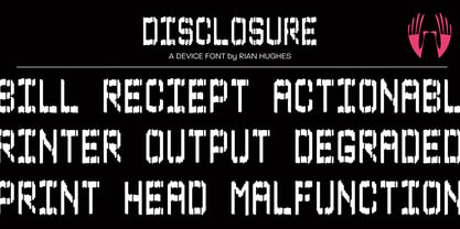
$39.00Disclosure is suggestive of low-grade digital output, screen displays, fax machines, or high-speed data transfer. It is missing vertical sections, perhaps due to a faulty print head or signal degradation. It is intentionally monospaced — each letter has the same width, like a typewriter — and unkerned. Suitable for uses where an unfussy urgency and drama is required. Developed from the 112 Hours numbers-only font, Throughput. - Salsiccia by Bech Type,
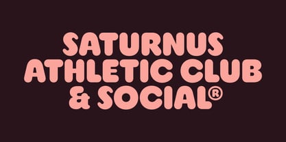
$19.00Inspired by bold and rounded typefaces on signs from the 1970s, Salsiccia can promote both your hot dog stand and your international toy store enterprise. Its boldness and roundness is combined with classical proportions, with wide letters — like the O — next to little nubby ones — like the T. This not only looks nice, but helps us even out the white spaces across words and sentences.


