3,481 search results
(0.041 seconds)
- Sukkergris by Bogstav,
$15.00 Need a catchy headline font with a clear handmade and organic look? Look no further, because Sukkergris is here to do the job! Each letter is handmade and manually cleaned up, but keeping the original quirky curves. I have added 6 different versions of each letter, which automatically cycle as you type. I also added a set of small caps, just because I think they look awesome!
 - Motto by FaceType,
$30.00 Motto is a beautiful Art Deco font in the tradition of the Italian Futurismo of the early 20th Century. Please Note: Combining Bicolor A and B you will create astounding multicolored pieces of typography. To achieve the two-tone effect shown in the samples, you need to use an application that supports layers such as Adobe Illustrator, Adobe InDesign, Adobe PhotoShop, CorelDRAW or Quark.
 - High Hopes by Ana's Fonts,
$15.00 High Hopes is a quirky handmade serif font with variations that show up "randomly" through contextual alternates, true italics and ornaments. Use this font in designs such as postcards and notes, posters, logotypes, social media posts, branding and packaging. High Hopes includes: Regular font with three contextual alternates for each letter Italic font with three contextual alternates for each letter Ornaments font with swashes and frames
 - Chromium Yellow NF by Nick's Fonts,
$10.00The Chromium Yellow family is based, very loosely, on Electro-type Serif, designed by John Wu of Hong Kong’s Archetype foundry. The rather quirky serifs have been removed and a few odd letter treatment have been amended to produce a smooth, techno-friendly family of faces. This font contains the complete Latin language character set (Unicode 1252) plus support for Central European (Unicode 1250) languages as well. - National Forest by Rachel Kick,
$12.00 National Forest is a font duo inspired by the National Park Service signs that are all made using a router bit. It was designed to put the timeless nostalgia of national park signs into a digital typeface. National Forest has a quirky, retro style and its’ natural imperfections add to its’ charm. The script and print compliment each other well for branding, display or marketing.
 - Love Ready by Epiclinez,
$18.00 Love Ready is the perfect font to express yourself. It's playful, fun, and crafty - just like you! With its quirky letterforms and bold style, Love Ready is perfect for everything from product packaging to letterheads. So what’s included : Basic Latin Uppercase and Lowercase Numbers, symbols, and punctuations Multilingual Support. PUA Encoded and fully accessible without additional design software Simple Installations works on PC & Mac Thank You.
 - Masbrushy by Sesa Grafika,
$69.00 Masbrushy is a bold and Modern handwritten Lettering font. Clean and a little bit quirky, this font is the perfect fit for all of your logos, branding, social media, and crafty DIY projects. This font especially design for awesome logo project. You can use this font for Logomark Project. This font is PUA encoded which means you can access all of the glyphs and swashes with ease!
 - Reiseburo Display by Elyas Beria,
$5.00 Pack your bag, Reisebüro is about to take you on a romp to the most wunderbar destinations around the globe. This quirky and playful display font is inspired by hand painted lettering. Pick a city from the list in the travel agency’s window and book your flight—your glass of champagne will be waiting for you in First Class. 4 Styles included: Regular Oblique Thin Thin Italic
 - Candy Coloured Clown by Jeremy Woods,
$15.00 Candy coloured clown is a unique and quirky display font created to invoke feelings of fun and carelessness that one might experience while visiting a carnival or circus. The font has a comic strip or cartoon aesthetic with it's thick outline and bubbly appearance. Candy Coloured Clown features a broad range of highly legible characters in both uppercase and lowercase, making it a guaranteed eye catcher.
 - Octangle by RagamKata,
$14.00 Octangle, a well-shaped font that gives a retro power as a display typeface. It’s quirkiness makes it looks funky to enhance your design. The groovy touch to the Octangle font, makes it a fun typeface to explore with! Octangle is very suitable for a variety design, such as posters, Invitations, greeting cards, logo, and many more. Embrace your design with Octangle to make your work pinnacle!
 - Saturday Champagne by Roland Hüse Design,
$18.00 SATURDAY CHAMPAGNE is a monoline modern calligraphy script. Perfect for titles, headings and logotypes for blogs, ads, quote prints, home decor, book title, invitation, birthday, custom product, lifestyle imagery (like quotes and stuff). This font is written by the amazing hand letterer and fellow artist of mine, Leah Chong, and is a collaboration project. The character set contains Western and Eastern European accents and extra characters, symbols and the following open type features: Ligatures: ff ll oo rr th tt ty Finals: b c d l g p y z Instagram: @leahdesign @rolandhusedesign https://leahdesign.sg https://rolandhuse.com Awesome background image for main poster by Simon Buchou from Unsplash https://unsplash.com/@simon_buchou Background mock ups for Girls Night Out and White Sea Cosmetics are from graphicburger.com http://graphicburger.com The Quote "Reality aligns with your mindset" is my favorite and is from Matt Lopez from the Lambo Goal podcast, picture is taken and photoshopped by me. Thank you I hope you like this font & good luck with your project! Roland
 - Cold Snowflake by Putracetol,
$16.00 Cold Snowflake - Quirky Ice Cream And Candy Theme Font is a delightful typeface designed to capture the essence of ice cream and candy in a playful and fun manner. The font features quirky, bold, and chubby letterforms, mirroring the sweet and indulgent theme it represents. It can be effectively used alone or in combination with its twelve charming variations. With twelve distinctive variations inspired by ice cream, candy, cones, sprinkles, sticks, melting treats, and chocolate, Cold Snowflake is the perfect choice for children's projects, crafting, and any design that seeks to evoke a sense of fun, playfulness, and a vibrant, colorful aesthetic. This font suits a wide range of applications, including logos, crafting projects, invitations, packaging, posters, titles, businesses, greeting cards, stickers, children's books, magazines, and any design related to the delightful world of ice cream and candy. With its sweet and cheerful theme, Cold Snowflake adds a touch of whimsy to your creative work, making it perfect for all things sweet and playful.
 - Black Diamond by Set Sail Studios,
$16.00 Black Diamond isn't your average brush font, it’s raw, edgy & bursting with attitude! Hand-painted with extra attention to quick-strokes and dry textures, Black Diamond is guaranteed to deliver a loud, proud & unashamed message - ideal for logos, handwritten quotes, product packaging, merchandise, advertising, social media & branding projects. Black Diamond comes as a single font packed full of great features. It contains a full set of lower & uppercase letters, a large range of punctuation, numerals, and multilingual support. The font also contains several ligatures and stylistic alternates for those who have opentype capable software. Lastly you can add some finishing touches to your work with the added bonus extras; Just type out any of the square-bracket characters { } [ ] on your keyboard for quick and easy access to 4 different swashes, and the arrow up ^ key to produce paint splatters. Huge Language Update; Black Diamond has now been updated to support Greek & Cyrillic alphabets.
 - ITC Johnston by ITC,
$29.00ITC Johnston is the result of the combined talents of Dave Farey and Richard Dawson, based on the work of Edward Johnston. In developing ITC Johnston, says London type designer Dave Farey, he did “lots of research on not only the face but the man.” Edward Johnston was something of an eccentric, “famous for sitting in a deck chair and carrying toast in his pockets.” (The deck chair was his preferred furniture in his own living room; the toast was so that he’d always have sustenance near at hand.) Johnston was also almost single-handedly responsible, early in this century, for the revival in Britain of the Renaissance calligraphic tradition of the chancery italic. His book Writing & Illuminating, & Lettering (with its peculiar extraneous comma in the title) is a classic on its subject, and his influence on his contemporaries was tremendous. He is perhaps best remembered, however, for the alphabet that he designed in 1916 for the London Underground Railway (now London Transport), which was based on his original “block letter” model. Johnston’s letters were constructed very carefully, based on his study of historical writing techniques at the British Museum. His capital letters took their form from the best classical Roman inscriptions. “He had serious rules for his sans serif style,” says Farey, “particularly the height-to-weight ratio of 1:7 for the construction of line weight, and therefore horizontals and verticals were to be the same thickness. Johnston’s O’s and C’s and G’s and even his S’s were constructions of perfect circles. This was a bit of a problem as far as text sizes were concerned, or in reality sizes smaller than half an inch. It also precluded any other weight but medium ‘ any weight lighter or heavier than his 1:7 relationship.” Johnston was famously slow at any project he undertook, says Farey. “He did eventually, under protest, create a bolder weight, in capitals only ‘ which took twenty years to complete.” Farey and his colleague Richard Dawson have based ITC Johnston on Edward Johnston’s original block letters, expanding them into a three-weight type family. Johnston himself never called his Underground lettering a typeface, according to Farey. It was an alphabet meant for signage and other display purposes, designed to be legible at a glance rather than readable in passages of text. Farey and Dawson’s adaptation retains the sparkling starkness of Johnston’s letters while combining comfortably into text. Johnston’s block letter bears an obvious resemblance to Gill Sans, the highly successful type family developed by Monotype in the 1920s. The young Eric Gill had studied under Johnston at the London College of Printing, worked on the Underground project with him, and followed many of the same principles in developing his own sans serif typeface. The Johnston letters gave a characteristic look to London’s transport system after the First World War, but it was Gill Sans that became the emblematic letter form of British graphic design for decades. (Johnston’s sans serif continued in use in the Underground until the early ‘80s, when a revised and modernized version, with a tighter fit and a larger x-height, was designed by the London design firm Banks and Miles.) Farey and Dawson, working from their studio in London’s Clerkenwell, wanted to create a type family that was neither a museum piece nor a bastardization, and that would “provide an alternative of the same school” to the omnipresent Gill Sans. “These alphabets,” says Farey, referring to the Johnston letters, “have never been developed as contemporary styles.” He and Dawson not only devised three weights of ITC Johnston but gave it a full set of small capitals in each weight ‘ something that neither the original Johnston face nor the Gill faces have ‘ as well as old-style figures and several alternate characters. - Meposa by Typodermic,
$11.95 Meposa is more than just a typeface; it is a bold statement of individuality and creativity. It’s a unique, tough, and quirky design that defies convention. Meposa’s mixed-case letters with open apertures deviate from the traditional roots of wood-block typography, bringing a fresh and modern twist to an old-school classic. This hybrid typeface is an amalgamation of various design elements from different eras and cultures. The result is a unique and mesmerizing typeface that defies categorization. Meposa also draws inspiration from the 1970s custom van culture, where artists and designers would showcase their creativity by customizing their vehicles with bold and colorful graphics. This typeface channels that same spirit of creativity and individuality, inviting you to break the mold and think outside the box. With historical wood type influences, Meposa pays homage to the timeless and authentic craft of typography. Yet, it also features retro-tech and modern design elements, resulting in a truly one-of-a-kind typeface that bridges the past and the present. In summary, Meposa is a unique and tough display typeface that is both historical and modern, quirky and bold. Its mix of design influences makes it an ideal choice for anyone looking to break the mold and stand out from the crowd. Whether you’re a graphic designer or a creative professional, Meposa is sure to leave a lasting impression. Most Latin-based European writing systems are supported, including the following languages. Afaan Oromo, Afar, Afrikaans, Albanian, Alsatian, Aromanian, Aymara, Bashkir (Latin), Basque, Belarusian (Latin), Bemba, Bikol, Bosnian, Breton, Cape Verdean, Creole, Catalan, Cebuano, Chamorro, Chavacano, Chichewa, Crimean Tatar (Latin), Croatian, Czech, Danish, Dawan, Dholuo, Dutch, English, Estonian, Faroese, Fijian, Filipino, Finnish, French, Frisian, Friulian, Gagauz (Latin), Galician, Ganda, Genoese, German, Greenlandic, Guadeloupean Creole, Haitian Creole, Hawaiian, Hiligaynon, Hungarian, Icelandic, Ilocano, Indonesian, Irish, Italian, Jamaican, Kaqchikel, Karakalpak (Latin), Kashubian, Kikongo, Kinyarwanda, Kirundi, Kurdish (Latin), Latvian, Lithuanian, Lombard, Low Saxon, Luxembourgish, Maasai, Makhuwa, Malay, Maltese, Māori, Moldovan, Montenegrin, Ndebele, Neapolitan, Norwegian, Novial, Occitan, Ossetian (Latin), Papiamento, Piedmontese, Polish, Portuguese, Quechua, Rarotongan, Romanian, Romansh, Sami, Sango, Saramaccan, Sardinian, Scottish Gaelic, Serbian (Latin), Shona, Sicilian, Silesian, Slovak, Slovenian, Somali, Sorbian, Sotho, Spanish, Swahili, Swazi, Swedish, Tagalog, Tahitian, Tetum, Tongan, Tshiluba, Tsonga, Tswana, Tumbuka, Turkish, Turkmen (Latin), Tuvaluan, Uzbek (Latin), Venetian, Vepsian, Võro, Walloon, Waray-Waray, Wayuu, Welsh, Wolof, Xhosa, Yapese, Zapotec Zulu and Zuni.
 - Chianti BT WGL by Bitstream,
$49.00Chianti was designed at Bitstream by senior designer Dennis Pasternak in 1991 and initially released in 1995. The intent behind the design was to provide a humanist sanserif of high readability at a wide range of sizes and weights. Humanist sanserifs (others that fall into this category are Linotype’s Frutiger and Optima, and Monotype’s Gill Sans) are an attempt to improve the readability of sanserifs by applying classical roman structure to the letterforms. To enhance its versatility, Mr. Pasternak designed a wide variety of alternate characters, rare ligatures, ornaments and swashes. Chianti is a friendly sanserif useful for a broad range of typographic needs. - LD Cherries by Dikas Studio,
$15.00 Hello... this is Cherries, a cute and bounch hand drawn font family. Cherries have 5 weight: light, regular, medium, semibold and bold with 2 styles: regular and slanted also included with pairing font Cherries Display. Cherries included with some alternate character and ligature to make your design awesome. Cherries is fun and very suitable for cute or girly design needs such as cover design, typography, sticker, greetings card, logo, merchandise and many more. Cherries also easy for read and you can use it for quote or caption. Add this beautiful handwritten font to each of your creative ideas and notice how it makes them stand out!
 - Teaspoon by Canada Type,
$29.95 Teaspoon was originally designed by Haley Fiege as a project-specific font in 2007, then completed and produced by Canada Type for commercial viability in 2008. With a personality that can only be described as “ironic cute”, it serves as a much needed alternative for the old overused poster faces, such as Cooper Black and Gill Sans Extra Bold. Words that look good set in Teaspoon include puppies, rainbows, salmonella poisoning and Tom Cruise. Teaspoon is available in all popular formats, comes with plenty of alternate characters, and supports a wider than normal range of Latin-based languages, as well as Cyrillic and Greek.
 - English Grotesque by Device,
$39.00 English Grotesque is based on the proportions of an early 20th century signwriter’s sans, emphasising the characteristic idiosyncrasies of type of the period. Sharing a similar Roman circle-and-square construction as Gill Sans or Johnston Railway, it has a wide T and W, a narrow S, and a long-tailed R. The Roman alphabet did not include a lower-case, and therefore early sans-serifs tended to base theirs on handwritten or cursive models, resulting in more even character widths. English Grotesque, by contrast, carries the more characterful proportions of the capitals through to the lower case. Available in six weights, with optional alternative versions for the Q, &, £ and J.
 - Macha by Positype,
$16.00 Macha shares the same DNA as its sibling Anago, but is a completely different species than the former or any of my other sans serifs (Aaux Next, Air, Akagi Pro or Wasabi). It's no-nonsense construction bears many influences from Gill Sans and Frutiger while stubbornly blending my own humanist touch. The focus on developing Macha was just to get to the point with each letterform and discard the rest. Macha takes a little but gives a lot. A fully-loaded character set includes: Small Caps, Proportional Lining and Oldstyle Numerals, Tabular Lining and Oldstyle Numerals, Fractions, Ordinals, Inferiors, Superiors, Stylistic Alternates, Ligatures, Case-sensitive, and more.
 - Abadi by Monotype,
$29.99 Designed by Malaysian designer, Ong ChongWah, Abadi is a versatile sans serif typeface whose style lies between the humanist Gill Sans and the more rigid lineales such as Monotype Grotesque and Helvetica. These humanist characteristics give the Abadi fonts a friendliness in use and contribute as much to its legibility as the generous 'x' height. The italic font relates to the roman, yet has sufficient character to be effectively used independently. The range of weights and widths available give Abadi a wide spectrum of graphic applications, from small quantities of text in magazines and newspapers, to display use in packaging, advertising and even television.
 - Chianti BT by Bitstream,
$29.99 Chianti was designed at Bitstream by senior designer Dennis Pasternak in 1991 and initially released in 1995. The intent behind the design was to provide a humanist sanserif of high readability at a wide range of sizes and weights. Humanist sanserifs (others that fall into this category are Linotype’s Frutiger and Optima, and Monotype’s Gill Sans) are an attempt to improve the readability of sanserifs by applying classical roman structure to the letterforms. To enhance its versatility, Mr. Pasternak designed a wide variety of alternate characters, rare ligatures, ornaments and swashes. Chianti is a friendly sanserif useful for a broad range of typographic needs.
 - Curely Pro by Konstantine Studio,
$15.00 Start from the idea of our free font, Curely, which has hit the milestone - a 70K project views on Behance and a thousand times more download (still going). Now we came up with the Pro version of it. More complex, more features, and absolutely more playful. So, please welcome, Curely Pro. A Versatile casual handmade decorative lettering typeface. Still inspired from the girly things and cuteness overload in every letters. Perfectly fit for your cute, sweet, lovely, and casual branding or logo project. Or any design stuff that need a lovely cute touch on it, let the Curely Pro smooch it all the way baby!
 - Ministry by Device,
$39.00 A 14-weight sans family based on the original British ‘M.O.T.’ (Ministry of Transport) alphabet. A capitals-only, single-weight design was drawn up around 1933 for use on Britain’s road network, and remained in use until Jock Kinnear and Margaret Calvert’s ‘Transport Alphabet’ was introduced for Britain's first motorway in 1958. The identity of the original designer is not preserved; however, Antony Froshaug in a 1963 ‘Design’ magazine article mentions Edward Johnston as an advisor. Speculation that it was based on Johnston’s London Transport alphabet is discussed in archived government documents from 1957: “So far as I am aware, the Ministry alphabet was not based on Johnston’s design; indeed, it has been suggested that Gill got his idea from Johnston. Our alphabet was based on advice from Hubert Llewellyn-Smith (then chairman of the British Institute of Industrial Art) and Mr. J. G. West, a senior architect of H. M. Office of Works.” A 1955-57 revision of the alphabet which polished the somewhat mechanical aspects of the original may be the work of stone carver and typographer David Kindersley. For the digitisation, Rian Hughes added an entirely new lower case, italics and a range of weights. The lower case mimics the forms of the capitals wherever possible, taking cues form Gill and Johnston for letters such as the a and g, with single-tier versions in the italic. A uniquely British font that is now available in a versatile family for modern use.
 - Southride by Maulana Creative,
$14.00 Southride is a quirky fun casual handwritten font. With wavy bold stroke, fun character. To give you an extra creative work. Southride font support multilingual more than 100+ language. This font is good for logo design, Social media, Movie Titles, Books Titles, a short text even a long text letter and good for your secondary text font with sans or serif. Make a stunning work with Southride font. Cheers, Maulana Creative
 - Gilded Majestic by Letterhend,
$17.00 Introducing, Gilded Majestic- a high contrast bold script with a touch of quirky looks. This type of font perfectly made to be applied especially in logo, headline, signage and the other various formal forms such as invitations, labels, logos, magazines, books, greeting / wedding cards, packaging, fashion, make up, stationery, novels, labels or any type of advertising purpose. Features : Uppercase & lowercase Numbers and punctuation Alternates & Ligatures Multilingual PUA encoded
 - Al Milky Sundae by Aluyeah Studio,
$129.00 Hello Aluyeaholics! Introducing Milky Sundae; the sweet and chic display font. Make your designs look absolutely delicious with Milky Sundae! With more than 370+ quick access alternates and ligatures at your fingertips, you'll have endless decorative possibilities to explore. Milky Sundae is your secret ingredient for adding a touch of sweetness and uniqueness. Spice up your projects with stunning alternates and ligatures that will have everyone craving for more!
 - Chalk Street Tag by Mvmet,
$10.00 Chalk Street Tag is a quick skinny handwritten font, inspired by graffiti-style tags made with chalk. It will elevate a wide range of design projects to the highest level. You can use this font for many design ideas such as stickers, t-shirt designs, amazing logo designs, magazine or book covers, comics, cartoon drawings, and many more. This font will add a super cool touch to your designs!
 - HU Roundsans by Heummdesign,
$280.00 HURoundsans is a geometric sans serif variable typeface with matching italics. It has a variable width that adapts to your needs, pushing for maximum readability. Useful for any quirky display uses. Variable is very versatile and can be used in print or on-screen environments. It's perfect for logos, posters, titling, UI/UX design, visual identity, social media, music cover art etc. * Specifications : Files included : Variable including italics Multi-language support
 - Chilli Peppers by Letterara,
$12.00 Chilli Peppers is a stylish, quirky, and incredibly distinct script font. Its stand-out feel makes this font incredibly versatile, fitting a wide range of contexts. Whether you’re using it for crafting, digital designing, presentations, poster, logos, events, or greeting card making, it’s perfect! This font is PUA encoded which means you can access all of the awesome glyphs with ease! It also features a wealth of special features including ligatures.
 - Speeding Bullet by Comicraft,
$19.00 Introducing... SPEEDING BULLET -- featuring SPEED TRAILS for increasing the, ah, speed of your bullets! Quick as The Flash, slicker than Quicksilver, the latest in our popular line of silver age display fonts could probably outrun a locomotive AND jump buildings in a single bound. It’s ASTOUNDING, it’s STARTLING, it’s ELECTRIFYING, PERAMBULATING, DISCOMBOBULATING and RETROFITTING. It really is Faster than a Speeding Bullet. Try it out for yourself. Under adult supervision, natch'.
 - Our Pal Hal NF by Nick's Fonts,
$10.00Of the many lettering gurus who published chapbooks on handlettering during its heyday, one of the most prolific was H. C. Martin. This quirky poster face was offered in one of his many Idea Books, and it remains as fresh and frolicsome today, some seventy years later, as when it first appeared. Both versions of this font include the complete Unicode Latin 1252 and Central European 1250 character sets. - Liferdas by Sealoung,
$20.00 Liferdas is a mix of Old Style Roman Serif styles. The glyphs are formed in extended width, smooth strokes, moderate stem contrast, and soft edges to pursuing clarity, quick recognizable text, and a warm personality. The italics style is 13 degrees low slanted with redrawn lowercase which has shown in more organic and flowy forms. This font contains 9 weights with more than 245 glyphs that support extended multilingual.
 - Pastel Palooza by Putracetol,
$20.00 Pastel Palooza - Quirky Easter Display Font, a delightful and playful typeface designed with the joyous spirit of Easter in mind. This fun and decorative font captures the essence of the holiday, making it the perfect choice for Easter-themed projects. Crafted with care, Pastel Palooza features a total of 10 font variations within the typeface, each reflecting the whimsical elements of the season - from eggs and bunnies to flowers and carrots.
 - Impulsive Marker by Mvmet,
$12.00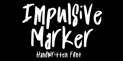 Impulsive Marker is a spontaneous and quick handwritten marker font, inspired by fun and fluid expressive energy of mankind. It will elevate a wide range of design projects to the highest level. You can use this font for many design ideas such as stickers, t-shirt designs, amazing logo designs, magazine or book covers, comics, cartoon drawings, and many more. This font will add a super cool touch to your designs!
 - Hangtime by Type Associates,
$24.50 Hangtime Rad and Extra were designed with surf posters in mind, a subject close to my heart as an avid sailboarder and surfer. Its slightly raked (3 degrees) yet vertical appearance makes for compact setting with extreme impact. Hangtime exhibits some quirky terminal features, its shortened upstrokes are balanced by the lengthened strokes of others providing unusually consistent spacing. Best applied to display situations but is readable at text sizes.
 - Unicorn Cake by NJ Studio,
$19.00 Hi...Thank for your visit :) Unicorn Cake A Quirky Handwritten Fonts are font designs that are made for various vector designs, printing such as digital wedding blogs, online shops, social media, while printing can be used in the field of product clothing, accessories, bags, pins, logos, business cards, watermarks and many others ... so it can make your product look cute and attractive, and also Multilingual support!!! Happy design ...
 - Hoicky by Putracetol,
$24.00 Introducing Hoicky, a quirky irregular font. Each character in this font has a different tilt angle, plus there is a ligature that makes this font even more unique. Hoicky also perfect for branding design, posters, apparel, logotype, header, quote, invitation, greeting card, cover, poster, fashion design and any more. Come with lot of ligatures character, its help you to make great lettering. This font is also support multi language.
 - Al Baratheon by Aluyeah Studio,
$125.00 Hello Aluyeaholics! Be the King or Queen of your project with Baratheon. This display font is inspired by Medieval Knights and crafted with attention to detail. Feel like a Lord or Lady and show your inner King or Queen with Baratheon. Coming with 200+ stunning and super easy to use alternates and ligatures with quick access. To get results like the preview just type B.2a.7r.ath.17eo.2n.14
 - Falling Love by Haksen,
$13.00 Introducing the elegant Falling Love quirky Font! If you are needing a touch of casual chic calligraphy for your designs, this font was created for you! This font works best in a program that supports OpenType features such as Adobe Indesign, Adobe Illustrator CC and CS, or Adobe Photoshop CC and CS also CorelDraw More Questions? Here are some (potential) answers! Multilingual Support is included for Western European Languages Cheers!