10,000 search results
(0.036 seconds)
- Brubecks Cube by Chank,
$99.00 A foxy, boxy, hand-drawn poster font.
 - Sweets by Agnieszka Ewa Olszewska,
$29.00 Sweets is an illustrative, hand made font.
 - BOOM by Albatross,
$19.00 A premium hand-crafted wide display family.
 - Joppa by MADType,
$21.00 Joppa is a cheerful hand drawn sans.
 - Olive by Typesketchbook,
$9.00 Olive is a hand-drawn condensed font.
 - LoveBirds by PintassilgoPrints,
$24.90 A handful of birds silhouettes. Sing along!
 - Skinny Walrus by m u r,
$15.00 A tall, thin, hand written style font.
 - Qualitype by Bülent Yüksel,
$19.00 QUALITYPE + VARIABLE FONT FAMILY "QualiTYPE" font extends its use by providing weights from "Thin" to "Black". Natural curves, ridges, and curved bodies grow in character as the font gains weight. "Qualitype" is an exciting serif font with contemporary twists. It has a distinctive sound that preserves the simplicity and elegance of classic "serif" fonts with a fresh, stylish rework. Her personality is bold and fills the space without shouting, she looks elegant and confident. The low X-height provides a great amount of visibility at all weights and is optically corrected for better readability. In the process of working on "Qualitype" we wanted to expand the functionality of the typeface a bit more, so after a few tries two different fonts were born: "Old", "Neo" and "italics" versions. "Qualitype" is perfect for use in magazines, in the fashion industry, in the branding of premium goods and services. "Qualitype" is quite versatile and suitable for use both in headings and in text arrays. In addition, we have done manual hinting in the typeface, and now it can be used with a clear conscience in the web and applications. “Quality” typeface consists of 56 styles: 2 style, 2 Shining, 7 weights and italics. Each typeface style consists of 860+ glyphs (except for the decoratives). “Qualitype” supports over 80+ languages. A variant version of the basic styles has been prepared for the most demanding users. Using the variability slider, you can adjust and select the individual thickness regardless of the current weight distribution. An important clarification - not all programs support variable technologies yet, you can check the support status here: https://v-fonts.com/support/. OPENTYPE FEATURES aalt, dnom, onum, pnum, tnum, lnum, numr, frac, zero, sing, sups, subs, case, c2sc, smack, salt, hist, titl, holing, dig, liga, ss01, ss02, ss03, ss04, ss05, ss06, ss07, ss08, ss09, ss10, kern FEATURE SUMMARY: - 4 Axes: 2 Style: Old and Neo. 7 weights: Thin, Light, Book, Regular, Medium, Bold and Black. 2 Shining: Dark and Lamp. Matching italics (12º) for all weights and style . - Matching small caps for all weights and widths. - Lining and old style figures (proportional and tabular). - Alternate characters (a, d, g, m, n, p, q, r, u, y). - Unlimeted fractions. - 24 Dingbats. - Extended language support. - Extended currency support. You can contact me at buyuksel@hotmail.com, pre-purchase and post-purchase with questions and for technical support. You can enjoy using it.
 - Basilio by Canada Type,
$29.95 In the late 1930s, old Egyptiennes (or Italiennes) returned to the collective consciousness of European printers and type houses — perhaps because political news were front a centre, especially in France where Le Figaro newspaper was seeing record circulation numbers. In 1939 both Monotype and Lettergieterij Amsterdam thought of the same idea: Make a new typeface similar to the reverse stress slab shapes that make up the titles of newspapers like Le Figaro and Le Frondeur. Both foundries intended to call their new type Figaro. Monotype finished theirs first, so they ended up with the name, and their type was already published when Stefan Schlesinger finished his take for the Amsterdam foundry. Schlesinger’s type was renamed Hidalgo (Spanish for a lower nobleman, ‘son of something’) and published in 1940 as ‘a very happy variation on an old motif’. Although it wasn’t a commercial success at the time, it was well received and considered subtler and more refined than the similar types available, Figaro and Playbill. In the Second World War, the Germans banned the use of the type, and Hidalgo never really recovered. Upon closer inspection, Schlesinger’s work on Hidalgo was much more Euro-sophisticated and ahead of its time than the too-wooden cut of Figaro and the thick tightness of Playbill. It has a modern high contrast, a squarer skeleton, contour cuts that work similarly outside and inside, and airy and minimal solutions to the more complicated shapes like G, K, M, N, Q and W. It is also much more aware of, and more accommodating to, the picket-fence effect the thick top slabs create in setting. Basilio (named after the signing teacher in Mozart’s Figaro) is the digital revival and major expansion of Hidalgo. With nearly 600 glyphs, it boasts Pan-European language support (most Latin languages, as well as Cyrillic and Greek), and a few OpenType tricks that gel it all together to make a very useful design tool. Stefan Schlesigner was born in Vienna in 1896. He moved to the Netherlands in 1925, where he worked for Van Houten’s chocolate, Metz department store, printing firm Trio and many other clients. He died in the gas chambers of Auschwitz in 1944. Digital revivals and expansions of two of his other designs, Minuet and Serena, have also been published by Canada Type.
 - Antimony Blue - Unknown license

- Diotima Classic by Linotype,
$29.99Diotima Classic is a total upheaval for the 21st century of Gudrun Zapf von Hesse's mid-20th-century Diotima, one of the most beautiful types ever cast in metal. Its roots lay in a calligraphic sheet written by Gudrun Zapf von Hesse. The text was the Hyperion to Diotima" by Friedrich Hölderlin; Diotima is the name of a Greek priestess in Plato's dialogue about love. In the philosopher's imagination, she should appear slim and beautiful. In 1948, Gudrun Zapf von Hesse finished the typeface's Roman. The Diotima family was released as a metal typeface for hand setting by D. Stempel AG in 1951-53. This original Diotima is a festive design particularly suited to invitations, programs, and poems. The delicate Italic drew attention to text passages that should be emphasized. Linotype's previous digital Diotima only had one weight, which looked great in display sizes, but was too thin for text setting. Diotima Classic has four weights. The new Regular has more robust serifs and thicker hairlines, making it more appropriate for text sizes. The Diotima variation with finer serif remains under the name Light. Gudrun Zapf von Hesse also took the opportunity in 2008 to add an extremely heavy weight to the family. In comparison to the old Diotima, letterforms of the Diotima Classic are more harmonious and balanced. The rhythm of the Italic letters in Diotima Classic is more consistent. The lining figures of the Diotima Classic align with caps, and the letter spacing of the tabular lining figures in Diotima Classic is significantly better. The forms of the figures have been improved as well." - Monotalic by Kostic,
$30.00 Monotalic was created as a fun experiment, exploring better solutions for the monospaced type design. Most monospaced (fixed-width) typefaces have the same main design problem regarding the lowercase – filling the empty space around l, f, i, j and r. That usually brings the addition of slab serifs to those narrow characters, causing many monospaced fonts to look and feel alike. Monotalic solves that problem by adopting the handwritten (or cursive) form for those problematic characters, which allows them to be defined in more strokes, thus getting a better distribution of form in that fixed-width space. On the other hand, cursive writing usually lacks the legibility of a Roman (Regular upright) style, so Monotalic was created to be a hybrid, taking the best of both worlds. Monospaced fonts today are mostly used for coding. Modern code editors use colored text in order to differentiate between different kinds of code. So, in that environment there’s actually no need for traditional text styling by adding Italics, Bold or other styles, because the code lines are overstated as it is. That is why Monotalic focuses on one style only, in three widths and four weights. The weights allow users to choose the perfect contrast of text on screen, depending on their monitor resolution and background color in the editor. Movie scripts are almost exclusively set in 12pt Courier. It became the industry standard because when set in the specific “screenplay format" it helps with the breakdown of the schedule and budgeting process of the film production. Although it looks completely different, text set in Monotalic (Normal width) will take the same amount of space as Courier.
 - Portaso by Larin Type Co,
$12.00 PORTASO This is a vintage display font inspired by signage, logos in the style of the wild west of the old time. This is a great find for creating logos, various kinds of designs in vintage and wild West style. Portaso font family has only Capital letters and alternates to them. Also the Stamp style has a different texture for upper and lowercase. This collection includes 14 font styles: regular, rough, two shadows for regular style and two shadows for rough style and stamp style, also vintage, vintage rough, two shadows for vintage style and two shadows for vintage rough style and stamp style,
 - Bayone by RGB Studio,
$16.00 Bayone is a bold, distinct and elegant blackletter font. Add it confidently to your projects, and you will love the results. Bayone This font is made with references to various letters that I combine and design with my style. * Bayone are great and usefull for product logo, poster title, headline, packaging, badge, wedding card logo, clothing brand logo,Vintage design and much more Files Include : Basic Latin A-Z and a-z Numbers Symbols PUA Encode Multi-language Support Thanks and have a wonderful day, If you have any questions, please get in touch with us Don't forget to check out our other products.
 - Dramaturg by GRIN3 (Nowak),
$26.00 Dramaturg is a handwritten, brush, fully connected script with ligatures and contextual alternates to help with flow and readability. Dramaturg is the most complete style, it contains over 600 glyphs, 7 stylistic sets, contextual alternates and ligatures. Every lowercase letter has six variations (uppercase letter has four). When the font is used in OpenType-savvy applications, the 3 variants of glyphs are automatically alternated to achieve a random-like effect. Dramaturg A and Dramaturg B have less glyphs than the Regular one (no stylistic sets), they only contain some selected alternates and ligatures. Language support includes Western, Central and Eastern European character sets, as well as Baltic and Turkish languages.
 - Little Muffin by Factory738,
$15.00 LittleMuffin is a lovely serif font family with a modern feel. The elegant design was created by fusing modern and vintage elements. When it comes to choosing the right typographic color for your project, the different weights give you a lot of options. The available Ligatures and Italic styles provide a diverse range of characters to make your project design stand out. 5 Weights (Light, Regular, Semibold, Bold, Black) 2 Styles (Regular and Italic) Basic Latin A-Z and a-z Numerals & Punctuation Stylistic Ligatures and Alternate glyps Multilingual Support for ä ö ü Ä Ö Ü ... Free updates and feature additions Thanks for looking, and I hope you enjoy it.
 - Quaint Vibe by Look Minus Today,
$12.00 Quaint Vibe is a unique display font created by Look Minus Today. It captures a distinct and charming vibe, blending vintage aesthetics with modern design elements. With its quirky and unconventional letterforms, Quaint Vibe adds a touch of whimsy and character to any project. Whether you're creating retro-inspired posters, playful logos, or eye-catching headlines, this font will evoke a sense of nostalgia and captivate your audience. With its extensive set of alternate characters and ligatures, Quaint Vibe offers endless creative possibilities, allowing you to craft truly unique and captivating designs. Embrace the charm of Quaint Vibe and infuse your projects with its one-of-a-kind appeal.
 - Sanatha by Pen Culture,
$19.00 Proudly Present "Sanatha - A Stylish Calligraphy Font" Sanatha is a stylish calligraphy font with natural handwritten that perfect for any kind of design project like wedding invitation, branding, poster and others. This font come with lovely swashes and ton of ligature which make this font stylish and elegant. What inside and what will you get: Uppercase and lowercase letter Number and punctuation Ligature Lovely swashes I really hope you enjoy it – please do let me know what you think, comments & likes are always hugely welcomed and appreciated. More importantly, please don’t hesitate to drop me a message if you have any issues or queries. Thank you
 - Pocky Block by Arterfak Project,
$16.00 Introducing Pocky Block, a font that's bold and blocky with elegant and modern design. This font exudes a sporty, assertive, and daring vibe, making it a perfect fit for designs with sports, adventure, or futuristic themes. It's great for stickers, movie posters, flyers, displays, logos, motion graphics, advertising, and more. Pocky Block comes in two styles: Regular and Slanted. The Slanted style highlights a spirit of enthusiasm, speed, and confidence. This thick font also boasts over 100+ ligatures, allowing you to create dynamic and sophisticated letter combinations. What you'll get : All capital characters Numbers, punctuation & symbols Stylistic alternates Stylistic set 100+ Ligatures Multilingual support Help file. Thank you for your appreciation!
 - Perfect Dream by Sealoung,
$17.00 Introducing Perfect Dream – a new serif with all the nostalgic vibes! A classy eighties magazine-inspired serif - with a complementary italic version :) Comes in two normal and condensed versions, mix them together to create an interesting effect. Perfect Dream is a beautiful nostalgic upper and lower case typography that looks amazing in both large and small settings as display and body text. I love combining regular and italics, either all in one word (as in the Missfits sample) or in body text! Don't forget to use all caps as well in your blending and matching - this adds contrast and impact to your type design.
 - Sogeh by Twinletter,
$12.00 Sogeh is a sanserif font with a simple and straightforward design. This basic font has a modern shape and an exotic appearance while being comfortable and attractive to the eye. With this font, all of your special projects will look luxurious, cool, and well-liked by a large portion of your audience. Use this typeface to achieve the best possible outcomes in all of your projects. of course, your various design projects will be perfect and extraordinary if you use this font because this font is equipped with a font family, both for titles and subtitles and sentence text, start using our fonts for your extraordinary projects.
 - York Village by Letterhend,
$19.00 York Village is a stylish retro font with swashes. The stylistic alternates and ligatures make this font event more unique and stands from the crowd, with 70s vibe. This font perfectly made to be applied especially in logo, and the other various formal forms such as invitations, labels, logos, magazines, books, greeting / wedding cards, packaging, fashion, make up, stationery, novels, labels or any type of advertising purpose. Features : uppercase & lowercase numbers and punctuation multilingual alternates, swashes & ligatures PUA encoded We highly recommend using a program that supports OpenType features and Glyphs panels like many of Adobe apps and Corel Draw, so you can see and access all Glyph variations.
 - Univers Next Arabic by Linotype,
$99.00 Univers Next Arabic is designed by Lebanese designer Nadine Chahine as a companion to the Latin typeface Univers Next and with the consulting of Adrian Frutiger. It is a modern Kufi design with large open counters and low contrast. It is mainly designed to work in titles and short runs of text. Its contemporary look makes it perfect for corporate branding as well as for advertising work. It is also well suited for user interfaces and low resolution display devices. The font includes the basic Latin part of Univers Next and support for Arabic, Persian, and Urdu. It also includes proportional and tabular numerals for the supported languages.
 - Lofty Chic by TypeClassHeroes,
$17.00 Masterfully designed to become an elegant, this font has the potential to bring each of your creative ideas to the highest level. Come with Cyrillic and Greek regular, italic script with different style combine with ligatures and special alternative glyphs so you can create a lot with layouts and compositions. Lofty Chic brings a touch of luxury and bespoke custom typography to logos, websites, social media quotes, wedding branding, and more. Feature Cyrillic and Greek Uppercase & Lowercase Number & Symbol International Glyphs Multilingual support Alternative ligature Feel free to drop us a message any time and follow my shop for upcoming updates. Hope you enjoy it.
 - FF Karbid Text by FontFont,
$58.99 German type designer Verena Gerlach created this sans FontFont in 2011. The family has 10 weights, ranging from Light to Black (including italics) and is ideally suited for book text, editorial and publishing as well as small text. FF Karbid Text provides advanced typographical support with features such as ligatures, alternate characters, case-sensitive forms, fractions, super- and subscript characters, and stylistic alternates. It comes with a complete range of figure set options – oldstyle and lining figures, each in tabular and proportional widths. This FontFont is a member of the FF Karbid super family, which also includes FF Karbid, FF Karbid Display, and FF Karbid Slab.
 - Omniscient by Comicraft,
$19.00 Omniscient is a narrative font that sees all… it’s everywhere and nowhere, the storyteller and the story, upper and lower case. This godlike font can be first person AND third person, friendly or serious, personable AND impersonal. It knows all the details but will only reveal them when it serves the narrative. The classical characters in Omniscient are all knowing, all seeing, and can even be all singing, all dancing on occasion. Even gods like to let their hair down and have fun. Features three weights with upper & lowercase alphabets, language support for Western & Central Europe, Automatic alternates, Stylistic Alternates & Crossbar I Technology™.
 - Americana by Linotype,
$40.99 Americana was designed by typeface artist Richard Isbell in 1965. The generous forms of this typeface contain large inner spaces. Lines of text look light and airy and require generous line spacing. The high cross strokes and the open inner spaces make this font highly legible even in small and very small point sizes. The triangular serifs are a distinguishing characteristic of Americana. These first appeared in the 19th century in France and inspired by the developments in lithography, which allowed for freer forms. The forms were typical for advertisement and display typefaces. The sophisticated Americana is particularly suitable for advertisements and personal correspondence.
 - Waratah Gothic by Bean & Morris,
$35.00 The Waratah flower is the the emblem of the State of New South Wales, Australia and is unique in its color and design. So too is this new contemporary sans serif typeface that bears its name. With a warmth and friendliness that echoes its origin Waratah Gothic is at home in both text and display and has potential to become a font family with a variety of weights and italics. For corporate, packaging or simple one-line display settings Waratah Gothic is sure to please. Waratah Gothic features a generous x-height and subtle rounding on alternate terminals providing a softness that makes for easy reading.
 - Bright Gesture by Letterhend,
$19.00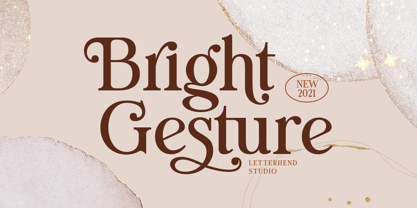 Introducing, Bright Gesture - A Modern serif font with swashes. The stylistic alternates and ligatures make this font event more unique and stands from the crowd. This font perfectly made to be applied especially in logo, and the other various formal forms such as invitations, labels, logos, magazines, books, greeting / wedding cards, packaging, fashion, make up, stationery, novels, labels or any type of advertising purpose. Features : uppercase & lowercase numbers and punctuation multilingual alternates, swashes & ligatures PUA encoded We highly recommend using a program that supports OpenType features and Glyphs panels like many of Adobe apps and Corel Draw, so you can see and access all Glyph variations.
 - Coben by cretype,
$20.00 Coben is a modern and futuristic san-serif font family. Simple and modern shapes with a tall x-height make the text legible and the spaces between individual letter forms are precisely adjusted to create the perfect typesetting. Coben Family consists of 2 widths (Condensed, Normal), 4 weights (Light, Regular, Medium, Bold), and Italics for each format. Coben provides a Central European character set. Each font includes support for Tabular numbers, Old-style Figures and Opentype Features such as Proportional Figures, Numerators, Denominators, Superscript, Scientific Inferiors, Subscript, Fractions and Standard Ligatures. We highly recommend it for use in books, web pages, screen displays, and so on.
 - Safran by Hubert Jocham Type,
$29.90 Besides all the display and script typefaces I design, my real passion is to design typefaces for copy. Safran is the first of my sans serif workhorse families available from Myfonts. Starting from a light version there are nine weights up to the strong ultrabold. All with italics. What was the inspiration for designing the font? I wanted to create a clear and elegant typeface with a wide variety of weights and proportions that are easy to use in corporate branding and magazines. What are its main characteristics and features? contemporary humanist legible sans serif Usage recommendations: corporate branding, magazines and other publications Elegant, clear and very legible.
 - Albiona by Device,
$39.00 A contemporary slab-serif which revisits aspects of Robert Besley’s all-time classic Clarendon, designed around 1842 for Thorowgood and Co. and named after the Clarendon Press in Oxford. The original design was subsequently extended by Sheffield foundry Stephenson Blake in the 1950s into a widely-used, robust workhorse family. Albiona uses the inwardly curved stroke terminals of the same foundry’s Grotesque series, while rationalising or removing entirely Clarendon’s ball serifs, flicked tails and other eccentricities to make it more functional in contemporary settings. The family consists of five weights plus italics and a stencil, and includes oldstyle and tabular numerals. Its clean readable style suits both text and headline setting.
 - Puntino by Fontador,
$18.99 A dotted script typeface Puntino is (maybe the first) dotted script typeface and not made up of grid-based dots. They are optical corrected and there is always the same distance between the dots, with the aim to create more harmonic letterforms. The dots also vary gradually in size to reflect the thickening and thinning of strokes, giving the letterforms a sophisticated overall look. Puntino comes up with 4 styles and is perfectly suited for logos, brands, congratulation cards … The language support includes Western, Central and Eastern European character sets, as well as Baltic and Turkish languages. OPEN TYPE FEATURES: Standard ligatures and contextual alternates should be activated.
 - Sofia Pro Soft by Mostardesign,
$26.00 Sofia Soft is the rounded version of the successful Sofia Pro family. This softer variation with rounded strokes gives Sofia Soft a unique geometric sans friendly aspect for display uses, texts and headlines, branding, signage, print, and web design projects. Sofia Soft is the ideal companion to Sofia Pro and improves the versatility of the global font family with optimized spacing and kerning for print and display. Sofia Soft supports extensive languages such as Western European, Central and Eastern European languages. Available in 8 versatile styles, all weights contain the same Opentype features as her sister font with case sensitive forms, stylistic alternates, localized forms, standard ligatures, lining, and oldstyle figures.
 - Cannon by W Type Foundry,
$20.00 The Cannon family is the result of combining the clean aesthetics from a classic sans neo-grotesque with a touch of a geometric design. The result is a simple but dynamic typeface with retro and technological airs. Cannon is ideal for robust advertising, bold brand identities and packaging, also suitable for high impact headlines and short texts. This type family consists of 36 variants and 9 weights (thin, extra light, light, regular, book, medium, bold, extra bold, black), matching italics for all weights and widths, matching small caps for all weights and widths, alternate characters and extended language support. We are proud to introduce: Cannon.
 - 52-Kfx by ILOTT-TYPE,
$49.00 Where most fonts are available in varying weights, 52-Kfx is a family consisting of 3 heights; High, Mid and Low. These offer the typographer a full palette, Low is readable for setting copy while at the opposite end High is better suited for display—names, headlines and logotypes. 52-Kfx has a sophisticated and elegant period feel with clean, modern lines that remain relevant for contemporary application. Exaggerated ascenders and descenders of the lowercase and a tall cap-height give it a lofty stature while the low x-height keeps characters grounded. The spacing and lyrical rhythm are perfectly in sync and epitomized by the fluidity seen in the ligatures.
 - Corporate E WGL by URW Type Foundry,
$210.99 The Corporate ASE typeface trilogy was designed by Prof. Kurt Weidemann, a well-known German designer and typographer, from 1985 until 1990. This superb trilogy consisting of the Corporate Antiqua, Corporte Sans Serif, and Corporate Egyptian is a design program of classical quality, perfectly in tune with each other. Weidemann says: My ASE trilogy, quite like triplets, is in perfect harmony and covers all needs of modern typography! Initially exclusively designed for DaimlerChrysler as a corporate font, the ASE trilogy may be now licensed and used without restriction. URW++ digitized the ASE for DaimlerChrysler and Prof. Weidemann and is the exclusive licencing agent for this outstanding and extremely popular typeface program.
 - Pilfnof by Eksign,
$13.58 Pilfnof contains: - 394 glyphs which include: Basic Latin, Latin Extended - A, Latin 1 - Supplement and General Punctuation. - 4 weights: Light, Regular, Bold and Black Pilfnof is a reverse contrast serif font family. Purpose of the project was to design a standing out modern serif which revolves around reverse contrast. Width of strokes is fully reversed. Weight, width and contrast are regular while x-height is high. It contains uppercase and lowercase letters and lining figures. Pilfnof is perfect for use in Branding and Publications. It can be used both for text as well as headings and titles. Heavy weights are ideal for headlines while light weights are suitable for body text.
 - Samrose by Letterhend,
$16.00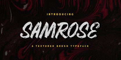 Introducing, Samrose. A unique textured brush typeface with bold and strong feel. This font perfectly made to be applied especially in logo, and the other various formal forms such as invitations, labels, magazines, books, greeting / wedding cards, packaging, fashion, make up, stationery, novels, labels or any type of advertising purpose. Features : uppercase & lowercase (alternates) numbers and punctuation Ligatures and alternates multilingual PUA encoded We highly recommend using a program that supports OpenType features and Glyphs panels like many of Adobe apps and Corel Draw, so you can see and access all Glyph variations. Email us to letterhend@gmail.com if you need something! Happy Designing!
 - Mezzophis by Letterhend,
$19.00 Mezzophis Typeface is a unique typeface which is speciality made for a logotype. it's also have techno and futuristic feel. This type of font perfectly made to be applied especially in logo, headline, signage and the other various formal forms such as invitations, labels, logos, magazines, books, greeting / wedding cards, packaging, fashion, make up, stationery, novels, labels or any type of advertising purpose. Features : numbers and punctuation ligatures multilingual alternates / swashes and ligatures PUA encoded We highly recommend using a program that supports OpenType features and Glyphs panels like many of Adobe apps and Corel Draw, so you can see and access all Glyph variations.
