10,000 search results
(0.028 seconds)
- Mataram by Hazztype,
$15.00 Mataram is a vintage script font, created using a parallel pen, and then refined on a computer. You can use Mataram to create interesting designs, covers, shop and store names, and logos. The font Mataram is also perfect for branding projects, Apparel Designs, Product packaging – or simply as a stylish text overlay to any background image.
 - Contraban by Arendxstudio,
$16.00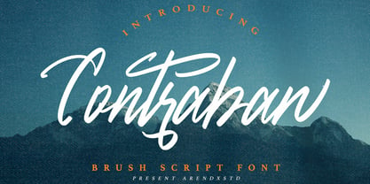 Introducing a Contraban Brush script fonts with sharp and beautiful letters that create fonts that are modern, tendy and elegant. Contraban came with opentype features such stylistic alternates, stylistic sets & ligatures good for logotype, poster, badge, book cover, tshirt design, packaging and any more. Features : • Character Set A-Z • Numerals & Punctuations (OpenType Standard) • Accents (Multilingual characters) • Ligature • Alternate
 - Slogan by Linotype,
$29.99Helmut Matheis originally designed Slogan for the Ludwig and Mayer type foundry in Frankfurt, Germany. Slogan is an informal script of medium weight, with some variation in color. Its caps are flowing and the lowercase letters are close fitting. A lighter, more upright companion was designed by Helmut Matheis as well; its design is named Charme. - Subjective by Arendxstudio,
$15.00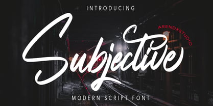 Introducing a Subjective Modern script fonts with sharp and beautiful letters that create fonts that are modern, tendy and elegant. Subjective came with opentype features such stylistic alternates, stylistic sets & ligatures good for logotype, poster, badge, book cover, tshirt design, packaging and any more. Features : • Character Set A-Z • Numerals & Punctuations (OpenType Standard) • Accents (Multilingual characters) • Ligature • Alternate
 - Waiting For My Girl by Hanoded,
$15.00 Waiting For My Girl comes from a System of a Down song (Hypnotize). I was listening to it when I created this font and I liked the name! Waiting For My Girl is a script font - it’s quite loose and uneven, just like proper hand writing. It comes with double letter ligatures and a lot of character!
 - Skid Row by ITC,
$29.00Skid Row is the work of Japanese designer Akira Kobayashi and named after a song from his favorite film, Little Shop of Horrors. It is an informal script typeface whose unique, streaky appearance was first drawn with a brush and then refined to give the typeface an even texture. Skid Row is particularly effective in large display applications. - Rosetica by FadeLine Studio,
$18.00 Introducing Rosetica, a smooth, soft script font in handwriting style which gives the characters of this font a very simple, natural and sweet touch. Rosetica is perfect for logo's, branding projects, homeware designs, product packaging, mugs, quotes, posters, shopping bags, logo's, t-shirts, book covers, name card, invitation cards, greeting cards, and all your other lovely projects.
 - Semiramis by Scriptorium,
$18.00Semiramis is based on lettering from the Roycroft movement, but has a Science Fiction/Fantasy feel to it, drawing on elements from antique scripts and the Art Nouveau period to produce a result which is modern and ancient at the same time. There are two different shapes for each character, accessed with the upper and lower case keys. - Psycho Killer by Hanoded,
$15.00 Psycho Killer is a song by the Talking Heads. It is also one of my favorite songs, so I figured I'd name a font after it. Psycho Killer is a script font; it contains some messy glyphs and gives the overall impression of a hastily scribbled note. Psycho Killer comes with alternates and a bagful of diacritics.
 - Jackart by Arendxstudio,
$15.00 Introducing a Jackart Brush script fonts with sharp and beautiful letters that create fonts that are modern, tendy and elegant. Jackart came with opentype features such stylistic alternates, stylistic sets & ligatures good for logotype, poster, badge, book cover, tshirt design, packaging and any more. Features : • Character Set A-Z • Numerals & Punctuations (OpenType Standard) • Accents (Multilingual characters) • Ligature • Alternate
 - FF Inkling by FontFont,
$30.99 American type designer Joel Decker created this script FontFont in 1997. The family contains 2 weights: Regular and Bold and is ideally suited for advertising and packaging, poster and billboards as well as software and gaming. FF Inkling provides advanced typographical support with features such as ligatures and case-sensitive forms. It comes with proportional oldstyle figures.
 - Lautren by Azzam Ridhamalik,
$16.00 Introducing Lautren, a new delightful bold script with reversed contrast typeface. The Ideas of this fonts came from funny summer vibes mood which is made more neater and smoother. Lautren created with a tons of opentype features like contextual alternates, stylistic sets, ligatures, and swashes at the ending of the letters. A fun typeface to play with!
 - Niquitta Mirzani by Arterfak Project,
$17.00 introducing Niquitta Mirzani, a brand new font combination Script and Sans. The script means signature because the letterform created with quick handwriting, wide, signature-like. The sans serif designed with condensed shapes, semi-bold that gives a large space to be combined with the script one. You can mix and match this font with any layout possibilities. top-bottom, left-right, headline-tagline, or side by side. Niquitta Mirzani script carefully crafted with additional alternates and ligatures that allow you to create a natural typographic design. This font duo is perfect for display such as apparel, name cards, headline, logo, packaging, labels, signage, quote, and many more! The versatile design for many themes such as romantic, professional, formal, or playful! Fonts featured : Uppercase Lowercase Smallcaps Numbers & punctuation Multilingual PUA encoded Swashes Stylistic set 01-03 Ligatures.
 - Seashore Pro by Sudtipos,
$59.00 A feminine, graceful script whose thicker horizontals create a wave-like rhythm — hence the name. Seashore is loosely based on an "eccentric" (left-leaning) penmanship style of the late 19th century. Used mainly by professional "engrossers" in certificates and tributes, or by society ladies in their stationery and invitations, it sent a message of true refinement, as the style would have been only been mastered after the more common business, Spencerian, and standard ornamental styles. In fact, unusual script styles were in such demand that type foundries of the era exploded with metal-type knockoffs of increasing fanciness. Seashore includes a wide variety of swash capitals, alternate endings, and contextual ligatures, over 900 glyphs in all. Seashore is best used in short display settings — in names and addresses on formal invitations, in menus and food packaging, or fashion and beauty contexts.
 - Escritura Hebrew by Vanarchiv,
$21.00 It was my first attempt to drawing a Hebrew alphabet to mach directly with other typeface (Latin) which I already designed. The Latin version is an handwriting display typeface influenced by chancery handwriting from the Italian Renaissance (broad-nib pen). One of the most typographic characteristic is there wavy forms, especially the serifs, where contains some of the main calligraphic references from this font family. The Hebrew script contain reverse contrast, the vertical proportions are more tall and the stroke weight is slightly more strong than latin lowercase to produce a correct visual balance between them, especially on small sizes (text proportions). This Hebrew square book-hand was influenced by Sephardic script style. The Latin characters contains interrupted strokes, the same was made for Hebrew letterforms to transpose correctly the same calligraphic approach between these two different alphabets.
 - Rush by Canada Type,
$24.95Follow us to the future. It is in your face. It is fashionable. It is friendly. It is fly, far-out, funkadelic, fun. But first of all, the future is fast and full. Named after the most famous Canadian rock group of all, Rush is a typeface that wants your full attention. It is square like a bodybuilder's jaw, round like a football player's muscles, and tight like an abdomen after a thousand sit-ups. It gives you plenty of attitude. It commands your respect and lets you know that if you've been thinking of giving up on macho in this brave new world, think again. It tells you that everything has an underlying engine, that every engine hums clockwise, that adrenaline is the name of the game, and if you don't like it, get your sensitive self back to your silly scripts. Rush comes in two fully interchangeable variations: Rush One and Rush Two. While Rush Two is the somewhat predictable, determined pedal-to-the-metal contemporary brute, Rush One is sharper, smarter and more sophisticated in the way it affects a design. While Rush Two's message is a straight-forward one of strength and speed belonging in an overall design, Rush One calls attention to itself first then turns on the wonder about everything surrounding it. Expertly mixing shapes from both fonts in the same word or line can achieve just that perfect form a design needs for its message. Such flexibility and distinction in character design and degree of message relay makes Rush the perfect font package for any design that has anything to do with speed, strength, and proud pursuit of adrenaline. - Bell MT by Monotype,
$39.00 Monotype’s hot metal Bell series from 1931 was based on original types made by the punchcutter Richard Austin for the foundry of John Bell in the 1780s. The different sizes of Monotype’s series were not all based on the same model. As type historian James Mosley wrote on Typophile, “For 18 point and above (the metal type was cut in sizes up to 36 point) Monotype’s model was a larger type [than the model used for the text sizes], the ‘Great Primer’ cut by Austin. This has greater contrast in the capitals and a flat foot to letter a.” The digital Bell closely follows the design of the hot metal 18pt version, and is therefore somewhat lighter in color than the text sizes of Monotype’s original metal face. James Mosley’s Typophile article can be found here.
 - Patzcuaro by Storm Type Foundry,
$28.00Patzcuaro is a summer resort by a lake of the same name. It is situated 370 km west of Ciudad de Mexico and a visitor from Europe, on seeing it, will be reminded of the Austrian Rust or the South Bohemian Trebon. The town's colonial architecture is protected as a historical monument, the reddish-brown tint of the footings of the buildings, their white facades and even the type of lettering with red initials is prescribed - and these regulations are also complied with as far as cars are concerned. This colour scheme is splendid in combination with the rich gamut of greys of the stone window jambs, vaults, lintels and pillars. Joking apart, even the local petrol station is 16th-century in appearance. Patzcuaro Regular is a cosy, welcoming type face which is good for use on labels. - Blackletter Moderne JNL by Jeff Levine,
$29.00 Blackletter Moderne JNL was inspired by the original 1935 pencil drafts for “Deutsche Schrift” (German script); designed for the country’s railway system – and is available in both regular and oblique versions.
 - Dimitrina by Evolutionfonts,
$- Dimitrina was created with a simple premise: Can there exist a typeface which features a minimum of sharp angles? And a readable typeface, as well? With these strict rules in mind, the development started. At first the typeface looked more like a script, and some characters ( M G or R, to name a few) still hold traces of a handwritten style which spices the overall taste of Dimitrina. Since the first draft every character was redrawn, and edited several times, for the purpose of making the typeface readable, and distinct at the same time. Estimate for yourself if our goals are achieved, while you observe the three weights which are available exclusively in MyFonts. All of them feature a full set of characters plus cyrillic support. You can also try the regular weight which is offered free.
 - Holiday by alphArt,
$13.00 Introducing our UPDATE "Holiday - Script Handwritten Font" Two years ago we created a script handwritten font that we named Holiday, we didn't expect, hundreds of designers have use the Holiday font, this is really cool font. And today, we've been working hard to make this Holiday font even better, it's the best script handwritten font we've ever made, we've named it Holiday2. Holiday2 - Script Handwritten Font is a handwritten script font with a simple and classy style, this font is great for your next creative projects such as branding, watermark on photography, signature or signature logo design, quotes, album cover, business card, and many other design project. From business cards to photo watermarks, Holiday2 is here to elevate your work to the highest level. However, we still included our old Holiday font, we created Holiday2 to be easier to read and of course with a better design and clean. Holiday comes with uppercase letters, lowercase letters, lowercase alternative letters, numbers, punctuation, ligature and multi lingual support To use alternative end text is just block end letters and select alternative letters on glyphs option. it may be used in almost any program by using your Operating System’s utilities (CharacterMap for Windows and Font Book for Mac.), as well as Illustrator, Photoshop CC 2017 and several other applications. we hope you enjoy this font. If you have any questions please don't hesitate to drop me a message :) Thank you, Best regards alphArt
 - Giambattista by Wiescher Design,
$39.50 Giambattista is a long-time project of mine finally come to an end. After redesigning all of Giambattista Bodoni's work and then some additional cuts I started a long time ago with this Non-Bodoni Bodoni. The idea came to me while redesigning the original Chancellerosa (chancery). I thought Bodoni just didn't have the right approach to a chancery, this was just not his cup of tea! Maybe that is why he never used the Chancellerosa very much for his own printshop in Parma. So I thought someone has to design a script, that looks like Bodoni could have designed it but is more lively than his. Over the years I have been working on and off on the face and it turned out to become three typefaces which can be freely mixed. Here is my modern version of a script in the style of Giambattista, meant as an hommage, I called it Giambattista. Your modern scribe Gert Wiescher
 - Baldufa by Letterjuice,
$66.00Baldufa is a charming typeface with strong personality, which looks very comfortable in text. There is a search to obtain complicated curves and detailed features, which give the typeface a touch of beauty and elegance. However, this is also a self-conscious design that claims appreciation for quirkiness and human imperfection through the rounded serifs and irregular vertical stems. The typeface family is also a multi script project, containing Latin and Arabic scripts. The Latin consists of Regular, Bold and Italic styles, including Small Caps and many other typographic features. Whereas Arabic Naskh includes Regular and Bold weights. The whole family has been designed to work harmoniously together to help to produce catalogues and small publications of cultural content. We believe that Baldufa is a tiny but nice contribution to build bridges between cultures and this make us very happy. The letterforms in the Latin are inspired by the slight distortions and idiosyncrasies that came with old printing methods. It has distinct, features such as rounded serifs, irregular vertical streams, ink traps and extremely thin junctions. In the Italic, serifs have been removed to enhance movement and expressivity. These experiments in form have not come at the cost of legibility: The typeface remains suitable for both small and display text. To certain extent, the design of the Arabic gathers the same interest for experimentation than its Latin companion. Baldufa Arabic respects the basic features of Arabic script such as thick stokes in the baseline, multiple vertical axis, genuine stem modulation and good linking between words. However, it steps away from traditional Calligraphic Style. It has rounded top terminals and the traditional contrast between curves and straight stokes has been softened. Letter shapes sometimes slightly differs from tradition in order to obtain more expressivity. Overall, Arabic has been designed to acquire the same elegant and quirky aspect of the Latin. - SoulCalibuR - 100% free

- VLNL Bint by VetteLetters,
$35.00 Kornelis de Vries, a headmaster from the Dutch province of Friesland, cultivated new potato breeds that he named after pupils in his school. In the early 1900s he came up with the tasty Bintje (a Frisian girl’s name) and it became a big success – in Belgium and France it has remained the most popular potato for french fries to this day, more than a century since its introduction. Donald Roos took 10 kilos of fresh Bintje potatoes and cut the Bint typeface by hand with a short, sharp knife. He then inked each character once and printed it twice; the second, lighter printing is accommodated in the lower case alphabet. The Bint family offers a script to make the letters bounce up and down the baseline; with OpenType functionality the font randomly chooses each character from the upper- or lowercase alphabet. ‘Tabular lining figures’ will activate a series of negative numerals in boxes; ‘Discretionary ligatures’ activates specially designed letter combinations like ‘www’ as well as arrows and stars. Bint has a distinct, slightly rough handmade appearance, making it useful for a wide range of designs.
 - Monkton Incised by Club Type,
$39.00 The inspiration for this typeface family came from my childhood experiences at West Monkton, amidst an historic part of the South West of England. Studies of the original incised capitals of the Trajan column in Rome were analysed and polished for this modern version. The lower case letterforms and numerals were then created in sympathy, taking their proportions from the incised letters of local gravestones. Its name honours not only the area where the original alphabet was conceived and drawn, but also the people responsible for fostering my initial interest in letters. These stylized incised typefaces give a depth to the letterforms that can be exploited in your typography - evoking the carved monumental inscriptions of the Roman era.
 - Rough Love by Positype,
$27.50 Rough Love, it’s fair to say, came before Love Script. The brushed letter specimens that would ultimately serve as the template for the much ‘cleaner’ Love Script have now been turned into a typeface. As I packed these up, I just kept coming back to them and staring at the texture and movement caught on the page. On a lark, I decided it would be fun to let people see an almost a before and after scenario of how one led to the other and decided to produce a typeface from these specimens… Rough Love. For the most part, in typical fashion for me when I brush out a typeface idea, I try to brush the entire character set along with each of the planned variants for swashes, titling, and other alternates—the reason for that is simple -- each letter looks and acts a bit differently when the same movements are imposed on them. With Rough Love, I tried to adhere to that and made very few modifications to the originals, and only had to ‘borrow’ in a few occasions when I happened to forget to brush a variant.
 - Casandra Lie by IbraCreative,
$17.00 Casandra Lie – A Chic Monoline Script Font Casandra Lie, a name like a whispered secret, perfectly embodies the essence of this chic monoline script font. Imagine the delicate stroke of a fine penmanship teacher gliding across paper, leaving behind an effortless trail of ink that dances and twirls with understated elegance. Every letter whispers tales of romance and intrigue, their slender forms adorned with graceful swashes and subtle flourishes that hint at a hidden passion. Think vintage Parisian boudoirs illuminated by candlelight, secret love letters penned under twilight skies, and the airy charm of handwritten invitations to soirees under the stars. Casandra Lie is not merely a font; it’s an invitation to a world of whispered dreams and unspoken promises, etched in ink as delicate as a spider’s web, yet strong enough to capture the beating heart of a story waiting to be told. Casandra Lie is perfect for branding projects, logo, wedding designs, social media posts, advertisements, product packaging, product designs, label, photography, watermark, invitation, stationery, game, fashion and any projects. Fonts include multilingual support for; Afrikaans, Albanian, Czech, Danish, Dutch, English, Estonian, Finnish, French, German, Hungarian, Italian, Latvian, Lithuanian, Norwegian, Polish, Portuguese, Slovak, Slovenian, Spanish, Swedish.
 - AT Move Nath! by André Toet Design,
$75.00 NATH !* Is a peculiar typeface. It’s design came by the fascination of Optical Illusions and 3D on a flat surface, like with Holborn and Powerplay. The typeface is named after a girlfriend of André Toet. *Made in the UK, 1974, London (Central School of Art & Design). (Redesigned 2013 by André Toet / Jasper Terra). Concept/Art Direction/Design: André Toet © 2017
 - Weekly Bazaar NF by Nick's Fonts,
$10.00Here’s another nostalgic beauty from the Central Type Foundry of St. Louis, originally titled Harpers, designed for the popular newsweekly of the same name. Its bouncy, quirky letterforms will add vitality and visual interest to your headlines and subheads. All versions of this font include the Unicode 1250 Central European character set in addition to the standard Unicode 1252 Latin set. - Amorphic by Ali Güzel,
$11.00 Chrome Balance is an experimental bitmap font created by photographing hand-modeled play dough and adding a chrome effect. It has a unique and dynamic look and is designed to accompany bold and simple designs such as album covers, posters etc.. The vector version of the same form has also been converted to the vector format, font named Amorphic. IG: algzl
 - Frozen Tree by Epiclinez,
$18.00 Frozen Tree is a thick lettered yet friendly display font. Whether you are using it for cartoon-related designs, children's games, quotes, titles, brand names, book covers, posters, or just any creation that requires a touch of joy, this font is a great choice. So what's included : Basic Latin A-Z & a-z Numbers, symbols, and punctuations Accented Characters : ÀÁÂÃÄÅÆÇÈÉÊËÌÍÎÏÑÒÓÔÕÖØŒŠÙÚÛÜŸÝŽàáâãäåæçèéêëìíîïñòóôõöøœšùúûüýÿžß Thank you
 - Hennepin by Josh Grzybowski,
$24.99 Hennepin derives from a bridge, a street and a county that share the same name in Minneapolis, MN. It is a serif font comprised of three agile weights: regular, light, and extra light. The character set contains typical OpenType features in addition to small caps, and old style numbers, but most importantly, it embraces stylistic alternatives that unite and complete this font.
 - II Balfron by Increments,
$19.00 Inspired by Ernö Goldfinger's east London tower block of the same name, II Balfron is an imposing, all caps, one-weight typeface. Brutalist in form, the characters embody the principles of the distinctive 27-storey concrete profile with unexpected angles set within a rigid, structural grid. Much like Goldfinger's humanist, utopian housing ideals, the font is best viewed at large scale.
 - Pirate Bay by Vozzy,
$5.00 A vintage look label font named "Pirate Bay".Typeface includes five styles plus aged version, for sample look at 4th preview. This font will good viewed on any retro design like poster, t-shirt, label, logo etc. For using effects layers: - Type your text in Regular. - Copy that and paste at the same position. - Change the style to Effects, Shadow or Texture.
 - Virago by Khoir,
$15.00 Virago Font consists of two alternative fonts namely Regular Virago which has a modern and contemporary soft impression while Virago Alternate has an old-fashioned vintage impression, both of which have their own distinct impression but have the same advantage of having lots of alternative fonts that make it easier for you to use it, so what are you waiting for?
 - Slotrip by PintassilgoPrints,
$20.00 Original and highly decorative, Slotrip family is suited for creative and eye-catching display uses: posters, book covers, packaging, t-shirts, you name it. It won't go unnoticed. The family has 2 styles, both are unicase – upper- and lowercase forms have the same height. Stylistic alternates are available for some letters. Broad language coverage? Yes. Both fonts? Absolutely. Definitely trying? Amazing!
 - Novadam Obese NF by Nick's Fonts,
$10.00This typeface derives both its style and its name from a logotype design for an eponymous magazine, executed in the 1940s by Catalán type designer Joan Trochut Blanchard, of Supertipo Veloz fame. Its strong geometric forms and large x-height make for commanding headlines. Both versions of this font include the complete Unicode 1252 Latin and Unicode 1250 Central European character sets. - Juxta by NaumType,
$19.00 Juxta is a unique experimental and futuristic script. It was born from the idea to combine two antipodes: programming fonts aesthetics and handwritten script. Juxta has witty and jagged character combined with a perfect grid structure and certain decorative elements, such as cross out letters, that gives it the spirit of Nordic minimalistic design. Juxta script is a part of Juxta superfamily, united by the same aesthetics, which currently also includes Juxta sans. Juxta script is available in 7 weights, including Thin, Light, Regular, Medium, SemiBold, Bold, and Black. It is a potential leitmotif of graphic design projects that need a creative breakthrough, including logos, labels, branding, identity, website design, album art, posters, advertising. Juxta offers standard ligatures, contextual and stylistic alternates. It extends multilingual support to Basic Latin, Western European, Euro, Catalan, Baltic, Turkish, Central European, Pan African Latin, Afrikaans, and Basic Cyrillic for exceptionally far-reaching global accessibility.
 - Breeder by Scratch Design,
$9.00 Introducing Breeder Font Duo it's a handwritten script. Enjoy this playful font in your designs with Breeder Script & Breeder Small Caps! This playful font consists of a natural handwritten and signature style, so this font is perfect for logos, menu design, social media posts, packaging, poster, name card, birthday card, etc. Breeder Script has a natural flow handwritten signature containing upper & lowercase characters, numerals, and punctuation. This font also has a ligature, stylistic alternate, swashes, multi-languages support, and doodles art for the bonus of this font. Breeder Small Caps comes with a natural & simple handwritten all-caps font. Complete with a-z letters, very charming handwritten font, and perfect for combining with Breeder Script. This font also includes multi-language support. Thank you for checking and visiting our store, and feel free to drop me a message if you had any questions! Visit our Instagram :) www.instagram.com/scratchdesignbali
