10,000 search results
(0.203 seconds)
- Lamp Post JNL by Jeff Levine,
$29.00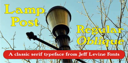 Lamp Post JNL is a digital interpretation of a design popular in the early 1900s called Post Old Style; no doubt inspired by a certain Saturday periodical with a similar name. There is an intrinsic charm to lettering that evokes a hand-made look, and this design is a perfect example of the genre. Available in both regular and oblique versions, it will add the nostalgia of simpler times to any print or web project.
 - Pinatas Masters by Piñata,
$17.00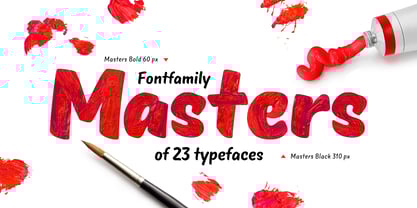 Original Foundry: TypeType Original name: TT Masters Pinatas Masters is a very emotional typeface. This typeface will add to your design sincerity and warmth. Pinatas Masters typeface consist of 4 different subfamilies: Pinatas Masters, Pinatas Masters Birds, Pinatas Masters Rough and Pinatas Masters Condensed. Each subfamily consists of 5 styles: Thin, Light, Regular, Bold and Black. Scope of typeface: DIY, handmade stuff, interior design, infographics, graphic design, logotypes, packaging, design of exhibitions, presentations.
 - Hleba Soli Ziamli Voli by Koval TF,
$39.99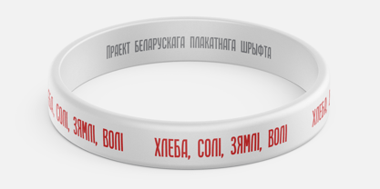 Hleba Soli Ziamli Voli typeface is a graphic discovery on title type that combines traditional poster shapes with Humanist notes from Renaissance. Hleba Soli Ziamli Voli is named after Belarus poem by Yanka Kupala and inherits some original glyph designs from Renaissance printings by Francisk Skoryna. Hleba Soli Ziamli Voli due to wide variety of weights is great for titles and posters. Cyrillic and Latin support makes the type sutable for multilingual communications.
 - Mrs Eaves by Emigre,
$125.00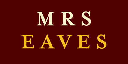 This typeface is named after Sarah Eaves, the woman who became John Baskerville’s wife. As Baskerville was setting up his printing and type business, Mrs. Eaves moved in with him as a live-in housekeeper, eventually becoming his wife after the death of her first husband, Mr. Eaves. Like the widows of Caslon, Bodoni, and the daughters of Fournier, Sarah similarly completed the printing of the unfinished volumes that John Baskerville left upon his death.
 - Graficz by MAC Rhino Fonts,
$36.00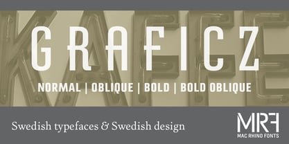 The origin of this typeface is a Polish catalog cover dated 1936, made by I. Rubin. The word ”Graficz” (included in the poster copy) seemed appropriate as a name for this typeface with its typical ”Central European look”. The original letters are more ”thin” (light weight) than the MRF interpretation and only consists of capital letters. Lower cases and almost all standard character signs have been added, in order to make it more functional.
 - Miss Demeanor by Typadelic,
$19.95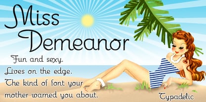 Miss Demeanor has a tendency to create her own rules due to her free-spirited nature. She conforms to every day typographic expectations but she wouldn’t like you to think so. She has unusual yet casual and eye catching shapes and makes the best of any situation. I hope you enjoy her pretty style! My inspiration for Miss Demeanor came from a specimen sheet of an american type style from the early 1930’s.
 - Tonus by Hurufatfont,
$29.00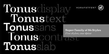 Tonus Super Family; It is a family of five character styles built on the same skeleton. The entire Tonus Family is built on the skeleton of the "sans" family, it is the only family where five different styles are presented together. All families have an equal number of characters. It has rich opentype features. It inspires designers for different and creative applications such as brand building, periodicals, packaging, and social cultural event designs.
 - Decutto by Michael Rafailyk,
$15.00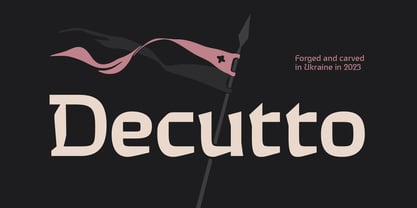 Decutto is a neo-grotesque that packs the Marionette formula and some blackletter ideas into a low-contrast sans serif design. Its name plays on the phrases “off cut” and “cut to” which express the key feature – the contemporary legible letter shape is decorated with cut carved edges and counters, giving the typeface crisp and simplistic look, like that of an old minted coin. Scripts: Latin, Greek, Cyrillic, Hebrew. Hinting: Manual PostScript.
 - ITC Eastwood by ITC,
$29.99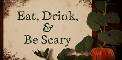 ITC Eastwood is the work of British designer Martin Archer and is named for Clint Eastwood. Archer was looking for a plain oldstyle typeface with open lower case forms and used Stempel Garamond as his starting point, although the result ended up well beyond its origins. In small point sizes the typeface looks interestingly rough while at display sizes it looks like a 16th century French typeface and its unique details come forward.
 - Wild Comedy JNL by Jeff Levine,
$29.00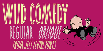 John Sigvard ‘Ole’ Olsen and Harold Ogden ‘Chic’ Johnson were musicians-turned-comedians who rose to fame in the zany 1938 Broadway musical review “Hellzapoppin'”. They reprised their roles in the 1941 film adaptation of the show, and the opening title card of the film has “Hellzapoppin'” hand lettered in a tall, condensed sans serif design with an inline. This is now available as Wild Comedy JNL in both regular and oblique versions.
 - Factor BF by Bomparte's Fonts,
$39.00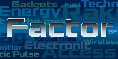 Factor BF takes inspiration from automotive lettering, and has elements of techno. It’s clean, strong and friendly, due to its overall soft, square, sturdy letterform construction. OpenType features include stylistic alternates for letters Q, a, e, f, y and ß; as well as automatic fractions, that are accessible in OpenType capable applications. Consider Factor BF for use in branding, signage, and logos to name just a few of its many areas of application.
 - ITC Klepto by ITC,
$50.99The ITC Klepto™ typeface from Phill Grimshaw is a hunkered down, bulldog blunt design. It's bold, rough around the edges, and more than a little quirky. ITC Klepto's extended character set, however - which even includes Greek and Cyrillic designs - makes the face a versatile international player. Grimshaw claimed that the name "Klepto" was a natural because the design was stolen from a series of headlines he drew for an advertising campaign - PiS LIETZ Berlham by PiS,
$38.00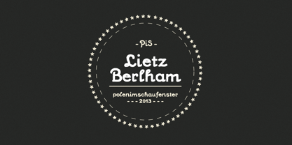 Need a perfect typeface for your post-apocalyptic shooting game? A documentary about suffragettes? Your vintage themed coffeeshop? PiS Lietz Berlham! Boom! Just as his straighter brother LIETZ Lindham, Lietz Berlham evokes the spirit of the 1920s and 30s. Hand-drawn and rough, it is perfect for large scale use in all things retro, but legibility is given also in smaller sizes. It features over 370 glyphs, ligatures and special characters. Have fun!
 - Oyko by The Northern Block,
$39.00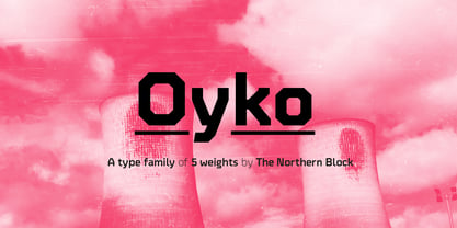 A geometric typeface that follows the grid but understands the rule to go off-grid. The design is sharp, square and engineered yet has plenty of craftsmanship in each character to give it a more human and friendly touch. Oyko is best suited to immersive interfaces, including mobile apps, video games, virtual reality and the web. Details include five purposeful weights with italics, over 500 characters, five variations of numerals, stylistic zeros, and OpenType features.
 - Bonus Jerk by PizzaDude.dk,
$17.00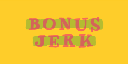 Serifs gone crazy! They are legible and recognisable and at the same time jumpy, skewed and random! What makes it really cool is that every letter has 5 different versions - and they automatically cycle as you type. That will make your text look quite random and more authentic (rather than obviously repeating letters!) Bonus Jerk also comes with a complimenting Box version - a handdrawn background layer, made to make the letters stand more out!
 - Parula by Atlantic Fonts,
$26.00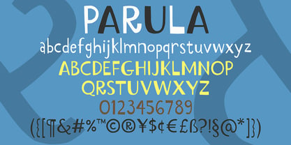 Parula is cool and lively like its sweet warbler namesake. Hand-drawn with lots of unique personality and line variation, Parula lends itself to any creative project requiring youthful energy. With double-letter ligatures and more, Parula has lots of charming options, easily turned on or off. Whether creating a look for a fun family game or the cover of a new children's book, Parula will be noticed. Parula pairs beautifully with Turmeric!
 - Terital United by Letterbox,
$80.00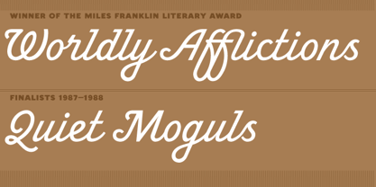 The long and frustrating search for a dynamic, monoline script drew our attention to the lack of such a typeface. This prompted us to create our very own, Terital, named after the 1960s Italian overcoat advertisement that was the original reference point for its 2003 creation. Fearing the odd all-caps script setting, we cheekily designed Terital as a lowercase set. This limitation was revised in the 2011 version. Beautiful swash capitals were also added.
 - Jaunty Gent NF by Nick's Fonts,
$10.00In 1936, Erich Mollowitz designed a typeface named »Rheingold Kräftig« for the German type foundry J. D. Trennert & Sohn (Hamburg-Altona). The original letterforms have been extended and beefed up a bit, and the result is a rollicking, righteously retro romp…a perfect choice when you want to strut your stuff. The PC Postscript, Truetype and Opentype versions contain the complete Latin language character set (Unicode 1252) plus Central European (Unicode 1250) languages as well. - Prism by Stereotypes,
$-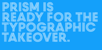 Prism was mainly inspired by two things, the sketches of Rudolf Koch for Prisma and the proportions of Avant Garde by Herb Lubalin. Even when the proportions and widths stay the same from ExtraLight to Black, you get the opportunity to change the weight and get a complete new look for that typeface by changing the grayscale or color. It is a modern combination for headlines, that want to have a different look.
 - Duetto by ParaType,
$25.00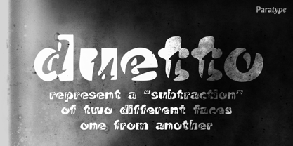 The letterforms of this face represent a "subtraction" of two different faces by weight, style, and shape -- one from another. The shapes of TM Miniature Italic are subtracted from FreeSet Bold with subsequent deconstruction. Though the spots may look amorphous they create images of both external and internal. At the same time none of them is explicit. The alphabet is lower case only. Designed by Boris Popov and licensed by ParaType in 2002 .
 - Baby Cakes NF by Nick's Fonts,
$10.00This robust, roly-poly typeface is patterned after a 1974 release from the Ludwig & Mayer foundry of Frankfurt am Main named Big Band, and designed by Karlgeorg Hoefer. The type color is even darker than the original, and the result is a delightful face that will definitely attract attention. The PC Postscript, Truetype and Opentype versions contain the complete Latin language character set (Unicode 1252) plus Central European (Unicode 1250) languages as well. - Herkimer Bunrab NF by Nick's Fonts,
$10.00Eh, what's up, Doc? This cuddly little oddball of a typeface was originally released under the rather unlikely name of Hercules by the Amsterdam Typefoundry in 1926. This face includes OpenType Stylistic Alternates for b, h, h, k and l, which feature very tall ascenders with a "bunny ear" vibe. Both versions include the complete Latin 1252, Central European 1250 and Turkish 1254 character sets, as well as localization for Moldovan and Romanian. - Sporting Chance JNL by Jeff Levine,
$29.00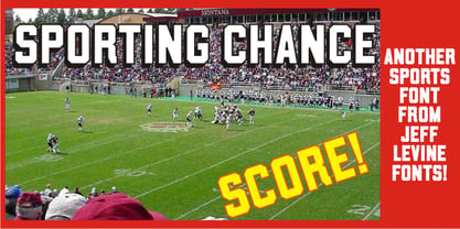 Lettering has an unusual way of adapting itself to many needs. The type style for Sporting Chance JNL was based on metal house identification letters used for Welcome Home JNL. The same type of block design was prevalent in 1920s-1930s era window signage via die-cut foil characters. Yet we tend to nowadays associate block lettering with sports-themed items. No matter the application, Sporting Chance JNL will fill the bill.
 - North End Stencil JNL by Jeff Levine,
$29.00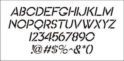 An image of a vintage British lettering stencil set [probably circa 1960s] spotted in an online auction inspired North End Stencil JNL. The original lettering was a hybrid of both stencil and solid letter forms, but for the digital version all of the characters were given the stencil treatment. North End Stencil JNL is named after a district in London, and the type face is available in both regular and oblique versions.
 - Culpepper by Galapagos,
$39.00I've always admired the work of Rudolph Koch. Culpepper is what I think Neuland would have looked like if it had been developed with lowercase, small caps and a range of weights. I started work on this series in the late 80’s and, like so many of my ideas, it was shelved when life drew me in another direction. Culpepper is the name of one of the islands in the Galapagos chain. - Olimpico by MAC Rhino Fonts,
$59.00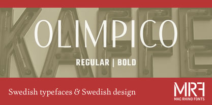 The name of this typeface is a hymn to the Stadio Olimpico in Rome. The home arena to the World's most beautiful football club – AS ROMA. A club with many great players through the years. The biggest of them all, is already a living legend… Francesco Totti. The design is a 2-weight family perfect for elegant display work. The regular weight is more even in blackness while the bold weight carry more contrast.
 - Coma by Barnbrook Fonts,
$30.00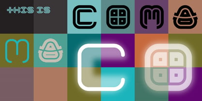 In its original form Coma was designed for use alongside Japanese typography. The uniform shape of Coma's letterforms allow it to be set horizontally or vertically with equal ease. With a striking profile, modular form and contemporary character, Coma can be used in myriad configurations. The name Coma refers to the perplexity of contemporary existence, to be assaulted by an endless stream of news and stimuli, and to feel paralysed and exhausted by it all.
 - XAirebesk by Ingrimayne Type,
$14.95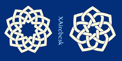 I am not sure exactly how to classify these geometrical ornaments. They resemble the arabesque ornamentation of medieval Islamic art, but also have similarities to Celtic knots and to some Chinese and Korean ornamentation. The bolder of the two only works well at very large point sizes, while the thinner is designed for use at smaller point sizes. There are usually similar ornaments on the same characters of the two, but not always.
 - Lorelei by insigne,
$21.99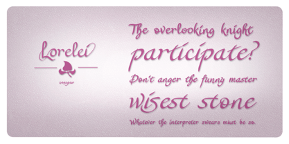 Lorelei is an exuberant and bouncy script. The ink seems to be slathered onto the surface in a casual and spontaneous manner, making for a flowing and feminine script that is perfect for invitations or greeting cards. The script also contains a large number of OpenType alternates and ligatures to extend the impulsive nature of the lettering. Lorelei is named for a young German maiden that supposedly threw herself into the Rhine.
 - NOh Carbone by OhType!,
$32.00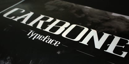 NOh CARBONE is a serif typeface with more than 250 glyphs, including Capitals, Small Letters, Numbers & Special glyphs and Punctuation. Appropriate for medium and large formats, its high contrast, strong features & aggressive and unconventional diagonal endow it with great elegance and give it distinction over other types of the same style. This typeface is adapted to different topics and applications, is easily modifiable and capable of generating a clear and direct message.
 - Mithella by Lafontype,
$19.00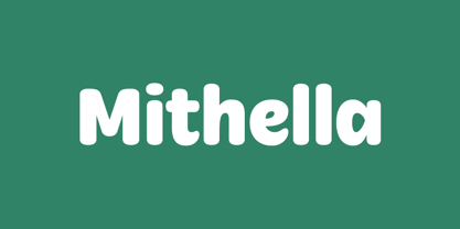 Mithella is a sans serif family with a pleasant touch. Some letters, especially linear ones, look normative like other rounded sans serifs, but the difference can be seen clearly in curved letters so that it gives a pleasant impression for each series of words. Mithella comes with eight weights ranging from thin to black to complement your design needs be it branding, blogging, logos, advertising, games, cooking, packaging, editorial and publishing, web and screen design.
 - Vintage Stencil Motifs JNL by Jeff Levine,
$29.00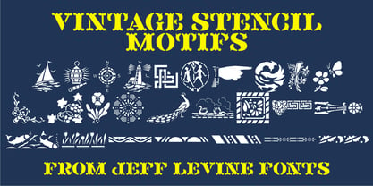 Vintage Stencil Motifs JNL is a collection of charming and decorative designs re-drawn (as the name indicates) from vintage source material. For decades, home decorators and do-it-yourself hobbyists embellished furniture, chests, walls and other areas with thematic stencils in both borders and topical vignettes. Today's digital designers can use these stencil patterns to embellish text set in other stencil alphabets or by themselves to evoke the feeling of rustic Americana.
 - Cartoon Nouveau JNL by Jeff Levine,
$29.00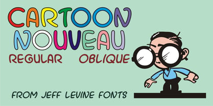 Most of the lettering on a piece of sheet music for a song from the 1921 George M. Cohan musical comedy entitled “The O’Brien Girl” was hand lettered in a playful, casual Art Nouveau design with rounded ends. The characters on that page took on a look reminiscent of cartoon or comic strip wording, and the result is a digital typeface named Cartoon Nouveau JNL, which is available in both regular and oblique versions.
 - Refillia Calligraphy by Aldedesign,
$18.00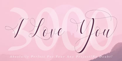 Refillia Calligraphy is a stylish calligraphy font that features a varying baseline, smooth line, modern and with a depth love. For those of you who are need a touch of love and modernity for your designs or branding, it can be used for various purposes such as headings, wedding, invitation, signature, logos, branding, t-shirt, letterhead, signage, label, news, posters, badges etc. Just imagine that your customers love to see something beautiful, elegant, and warm, right? You don’t need to get confused to find an interesting font to attract their attention. We have a special font namely Refillia. The font design looks simple without losing its elegance and warmness. The function of the font is to show that you have a modern spirit to serve high-quality products and services. We design this font with OpenType features to give an artistic touch on it. This font is also applicable for numbers, punctuation, and other languages. It is also a multifunction font where you can use for a business logo, branding, wedding invitation, and anything you want. We'll have more great and artistic fonts. Just check our font collection by visiting Our Profile. Then, pick your most favorite font and use it to reach your goals.
 - Fresh Lemons by Yumna Type,
$15.00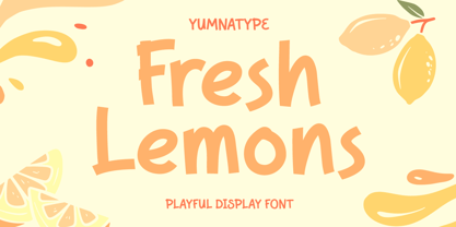 Your font choice is important because without the right font, you have a higher risk of failure to attract the audience's attention resulting in having a big trouble competing with competitors. A good font shows characters of your projects and makes them more prominent than the others. Therefore, Fresh Lemons is here to be the perfect, eye-catching font option. Fresh Lemons is a visually amazing display font with thin lines suitably applied for a more elegant, modern looking display. In addition, such a font shows professional, high quality nuances on your designs due to the simple forms and consistent proportions to be legible enough. You will receive a clipart as a bonus and you can also enjoy the available features here. Features: Ligatures Multilingual Supports PUA Encoded Numerals and Punctuations Fresh Lemons fits best for various design projects, such as brandings, posters, banners, headings, magazine covers, quotes, invitations, name cards, printed products, merchandise, social media, etc. Find out more ways to use this font by taking a look at the font preview. Thanks for purchasing our fonts. Hopefully, you have a great time using our font. Feel free to contact us anytime for further information or when you have trouble with the font. Thanks a lot and happy designing.
 - Sweet Jasmine by Nathatype,
$25.00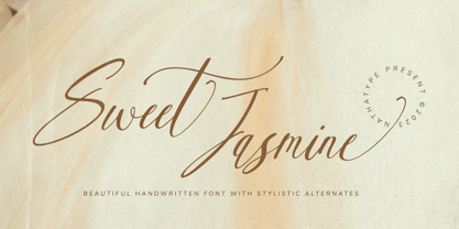 Are you having trouble finding a perfect font for your projects? Using an inappropriate font will only show unprofessional, uninteresting projects and leave bad impressions to the audience. Therefore, let us introduce you to our script font to help you create lovely, unique, prominent designs. This is Sweet Jasmine. Sweet Jasmine is a handwriting-like script font created with mixing the natural handwriting elements with natural nuances to produce warm, flowing-looking designs. Its letters are interconnected in high contrasts, and it is suitable to apply for big text sizes because it has somewhat complicated font style details to ease the font to read. In addition, you can enjoy the available features here. Features: Ligatures Stylistic Sets Multilingual Supports PUA Encoded Numerals and Punctuations Sweet Jasmine fits best for various design projects, such as brandings, posters, banners, headings, magazine covers, quotes, invitations, name cards, printed products, merchandise, social media, etc. Find out more ways to use this font by taking a look at the font preview. Thanks for purchasing our fonts. Hopefully, you have a great time using our font. Feel free to contact us anytime for further information or when you have trouble with the font. Thanks a lot and happy designing.
 - Rough Hearts by Nathatype,
$29.00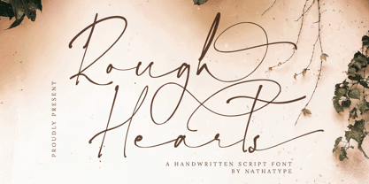 Do you want a handwriting style font in consistent, professional displays? Well, finding such fonts can be tough and time-consuming work. Therefore, Rough Hearts is here for your perfect choice. Rough Hearts is a font in a handwriting style with different, more natural shapes looking like spontaneously written letters. Each letter detail is made in swinging styles and this font also has high letter contrast, which means the thickness and thinness differences of the lines on each letter can be clearly seen. This font produces personal and creative impressions resulting in its legibility and attractiveness to apply for simply interesting design projects. You can use this font for big text sizes to be greatly legible and also enjoy the available features here. Features: Alternates Ligatures Stylistic Sets Multilingual Supports PUA Encoded Numerals and Punctuations Rough Hearts fits best for various design projects, such as brandings, headings, magazine covers, quotes, printed products, invitations, greeting cards, name cards, merchandise, social media, etc. Find out more ways to use this font by taking a look at the font preview. Thanks for purchasing our fonts. Hopefully, you have a great time using our font. Feel free to contact us anytime for further information or when you have trouble with the font. Thanks a lot and happy designing.
 - Dragonflight Pro by Fontforecast,
$29.00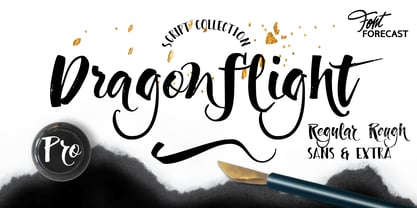 Dragonflight Pro is a script collection of four modern calligraphy fonts. Each glyph was hand-drawn with a brass folded pen dipped in ink. The tip of the folded pen resembles the shape of a dragonfly’s wing, hence the name. By tilting the pen variations in line width are made. This produces fun, expressive letters with a spontaneous personality. The regular and rough version of Dragonflight Pro have alternate glyphs that can either be accessed by the swashes feature, stylistic set 1, or the glyphs panel, depending on the application you are using. There are lots of discretionary ligatures that offer even more variation. By typing _1 to _10 you can access bonus swashes that are part of Dragonflight Pro Regular and Rough. Both fonts have 567 glyphs. Dragonflight Pro Sans is an all caps font with 402 glyphs, also hand-drawn with the folded pen, that compliments the other styles perfectly. Dragonflight Pro Extra offers an additional 117 swashes, doodles and ink splatters. With Discretionary Ligatures activated you can type an underscore in front of a letter and (when available) this gives you the rough version of the glyph.
 - Colorado by Juliasys,
$-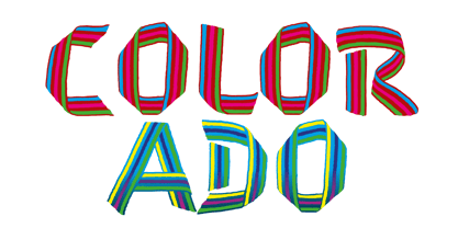 Nature is fond of stripes. Animals have them, plants have them and the rainbow has them. Besides being beautiful, stripes in nature have various origins and functions. But only Homo sapiens gave them symbolic meaning. In the American flag, the 13 stripes symbolize the 13 colonies that declared independence from Britain. In the French “Tricolour” flag, they represent Paris and the king of France. And in Russia’s “Georgiyevskaya lenta,” they symbolize the death and resurrection of St. George, the dragon-slayer. The font family COLORADO , named after the beautifully striped Colorado potato beetle, can be used to construct all kinds of symbolic or just beautiful messages. And thankfully, you need no OpenType diploma to do this. To get your texts multi-striped and multicolored, follow this simple procedure: Write the message with one of the COLORADO fonts and apply a color. Then copy and paste in place, and apply a second font and color. Repeat this again if wanted – and the masterpiece is done. COLORADO ’s language support covers about 100 languages. It has a Western European, a Central European and an Extended Cyrillic character set.
 - Caminito by JVB Fonts,
$15.00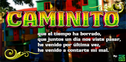 This fontface is inspired on Argentinean classic and traditional art craft named as Fileteado Porteño. Caminito is available in 10 layered styles for compose with multi combinations and a extra of ornaments. Highly recommended to be used for colorized titles and display texts. Fileteado Porteño is a type of artistic drawing, with stylized lines and flowered, climbing plants, typically used in Buenos Aires, Argentina. It is used to adorn all kind of beloved objects: signs, taxis, lorries and even the old colectivos, Buenos Aires’s buses. Filetes (the lines in fileteado style) are usually full of colored ornaments and symmetries completed with poetic phrases, sayings and aphorisms, both humorous or roguish, emotional or philosophical. They have been part of the culture of the Porteños (inhabitants of Buenos Aires) since the beginnings of the 20th century. One of the most highlighted and recognized artists nowadays is Alfredo Genovese, who does a great job of teaching and claim this art and craft. The name Caminito reminds the emblematic and iconic Buenos Aires neighborhood immortalized by Carlos Gardel in music, in the tango.