10,000 search results
(0.045 seconds)
- ASTYPE Ornaments Accolades A by astype,
$28.00 The astype series Accolades A offers the designer a fine balanced set of calligraphic swashes, swirls and floral ornaments. The shapes are in systematic order and harmonize in contrast and detail. The shapes can be combined easily and the advanced designer can build hundreds of sophisticated compositions. No matter, whether packaging lables, invitations or greeting cards - every assignment with the need of a delightful appeal will be served well. Accolades A and A2 share the same base set of ornaments but differ in some of the major shapes. Despite these differences, the total width of the shapes will be always the same. If you are looking for some good companion fonts, give Gracia and Adana a try. Every classic high contrast stroke design like Didot or Bodoni works well. Note: To look perfect, adjust the size of the ornament font to fit in contrast the design of the companion font. So if you use a Bodoni font as companion, try to match the thickness of the thinnest part of a upper case Bodoni letter with the thinnest part of a shape from the ornament. Note 2: Each package comes with a technical documentation and an InDesign2 sample file.
 - Kang Meatball by Midvel,
$15.00 Kang meatball inspired by brush pen calligraphy. Characters shape based on brush pen stroke. Start by making words with brush pen on paper. Some words that have suitable shape are selected to be the initial inspiration for the font design. We draw calligraphy for uppercase, lowercase and number character. After drew Calligraphy character, next process is design digital lettering. We design Uppercase, lowercase, and number character in digital. Add puctuation and ligature characte. There are some style set, endswash and underline swash character that make lettering design more unique. We encoded unique character in Private Use Area (PUA). Kang meatball has 305 characters including uppercase, lowercase, numbers, punctuation, set style, and underscore swash. Kang meatball is suitable for many design. This brush font is suitable for logos, posters, advertising, gift cards, name cards, and T-shirt design. The font is suitable for logos, name cards, and gift cards. Fonts can be combined with visual elements to create posters, advertising, t-shirt designs or book cover designs. Feature : · Uppercase · Lowercase · Number · Punctuation · Multilingual (Accented Letters) · Ligature · Swash · Style set (01-04) · PUA Encoded Characters If you have question or request for any languange glyph, please contact us.
 - Square Beat by Hanoded,
$15.00 After a lot of time sitting at my desk, creating fonts and trying to figure out how my new software works, I really like to work out a bit. The only thing that I do not like is the music they play at the gym; it is usually a selection of poppy tunes that appeals to a large audience. But not to me. I prefer my death metal - and eighties music, as it brings back a lot of good memories. So, I bought myself some ear buds and installed a music streaming app on my phone. Yes, I know, I am probably the last person on earth who discovered streaming... One day, during a workout session, I listened to a list of eighties music and one song that I had forgotten about started playing: Rappers Delight by The Sugarhill Gang. When I started working on the font, I had to think about the song and named it Square Beat. Square Beat font, other than the name implies, is a rounded, handmade font, ideally suited for books and magazines aimed at a young audience, toy packaging or posters. It comes with great language support, including Vietnamese.
 - Arsena by Apostrof,
$50.00 The font Arsena was designed for a contest on the creation of modern Ukrainian business font "Arsenal" and awarded the 3rd prize. A little squared figure which is enlightened from the middle, unobvious, but the existing modular grid, simplified, but not a primitive design of letters, mathematically defined optimum inclination angle, counterbalanced ratio of thickness, an optimum spacing and a manual kerning - all of this is for the best reproduction in any conditions as well as for the maximum clarity and readability. Asymmetric slab serifs make the font Ukrainian and at the same time have a modern and dynamic look. Besides its highlighting function, Italics also have an independent assignment. The Italics are made under calligraphic traditions in a modern style of mono-thickness (but optically compensated) and in particular, in combination with alternative initials of the same style and it is relevant to use it in a private letter, or in the design of the official greetings, etc. It is also promoted by four typographic ornamental motives. Due to the above-mentioned qualities this font can be used successfully for a wide range of tasks - from business to mass media, publishing, advertising and accidental.
 - Basic Commercial Soft Rounded by Linotype,
$29.99 Basic Commercial is a font based on historical designs from the hot metal typeface era. It first appeared around 1900, and was created by type designers whose names have not been recorded but whose skills cannot be overlooked. This typeface's design has been popular among groups and movements as diverse as the Bauhaus, Dadaism, and the masters of Swiss/International-Style typography. It influenced for a variety of later grotesque fonts, such as Helvetica and Univers. Basic Commercial was distributed for many years in the United States under the name Standard Series. The typeface worked its way into many aspects of daily life and culture; for instance, it became the face chosen for use in the New York City subway system's signage. The Basic Commercial's font family members have a clear and objective design. Their forms exhibit almost nothing unusual, but remain both lively and legible nonetheless. Perhaps for this reason, Basic Commercial's design has been popular with graphic designers for decades. To read more about the history of typefaces like Basic Commercial, visit our font feature, The Sans Serif Typefaces. In addition several weights of this typefamily are available as soft rounded versions."
 - Roller Poster by HiH,
$12.00 Roller Poster is named after Alfred Roller. In 1902, Roller created a poster to advertise the 16th exhibit of Austrian Artists and Sculptures Association, representing the Vienna Secession movement. The exhibit was to take place in Vienna during January & February 1903. The location is not mentioned because everyone in Vienna knew it would be held at the exhibit hall in the Secession Building at Friedrichstraþe 12, a few blocks south of the Opernring, near the Naschmarkt. Designed by Joseph Maria Olbrich in 1897, the buiilding has been restored and stands today as one finest of the many fine examples of Art Nouveau architecture in Vienna (see vienna_secession_bldg.jpg). Because of its dome, it is called “the golden cabbage.” The poster itself is unique. The word “secession” is in one type style and takes up two-thirds of the elongated poster. At the bottom of the poster are the details in a different lettering style. It is this second style at the bottom that is the basis for the font Roller Poster. In keeping with our regular naming conventions, we were going to call it Roller Gezeichnete (hand-drawn), but the wonderful play on both words and the shape of the three S’s in secession was too compelling. In November 1965 there was an exhibit of Jugendstil and Expressionist art at the University of California. Alfred Roller’s Secession Poster was part of that exhibit. Wes Wilson was designing promotional material at Contact Printing in San Francisco. Among their clients was a rock promoter named Bill Graham, staging dance-concerts at Fillmore Auditorium. Wilson saw the catalog from the UC exhibit and Roller’s lettering. Wilson adapted Roller’s letter forms to his own fluid style. The result was the poster for the August 12-13, 1966 Jefferson Airplane/Grateful Dead concert at Fillmore put on by Graham (BG23-1). Wilson continued to use Roller’s letter forms on most of the posters he did for Graham through May 1967, when he stopped working for Graham. The posters were extremely successful and the lettering style along with Roller’s letter forms were picked up by other artists, including Bonnie MacLean, Clifford Charles Seeley, James Gardner, and others. The Secession poster and the Fillmore posters have inspired a number of fonts in addition to ours. Among them are JONAH BLACK (& WHITE) by Rececca Alaccari, LOVE SOLID by Leslie Carbarga and MOJO by Jim Parkinson. Each is different and yet each clearly shows its bloodlines. Our font differs in two ways: 1) the general differences in the interpretation of the letter forms and 2) the modification of the basic letter form to incorporate the diacriticals within the implied frame of the letter, after the manner of the original design by Roller. We borrowed Carbarga’s solution to the slashed O and used it, in a modified form, for other characters as well to accomplish the same purpose. We recommend that you buy ours and at least one of the other three. According to Alaccari, a version called URBAN was released by Franklin Lettering in the 70’s (and is shown on page 51 of The Solotype Catalog). For comparison of our font to original design, see image files roller_poster_2s.jpg of original poster and roller_poster_2sx.jpg showing reconstruction using our font for the lower portion (recontructed area indicated by blue bar). Please note the consistency of character width. In the lower case, 23 of the basic 26 letters are 1/2 EM Square wide. The ‘i’ is an eighth narrower, while the ‘m’& ‘w’ are one quarter wider. All the Upper Case letters are 1/8 EM wider than the lower case. This is to make it easier to fill a geometrical shape like a rectangle, allowing you to capture a little of the flavor of Wes Wilson’s Fillmore West poster using only a word processor. We have also included a number of shapes for use as spacers and endcaps. If you have a drawing program that allows you to edit an ‘envelope’ around the letters to distort their shape, you can really get creative. I used Corel Draw for the gallary images, but there are other programs that can accomplish the same thing. The image file “roller_poster_keys.jpg” shows the complete character set with the keystrokes required for each character (see “HiH_Font_readme.txt” for instruction on inserting the non-keyboard characters). The file “roller_poster_widths.jpg” shows the exact width of each character in EM units (based on 1000 units per EM square). You will notice that the font is set wide for readability. However, most programs will allow you to tighten up on the character spacing after the manner of Roller & Wilson. In MS Word, for example, go to the FORMAT menu > FONT > CHARACTER SPACING. Go to the second Drop-Down Menu, labeled ‘Spacing’ and select "condensed' and then set the amount that you want to condense ‘by’ (key on the little arrows); two points (2.0) is a godd place to start. Let your motto be EXPLORE & EXPERIMENT. Art Nouveau has always been one of my favorite movements in art -- I grew up in a home with a couple of Mucha prints hanging on the living room wall. Perhaps because of that and because I lived through the sixties, I have enjoyed researching and designing this font more than any other I have worked on. Let’s face it (pardon the pun), Roller Poster is a FUN font. You owe it to yourself to have fun using it.
 - Back to the Futurex - Unknown license

- Neutraface Display by House Industries,
$33.00 Although better known for his residential buildings, Richard Neutra’s commercial projects nevertheless resonate the same holistic ecology—unity with the surrounding landscape and uncompromising functionalism. His attention to detail even extended to the selection of signage for his buildings. It is no wonder that Neutra specified lettering that was open and unobtrusive, the same characteristics which typified his progressive architecture. House Industries brings the same linear geometry to Neutraface without sacrificing an unmistakably warm and human feel. FEATURES LIGATURES: This feature is on by default. It will substitute a long list of “f” and “t” ligatures. For example, open InDesign or Photoshop and type “ff” or “tt”. NEUTRAFACE DISPLAY ALTERNATES: Neutraface Display contains several stylistic alternate characters useful when a purely geometric setting is desired. Like all good subversives, House Industries hides in plain sight while amplifying the look, feel and style of the world’s most interesting brands, products and people. Based in Delaware, visually influencing the world.
 - Kenyan Coffee Stencil by Typodermic,
$11.95 Introducing Kenyan Coffee Stencil, the industrial/deco headline typeface hybrid that will elevate your graphic design game to the next level! This practical and compact alphabet has a unique stencil design that adds a touch of ruggedness and grit to your message. Crafted with utmost care and attention to detail, Kenyan Coffee Stencil is the perfect choice for designers who are looking to infuse their projects with a sense of integrity and hard-working honesty. The typeface’s compact design ensures that your message will be delivered with clarity and impact, making it ideal for headlines, logos, posters, and more. But that’s not all—Kenyan Coffee Stencil comes in five different weights, so you can choose the perfect level of toughness to suit your project. Whether you’re looking to create a bold and impactful message, or something more subtle and refined, Kenyan Coffee Stencil has got you covered. And don’t forget to check out the non-stencil version, Kenyan Coffee. This sleek and stylish typeface is perfect for body copy, and its versatility makes it a great choice for a wide range of projects. So why wait? Add Kenyan Coffee Stencil to your toolkit today, and start creating bold, impactful designs that are sure to leave a lasting impression! Most Latin-based European, Vietnamese, Greek, and most Cyrillic-based writing systems are supported, including the following languages. Afaan Oromo, Afar, Afrikaans, Albanian, Alsatian, Aromanian, Aymara, Azerbaijani, Bashkir, Bashkir (Latin), Basque, Belarusian, Belarusian (Latin), Bemba, Bikol, Bosnian, Breton, Bulgarian, Buryat, Cape Verdean, Creole, Catalan, Cebuano, Chamorro, Chavacano, Chichewa, Crimean Tatar (Latin), Croatian, Czech, Danish, Dawan, Dholuo, Dungan, Dutch, English, Estonian, Faroese, Fijian, Filipino, Finnish, French, Frisian, Friulian, Gagauz (Latin), Galician, Ganda, Genoese, German, Gikuyu, Greenlandic, Guadeloupean Creole, Haitian Creole, Hawaiian, Hiligaynon, Hungarian, Icelandic, Igbo, Ilocano, Indonesian, Irish, Italian, Jamaican, Kaingang, Khalkha, Kalmyk, Kanuri, Kaqchikel, Karakalpak (Latin), Kashubian, Kazakh, Kikongo, Kinyarwanda, Kirundi, Komi-Permyak, Kurdish, Kurdish (Latin), Kyrgyz, Latvian, Lithuanian, Lombard, Low Saxon, Luxembourgish, Maasai, Macedonian, Makhuwa, Malay, Maltese, Māori, Moldovan, Montenegrin, Nahuatl, Ndebele, Neapolitan, Norwegian, Novial, Occitan, Ossetian, Ossetian (Latin), Papiamento, Piedmontese, Polish, Portuguese, Quechua, Rarotongan, Romanian, Romansh, Russian, Rusyn, Sami, Sango, Saramaccan, Sardinian, Scottish Gaelic, Serbian, Serbian (Latin), Shona, Sicilian, Silesian, Slovak, Slovenian, Somali, Sorbian, Sotho, Spanish, Swahili, Swazi, Swedish, Tagalog, Tahitian, Tajik, Tatar, Tetum, Tongan, Tshiluba, Tsonga, Tswana, Tumbuka, Turkish, Turkmen (Latin), Tuvaluan, Ukrainian, Uzbek, Uzbek (Latin), Venda, Venetian, Vepsian, Vietnamese, Võro, Walloon, Waray-Waray, Wayuu, Welsh, Wolof, Xavante, Xhosa, Yapese, Zapotec, Zarma, Zazaki, Zulu and Zuni.
 - Warugaki by Typodermic,
$11.95 Introducing Warugaki: a typeface that defies convention and eschews predictability. With a bold, untamed energy that is deeply rooted in mid-century Japanese style, Warugaki captures the essence of a bygone era while remaining firmly anchored in the present. But don’t be fooled by its seemingly disorganized appearance—this headline typeface is the result of a meticulous subtractive process that imbues each letterform with a sense of organic authenticity. The edge technique used is reminiscent of a handcrafted silk screen or wax dye resist, resulting in compact letterforms that exude a sense of raw, unbridled energy. But Warugaki is more than just a typeface—it’s an experience. With bespoke letter combinations and alternate letters in the lowercase position, each word you create with Warugaki is a unique expression of your own creative vision. No two designs will ever be the same, and that’s exactly the way it should be. So if you’re looking to break free from the constraints of traditional typography and embrace a more spontaneous, expressive approach to design, look no further than Warugaki. This is a typeface that will take your work to new heights, and leave a lasting impression on anyone who sees it. Most Latin-based European, Vietnamese, Greek, and most Cyrillic-based writing systems are supported, including the following languages. Afaan Oromo, Afar, Afrikaans, Albanian, Alsatian, Aromanian, Aymara, Azerbaijani, Bashkir, Bashkir (Latin), Basque, Belarusian, Belarusian (Latin), Bemba, Bikol, Bosnian, Breton, Bulgarian, Buryat, Cape Verdean, Creole, Catalan, Cebuano, Chamorro, Chavacano, Chichewa, Crimean Tatar (Latin), Croatian, Czech, Danish, Dawan, Dholuo, Dungan, Dutch, English, Estonian, Faroese, Fijian, Filipino, Finnish, French, Frisian, Friulian, Gagauz (Latin), Galician, Ganda, Genoese, German, Gikuyu, Greenlandic, Guadeloupean Creole, Haitian Creole, Hawaiian, Hiligaynon, Hungarian, Icelandic, Igbo, Ilocano, Indonesian, Irish, Italian, Jamaican, Kaingang, Khalkha, Kalmyk, Kanuri, Kaqchikel, Karakalpak (Latin), Kashubian, Kazakh, Kikongo, Kinyarwanda, Kirundi, Komi-Permyak, Kurdish, Kurdish (Latin), Kyrgyz, Latvian, Lithuanian, Lombard, Low Saxon, Luxembourgish, Maasai, Macedonian, Makhuwa, Malay, Maltese, Māori, Moldovan, Montenegrin, Nahuatl, Ndebele, Neapolitan, Norwegian, Novial, Occitan, Ossetian, Ossetian (Latin), Papiamento, Piedmontese, Polish, Portuguese, Quechua, Rarotongan, Romanian, Romansh, Russian, Rusyn, Sami, Sango, Saramaccan, Sardinian, Scottish Gaelic, Serbian, Serbian (Latin), Shona, Sicilian, Silesian, Slovak, Slovenian, Somali, Sorbian, Sotho, Spanish, Swahili, Swazi, Swedish, Tagalog, Tahitian, Tajik, Tatar, Tetum, Tongan, Tshiluba, Tsonga, Tswana, Tumbuka, Turkish, Turkmen (Latin), Tuvaluan, Ukrainian, Uzbek, Uzbek (Latin), Venda, Venetian, Vepsian, Vietnamese, Võro, Walloon, Waray-Waray, Wayuu, Welsh, Wolof, Xavante, Xhosa, Yapese, Zapotec, Zarma, Zazaki, Zulu and Zuni.
 - Geza Script by Mans Greback,
$59.00 Geza Script is a wild, calligraphic typeface. It has a foreign look that is hard to put a name on, it could be seen as Eastern inspired or as a forgotten script from the European 1500's. Use Geza Script in a urbane logo or graphic project you want to emit confidence. The font is created by Måns Grebäck and contains an alternate alphabet, ligatures and support for hundreds of languages.
 - Battle Ground by Arendxstudio,
$15.00 Battleground is a very characteristic Display Font with a strong Sports theme and is very suitable for the Esport Logo as well Battleground came with opentype features such stylistic alternates, stylistic sets & ligatures good for logotype, poster, badge, book cover, tshirt design, packaging and any more. Features : -Uppercase & Lowercase -Multilingual support -Number, -Symbol -Punctuation. -Support in Mac and Windows OS -Support in design application (photoshop, illustrator, and more)
 - Shangri La NF by Nick's Fonts,
$10.00An unusual handlettered alphabet from the 1922 chapbook Modern Show Card Writing, by Joseph Bertram Jowitt, provided the pattern for this whimsical face. Its letterforms, as well as its name, conjure up visions of faraway places, and is sure to add a unique charm to your next project. This font contains the complete Latin language character set (Unicode 1252) plus support for Central European (Unicode 1250) languages as well. - Amerika Signature by Scratch Design,
$10.00 Introducing Amerika Signature is a modern calligraphy script works perfectly together with the signature style is ideal for elegant branding design projects, packaging, social media, name card, logo design, wedding invitations. Amerika Signature includes handy OpenType features that make the font look more natural like a signature. Includes universal beginning swash for lowercase letters, a full set of lowercase alternates stylistic set letters with ending swashes, and some of the ligatures.
 - Amalitha by Attype Studio,
$12.00 Amalitha is a Layered script font with stylistic set. Combine Amalitha with extrude & outline version to get amazing 3D letterform! Fall in love with its incredibly versatile style and use it to create spectacular designs! Amalitha is perfect for branding, logo, invitation, quotes, apparel design, product packaging, merchandise, game titles, cute style design, Book/Cover Title and more. What's Included : - Amalitha - Extrude.otf - Amalitha - Outline.otf - Stylistic Set character - Multilingual Support
 - Mexia NF by Nick's Fonts,
$10.00Another addition to the Whiz Bang Woodtype series, this typeface is a double-wide, extrabold version of the so-called Tuscan style of lettering, popular at the end of the nineteenth century. Named after a small town in Texas, which the locals pronounce "meh-HAY-a." Both versions of this font contain the Unicode 1252 Latin and Unicode 1250 Central European character sets, with localization for Romanian and Moldovan. - Heikudo Freedom by Hanzel Space,
$25.00 A typeface that proves its usefulness over time. Letter strokes that produce unique characters on each glyph so that they display a natural impression. This font is very suitable for branding, film titles, book titles, quotes, product names and the business you want to create. What's Included : Heikudo Freedom Standard glyphs Works on PC / Mac Simple installations Accessible in the Adobe Illustrator, Adobe Photoshop, Adobe InDesign, even work on Microsoft Word.
 - Tapas by Fenotype,
$20.00 Tapas is a delicious multi type family with a little something for everyone's tastes and needs. The family consists of four distinct members that share same traits but communicate different aspects. Together they’ll create a bold and effortless mix of various flavors and accents. Naturally, the fonts can be used individually too. Use the Tapas type family in packaging, branding or editorial – wherever some delicious flavors are needed.
 - Seahawk JNL by Jeff Levine,
$29.00 The 1939 sheet music for “Sea Dreams” had its title hand lettered in an unusual Art Deco style that employed many unusual character shapes and widths within the font design. A teardrop-shaped ‘D’, a slightly off-kilter ‘S’ and a number of other interesting variations became the model for Seahawk JNL, which is available in both regular and oblique versions. The term “Seahawk” is another name for an Osprey.
 - Kifisia Antigua NF by Nick's Fonts,
$10.00This rough-and-ready display face is based on El Greco Antique, released by the Fundición Richard Gans of Madrid in the 1930s. Distressed but not distressing, rough yet charming, ragged around the edges but curiously refined. Named after a village in Greece which is the ancestral home of the forebears of the Curtii. Both versions of the font include 1252 Latin, 1250 CE (with localization for Romanian and Moldovan). - Meyer Two by Font Bureau,
$40.00 Meyer Two captures the early Hollywood flavor and nostalgia of silent-film intertitles. From 1922 through 1928, Mergenthaler Linotype cut five fonts to Louis B. Meyer’s personal specifications. Meyer Two, drawn in 1926, curiously combines Cleland’s ATF Della Robbia capitals of 1902 with lowercase and figures from ATF Post Monotone No. 2, also from the same period. Meyer Two was revived, with a Condensed added, by David Berlow; FB 1994
 - Bebas Neue Semi Rounded by Dharma Type,
$4.99 Bebas Neue SemiRounded is the Bebas Neue with rounded corners. As you know, Bebas Neue is the most widely used free font recently. This semi-rounded version is the new style for more widely use. The basic theory and proportion are same as Bebas Neue but rounded shape gives a warm, soft and natural impression. A bit more rigid than Bebas Neue Rounded. Available at an affordable price.
 - Chu Ching San JNL by Jeff Levine,
$29.00 Novelty songs and their often crazy or extra-long titles were all the rage at the beginning of the 20th century. A piece of sheet music for the 1920 song "When Chu-Ching-San weds Paddy McCann" had the title hand lettered in an unusually bold form of Asian-inspired lettering. This has been recreated digitally as the type font named for the song - Chu Ching San JNL.
 - Chilly Cherry by Hanoded,
$15.00 It’s cherry season, so I bought 2 kilos of cherries at the local cherry farm. The cherries I bought had been in a cooling cell, so they were quite cold. As I was eating them, the name for this new font popped up! Chilly Cherry is a handmade serif. It’s a little wobbly, a little off-center, but it will surely put a smile on the cherry lips of your customers.
 - Old Softy NF by Nick's Fonts,
$10.00The pattern for this friendly face was found within the Keystone Type Foundry's 1884 specimen book, under the rather prosaic name of Round Gothic. This version retains all of the original's warmth and charm, while updating it to twenty-first century standards. Both versions of this font include the complete Latin 1252, Central European 1250 and Turkish 1254 character sets, along with localization for Lithuanian, Moldovan, Romanian and Turkish. - Rock Concert JNL by Jeff Levine,
$29.00 Rock Concert JNL is a playful free form type design inspired by the opening title and credits for the 1964 motion picture comedy “Send Me No Flowers” starring Rock Hudson, Doris Day, and Tony Randall. Strongly resembling hippie movement poster lettering of the mid-1960s, this fonts fits well with any retro project emulating the “Peace and Love” movement or (as its name implies) re-creating period piece rock concert posters.
 - Supertall by wearecolt,
$11.00 Supertall, ultra condensed and very large. Supertall is a massive statement display font designed to command a page by filling a lot of space. Taking inspiration from hard-hitting movie titles, Supertall brings some 80s video game vibes with a modern touch. The Supertall type family features Regular and bold weights with obliques and reverse obliques for added speed and style. Features: 357 Glyphs Fractions Extensive language support.
 - WORKSHOP Marker by Posterizer KG,
$19.00 WORKSHOP Marker is a handwritten font with a casual and modern look. You can use the alternates and ligatures to give your design a realistic, hand painted look. If you find a single repeating glyph, you can change that by toggling between Stylistic Alternates. There are Cyrillic glyphs and more then 100 playful Dingbats in the same style. WORKSHOP Marker is the perfect choice for all imaginative, playful and beautiful things.
 - EFCO Boldfrey by Ilham Herry,
$20.00 Inspired by vintage labels where there are many types of style in one design label, that's why Boldfrey came up with 6 styles, compressed to superwide for mixing and match each other for design needs. Boldfrey is also available in variable font format. Opentype features with stylistic character, lining figure, and ligature in Co. and LTD. Suitable in display needs, such as headline, logo, T-shirt, signage, poster, etc
 - Rotenfold by HansCo,
$15.00 Rotenfold is a Elegant yet Luxury Handwriten that is luxurious in a casual and distinctive style that is perfect for your branding design, and will also be very beautiful in your wedding invitations and business cards and especially for your brand name logotype. This one should make your designs instantly professional and amazingly! Be a perfect professional in a minute and start creating with this font today! Enjoy
 - Paddy Wagon NF by Nick's Fonts,
$10.00The typeface which inspired this offering was originally called "Chaucer", not because it is typical of lettering of Chaucer’s time (which it is not) but, more likely, because it’s pretty funny, even if the humor is low. Another purveyor of low humor, Mack Sennett and his Keystone Kops, suggested this version’s name. Both versions of this font include the complete Unicode Latin 1252 and Central European 1250 character sets. - Zeebonk by Hanoded,
$15.00 Zeebonk (literally 'Sea Chunk') is Dutch for a sailor - in particular, a large, pickled and brined, seven-seas-been-there-done-that specimen. The font itself brings back memories of the outrageous tattoos those same 'zeebonken' used to have. Zeebonk comes with extensive language support, alternates for the upper case (and some lower case letters as well) and a healthy dose of good old fashioned sea dog humor!
 - Night Halloween by Wyarecreatype,
$13.00 Night Halloween is a lovely halloween themed. Wide variety of halloween line art for Stylistic Alternates. Masterfully designed to become a true favourite, this font has the potential to bring each of your creative ideas to the highest level! Perfectly fit for the visual project such as logo, branding, poster, food and beverages, social media content, website, UI/UX design, youtube thumbnail, CV, mood board, wedding, you name it.
 - Hearty Chintya by Attype Studio,
$10.00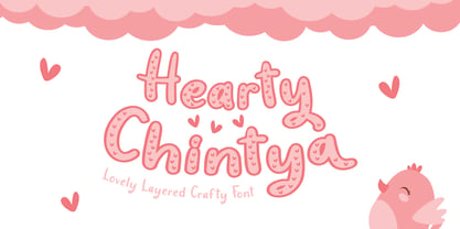 Hearty Chintya is a Lovely Layered Crafty font with stylistic set. Combine Hearty Chintya with display & outline version to get amazing 3D letterform! Fall in love with its incredibly versatile style and use it to create spectacular designs! Hearty Chintya is perfect for branding, logo, invitation, quotes, apparel design, product packaging, merchandise, game titles, cute style design, Book/Cover Title and more. What's Included : - Stylistic Set character - Multilingual Support
 - Designer RD by Kostic,
$40.00 Designer RD was created in 1999, at the same time as Just Square and Why Square typefaces, and envisioned to be their rounded alternative. Zoran based the font on the logotype his son Nikola made and its primary purpose is to be used in logotypes, headlines, fliers, websites, etc. that are going for a hard geometric look. Designer RD’s character set supports Western European languages, as well as the Cyrillic script.
 - Waxedtown GT by Gartype Studio,
$15.00 Street Arts give us inspiration to make a uniquely typeface with a touch of street artistic typeface with graffiti vibes. Waxedtown is a graffiti inspired typeface from us that also comes with multilingual features and extra graffiti swashes to make graffiti vibes. This font look so great when you using it for projects like text headlines, product packaging, poster, music purpose, game logo title, brands, and mascot logo designs.
 - Fireside Chat NF by Nick's Fonts,
$10.00This unusual display face is another in a series of works based on the work of lettering artist Samuel Welo. The sinewy curves and radiant inline decoration give this typeface a cozy, warm and inviting charm. Named after the informal radio addresses popularized by Franklin Delano Roosevelt in the 1930s. Both versions of this font include the complete Latin 1252 and CE 1250 character sets, with localization for Romanian and Moldovan. - TS Karagoz by TSfonts Type Studio,
$35.00 Introduction: Karagoz is a playful and fun display typeface that has strong and powerful. It is designed to be bold and large. Karagoz is perfect for video games, cartoons, t-shirts, children’s books, captions, headlines, and posters. Weights and Languages: It consists of 1 Weight. It supports Latin, Arabic, Persian, and Urdu. Usage: Karagoz Font is used in headlines, posters, websites, social media, and visual identities. Designing & Developing: TSfonts Type Studio.
 - Farm Girl by Open Window,
$19.95 From the lab of Open Window comes Farm Girl. Farm Girl was inspired by old Art Nouveau posters from Toulouse Lautrec and others. Farm Girl utilizes the same 'loosey-goosey' quality as those posters. Farm Girl consists of 3 different styles which are designed to be used in combination with each other. Many different variations are possible. It's fresh cut and contemporary. It's ideal use is as a display font.
 - Basik by Superfried,
$32.50 As the name suggests, Basik is a simple, clean and versatile sans-serif typeface designed by Superfried. It is equally apt in both body and display scenarios. There are already numerous san-serif fonts available which is why we have tried to create some unique styles and cuts throughout the typeface. Basik has been featured on the Behance curated typography gallery TypographyServed.com. It is available in two styles, book and stencil.
