10,000 search results
(0.058 seconds)
- CLASSIC Line by WAP Type,
$25.00 frontline classic font Font a stylish Font. It’s useful for any Design project. Decal, card, e-card, Good for Logos & Headlines, Poster,Tag design, Newspaper & Magazine Ad Design and many more. True type and Open type font files
 - Zn Fragile by Zeenesia Studio,
$18.00 fragile is an elegant chique font. fragile is a serif font, This font is perfect for Bandin, logo design, wedding, quotes, magazing anything do you want. You will get classy, elegant, and certainly unique logos with this font.
 - Lecory by vuuuds,
$16.00 Introducing Lecory Font! Lecory is modern serif font, every single letters have been carefully crafted. This font including beautiful alternate glyph. You can access the alternate glyph via Font Book (Mac user) or Windows Character Map (Windows user).
 - SK Irrationalist by Shriftovik,
$16.00 SK Irrationalist is a new experimental accidental font created by the SHRIFTOVIK font foundry and Tikhon Reztcov. This font is very unusual. It uses non-standard graphic techniques. Sloping non-parallel lines, sharp shapes and a combination of rectangles and circles all make the font special. The SK Irrationalist font was inspired by the works of constructivist artists of the early 20th century. The font contains both Latin, Latin Pro version for European countries and Cyrillic. This font delivered in 4 styles: Regular; Sharp; Outline; Rounded.
 - DXEgyptian Fett by DXTypefoundry,
$45.00 Digital version of the font Egyptian Bold (Headset No. 8, Narrow fat Egyptian), Cyrillic version of the Egyptienne schmale font, around 1870. A squared antiquarian font with almost no contrast between the strokes. For the reconstruction font were used stamp from the catalog Typefoundry and the factory of copper lines B. Krebs Priemnik, St. Petersburg and Frankfurt am Main; Catalog of hand and machine fonts, Publishing House Book, 1966; Catalog of manual fonts of the Kharkov liner factory, Prapor, 1973; Catalog of fonts typography Volodarskogo, Lenizdat, 1985.
 - Gloomie Saturday by Timurtype,
$14.00 Introduced by Timurtype Studio! Gloomie Saturday is a Bubbly Handwritten Font this font captures the charm of handcrafted elegance with our cheerful handwritten font collection – where every word dances with personality. Enhance your designs and captivate your audience with custom lettering art. Let your words sparkle with the magic of authenticity. Explore our cheerful fonts and make your message stand out! Gloomie Saturday Font also supports multilingualism. Enhance your designs with our original fonts, feel free to comment or provide feedback, Enjoy the fonts 😊 Thank You
 - Epicgant by Viaction Type.Co,
$25.00 Epicgant is a sans serif font with elegant characters. Epicgant is perfect for your elegant-themed work, suitable also for elegant vintage. This font is available in two font style variants, making it easy to do work on various design themes. Epicgant is equipped with multilingual accents. Check out the latest Viaction Type.Co font products : Matrole : https://www.myfonts.com/fonts/viaction-type/matrole/ Baskar : https://www.myfonts.com/fonts/viaction-type/baskar-stc/ Get it now Epicgant Family fonts, to add to your collection and work solutions. Thanks.
 - Notes and Quotes by Ana's Fonts,
$14.00 Notes And Quotes is a font duo that includes a bold typewriter font and a casual script font. The contrast between the fonts makes it a striking pair, perfect for logotype design, modern branding and packaging, quotes and social media posts. Notes And Quotes includes 6 fonts: a handwritten script font with a slant alternative and a bonus set of handwritten doodles (underlines, circles, words and short sentences, etc) a bold typewriter font with a "jumpy" alternative and a set of bonus misprints and grungy elements
 - Neue Aachen by ITC,
$40.99 Impressed by the quality of the Aachen typeface that was originally designed for Letraset in 1969 and extended to include Aachen Medium in 1977, Jim Wasco of Monotype Imaging has extended this robust display design to create an entire family. Derived from the serif-accented Egyptienne fonts dating to the early 20th century, Aachen has serifs that are very solid but considerably shorter than those of its precursor. The incorporated geometrical elements, such as right angles and straight lines, provide the slender letters of Aachen with a slightly technological, stencil-like quality. Despite this, the effect of Aachen is by no means static; its dynamism means that this typeface, originally designed for use in headlines, has come to be used with particular frequency in sport- and fitness-related contexts. Jim Wasco, for many years a type designer at Monotype Imaging, recognized the potential of Aachen and decided to extend the typeface to create an entire typeface family. He appropriated the existing Aachen Bold in unchanged form and first created the less heavy cuts, Thin and Regular. Wasco admits that he found designing the forms for Thin a particular challenge. It took him several attempts before he was able to achieve consistency within the glyphs for Thin and, at the same time, retain sufficient affinity with the original Aachen Bold. But he finally managed to adapt the short serifs and the condensed and slightly geometrical quality of the letters to the needs of Thin. The weights Light, Book, Medium and Semibold were generated by means of interpolation. Supplemented by Extralight and Extrabold, the new Neue Aachen can now boast a total of nine different weights. Wasco initially relied on his predilection for genuine cursives in his designs for the Italic cuts. But it became apparent with these first trial runs that the soft curves of cursives did not suit Aachen and led to the loss of too much of its original character. Wasco thus decided to compromise by using both inclined and cursive letters. Neue Aachen Italic is somewhat narrower than its upright counterparts; the lower case 'a' has a closed form while the 'f' has been given a descender, but the letters have otherwise not been given additional adornments. The range of glyphs available for Neue Aachen has been significantly extended, so that the typeface can now be used to set texts not only in Western but also Central European languages. Wasco has also added a double-counter lowercase 'g' while relying on the availability of alternative letters in the format sets for the enhancement of the legibility of Neue Aachen when used to set texts. The seven new weights and completely new Italic variants have enormously increased the potential applications of Aachen and the range of creative options for the designer. While the Bold weights have proved their worth as display fonts, the new Book and Regular cuts are ideal for setting text. And the subtlety of Ultra Light will provide your projects with a quite unique flair. The new possibilities and opportunities in terms of design and applications that Neue Aachen offers you are not restricted to print production; you can also create internet pages thanks to its availability as a web font.
 - Iwan Stencil by Linotype,
$40.99 Iwan Stencil is a new revival of an old display typeface. Based on type originally designed by Jan Tschichold in 1929, the style was revived by Klaus Sutter in 2008. The letterforms in this peculiar design are very high contrast; all of the thin bits are much thinner than the thick parts. They have a modern, upright axis. All in all, the creation has a bit of a Bodoni-gone-crazy touch. The thin elements are the unique part of the design that binds this face together. They almost naturally fade away in the stencil gaps (or pylons), making you wonder if you are really looking at a stencil face at all. These thins contribute greatly to the typeface's overall serif-style, making the design at least a semi serif typeface, if not a full serif one. The lowercase n, for instance, has no serifs of its own, but many of the other letters have clear ones, or serif-like terminals. A serif stencil face is a peculiar variety, especially in this day and age, but in the past they were much more common, if not the norm, The Iwan Stencil typeface has only one weight. Naturally, this is just for display. Use Iwan Stencil to cut real stencils, or only to create the effect of stenciled type in your design work. Ivan Stencil includes all of the characters that you have come to expect in a font. Just because this design was originally made in 1929 does not mean that is has a 1929 character set. Instead, it includes a 21st century, with extended European language support Jan Tschichold, who we have to thank for today's Iwan Stencil inspiration, was a man of many faces. A trained calligrapher who went on to codify the New Typography, would go on to become a teacher, a classical book designer, and the creator of the Sabon typeface. Like all young designers, he was occasionally in need of money. Before his emigration from Germany in 1933, he took on many kinds of commissions. In the late 1920s, a time full of waves of economic turmoil within Germany and across the world, he began designing a typefaces for different European companies, mostly display things like this. For a time during the mid-1920s, Jan Tschichold went by the name Iwan" "
 - Adelle Sans by TypeTogether,
$45.00 The Adelle Sans font family by José Scaglione and Veronika Burian provides a more clean and spirited take on the traditional grotesque sans. As is typical with TypeTogether typefaces, the most demanding editorial design problems were taken into consideration during its creation. The combination of lively character and unobtrusive appearance inherent to grotesque sans serifs make it an utterly versatile tool for every imaginable situation. Whether for global branding, screens, signage and advertising, or UI, the keyword behind Adelle Sans’s use is flexibility. To save space and keep legibility high, Adelle Sans is available in eight weights with matching italics and includes a condensed width of seven weights with their matching italics. Each of these 30 styles hits the perfect tone as a headline punch or subdued background hum, and the condensed widths are adept at setting short texts while retaining the expected personality. Rooted in the belief that broad language support is crucial to modern global type design, the Latin-matching variants are yet another push in TypeTogether’s ongoing multilingual efforts. The Latin script may have been first, but Adelle Sans has thus far been expanded into an exhaustive nine script family with extensive language support. Careful research and close collaboration with type experts yielded typographic consistency, legibility, and cultural awareness among all scripts, as well as filling the need for quality editorial typefaces in Arabic, Armenian, Chinese, Cyrillic, Devanagari, Latin Extended, Greek, and Thai, with more planned for the future. In addition to the 30 Latin styles, all other scripts have between seven and fourteen styles, each of which has been engineered to optically match the proportions of its counterparts. And each script comes bundled with the Latin script to ensure an harmonious fit amongst any two or more Adelle Sans families in the same block of text. The full Adelle Sans family delivers consistent, flexible, and personable results in multilingual documents, in apps, and multicultural branding worldwide. Its wide character set includes typographic niceties, small caps, several sets of figures, icons, and support for over 245 Latin-based languages. Be sure to check out the companions for Adelle Sans: Adelle, for a versatile and authoritative slab serif with no shortage of personality; and Adelle Mono, a two-width family flexible enough for developers and graphic designers alike.
 - ITC Bodoni Seventytwo by ITC,
$29.99Giambattista Bodoni (1740-1813) was called the King of Printers; he was a prolific type designer, a masterful engraver of punches and the most widely admired printer of his time. His books and typefaces were created during the 45 years he was the director of the fine press and publishing house of the Duke of Parma in Italy. He produced the best of what are known as modern" style types, basing them on the finest writing of his time. Modern types represented the ultimate typographic development of the late eighteenth and early nineteenth centuries. They have characteristics quite different from the types that preceded them; such as extreme vertical stress, fine hairlines contrasted by bold main strokes, and very subtle, almost non-existent bracketing of sharply defined hairline serifs. Bodoni saw this style as beautiful and harmonious-the natural result of writing done with a well-cut pen, and the look was fashionable and admired. Other punchcutters, such as the Didot family (1689-1853) in France, and J. E. Walbaum (1768-1839) in Germany made their own versions of the modern faces. Even though some nineteenth century critics turned up their noses and called such types shattering and chilly, today the Bodoni moderns are seen in much the same light as they were in his own time. When used with care, the Bodoni types are both romantic and elegant, with a presence that adds tasteful sparkle to headlines and advertising. ITC Bodoni™ was designed by a team of four Americans, after studying Bodoni's steel punches at the Museo Bodoniana in Parma, Italy. They also referred to specimens from the "Manuale Tipografico," a monumental collection of Bodoni's work published by his widow in 1818. The designers sought to do a revival that reflected the subtleties of Bodoni's actual work. They produced three size-specific versions; ITC Bodoni Six for captions and footnotes, ITC Bodoni Twelve for text settings, and ITC Bodoni Seventytwo - a display design modeled on Bodoni's 72-point Papale design. ITC Bodoni includes regular, bold, italics, Old style Figures, small caps, and italic swash fonts. Sumner Stone created the ornaments based on those found in the "Manuale Tipografico." These lovely dingbats can be used as Bodoni did, to separate sections of text or simply accent a page layout or graphic design." - ITC Bodoni Twelve by ITC,
$29.99Giambattista Bodoni (1740-1813) was called the King of Printers; he was a prolific type designer, a masterful engraver of punches and the most widely admired printer of his time. His books and typefaces were created during the 45 years he was the director of the fine press and publishing house of the Duke of Parma in Italy. He produced the best of what are known as modern" style types, basing them on the finest writing of his time. Modern types represented the ultimate typographic development of the late eighteenth and early nineteenth centuries. They have characteristics quite different from the types that preceded them; such as extreme vertical stress, fine hairlines contrasted by bold main strokes, and very subtle, almost non-existent bracketing of sharply defined hairline serifs. Bodoni saw this style as beautiful and harmonious-the natural result of writing done with a well-cut pen, and the look was fashionable and admired. Other punchcutters, such as the Didot family (1689-1853) in France, and J. E. Walbaum (1768-1839) in Germany made their own versions of the modern faces. Even though some nineteenth century critics turned up their noses and called such types shattering and chilly, today the Bodoni moderns are seen in much the same light as they were in his own time. When used with care, the Bodoni types are both romantic and elegant, with a presence that adds tasteful sparkle to headlines and advertising. ITC Bodoni™ was designed by a team of four Americans, after studying Bodoni's steel punches at the Museo Bodoniana in Parma, Italy. They also referred to specimens from the "Manuale Tipografico," a monumental collection of Bodoni's work published by his widow in 1818. The designers sought to do a revival that reflected the subtleties of Bodoni's actual work. They produced three size-specific versions; ITC Bodoni Six for captions and footnotes, ITC Bodoni Twelve for text settings, and ITC Bodoni Seventytwo - a display design modeled on Bodoni's 72-point Papale design. ITC Bodoni includes regular, bold, italics, Old style Figures, small caps, and italic swash fonts. Sumner Stone created the ornaments based on those found in the "Manuale Tipografico." These lovely dingbats can be used as Bodoni did, to separate sections of text or simply accent a page layout or graphic design." - ITC Bodoni Ornaments by ITC,
$29.99Giambattista Bodoni (1740-1813) was called the King of Printers; he was a prolific type designer, a masterful engraver of punches and the most widely admired printer of his time. His books and typefaces were created during the 45 years he was the director of the fine press and publishing house of the Duke of Parma in Italy. He produced the best of what are known as modern" style types, basing them on the finest writing of his time. Modern types represented the ultimate typographic development of the late eighteenth and early nineteenth centuries. They have characteristics quite different from the types that preceded them; such as extreme vertical stress, fine hairlines contrasted by bold main strokes, and very subtle, almost non-existent bracketing of sharply defined hairline serifs. Bodoni saw this style as beautiful and harmonious-the natural result of writing done with a well-cut pen, and the look was fashionable and admired. Other punchcutters, such as the Didot family (1689-1853) in France, and J. E. Walbaum (1768-1839) in Germany made their own versions of the modern faces. Even though some nineteenth century critics turned up their noses and called such types shattering and chilly, today the Bodoni moderns are seen in much the same light as they were in his own time. When used with care, the Bodoni types are both romantic and elegant, with a presence that adds tasteful sparkle to headlines and advertising. ITC Bodoni™ was designed by a team of four Americans, after studying Bodoni's steel punches at the Museo Bodoniana in Parma, Italy. They also referred to specimens from the "Manuale Tipografico," a monumental collection of Bodoni's work published by his widow in 1818. The designers sought to do a revival that reflected the subtleties of Bodoni's actual work. They produced three size-specific versions; ITC Bodoni Six for captions and footnotes, ITC Bodoni Twelve for text settings, and ITC Bodoni Seventytwo - a display design modeled on Bodoni's 72-point Papale design. ITC Bodoni includes regular, bold, italics, Old style Figures, small caps, and italic swash fonts. Sumner Stone created the ornaments based on those found in the "Manuale Tipografico." These lovely dingbats can be used as Bodoni did, to separate sections of text or simply accent a page layout or graphic design." - ITC Bodoni Brush by ITC,
$29.99Giambattista Bodoni (1740-1813) was called the King of Printers; he was a prolific type designer, a masterful engraver of punches and the most widely admired printer of his time. His books and typefaces were created during the 45 years he was the director of the fine press and publishing house of the Duke of Parma in Italy. He produced the best of what are known as modern" style types, basing them on the finest writing of his time. Modern types represented the ultimate typographic development of the late eighteenth and early nineteenth centuries. They have characteristics quite different from the types that preceded them; such as extreme vertical stress, fine hairlines contrasted by bold main strokes, and very subtle, almost non-existent bracketing of sharply defined hairline serifs. Bodoni saw this style as beautiful and harmonious-the natural result of writing done with a well-cut pen, and the look was fashionable and admired. Other punchcutters, such as the Didot family (1689-1853) in France, and J. E. Walbaum (1768-1839) in Germany made their own versions of the modern faces. Even though some nineteenth century critics turned up their noses and called such types shattering and chilly, today the Bodoni moderns are seen in much the same light as they were in his own time. When used with care, the Bodoni types are both romantic and elegant, with a presence that adds tasteful sparkle to headlines and advertising. ITC Bodoni™ was designed by a team of four Americans, after studying Bodoni's steel punches at the Museo Bodoniana in Parma, Italy. They also referred to specimens from the "Manuale Tipografico," a monumental collection of Bodoni's work published by his widow in 1818. The designers sought to do a revival that reflected the subtleties of Bodoni's actual work. They produced three size-specific versions; ITC Bodoni Six for captions and footnotes, ITC Bodoni Twelve for text settings, and ITC Bodoni Seventytwo - a display design modeled on Bodoni's 72-point Papale design. ITC Bodoni includes regular, bold, italics, Old style Figures, small caps, and italic swash fonts. Sumner Stone created the ornaments based on those found in the "Manuale Tipografico." These lovely dingbats can be used as Bodoni did, to separate sections of text or simply accent a page layout or graphic design." - ITC Bodoni Six by ITC,
$40.99Giambattista Bodoni (1740-1813) was called the King of Printers; he was a prolific type designer, a masterful engraver of punches and the most widely admired printer of his time. His books and typefaces were created during the 45 years he was the director of the fine press and publishing house of the Duke of Parma in Italy. He produced the best of what are known as modern" style types, basing them on the finest writing of his time. Modern types represented the ultimate typographic development of the late eighteenth and early nineteenth centuries. They have characteristics quite different from the types that preceded them; such as extreme vertical stress, fine hairlines contrasted by bold main strokes, and very subtle, almost non-existent bracketing of sharply defined hairline serifs. Bodoni saw this style as beautiful and harmonious-the natural result of writing done with a well-cut pen, and the look was fashionable and admired. Other punchcutters, such as the Didot family (1689-1853) in France, and J. E. Walbaum (1768-1839) in Germany made their own versions of the modern faces. Even though some nineteenth century critics turned up their noses and called such types shattering and chilly, today the Bodoni moderns are seen in much the same light as they were in his own time. When used with care, the Bodoni types are both romantic and elegant, with a presence that adds tasteful sparkle to headlines and advertising. ITC Bodoni™ was designed by a team of four Americans, after studying Bodoni's steel punches at the Museo Bodoniana in Parma, Italy. They also referred to specimens from the "Manuale Tipografico," a monumental collection of Bodoni's work published by his widow in 1818. The designers sought to do a revival that reflected the subtleties of Bodoni's actual work. They produced three size-specific versions; ITC Bodoni Six for captions and footnotes, ITC Bodoni Twelve for text settings, and ITC Bodoni Seventytwo - a display design modeled on Bodoni's 72-point Papale design. ITC Bodoni includes regular, bold, italics, Old style Figures, small caps, and italic swash fonts. Sumner Stone created the ornaments based on those found in the "Manuale Tipografico." These lovely dingbats can be used as Bodoni did, to separate sections of text or simply accent a page layout or graphic design." - Happy Cloud by Cultivated Mind,
$25.00 Happy Cloud is a fun, tall handwritten font created by Cultivated Mind. This font features five font weights (Light/Regular/Bold/Black/Heavy).
 - Culoare by Luxfont,
$18.00 Introducing space-bright COLORED hologram font. Soft color transitions combined with minimalistic clean glyphs. Ideal for modern web and print design. Excellent readability of glyphs for both the title and the large volume of text is preserved. Multi-colored modern family with different types of coloring - a highlighted gradient border of letters or fully hologram glyphs - a large selection of 11 ready-made font styles. Originality of the font will fit well into the fashionable logo, headline in the magazine or on the website, emphasize the trend of the product in branding and complement web advertising on social media. This font family is based on the Regular font Boldini - which means that if necessary you can combine these two families and they will be absolutely stylistically identical and complement each other. Check the quality before purchasing and try the FREE DEMO version of the font to make sure your software supports color fonts. Features: Free Demo font to check it works. 11 OTF SVG color fonts in the family Free Demo font to check it works. Gradient and hologram fonts Kerning IMPORTANT: - OTF SVG fonts contain vector letters with gradients and transparency. - Multicolor OTF version of this font will show up only in apps that are compatible with color fonts, like Adobe Photoshop CC 2017.0.1 and above, Illustrator CC 2018. Learn more about color fonts & their support in third-party apps on www.colorfonts.wtf -Don't worry about what you can't see the preview of the font in the tab "Individual Styles" - all fonts are working and have passed technical inspection, but not displayed, they just because the website MyFonts is not yet able to show a preview of colored fonts. Then if you have software with support colored fonts - you can be sure that after installing fonts into the system you will be able to use them like every other classic font. Question/answer: How to install a font? The procedure for installing the font in the system has not changed. Install the font as you would install the classic OTF | TTF fonts. How can I change the font color to my color? · Adobe Illustrator: Convert text to outline and easily change color to your taste as if you were repainting a simple vector shape. · Adobe Photoshop: You can easily repaint text layer with Layer effects and color overlay. ld.luxfont@gmail.com
 - Jambetica - Personal use only

- Roasted Lemon by Balpirick,
$15.00 Roasted Lemon is a Handbrushed Font. Whether you’re using it for crafts, digital design, presentations, or making greeting cards, this font has the potential to become your favorite go-to font, no matter the occasion! This font only has allcaps letters. - also multilingual support Enjoy the font! Feel free to comment or feedback! Thank you!
 - Fox Wizard by Fox7,
$12.00 Fox Wizard is a vintage and cool slab serif font. this font is perfect for publications, logos, business cards, or printed on t-shirts, this font will look outstanding on everything, no matter the topic. This font will be an incredible asset to your fonts’ library, as it has the potential to elevate any creation.
 - Maghfirah Two by ARToni,
$36.00 Maghfirah is a dazzling script font. This font is neatly crafted and highly detailed. Whatever the topic, this font will be a wonderful asset to your font library, as it has the potential to enhance any creation. This font is PUA encoded which means you can access all of the glyphs and swashes with ease!
 - Sunrise Time by Balpirick,
$15.00 Sunrise Time is a Handdrawn Font. Whether you’re using it for crafts, digital design, presentations, or making greeting cards, this font has the potential to become your favorite go-to font, no matter the occasion! This font only has allcaps letters. - also multilingual support Enjoy the font! Feel free to comment or feedback! Thank you!
 - Cookie Jars by Balpirick,
$15.00 Cookie Jars is a Handdrawn Font. Whether you’re using it for crafts, digital design, presentations, or making greeting cards, this font has the potential to become your favorite go-to font, no matter the occasion! This font only has allcaps letters. also multilingual support Enjoy the font! Feel free to comment or feedback! Thank you!
 - Manda Rawles by Ws Studio,
$15.00 Manda Rawles is a dazzling script font. This font is neatly crafted and very detailed. Whatever the topic, this font will be a great asset to your font library, as it has the potential to enhance any creation. This font is PUA encoded which means you can access all the glyphs and sweeps easily!
 - Maple Glaze by Balpirick,
$15.00 Maple Glaze is a Handdrawn Font. Whether you’re using it for crafts, digital design, presentations, or making greeting cards, this font has the potential to become your favorite go-to font, no matter the occasion! This font only has allcaps letters. - also multilingual support Enjoy the font! Feel free to comment or feedback! Thank you!
 - Gloomie Sunday by Balpirick,
$15.00 Gloomie Sunday is a Handwritten Font. Whether you’re using it for crafts, digital design, presentations, or making greeting cards, this font has the potential to become your favorite go-to font, no matter the occasion! This font only has allcaps letters. - also multilingual support Enjoy the font! Feel free to comment or feedback! Thank you!
 - Hebrew Kria Tanach VF by Samtype,
$360.00 This is a modern, wonderful, and beautiful font. This font is super readable and can be used from Posters to a Hebrew Bible. The readability of this font is amazing. This font has the modern Hebrew punctuation: Shevana, Kamatz Katan, Dagesh Hazak, and Cholam Chaser. The first Hebrew Variable font with all Trop and Nikud!
 - Mango Mingle by Balpirick,
$15.00 Mango Mingle is a Handdrawn Font. Whether you’re using it for crafts, digital design, presentations, or making greeting cards, this font has the potential to become your favorite go-to font, no matter the occasion! This font only has allcaps letters. - also multilingual support Enjoy the font! Feel free to comment or feedback! Thank you!
 - Honey Bread by Balpirick,
$14.00 Honey Bread is a Handbrushed Font. Whether you’re using it for crafts, digital design, presentations, or making greeting cards, this font has the potential to become your favorite go-to font, no matter the occasion! This font only has allcaps letters. - also multilingual support Enjoy the font! Feel free to comment or feedback! Thank you!
 - Bijoute Sans by Struvictory.art,
$16.00 Bijouté is a modern sans serif font with bohemian motives. The font is created in classic proportions and decorated with elegant decor. The font is suitable for the design on the theme of mysticism, esotericism, fashion and style. This font is based on my Nomad Bohemian Sans: https://www.myfonts.com/collections/nomad-decorative-font-struvictory-art
 - Summer Peach by Sakha Design,
$10.00 Summer Peach is a dazzling script font. This font is neatly crafted and highly detailed. Whatever the topic, this font will be a wonderful asset to your font library, as it has the potential to enhance any creation. This font is PUA encoded which means you can access all glyphs and swashes with ease!
 - Shield 2 Letters Monogram by MonogramBros,
$12.00 Shield 2 Letters Monogram Font is a perfect shield shaped monogram font consisting of 52 letters and 1 basic frame. With just a single font file you will be able to create beautiful monograms in just a matter of minutes after the purchase! Shield 2 Letters Monogram Font comes with font file in OTF format.
 - Pierce Jackson by Balpirick,
$15.00 Pierce Jackson is a Handbrushed Font. Whether you’re using it for crafts, digital design, presentations, or making greeting cards, this font has the potential to become your favorite go-to font, no matter the occasion! This font only has allcaps letters. - also multilingual support Enjoy the font! Feel free to comment or feedback! Thank you!
 - Akahe by Product Type,
$17.00 Introducing Akahe, a font that blends traditional elegance with modern sophistication. With its thick strokes and serif edges, Akahe adds a touch of classic style to any design. And with its stylistic set options for upper and lowercase letters, you can personalize the font to suit your unique style. Whether you’re working on a website, a brochure, or a branding project, Akahe is the perfect font to elevate your designs. Its thick strokes and serif edges make it highly legible, so your designs will always be easy to read and understand. But Akahe isn’t just beautiful, it’s also versatile and functional. You can use its stylistic set options to customize the font to your specific needs, making it perfect for a wide range of design projects. And with its comprehensive character set, you can create designs in multiple languages. So why settle for a standard font when you can have Akahe? Download it today and start creating designs that are both classic and modern, sophisticated and stylish. Whether you’re working on a large-scale project or just looking for a new font for your personal designs, Akahe is a perfect choice. What’s Included : - File fon - All glyphs Iso Latin 1 - We highly recommend using a program that supports OpenType features and Glyphs panels like - many Adobe apps and Corel Draw, so you can see and access all Glyph variations. - PUA Encoded Characters – Fully accessible without additional design software. - Fonts include Multilingual support
 - Hebrew Castel by Samtype,
$125.00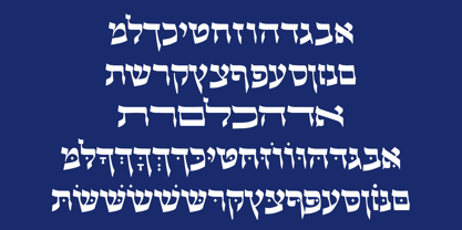 Beautiful Calligraphic font and also a readable font.
 - WarpedJenny by Ingrimayne Type,
$9.00 A warped font based on the font JennerickInformal.
 - WC Mano Negra Bta - Unknown license

- Bestiful by GlyphStyle,
$16.00 Beautiful is a font with a modern calligraphy style and free form, has a curly end, not found in other fonts. Charming and beautiful font - Font feature Uppercase, Lowercase, Numerals & Punctuations, Stylistic alternate(ending), Ss01(beginning), Ligature, Swashes, Multilanguage
 - Tasty Matcha by Crumphand,
$20.00 Here is it, Tasty Matcha Fonts. Based on my favorite drink become a fonts called Tasty Matcha. The fonts looks good, stunning, great, ease reading. What's Included Inside The Fonts ? Uppercase Lowercase Symbols Numerals European Multilingual Thank You, Regards!

