6,264 search results
(0.025 seconds)
- Space Walk by Olivetype,
$18.00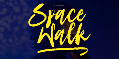 Space Walk is a dry brush handwritten script font. It is a nice choice for creating eye-catching logos, branding, and quotes. The font is supporting 66 languages, which include: Afrikaans Albanian Catalan Danish Dutch English Estonian Finnish French German Italian Norwegian Portuguese Spanish Swedish Zulu, and more. So what’s included: Basic Latin A-Z & a-z. Numbers, symbols, and punctuations. Ligatures . Multilingual Support. Accented Characters : ÀÁÂÃÄÅÆÇÈÉÊËÌÍÎÏÑÒÓÔÕÖØŒŠÙÚÛÜŸÝŽàáâãäåæçèéêëìíîïñòóôõöøœšùúûüýÿžß Thank You.
 - Garloise by Ergibi Studio,
$14.00 Garloise of script and sans will match perfectly. This font is perfect for logotype, apparel, branding, packaging, advertising and more. It comes with uppercase, lowercase, punctuation, symbols, numerals, stylistic alternates, ligatures, and several different swashes are included as well. Includes multi-lingual support for; Afrikaans, Albanian, Catalan, Danish, Dutch, English, Icelandic, Italian, Spanish, Portuguese, German, Swedish, Norwegian, Polish, Indonesian, Zulu. Hope you enjoy with our font! Big Thaks, Ergibi Studio
 - Rough Stone by Epiclinez,
$18.00 Rough Stone is a lovely and trendy hand brush font. It is a good choice for creating eye-catching logos, brandings, and quotes. This Font is supporting more than 66 languages, which include: Afrikaans Albanian Catalan Danish Dutch English Estonian Finnish French German Italian Norwegian Portuguese Spanish Swedish Zulu, and more. You will get : Basic Latin A-Z & a-z. Numbers, symbols, and punctuations Multilingual Support. Accented Characters : ÀÁÂÃÄÅÆÇÈÉÊËÌÍÎÏÑÒÓÔÕÖØŒŠÙÚÛÜŸÝŽàáâãäåæçèéêëìíîïñòóôõöøœšùúûüýÿžß Thank you
 - Melancholie by Anmark,
$18.00 I’m pleased to introduce my handwritten font Melancholie. Melancholie is a calm and elegant font. It is perfect for invitations, cards, branding projects, packaging, magazines, social media, logos, signatures, quotes, headers and many more... You can use it for long texts or short phrases. The modern calligraphy uppercase letters are ideal for monograms and logos. Melancholie supports Spanish, German, French, Italian, Portuguese, Swedish, Norwegian, Danish, Finnish and others.
 - Krydderi by PizzaDude.dk,
$15.00 A touch of spice is often what makes a good meal even better. In Danish, spice is called "krydderi" I chose that particular name for this font because it is the kind of brush font that most likely could spice up your next design. I've added 6 different versions of each letter, and they automatically cycle as you type, leaving the result like authentic brush written text. All Caps Fonts.
 - Foxglove by Set Sail Studios,
$14.00 Foxglove is a playful, minimal brush font designed to add a personal, charming quality to quotes, branding, promotional images and product designs. Foxglove contains two sets of uppercase characters, you can switch between these simply by turning your caps-lock on & off. Contains language support for; English, French, Italian, Spanish, Portuguese, German, Swedish, Norwegian, Danish, Dutch, Finnish, Indonesian, Malay, Hungarian, Polish, Croatian, Turkish, Romanian, Czech, Latvian, Lithuanian, Slovak, Slovenian.
 - Summer Square by Attype Studio,
$10.00 Summer Square is vintage all caps font with 2 styles clean & rough. Summer Square is a strong font, this font is perfect for branding, logo, invitation, stationery, social media post, product packaging, merchandise, blog design, game titles, retro style design, Book/Cover Title and more. This font features Multilingual Support (Afrikaans, Albanian, Catalan, Danish, Dutch, English, Estonian, Finnish, French, German, Icelandic, Italian, Norwegian, Portugese, Spanisch, Swedish, Zulu) and includes 62 ligatures.
 - North Shore by Bruised Goods,
$18.00 NORTH SHORE – The ultimate Hawaiian surf spot typeface, both groovy and mid century inspired. Designed by Lauren Kilbane (on the other coast!) in sunny South Florida, USA. USE THIS FONT FOR: ads, album covers, apparel, cards, flyers, invitations, logos, menus, merchandise, packaging, signage, web, and more. 204 Glyphs Total: Uppercase ONLY, Numbers, Symbols, Punctuation, Emojis, & Language Support. Language Support: Danish, English, French, German, Irish, Italian, Portuguese, Spanish, Swedish, & Swiss German.
 - Sweet Farm Story by Epiclinez,
$15.00 Sweet Farm Story is an informal and friendly handwritten font that can be used for all chalkboard quotes or teaching material! Its authentic look and feel will add a personal and realistic feel to your designs. This font supports Multi-Languages, including Afrikaans Albanian Catalan Danish Dutch English Estonian Finnish French German Italian Norwegian Portuguese Spanish Swedish Zulu. Features : Basic Latin All Caps Numbers, symbols, and punctuations Thank you
 - Sans Anger by Olivetype,
$18.00 Sans Anger is a stunning and authentic brush font with a natural feel. Get inspired by its whimsical style and turn any design project into a true stand-out. So what’s included: Sans Anger (OTF, TTF, and WOFF) Basic Latin A-Z, a-z, numbers, symbols, and punctuations Sans Anger is supporting Multi Languages: from Afrikaans Albanian Catalan Danish to Dutch English Spanish Swedish Zulu. Accented Characters : ÀÁÂÃÄÅÆÇÈÉÊËÌÍÎÏÑÒÓÔÕÖØŒŠÙÚÛÜŸÝŽàáâãäåæçèéêëìíîïñòóôõöøœšùúûüýÿžß Thank you
 - Pikolo by Ideabuk,
$16.00 Pikolo font family is inspired by vintage woodblock printing. It is a bold and playful slightly rounded display typeface, perfect for headings, logos and so much more! The font comes with full upper & lower case characters, numbers, symbols and includes the most common stylistic ligatures. Multilingual support, languages include: Dutch, Danish, Norwegian, Finish, Swedish, Icelandic, Estonian, Latvian, Lithuanian, German, Hungarian, French, Portuguese, Spanish, Italian, Bosnian, Croatian, Czech, Slovak.
 - Corporative Sans Round Condensed by Latinotype,
$26.00 Corporative Sans Rounded Condensed is the narrowed version of Corporative Sans Rounded that offers high performance when using for text, what makes it the perfect match for Andes Rounded. The font works well at both display and small sizes. Corporative Sans Rounded Condensed is the perfect choice for logotypes, posters, signs, branding, packaging and so on! Corporative Sans Rounded Condensed comes with Latinotype’s standard set of 350 characters, making it possible to use the font in 128 different languages. Corporative Sans Rounded Condensed provides users with a wide range of characters and weights for every project. By combining different variants, designers can achieve the best results. The family consists of 32 fonts: a basic family that includes 8 weights plus italics and an alternative family of 8 weights with matching italics as well. Corporative Sans Rounded Condensed was created by Latinotype Team and developed by Elizabeth Hernández and Rodrigo Fuenzalida, under the supervision of Luciano Vergara and Daniel Hernández.
 - Absentia Slab by DR Fonts,
$19.00 Conceived as a slab serif companion to the Absentia Sans family, this typeface complements its sibling with charisma and style. Built on the same geometric framework, they combine and harmonize gracefully. Yet Absentia Slab stands on its own as a novel alternative to conventional options. Anchored by blocky serifs, it presents an appearance of stability and steadiness. Its audacious design integrates unique features such as vertical terminals in glyphs ‘a’, ‘e’ and ‘6’. To make optimal use of available space, one-sided serifs (and in some cases, simple strokes without any serifs) help maintain an airy, uncluttered footprint as seen in letters ‘m’, ‘E’ and ‘N’. This forward-looking typeface is well suited for a variety of projects: understated yet spirited, technical yet welcoming. It has a modernist appeal, while reminiscent of XIXth Century woodblock lettering. Designed by Daniel Robichaud, Absentia Slab is available in ten weights with matching italics and two variable fonts.
 - Diverda Sans by Linotype,
$40.99Diverda Sans is a geometric family of typefaces that are all free from ornament. Swiss designer Daniel Lanz optimized Diverda Sans for maximum legibility. In contrast to many other modern typefaces, which try to squeeze the traditional rounder forms of the alphabet into square designs, and which often attempt to equalize the widths of the capital letters, Diverda Sans remains true to the proper proportions of the Roman alphabet. The x-heights of Diverda's characters are low, and the differences between curved, square, and triangular elements are very clear. Like the more calligraphic typefaces of the past, Diverda's strokes exhibit contrast that is inspired by movements of the pen on paper; down strokes are heavier than up strokes. Possible applications for the Diverda Sans include magazine design, as well as advertising for fashion, design, or architectural products. Because of its 10 different individual styles or weights, Diverda Sans is also a good fit for Corporate Identity solutions. - Boston by Latinotype,
$29.00 Designed by Daniel Hernández and Paula Nazal with digital editing by Elizabeth Hernández. Corrections and review by Alfonso García and Rodrigo Fuenzalida. Boston is a slightly rounded-edged typeface, which is inspired by “Trenda”—a geometric sans serif based on the uppercase of “Trend”(a Latinotype font, released in 2013, that was very well received). This new typeface comes with a wider character set that offers a complete family of uppercase and lowercase in different weights. Boston is a versatile, easy-to-use, functional display font with a strong personality, especially its uppercase, which makes the designer’s work easier. Boston’s lightest and heaviest variants are ideal for display use while its middle weights work well with short and mid-length texts. This typeface has been designed especially for corporate projects, logotypes and publishing. Boston comes in 8 weights, ranging from Thin to Heavy, and includes matching italics as well as small caps and alternates. The family contains a 634-character set that supports 206 different languages.
 - Save The Date by Latinotype,
$40.00 A wedding begins long before the "I Do's" on the big day—everyone works together throughout the process to make sure that everything happens as planned: details, color combinations, decorations, the way we convey the magic of the visual elements and deliver our message of love. Through this beautiful font, we would like to deliver to you that very message, you make it your own and express yourself in your own way—through the perfect invitation on your wedding day. No matter how sweet or wild your invitation looks, try to be yourself. Save the Date is a font collection consisting of 9 styles and 4 variants: Script, Sans, Serif and Small. The font set is intended to provide users with a wide range of choices for any design project. Save the Date was designed by Paula Nazal and Daniel Hernández. Digital editing by Rodrigo Fuenzalida. Photos by Mónica Muñoz. Mónica specializes in wedding photography. You can find more of her work here: www.thewildbrides.com
 - Corporative Sans Rounded by Latinotype,
$26.00 Corporative Sans Rounded is the rounded version of Corporative Sans. Its curved terminals provide it with a marked personality and distinctive traits, but turn it into a friendly face at the same time. The font works well at both display and small sizes. Corporative Sans Rounded is the perfect choice for logotypes, posters, signs, branding, packaging and so on! Corporative Sans Rounded comes with Latinotype’s standard set of 350 characters, making it possible to use the font in 128 different languages. Corporative Sans Rounded provides users with a wide range of characters, weights and widths for every project. By combining different variants, designers can achieve the best results. The family consists of 32 fonts: a basic family that includes 8 weights plus italics and an alternative family of 8 weights with matching italics as well. Corporative Sans Rounded was created by LatinotypeTeam and developed by Elizabeth Hernández and Rodrigo Fuenzalida, under the supervision of Luciano Vergara and Daniel Hernández.
 - Labyrindo by URW Type Foundry,
$39.99 Labyrindo is inspired on the classic Labyrinth. The oldest known labyrinth is 3200 years old and is to be found in Greece. The mythological king Minos held the monstrous son of his wife ‘Minotaurus’ prison in a labyrinth. Much later the labyrinth made his appearance in the medieval churches, this time as a pattern on the church floor. During the Italian renaissance the multiple gate labyrinth came in fashion. Paths led trough green hedges in beautiful palace gardens. These hedges where perfectly cut in rectangular shapes. Mainly meant as an aesthetic statement. Besides the origin of the physic labyrinth, it has always been a great source of story-telling and myths. I mention a few personal favourites (film) like, Pan’s Labyrinth (a journey to the underworld), Labyrinth (with David Bowie) and the Shining with Jack Nicholson (where a horrific scene takes place in a labyrinth). Not the most cheerful stories but fascinating and intriguing. A Labyrinth is mind boggling and mysterious but wonderful. I made graphic translation in this typeface.
 - Greatest Richmond by Azetype,
$19.00 Presenting Greatest Richmond! An Authentic Brush Font with 3 alternates and 36 swashes. This font made with the perfect combining of each character. You can type by Mix & Match with alternate version to get a unique combining. It looks original and can be used for all your project needs. Each glyph has its own uniqueness and when meeting with others will provide dynamic and pleasing proximity. This font can be used at any time and any project. You can see in the presentation picture above, Greatest Richmond looks stylish and wildly on design projects. So, Greatest Richmond can't wait to give its touch to all your design projects such as quotes, poster design, personal branding, promotional materials, website, logotype, product packaging, etc. Besides that, Greatest Richmond also has some ligature that gives a surprise when you type certain characters combining. The ligatures are ee, ff, ii, nn, oo, rr, ss, st, St, tt, lt, rt, and th. WHAT'S INCLUDED? 1. Greatest Richmond Basic • The first version comes with uppercase, lowercase, ligatures, numeral, punctuation, symbols, and Standard Latin Multilingual Support (Afrikaans, Albanian, Catalan, Danish, Dutch, English, French, German, Icelandic, Indonesian, Italian, Malay, Norwegian, Portuguese, Spanisch, Swedish, Zulu, and More). 2. Greatest Richmond Alternate One • The first version comes with uppercase, lowercase, ligatures, numeral, punctuation, symbols, and Standard Latin Multilingual Support (Afrikaans, Albanian, Catalan, Danish, Dutch, English, French, German, Icelandic, Indonesian, Italian, Malay, Norwegian, Portuguese, Spanisch, Swedish, Zulu, and More). 3. Greatest Richmond Alternate Two • The first version comes with uppercase, lowercase, ligatures, numeral, punctuation, symbols, and Standard Latin Multilingual Support (Afrikaans, Albanian, Catalan, Danish, Dutch, English, French, German, Icelandic, Indonesian, Italian, Malay, Norwegian, Portuguese, Spanisch, Swedish, Zulu, and More). 3. Greatest Richmond Alternate Three • The first version comes with uppercase, lowercase, numeral, punctuation, symbols, and Standard Latin Multilingual Support (Afrikaans, Albanian, Catalan, Danish, Dutch, English, French, German, Icelandic, Indonesian, Italian, Malay, Norwegian, Portuguese, Spanisch, Swedish, Zulu, and More). 3. Greatest Richmond Swash • The first version comes with 36 Swashes. You can feature all with typing A-Z, a-z, and 0-9 Thank You Azetype Studio xx
 - Blastone by Azetype,
$10.00 Presenting Blastone! A Brush Font with 2 Versions, Alternates, and Extra. This font made with the perfect combination of each character. You can type by Mix & Match with an alternate version and extra swashes to get a unique combining. It looks original and can be used for all your project needs. Each glyph has its own uniqueness and when meeting with others will provide dynamic and pleasing proximity. This font can be used at any time and any project. You can see in the presentation picture above, Blastone looks amazing on design projects. So, Blastone Font can't wait to give its touch to all your design projects such as quotes, poster design, personal branding, promotional materials, logotype, product packaging, etc. Besides that, Besteam also has some ligature that gives a surprise when you type certain characters combining. The ligatures are ee, ff, ii, nn, oo, rr, ss, tt, and yy. WHAT'S INCLUDED? 1. Blastone Texture • The first version comes with uppercase, lowercase, ligatures, numeral, punctuation, symbols, and Standard Latin Multilingual Support (Afrikaans, Albanian, Catalan, Danish, Dutch, English, French, German, Icelandic, Indonesian, Italian, Malay, Norwegian, Portuguese, Spanisch, Swedish, Zulu, and More). 2. Blastone Texture Alternate • The Second version comes with uppercase, lowercase, ligatures, numeral, punctuation, symbols, and Standard Latin Multilingual Support (Afrikaans, Albanian, Catalan, Danish, Dutch, English, French, German, Icelandic, Indonesian, Italian, Malay, Norwegian, Portuguese, Spanisch, Swedish, Zulu, and More). 3. Blastone Solid • It comes with uppercase, lowercase, ligatures, numeral, punctuation, symbols, and Standard Latin Multilingual Support (Afrikaans, Albanian, Catalan, Danish, Dutch, English, French, German, Icelandic, Indonesian, Italian, Malay, Norwegian, Portuguese, Spanisch, Swedish, Zulu, and More). 4. Blastone Solid Alternate • It comes with uppercase, lowercase, ligatures, numeral, punctuation, symbols, and Standard Latin Multilingual Support (Afrikaans, Albanian, Catalan, Danish, Dutch, English, French, German, Icelandic, Indonesian, Italian, Malay, Norwegian, Portuguese, Spanisch, Swedish, Zulu, and More). 5. Blastone Texture Swash • It comes with 19 underline swashes. Just type s_1 until s_19 to feature all or type a-z/A-Z and choose this version. 6. Blastone Solid Swash • It comes with 19 underline swashes. Just type s_1 until s_19 to feature all or type a-z/A-Z and choose this version. Enjoy the Font! Thank You Azetype Studio
 - Scriptuale by Linotype,
$29.00The Scriptuale family, which contains eight styles, is a contemporary upright calligraphic face. Designed by German designer Renate Weise in 2003, this family of typefaces speaks to the present, while at the same time reflecting on a lyrical past. The letterforms of the Scriptuale family are romanticized, they reference German calligraphic styles from the 19th and early 20th Centuries. For instance the design of Scriptuale's uppercase strays from the canon of classical proportion into romantic idealism. While the C and O are drawn according to the ancient quadratic proportions - almost twice as wide, optically, as the E or the L - the letter A is wider than would be expected, and the D narrower. These subtle differences introduce a different rhythm into text set in Scriptuale than Italic styles of calligraphy may offer. Scriptuale's Gs merit special notice: both the upper and lower case G lunge slightly forward, further enhancing the dynamic quality of the text. Also unique in Scriptuale's design is the lowercase width: the letterforms appear slightly condensed; they have large x-heights to compensate for this. In a delightful twist, the number 2's beak has been closed by drawing it full-circle, back into the stem: this references a style of letter design that was practiced, among other places, by artists from the old Klingspor foundry in Offenbach Germany. Typefaces constructed there easily captured the zeitgeist of the romantic period, but are less calligraphic than Scriptuale (e.g., Rudolf Koch's Koch Antiqua). A semi-serif face (like Prof. Hermann Zapf's Optima or Otl Aicher's Rotis Semi), some of Scriptuale's letters have serifs (D), and some do not (A). And although both the B and the E normally have the same "structure" on their left side, Weise has drawn them differently in Scriptuale. These strengthen the calligraphic-like quality of the family. Traces of the pen are easy to see in Scriptuale's design; it is a thoroughly calligraphic face. The eight typefaces in the Scriptuale family include Light, Regular, Semi Bold, and Bold weights. Each weight has a companion italic. Scriptuale is similar to one other contemporary calligraphic family in the Linotype portfolio, Anasdair , from British designer - Cornhusker Rough by Section Type,
$22.00 Well lookee here: an authentically distressed "rough" version of our best-selling Cornhusker font! Standing tall as an Illinois cornfield in September, Cornhusker Rough is a faux-printed, condensed sans designed by a champion cornhusker. Inspired by 1940s Midwestern signage, it's warm & inky characters are perfectly at home in logos, beverage bottles and food packaging, restaurant menus, travel advertisements, websites, stationery, handmade product packaging and so much more. If you're looking for a hand-crafted typeface with punch (who can fit into tight spaces!) then Cornhusker Rough is the font for you. This inspired revival excels in both retro & modern designs. Cornhusker Rough includes capital letters, small caps, and alternate cuts (with diacritics) of A, E, F, J, X, Y, ᴀ, ᴇ, ғ, ᴊ, x, ʏ, 0, 1, 2, 3, 4, 5, 7 and a sharp German double s in both cap and smallcap. Please note: Cornhusker Rough features a highly detailed, realistic inkplate texture. This font may render slowly in some applications. This font is not affiliated with or endorsed by the University of Nebraska. WHAT'S INCLUDED Cornhusker Regular includes an installable digital Opentype Font file in a single weight. This file contains a basic Latin character set with a full set of uppercase and small caps, multilingual diacritics, numbers, international currency figures, punctuation and pagination symbols. The font also includes alternate cuts for select uppercase and smallcap letters (located in stylistic sets). It is compatible with Adobe CS and CC, Microsoft Word and other type editing apps. SUPPORTED LANGUAGES Afrikaans, Alsatian, Basque, Bislama, Breton, Catalan, Chamorro, Danish, Dutch, English, Faroese, Finnish, Flemish, Franco-Provencal, French, Frisian, Friulian, Galician, German, Greenlandic, Icelandic, Indonesian, Irish, Italian, Ladin, Latin, Luxembourgish, Malay, Manx Gaelic, Northern Sotho, Norwegian (Bokmål), Norwegian (Nynorsk), Occitan, Portuguese, Rhaeto-Romance, Romansh, Sami (Inari), Sami (Lule), Sami (Northern), Sami (Skolt), Sami (Southern), Scottish Gaelic, Spanish, Swahili, Swedish, Tagalog, Walloon and Welsh.
 - Xenara by Typodermic,
$11.95 Introducing Xenara—a typeface born from the mechanical precision of vintage calculators and electric typewriters of the 1970s. Designed with technical applications in mind, Xenara features stolid letterforms and rounded ends that communicate a cold, businesslike style with scientific precision. Xenara’s unique design elements include an alternate barless “A”, trident “M”, zigzag “E”, and square “S”, which are available when you use the OpenType alternates feature. These details add a level of technical sophistication to your work that is unmatched by other typefaces. Available in both Regular and Bold weights, Xenara is the perfect choice for projects that require a technical look and feel. Whether you’re creating data-heavy reports, technical manuals, or scientific publications, Xenara will ensure your message is delivered with the utmost precision. Choose Xenara for a typeface that speaks to the essence of science and technology with a timeless design that will endure for years to come. Most Latin-based European writing systems are supported, including the following languages. Afaan Oromo, Afar, Afrikaans, Albanian, Alsatian, Aromanian, Aymara, Bashkir (Latin), Basque, Belarusian (Latin), Bemba, Bikol, Bosnian, Breton, Cape Verdean, Creole, Catalan, Cebuano, Chamorro, Chavacano, Chichewa, Crimean Tatar (Latin), Croatian, Czech, Danish, Dawan, Dholuo, Dutch, English, Estonian, Faroese, Fijian, Filipino, Finnish, French, Frisian, Friulian, Gagauz (Latin), Galician, Ganda, Genoese, German, Greenlandic, Guadeloupean Creole, Haitian Creole, Hawaiian, Hiligaynon, Hungarian, Icelandic, Ilocano, Indonesian, Irish, Italian, Jamaican, Kaqchikel, Karakalpak (Latin), Kashubian, Kikongo, Kinyarwanda, Kirundi, Kurdish (Latin), Latvian, Lithuanian, Lombard, Low Saxon, Luxembourgish, Maasai, Makhuwa, Malay, Maltese, Māori, Moldovan, Montenegrin, Ndebele, Neapolitan, Norwegian, Novial, Occitan, Ossetian (Latin), Papiamento, Piedmontese, Polish, Portuguese, Quechua, Rarotongan, Romanian, Romansh, Sami, Sango, Saramaccan, Sardinian, Scottish Gaelic, Serbian (Latin), Shona, Sicilian, Silesian, Slovak, Slovenian, Somali, Sorbian, Sotho, Spanish, Swahili, Swazi, Swedish, Tagalog, Tahitian, Tetum, Tongan, Tshiluba, Tsonga, Tswana, Tumbuka, Turkish, Turkmen (Latin), Tuvaluan, Uzbek (Latin), Venetian, Vepsian, Võro, Walloon, Waray-Waray, Wayuu, Welsh, Wolof, Xhosa, Yapese, Zapotec Zulu and Zuni.
 - Freigeist by René Bieder,
$29.00 The story of Freigeist is a journey into the past, back to the early grotesk fonts and long before Helvetica and Co were standard fonts in operating systems. For what we take for granted today is the result of innovation and pioneering spirit of type foundries such as Caslon or Stephenson Blake in the 19th century, whose expressive designs are mostly forgotten today. The Freigeist family captures this untamed spirit — hence the name (German for “free spirit”) — and puts it into a contemporary context, resulting in a multi-faceted family with a wide range of applications, font styles and features for modern typesetting. Design Details Unlike other modern grotesk typefaces like Helvetica or Univers, Freigeist is characterized by a warm and dynamic appearance. It draws inspiration from various historical models such as Caslon’s Doric or the Grotesque variants of Stephenson Blake. Particularly noticeable are the narrow terminals, the serpentine S or the dynamic g in combination with ascenders that reach to the cap-height only. Italics Many italic grotesk fonts are strongly oriented towards their upright counterparts. Unfortunately, this often means that they cannot do justice to their actual task, which is to highlight words or sections of a text. The italic cuts of Freigeist try to remedy this situation by using the greatest possible formal distance while reinforcing the untamed spirit. What adds to this, is a reminiscent of handwritten forms, which can be found in a, n, y or g, as well as the German sharp s or the ampersand. Alternate Characters Alternative letterforms are ideal for customizing the overall appearance of a text, for usage in logos or they can even work as custom fonts for companies. Freigeist comes with ten stylistic alternatives that are easy to insert via the Opentype window, such as the single-storey a, a tail-less version of the a for compact text, when uses in condensed widths or a dialed down version of the r. Languages Freigeist has a built-in support for Latin and Cyrillic based languages and covers more than 210 languages. Opentype Features and Symbols The family comes with many opentype features to support modern typesetting. This includes ligatures, different number sets or alternative shapes for texts set in all caps. Styles Freigeist is available in five widths (XCon, Con, Normal, Wide, XWide) and six weights (Thin, Light, Regular, Medium, Bold, Black). Including the accompanying italics, the family comes in 60 cuts that are suitable for any application. Testfonts If you like to test the fonts before buying the full version, please follow the link below: https://www.renebieder.com/test-fonts Update 1 A lot has changed in this first update. It is more than just a 1.01 or 1.02. It is actually the 2.0! I’ve gone through all! single glyphs of the 18 master files, making the family more sharp and even a bit more modern. I’ve added some new opentype features and redesigned the italics, because I wasn’t happy enough with the result. I’ve added new kerning pairs, new metrics, and even new glyphs. Please check my website for more details on the new design and overview about the opentype features and alternate shapes. If you purchased the Freigeist family already, thanks a lot!! It is the most advanced family that I published so far. I hope that you’re happy with this new version. Thanks!
 - 1925 My Toy Print Deluxe Pro by GLC,
$42.00 This family was created inspired from two French (one so common and a very rare large one) "toy print" boxes, named Le petit imprimeur, with rubber stamp characters from the 1920's. The big difference from our 1920 My Toy print is that this font is complete, with upper and lower cases, accented, complete punctuation and some symbols. The doubly of each usual character in each style (A-Z/a-z and numerals) allow to give a rich and variously uneven appearance, looking like the results of the real use of those old rubber stamps, with bad kernings and alignement. The font is containing West (including Celtic), Central, East European, Turkish and Cyrillic characters. The bold style may be used as a reinforcement, mixed with normal style without disadvantage, allowing finally four choices for each usual letter... The original size is 6mm (about 17 pts).
 - ITC Aspera by ITC,
$29.99ITC Aspera is the product of graphic experimentation. Olivera Stojadinovic, who designed the face, recalls, Over the last 15 years, I have made several small prints using Cyrillic characters. Often, I made my first sketches with a special pointed brush which was difficult to manipulate well, but once tamed, gave me interesting results." Stojadinovic decided to see if she could reproduce the unique brush quality in digital form. "The idea was to preserve the look of strokes made by my brush, so I kept the scanned shapes as close as possible to the originals, making interventions just to maintain consistent proportions, slope and weight." While this typeface is not a connecting script, Stojadinovic did create a number of letters, such as the 'o' and 's' that are natural connecting characters. She also drew a set of ligatures and matching ornaments to accompany the design." - Brioso by Adobe,
$35.00Brioso Pro is a new typeface family designed in the calligraphic tradition of the Latin alphabet. Brioso displays the look of a finely-penned roman and italic script, retaining the immediacy of hand lettering while having the scope and functionality of a contemporary composition family. Brioso blends the humanity of written forms with the clarity of digital design, allowing designers to set pages of refined elegance. Designed by Robert Slimbach, this energetic type family is modeled on his formal roman and italic script. In the modern calligrapher?s repertoire of lettering styles, roman script is the hand that most closely mirrors the oldstyle types that we commonly use today; it is also among the most challenging styles to master. Named after the Italian word for ?lively,? Brioso moves rhythmically across the page with an energy that is tempered by an ordered structure and lucidity of form. - Core Sans A by S-Core,
$19.00 Core Sans A Family from S-Core is a modern sans-serif typeface that is clean, simple and highly readable. It is a part of the Core Sans Series (Core Sans N SC, Core Sans N, Core Sans NR, Core Sans M and Core Sans G). Letters in this type family are designed with genuine neo-grotesque and neutral shapes without any decorative distractions. The spaces between individual letter forms are precisely adjusted to create the perfect typesetting. Core Sans A family consists of 8 weights (Thin, Extra Light, Light, Regular, Medium, Bold, Extra Bold, Heavy) with their corresponding italics. Core Sans A contains complete Basic Latin, Cyrillic, Central European, Turkish, Baltic character sets. Each font includes proportional figures, tabular figures, numerators, denominators, superscript, scientific inferiors, subscript, fractions and case features. We highly recommend it for use in books, web pages, screen displays, and so on.
 - 1543 Humane Jenson by GLC,
$38.00 In 1543 the well-known “De humani corporis fabrica” treatise on anatomy by André Vesale, was printed by Johann Oporinus in Basel (Switzerland). Various typefaces were used for this work, mostly in Latin but including Greek characters. Its Jenson-type font was the one which inspired this font. It is a very elegant one, including the “long s”, a few abbreviation forms and ligatures. As it was a Latin text, there were no accented characters and a few capitals were absent. I had to reconstruct them. A render sheet, in the font file, makes all characters easy to identify on the keyboard. This font may be used as a “modern” one for web-site titles, posters and flier designs, publishing ancient texts... and anything else you want! One of the most elegant types ever cut, it stands up very well to enlargement, remaining as readable as in its original small size.
 - Bologna by David Turner,
$35.00 Inspired by pointed pen calligraphy and modulated sans serif typefaces used for advertising in the 1920´s, Bologna is a high contrasted sans serif with a modern and fashionable look. Bologna comes in three weights: Regular, Bold and Black. The Regular and Bold weights are, despite of their high contrast, also build for body texts. Whereas Bologna Black, with a more expressive look and sharp angles, is specially designed for large and striking headlines, packaging or identities. Overview: 3 weights - Regular, Bold, Black Regular/Bold: 657 Glyphs Black: 871 Glyphs Lining, tabular and old style figures Ligatures: fl, fi, ff, ffi ffl, Unicase Letters: a, e, m, n, r Alternative Guillemets Case Sensitive Arrows Bologna Black: hairline accents and interpunctations Fractions Extended Language Support Stylistic Sets: ss01 = Alternative Guillemets / Alternative y ss02 = Unicase glyphs ss03 = Numerals in circle ss04 = Numerals in black circle ss05 = Hairline Accents and Interpunctations (Bologna Black)
 - VTF Charisma by VarsityType,
$15.00 Like traditional athletic block typefaces, VTF Charisma is built with chiseled cornersand a rigid skeleton. However, an underlying formula of fervor and functionality emerges in execution. The typeface features traditional block tendencies that are challenged by expressive angles and deviations in line weight that harken to penmanship. Uniquely tapered terminals seen in letters like "a", "c", and "s" demonstrate a strong visual energy while increasing legibility. The legs of angled letterforms like the "A", "v", and "y" are cropped in a way that further reinforces this motif. These stylistic cues are employed throughout the family’s 7 weights, ranging from Thin to Black with an accompanying Oblique variant for each. VTF Charisma is equipped with a hefty 970 glyphs that support Small Caps, fractions, extensive Latin characters, stylistic alternates and more. Paired with its dynamic charm and strong visual appearance, the family’s horizon of capabilities broadens.
 - Smokey Brown by IKIIKOWRK,
$17.00 Proudly present Smokey Brown - Funky Type, created by ikiiko. Smokey Brown is inspired by the 70's funk & soul vibes. Is a distinctive and vibrant style of typography that emerged during the 1970s, primarily in the context of soul, funk, and disco. One feature that makes this font style distinctive is the use of bold letters with thin lines to form letters. Typography itself is fun and enjoyable. The letters can be played with by being stretched, bent, or distorted in various ways, giving the font a sense of movement and energy. This type is very suitable while used in retro-themed designs or for projects that want to evoke a sense of nostalgia and retro vibes. Like a poster design, magazine layout, movie title, brand logo, quotes, or simply as a stylish text overlay to any background image. What's Included? Uppercase & Lowercase Numbers & Punctuation Multilingual Support Works on PC & Mac
 - Al Eriega by Aluyeah Studio,
$120.00 Inspired by the many emerging tech startups, we wanted to create a font that can play to give the impression of technology but still fit into various design areas. Eriega gives the impression of modern and technology as a movement for change for the better. Eriega is a modern tech display typeface that unites the enthusiasm and technology. A simple, modern, futuristic font that can be applied to many areas of design. Coming with 90+ stunning and super easy to use alternates and ligatures. Very suitable for apps, magazine, headline, website, ads, product package and all type of design project you have. Features: OpenType support Multilingual support (15 languages) PUA Encoded Super Easy to Use alternates - It's OpenType support but you can easily call alternates character using special combination like A.2 S.2 a.r r.i etc. To get results like the preview just type Er.iega
 - Balter Serif by Art Grootfontein,
$19.00 Balter Serif is a hand-drawn layered typeface family inspired by sign painting, 1960’s movie posters and jazz album lettering. It can look fresh and modern or exquisitely vintage. Combine upper, lowercase and alternates to create a handmade custom lettered look, then layer the styles using colors to add value and depth to your designs ! Balter Serif works perfectly in short headlines. It is suitable to create a wide range of projects from posters to branding, logos, packaging, magazines and more. Features Uppercase & Small caps Numbers & Symbols International Glyphs 60 Alternates & swashes 70 Ligatures 30 Letter combinations Quick tip for layered fonts in Adobe Illustrator : Click and drag out a text frame to start (don’t just click with the cursor on the page). Then select the stacked text frames, go to Type in the menu bar > Area Type Options > Offset: First Baseline and select “Fixed”.
 - 1785 GLC Baskerville by GLC,
$42.00 This family was created/inspired from the well-known Baskerville Roman and Italic typefaces created by John Baskerville, the English font designer. We were inspired by the original family sent by Baskerville’s wife after his death. The full Baskerville collection was bought by the French editor and author Pierre-Augustin Caron de Beaumarchais who used it to print - in Switzerland - for the first time the complete works of Voltaire (known as the “Kehl edition” from the "Imprimerie de la société littéraire typographique"). We have used this edition, with copies from 1785, to reconstruct these two genuine historical styles. The font faces, kerning, and spacing are scrupulously identical to the original. This Pro font includes characters for Western, Eastern and Central European languages (including Celtic) and Turkish, with a complete set of small caps, standard and “long s” ligatures in each of the two styles.
 - Pickled Limes by Missy Meyer,
$15.00 It all started with the letter S. I drew it, I liked it, I based a font around it! This is Pickled Limes, a tall and narrow single-case font. It's built clean from the ground up, for ultra-sharp lines and corners, as well as super-smooth curves. The slightly flared ends and quirky character mix make this font a ton of fun to use on its own, but it will also pair well with tons of hand-written styles! I've branched out on this one; in addition to over 300 Extended Latin characters, I've also included Unicode's 256 Cyrillic and 121 Greek characters for even more language support. Add in the 90+ alternates, ligatures, and catchwords, and Pickled Limes clocks in at just over 1000 characters. I hope you enjoy using my tasty Pickled Limes for your branding project, logo, crafting work, or design project. Happy fonting, MyFonts fans! :)
 - ITC Scram Gravy by ITC,
$29.99The 1928 logotype for Sertal Toiletries consisted of a stylized woman's head, a very snaky S, and five fine, fat deco caps spelling out the rest of the brand name. From these five clues, designer Nick Curtis divined the rules" of the typeface and drew a complete alphabet, including a lower case. The result: ITC Scram Gravy. The finished product could be described as Bodoni on steroids. Tight curls in characters like the 'm,' 'r' and 'y' soften the lower case and give the design a light-hearted flavor. ITC Scram Gravy takes its name from one of many running gags in the screwball comic strip "Smokey Stover," which had folks alternately splitting their sides and scratching their heads from 1935 to 1973. Those familiar with Bill Holman's strip will recall Smokey's car, the Foomobile, and one of his famous nonsense declarations: "No foo-ling, that scram gravy ain't wavy."" - Bigticy by Présence Typo,
$36.00Bigticy is a typeface with a "new-retro" feeling. Its square outline is tempered by rounded angles. This makes it suitable for a large range of applications in the domains of magazine headlines and posters. The Narrow version has been drawn from a title found in an example (dated from the 50's) of the French newspaper "Le Dauphiné Libéré". For the Maxi style, I have tried to reduce to their minimum the inner white spaces. I had in mind those amazing stone walls that one can see in the antique Inca cities in Peru. The stones are so tightly joined that it is impossible to slip a sheet of paper between them. The Plain version is an interpolation of the two other ones. It is a very useful style since I keeps the main quality of each parent: the weight of the Maxi and the narrowness of the Narrow. - Edgethorn by Up Up Creative,
$16.00 Edgethorn is a beautiful, italic-only transitional serif typeface that was born after I became obsessed with a few small paragraphs of italic text on a type specimen broadside from 1785. Working on this type revival allowed me to delve much more deeply than I ever have before into type history and typeface classification, and I’ve included some type history for you with your download so that you can play around with the smattering of historical characters I included (like the medial s). Although it is based on centuries-old typefaces, Edgethorn is elegant, timeless, and perfect for 21st century projects. Edgethorn includes approximately 525 glyphs — including 64 standard and discretionary ligatures and a handful of contextual alternates and character variants — and supports over 200 languages. The OpenType features can be very easily accessed by using OpenType-savvy programs such as Adobe Illustrator and Adobe InDesign.
 - Scientist Castle by DLetters Studio,
$13.00 Scientist Castle Family Slab Serif Font Is A Great Font For any project! Available in 4 styles that you can use for various purposes, as a combination or separation according to the design style. Complete with OpenType features, which allow you to give a more calligraphic look! There are regular, Italic, Outline, and Outline Italic styles and very easy to use. Scientist Castle Family Slab Serif Font is a great choice for Projects you like branding, design, wedding, photography, Magazine, logo designs, album, covers Book, business cards, quotes, and projects other designs. What’s Included : – S-Alt – Works on Win, Mac – Simple installations – Accessible in Adobe Illustrator, Adobe Photoshop, Adobe InDesign, even work on Microsoft Word. – PUA Encoded Characters – Fully accessible without additional design software. Thanks for your support, please kindly send us a message for any question about our product. Hope you like it.