6,264 search results
(0.022 seconds)
- Nice Wave Font by Softulka,
$22.00 Nice wave font - a fluffy fun display typeface with a wavy form. This decorative font works perfectly for bold titles, festival posters, as a graphic element for bright T-shirts or hoodies, or even backgrounds! This weird and ugly typeface likes an experiment with spacing and additional graphic elements. Please, don't hold back on your bold modern ideas!
 - Delivery Note by Hanoded,
$15.00 I like fonts that look like scribbled notes… so I made one! Delivery note was made with a sharpie pen on paper. I didn’t ‘clean’ the glyphs too much, as I wanted it to look like a genuine note script. It comes with double letter ligatures for the lower case glyphs and a fun doodle pack!
 - QSansPro by Fontop,
$11.00 Create bold headlines and elegant designs with a versatile QSansPro font family. Excellent for large type as well as logos, quotes, advertisements and more. QSansPro is a strong and sophisticated sans serif, yet classic and you'll keep coming back to it again. Each font in this family is full of character and can stand on its own.
 - Brush Marker by Fenotype,
$18.00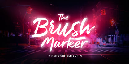 Brush Marker is a strong hand drawn dry brush font. Brush Marker is great for headlines and logotype use. Brush Marker is packed with automatic Contextual Alternates and Standard Ligatures that keep the text vivid. Brush Marker has a wide language support and it is PUA encoded so you can access extra glyphs in most graphic design softwares.
 - Goudy Old Style by Bitstream,
$29.99 Inspired by the Froben capitals believed to have been cut by Peter Schoeffer the Younger, son of Gutenberg’s apprentice, this design is neither strictly a Venetian nor an Aldine. The archaic approach and lack of the Aldine model lead us to place the face in the Venetian group. The design owes more to Goudy than to Schoeffer.
 - Tarotee One by Monotype,
$29.99Traditional as Gutenberg, fresh as a sealed deck of playing cards - Tarotee One Arabesques is a remarkable set of ornaments that combine and recombine in endlessly beautiful combinations. Created by Tony Lansbury (and if you're still wondering what "tarotee" means, here's a hint - tear open that deck of cards mentioned above and look at the backs). - Marthiline by Motokiwo,
$15.00 Introducing Marthiline: a sweet beauty handwritten font that is perfect for beauty branding, book covers, posters, magazines, or quotes. Marthiline is packed with uppercase, lowercase, numeral & punctuation, multilingual and ligature that already PUA encoded. With its real brush texture and natural stroke gesture you can use this font stand alone or combine it with a thin sans serif.
 - Pragnea by Hazztype,
$20.00 Introducing Pragnea, a modern sans serif font with a unique touch. It had many unique quirks such as its distinctive e, curved stroke on R, K, V, W, and many others. The type family consists of three weights plus matching italics. Packed with 300+ glyphs, it works well both for impactful headlines and for reading sizes.
 - The Boldstyle by Almeera Studio,
$15.00 Introducing The Boldstyle a retro bold script which will bring yo back to 70s feel.comes with Extrude versions. So you don't need extra effort to create extrude effects. Its features include: Stylistic Alternate, Swash, Ligatures, Stylistic set and multilingual support. You can choose alternatives for substitution with various variants Glyphs. Very suitable for logos, tshirts, posters, branding, etc.
 - Minebold by ahweproject,
$9.00 Minebold is a retro bold handwritten font that will bring you back to the 70s. Fall in love with its unique character and use it to create gorgeous wedding invitations, beautiful stationery art, eye-catching social media posts, and much more! Minebold is PUA encoded, which means you can access all glyphs and swashes with ease!
 - Ancora by FAEL,
$20.00 I’m happy to announce the complete version of Ancora, a typeface I designed back in 2013. Ancora is a sans serif typeface with a distinctive style, inspired by the imagery in the production of the famous Port wine, such as boats, barrels, grapes, and bottle labels. Use Ancora for magazines, packaging, posters, stamps, brands and logos a new taste.
 - Auster Variable by Resistenza,
$89.00 Auster Variable for Adobe's softwares. Auster packs sensational personality in its fine-tuned forms. Confident and quirky, yet comfortable to read, this distinctive san serif family stands out from the crowd. The curves cinch and strokes flair in unconventional places making Auster an unashamed rebel sure to turn heads. More About Opentype Features: https://bit.ly/opentype-rsz
 - Bantero by Viaction Type.Co,
$18.00 Bantero Typeface is a display font with a vintage theme and a victorian style. It’s perfect for vintage-themed projects. The font pack includes a bonus of 6 vintage ornaments which are very easy to edit. Font features include: Bantero File Multilingual Support. Punctuation & Symbol. Get this cool & interesting font collection right away at an affordable price.
 - Tacky Font by Ingrimayne Type,
$14.95 Four letters for this font came from a puzzle in a 1983 Games magazine. After seeing them, I could not resist the temptation to do a complete set of letters made from push pins or tacks, a truly tacky font. Most of the letters on the lower case keys are alternatives--choose the one works best for your purposes.
 - Paciencia by Typographias,
$16.00 This family started as a graduation project back in 2009, coming from calligraphic studies and sketches with a broad nib pen, based on humanist proportions and inclination. From its ink and paper origins it has come a long way until the current form, being digitalized and made into fonts through the course of the last 8 years.
 - Tyrium by Kavoon,
$12.00 Tyrium is the font pack. The Normal font combines with the alternate character font to make each word unique. Then add the Splatters font as your tagline and — the ideal logo! What's included: - .TTF and .OTF files - Opentype features. - Splatters combines perfectly with Tyrium to create cool typography or logo design. - A range of multilingual support.
 - Rakia by Greater Albion Typefounders,
$15.00 Why not take a giant leap back to the 1970s? Rakia is a science-fiction inspired font, with classic overtones of the 70s. Alternatively, it is a 1970s font with scoff overtones. Take your pick! It’s an all capitals face, with a strong suggestion of speed and motion about it. A wonderful display font and fun to use!
 - Aberration by Mad Irishman Productions,
$22.00Aberration is a distressed display typeface with a flair for exploration. Suitable for headings where you want to convey just a hint of danger, this font includes Cyrillic and Greek characters. - Philadelphian by FontMesa,
$29.00 Philadelphian is a revival of a MacKellar, Smiths & Jordan font from 1867 by the same name. The regular version with shadow outline was the only style that was offered in 1867. We've taken the original design further by creating two additional weights of medium and bold plus plain black versions. The medium and bold weights are unique because only the horizontal strokes increase in thickness while the vertical strokes remain the same in each weight. Philadelphian Nite is the plain black version of this font family, Nite is the casual spelling of the word Night meaning dark or black. In the late 1800's Philadelphian was a very popular typeface which can be seen on many billheads and letterheads through the early 1900's. If you're looking for a western style font that doesn't look like any other then Philadelphian is the right choice. While the name doesn't remind you of the cowboy genre we've kept the original name for historical reasons because this font was so popular in its day. We plan on going forward with a weathered version of Philadelphian which will be released under a southwestern style name. With Philadelphian we've decided to set the complete family price to an amount that may be considered on sale all of the time.
 - VLNL Tp Kurier by VetteLetters,
$35.00 VetteLetters is proud to bring you the TpKurier-family. It is cooked up by our German chef Martin Lorenz currently living in lovely Barcelona! Chef Lorenz about the TpKurier recipe: “TpKurier is the second redesign we did of Courier. The first redesign in 2000, although based on a five-unit grid, was drawn completely by hand. Six years later we designed another grid version of Courier, and the TpKurier family was born. This version is completely constructed up till its last detail. We didn't want to correct ‘mistakes’ deriving from the use of the grid, but instead make them visible (see “S”). TpKurier is based on a very simple grid, composed a proportion of four units high by two units wide. A series of other links between them make it possible to form a font from this grid. We felt it was important to consistently work within these limitations so that any unexpected asperities would help provide the font with its character. Even though it is a rough constructed typeface it was important to us to design real italic lower case letters and not just a sloped roman (see “a”, “g” or “s”). The first family published contained a serif and sans-serif version of the TpKurier, with italic and bold.”
 - Awardos by upirTYPO,
$6.00 Awardos is a complete solution for awards, badges and all kind of certificates. This font allows to mix various borders, laurels and icons to create a very unique badges. To quickly create an unique badge, type any number, any uppercase character and any lowercase character, for example 0Aa, 5Gk, 9Kl, 7Fr etc. To add starfield, start with a symbol (!"#$%&'()*+,). Glyphs included: 12x starfields - characters: ! " # $ % & ' ( ) * + , 16x borders - characters: 0 1 2 3 4 5 6 7 8 9 : ; < = > ? 36x laurels and outer elements - characters: A B C D E F G H I J K L M N O P Q R S T U V W X Y Z À Á Â Ã Ã Ä Å Ç È É Ê 12x crown icons - characters: a b c d e f g h i j k l 12x cup icons - characters: m n o p q r s t u v w x 12x number one digits - characters: y z à á â ã ã ä å ç è é ê It is not required to use a symbol from every category. For example only laurel with crown icon can be used, or only starfield with the cup icon. Awardos Inverse is an inversed version. The outline borders are still included, used symbols are: [ \ ] ^ _ { | } ~ ¢ £ ¤ ¥ ¦ § €
 - Art Gothic HiH by HiH,
$10.00 Art Gothic was attributed to the Central Type Foundry of St. Louis, Missouri, USA by Henry Lewis Bullen, writing in INLAND PRINTER in 1907, with a reproduction shown in Kelly’s American Wood Type. The typeface appears on the cover of an issue of “The Superior Printer” pictured in Typology by Heller and Fili dated in the 1870s. Art Gothic was designed in 1884 by Gustav Schroeder and proved to be one of the more popular and enduring of the American-designed Victorian display faces of the period, appearing frequently in ads in various publications. The Hamilton Mfg. Co showed a very similar wood type, No. 232, with a modified and rather heavy-handed upper case in 1892. As late as 1897, it may be found in the advertising section of The Ivy of Trinity College of Hartford, Connecticut and was included in the Norwood Press 1902 Specimen Book. Our font includes a complement of five upper case and four lower case alternatives as follows: 123=C, 125=E, 135=H, 137=S, 172=c, 175=e, 215=m and 247=s. Great for period pieces. ART GOTHIC HIH is clean, readable, and surprisingly modern-looking; unlike so many overly complex Victorian display fonts, it can be used in text sizes.
 - Mystical Woods by Missy Meyer,
$12.00 Mystical Woods is a script and caps font duo. I went back to the basics for this one -- ink and a brush on paper. I cleaned up the letters enough so that there are no jagged edges, but left enough of the character to keep that inky look -- those are the Rough fonts. Then I went back through again and cleaned the heck out of them, making every line and curve smooth for our cut-crafting friends -- those are the Smooth fonts. Since these two fonts were written together with the same tools and style, you can also mix the script letters in with the caps letters! Each font comes with a full set of standard characters and punctuation, as well as over 300 extended Latin characters for language support. And the script fonts also have 45 double-letter ligatures!
 - Shout Out by Comicraft,
$19.00 Here's a big shout out to all our Loud and Proud font homies -- If you've got a good set of lungs on you -- fill 'em up and get ready to Shout, SHOUT! Yes, let it all out because this is a font you can't do without -- It will make you wanna SHOUT! Throw your hands up, SHOUT! Kick your heels back, SHOUT! Throw your head back, SHOUT! Come on now, SHOUT! And don't forget to say you will... Don't forget to SHOUT! Yeah yeah yeah yeah, SHOUT! A little bit softer now, (Shout) A little bit softer now, (Shout) A little bit softer now, (Shout) A little bit louder now, SHOUT! A little bit louder now, SHOUT! A LITTLE BIT LOUDER NOW! SHOUT! SHOUT! SHOUT! SHOUT! PHEW -- Who says Comicraft doesn't know how to Pump it Up AND Get Down?!
 - Yes Script by Fenotype,
$50.00 Yes Script says Yes! Yes Script is a bold connected brush script inspired by the typography of the late 60s and 70s. Yes Script is not an anachronistic vintage type -due to it’s clean features and straight edges it’s more of a contemporary design suitable for branding, packaging, magazines and so on from digital to print. Yes Script is equipped with Contextual Alternates and Standard Ligatures that are automatically on and help to keep the flow of the font natural and connections between letters smooth. In addition there’s Swash, Titling Alternates and two packs of Stylistic Sets. Access the alternates in any OpenType savvy software or seek the Character Palette for even more alternates. Stylistic Set 3 is packed with 24 swooshes and ornaments set in letters a-x. Yes Script is PUA encoded so you can access the alternates in any software.
 - Zauberer by Scriptorium,
$24.00The Scriptorium got its start in the early days of personal computers with a few font designs for the Commodore 64, and the very first font which we did back then in the early 1980s was a gothic calligraphy font. That style of fonts - the medieval, gothic and black letter genre - has always been the backbone of our collection, but with recent releases we've stayed away from them to introduce a bit more variety. Well, with our new Zauberer font the antique, medieval and gothic look is back with a vengeance. Zauberer isn't a true medieval calligraphy style. It's based on early printed type from Germany which combines calligraphic elements with decorative embellishments from the woodcut printing era. The result is decorative and antique looking and rather appealing. The name comes from the German word for a magician or illusionist. - Ephemera Kingsford by Ephemera Fonts,
$39.00 A new vintage display typeface by Ilham Herry. Started from the passion of collecting the old tin packaging with classic labels on it, the layout and composition make Ilham pretty inspired and the urge of crafting the letters is getting bigger since that day. That's what comes first as a motivation in making this Ephemera Kingsford typeface.Adapted and referencing from the real physical collectible old tins and cans to a single pack of digital fonts asset. Packed up with 9 layered fonts, 1 font as a pair, and of course ornaments and vintage panels as a vector file.Perfectly fit for display printing, handcrafted product, screen printing industry such as apparel, packaging, labels, and also sign painting, scrapbook, glass gilding, et cetera. Not every visual can go vintage but if you want to, there's no other choice, oldsport. check Ephemera Kingsford type specimen here
 - Ongunkan Phoenician by Runic World Tamgacı,
$50.00 Phoenician/Canaanite The Phoenician alphabet developed from the Proto-Canaanite alphabet, during the 15th century BC. Before then the Phoenicians wrote with a cuneiform script. The earliest known inscriptions in the Phoenician alphabet come from Byblos and date back to 1000 BC. The Phoenician alphabet was perhaps the first alphabetic script to be widely-used - the Phoenicians traded around the Mediterraean and beyond, and set up cities and colonies in parts of southern Europe and North Africa - and the origins of most alphabetic writing systems can be traced back to the Phoenician alphabet, including Greek, Etruscan, Latin, Arabic and Hebrew, as well as the scripts of India and East Asia. Notable features Type of writing system: abjad / consonant alphabet with no vowel indication Writing direction: right to left in hortizontal lines. Sometimes boustrophedon. Script family: Proto-Sinaitic, Phoenician Number of letters: 22 - there was considerable variation in their forms in different regions and at different times. The names of the letters are acrophonic, and their names and shapes can be ultimately traced back to Egyptian Hieroglyphs. For example, the name of the first letter, 'aleph, means ox and developed from a picture of an ox's head. Some of the letter names were changed by the Phoenicians, including gimel, which meant camel in Phoenician, but was originally a picture of a throwing stick (giml).
 - Pantano by Los Andes,
$29.00 Pantano is a handmade grunge typeface inspired by the rustic style of Amazonia. Alternate characters and ligatures give a sensual and naturalistic touch to the written word. Photography by Damien Vignaux (www.elroy.fr)
 - Hannover Modern by Type-Ø-Tones,
$40.00 Hannover Modern belongs to a series of typefaces used at the Estudio Mariscal in Barcelona. José Manuel Urós developed this weight, a vigorous egyptian-style, the embodiment of the Javier Mariscal style.
 - Coffee Beans Time by TypoGraphicDesign,
$9.00 The typeface Coffee Beans Time is designed from 2018–2022 for the font foundry Typo Graphic Design by Manuel Viergutz and Annelena Grascht as a graphic design and photography project. The display font based on the original coffee beans and create a dingbat pattern. 3 font-styles (Dingbats, Mix, Coffee Ground) with 304 glyphs (Adobe Latin 2) incl. decorative extras like icons, arrows, dingbats, emojis, symbols, geometric shapes (type the word #LOVE for ♥︎ or #SMILE for ☺ as OpenType-Feature dlig) and stylistic alternates (2 stylistic sets). For use in logos, magazines, posters, advertisement plus as webfont for decorative headlines. The font works best for display size. Have fun with this font & use the DEMO-FONT (with reduced glyph-set) FOR FREE! ■ Font Name: Coffee Beans Time ■ Font Styles: 3 (Dingbats, Mix, Ground) + DEMO (with reduced glyph-set) ■ Font Category: Display for headline size ■ Glyph Set: 304 glyphs (Adobe Latin 2) incl. extras like icons (decorative extras like arrows, dingbats, emojis, symbols) ■ 93 languages: Afrikaans Albanian Asu Basque Bemba Bena Breton Catalan Chiga Cornish Danish Dutch English Estonian Faroese Filipino Finnish French Friulian Galician German Gusii Indonesian Irish Italian Kabuverdianu Kalenjin Kinyarwanda Luo Luxembourgish Luyia Machame Makhuwa-Meetto Makonde Malagasy Manx Morisyen North Ndebele Norwegian Bokmål Norwegian Nynorsk Nyankole Oromo Portuguese Quechua Romansh Rombo Rundi Rwa Samburu Sango Sangu Scottish Gaelic Sena Shambala Shona Soga Somali Spanish Swahili Swedish Swiss German Taita Teso Uzbek (Latin) Volapük Vunjo Welsh Western Frisian Zulu ■ Design Date: 2018–2022 ■ Type Designer: Manuel Viergutz und Annelena Grascht
 - Rooster Squad by Alexander Sharkov,
$9.00 Let me introduce our new handwritten font - the Rooster Squad! Our dangerous font is designed for completely different missions. Suitable for logo and package design, user interface design, online and print use, comics and more! The font contains letters from a huge number of languages. Contains Latin and Cyrillic alphabets. We also designed various ligatures and alternate letters to add variety to our cool and dangerous typeface. The font will be constantly updated and developed! Don't know what to do with your cool new project? Call the Rooster Squad!
 - Hyggelig by Hanoded,
$15.00 After watching a bunch of Danish series like Dicte, Bron and The Killing, I figured it would be nice to give my newest font a Danish name. It became Hyggelig. Hyggelig, like the Dutch word 'Gezellig', cannot be translated into English, but it means something like 'cosy'. And a 'cosy' font it is. Hyggelig is a very cute, very threedee-ish typeface. It works great in poster ads and as a display font. It comes with upper and lower case letters and a whole bunch of diacritics. Enjoy!
 - Bali Script by Eclectotype,
$40.00 Inspired by the Indonesian island’s laid back feel and easy going culture, Bali Script is a tribute to the hand-lettered signage on beach bars, surf shacks and cafes. The swell of the stroke endings and the bolder-than-your-average gooey look convey a cool, contemporary take on baseball scripts. Overlay Bali Script Highlight for a cartoonish, glossy finish. Perfect for logos. This font is jam-packed with OpenType features that make smooth flowing text a doddle. Contextual alternates and ligatures are best left on by default. The alternates especially work a subtle magic that helps letters connect with an even rhythm, and automatically substitutes letters with the best fit alternatives based on their context, such as at the end of words, or adjacent to certain other letters. There are four stylistic sets (or all grouped together in the stylistic alternates feature for those without easy access to them) which do the following: SS01 - changes the r to a script form SS02 - makes certain caps more ‘scripty’ SS03 - capital I (and accented versions of it) get serifs SS04 - underline function. typing two or more underscores extends on underline beneath the previous word. Also included for your pleasure - oldstyle figures, automatic fractions, superior and inferior numbers, ordinals, some discretionary ligatures, swash alternates and extended language support.
 - Space Rave - Personal use only

- ITC Isadora by ITC,
$29.99This calligraphic typeface, designed by Kris Holmes in 1989, manages to look both confident and relaxed, while showing great intricacy and beauty upon closer inspection; it is named after the dancer Isadora Duncan. - J Scott Campbell Sketchbook by Comicraft,
$29.00 Created for J. SCOTT CAMPBELL'S DANGER GIRL SKETCHBOOK, this slick and stylish font is perfect for architectural drawings, marker comps or, um, sketchbooks! Artwork from Elephantmen: Man and Elephantman by J. Scott Campbell
 - Cristal True by Johannes Krenner,
$5.00 »Cristal True« is an elaborate matrix display font. It contains 645 letters per font style and some Open Type features: Different stylistic alternates, small caps, various font styles and different sets of numerals. It is monospaced and therefor easy to handle, if you want to simulate the look and feel of a LCD display. The basis of this font is a Union-Jack or sixteen-segment display (SISD). It is expanded by another 10 segments for a wider range of languages supported (this should cover all European regions). »Crystal True« is perfected for the quick, easy and precise use in modern graphic design applications. Try »Cristal Text« for more text-heavier usages.
 - Detective Client JNL by Jeff Levine,
$29.00 There is no doubt that the 1941 version of “The Maltese Falcon” was superior to the prior two attempts by Warner Brothers at filming Dashiell Hammett’s 1930 novel. Sam Spade was perfectly portrayed by Humphrey Bogart, and the supporting cast of Mary Astor, Peter Lorre, Sidney Greenstreet and Elisha Cook, Jr. rounded out the main players in a great suspense film that is considered to be the first (if not one of the first) of the film noir genre. The title cards for the production and cast credits were hand-lettered in a spurred serif type style strongly reminiscent of the Art Nouveau period, so instead of naming the digital version with some “tough guy detective” moniker, it was decided that Detective Client JNL was more appropriate. After all, this is a reasonably attractive font, and in this kind of film it’s usually the “attractive damsel in distress” [be she the victim or the actual perpetrator] that gets the story rolling… Detective Client JNL is available in both regular and oblique versions.
 - Vortices by Jorsetype,
$12.00 Vortices is a font that made the hand by having the character up and down like a dancer. Vortices has a very unique style of calligraphy, it is very suitable for use in the work of modern design. combines from copperplate to contemporary typeface with a dancing baseline, modern and elegant touch. Vortices features 531 glyphs and alternate characters Include . including initial and terminal letters, alternates, ligatures and multiple language support. Programs that support in this font is a Adobe Photo Shop, Adobe Illustrator, Adobe Indesign, Corel Draw and Microsoft Office. Languages supported: Breton, Catalan, Czech, Danish, Estonian,French, German, Hungarian, Icelandic, Italian, Romanian, Scottish Gaelic, Slovak, Latvian, Lithuanian, Norwegian, English, Finnish, Polish, Portuguese, Slovenian, Spanish, Swedish, Turkish, Welsh. Basically, all european languages that are based on latin alphabet Can be used for various purposes.such as headings, logos, wedding invitation, t-shirt, letterhead, signage, lable, news, posters, badges etc. To enable the OpenType Stylistic alternates, you need a program that supports OpenType features such as Adobe Illustrator CS, Adobe Indesign & CorelDraw X6-X7
